As the old saying goes: When in October, Halloween. Even with a growing popularity of horror in comics, October has a higher-than-normal number of new thematic releases, with Nightfall Double Feature from Vault Comics adding to the roster of new anthologies. Following on from Shock Shop and the newly revitalized Creepshow, Nightfall Double Feature encases the start of two new horror stories, each one set to chill readers to the bone.
The Cemeterians is a creepy and disturbing urban horror from writer Daniel Kraus and artist Maan House, with colors by Kurt Michael Russell and letters by Jim Campbell.
Denizen is a more classic 1970’s style demonic horror from writers Davis Andry and Tim Daniel. The artwork is by Chris Shehan, with colors by Jason Wordie and letters by Andworld Design.
First Frights
As with any anthology, there are strengths and weaknesses, often with one story standing out above the others. In Nightfall, a large portion of the comic is engaging, exciting, and brilliantly executed. Unfortunately, the rest is best described as tedious. The difference to the usual makeup of an anthology comic is that the tedium isn’t situated in one story that could potentially reflect badly on the other, but is instead ingrained into the entire comic.
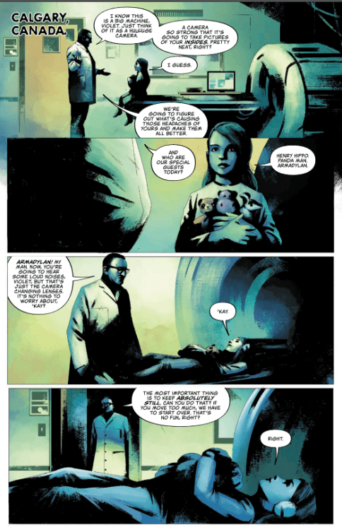
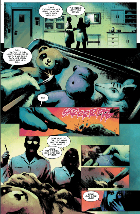
In The Cementerians, the initial introduction to the story is intriguing with a disturbing twist. It has promise and the shadow-heavy artwork by House adds a really uncomfortable atmosphere to the narrative. Campbell’s lettering produces a warm tone for the Doctor and Mother but this is subverted by the harsh, imposing sound effects. The opening scene builds up tension until an unsettling shock image. Russell’s colors change from the clinical bluey green wash of the hospital to a grotesque parody of children’s toy design, subverting the bright colors of the soft toys to create an image that makes you physically recoil.
With such a strong start, it’s disappointing that the story fails to continue in this vein. As soon as the focus shifts to the main cast, there is a change in the narrative tone. It moves away from the cleverly controlled atmosphere and towards a tedious chest thumping contest between two (mostly) unlikable characters. The script seems to be content to characterize Alan Hogarth and Ivy Bell as a disgraced ‘mad’ scientist and an overzealous religious fanatic, hammering home this point every time they have a conversation. As the mystery at the heart of the narrative is revealed, both characters maintain their single character traits to the point that neither of them are likable. Add in the fact they reach a conclusion to part of the mystery a mere 14 pages after the reader has already made the same connection, and it becomes difficult to be engaged with the story.
There are some disturbing images in this story and House’s artwork does cover up some of the self-indulgent speeches that Hogarth and Bell make. Unfortunately, it is not enough to keep the narrative as engaging as it should be, or is promised by the opening few pages.
The saving grace for The Cemeterians is Russell’s colors. The watercolor washes that bleed into the heavy black inks give this part of the comic the atmosphere that it deserves. Any sense of horror to be gleaned from the unsettling images comes from the color work and not the forced narrative interactions between the two unlikable leads.
A Saving Grace?
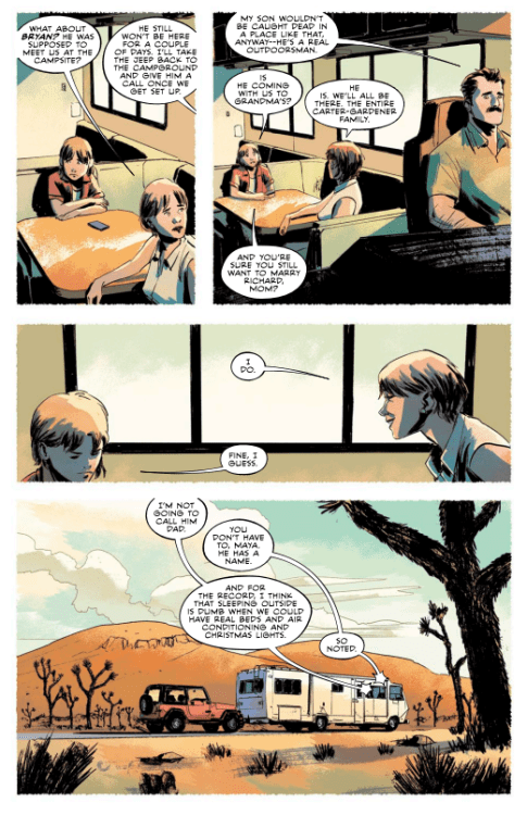
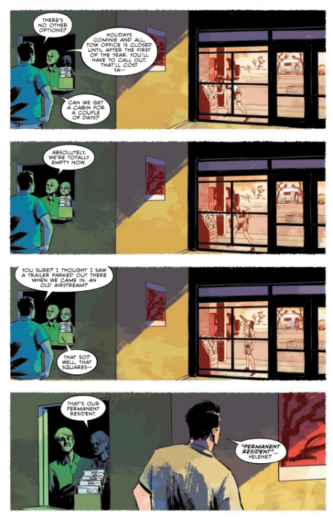
The second story in this anthology, Denizen, fairs slightly better. It too has a strong opening that is intriguing and mysterious but is much more blunt than the previous tale. There are classic horror tropes on show from panel one but the pace of the action, driven by the composition of the layouts, almost speeds the reader on too fast to notice. You take in the tropes, such as the lonely caravan, the dark forest, the unsettling sounds, but the 1970s jump scare narrative pushes you on too quickly to obsess over them. Before you know it, the darkness has retreated and you are safely in the camper van along with the happy, singing family.
It’s worth noting at this point the superb double-page spread that separates the two halves of Denizen. The blood red sky overpowering the black landscape below is a striking image, punctuated by a quote from Lord Byron. This page is reminiscent of the superb Image Comics mini-series Winnebago Graveyard from 2017. In fact, that Steve Niles/Alison Sampson narrative contained a similar family drama leading into the horror element of the tale. The main difference is that, just like The Cemeterians before it, the central cast of Denizen are less characters and more like mouth pieces to impart information, often in an unnaturally forced way.
The character exposition comes across as more palatable in Denizen because of the architectural design in the artwork. Shehan uses the space created by the elements of the camper van to great effect within the panels on the page. The shape of the windows, for example, creates additional natural panels within the frames and this enhances elements of the family dynamics. There is a distance between Maya and Helene, illustrated and punctuated by the positioning of the characters at a table, and by the windows of the van. These spaces create separate panels for the characters to inhabit. Shehan’s work takes elements of the script and gives them a strong visual presence on the page.
There is a very obvious shift in the color palettes between the blatant horror scenes and the mundane family holiday. As a technique for controlling the tension within the narrative, this works wonderfully and there is even a gradual shift between the two later in the story as the holiday slips away into horror.
At first glance, the rough, sketchy artwork provided by House in The Cemeterians might lead you to believe that the first story is the more challenging, creatively. However, it is Shehan’s structured panel layouts contrasted by the interior artwork that provides a more satisfying visual treat. There is a page of aspect-to-aspect panel transitions and several pages where the panel frames and gutters become a more integrated part of the story telling. Shehan is playful with the page designs, using a wider range of techniques to keep the story alive and kicking.
Conclusion
Nightfall contains some intriguing elements and, as a general rule, the artwork is wonderfully executed, with the colorists and letterers producing some standout moments. The overall story for The Cemeterians is more imaginative, giving the reader something they probably haven’t seen, unfortunately this is hampered by the less approachable Scully and Mulder couple at the center of the piece. The lack of personality and chemistry between the main characters makes the comic difficult to engage with.
In contrast, Denizen has a more traditional story, told in a classic modern structure, but the compelling artwork and pacier narrative makes it more attractive. It becomes more enjoyable which in turn makes the reader want to spend time appreciating the creativity behind it.
As a package, Nightfall Double Feature, has two strong openings that fail to deliver on their promise by the final pages. Denizen proves to be a stronger element of the comic but it might not be enough in a market already saturated with new horror comics.