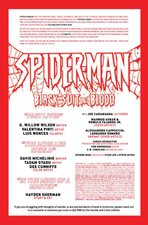
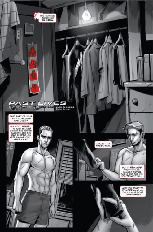
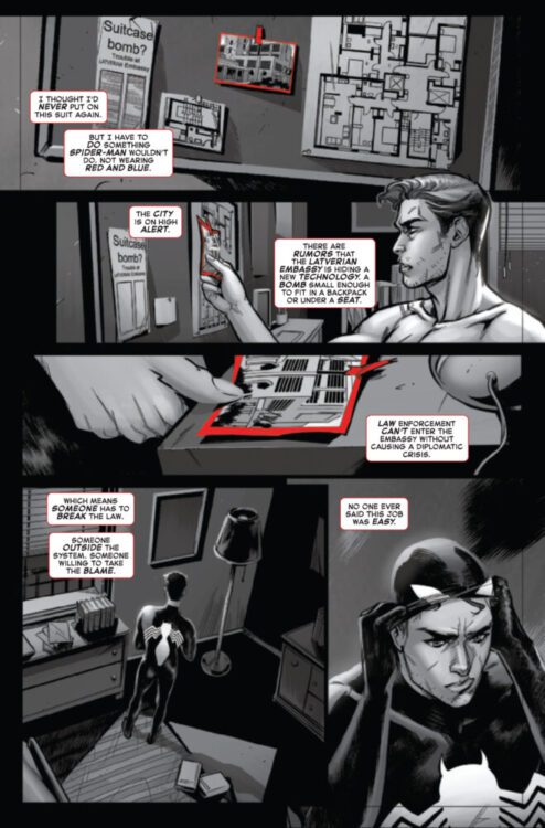
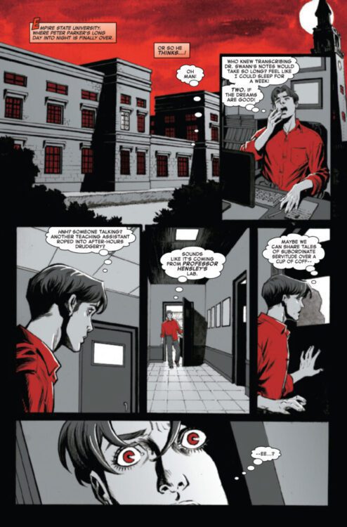
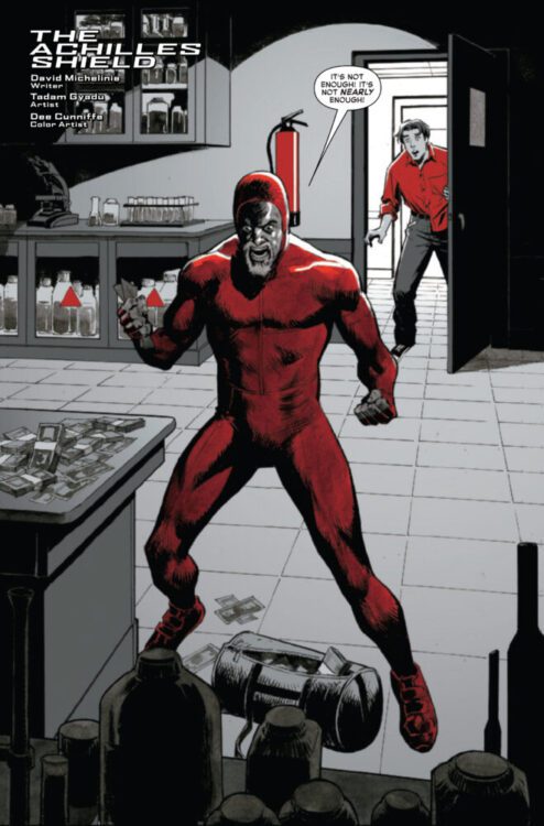
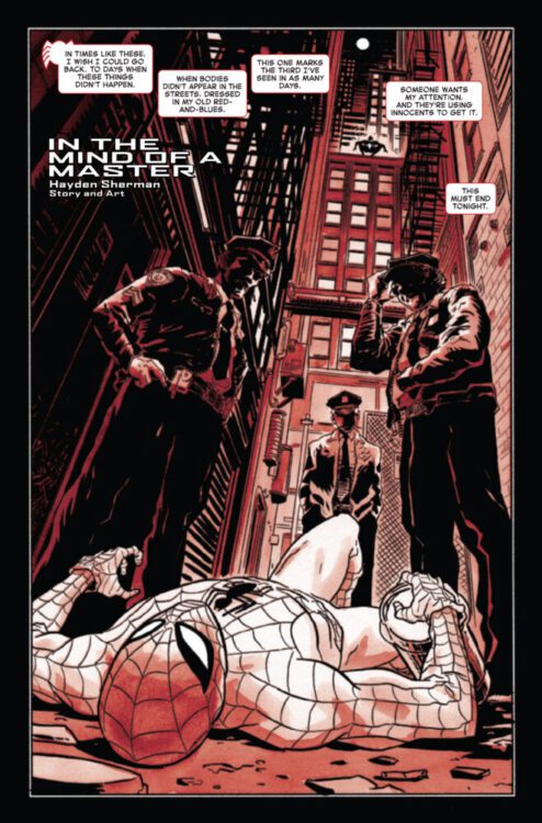
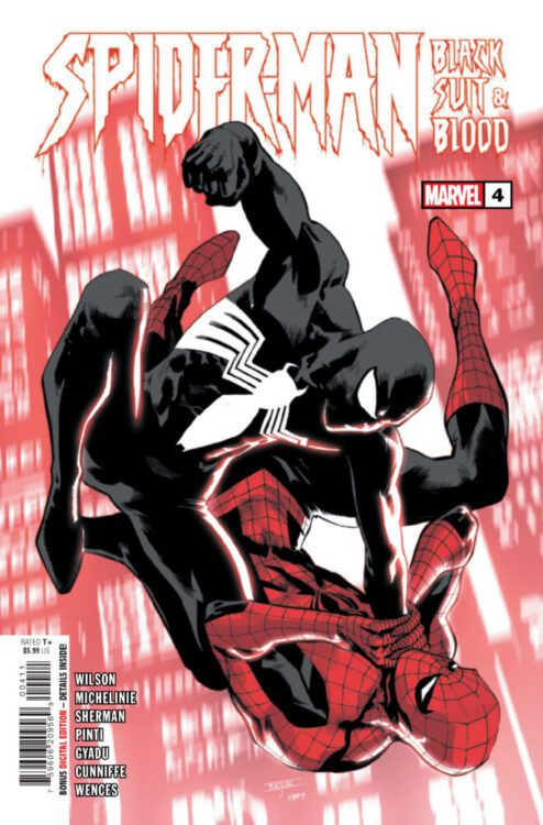
SPIDER-MAN: BLACK SUIT & BLOOD #4 hits your local comic book store on November 6th, but thanks to Marvel Comics, Monkeys Fighting Robots has an exclusive five-page preview for you!
About the issue: NO QUIPS, JUST TWHIPS!
Celebrate the 40th anniversary of SPIDER-MAN’s black costume – “BLACK, WHITE & BLOOD”-style! Iconic AMAZING SPIDER-MAN scribe and Venom co-creator DAVID MICHELINIE returns to utterly upend the web-slinger’s world! G. WILLOW WILSON teams Spidey up with the Black Cat for a heist that will challenge everything Peter believes in! And rising star HAYDEN SHERMAN’s nail-biting tale sends Peter Parker on a dark, twisted journey when a foe out of his past returns hungry for vengeance – and to force Spider-Man to confront old sins!
The issue features three stories. The first is by writer G. Willow Wilson and artist Valentina Pinti, with colors by Luis Wences; the second is by writer David Michelinie and artist Tadam Gyadu, with colors by Dee Cunniffe; the final story is written and drawn by Hayden Sherman. All stories are lettered by Joe Caramagna, and the main cover is by Mahmud Asrar and Romulo Fajardo Jr.
Check out our SPIDER-MAN: BLACK SUIT & BLOOD #4 preview below:
Have you been reading SPIDER-MAN: BLACK SUIT & BLOOD? Sound off in the comments!
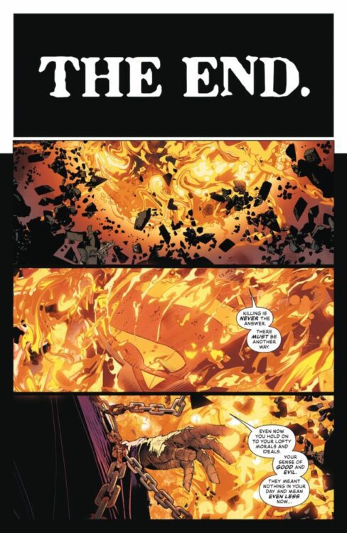
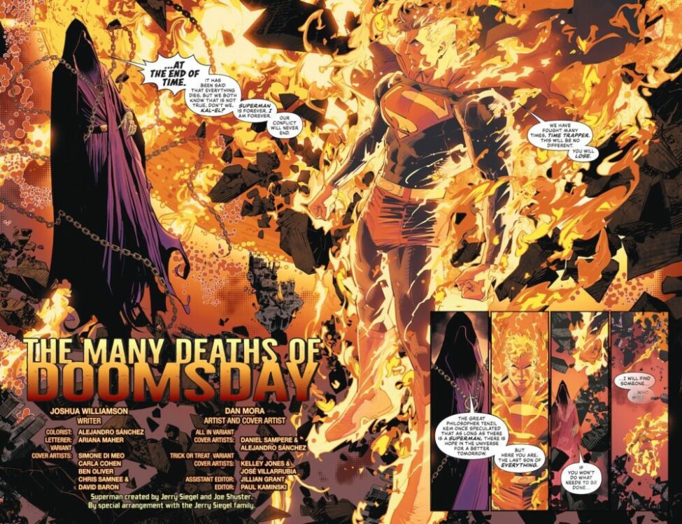
Superman #19 marks the beginning of a new status quo for Superman and company. With Absolute Power over, this is the first new issue of Superman after DC’s All-In relaunch. Joining writer Joshua Williamson and letterer Ariana Maher are new series artist Dan Mora and colorist Alejandro Sánchez. It’s the first issue of a new storyline, starring Lois Lane as Superwoman, and the return of Doomsday (back from hell). The team sets that up nicely without telling us why, establishing an exciting mystery.
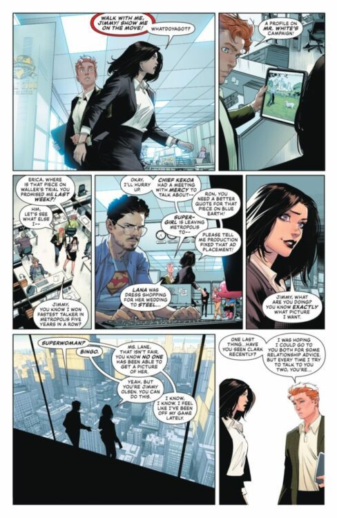
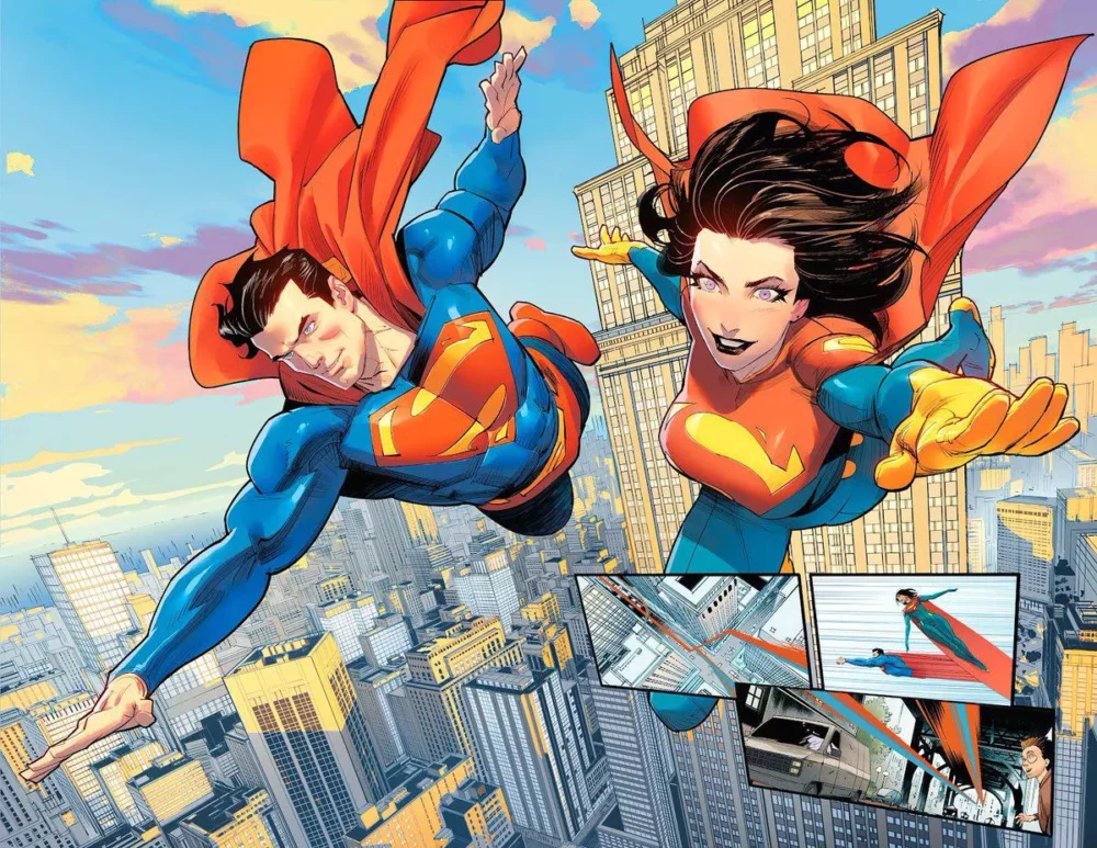
The issue starts with the Time Trapper talking to a blazing Superman in a far future. The two talk, and then we’re taken to the present day’s Daily Planet, where Jimmy Olsen is showing Lois pictures that he’s taken for the front page. Lois says she wants a picture of the new Superwoman. An explosion sounds off in the distance, and Lois leaves Jimmy and rushes to the supply closet where Clark Kent is already waiting. The two unbutton their shirts to reveal their matching bright S emblems, and they fly towards the danger together.
Time Trapper approaching Superman
WRITING
This story feels like it’s very exciting to Williamson, therefore making it feel exciting to the reader. Not all our questions are answered in this first issue, but that’s okay! He builds up to the reveal of Superwoman well here. Williamson has written a great Lois for the majority of the run, and this issue marks one of the best instances of that. Lois and Clark working together as a superpowered married couple is an incredibly entertaining idea. Williamson really utilizes it to its fullest here by having Lois feel as though she’s on top of the world. He then contrasts that with Clark reminding her to not lose herself in it.
In this issue, we also learn that there’s definitely more to Lois gaining her powers than meets the eye. Something that either insinuates that she might not have them for long, or that the more she uses them the more she exerts and damages herself. Whatever it is, it’s an interesting little ticking timebomb that Williamson has set up that hopefully leads to a big moment.
Time Trapper and Superman talk
ART
Mora astonishes with every book he’s on. He constantly puts out impressive work that somehow manages to surpass his last, and this is no exception. He draws an amazing Superman and Lois, and his Superwoman design for Lois is really striking. It’s a great take on the classic Superman suit with some touches that really change it to make it hers, like the gloves that go up her forearm and soles at the bottom of her feet.
Mora also just captures the general vibe of each character’s feelings in this. There’s one panel where Lois and Clark are flying together for the first time and he flies straight while she flies at an upward angle, crossing his path. He’s used to this by now, but she’s taking it all in and appreciating it to its fullest. It’s a great small contrast. Not just that, but Mora also panels exceptionally in this. There’s one specific set of them where each curve of Superman’s crest is a new panel, and it just looks beautiful.
Jimmy shares his photos with Lois
COLORS
Sánchez hits the ground running here. Superman of the future is covered in flames, and they look astonishing. The oranges and yellows and reds in that beginning portion all come together naturally and beautifully.
There’s another great detail too that really sells the issue for Lois. The Daily Planet is so hectic for her. It’s all darker colors when she’s there with no escape. No matter how far through the Daily Planet she goes, it’s still shrouded in these darker colors. When she suits up though, Sánchez flips it completely. It’s all bright colors, Lois glowing especially in them. Even the interiors of the planet look brighter than they were before. It’s a really nice touch.
Superman and Superwoman fly together
LETTERS
Maher does her best here to give not only the characters, but the city itself a personality through the lettering. A couple have their own custom logos that pop up in the speech bubbles, and they really help to tell us about the character before we even see them. In Doomsday’s case, his logo doesn’t look much different from regular text, but it’s all rigid and messy, like it’s meant to represent someone more barbaric than the average person.
Maher also gives Metropolis itself some life, adding extra text to the civilians on the ground below the heroes. We know Superman can hear them, but now we see that too, and Lois as well considering most of the issue is told from her perspective.
CONCLUSION
This team really rounds out a great Superman issue that not only looks beautiful, but houses some really intriguing story beats as well. It feels like what the first issue of a new story in an already running comic should be, and doesn’t lose any steam with this being the nineteenth issue.
This book really needed something fresh and exciting after those Absolute Power issues, and this is it. It’s a new beginning for Superman and Superwoman as much as it is for some of their enemies, and exploring that in the future is going to be very exciting.
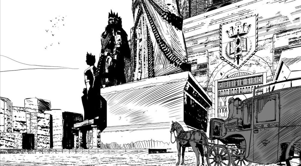
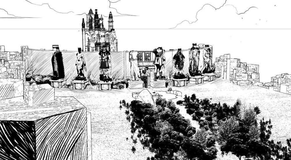
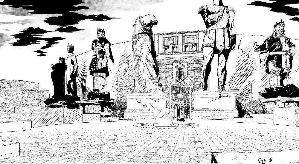
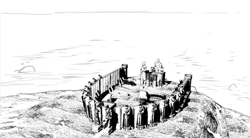
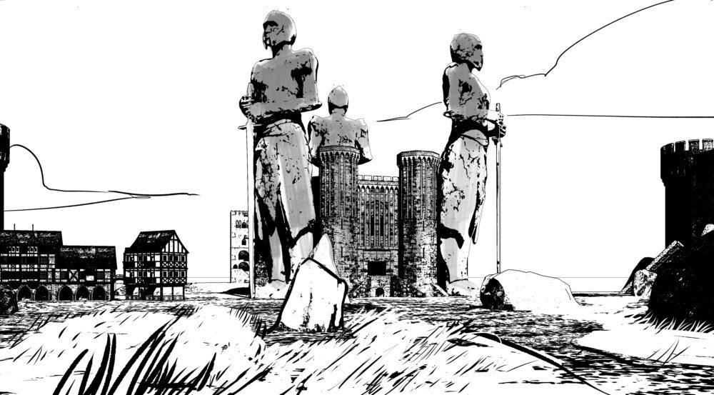
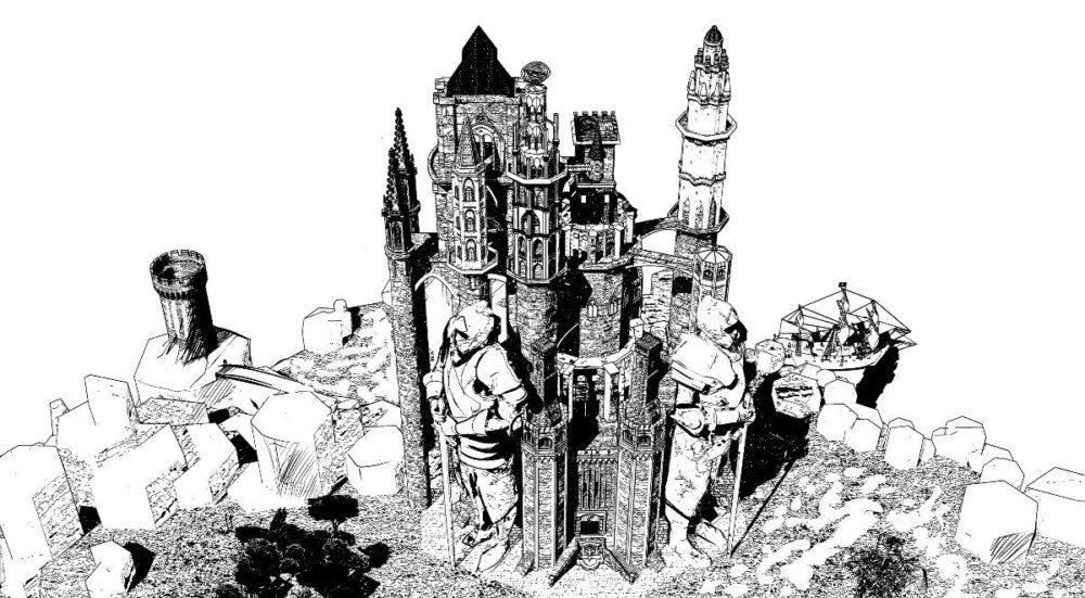
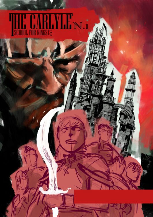
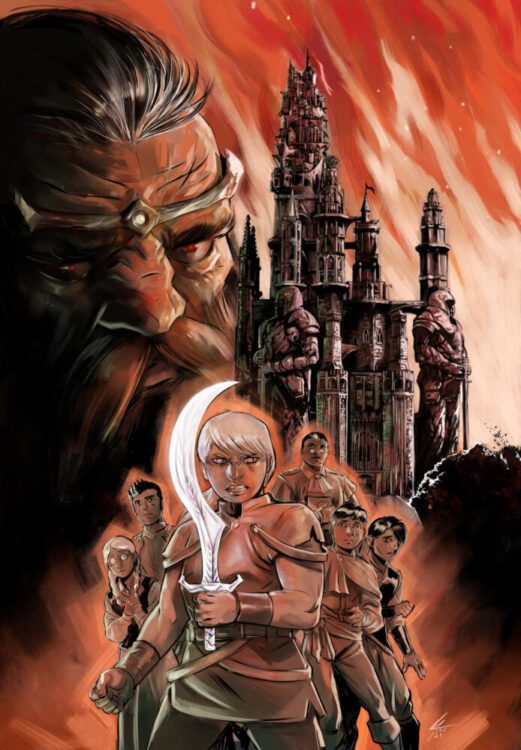
THE CARLYLE SCHOOL FOR KINGS #1 is out next week, but thanks to Dark Horse Comics, Monkeys Fighting Robots has an exclusive six-page look at the art process behind the debut issue!
About the series: Emmelene Heron is the daughter of traitors, but even she cannot be denied entrance to the Carlyle School for Kings. For thousands of years, the academy has opened its doors to the best and brightest young people in the Kingdom. There, they are trained in matters of heart, strength, and mind, and the one who is deemed most exceptional will be crowned king for the next thirty years, when the King Cycle repeats. This decree was enacted by Godwit himself, to ensure the King is one young enough that hope and idealism still thrive within them—but if they want hope and idealism, they invited the wrong girl.
The series is by writer Nelson Greaves and artist Davide Castelluccio, with colors by Francesca Vivaldi, and letters by Frank Cvetkovic. The main cover is by Castelluccio.
Check out our CARLYLE SCHOOL FOR KINGS art process preview below:
Are you picking up THE CARLYLE SCHOOL FOR KINGS #1 next week? Sound off in the comments!
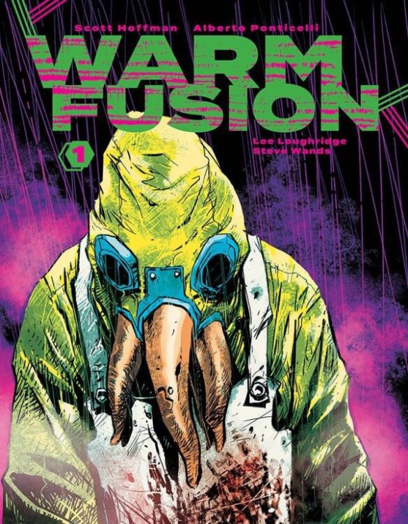
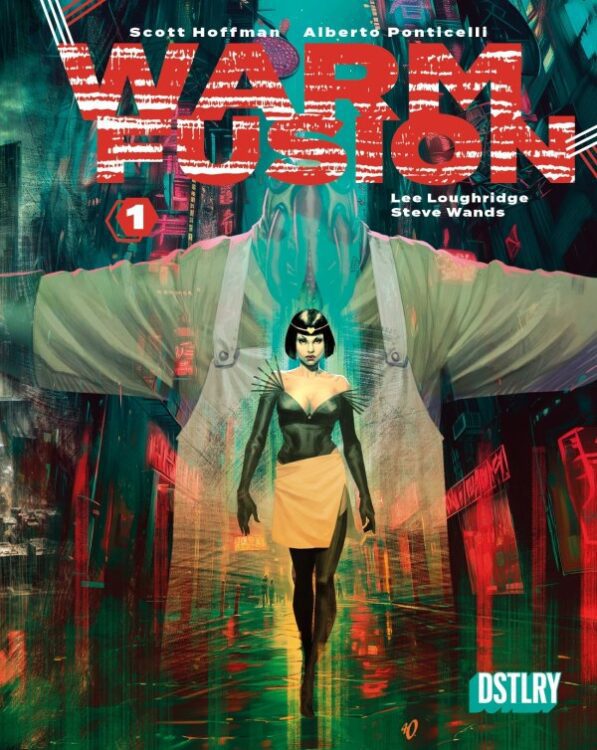
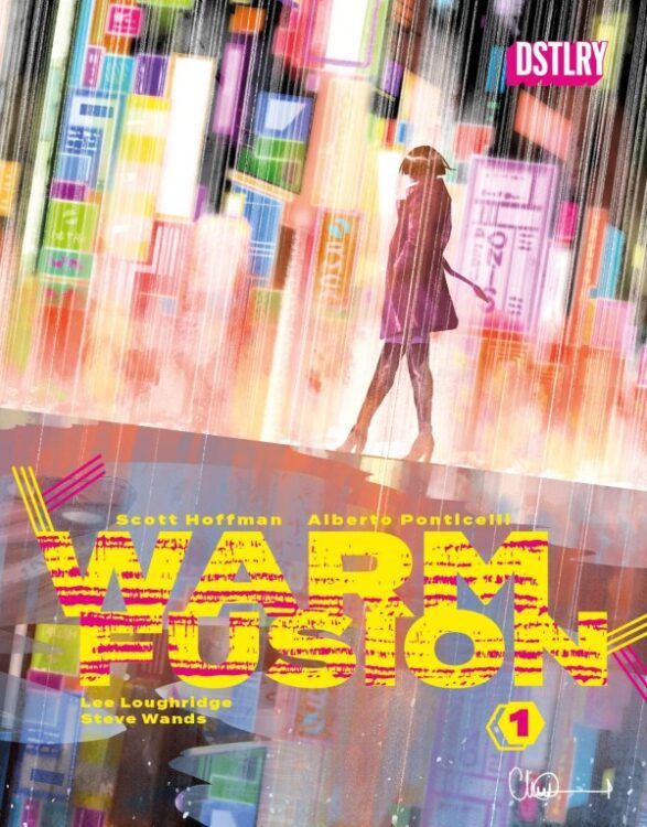
From writer Scott Hoffman (Nostalgia Wag, Scissor Sisters member) and artist Alberto Ponticelli (Frankenstein: Agent of S.H.A.D.E.) comes a fantastic blend of Cyberpunk science-fiction and Cronenberg-ian body horror in Warm Fusion #1. With painfully relevant themes, a sharply handled blend of genres, and phenomenal, atmospheric visual work, Warm Fusion looks to be another stellar new story from comics publisher DSTLRY.
“Half a century into the future, New York City has been devastated by crime, ongoing storms, residual radiation from a terrorist attack, and genetic mutations spurred by the medical innovations created in response. After a series of murders rip through the city’s brothels, an escort named Vin Young, who cosplays as the Brothers Grimm’s Snow White—and is one of the generation of deformed victims—pursues the killer, or killers, reluctantly joining forces with Jarrod Hannover, the lone cop assigned to the case. The two eventually arrive at a biotech megacorp developing a cellular metal called Warm Fusion—a pioneering technology meant to replace prosthetics limbs—and soon confront the sociopathic scientist Nicholas Fleischer, his monstrous alter-ego, Mr. Barnaby, and the hideous monster that he’s been secretly developing.”
Writing & Plot
Scott Hoffman brings together a batch of notable influences to create something intelligent and unique in Warm Fusion #1. The procedural detective story pulls from sources like Blade Runner and Shadowrun, paying homage to past genre icons while blending into this wholly new environment. The sense of fear and destitution throughout the comic is made palpable on every page, and through the eyes of every character. Hoffman pens these news reports that Vin, one of the protagonists, listens to while on the subway. These reports describe a New York ripped apart by fear and trauma stemming from some unknown series of events in this universe’s past. This is yet another Cyberpunk genre staple, and it feels frighteningly real in our own reality. They main story is segmented into three different perspectives – Detective Hannover’s investigation, Vin Young’s experiences as an escort and her growing paranoia surrounding the murders, and tech billionaire Nicholas Fleischer’s development of a new product – and the twisted acts he commits to achieve his goals. All three of these intertwined stories are equally compelling, from Hannover’s noir-styled notes, Vin’s detached commentary on her reality, and Fleischer’s utter derangement. Every bit of dialogue comes off as naturalistic and compelling to read, all while crafting a sort of dream-like haze surrounding the grime and filth their world is covered in. The body horror elements start off like any other gore-horror affair before turning into a medically-fused nightmare, giving readers a nice shock of bloody terror in their science fiction read. Scott Hoffman’s writing here is brilliant, and starts Warm Fusion off strong with one hell of a script.
Art Direction
Alberto Ponticelli’s detailed and thoughtfully directed visual work brings the dystopian cyberpunk vision of New York to life in Warm Fusion #1. His character work is reflective of the kind of diverse figures we often see in this brand of sci-fi, from 2077 to Total Recall. The streets are littered with struggling, armed denizens and the trash they leave behind. These street-level visions contrast with the polished and sanitized offices that Fleischer and his staff work in, letting the irony of the story hit readers in a subtle way. Ponticelli’s direction lets the story flow perfectly, letting each moment have breathing room and feel important. Tense conversation scenes among the sex workers transition to the floating, dissociative sequences of Vin while she’s working. The detective sequences with Hoffman are directed with the look of a noir mixed with a police procedural, complete with flashing red and blue lights through the rainy, foggy haze of an urban alleyway. The horror sequences carry all the gore and tension of an actual horror comic, complete with visions of dismemberment and a terrifying visage with Mr. Barnaby (seriously, what a mask). There’s an intentional messiness to Ponticelli’s work here that fits perfectly with the tone of the story, and how he shifts from moments of dreamy dissociation to pure terror. This is a stellar vision of cyberpunk brought to the comics medium.
Verdict
Warm Fusion #1 is a phenomenal debut issue, and yet another fantastic story from DSTLRY publishing. Scott Hoffman’s script is thematically rich and compelling, blending sci-fi noir and horror in expert fashion. Alberto Ponticelli’s visuals bring this grimy dystopia to life in equally stellar form, with his pencils and hazy colors pulling readers in to the pages with ease. Be sure to get to your local comic shop to preorder this new #1 ahead of FOC on October 28th!
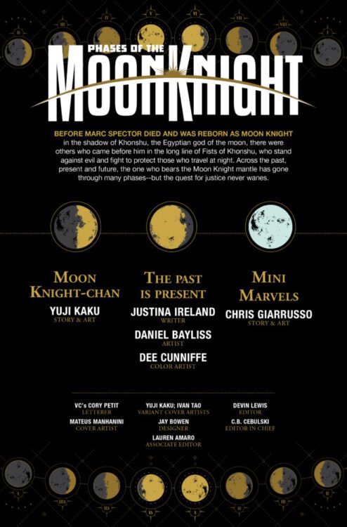
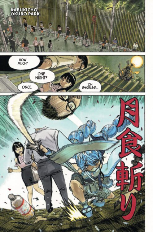
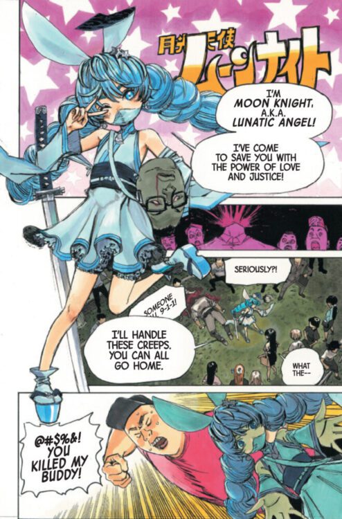
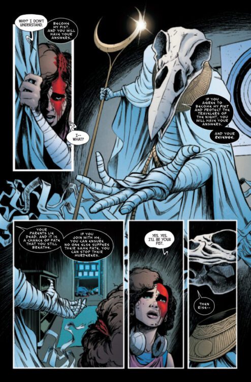
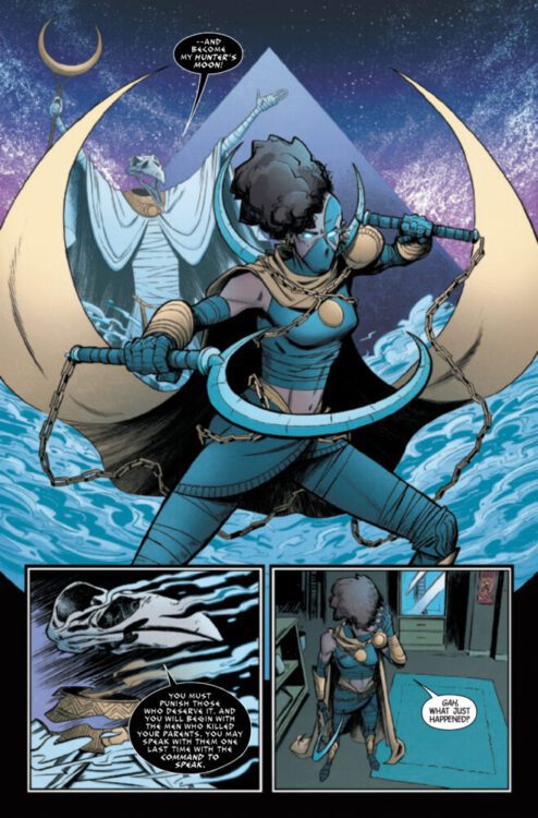
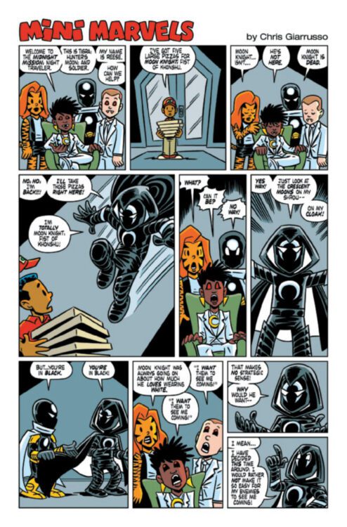
PHASES OF THE MOON KNIGHT #3 hits your local comic book store on October 30th, but thanks to Marvel Comics, Monkeys Fighting Robots has an exclusive five-page preview for you!
About the issue: Fall into the next PHASES OF THE MOON KNIGHT alongside New York Times best-selling Author JUSTINA IRELAND as she weaves a tale of an ALL-NEW avatar of Khonshu that might just eclipse every other Fist of Khonshu that came before!
Plus! Don’t miss the Marvel debut of manga superstar YUJI KAKU (HELL’S PARADISE) as he introduces a brand new Moon Knight with a violent past from a magical future!
The issue features three stories. The first is written and drawn by Yuji Kaku; the second is by writer Justina Ireland and artist artist Daniel Bayliss, with colors by Dee Cunniffe; the final story is written and drawn by Chris Giarrusso. All three stories are lettered by Cory Petit, and the main cover is done by Mateus Manhanini.
Check out our PHASES OF THE MOON KNIGHT #3 preview below:
Are you reading PHASES OF THE MOON KNIGHT? Sound off in the comments!
From writer Sabir Pirzada and artist Michael Walsh comes a story of ancient evils taking vengeance against humanity in The Sacred Damned #1. Featuring additional color art by Toni Marie Griffin and lettering from Becca Carey, this comic makes for a stellar horror pilot, and my personal favorite of the Horizon Experiment issues thus far. With a fun, gruesome script and grossly atmospheric visual work, this is a blast of a first issue that deserves to have its full story told.
“Celebrated TV writer SABIR PIRZADA (MS. MARVEL, MOON KNIGHT, DANDELION) and Eisner-winning creator MICHAEL WALSH (THE SILVER COIN) present INAYAH JIBRIL, a “Muslim John Constantine” — a new type of exorcist re-examining modern horror for fans of THE DEPARTMENT OF TRUTH and KILLADELPHIA.”
Writing & Plot
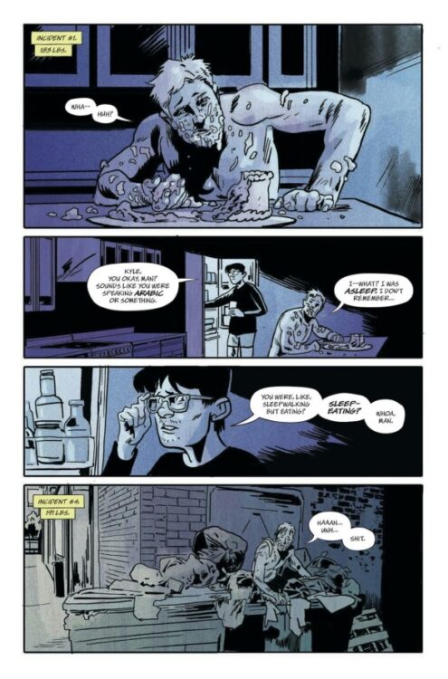
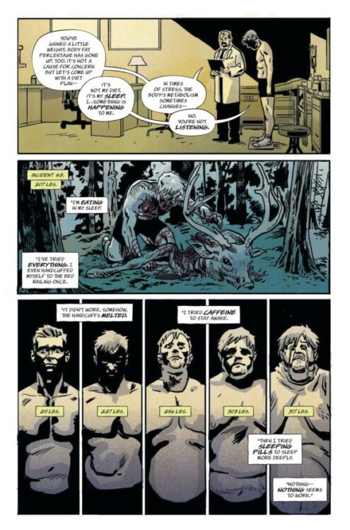
Sabir Pirzada takes readers along on a journey of twisted Middle Eastern mythology and ancient anger with his script for The Sacred Damned #1. A rising young football star begins to have some strange bouts of sleepwalking – and sleep eating. His problems become worse and worse until Inayah Jibril, an occult specialist a la John Constantine, arrives to help him with his case. Pirzada’s script feels like a mix of The Twilight Zone and a classic Tales From the Crypt story. There’s a kind of twisted humor to what happens to the young athlete that will definitely be a hit among fans of that sort of ironic, gallows humor/horror. The dialogue and interactions around what is happening are also kind of stilted in an intentionally peculiar way, with no one reacting to the athlete’s actions and bodily changes in any kind of sensible manner. The issue feels like a sort of uncanny nightmare until Jibril comes in. Structurally, this comic plays out like any other possession story seen or read since Blatty/Friedkin’s The Exorcist. This doesn’t keep Sacred Damned from being any less fun, however. While the final pages of the issue are bogged down a bit by backstory exposition, the script as a whole is a satisfying possession romp that deserves the chance to breathe with a proper long-form series.
Art Direction
Arguably more than any other genre, horror comics are made or broken on their visual style. The Sacred Damned is blessed with the talents of Michael Walsh to deliver the story’s atmospheric experience. The Silver Coin artist’s unique use of heavy hatching and thick pencil lines give the entire comic an unsettling feeling – even when there’s nothing horror-related on the page. Walsh’s sequential direction carries the comic along at a careful, suspenseful pace, with an interesting mix of classically “cinematic” panels and interesting POV shots. Walsh actually cuts in and out of POV fur several sequences, where each part ends with some new, twisted climax to what is happening to the athlete. The color art, with help from Toni Marie Griffin, pulls readers into this comic’s atmosphere. Each page has its own palette that often looks like it’s being lit by neon or RGB lighting. Even the direct sunlight somehow feels oppressive due to the use of shadows in each panel. When the body and demonic horror hit, they do so in an almost cartoonish manner that still fits with the comic. Becca Carey’s lettering adds to this creepy reading experience with a sort of harsh, scratchy lettering style. There are pages where an entity will be speaking, almost as if to the reader, and the words show up in the dead space of a panel in a striking font that looks like it’s been carved with a knife. This team manages to create a visual experience that is unsettling and fits with a very classic-feeling kind of comics horror. Hopefully, we get to see them craft more of The Sacred Damned like this.
Verdict
The Horizon Experiment: The Sacred Damned #1 is a fun horror romp that deserves a chance to full breathe as a complete long run. Sabir Pirzada’s script takes some classic tropes and mixes them with a sort of Tales From the Crypt-style approach mixed with Middle Eastern mythology to create a story that is very familiar but still a blast to read. Michal Walsh and Toni Marie Griffin’s visual work is creepy and atmospheric, combining a sort of pre-comics code art style with modern techniques to make a comic that is lovably gross as it is enjoyable. Be sure to grab this new release when it hits shelves on October 23rd!
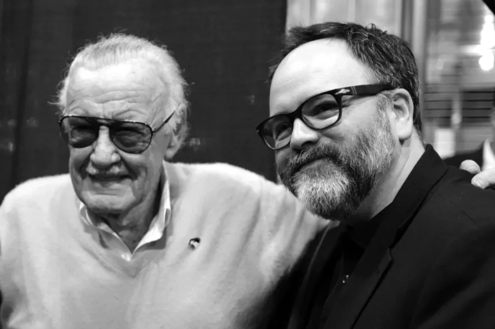
Gerry Duggan, widely known for X-Men, takes readers on a journey half a century in the making. Released by Image Comics and presented as a series of photo essays, Timing/Luck is a time capsule and visual narrative of Duggan’s life as he falls in love with comics, writing, and photography, and how the world around him both changes and stays the same.
Timing/Luck features a wide array of comic writers that Duggan calls friends and mentors, such as his Deadpool writing partner Brian Posehn, and other legends like Stan Lee, Jason Aaron, Skottie Young, and Jeff Lemire to name just a few. The book also captures other celebrities, influential writers, and actors, like J.J Abrams, Sarah Silverman, Patton Oswalt, Ta-Nehisi Coates, and many more. However, Timing/Luck is much more than a photo album of famous cameos; it’s a strong visual narrative of a changing world, empty streets, lasting friendships, and over 40 years of photographs.
Writing
Duggan writes like he photographs: with sincerity, curiosity, and respect. There’s no sentence in this book that doesn’t feel bathed in awe and gratefulness for his peers, mentors, and those who came before him. Inanimate objects, like his first car, and old Hollywood institutions are given life through his storytelling and accompanying photos. Duggan’s writing is hard to dislike as it is purely honest. It is a man who is so grateful to everyone around him, for the life he lived and the lessons he learned simply for having lived it, and it made it very difficult not to feel the same emotionality when reading along.
While Timing/Luck does not shy away from the hardships of Duggan’s life, the sense of dread and sadness is often cut by a clear optimism, especially as he writes about the days leading to and overcoming the pandemic.
Art
The photographs used in this book come in many varieties. There are the candids, most of which typically feature Duggan’s friends, other celebrities, and the occasional interesting person on the street. These take up much of the book, with Duggan making clear choices to be a fly on the wall, wanting to save the moment as opposed to intrude on it, which allows for many behind the scenes in usually private or reserved areas, such as writers’ rooms and backstage rehearsals.
Many photos feel much more typical to the everyday person with a camera, with a few selfies, convention panel photos, and bar hangouts throughout the book.
However, the photos that most stood out to me were the ones without a human subject as the focus. Duggan showed the life and spirit of the places he visited through his photographs, not just by portraying their beauty, but by showcasing why they were important to him and their communities.
Verdict
The title Timing/Luck heavily undersells this book, but after reading it, it’s clear that Duggan is the kind of man who would consider all the work he put in as a product of just timing and luck. Yet it is so much more than that. It is decades of hard work, dedication, love, and effort, to himself, his friends, family, and simply his craft: this book is a splendid biography, and a journey worth following.
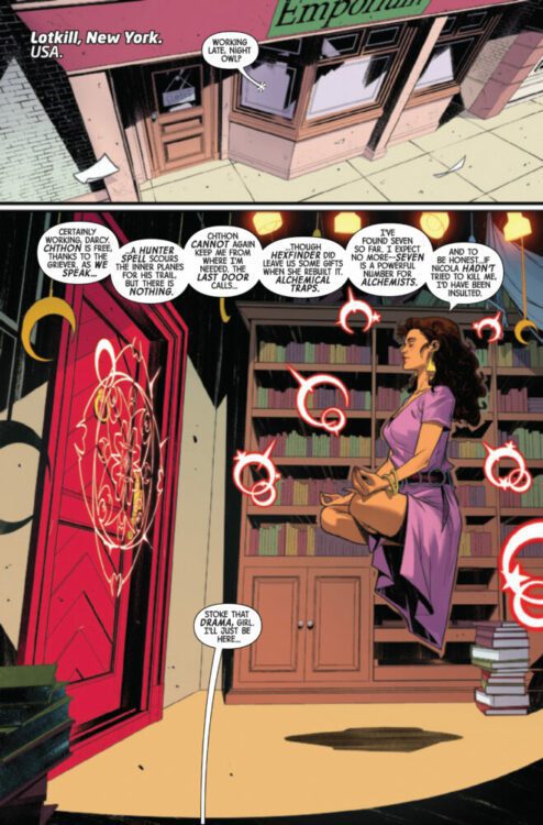
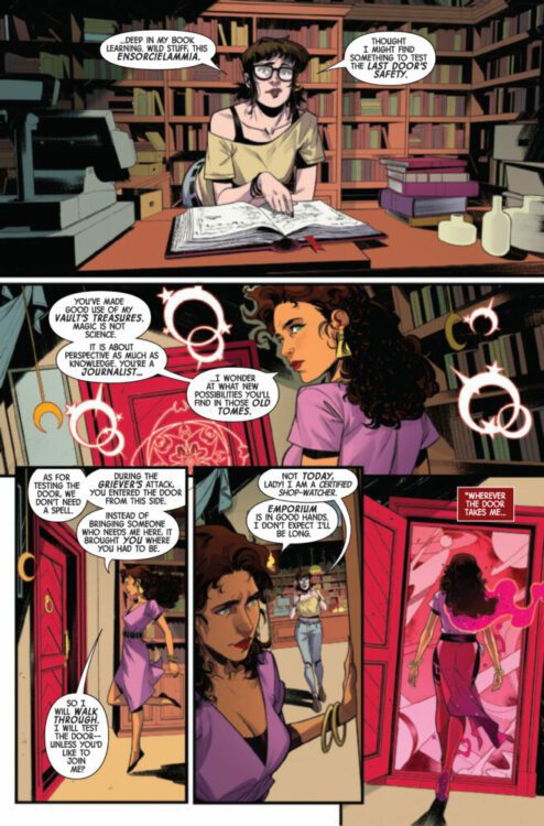
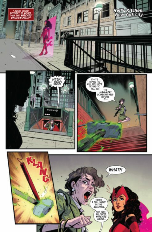
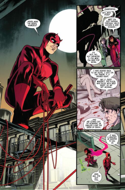
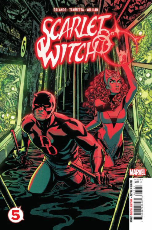
SCARLET WITCH #5 hits your local comic book store on October 23rd, but thanks to Marvel Comics, Monkeys Fighting Robots has an exclusive four-page preview for you!
About the issue: HAUNTING IN HELL’S KITCHEN!
When the Scarlet Witch and Daredevil team up to exorcise a murderous spirit from the subway tunnels of Hell’s Kitchen, Wanda realizes she’s encountered the entity before. But will that knowledge be enough to save a train car full of possessed civilians?
The issue is by writer Steve Orlando and artist Lorenzo Tammetta, with colors by Frank William, and letters by Travis Lanham. The main cover is by Russell Dauterman.
Check out our SCARLET WITCH #5 preview below:
Are you reading SCARLET WITCH? Sound off in the comments!
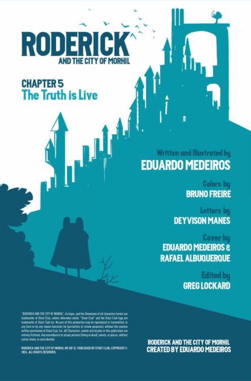
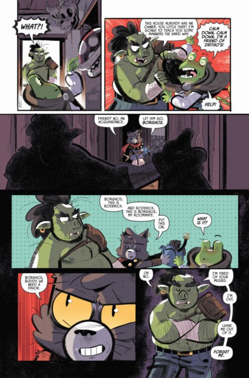
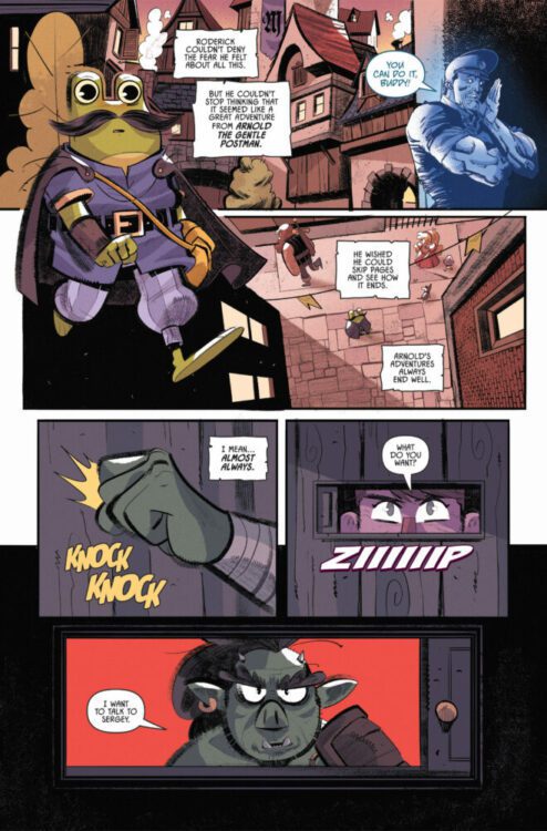
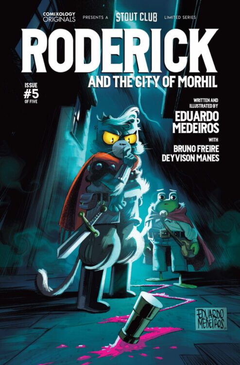
RODERICK AND THE CITY OF MORHIL #5hits the internet October 15th, but thanks to Comixology Originals, Monkeys Fighting Robots has an exclusive five-page preview for you.
About the series: Roderick is a dedicated, young postman from the countryside making a delivery in Morhil, the biggest city on the entire continent. Roderick’s dedication will be put to the test when the package he should deliver is stolen, and he finds himself as the main suspect of the disappearance of a famous influencer from the kingdom.
About issue #4:
The deception has been uncovered! Now Roderick and Dritho race against time to prove the truth to all the citizens of Morhil.
The series is written and drawn by Eduardo Medeiros, with colors by Bruno Freire, and letters by Deyvison Manes. Issue #5 is the final issue of the series.
Check out the RODERICK AND THE CITY OF MORHIL #5 preview below:
Have you been reading RODERICK AND THE CITY OF MORHIL on Comixology? Sound off in the comments!
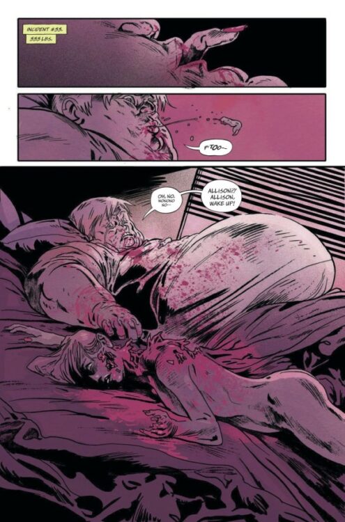
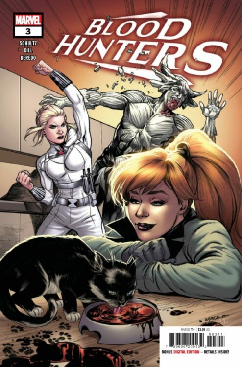
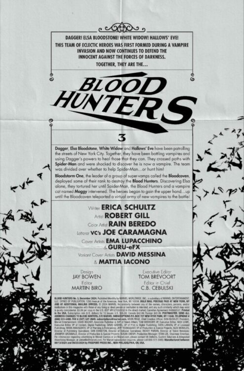
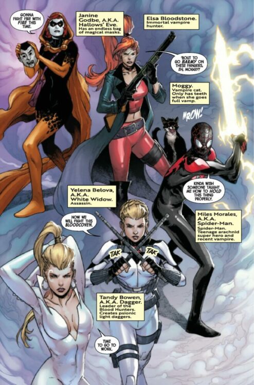
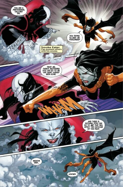
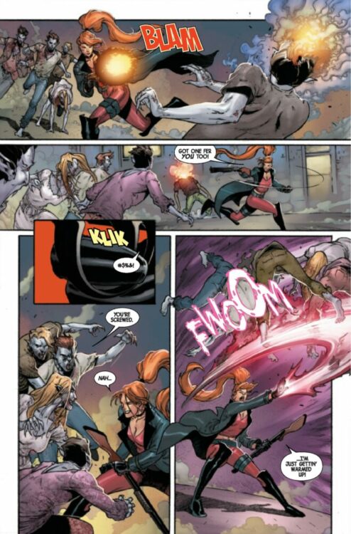
BLOOD HUNTERS #3 hits your local comic book store on October 16th, but thanks to Marvel Comics, Monkeys Fighting Robots has an exclusive three-page preview for you!
About the issue: The BLOODCOVEN strikes! It’s an all-out action issue as the super-vamp villains finally descend upon the BLOOD HUNTERS. Will a vampirized SPIDER-MAN on their side be enough to push back the darkness? Marvel’s newest – and bloodiest – team faces their ultimate challenge!
The issue is by writer Erica Schultz and artist Robert Gill, Rain Beredo drops the color, with letters by Joe Caramagna.