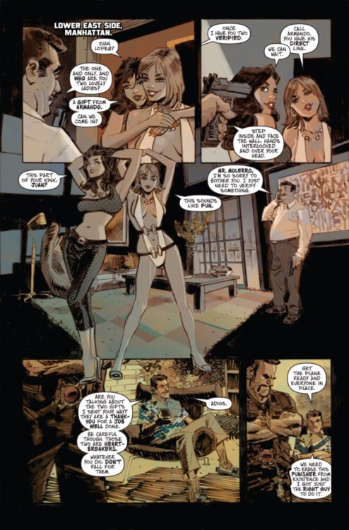
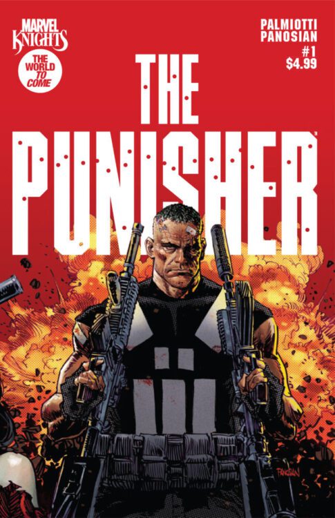
MARVEL KNIGHTS: THE PUNISHER #1 hits your local comic book store on October 8th, but thanks to Marvel Comics, Monkeys Fighting Robots has an exclusive five-page preview for you!
About the issue: THE WORLD TO COME EXPANDS!
One of the other pillars of MARVEL KNIGHTS enters the fray with THE PUNISHER! How did Frank get from the killer of killers you know to the man you met in THE WORLD TO COME?! Marvel Knights co-founder Jimmy Palmiotti and artist extraordinaire Dan Panosian treat you to one of the most savage comics ever!
The issue is by Jimmy Palmiotti and Dan Panosian, with letters by Richard Starkings and Tyler Smith. The main cover is by Panosian.
Check out our MARVEL KNIGHTS: THE PUNISHER #1 preview below:
Are you picking up MARVEL KNIGHTS: PUNISHER #1next week? Sound off in the comments!
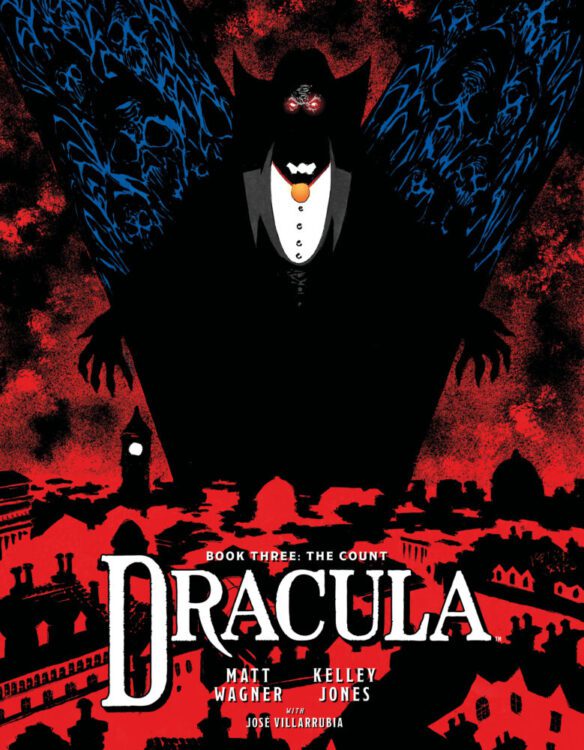
Matt Wagner and Kelly Jones are comic book royalty. Wagner burst onto the scene by writing and drawing Grendel, an epic that spanned centuries and is one of THE most important comics in the entire medium. He then followed that up with the fantasy book Mage. He was the writer of the long-running and award-winning DC/Vertigo book, Sandman Mystery Theater. He’s also penned multiple award-winning and fan-favorite Batman tales and has written comics based on pulp heroes like The Shadow, Green Hornet, and Zorro. Artist Kelly Jones gained attention with his haunting depictions of DC’s Deadman, which led to a career drawing for DC/Vertigo’s Sandman, Batman: Red Rain (where Bats meets Dracula!), and a legendary stint drawing the Batman/Detective Comics covers for the epic Knightfall, followed by a three-year run drawing the actual Batman book. These two comic powerhouses have been teaming up for their very own take on Dracula, with two books already under their cape. Those two volumes have already taken the comics world by storm, with fans from horror legends like director John Carpenter, who said “Dracula is a preeminent character in the horror hall of fame…this book is a horror lover’s delight” and comics writer Scott Snyder saying “As someone who has read a lot of Dracula takes, believe me when l tell you that this stands up with some of the very best ever. A new favorite of mine.” Now, on the eve of getting ready to launch the Kickstarter campaign for the final volume of their epic version, Dracula Book III: The Count (you can back the book here), Wagner and Jones took some time to allow us here at Monkeys Fighting Robots to take a stab at asking them a few questions. Check it out and make sure to click the link above and support the book!
MFR: Matt, I know Dracula is a well-known character, but for those folks who have not yet read your incarnation, can you give us a brief synopsis of what your story is about?
Matt Wagner: Well, I’ve maintained from the beginning of this project that Dracula is the most famous literary character of all time. There’s almost no place on Earth that you can mention the name and most everyone won’t immediately know who you’re talking about and at least the rudimentary elements of his character and myth—he’s the most fearsome and powerful vampire that’s ever un-lived! He’s also the character most adapted into film and other media more than any other…with Sherlock Holmes running second. And ever since the original 1987 incarnation of Bram Stoker’s classic novel, every adaptation has been altered or amended to suit the needs and tastes of those creators who followed in Stoker’s wake. I had wanted to try my hand at adding to the vast mythology surrounding Dracula for many years, and yet I just couldn’t find a fresh or unique take on the character, which at this point has been (pun intended) done to death (un-death?). And then the concept came to me…telling the stories around the story contained in the original novel. Dracula’s portrayal in the novel is somewhat oblique; he’s often portrayed as more of a spectral presence rather than an onstage villain. And the book itself is full of tantalizing hints and clues as to his history and actions that aren’t fully depicted in the narrative.
So, this series aims to tell the stories hidden in the shadows of Stoker’s original tale…while still remaining absolutely strict to the canon of the novel’s specifics. Almost every adaptation of the novel claims to be “the most faithful” and yet, really, none of them are; this is mainly a result of the fact that a novel isn’t a film and isn’t a comic—certainly, changes are always necessary for translation. But by not doing a direct adaptation, this version is able to maintain and expand upon the canon. And, of course, a huge factor in the success of this endeavor is the amazing art of Kelley Jones. Kel and I have been pals for decades, and we’d always wanted to work on something together…some big and significant project, not just a one-off. When I finally solidified what I wanted to with Dracula, my first thought was that this had to be rendered as a partnership with Kelley. When I first approached him with the idea, he was immediately on board with everything I was presenting to him. Luckily, the time was right for him, and it was right for me…and now we’re getting ready to launch the Kickstarter campaign for our third volume in this epic saga!
MFR: Matt, what kind of research did you do for this project? Because it’s so dense with history and mythology, that’s its mindblowing!
MW: I’ve done a ton of research for this project…and that process is still ongoing! Dracula not only features the most famous literary character of all time, but it’s also one of the most studied and annotated novels in the English language. I have four different annotated versions of the novel as well as various literary analyses, cultural dissections, narrative time-lines, screenplays, stage-play scripts, and a facsimile edition of Stoker’s original notes and outlines—which are still intact and housed at the Richenbach Museum in Philadelphia— that I accessed for my research. The novel is an example of epistolary storytelling, meaning there is no omniscient voice and the story is told in the form of letters, private journal entries, and such, and so every event of the narrative is dated as a specific month and day. Again, we wanted these stories to perfectly align with the details of the original book, and based on my own research, I think we’ve pulled that off. We’ve also gotten several endorsements from Leslie Klinger, who is one of the world’s foremost Dracula scholars and who wrote the New Annotated Dracula. The script for our
third volume, Dracula: Book III—The Count, was, without question, the most intensive thing I’ve ever written. I surrounded myself with photos and maps of Victorian-era London, as well as a calendar from Prof. Leonard Wolf’s annotated version that detailed every event of the novel on a day-by-day basis, which also included the sunrise and sundown times as well as the phases of the moon. There is some debate amongst Dracula scholars as to what year the events of the story take place. The novel was published in 1897 and claims that it had been seven years since the accounts presented therein. But there’s no indicator as to how long it had been between when the various journal entries were recorded and the actual publication. For various narrative reasons, I settled on 1988, which is also the year that Leslie Klinger supports. So…as you can see…I covered my bases for this project.
MFR: What other Dracula or vampire stories or books inspired you?
MW: Pretty much any and every version that’s out there had some influence on our version of these tales. But here’s a few books I particularly like: THE HISTORIAN by Elizabeth Kostova… This is a long novel that is a contemporary continuation of Stoker’s narrative. It’s a slow burn, but I really like its creeping sense of dread and its portrayal of Dracula himself, who, much like in the original novel, is more of an off-stage presence. THE DRACULA TAPES and THE HOLMES-DRACULAfile by Fred Saberhagen. Saberhagen wrote a number of Dracula pastiche books, but these were favorites of mine at a much younger age. THE DRACULA HORROR SERIES by Robert Lowry… This is a series of almost a dozen paperbacks from the 70s that read like a fever dream of that era’s exploitation films. The stories center on a crime-fighting team led by a Professor X-type academic who has resurrected Dracula and uses him as the squad’s mega-weapon against bad guys. Dracula, of course, wants no part of these adventures and always tries to break free of his yoke, but the professor has a convoluted fail-safe for keeping his attack dog in check. Pure pulp fun!
MFR: So far, we have had two volumes, Dracula: The Impaler and Dracula: The Brides. Where do we find Vlad at the end of the second book?
MW:Book II—The Brides takes us right up to the beginning of the novel itself, when Dracula has grown disillusioned with his life in the Carpathian highlands and direly needs an influx of fresh blood to revitalize him. Thus, he conceives the plan to emigrate to England, the empire that has, over the past century, spanned the entire world.
MFR: What can readers expect in this third volume, Dracula: Book III—The Count?
MW: Any fan of Stoker’s original classic will tell you that one of the most frustrating aspects of its narrative is that once the action shifts from his castle in Transylvania to the foggy streets of London, Dracula himself is basically off-stage for the remainder of the novel. He’s treated as more of a sinister presence rather than a physical villain. Since our series presents everything from Dracula’s own point of view, Book III—The Countshows readers exactly what the novel only hints at. I mean, he’s gotta be doing something during his time in London, right? Our story unveils his diabolical actions and sinister schemes as Dracula explores and adapts to this all-new metropolitan environment, which is so very different from the rustic existence in the Carpathian highlands that he’d lived for the past four hundred years. London at the time was home to over five million people…more than the entire population of Transylvania, so it’s quite a vast well of opportunity for him. We’ve got at least one more volume planned after this one.
MFR: Outside of this book, what’s your favorite incarnation of Dracula?
MW: Again, almost too many to list. I already talked about various other literary versions, but there are, of course, so many film incarnations as well. I love every single version of Nosferatu for varying reasons, but even though those films are inspired by Dracula, they aren’t depicting the character as seen in the novel. Similarly, the 1931 film version starring Bela Lugosi is based on the greatly adapted stage versions that were popular at the time and shifted the narrative into being more of a drawing-room spook story rather than the events of the novel. Hammer Studios’ film series starring Christopher Lee breathed new cinematic life into the character but offered diminishing returns of quality as the series progressed. The Dan Curtis-directed TV version starring Jack Palance and adapted by the legendary Richard Matheson was a lot of fun and was the first version to introduce the concept of Mina Harker being a reincarnation of Dracula’s long-lost lover, which of course was later a major part of the Coppola film. There’s a lot that I really like about the 1979 version starring Frank Langella, if you can get past his blow-dried do. That
one also has a rushed and confusing ending. And then, of course, there’s Francis Ford Coppola-directed adaptation, Bram Stoker’s Dracula, which, despite its title, isn’t “the most faithful” version. There is absolutely no love story in the original novel…Dracula is not a romantic figure; he’s a monster through and through. I have a real love-hate relationship with this version; I absolutely adore the filmmaking and sense of cinema, and, yes, this version does include a lot of material that’s left to the wayside in other adaptations. But I think the casting is terrible, almost across the board. All of which goes to illustrate the fact that none of these versions fully satisfied my love of the character and how both Kelley and I thought Dracula needed to be portrayed. And that, of course, is what led us to create our own incarnation…to effectively have Dracula, once again, rise from the grave!
MFR: Kelly, you’re no stranger to drawing vampires. And your excitement for drawing them definitely comes through in your images. What makes these creatures so fascinating to draw?
Dracula Book III: The Count
KELLEY JONES: Vampires have no redeeming characteristics. There is no romance to them. They are parasitical beings that delight in corruption. So they are an uncomplicated thing to draw. Just evil. I love it!
MFR: Did you draw (pun intended!) any inspiration from other vampire or Dracula works?
KJ: I didn’t follow or have any inspiration for Dracula from any outside source because Matt’s script was so original in concept that I felt I had to do the same. No echoes of other
Dracula portrayals, no matter how much I love them. Just respect for Matt’s herculean
efforts researching and writing this story to give it the look he wanted.
MFR: What was your process for illustrating this project? Was this digital or hand-drawn?
KJ: All hand-drawn. All research IS from books. Anachronistic, but the results come out with an atmosphere that’s all mine.
MFR: And what was it like working with colorist Jose Villarubia? He did a fantastic job!
KJ: Nothing but pure joy working with Jose. He’s an artist in every sense and brings an energy that’s all his own. I’m mystified by his talent, and lucky to have him…as well as
the incredible Rob Leigh as our letterer on this book.
MFR: And, what’s your favorite incarnation of Dracula? KJ: I adore Christopher Lee.
DRACULA—BOOK III: THE COUNT will be funded via Kickstarter. For updates, follow Matt Wagner on Facebook and X and Kelley Jones on Instagram and X.
The Amazing Spider-Man swung into newsprint on Monday, January 3, 1977, bringing Marvel’s most popular hero from comic pages to newspapers worldwide. Through Stan Lee’s storytelling and John Romita’s masterful art, the strip delivered dramatic storylines that pitted Spidey against classic foes while introducing brand new characters, helping make Spider-Man a household name beyond the comic book stands. Now, for the first time ever in softcover, Stan Lee and John Romita’s THE AMAZING SPIDER-MAN CLASSIC NEWSPAPER COMICS will return to print as a part of Clover Press’s spectacular new line of deluxe slipcase editions. The pre-launch page for the Kickstarter campaign is now live.
“The Library of American Comics remastered and collected the strip in a series of hardcover collections—but so many of them are out of print, making the collection highly sought after and almost impossible for your average comics lover to get their hands on,” said Clover Publisher Hank Kanalz. ”Now, Clover Press and The Library of American Comics are bringing the collections back to print in an affordable softcover format! We’re collecting the strip strictly by year, reprinting each installment from January 1 to December 31. We can’t wait to help get these iconic comic strips into the hands of Spidey lovers everywhere!”
THE AMAZING SPIDER-MAN CLASSIC NEWSPAPER COMICS campaign features four volumes, with strips from the years 1977, 1978, 1979, and 1980. Each volume will measure 11″ x 8.5″ in a horizontal format and slide into a vertical slipcase, designed for protection and easy shelving. The first offering will collect the strips from the years 1977 to 1980. Backing this Kickstarter campaign will allow readers to get all four volumes in one bundle. The campaign will also include extras such as a puzzle, stickers, lithographs, and more.
Spidey Stickers!
To visit the campaign for THE AMAZING SPIDER-MAN CLASSIC NEWSPAPER COMICS, head to Kickstarter. For updates, follow Clover Press on Instagram, X, Bluesky, and Facebook. You can subscribe to the Clover Press newsletter here.
From It’s Only Teenage Wastelandand Wyrd writer Curt Pires comes a blast of a space opera comic in Galactic. Joined by artist Amilcar Pinna, this book is packed to the brim with hard-hitting action, slick dialogue, and a story that ranges from the dens of scoundrels to intergalactic political conflict.
I sat down with Pires to find out about his approach to writing Galactic, his influences, and what the comics medium can bring to the space opera genre.
Hi Curt, congrats on Galactic!
MFR: What made you want to sit down and write this sort of grimy, uncouth space opera?
Pires: I don’t know that I’d call it uncouth. There’s certainly moments of sincerity and grace amidst all the violence and sex. It’s just like our world—where it’s a glorious mix of all
these beautiful and disgusting things. Except here we have rocket ships and laser guns
and aliens, too.
MFR: I can tell by how the dialogue flows and how the story wears its influences on its sleeve that this must have been a fun book to put together. What were some of those major influences, and how did they help you shape what Galactic was going to be?
Pires: The nonlinear narrative stuff that Tarantino does was formative to me as a writer, and that’s on display here. I love Star Wars so that one’s obvious, too. Euro comics like The
Incal were a big inspiration, and the irreverent postmodernism of something like Rick
and Morty inspired the way we shove the Star Wars mythos in a blender and turn it into
our own new twisted story.
MFR: Amilcar Pinna’s work here makes this sci-fi story really stick out from the pack. What was your work process like with him, and did his version of your scripts ever surprise you?
Pires: I had a feeling Amilcar would excel at the material, and he did. I love his use of fisheye and the way he plays with perspective, so it’s been a joy seeing him bring the book to life. He handles the high-page-count stuff with as much beauty as he does the two-page
splashes.
MFR: How was working with the folks at DSTLRY, and how did they help you bring Galactic to life?
Pires: It’s great. I’ve worked with most of the core people behind DSTLRY for many years. So it’s like working with friends in a way. I’m very in love with the format and how it gives us a chance to do the IMAX version of comics—big, widescreen epic storytelling on a
massive canvas.
MFR: For any who may not know, you also work with a lot of film and television studios. In your mind, what specifically about comics gives the medium some advantages over those other art forms – specifically when creating a space opera such as Galactic?
Pires: I’ve been lucky enough to work with a bunch of studios over the years and the best part of comics is the collaboration—and the immediacy. You don’t have five years of working on something and it going nowhere. Amilcar hit the ground running on this and we’ve already got over 90 pages done. It’s amazing seeing it come to life. Comics is truly my first love.
MFR: Going back to the influences that helped shape Galactic, in crafting this story was there an intent to specifically pay homage to the sci-fi creators that built the genre (Moebius, Herbert, Lucas)? In your process, how do you separate those influences from your specific style and the story you want to tell?
Pires: Just doing things and going places that are a little more grounded and character driven than maybe sci-fi traditionally is. At its heart this is really a book about family and found family, and we take the time to explore that. I feel like so many of the stories that were influential on this are so plot-driven they maybe don’t get the time to slow down and
explore that. Of course I have the benefit of hindsight and reverse engineering what
works for me and didn’t work for me in those stories.
Be sure to head to your local comic shop or to dstlry.co to preorder Galactic #1 before FOC on October 6th!
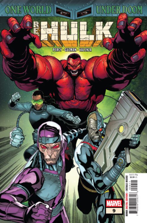
RED HULK #9 hits your local comic book store on October 1st, but thanks to Marvel Comics, Monkeys Fighting Robots has an exclusive three-page preview for you!
About the issue: Mission: Latveria!
Thunderbolt Ross is a fugitive in his own country, but he still has secret allies inside the government. When he calls in a favor, he gets the help he needs to launch a mission to Latveria to clear his name and take on War-Wolf and Doom.
The issue is by writer Benjamin Percy and artist Gabriel Guzman, with colors by Bryan Valenza, and letters by Cory Petit. The main cover is by Geoff Shaw and Marte Gracia.
Check out our RED HULK #9 preview below:
Are you reading RED HULK? Sound off in the comments!
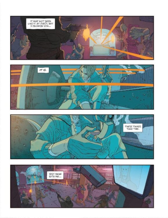
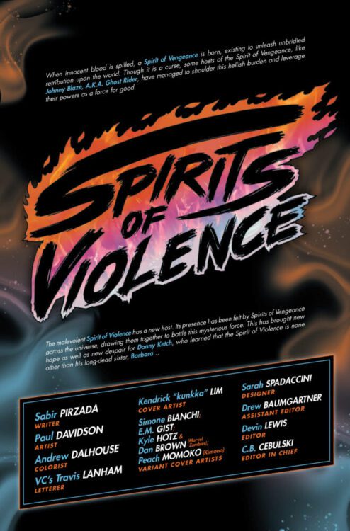
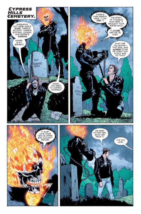
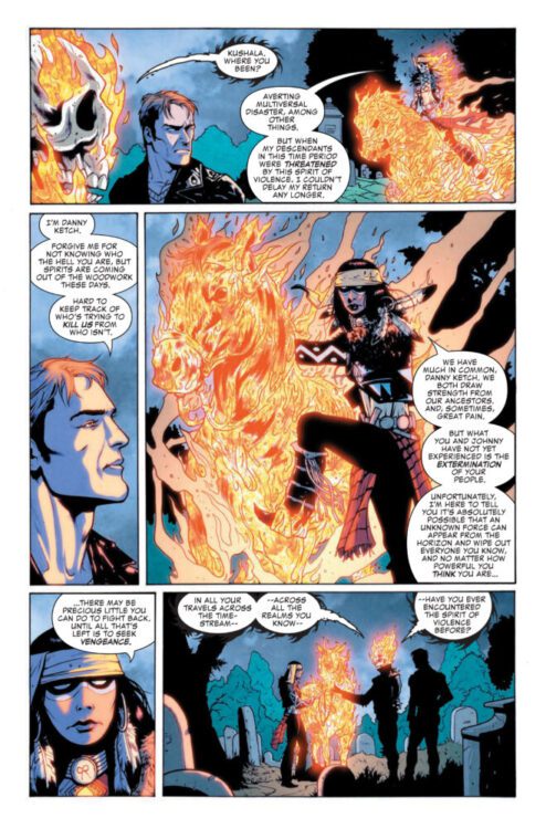
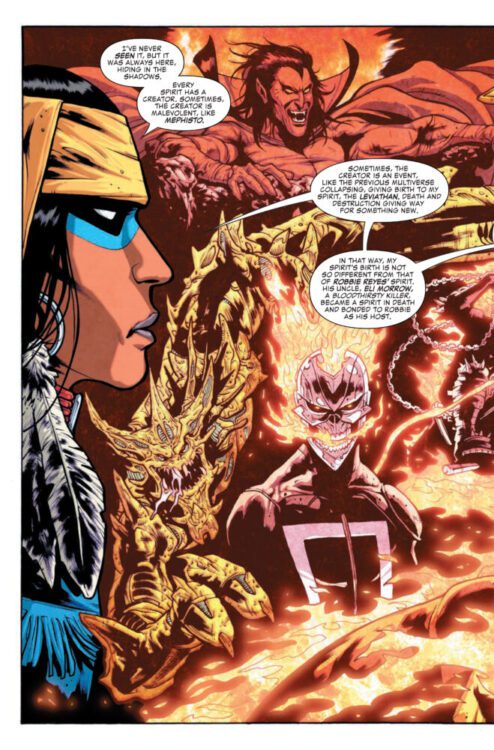
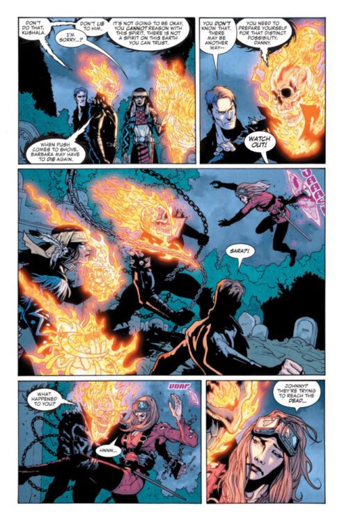
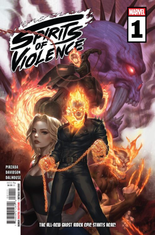
SPIRITS OF VIOLENCE #1 hits your local comic book store on October 1st, but thanks to Marvel Comics, Monkeys Fighting Robots has an exclusive five-page preview for you!
About the issue: Johnny Blaze, Danny Ketch, Robbie Reyes, Kushala, Fantasma, Hellverine and more! Ghost Riders unite!
When a strange group of new villains set their sinister plan in motion, Ghost Riders past, present and future must combine forces to save the world. But just who is the Spirit of Violence, and what horrors do they bring from Johnny Blaze’s and Danny Ketch’s pasts? Forget everything you thought you knew about Ghost Rider! The most climactic ride in history starts here!
The issue is by writer Sabir Pirzada and artist Paul Davidson, with colors by Andrew Dalhouse, and letters by Travis Lanham. The main cover is by Kendrick “kunkka” Lim.
Check out our SPIRITS OF VIOLENCE #1 preview below:
Are you picking up SPIRITS OF VIOLENCE next week? Sound off in the comments!
From Nottingham to Dick Tracy and beyond, Mad Cave joins Neon Ichiban’s next-generation platform for a new era of reading, collecting, and connecting.
Mad Cave Studios announced today that its acclaimed library of original series and upcoming slate of releases will soon be available on Neon Ichiban, the revolutionary digital platform redefining how fans discover, buy, read, and collect digital comics and manga. Neon Ichiban rolled out its invite-only beta last week, with fans already diving into its catalog. A public beta will launch soon.
Comixology veterans David Steinberger and Chip Mosher co-founded Neon Ichiban in 2025 as the definitive digital destination for fans, creators, and publishers. Mad Cave’s arrival brings its award-winning catalog, including award-winning titles Nottingham, Pop Kill, and It Killed Everyone But Me, alongside fan favorites such as Speed Racer and Gatchaman.
“Neon Ichiban is a look at the future of comic collecting and the community as a whole. Mad Cave Studios is excited to work with such forward thinking people, like David and Chip, to make sure every comic fan can read and collect their own way!” said Chris Fernandez, Publisher of Mad Cave Studios.
Neon Ichiban serves readers and collectors alike with same-day-as-print comics, manga, collections, and graphic novels, including always-available standard editions alongside limited-edition variants and sketch covers. Fans enjoy seamless digital control, choosing to read online or offline and even downloading a local copy when enabled. With participating publishers, digital comics can be transformed into one-of-a-kind collectibles through digital signatures and remarques from top creators—unique pieces that can be cherished or resold with provenance intact. A built-in secondary marketplace allows fans to buy and sell digital comics while ensuring publishers and creators benefit.
“Mad Cave has quickly established itself as one of the most exciting, ambitious publishers in comics,” said David Steinberger, CEO & Co-Founder of Neon Ichiban. “We’re thrilled to give their incredible catalog a global stage.”
“Mad Cave is one of the most agile and innovative publishers in the market, consistently identifying talent and creating properties with long-term potential,” added Chip Mosher, CCO & Co-Founder of Neon Ichiban. “Partnering with them strengthens Neon Ichiban’s mission to provide readers with the most cutting-edge, innovative digital library of comics available.”
Mad CaveStudios joins publishers (in alphabetical order) Dark Horse, DC, DSTLRY, Dynamite, Kodansha, Marvel, Oni Press, Titan Comics, and Vault Comics, further cementing Neon Ichiban as the one-stop shop for comics and manga in digital form. Mad Cave will make available both its extensive backlist and all future same-day-as-print digital.
Get the latest news on Mad Cave Studios, on social media, or visit madcavestudios.com.
To keep up with Neon Ichiban and its expanding catalog, visit neonichiban.com and follow @NeonIchiban across social platforms.
About Mad Cave Studios
Mad Cave Studios is an independent comic book publisher founded in 2014 and a home for graphic storytelling. With a library spanning original, creator-owned, and licensed comics and graphic novels, Mad Cave delivers bold, character-driven stories across genres for readers of all ages. Its imprints include Mad Cave Comics (T+), Maverick (YA), Papercutz (all-ages), and Nakama Press (manga), together forming a publishing ecosystem that inspires, entertains, and connects fans worldwide.
About Neon Ichiban
NEON ICHIBAN is the next evolution in digital comics and manga—a future-forward platform where fans don’t just read, they can buy, sell, collect, and connect. Founded by Comixology veterans David Steinberger and Chip Mosher, NEON ICHIBAN delivers unprecedented digital control, direct access to creators, and a resellable marketplace. This isn’t just a platform—the future of fandom is here.
THOR #2 hits your local comic book store on September 24th, but thanks to Marvel Comics, Monkeys Fighting Robots has an exclusive three-page preview for you!
About the issue: WHO IS THE MAN CALLED THOR?
The Thunder Gods were hired to teach a simple lesson – make trouble for Roxxon Construction, and they’ll make trouble for you. Now somebody’s targeting the bike gang where they live. Somebody who won’t give up. Somebody calling himself “Thor.” Somewhere in the city, a man with a hammer is getting to work.
The issue is by writer Al Ewing and artist Pasqual Ferry, with colors by Matt Hollingsworth, and letters by Joe Sabino. The main cover is by Alex Ross.
Check out our THOR #2 preview below:
Have you been reading THOR? Sound off in the comments!
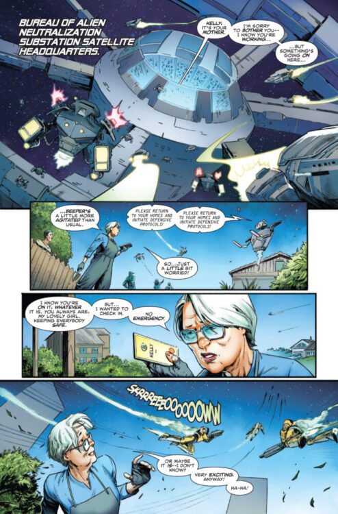
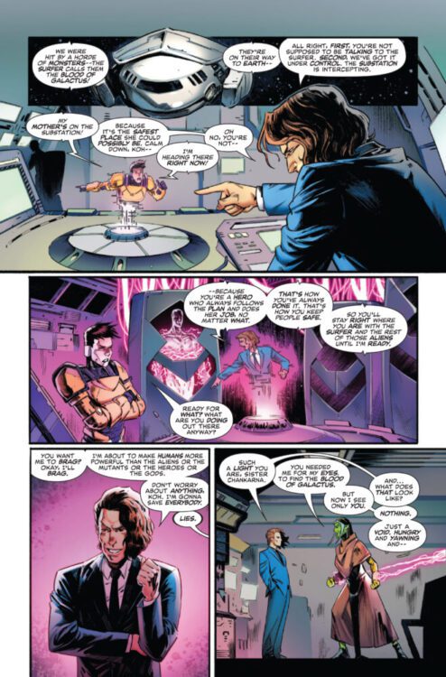
DEATH OF THE SILVER SURFER #4 hits your local comic book store on September 24th, but thanks to Marvel Comics, Monkeys Fighting Robots has an exclusive four-page preview for you!
About the issue: SURFER’S FINAL SACRIFICE?!
Earth stands on the brink of annihilation and the Silver Surfer’s time is almost up. What will Norrin Rad’s legacy be? The better question is…”Who?”
The issue is by writer Greg Pak and artist Sumit Kumar, with colors by Frank D’Armata, and letters by Joe Sabino. The main cover is by Dike Ruan.
Check out our DEATH OF THE SILVER SURFER #4 preview below:
Have you been reading Marvel’s DEATH OF THE SILVER SURFER? Sound off in the comments!
From writer Alex Paknadel (Redfork, Carnage) and artist Amancay Nahuelpan comes the solo return of our favorite hockey mask-wearing vigilante in Teenage Mutant Ninja Turtles: Casey Jones #1. Featuring color art by Luis Antonio Delgado and lettering from Darran Robinson, this first issue does a fantastic job of feeling like something straight out of the classic era of TMNT comics while still offering plenty for new readers to latch onto. With a compelling, fun script and stellar visual work, this opening issue is a must-read for both longtime TMNT fans and curious new readers alike.
“Casey Jones was shot by D.A. Hale, he’s awake, and he has a second chance at life. Instead of taking things slow and smelling the flowers, he’s jumping headfirst into the action. Casey is hitting the streets and doing everything he can to protect the people of New York City, but those closest to him think he’s pushing too hard. April O’Neil and the Teenage Mutant Ninja Turtles, especially Casey’s closest friend Raphael, are concerned. Things are only going to get worse as a new strain of mutagen starts changing the shape of New York City, and a brand-new villain threatens everything Casey believes in.”
Writing & Plot
Alex Paknadel shows his clear understanding of what makes Eastman and Laird’s world work in TMNT: Casey Jones #1. Building off of the story being told in Jason Aaron’s main Teenage Mutant Ninja Turtles story, Casey Jones rejoins the fight protecting the innocent people of Mutant Town after taking a bullet from a corrupt official. Now, a mysterious new threat hides in the background, capturing mutants and giving out a twisted new strain of mutagen. Every part of this comic oozes (heh) classic TMNT goodness, and Casey himself is in peak form. Paknadel’s banter fits right in with the characterizations of each classic hero, and his actual plot-progressing dialogue nails the tone as well. Every page with Jones and the Heroes in a Half-Shell is full of the exact attitude lonetime fans would expect, but the writing also stays genuinely compelling. The evil being done in the story feels like something we’ve absolutely seen before in TMNT stories or even in X-Men, but that doesn’t keep it from being tense and engaging. In fact, this entire treatment of the Turtles, their allies, and the people of Mutant Town is very X-Men-coded, but that’s probably one of the things that helps the overall plot stay so interesting. Overall, Paknadel nails this opening issue with a script that is a blast to read and will doubtless make readers hyped for the following chapters.
Art Direction
While all of the recent TMNT comics have had great visual direction, Amancay Nahuelpan‘s pencils in TMNT: Casey Jones #1 may establish this book as the best looking issue of the current era. Nahuelpan’s character designs and animations are clean and full of detail, but also have an edge and dimension to them that make this book feel like something out of the 90’s. Casey’s design under Nahuelpan’s style is still timelessly kickass, and seeing him in action beating on goons is an absolute treat in this comic. In fact, all of the characters major and minor look stellar, having designs that fit with the tone of the comic but while also feeling like people. That latter part is especially important when drawing the mutant characters in this story. Nahuelpan’s excellent character aminations help raise the stakes as we see how the people in Mutant Town are being victimized by this new enemy, and makes us root for Casey and the boys that much more. The action choreography goes hard in this comic as well, with each page of fight scenes having poster-worthy poses and making Casey as badass as possible. His pencils are given life and dimension by Luis Antonio Delgado’s excellent color art. Delgado’s work here is dense, with a focus on the darker end of the color palette that blends perfectly with Nahuelpan’s shading. Again, it’s a visual presentation that emulates the 90’s era of Turtles comics but with modern techniques, and it does a stellar job of placing readers in that classic TMNT world.
Verdict
Teenage Mutant Ninja Turtles: Casey Jones #1 is a blast of a start to this reintroduction of a beloved vigilante. Alex Paknadel’s script nails Jones’ attitude and that of the entire TMNT cast, and his new villains offer stakes at a level that makes the wait for the next chapter especially painful. The visuals from Amancay Nahuelpan and Luis Antonio Delgado take readers right back to the 90’s with a visual style that feels like an homage to Eastman and Laird’s original run while still offering up their own visual spin on these characters. Be sure to grab this debut issue when it hits shelves on September 17th!