There was a time where killing off Peter Parker seemed so unbelievable. Much like the Deathof Superman, it didn’t seem like a possibility, until it happened. Superior Spider-Man was born from one of these time Peter was presumed dead. The series was a huge hit, and seeing Doctor Octopus take over the role of web-slinger and actually do some good was exciting. But those days ended, and Otto has gone back into a villainous role. However, with this week’s Superior Spider-Man Returns, we may be able to revisit the popular character and his stories for a while. Written by Christos Gage based on a story by Dan Slott, Gage is joined by Mark Bagley, Ryan Stegman, Humberto Ramos, and Giuseppe Camuncoli on pencils. John Dell, JP Mayer, and Victor Olazaba are on inks, Edgar Delgado is the color artist for all of these artists, and Joe Caramagna is the letterer.
WRITING
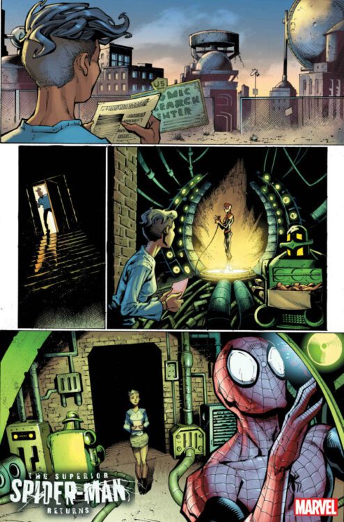
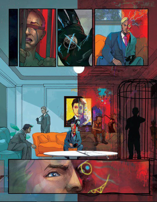
Christos Gage has been around the comic book industry for what feels like forever. His work speaks for itself, as he usually does a phenomenal job with whatever project he’s on. Superior Spider-ManReturns #1 mostly takes place during a flashback that Doctor Octopus has. Gage steps right in and delivers a voice that sounds familiar with the Superior Spider-Man. The character is cocky and arrogant, and loves himself more than the people of the city. Gage also gives readers some decent interactions between Superior Spider-Man and his new assistant, Estrella Lopez. Gage makes it clear that the one thing Otto Octavius respects is intelligence, and he sees something in Estrella. Their relationship grows throughout the issue as both characters begin to like one another. Lopez seems like an interesting character that we would like to see more of. She comes off as honest and smart, but she also appears humble. Now of course, knowing Doctor Octopus, he’s going to screw this up somehow. Gage shows us how arrogant of a man Otto Octavius can be in this issue, and how his arrogance usually ends up killing relationships. He’s constantly selfish and vain. This leads to a lot of his problems in his life, and it handicaps him in this story. Gage gives us a cliffhanger that sets up the newest series coming out and should interest all Spider-fans. The new villain that appears seems like a powerhouse and it will be intriguing to see how she is dealt with.
ART
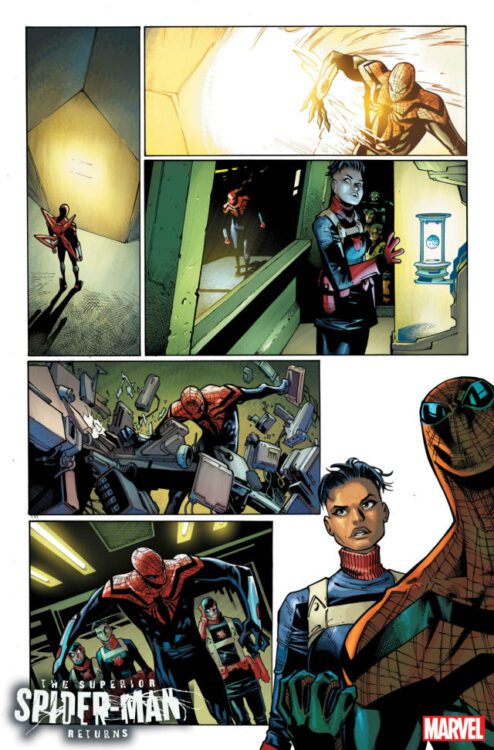
Mark Bagley, Ryan Stegman, Humberto Ramos and Giuseppe Camuncoli all takes turns spreading their pencils on the page for this issue. Despite having many artists working on one book, the pencils remain consistent throughout the issue. Bagley and Stegman start us off. The panels of the Superior Spider-Man chasing after Slyde work for a few reasons. We get panels that have Slyde far away while having Superior Spider-Man close. This dynamic gives a close up and a far shot at the same time. Slyde is a speedster, so he’s constantly at a distance, but we get a close up of his face and it’s drawn with no emotion, but we can feel the emotion.
Ramos steps in to handle a fight scene. Ramos does well with these big spider bots as they attack A.I.M. Scale is everything for these panels, and Ramos draws a lot of small A.I.M employees compared to the large robots. The panels look great and show off how much skill Ramos has as an artist.
Camuncoli is able to draw the pages with the villain emerging and gaining powers. These pages are crucial because the look of the character will determine a lot with fans. Camuncoli nails it as the unnamed character looks fierce and displays great power. Blasting through walls and attacking Superior Spider-Man look dangerous. This character has the ability to cause some real damage for the city of New York and the Superior Spider-Man.
The colors are so crucial this issue because Edgar Delgado has to color for several different artists and maintain a consistent tone. For a lot of the work on Superior Spider-Man himself, Delgado uses a lot of shading and dark tones. This is fitting since this version of Spider-Man is darker and not as jovial as Peter Parker. As the villain emerges, Delgado uses an extremely bright white to allow her to shine off of the page. The pages with Doctor Octopus in the present have a lighter tone to them. Delgado makes sure to shade over Otto’s face as he stands beside a big containment device. Pages where Estrella is in the lab are dark and moody. Delgado does an amazing job by handling all these different artists.
The letters are handled by Joe Caramagna. The first thing that Caramagna does that works is his placement of word balloons. These are put out of the way of the action and don’t cover up faces as characters talk. The effects used in action sequences are effective as well. As Superior Spider-Man rips a machine in half, Caramagna places the sound effect “KRANGCH” sprawled on the lower part of the panel. It’s perfect placement and goes right along with the action. Lastly, Caramagna uses emotion as characters yell. When Superior Spider-Man yells for one of his employees to fire at an A.I.M. fighter, he says “FIRE AT WILL.” Caramagna emphasizes this with a black bubble and red letters.
CONCLUSION
Superior Spider-Man Returns #1 is a fun ride back into nostalgia. Christos Gage and company reminds readers why the character was so much fun. His cocky attitude and overall crassness make Superior Spider-Man hilarious and dangerous. The art, colors, and letters shine here as well as they show us how dark the story can be. Superior Spider-Man #1 is available at a comic shop near you!
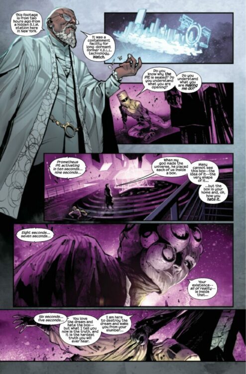
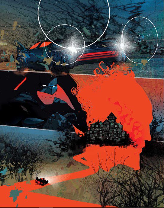
This comic wasn’t released — it broke out of confinement. Writer and artist Christian Ward’s Batman: City of Madness #1 is unrelenting in its terror and its beauty.
About the Story:
Buried deep beneath Gotham City there exists another Gotham. This Gotham Below is a living nightmare, populated by twisted mirrors of our Gotham’s denizens, fueled by the fear and hatred flowing down from above. For decades, the doorway between the cities has been sealed and heavily guarded by the Court of Owls. But now the door swings wide, and the twisted version of the Dark Knight has escaped…
Writing
There’s a strange logic to the horrors you’ll find in these pages. Ward utilizes the characters and rules of Gotham City in such a way that the terrifying elements almost seem to pop up organically. Every twist and turn is based off of an idea that we already know about Gotham. The whispered prophecies through the doors of Arkham Asylum, the corrupt police officers with animalistic goons on their payroll, or the shared madness of Batman and his rogues — it’s all already lying beneath the surface of the stories we know and love. Ward simply teases it all out in a way that will have you going, “Wow, how come no one has done this before?”
But to simply call Ward’s script terrifying would be to do it a great disservice. There’s plenty more to this story than its scares. Ward also discusses the reliability of the media, the wickedness of the world’s elite, and the warped example of justice that Batman’s violent crusade creates. And there’s a quiet terror to these moments too, because they’re real. Unlike the fictional Lovecraftian monsters that slither out of their hidey holes, these evils can actually get you.
Art
Ward’s art is incredibly versatile. At times, he’s photorealistic. Elsewhere, he’s nearly cartoonish. Most often, though, he’s both. Ward is almost like the comics equivalent of Jean-Michel Basquiat. He paints beautiful pictures, rendered carefully, and then he scribbles over them with a vibrant graffiti style. He’s defacing his own panels, and the result is mesmerizing and deeply effective. It helps you to enter into this world that’s almost splitting at the seams. What’s real? What isn’t? Ward’s vacillation between different styles will have that question at the top of your mind from the first page to the last.
Ward’s colors also create such a palpable sense of tone, sometimes you have to pinch yourself to remember you’re not actually there, looking at the purple neon signs glinting off of the faces of people passing you, feeling the cold blue Gotham night, or smelling the damp air of its greenish underground lairs. Ward is truly a master of world-building. He’ll grab you by the eyes and pull you headfirst into this spooky dream he’s created — and you’ll probably thank him for it.
Lettering
Hassan Otsmane-Elhaou is quite possibly the best letterer in the industry. You always know when you’ve picked up a book lettered by him, because it’s got a particular flare to it. Provide any opportunity for personality to shine through in the letters, and Otsmane-Elhaou will take it. City of Madness feels like Ward wanted Otsmane-Elhaou to go nuts. Two-Face’s different halves have totally distinct fonts and styles to their word balloons, which almost seem to be at war with one another. The bloody “SHINK” sound of a knife going through someone’s chest is completed by the blade also serving as the “I” in the sound effect. The raspy laughter of a bunch of gangsters looks like it’s been scratched into the page.
But for every use of lettering that stands out — adding flavor and fun where it can — there are just as many moments with subtle differences that help us understand each scene better. The angry but terrified words of a young boy look jagged and uneven. You can feel how unsure he must sound. One of Batman’s caption boxes tilts slightly as he enters Arkham Asylum, showing just how off-kilter he’s feeling. There’s meaning everywhere in Otsmane-Elhaou’s letters.
Verdict
Batman: City of Madness is nothing short of a masterpiece. It does exactly what you want it to do — it delivers terrifying images and a deeply foreboding script — but it also rises above expectations. It’s intriguing, experimental, visually stunning, and provocative. In short, this is a surefire classic that you don’t want to miss. Batman: City of Madness #1is out from DC Comics at a comic shop near you!
Actor and writer David Dastmalchian will join Dark Horse Comics this Friday, October 13th, at the Famous Monsters Festival in King of Prussia, Pennsylvania for one night only.
The Famous Monsters Festival is a “horror, sci-fi, and fantasy themed convention that brings the world’s top genre celebrities and vendors to fans.” This Friday the 13th, Dastmalchian will hold a Q&A panel at the convention, starting at 7pm. Dark Horse will also have a table at the event (again, for Friday night only), where they will be selling a variety of spooky titles, including both volumes of Count Crowley, Dastmalchian and Lukas Ketner’s horror series.
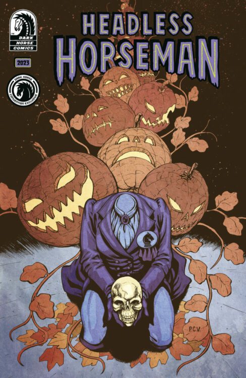
Another “spooky read” the publisher will have at the event is their upcoming HEADLESS HORSEMAN HALLOWEEN ANNUAL. The one-shot is the publisher’s first annual Halloween anthology, and will feature five stories from different creators, including one written by Dastmalchian himself!
To up the ante even further, the HEADLESS HORSEMAN HALLOWEEN ANNUAL that Dark Horse will be selling at the event will be a limited-edition variant with a cover by Philip Sevy!
Get your first look at Philip Sevy’s limited-edition variant cover right here:
The limited-edition variant will be available for purchase at The Famous Monsters Festival, at DarkHorseDirect.com, and at New York Comic-Con at Phillip Sevy’s table in Artist’s Alley (#B10). Each venue will have the one-shot for sale for $20 and will be limited to 2 copies per person.
The Headless Horseman Halloween Annual is a new Halloween anthology from Dark Horse Comics with stories from: Angela Slatter (Castle Full of Blackbirds), Lukas Ketner (Count Crowley: Reluctant Midnight Monster Hunter), Olivia Stephens (Darlin’ and Her Other Names), Phillip Sevy (Tomb Raider, The House), Christie Porter, Leah Kilpatrick, David Dastmalchian (Count Crowley), Valeria Burzo (Castle Full of Blackbirds), Tyler Crook (Harrow County), and Frank Cvetkovic (The House).
The Headless Horseman Annual (56 pages) will be available in comic shops on October 18, 2023 and can be pre-ordered from you local comic shop now for $7.99.
Tickets for The Famous Monsters Festival can be bought at www.famousmonstersfest.com or at the door. The Headless Horseman Halloween Annual limited edition variant can be bought at the event, at NYCC (#B10), or at www.darkhorsedirect.com.
The premise is simple: read one comic every day for the entire year. It seems like a simple task but there is no way that I read 365 comics last year, even if you count the individual issues in collections. So, this year, I am committing myself to this reading challenge, in the hope that I can broaden my reading habits and fully engage with my favorite hobby again.
This week is a game of two halves. No, the comics aren’t sport related, although it would be fascinating to do a week of sport-related comics. I have comics based on Roller Derby, fencing, football (soccer, for my American friends) and it might give me an excuse to buy Ping Pong, a manga I’ve been intrigued about for a while.
No, this week has been half classic anthropomorphic fantasy and half new comics based on old concepts. Even when I pick up something new, it seems to be old.
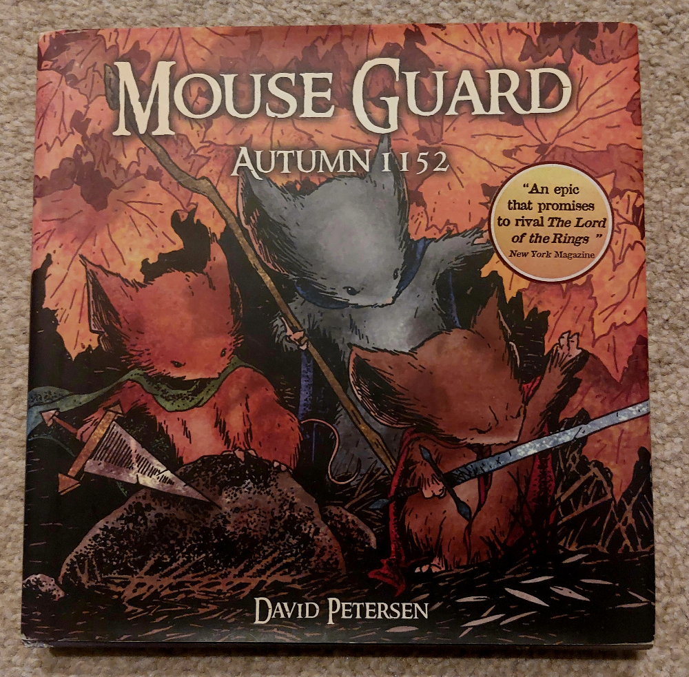
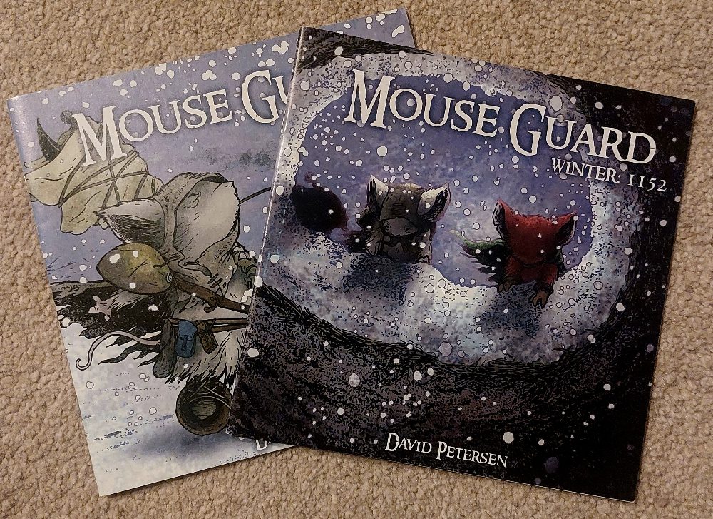
Comic Number 272 – 274: Mouse Guard Autumn 1152 (counting 2 chapters as 1 comic as I read it over 3 days)
This is a hardback collected edition of the six-issue series written and illustrated by David Petersen. It was released in 2006 and was named “Best” something or other by many different publications and websites (Best Indy Adventure Book by Wizard, Best Indy Book by IGN.com, Best Mini Series by Metro News in Canada) and has always been one of my favorites. It has the presentation and aesthetic of many classic children’s literature — think Brian Jacques’ Redwall series and Kenneth Grahame’s The Wind in the Willows, but with a touch of darkness to its soul. I would say Mouse Guard is born from the traumatic experiences of Watership Down and adult fantasy series like A Song of Fire and Ice.
The two most impressive things about Petersen’s work are the world building and the presentation. The world of Mouse Guard is massive and contains so much detail in a very small amount of space. Petersen manages this by creating the impression of a large world through throwaway comments and references to histories as yet explored. A map at the front of the book teases the possibilities for adventure and that sticks with you as you read, even when much of the action takes place in an unnamed woodland. You finish each issue with the sense of having experienced more than you have. This is compounded by the fact each issue has an opening page which acts as a ‘previously in…’ but also expands on the narrative threads elsewhere in the world.
It’s not possible to talk about Mouse Guard without addressing the shape of the comics. It is a big factor in the reading experience because each square issue feels so much bigger than a regular comic (without being so) and the layouts tend towards larger panels with simple panel transitions across the page. Although simple, there is a majestic beauty to the images and the straightforward way in which Petersen tells his story. Anyone can pick a copy of Mouse Guard up and instantly understand not only the narrative each issue displays but also how to read it. It is designed to appeal to anyone of any age but that doesn’t mean that older readers can’t enjoy it.
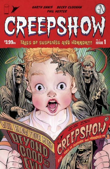
Creepshow Vol 2 #1, Image Comics Cover Credit: Guillem March
Comic Number 275: Creepshow Vol 2 #1
The Creepshow format has been around since 1982 when Stephen King and George A. Romero joined forces to create a movie anthology of grotesque horror in the vein of EC’s Tales from the Crypt. The movie was a collection of spooky tales, each with a different twist but all embracing the visual horror that a large budget movie would allow. The stories were laced with humor and enhanced gore.
There have been two sequels and a recent television series based on the concept, so it’s not surprising that there would be a comic book series as well. The horror anthology has been the backbone of the comic industry almost since the beginning so it’s always a bonus to see new titles hitting the selves.
In this issue there are two disturbing tales. The first by Garth Ennis and Becky Cloonan which deals with the consequences of a dark family secret, and the second by Phil Hester and Eric Gapstur is a tale of reanimated corpses and natural invaders upsetting the balance of power.
Garth Ennis’ Make Your Choice is as brutal and as cruel as you would expect from the writer of Preacher but it is the artwork by Becky Cloonan and the colors by Lee Loughridge that really give this story its edge. There is a reality in the visuals that is undermined by the supernatural element. This creates an atmosphere of unease that becomes more and more unbearable throughout. The ending is brutal but, arguably, justifiable. It is a comment on modern society that is as blatant as the images are unsettling.
Phil Hester’s contribution is contrasting in visual design but not narrative punch. His artwork has a style that is harsher and suits the off-kilter, horror genre. He also takes a standard horror cliche and gives it an added twist, clearly not satisfied with a pure zombie story. Why just have flesh eating ghouls when you can include parasites and fear induced delusions?
Just like the movies before it, the Creepshow comic does exactly what it sets out to do. It may not have the narrative brilliance of the EC comics, or the ingenuity of longer form horror comics such as The Empty Man, but Creepshow gives you a scare, turns your stomach, and leaves you nervously laughing about the absurdity you have just read.
Comic Number 276-277: Mouse Guard Winter: 1152 #1-2
Hot on the heels of Autumn: 1152, Winter: 1152 is the continuation of the rodent adventures by David Petersen. The opening third of the series is packed with the same high adventure as Autumn but with a brand new backdrop of frozen wastes and dark, cavernous tunnels.
Petersen’s artwork continues to impress and his narratives really get the emotions flowing. Each mouse is distinct and has their own personality that shines through from panel to panel, page to page, issue to issue. After eight issues, it’s almost possible to predict how some of the characters will react because Petersen’s character work is so spot on.
This, of course, makes it emotionally more upsetting when they are thrown into life threatening situations. There are some edge of the seat moments in these two issues and the first cliffhanger is perfectly executed.
The bonus of owning all of these comics and reading them in bulk is that you don’t have to wait for each issue to come out. Reading the collected books, you will never know the long, agonizing wait between issues and stories. At first they were bi-monthly, but by the end of the Winter: 1152 run, there were longer gaps between the issues. The third series, Black Axe, began in December 2010 but was not completed until June 2013. Keeping to a regular publication schedule is paramount to maintaining readers, something which the big two publishers, Marvel and DC, understand. I can completely understand why readers of Mouse Guard became frustrated by the long waits. However, the finished product was worth the wait in this instance.
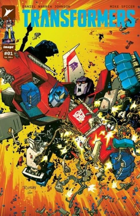
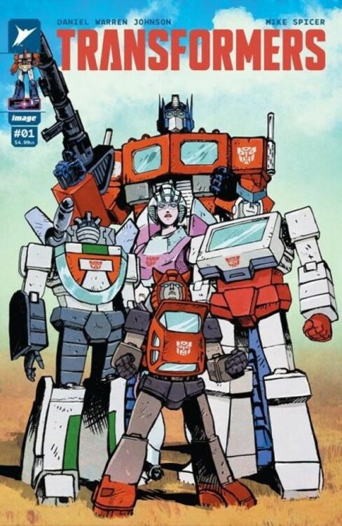
Comic Number 278: Transformers #1 (2023)
How could I possibly let this one go by unmentioned? It’s not like I’ve spent half the year re-reading the G1 Transformers comics or anything.
There are some very good insights into this comic elsewhere on the site (here for example) but I couldn’t let the week pass without giving a huge thumbs up to Daniel Warren Johnson, and co-creators, for an exceptional first issue. I’ve read a number of different interpretations of the Transformers and each is fascinating in its own way. More often than not, each interpretation reflects the trend in comic visuals/narratives that is prominent at the time of publication but I think that Johnson has created something that is distinctly his own. There are a number of Easter eggs and references to the franchise which will make a few old school fans smile, but I see the main goal of this comic as attracting new readers.
It has been 39 years since The Transformers #1 was released so it’s about time for the robots in disguise to find a new audience. If current fans like it then great, wonderful, throw your money at it, but if not, it doesn’t matter. Times have changed, comics have changed, and the Transformers have…. changed*. This comic is in safe hands with Daniel Warren Johnson who is proving to be one of the best comics book artists working today.
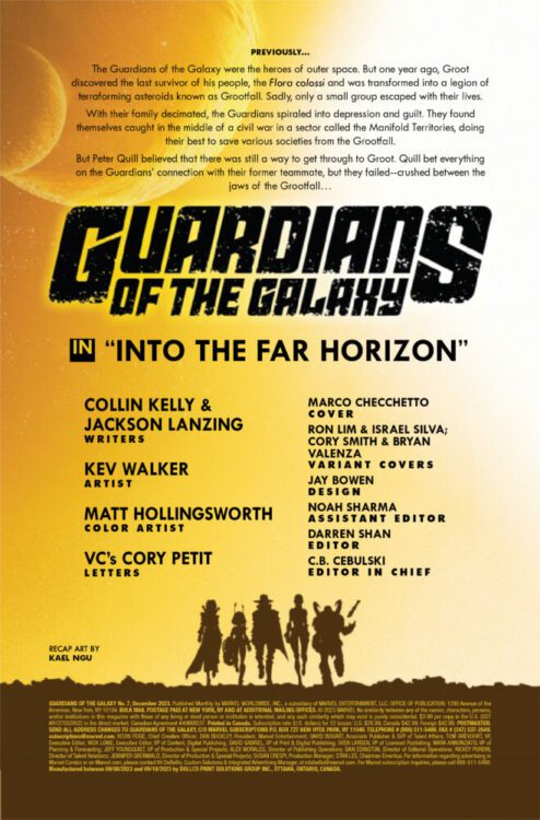
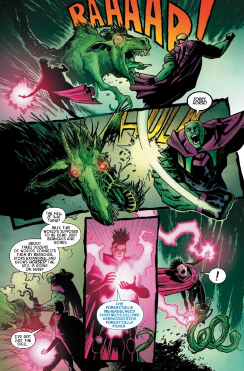
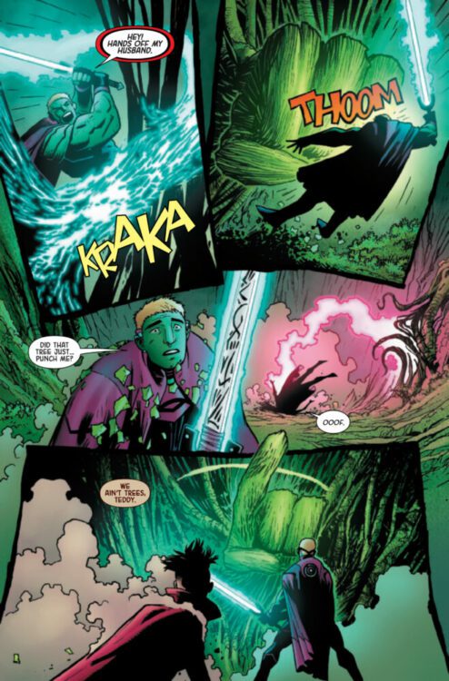
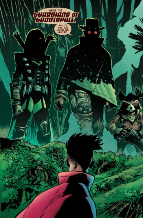
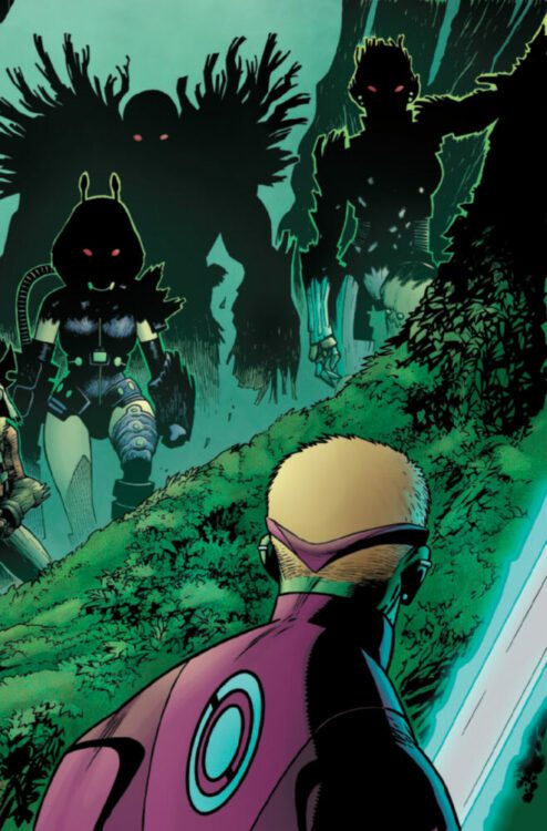
GUARDIANS OF THE GALAXY #7 hits your local comic book store on October 11th, but thanks to Marvel Comics, Monkeys Fighting Robots has an exclusive four-page preview for you!
About the issue: R.I.P. GUARDIANS!
The Guardians of the Galaxy are dead. The Manifold Territories are no more. In their place is Grootspace! With the cosmos’ heroes defeated, it’s up to Emperor Hulkling and Wiccan to hold the Grootfall back from the rest of the universe. Is this the beginning of a NEW Guardians of the Galaxy?
The issue is by writers Collin Kelly & Jackson Lanzing and artist Kev Walker, with colors by Matt Hollingsworth, and letters by Cory Petit. The main cover is by Marco Checchetto.
Check out our GUARDIANS OF THE GALAXY #7 preview below:
Is GUARDIANS OF THE GALAXY on your pull list at your local comic shop? Sound off in the comments!
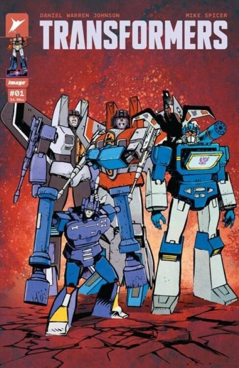
From current comics superstar Daniel Warren Johnson (Murder Falcon; Beta Ray Bill) comes a high-octane reset for some of modern fiction’s most beloved characters with Transformers #1. Featuring colors by longtime collaborator Mike Spicer, this opening issue is packed with intense action and compelling character storytelling that brings humans and bots together in impactful fashion. With an emotionally engaging script and unsurprisingly stellar art, this is a must-read #1 for longtime fans and newcomers.
“Optimus Prime was supposed to have led the Autobots to victory. Instead, the fate of Cybertron is unknown, and his allies have crash-landed far from home, alongside their enemies—the Decepticons.
As these titanic forces renew their war on Earth, one thing is immediately clear: the planet will never be the same. New alliances are struck. Battle lines are redrawn. And humanity’s only hope of survival is Optimus Prime.”
Writing & Plot
Daniel Warren Johnson sets up his story for Transformers #1 by focusing on the emotional core of his cast. At the start of the comic, we are introduced to Spike, a teenage boy with aspirations of being an astronaut struggling to deal with the loss of his brother – also an astronaut, but was killed during a takeoff gone wrong. To make matters worse, Spike’s father has no idea how to handle the loss of his eldest son, leaving Spike to handle things on his own. When Spike and his friend Carly go into the mountains for some stargazing, they stumble upon a crashed ship – a ship carrying both Autobots and Decepticons. From here, the action and dynamic between Spike and the bots takes off. As per usual, Johnson’s character writing is compelling and heartfelt. He immediately gets us into the lives and heads of his human cast, making for some of the most interesting people ever introduced in a Transformers story. Johnson then extends that humanity to the Autobots. Spike can see the struggle that Optimus and the others are working through, having awoken after a long war on CyberTron only to be surrounded by foes once again. The dynamic between Spike and the Autobots going forward is no doubt going to be a wonder to watch. Of course, none of this would feel like a Transformers comic if the bots themselves didn’t feel right. Fortunately, Johnson writes this cast of classic characters with the familiarity of a longtime fan. With a compelling, character driven plot and great treatment of an iconic cast, Johnson’s script for this opening issue makes for a blast of a read.
Art Direction
If you’ve ever read a Daniel Warren Johnson book, it shouldn’t come as a surprise that Transformers #1 is an excellent looking and energetic comic book. The Do A Powerbomb! creator applies his signature style to the mechanoid forms of the Autobots and Decepticons with awesome results. All of the classic Transformers, from Optimus to Starscream, look as great as they ever have and are drawn with the same attention to facial animation as any of his human characters. Johnson’s environmental detail combined with his sequential direction make the world and lives of Spike and his family feel fleshed out, selling the notion that the Autobots and Decepticons have stumbled into the complex lives of our human cast. When the action hits, it delivers a mean right hook with massive impacts and explosive force. Much of that effect is due to Johnson’s own lettering ability, specifically with how he does SFX. Mike Spicer’s colors finish off the visual experience with the same sort of vivid yet subdued work that he has done on all of Johnson’s other comics. The color still pops, but it sort of sits behind the action, letting the kinetic energy of Johnson’s pencils take the lead in guiding the reader. What is in this comic isn’t among Johnson’s best work, but it’s still astonishingly good and will doubtless make readers beg for the next issue.
Verdict
Transformers #1 is a compelling and thrilling start to this brand-new era for an iconic franchise. Daniel Warren Johnson continues his streak of kick-ass yet emotionally stirring stories with a familiar plot that focuses on the struggles of both the human and bot characters and how they come together – when stuff isn’t being blown up. His artwork packs as much power as ever, with his faithful recreations of iconic Transformers colliding with the unbeatable kinetic power of his pencils and ability to imbue sequences with emotional weight. Be sure to grab this new beginning from your local comic shop today!
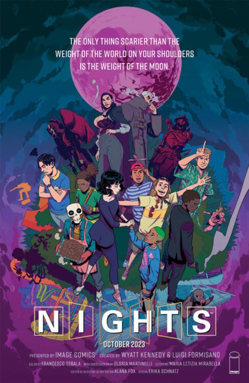
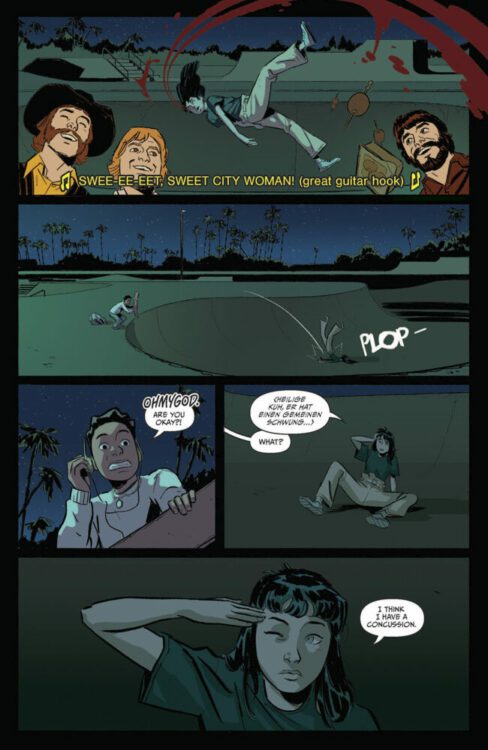
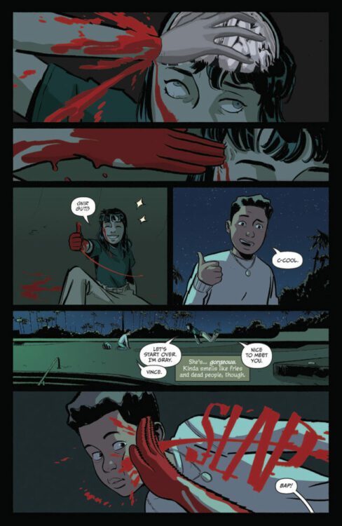
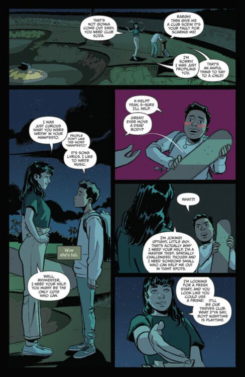
NIGHTS #1 hits your local comic book shop on October 11 from Image Comics. This new ongoing series is written by Wyatt Kennedy, with art by Luigi Formisano, Francesco Segala drops the colors, and you will read Maria Letizia Mirabella’s letter work. Check out my review and a five-page preview below.
https://youtu.be/DU8Glzzshoo
About the series: It’s 2003, Supernatural creatures casually exist amongst humans, and America is made up of 31 states. Vince Okonma has lost his parents, moved in with his secret mercenary cousin, his video game-making roommate, and befriends “the greatest vampire who’s ever lived.” And that’s just the first 20 pages. Welcome to Florida, youth is wasted on the young…
THE DEVIL THAT WEARS MY FACE #1 hits your local comic book shop on October 4th from Mad Cave Studios. The book is written by David Pepose, with art by Alex Cormack, and you will read Justin Birch’s letter work.
The entire creative team was in sync on this issue, which made for an exciting entry way into the of THE DEVIL THAT WEARS MY FACE. Check out my full review and a three page preview below.
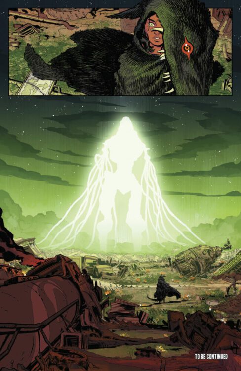
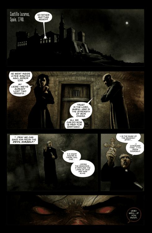
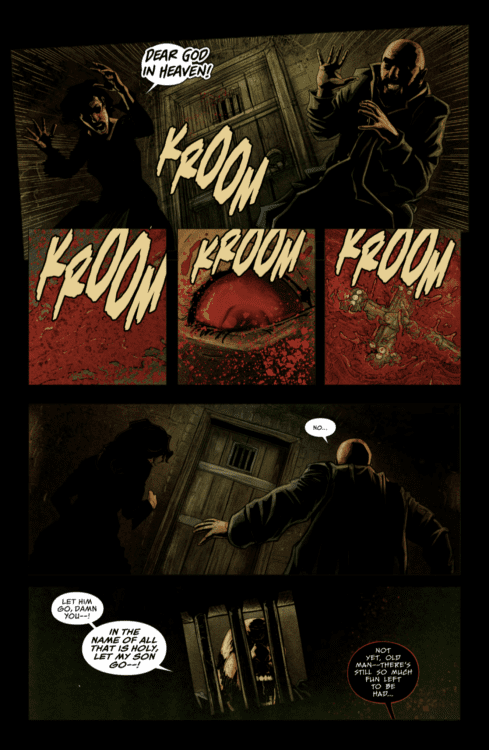
About the series: The year is 1740, and the Vatican is in turmoil. Grappling with a profound crisis of faith, outcast exorcist Father Franco Vieri is dispatched on a mission of grave importance — to rescue a Spanish nobleman from the clutches of the sadistic demon known as Legion. But when the exorcism goes tragically wrong, Vieri finds himself trapped in a stranger’s body… and learns what horrors lie ahead when the Devil wears his face. Equal parts Face/Off and The Exorcist, Ringo Award-winning writer David Pepose (Moon Knight: City of the Dead, Savage Avengers) and Bram Stoker Award-nominated artist Alex Cormack (Sea of Sorrows, The Crimson Cage) conjure a harrowing tale of terror, action, and body-swap intrigue that will leave comic readers at the edge of their seats.
G.O.D.S. #1 hits your local comic book shop this week from Marvel Comics. This is an epic over-sized first issue from writer Jonathan Hickman, artist Valerio Schiti, colorist Marte Gracia, and letterer Travis Lanham. Hickman and the creative team surprised me with this issue and I’m excited to see where the series goes, check out my full review and five-page preview below.
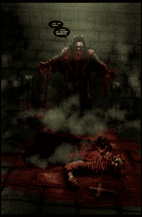
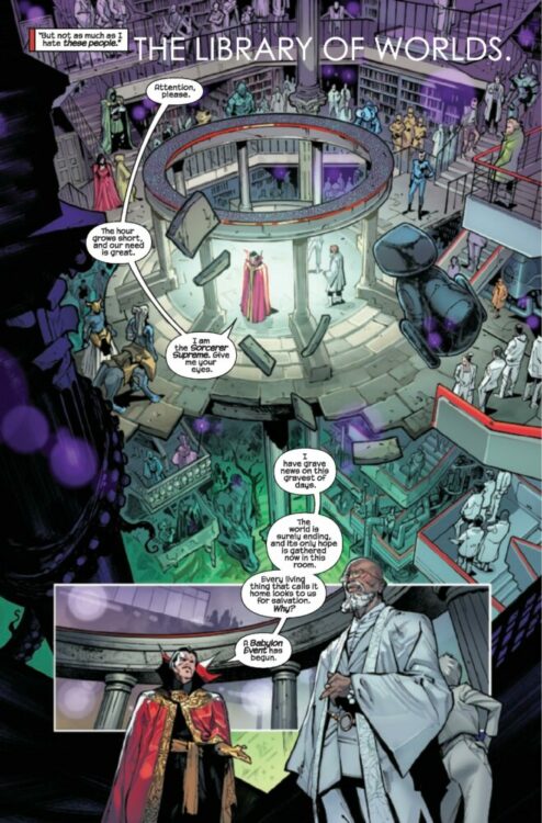
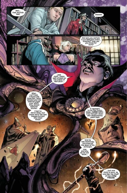
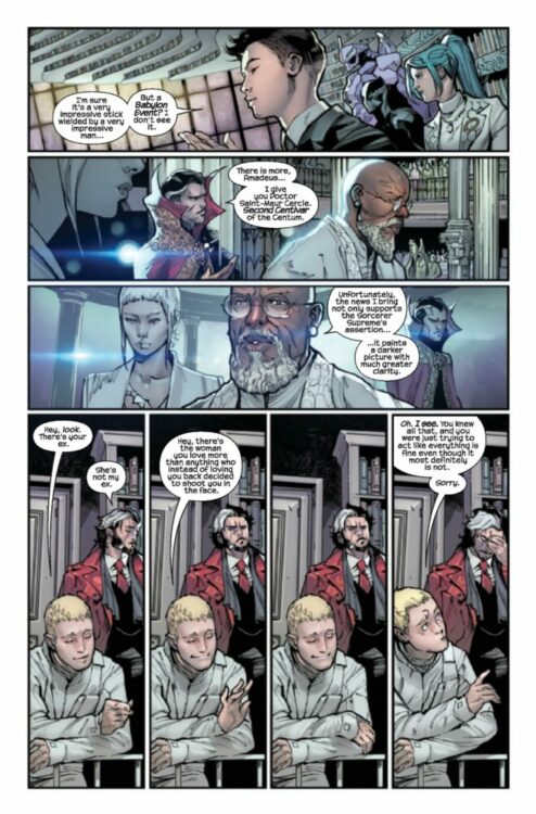
About the series: JONATHAN HICKMAN RE-INVENTS THE COSMOLOGY OF THE MARVEL UNIVERSE! WHAT HAPPENS WHEN THE-POWERS-THAT-BE MEET THE-NATURAL-ORDER-OF-THINGS? The infinite détente between THE-NATURAL-ORDER-OF-THINGS and THE-POWERS-THAT-BE nears an end. Old acquaintances are reunited during a Babylon Event. The Lion of Wolves throws the worst parties. Don’t look under the table. There’s a John Wilkes Booth penny on the ground. This ENORMOUS EXTRA-SIZED first issue features DOCTOR STRANGE, who, while not boring at all, is easily the most boring person in the book.
The premise is simple: read one comic every day for the entire year. It seems like a simple task but there is no way that I read 365 comics last year, even if you count the individual issues in collections. So, this year, I am committing myself to this reading challenge, in the hope that I can broaden my reading habits and fully engage with my favorite hobby again.
If you are still reading the opening paragraph to this ongoing series of articles, then you will know not only the general aim of this project but also the purpose behind it: to rediscover my love of comics. During the early days of Covid times, I found it hard to enjoy comics, as a medium. My interest had been waning for a while and then, suddenly, I lost access to new comics. Even when the trickle of publications began to seep back into the UK, I had removed myself enough to no longer feel the excitement of new comic book day.
For a couple of years, I only went to my local comic shop every other month, picking up what was in my standing order and almost ignoring everything else on the shelf. Then two things happened: Firstly, I completed a Master’s Degree in Comic Studies, where I found a new interest in the historical and cultural impact that comics have had on society. Secondly, I changed jobs, meaning that I no longer worked near my local comic book shop. As a result of the latter, I canceled my standing order. For the first time in 15 years, I didn’t buy comics on a regular basis. And (don’t tell my editors) it is probably the first time in much longer that I don’t look at solicitations and know well in advance what is due to come out in the coming months.
This project was supposed to change that. And in the last few weeks, I’ve come to realize it hasn’t.
“Oh, yeah!” I hear you cry, “We’re missing a bunch of weeks. Where are the comics, Darryll? What have you been reading?”
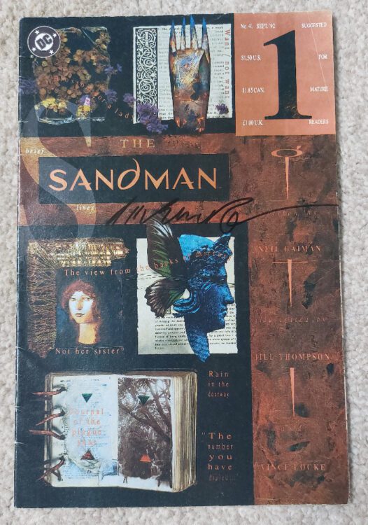
The Sandman #41 Credit: DC Vertigo
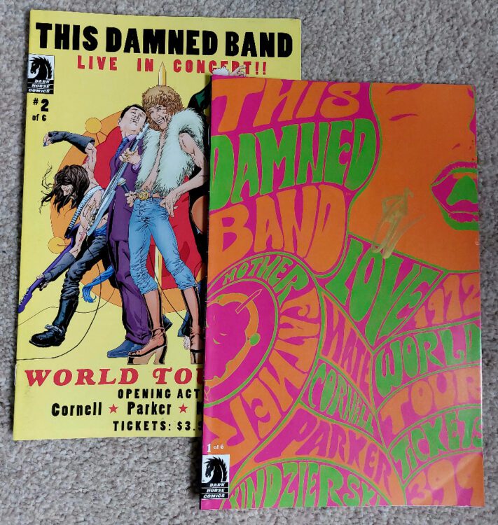
I am still reading and I’ll let you know what I’ve read at the end. My writing, however, stalled. Summer is a busy time — I have two children — so it’s difficult to pick up my laptop once a week, never mind every day. Excuses, excuses! And not the real reason my writing dried up. I started with Week 34, delving into a couple of X-Files comics, leading into an issue of The Sandman (above), with the intention of moving, via This Damned Band and Good Apollo: I’m Burning Star IV, on to Tori Amos’ Comic Book Tattoo (which deserves a proper review). I read all of these but only got as far as writing about The X-Files and The Sandman.
As the week dragged on, and my words dried up, I looked for other comics to read. Each and every one I picked was from my collection. Not a single new title. Even ones that I liked the look of passed me by because, and this is the crux of it, I can’t afford to buy comics any more. Everything in England, where I live, is increasing in cost month on month. I get paid more now than I ever have but I have less disposable income. I was better off when I was a student in the 1990s, where some weeks it was a choice between eating or going to the pub. I was an Art student; the pub always won.
The intense scrutiny I have been giving to my reading habits has had the opposite effect than I had expected. Instead of increasing my excitement for the comics I was reading, and looking forward to reading, I became disillusioned. A lot of the new comics I have read were not entertaining me at all. The likes of the new Planet of the Apes, a franchise that I love, was a disappointment, a wasted opportunity, and ultimately a waste of money I don’t really have.
I need to write something about the comics I’m reading. I need to shout about what I love, and don’t love, about each issue. However, a lot of the time I am reading comics that aren’t easy to get hold of. If I was to say a particular comic was a must-read, the chances are you wouldn’t be able to get a copy. My excitement is pointless unless you want to come round to my house and dig through my collection.
Where do I go from here? How do I make this ongoing article worth reading? It has, for the most part, become historical in nature, often a nostalgic look at my personal journey through comics. Maybe, instead of writing about the comics themselves, I should be focusing on an aspect of them, an element of the storytelling or production, that has something to say about the medium. I think I have touched on this before, especially when it comes to adaptations, a personal favorite area of study.
What I am saying is, I have faltered but I will get back on track. I haven’t stopped reading, but I need to find the reason why certain comics bring me pleasure and verbalize that. Otherwise, you’ll all stop reading, right?
So, to bring the list up to date, here are the comics I have read over the last few weeks with thoughts about a few of them:
This Damned Band #1-2 Credit: Dark Horse Publications
Week 34:
The X-Files #13 – 14 (UK edition)
The story by Stefan Petrucha and Charles Adlard is a classic ghost tale with some biblical elements thrown in for good measure. There are elements within the two parter that are creepy and unnerving and some lovely nods to the television series, such as the series one story Beyond the Sea, which features a ghostly presence in the form of Scully’s father. In fact, Hallow Eve (the story in these two issues) is a better story for Scully than it is for Mulder. It draws on the strengths of the character and, for the first time in the comic series, there is some real attempt to reconcile what she witnesses with scientific fact. If you wanted to know about Dana Scully, this is a great place to start, featuring as it does many facets of her character
The Sandman #41
I picked this story because of a Tori Amos lyric link to the X-Files comics above. This musical link dictated the rest of this week’s, and next week’s, reading.
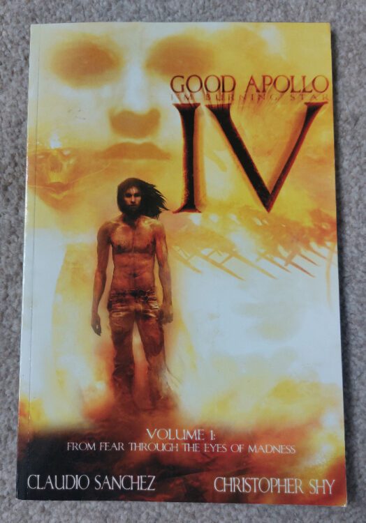
This Damned Band #1-6 and Good Apollo and I’m Burning Star IV (a graphic novel, but it is a quick, and visually beautiful, read)
Good Apollo, I’m Burning Star IV Credit: Evil Ink Comics
Week 35:
Tori Amos’ Comic Book Tattoo.
This is a large book with many stories by many of the industry’s greats. It’s a week’s worth of reading, easily. And a must read in my opinion, if you can get hold of a copy.
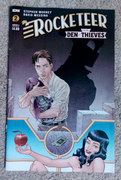
The Rocketeer in the Den of Thieves #2 Credit: IDW Publishing
Week 36:
The Rocketeer in The Den of Thieves #2
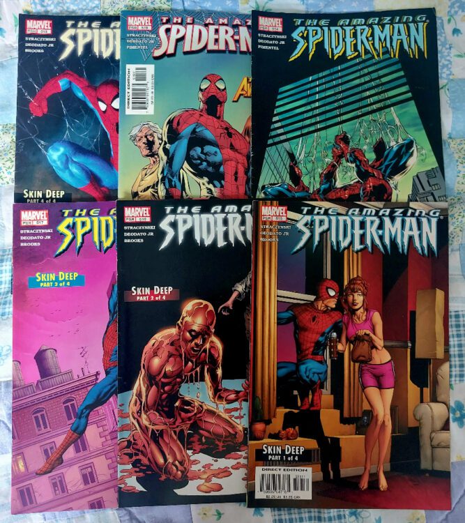
The Amazing Spider-Man #514 – 519.
This was the start of a long run of Spider-Man comics that I’m reading. Spider-Man is my go-to comic when I need a pick me up (Doctor Who is the television equivalent) and I enjoy mindlessly re-reading the older Spidey comics in my collection.
Various The Amazing Spider-Man comics Credit: Marvel Comics
Week 37:
Doctor Who: Once upon a Timelord and Werewolf by Night #1 (2023)
These two titles shared one thing in common: I enjoyed the thought of them more than I did the reading.
The Amazing Spider-Man # 520 – 524
More classic Spidey. It saddens me that I can correctly refer to comics published in 2005 as “classics.”
Various Spider-Man titles Credit: Marvel Comics
Week 38:
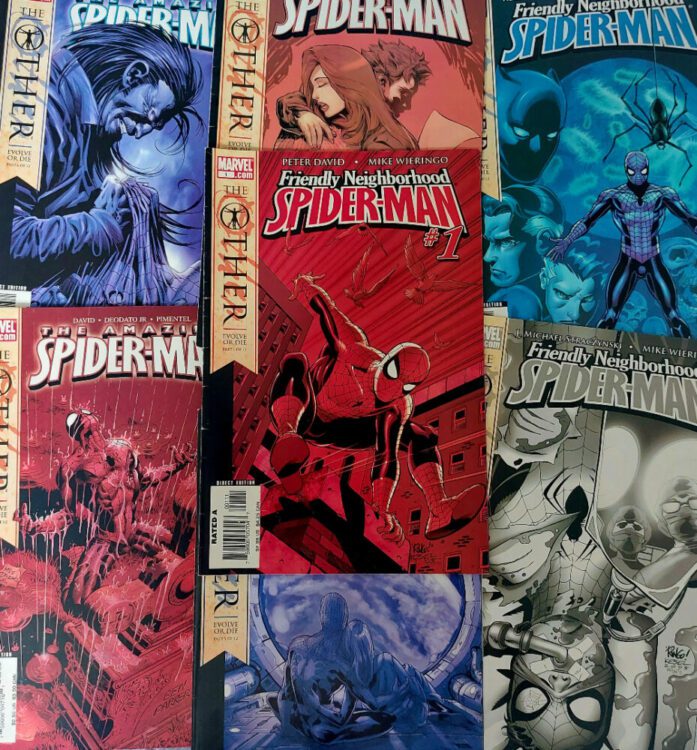
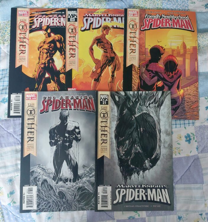
The Other: Evolve or Die (featured in Friendly Neighborhood Spider-Man #1-3, Marvel Knights Spider-Man #19-20, The Amazing Spider-Man #525 – 526)
This is the first half of my readthrough of the surprisingly-not-actually-that-controversial Spider-Man story The Other. The basic premise is that Spidey is being stalked by Morlun, who can sense that Spidey will be at his weakest very soon, perfect for the life sucker to strike. Spidey’s luck almost runs out when he is shot by Tracer, a two-bit villain with an inflated sense of importance, and Morlun strikes, beating the superhero to within an inch of his life and tearing out one of his eyes.
In the hospital, Morlun makes his final move but is stopped initially by Mary Jane. When Morlun threatens her life, Peter has one last outburst of strength and attacks Morlun; fury spreads across his mutilated face and stingers spring from his arms. He dispatches Morlun but the cost is his own life. And so ends the story of Peter Parker, the Amazing Spider-Man.
The build up to his death is actually very entertaining and, in many moments, quite tense. The violence that runs through this story is not toned down and Morlun’s first attack on Spidey is brutal. There is a consistency to the characters and the narrative across the various titles which is a testament to the writers and artists who worked on each title. This reads like a single story from a single comic and not a crossover event.
Obviously the ‘death’ of Spider-Man would be big news and many fans would have their opinions, but unlike other high profile death storylines, it’s made very clear that this isn’t going to be a lasting event. This story is less about the actual death and more about what comes next. So what did writer J. Michael Staczynski have planned for everyone’s favorite wall crawler?
The Other in Spider-Man Credit: Marvel Comics
Week 39:
The Other: Evolve or Die (featured in Marvel Knights Spider-Man #21-22, The Amazing Spider-Man #527 -528, Friendly Neighborhood Spider-Man #4)
As with all changes made to legacy characters, there are some fans who get their panties in a twist, but I think The Other didn’t get chance to make a lasting impression on the hive mind. Possibly, the reason for this is that it is bookended by two much more controversial stories. Pre-The Other, in the story Sins Past, Staczynski introduces the children of Gwen Stacy and Norman Osbourne. Post-The Other (and post-Civil War), the same writer* ret-conned the marriage of Peter Parker and Mary Jane, thus changing decades of storylines. In essence, everything that happened in The Other was overshadowed by three stories that surrounded it.
Personally, I love The Other. I think the way that the story unfolds is intriguing and handles the concept of premature death with compassion. The interactions between Peter and Mary Jane are touching, and MJ’s reaction to Peter’s death is moving and heartbreaking. The story also allows the creators to show how the superhero world would deal with such a death, offering a different perspective on the superhero genre, something that was done well in the aftermath of Superman’s death in the 1990s.
As a standalone story, The Other is definitely worth checking out and, from my point of view, it’s a shame that the changes Spidey went through never really got the chance to be investigated.
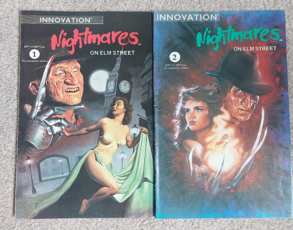
And to finish off the last 6 weeks (has it been that long?) I read Nightmare on Elm Street #1-2 by Innovation Comics. The story links into the first three movies, employing characters from the cinematic adventures to once again fight Freddy. Andy Mangels nails the characters and creates sequences straight from the 1980s slasher movie genre. Tony Harris’ painted artwork is beautiful and reminds me of the more expressive artwork of the 1990s. It was an enjoyable read back then and has stood the test of time in the same way that the early movies have. Yes, there are some rough edges but isn’t that what we want from this genre?
A Nightmare on Elm Street #1-2 Credit: Innovation
That takes us up to Comic Number 271.
*Sort of. The production of this story is, itself, quite a controversy and led to falling outs between writers and editors at Marvel.


")