Home Blog Page 327

NEXTWAVE: The Surreal Life of Marvel’s D-Listers

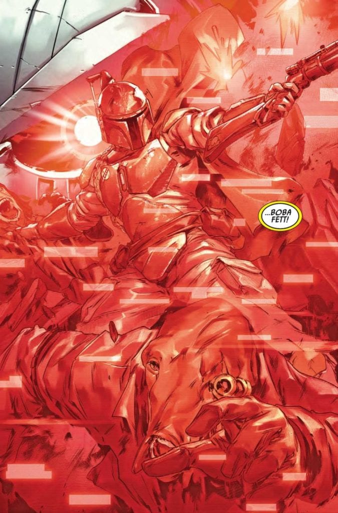
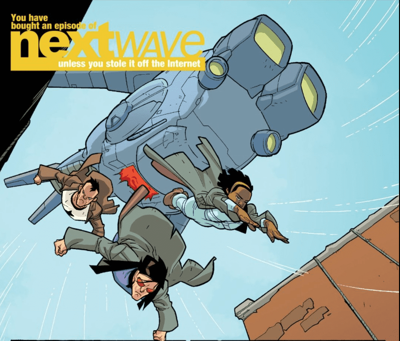
Nextwave is the perfect way to kick back and enjoy anything when life turns sour. From the time of its creation to the ever divisive fandoms, this series is practically the perfect medicine. Who needs comics’ penchant for reboots, retcons, status quo changers, and events when you can just have fun? Squirrel Girl? Okay fair, but Warren Ellis got one over Ryan North when Marvel was tearing itself apart over Civil War, especially since this series comes with a dedicated theme song.

Nextwave: Nobodies Have Feelings Too

Nextwave revolves around the adventures of the titular team composed of Marvel D-Listers. Most of these characters on their own are pretty forgettable despite their fascinating power sets and backgrounds. Monica was Captain Marvel at one point, and Elsa’s a monster hunter. But there’s a chemistry about the cast reminiscent of dysfunctional families in sitcoms. The Captain’s the drunk dad; Tabby’s the rebel, Monica’s the authority, etc. But there’s a lot more to them with how they all interact with each other and the just as absurd world. Like when the team calls out their moves as if they’re in a video game.

Not only that, but there’s the general nonsense that comes from comics you can jump right into. Who needs vast overarching narratives when you can amuse yourself with the surrealism you can only find in comics? Men in pterodactyl suits, soldiers made out of broccoli, yet people accept that this is pretty normal. What’s not as normal is how underutilized concepts like Forbush Man appear, but none of the Marvel Universe A-Listers. Because who needs a cheap way to advertise Nextwave?

Nextwave On Defying Expectations

Comics have a very divisive reputation for several reasons: long histories, continuity, and an ever-changing status quo. Nextwave does practically none of that but still comes out on top. Despite the number of explosions that put Michael Bay to shame, Nextwave never takes itself seriously. That’s the problem with many high octane action sequences; with world-ending threats being so common, it’s better to treat them like a joke. If D-listers aren’t going to be remembered for characters, show-up the A-Listers.

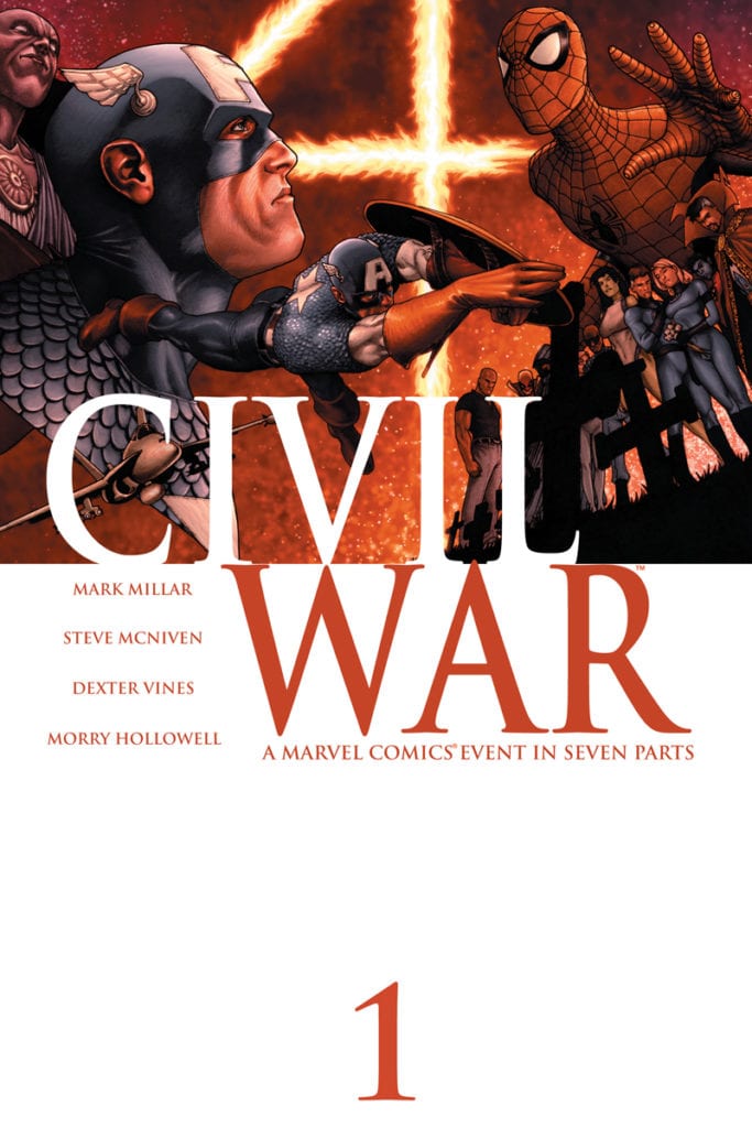
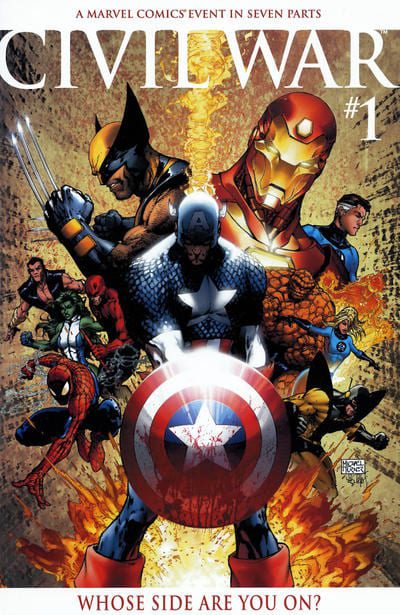
Take the team’s numerous jokes at Captain America’s expense, or at least Mark Millar’s interpretation of him. Millar has Steve Rogers be the square-jawed old fashioned type, so much that his Ultimate Universe counterpart is practically a parody of the main one. Yet in Civil War, Millar has the main interpretation act more like the Ultimate version. So Ellis has Nextwave display their interpretations of the Sentinel of Liberty. In short, a stiff sexist ultranationalist; whereas the Captain America of all other times would be unlike this in every way. Hence why the actual Rogers never shows up. It’s all a joke at Millar’s expense.

Mark Millar Licks Goats

Considering nowadays Millar isn’t too fond of his more pessimistic work, he probably welcomes the mockery. Because who can blame him or Ellis for the jokes? During Civil War, Marvel was at its most divisive, for there was no clear message behind the Superhero Act. Yet people took it so seriously. So instead of being a part of the problem, Nextwave takes the opportunity to mock Millar and Marvel behind the scenes.

Marvel Doesn’t Notice Squat

Nextwave has a lot of content that both parodies and foretells events. For example, H.A.T.E. the SHIELD stand-in, has a Fury parody while blind to the fact that H.A.T.E. gets its funding from their enemies. This is way before Hickman’s SHIELD series. But more so than that, the Marvel writers like this series so much they go behind people’s backs to keep Nextwave’s spirit alive. All through the main cast who retain their quirky personalities as they go to guest star in other series. Even the Captain gets his moment in Sean Ryan’s Nova, if you call casually getting drunk during an invasion a moment. At least he’s not a casualty.

Nextwave: Style Over Substance

The art group certainly likes to play up some of the more absurd aspects of this series. Stuart Immonen’s designs range from action-packed to quirky dynamics. For example, the appearance of Fin Fang Foom, who cinematically rises out of the earth in kaiju fashion. All while Chris Eliopoulos’ stand-out captions display some of the more ridiculous aspects of the monster. From how he wants to find a mate but has no genitals. Which calls back to why Foom wears purple boxers for no reason.Never a dull moment in Nextwave

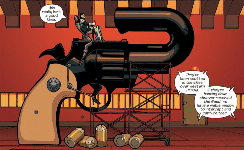
Other times Immonen’s designs regarding Dirk Anger’s appliances like a giant telephone and handgun steal the moment. Especially with how Wade von Grawbadger outlines them or how Dave McCaig provides the details through coloring. That’s not to say other more subtle designs come up every now and then to describe character. Tabby’s red clothes, for example, show how much she keeps her superhero life close to her civilian life. Because after having so many codenames that didn’t stick, she likes to have something only she identifies with unlike the rest of Nextwave, who don’t have much outside of superheroics.

Lettering With Attitude

Relax I bought the trade this is in.
Respect the creators!

As soon as Eliopoulos steps out, Joe Caramagna shows he’s got just as much moxy. Whether it’s giving specialized fonts to robotic or monstrous characters or the snarky captions in the logo, Caramagna brings the casually sassy attitude that completes Nextwave. Because who else can make the iconic message of “Do You Think This Letter On My Chest Means America?” in such irony?

Nextwave! (Explosion!)

Do you have some random event? Confusing continuity? Some toxic comic fans? Maybe you’re just getting tired of A-listers that aren’t at the top of their game. Find some comic retailer and get Nextwave! Parodies, over-the-top action and gimmicks, and a crew who are funny without really trying. It’s everything fans should love about comics.

Is Nextwave the comic for you? Leave your thoughts in the comments.

Monkeys Fighting Robots Youtube

BATMAN: THE ADVENTURES CONTINUE #1 is a Careful Continuation

Dini Batman The Adventures Continue DC Comics

Written by Alan Burnett and Paul Dini, with art by Ty Templeton, colors by Monica Kubina and letters by Joshua Reed, Batman: The Adventures Continue #1 out this week from DC Comics follows in the footsteps of the cartoon, and doesn’t stray far. The comic acts as a sequel of sorts to the animated series. With the legacy of the cartoon overhead, this creative team seems to follow the beats of the original series very carefully.

Writing

Burnett and Dini, writers of Batman The Animated Series, return to a world they’ve written for before. They emulate the show in very interesting ways. The action moments that on-screen often involved characters jumping around and grunting are just as action-based here. The fisticuffs and the villains are the focus. But the transition into the role of playboy billionaire is also very present. Burnett and Dini give Bruce Wayne his time in the sun too, and Wayne’s conversations with Luthor provide them with a chance to flex their dialogue-writing muscles. Batman is their silent knight, and Bruce Wayne is their silver-tongued diplomat. It creates a kind of symmetry for the character that’s often lacking elsewhere.

Art

Templeton’s art closely follows the character models we have come to know. Though it’s actually Templeton’s relaxed attitude that makes his art so appealing. Instead of working in the shadow of the animated series, Templeton occasionally veers off slightly into his own style. It never seems out of place, yet it seems fresh and new. With so much faithfulness to the original style, it’s nice to see slight variations. Much of Templeton’s layouts read like a cartoon too. With characters moving in a scene only slightly between panels. It creates a sense that we are watching the whole scene play out, instead of jumping into important moments.

Coloring

Kubina’s colors feel slightly out of place. The simplified coloring of each scene seems like the kind of coloring that works better on the screen than the page. Yet the Animated Series itself often created depth with its dark tones. Each scene is colored in solid blocks of color. Perhaps it’s the colors themselves that seem out of place. The red sky in the background looks odd when not given texture. It actually looks like the sky has gone red and you wonder to yourself why all the characters aren’t panicking. Many of the color choices themselves are more stylistic than literal, but when paired with Templeton’s more simplified art and not given texture, it often looks wrong.

Lettering

Reed’s lettering sets the pace for each scene. With the action-packed fight scenes requiring very little lettering, Reed doesn’t hesitate from creating large blocks of writing in the more conversational moments. Reed frees up earlier pages, making them a quick read, so we can slow down in the wordier moments. We read the conversations between Wayne and Luthor and are slowed down by how the lettering is presented. It gives us a chance to notice and digest what is being said. These conversations aren’t throwaway moments, and Reed wants us to take them in carefully.


Batman: The Adventures Continue #1 takes much of the charm of the cartoon and follows in its footsteps. It’s nice to see Bruce Wayne get some time out of the house, for one thing. Though the start of this series is charming, for sure, it does seem to carefully stay in the lines instead of taking risks. It delivers on what it claims to be and stops there. Fair enough! For fans of the show, this will surely be a worthy addition. Batman: The Adventures Continue #1 will be available on ComiXology on April 1st!

Monkeys Fighting Robots Youtube

Box Office Flashback: April – Ernest, A Submarine, And Titans Clash

One-hundred-plus years of filmmaking provides a long, rich, and deep history to look back on. Retro reviews and analysis of old films are practically necessary full-time specialties. Month after month, films release, vying to make as much money and grab as much attention as possible. Some rise, some fall, but regardless of financial success, the lasting effect of a film in popular culture is unpredictable.

So, where does that leave past box office champs? Let’s take a look back ten, twenty, and thirty years ago at the biggest movies released in April.

1990 • Ernest Goes To Jail • 25 million

ernest-comedy-film

March 1990 was full of hits, but April of that year was a bizarre cocktail of mostly forgotten films. Ernest Goes To Jail is the fourth film (of nine!) in the Ernest series that sends the titular character to a state penitentiary. The Ernest films were quite a thing back in the late 80s and early 90s. The role of Ernest P. Worrell was played by Jim Varney, and the entire franchise (a TV series included) spawned from a series of commercials in the early 80s.

Following Ernest is The First Power starring Lou Diamond Philips. The neo-noir horror film isn’t great but features an interesting concept that’s maybe due for a re-imagining. In third is a film featuring Joaquin Phoenix and Keannu Reeves called I Love You To Death. The Guardian, directed by William Friedkin (The Exorcist), made its way into fourth after a troubled production. Right behind it was a science fiction comedy called Spaced Invaders about a group of incompetent Martians trying to take over Earth.

2000 • U-571 • 77 million

submarine-military-movie

April 1990 wasn’t pretty, and ten years later, things aren’t much more interesting in the month. The winner in 2000 was submarine thriller U-571 starring Matthew McConaughey and featuring rocker Jon Bon Jovi and Bill Paxton. Things weren’t alright, alright, alright, though as the film received backlash from the British government for distorting history too far.

Another military drama, Rules of Engagement, trailed U-571 by 16 million, taking in 61 million at the domestic box office. The film starred Tommy Lee Jones and Samuel L. Jackson and was directed by William Friedkin. Horror film Frequency, a science fiction thriller starring Dennis Quaid came in third. Comedy-drama 28 Days with Sandra Bullock took fourth followed closely by Edward Norton’s directorial debut, the romantic-comedy Keeping the Faith.

2010 • Clash Of The Titans • 163 million

greek-myth-movie

The 2000s have certainly seen a monumental shift in the film industry. The burgeoning overseas market has ramped up the numbers, but also the way return on investment is considered. Clash of the Titans took in nearly 500 million worldwide despite mostly negative reviews against a 125 million dollar production budget and many million more spent on advertising. The film earned two Golden Raspberry nominations too.

The champ from just ten years prior would fall into a distant third in 2010. The second-place winner, Date Night starring Steve Carell and Tina Fey, made nearly 100 million domestically. The Nightmare on Elm Street remake came in third closely followed by Tyler Perry’s Why Did I Get Married Too? In last place is probably the best-known film of the bunch, Kick-Ass, which spawned a sequel.

April 2020

Well, this is a tough one to write. Due to COVID-19, theaters across the world are shut down for safety. However, had things not gone globally haywire, this April would’ve seen Daniel Craig’s last go-around as James Bond in No Time To Die go head-to-head against Marvel’s (sort of?) The New Mutants. As of now, No Time To Die is pushed back to November, and that’s a best-case scenario kinda thing. The New Mutants has been in release limbo for a long time now, and so this is just more of the same for the ill-fated film.

My prediction …

No predictions. Things are weird. The most important thing right now is that everyone stays safe and healthy. Watch movies at home for now.

Read more from Ruben R. Diaz!

Don’t go, there’s so much more on PopAxiom!

Monkeys Fighting Robots Youtube

Why You Should Revisit BATMAN: THE DARK KNIGHT RETURNS #1

BATMAN: THE DARK KNIGHT RETURNS #1, published in 1986 by DC Comics, is considered part of one of the greatest comic book masterpieces of all time. Written by Frank Miller, and illustrated by Miller, Klaus Janson, Lynn Varley, and John Costanza, this history-making story showed the wider public that superhero comics could be a medium for adult themed stories. Fans of the Dark Knight will find this tale darker than many modern Batman comics, following Bruce Wayne after putting up the cowl ten years prior.

Story

The inaugural issue opens with an unknown middle-aged driver speeding down a track. A group of similar race cars flank him on either side, eventually leading to an unexpected crash. The driver, narrowly escaping death, is revealed to be an older Wayne who’s clearly craving any form of excitement in his now “normal” life.

The narrative proceeds to reintroduce readers to Gotham, a city in the midst of Cold War panic and an ever-increasing crime rate. Unsurprisingly, the news reports are full of despair. But one piece of news takes use by surprise: it is the tenth anniversary since the last sighting of “the Batman.”

Wayne spends an evening with Jim Gordon who attempts to relive the “old days” to no avail. The Commissioner tries to cheer him up, going to far as to recommend he “find a woman.” But Wayne knows his melancholic feelings stem not from loneliness, but a deep hunger for the war he ended years ago.

This issue sits both in Wayne’s future and his past. Miller’s script portrays a man who is stuck in the aftermath of his war on crime, wishing he could fill his passion once more. Wayne’s inner monologue is a jumbled mass of regrets, fears, and hopes, much like those within ourselves. Miraculously, we are able to find a commonality with this larger-than-life figure.

Readers soon find that the newest threat to plague Gotham may be enough to bring the former superhero out of retirement. And when Two-Face and the Joker plan to reintegrate into society, the Dark Knight finds the stakes to be higher than ever.

Artwork

Miller’s pencils add to the cohesiveness of the comic’s illustrations. Backed by Janson’s ink work, the art embodies a unique style that was rare in Batman comics before this issue’s release. The characters are often depicted with a simplicity that conveys complex emotions. In addition, Lynn Varley’s coloring does a fantastic job of placing the readers’ focus on the action by using brighter colors for the active characters in each scene.

As beautiful as the illustrations are in this book, Costanza’s lettering is what adds the most intrigue. The fonts are interspersed all around the illustrations and panels, but take nothing away from the action. On the contrary, they enhance it. These frame the scenes when needed and seem to join in the scenes as independent acting agents.

Comic Cover

The comic cover, illustrated by Miller, shows the Dark Knight leaping into action with a flash of lighting. This readies readers for the action sure to come.

Conclusion

BATMAN: THE DARK KNIGHT RETURNS #1 launched a new era of comics and is referenced by creators as the standard for many darker stories. We highly recommend picking this up and experiencing the Dark Knight’s reawakening.

What do you like best about this ground-breaking story? Let us know in the comments below!

Monkeys Fighting Robots Youtube

Marvel’s CIVIL WAR #1 — Remembering The Great Debate That Split The World

CIVIL WAR #1, a Marvel Comics Event, rocked the comic book world when it was released on May 3rd, 2006. Written by Mark Millar and illustrated by Steve McNiven, the story pits fan favorites heroes Captain America and Iron Man against one another in one of the most topical dichotomies: freedom and security. A line is about to be drawn between heroes and the public alike. Which side are you on?

Story

The story opens up with the New Warriors, a young group of heroes who are seeking fame while crime-fighting. Their latest exploit takes place in Stamford, Connecticut—their plan is to charge into a supervillain hideout. However, the brash team fails to account for the human bomb Nitro, and the elementary school filled with children near door.

Nitro sets off an explosion that kills the hundreds of the students in the blink of an eye. The only things left are dust, ashes, and those who managed to cling to life.

Following this horrific event, readers witness an inevitable fallout between superheroes and the public at large. Many call for the ban of all heroics, while others lobby for governmental restrictions on “capes.” Even the superhero community finds themselves on opposite sides of the issue. Iron Man and many of the top-level heroes believe it’s high time they register so they may be held accountable to the people they serve. Others—street-level heroes like Luke Cage and Daredevil—refuse to consider registering on account of their liberties being violated.

The climax of the issue hits when we’re taken to Captain America as he prepares to give Maria Hill his opinion on the matter. We see the pain the Avenger has undergone while contemplating the issue. It’s clear even the best heroes have doubts about what is “right.” But he soon makes his position clear, and he’ll stop at nothing to uphold his conviction.

Millar’s script is a perfect parallel to events in our own society, both past and present. The public faces choices between freedom and security almost every day. We try to find the perfect balance, but our convictions often place us on polarized sides. And as readers will see, the Marvel heroes fair no better than the divided world we know.

Artwork

McNiven’s penciling, along with McKniven, Dexter Vines, Mark Morales, John Dell, and Tim Townsend’s ink work, captures the true essence of our favorite Marvel heroes. Each character is fully fleshed out in exquisite detail, from Captain America’s boot cuffs to the fused pieces of Iron Man’s suit.

These and the rest of the illustrations are expertly colored by Morry Hollowell, who contrasts the warm colors of the explosion’s aftermath with subdued, cool colors for the stricken heroes. In addition, the lettering from VC’s Chris Eliopoulos helps readers feel the emotions from each character through well-placed bold letters.

Comic Covers

Main Cover

McNiven’s cover illustration shows Captain America facing Spider-Man and the rest of the Marvel hero line-up. We get the sense he’s about to do something that will leave the rest of them in disarray.

Aspen Variant Cover

Michael Turner and Peter Steigerwald’s variant cover features three of the big players in this conflict: Captain America, Iron Man, and Wolverine. What’s more, the cover is divided, showing the anti-registration heroes on Wolverine’s side and the pro-registration hero on Iron Man’s. One might think Captain America, positioned directly on the line, will be the equalizer in this conflict. But his downtrodden face suggests otherwise.

Conclusion

The story laid out in CIVIL WAR #1 continues to amaze readers far and wide. Few comic books can bridge the gap between fantasy and reality. We highly recommend revisiting this tale.

What parallels do you see in CIVIL WAR #1 to events in our own world? Let us know in the comments below!

Monkeys Fighting Robots Youtube

OPED: Tom Taylor Is The Master Of Tragedy Through Levity

Tom Taylor

For more than a decade now, Tom Taylor has been bringing us to tears with his comics. He writes the kind of scripts that frankly shouldn’t work. A zombie apocalypse in the DC Universe, a tyrant Superman taking over the world. His premises are full of tragedy, and if his scripts were just that, it would all become old hat fast. Instead, Taylor fills nearly every page with heartwarming connections and side-splitting laughter. It’s his pension for levity that makes Taylor a master of the tragic.

INJUSTICE #5. Art by Bruno Redondo. A prime example of the kinds of jokes/connections Taylor creates in the midst of tyranny.

What is the purpose of filling a tragedy with jokes and levity? It would seem that that would be working against the grain of what that piece of art is trying to achieve. But the fact is, characters who stare gloomily out windows aren’t all that interesting. It’s not long before you’re looking at your watch and wondering, “When will this guy die already?” If the characters aren’t given much of a life to begin with, we often find we don’t care that it’s over for them.

The best example of someone who employs humor effectively in tragedy is Shakespeare. Many of Shakespeare’s plays (like Taylor’s comics) work on a level of dramatic irony. We know the end is nigh from the beginning. Romeo & Juliet begins with the Chorus coming out and telling us, in not so many words, “Don’t get too attached; these guys are headed for the chopping block.” But then suddenly the stage is filled with the kinds of characters that we care about: characters that don’t know they’re going to die.

INJUSTICE YEAR 2 #23. Art by Bruno Redondo and Xermanico, colors by Rex Lokus. This moment would come off as melodramatic or cheesy if not for the overall tone of this series. Instead, with context, the scene is heart wrenching.

Taylor brings this approach to the superhero medium brilliantly. After all, what are superheroes other than characters that don’t think they’ll die or lose? They can repel bullets; they’ve saved planets, why should they be worried? They always find a way to come out on top. In a true act of kismet, in some of Taylor’s more recent projects, like Injustice and DCEASED, DC has handed Taylor the keys to the house. And so these characters that have so often been protected by fandoms and continuity are suddenly fragile.

Nearly every issue of Injustice has a heartbreaking death scene. For DCEASED, it’s almost every page. And the thing that keeps it from being grueling is that there are still characters out there who believe they can come out on top. Whether it’s Harley renaming the Arrow Cave or Lobo not wanting to talk about his feelings, life just goes on for such characters. They don’t wait at the window for death. They have a good laugh about how everything is falling apart.

Taylor has found something profound and seemingly contradictory in his comics. The things we connect to in a character are the things that make them human. But one of the things that make us the most human is that we think of ourselves as immortal. We don’t wait at the window. Most writers would think quite the opposite and wouldn’t tap into that shared humanity we have with immortal superheroes. Thank God Tom Taylor isn’t most writers.

DCEASED #1. Art by Trevor Hairsine and Stefano Gaudiano. Dinah and Ollie give Hal Jordan a hard time. You kind of love them for it though.


In an interview with MFR, Taylor said: “I’ve made lots of people cry in public, and that’s always one of my favorite things.” It’s good he likes doing it, because he does it well. Taylor is aware of the fact that if you want lows in a story, lows that a reader cares about, you must first have highs. We have to laugh with a character if you want us to care that they lost. He puts a human face on apocalypses and makes us care about the slog to the end of the world. So if you want to cry in public, Tom Taylor is your man.

Monkeys Fighting Robots Youtube

Longbox Legends: SWEET TOOTH – Innocence in the Time of the Apocalypse

“This is a Story.”

In the time surrounding the year 2010, the post-apocalypse story setting was near beaten to death by the mainstream horde of apocalyptic fiction. Television, film, games, and comics were swarming with stories of varying quality of people surviving in the ruins of our society. This oversaturation undoubtedly caused many to become fed up with the entire post-apocalypse subgenre and dismiss it entirely for several years. In that time though, there were a few standout tales that have stood out from the deluge to become modern classics. One of these is Jeff Lemire’s folk-style comic tale, Sweet Tooth. Lemire’s expert handle on dialogue, characterization, and pacing over a long-form story works in concert with his unmistakable art style and original concepts. As a result, Sweet Tooth stands as not only a gem of post-apocalyptic storytelling but as one of the most memorable comic stories in recent decades.

Writing & Plot

Sweet Tooth begins in a cabin in the woods in the midwestern United States. Gus, a hybrid boy (half-human, half-deer in this case) lives in hiding with his father after a cataclysmic plague wipes out most of humanity, leaving the rest to fend for themselves in often brutal manners. Gus’s father advises him to never leave the safety of the woods, or else the remaining “sinners” will capture and kill him. Unfortunately, the plague reaches all humans at some point, and one night Gus’s father dies of the illness. As Gus ventures out for more supplies, he is found by a pair of “hybrid hunters,” people who capture hybrids and take them to military researchers in hopes of finding a cure for the plague. See, hybrids, which started being born in place of normal humans at the start of the pandemic, are immune to the plague. However, Gus is saved by a hardened survivor by the name of Jeppard. The grizzled fighter offers to take Gus to a place of safety, and the main body of the story begins. On the road, they meet a cast of villains and supporting characters of all manner, origin, and cross-species DNA that color this comic’s world.

One of Lemire’s great strengths as a storyteller is his ability to take familiar tropes and combine them with wildly original concepts (see Black Hammer). This post-apocalypse already holds many genre-familiar sights, such as human brutality and desolation. The main character pairing, with the young boy Gus under the protection of the experienced older survivor Jeppard is reminiscent of many other “on the road” stories. The story itself is laced not only with the fantastical nature of the hybrids, but with questions of religion versus science and the humanity’s relationship with nature. The story is just as much about Gus growing out of his father’s single-minded mentality and learning to see the good in the people that have it – and to do what is necessary against the evil. The development and pacing of Gus’s character guided is with a patient hand. His innocence contrasts with Jeppard’s – and the entire world’s – brutality. He acts as a beacon of hope for so many, even as he learns how to navigate this new world without losing what makes him such an endearing character.

Lemire practices characterization via dialogue to an expert degree. Each character has their own style of delivery based on the context of their character. Gus was raised by a poorly educated father and so his use of simple colloquialisms and sloppy grammar are fitting. Bobby, a groundhog hybrid, received almost no education, so he refers to himself in the third person and uses “am” instead of “is.” There are so many more examples of this; from Jeppard’s “less is more” vocabulary to Dr. Singh’s distressed intellectualism. The individual dialogue is so well composed that even without the artwork, it would be easy to decipher who was speaking just from reading the lines.

Art Direction

Speaking of artwork, Lemire’s is admittedly a bit hard to comment on. The visuals are purposefully lo-fi, and a combination of almost amateurish and expert skills. His art in Sweet Tooth can go from meticulous facial detailing in one moment, to looking like a hastily scribbled sketch in the next. This is in no way an insult. Lemire constantly shifts style and detail based on the context of the current scene. The less detailed and messier sequences are usually dreams or visions, drawn to represent a foggy distance from the story’s reality. At the same time, Lemire’s attention to detail in character moments and action sequences is still fantastic. He portrays wide ranges of emotional expression and turmoil on a single page. Lemire’s pencils are aided by Jose Villarrubia’s fantastic colors, which dip into the surreal at times (watercolored purple and gold skies, at one point) but stay fitting to the context of whatever is going on in the plot. Villarrubia managed to match exactly the stylistic touch Lemire was after, creating an aesthetic that is folky and unpolished but also gorgeous and perfect for the kind of comic being made.

Verdict

Jeff Lemire’s Sweet Tooth does what a great post-apocalypse story should by transcending the shackles and tropes of its genre. The brilliantly unique plot, cast of loveable (and hateable) characters, unforgettable art and one of the most touching endings in modern storytelling culminate in one of the most outstanding comics in recent decades. To quote one of the passages: “This is a story of a little boy with antlers and a big man with guns who found each other and learned there was still some good left in the world…this is a story of fear and friendship…of passage and rebirth…of sacrifice and redemption…of hatred and love…of innocence and age.”

“This is a story.”

Monkeys Fighting Robots Youtube

SPAWN: The Retroactive Redemption of Todd McFarlane

Spawn back and better than ever

Spawn is a character that needs very little introduction. He’s the character who puts Image Comics on the public radar thanks to the cultural zeitgeist. But that hasn’t been apparent in twenty years. Part of it has to do with a number of lawsuits that creator Todd McFarlane was involved in. But with Spawn’s appearance in Mortal Kombat 11 and a movie with some troubling productions, Al Simmon’s is back in the public consciousness. But how does it come to this? This is the research from the gutters.

The Spawn Zeitgeist

Roughly 20 years before this article, Spawn was at the height of his popularity. With an Emmy winning adult TV animation along with some quality action figures, nobody escapes McFarlane’s grasp. Well, among other less notable reasons like the Michael Jai White movie and the Spawn Armageddon video game. Spawn even stars in a number of crossovers like with DC’s Batman and even a guest appearance in Soul Caliber II. The comics meanwhile reach well over 100 issues.

And It’s Screeching Halt

The Gaiman lawsuits were technically over this guy.
Technically Gaiman just wanted the rights to Miracleman.

Unfortunately, all of that comes to a screeching halt when McFarlane gets into some legal trouble. The most notable of which is with Neil Gaiman, co-creator of Angela and Medieval Spawn. McFarlane’s wanted to cut off Gaiman from his share of the royalties, so he and Gaiman get into a civil suit. McFarlane tries everything to keep his stance, but all end up rejected. So Gaiman takes ownership of some of these characters like Angela and the Man of Miracles and sells them to Marvel. This, along with another lawsuit involving a character’s likeness to a hockey player, cost McFarlane millions. So for the next twenty years, McFarlane tries everything to recover from his losses.

Spawn In-Universe Fallout

With Gaiman winning the lawsuit, McFarlane tries everything to remove his influence over more legal matters. The iconic Armageddon and Endgame stories, for example, make heavy use of the Man of Miracles. Giving Spawn to other writers sporadically, McFarlane’s quality and success start to shift around. He even gives the Spawn mantle from Al Simmons to someone else by killing Al off. All to increase sales while trying to find some new ideas. McFarlane’s plans for a new TV series meanwhile are stuck in development hell. But whether that that can resurrect like the comics are up for debate.

Resurrection

Delcourt probably give this Spawn story a better name.
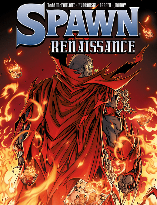
After a few years, McFarlane pulls a retcon to remove all of Gaiman’s influence from Spawn. All while setting up a new status quo and keeping things simple. Spawn Resurrection and Satan Saga Wars are essentially a new take on the above two stories. It even removes Al Simmons’ more controversial status as a wife-beater from Armageddon. With some fans already complaining about how Spawn depicts a problematic superhero for reveling in killing a child molester, this was a welcome change. Afterward, Spawn goes through a journey to reconnect with the world around him. This naturally includes his now late wife’s daughter, Cyan Fitzgerald.

For McFarlane, however, this is about reconnecting with his audience on their level. All through Spawn surrendering a significant portion of his power. Because when you’re on top of the world, everything looks small and insignificant, a mistake McFarlane will not make again. Al’s veteran status is on much greater display instead of relying on his usually absurd powers. Not just for his ability to fight off enemies with machine guns but the respect he gives other soldiers. All while still dealing with trust issues after many past betrayals. Despite this, Al gets allies like a new She-Spawn because he knows he can’t do it all alone. For McFarlane, it’s opening up to others and showing respect to other creators who helped Spawn get to where he is.

Spawn Renaissance

Now Spawn is back in the public consciousness as Image Comics’ poster boy. After 20 years of lawsuits that held him and McFarlane back, Todd goes back to why Spawn is so great. Not just for the humanity in the character but appreciating all who help get them to this point. Now, if only that Spawn movie can come out without any more troubles.

What do you think of Spawn and Todd McFarlane? Leave your thoughts in the comments.

Monkeys Fighting Robots Youtube

Review: STAR WARS BOUNTY HUNTERS #2 Sees The Hunters Converge

Star Wars Bounty Hunters #2, Barmejo cover

STAR WARS BOUNTY HUNTERS #2 jumps right into the action with the competing bounty hunters racing to be the first to find Nakano Lash. Will they kill each other before they get to Nakano? Let’s find each out?

How did we get here?

In issue #1, a group of bounty hunters disbands and scatter throughout the galaxy after one of their own (Nakano Lash) seemingly betrays them and kills the gangster who hired them. (Click here to read the review of Star Wars Bounty Hunters #1). Many years later, Nakano Lash has resurfaced, and the bounty hunters, each with a score to settle, race to be the first one to find her.

Cover

Lee Bermejo turns in another stellar piece of work with the cover. Bermejo’s composition is dynamic, and his textures are painted with precision. Every detail, from the laser blasts whizzing by to the folds on Boba Fett’s cape, are painstakingly rendered. I’m a stickler for lighting and shadows, and Bermejo captures the effect of the background explosion expertly.

Writing

Ethan Sacks picks up the story almost immediately where the last issue left off. Each bounty hunter picks through clues and follows trails using their own, often violent and brutal, methods. Sacks’ approach cleverly gives each bounty hunter a bit of personality when he shows how differently they each go about chasing down the same prey.

There’s lots of action in this issue. The bounty hunters kill off anyone who gets in their way, and there’s a bit of a bonus with a flashback scene showing how Valance the cyborg first joined up with the team.

Sacks doesn’t address two plot points that have been missing since the first issue: Why did Nakano Lash kill the gangster who hired them? Why does T’onga blame Nakano Lash for her brother’s death?

Without those answers, there’s a lack of emotional weight to the chase. Nakano Lash killed the boss for a reason, so if that reason is not clear to the audience, the revenge chase comes across as unearned. Sacks must answer those questions soon to keep the reader engaged with this series.

Coloring

Arif Prianto does an excellent job on coloring duty. As with Bermejo’s cover, Prianto pays a lot of attention to using shades of color to create texture and depth. Sometimes, Prianto can get a little carried away with the shading such that you can’t tell where the light is coming from, making the scene look a little busy.

Also, Prianto uses a lot of muted earth tones in this issue. That works when giving most scenes a dusty, dirty feel, but it lacks pop, and surfaces tend to blend. Prianto could improve this by using less neutral colors.

Overall, these are minor quibbles with the coloring, and the issue is generally beautiful.

Lettering

Travis Lanham covers lettering with this issue and does something a less capable artist struggles with. Lanham knows how to get out of the way.

The issue has easily 5 to 6 panels per page. For each panel to work, the art has to come through WITH the lettering without getting crowded out BY the lettering. That’s not an easy thing to do when there are so many small panels, some overlapping others. Lanham’s lettering compliments each tightly packed panel instead of overpowering it to let the art shine through.

Pencils/Inks

There’s not much to really say about Paolo Villanelli’s artwork. Each character looks like it’s pulled straight from a Star Wars film. Each droid is authentic to the setting. Every ship looks like something you’d see in a Star Wars battle. Villanelli could improve the artwork just a little more by pulling back on some of the panels. There’s an awful lot of panels packed onto each page, which helps to move the eye long quickly, but it can look a little crowded at times. Again, this is a minor quibble.

Favorite panel/page: Page 11 is the winner for this issue for its sheer difficulty. It’s an infrared drawing of Boba Fett in a firefight. In less capable hands, the scene would be completely washed out with all the reds. Here, the image is clear and exciting. A testament to the entire art team working together for maximum results.

Star Wars Bounty Hunters #2, fav image

Conclusion

STAR WARS BOUNTY HUNTERS #2 is a solid entry in this story arc. The pages are action-packed, and each bounty hunter gets to show off their skillsets. There are still some lingering plot questions that diffuse the emotional weight of the story that Sacks needs to address, but otherwise, this is a great issue.

Writer’s Note: Local Comic Shops (LCS) are going through a tough time right now with the pandemic outbreak of COVID-19. Comics fans of every flavor that care about his or her LCS should try to do what they can. So, here’s my part:

If you’re in Northern Delaware, South East Pennsylvania, or Southern New Jersey area, please take a moment to visit Captain Blue Hen Comics in Newark, DE. Say ‘hi,’ pick up a book, order a book (they’re on Comichub.com), and let them know you support them.

If you’re nowhere near that area, please find YOUR LCS using Comic Shop Locator and lend your support.

Thanks, and stay safe.

Monkeys Fighting Robots Youtube

Review: MARVELS SNAPSHOTS FANTASTIC FOUR Brings A New Twist

Marvels Snapshots Fantastic Four. Ross cover

MARVELS SNAPSHOTS FANTASTIC FOUR, available from Marvel Comics on March 25th, is part of a series of one-shots that looks at a slice of life with the Fantastic Four. This is not your typical FF adventure story, so is it worth the price of admission? Let’s find out.

Cover

Alex Ross painted the cover showing the Human Torch. If you’re an Alex Ross fan, you will instantly recognize his hyper-realistic style. Ross’ technique makes you believe you can see these fantastical (no pun intended) heroes and villains appear in the street right in front of you.

Where the cover doesn’t work is in the extreme closeup. Johnny Storm flying through the air, is a sight to behold. By zooming in so tightly, the spectacle overwhelms the cover to the point that you can’t appreciate the wonder of it. To be fair, I believe this was an editing misstep and not necessarily on the cover artist. This cover would have been better if the frame was zoomed out more.

Writing

Evan Dorkin and Sarah Dyer have writing credits on this issue. The pacing starts slow, and the story gets a little ugly just past the halfway point, but there’s a surprising twist in the last third that shows me something I’ve not seen before. Let’s set expectations a little bit (without spoilers).

Despite the title, this is not a Fantastic Four story. It’s a story about Johnny Storm/Human Torch attending his 10-year High School reunion. Further still, it’s less about Johnny Storm and more about the civilians who have known Johnny Storm in High School and the years since graduation. Nearly the entire issue is told from the perspective of a news crew covering the event, so you have a lot of Q&A and remembrance storytelling. It’s a unique approach to a superhero title, but again, very little to do with a superhero and mostly people just talking about the superhero. These interviews before the reunion take up the entire first half of the book, which is hard on the pacing. Dorkin and Dyer could improve the story by tightening some of the interviews and shortening to a third of the book.

The reunion is uncomfortable and awkward, so the writers nailed it. Some attendees get drunk and make fools out of themselves. Other attendees either hate Johnny Storm, or they fawn over him like cut-rate groupies. You’re given the impression that Johnny Storm is a conceited jerk, and the town, while appreciative of the fame he brought them, doesn’t like him very much. I was increasingly uncomfortable reading this section, so Dorkin and Dyer succeeded in giving you an authentic reunion experience.

Then, there’s a turn in the last third of the book that starts poorly but sticks the landing. Without spoiling it, the news crew notices something is off. Marcia’s (the reporter) explanation about what she sees feels forced and comes out of nowhere. Dorkin and Dyer could have improved this setup by dropping a few more cues for the reader. That aside, the news crew follows the trail, and they discover a surprise that I did not see coming. It was a pleasant and exciting surprise.

If Dorkin and Dyer could tighten up the interviews in the first half, this would be a more satisfying read. Perhaps, move some of the Q&A interviews into the reunion itself while Johnny is milling about in the background.

Coloring

Jordie Bellaire is the colorist for this book. The colors are bright but extremely flat. Bellaire uses almost no shading or gradient of any kind, and it gives the entire book a 2-D newspaper comic strip look. Bellaire could do more by adding textures and gradients to each surface.

Lettering

Joe Caramagna’s lettering is very good in isolation. If you looked at the lettering by itself, it’s clean, clear, and easy to read. However, the lettering doesn’t match the art because it’s sharper and stands out more, than the artwork it supports. Caramagna’s lettering could be improved if he integrated with the panel’s art more organically. In this issue, it looks like stickers slapped onto the panels.

Marvels Snapshot Fantastic Four, letter sample 1

Pencil/Inks

Benjamin Dewey handled the artwork here, and it’s the weakest part of the entire issue. You can tell the art was digitally drawn because you can see lines are clearly pixelated in several panels. In addition, Dewey draws some panels where the characters are clear and expressive. In other panels, Dewey draws backgrounds and characters with such low detail that they don’t look much better than colored blobs. For the price tag, the quality of the art is lacking.

Marvels Snapshot Fantastic Four, art sample 1

Conclusion

MARVELS SNAPSHOTS FANTASTIC FOUR is a novel story with an interesting, surprise twist at the end. Unfortunately, the story is almost ten pages too long, and the artwork is sub-par. This book is not worth the $5 price, and it should be given out for free as a digital strip on Marvel’s website or as a supplement on Free Comic Book Day.

Writer’s Note: Local Comic Shops (LCS) are going through a tough time right now with the pandemic outbreak of COVID-19. Comics fans of every flavor that care about his or her LCS should try to do what they can. So, here’s my part:

If you’re in Northern Delaware, South East Pennsylvania, or Southern New Jersey area, please take a moment to visit Captain Blue Hen Comics in Newark, DE. Say ‘hi,’ pick up a book, order a book (they’re on Comichub.com), and let them know you support them.

If you’re nowhere near that area, please find YOUR LCS using Comic Shop Locator and lend your support.

Thanks, and stay safe.

Monkeys Fighting Robots Youtube