Home Blog Page 321

SUPERGIRL and COMBAT COLIN: Two Peas In A Pod?

Supergirl cover art
Supergirl #39 cover Credit: DC Comics

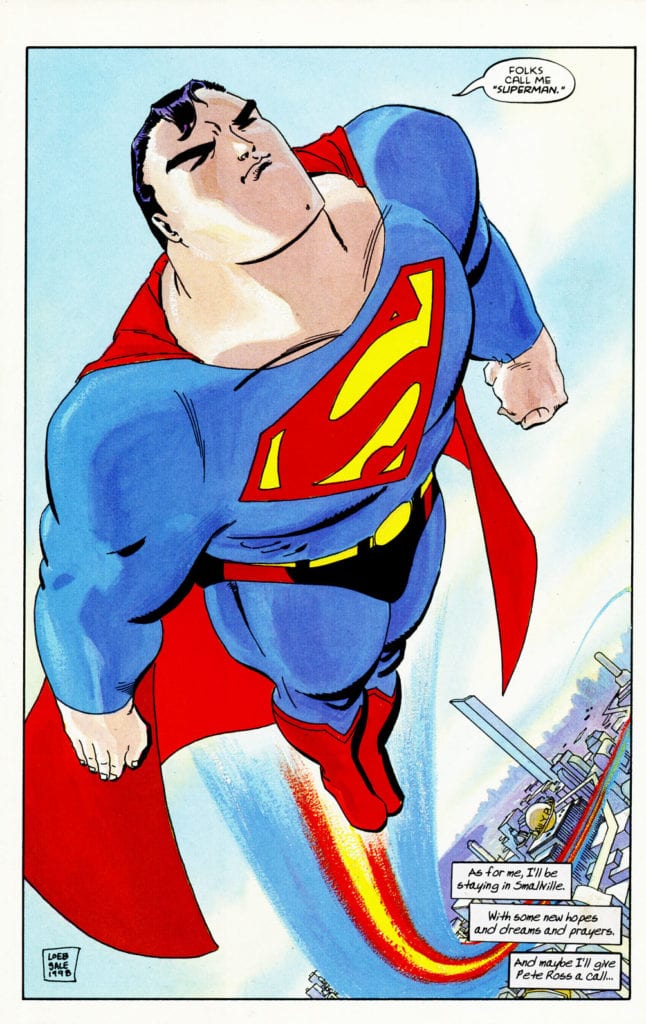
Towards the end of 2019 a new writer and artist took over duties on DC Comics Supergirl. Jody House and Rachael Stott have a track record of producing wonderful work, especially together, so the scene was set for a fun, intensive run for the Last Daughter of Krypton.

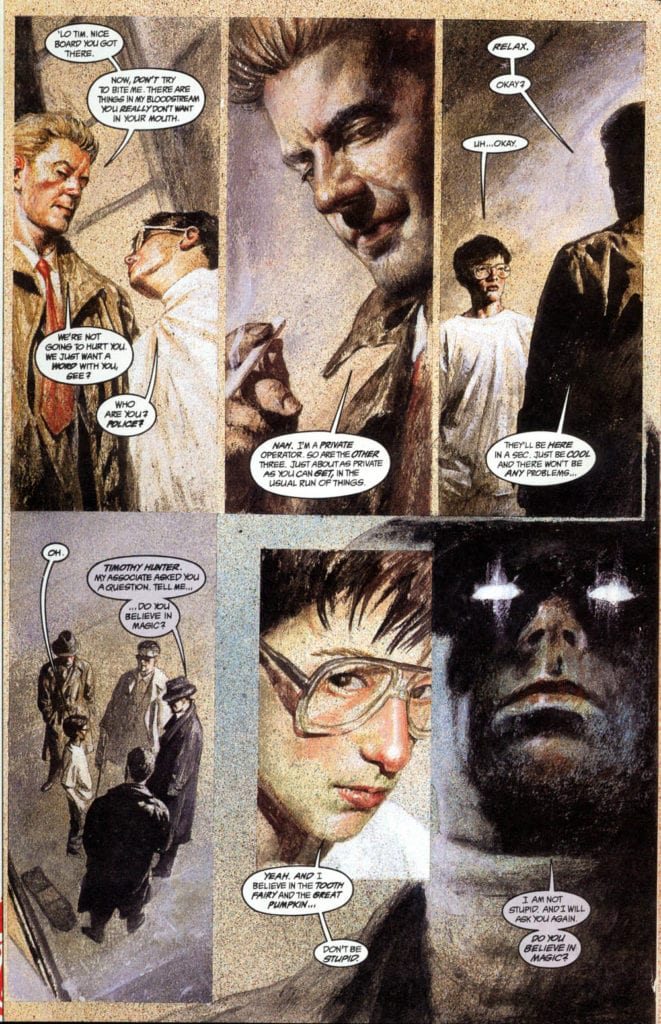
When their story finally started in issue 37 it wasn’t the spectacular I expected. In fact, I would go as far as saying it was a disappointment, although not necessarily because of the work that Houser and Stott were doing. The plot revolves around an ongoing DC Universe event and has Kara infested with the Batman-Who-Laughs virus. The following four part story entitled I’m The Bad Guy pits Supergirl against a number of other DC heroes in a less than original story.

The narrative takes four full issues of Kara fighting for her to realise that the virus is in control of her and then the conclusion takes place in a separate comic. On the surface it was unimaginative despite some visual flair and witty scripting.

Combat Colin
Combat Colin #1 cover Credit: Lew Stringer

All Change

But then lockdown. The international pandemic has affected everyone and changed day to day living. One of the outcomes, personally, is that I am re-reading a lot of comics that are kicking around in my home. It was while reading one, random comic, that I gleaned a new perspective on the Houser/Stott Supergirl run. Something in the UK strip comic Combat Colin by Lew Stringer made me re-assess how I should have been reading Supergirl.

In an essay published in Critical Approaches to Comics published by Routledge in 2012, Joseph Witek discusses modes of comics. He posits that there are two traditions in visual representation for modern comics; The Cartoon Mode and the Naturalistic Mode. The former deals in caricature, expressiveness over realism, and the interpretation of the world through exaggeration. The later creates a ‘realistic’ world for the characters to live in with some form of grounding to explain how the world works. This often takes the form of realistic artwork with complex and detailed scenery or characters.

One is often seen as more serious than the other but this is a misnomer as comics fitting under The Cartoon Mode often deal with complex matters of politics, relationships, sexuality, and violence. The Underground Comix scene had a large influence on the ‘darkness’ that took over superhero comics in the late 80’s because the instigators of that movement, people like Alan Moore and Frank Miller, came out of an environment rich with self published comics and pulp noir novels.

But what has this got to do with Supergirl and who is Combat Colin?

Combat Colin Strip
Example of a Combat Colin Strip Credit: Lew Stringer

Everyman Colin

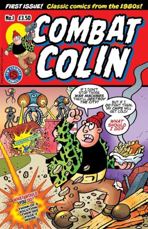
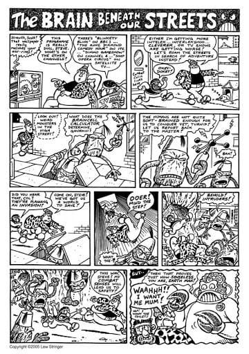
If you grew up in the UK reading Transformers or Action Force comics you will know and love Combat Colin. For those who didn’t, he is a down to Earth street hero who has some super strength and a sidekick named Steve. The character was created, written and drawn by Lew Stringer. At first in a single row strip before blooming into a half page, or even full page, gag comic.

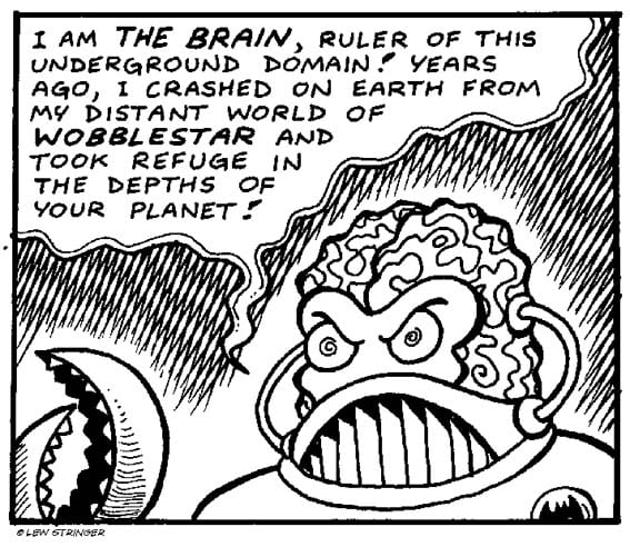
The character and the strip is charming and funny, even after 30 plus years since its creation. Although there isn’t much continuity within the stories, occasionally a number of strips would build up to form a larger story. One such story introduced an arch nemesis for Colin in the form of The Brain; a super intelligent alien and ruler of an underground domain. The references to Superhero comics, such as the Fantastic Four, are obvious but there is a lot more going on in these short strips.

Stringer uses Combat Colin to parody mainstream comics, riffing off of established characters and tropes to create absurd situations. However, the reading can be taken a step further. Stringer uses the Cartoon Mode of comic representation to poke fun at the society he lives in. In The Brain story, for example, the masterminds plan is to ultimately control Humans by turning their brains to custard via boring television shows. Through the control of programming, The Brain is able to fill the homes of the UK with endless drivel like Game Shows and Soap Operas.

This comical dig at the state of British television highlighted a growing concern that the dumbing down of television would lead to an less engaged audience. It is clear from the comic strip that Stringer believed this was possible and depicted it as a travesty that must be stopped. Stringer’s fight wasn’t against television but a lack of imagination, something that he has in spades.

Combat Colin's The Brain
The Brain from Combat Colin Credit: Lew Stringer

Complex Characters

The other aspect of the comics that I noticed more with a re-read is the complex personalities of the characters. Initially they seem like two dimensional caricatures with a boldness that matches the artwork. This was perfectly acceptable to the young teen version of myself as I read through the Transformers comics, but in retrospect I can see Stringer working in layers.

The heroes have one goal and are determined to save the day at all costs: true hero qualities. But they are also flawed. They wear their fear openly in their reactions, “I want my mummy,” screams Colin when he comes face to face with a grotesque alien creature. His bravado melts away as his sidekick turns in an attempt to escape the panel. Colin reacts in a way that most people would react, not like the Superheroes in the comics that Stringer is sending up, but with realistic panic and desperation.

The villains of his story are equally interesting. The Brain has as many facets to his personality as Colin or Steve does. He is offended by being called a monster, a reference to the creature from Frankenstein, and he has created life and wishes to care for it. He also has a backstory that is familiar to any readers of DC comics, as it closely resembles that of Superman and Supergirl. Lost in space, separated from his own kind and marooned on a world that could not accept him.

Supergirl Interior Art
Supergirl fights in an empty landscape Credit: DC Comics

And Now Supergirl

It wasn’t, however, The Brains backstory that made me link Combat Colin with the current run of Supergirl. Instead, it was the style in which the story was being told. To compare the two you would instinctively find little similarity between them and you would definitely not say that they are working to the same modes of storytelling. As a general rule DC comics would fit Witek’s Naturalistic Mode perfectly by creating a realistic world for their superheroes to live in. The artists more often than not strive for realism, and there appears to be a house style to this effect.

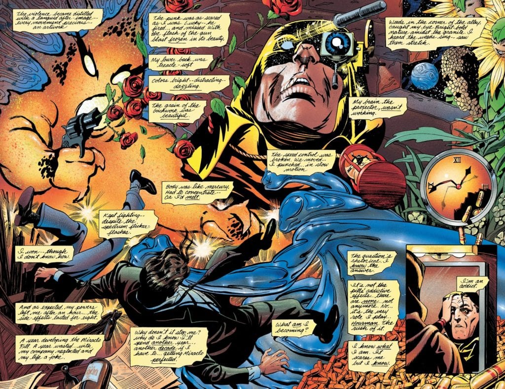
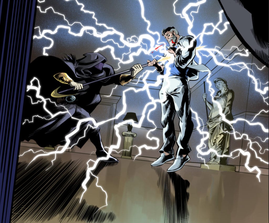
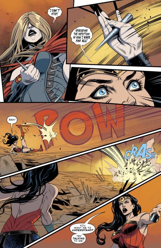
In issue 37, the first of Stott’s Supergirl run, it would appear that the artist is continuing this approach to the comic. The characters are fully realised and the scenery is highly detailed giving the reader a clear sense of their surroundings. However, as the story continues into part 2 and most notably in parts 3 and 4, the style begins to change.

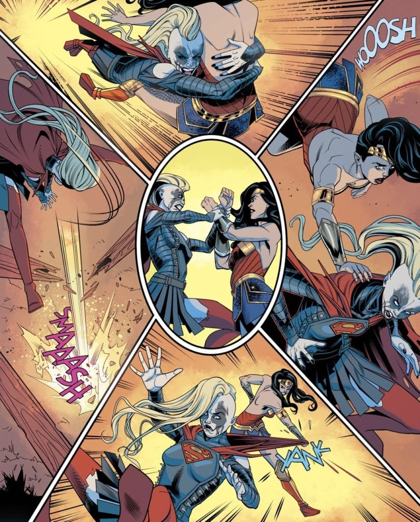
Stott does not alter her rendering of the characters very much although they do seem to become more stylised, more like caricatures of the superheroes they represent. Instead she takes a leaf out of The Cartoon Mode of representation and reduces the scenery. The backgrounds become empty landscapes with the occasional building required for plot reasons. The sense of location is lost as the focus shifts to the concepts of the characters fighting.

The emphasis of issues 39 and 40 is not the DC Universe; it is not the larger narrative beyond these pages in previous or future issues; it is not even the fight that is happening between Supergirl and Wonder Woman. Houser and Stott want the reader to focus entirely on the struggle that is happening within Supergirl, the fight between Kara and the Batman-who-laughs virus. The reality of the world slips away as the focus on personality takes over.

Just as the Combat Colin strips contain layers of character within simple, broad strokes of art, so too does Stott’s Supergirl. The physical fight becomes ridiculous, as illustrated by the ever changing ‘metal’ costume that Supergirl wears. The interaction between Wonder Woman and Supergirl becomes a parody of superhero punch ups. Through it all, however, is the psychological battle, the hinted at struggle, and the depths that the reader has to find for themselves.

Supergirl interior art
A Parody of it’s own storytelling in Supergirl Credit:DC Comic

Conclusion

By reading through an event story that features in a number of different titles, it is easy to become lazy in your reading. Especially if that event is in one of the two big publishers because a certain house style is expected and therefore you automatically adjust yourself to a particular frame of reading. This can cause issues if something a bit different is thrown into the mix.

With Houser and Stott’s Supergirl an element of realism, grounded in the DC Universe is to be expected because, as I have shown, the usual  approach to these comics is Witek’s Naturalistic Mode. However, this version of Kara’s adventures leans more heavily into a Cartoon Mode, taking a more metaphysical route into the narrative. Stott chooses to forgo the complex visuals required to tell a realistic story and creates an abstract setting for larger than life characters. Reading the story through from issue 37 to issue 40, you can clearly see that the art style changes, dropping further away from reality as Kara’s struggle intensifies. The entire story-line is a visual metaphor for Supergirl’s journey while infected and, just as the story becomes more ridiculous, the art adopts an expressionistic style.

The lesson here, and one that I have learned, is not to judge a comic by its predecessors or current partners. The scope, even within a DC Comics event, for different styles and modes of storytelling is massive. Sometimes it is important to look past expectations and to embrace these different modes of storytelling.

I may still have some problems with the narrative of the current run of Supergirl but by applying a different mindset to my reading I can appreciate much more what the creators are doing.

Are there any comics you are reading that you are seeing in a new light? Let us know in the comments below.

Monkeys Fighting Robots Youtube

SUPERMAN FOR ALL SEASONS – A Boy Becomes A Man

To an outsider, Superman is not an easy character to like. He’s an all-powerful boy scout with a stupid disguise and a cheesy suit. Even more ardent superhero and DC Comics fans can find it hard to find a Superman tale that makes the Man of Steel more appealing. It takes a specific kind of creator to pinpoint and flesh out the characteristics that make this icon arguably the greatest superhero of all time. The acclaimed creative duo of writer Jeph Loeb and artist Tim Sale accomplished such a feat by scaling back the “super” and just focusing on the man.  Superman For All Seasons is the story of a boy growing up to be a man, and the responsibilities that come with that. It is an intimate and timeless tale that any person of any age could enjoy and relate to, that just so happens to be about a superhero who grew up on a farm.

Writing & Plot

Superman For All Seasons watches Clark Kent as he struggles to define himself and leaves his family’s farm to become the hero of Metropolis, all the while maintaining the values and manner instilled in him by his humble beginnings. The four issues that make up this miniseries are each told from the perspective of a different person in Clark’s life: his father, Jonathan Kent, his co-worker and future lover Lois Lane, his arch-nemesis Lex Luthor, and his high school sweetheart Lana Lang. The series takes place over the course of a year, with each issue representing a season. The four issues each pose a different internal or external conflict that a young Superman has to evolve past. Despite the fact that the comic is told from the perspective of other people, it is still clearly introspective on Kal-El. In these pages, the boy from Smallville decides to become a hero, learns what responsibilities that entails, starts to walk back his decision, and then is reminded by those who raised him as to why he does what he does.

Writer Jeph Loeb has proven himself tour de force in the comics world with the likes of  Batman: The Long Halloween and  Daredevil Yellow. What makes  For All Seasons such a special piece in his bibliography is the small scale heart and effectiveness of the style used in this miniseries. The majority of this comic is written in internal narration from the four chosen characters in Superman’s life, and they each bring a new perspective and tone; the aging farmer who raised his son the best he could, the dedicated reporter in awe of her newest subject, the envious and insecure genius targeting his newest rival, and a girl trying to understand the boy she once loved. Loeb gets into the minds and hearts of these characters with an intimacy and simplicity seldom seen in any medium, making the comic an emotional joy to read. The events in the comic are the perfect examination of Superman’s dedication as well, as he saves people and communities in Metropolitan disasters and small-town mishaps alike. Most importantly of all, Loeb succeeds as a writer who understands what makes The Man of Steel a great character.

Art Direction

Tim Sale’s signature unorthodox visual style may seem an odd fit for a Superman comic to anyone coming away from his work on The Long Halloween or  Challengers of the Unknown. However, Sale manages to curb the eccentricities in his style for  For All Seasons to accommodate a simpler tale. The result is one of the most charming aesthetics in all of comics. Sale’s interpretation of Supes is one of the most recognizable in the character’s history, towering over his peers with a muscular sort of “pudginess” that makes the character especially endearing. All of the character detail is down to earth and easy to interface with, as character expressions are nailed down in lieu with the comic’s introspective nature. Sale’s vision of Smallville may be the best ever drawn, as its beauty in all four seasons is reminiscent of a Rockwell painting. While Metropolis looks as fine as ever, it can’t compete with the sunrises and sunsets, the snowy fields, or the quaint Mainstreet views of the Kent family hometown. This is some of Sale’s finest work, and it’s all out of artistic finesse.

Jeph Loeb and Tim Sale’s  Superman For All Seasons is the sort of comic that should be thrust into the hands of anyone who says they don’t like Superman. It’s a quiet, quaint, and simplistic tale of a boy from Kansas who takes off for the big city, only to need to be reminded as to why he’s made the decisions he has. Jeph Loeb’s idea to frame Supes in the viewpoint of four different people in his life is an intimate and varied touch unique within any medium. Tim Sale’s art captures characters and scenery in a quiet beauty rarely seen in comics. I mentioned earlier that  For All Seasons succeeds because Loeb understands what makes Superman a great character. What exactly is that, though? Well, Superman succeeds as a character because of the impossibility of his choices. An alien crashes into a farm to be raised by a kind pair of small-town farmers. The values instilled into the child stay with him for the rest of his life even as he becomes impossibly powerful. Kal-El/Clark Kent is a man with all the power in the universe, who decides to simply be good. This is why Superman is great.


Monkeys Fighting Robots Youtube

INTERVIEW: ‘Get Out’ Composer Michael Abels Scores HBO’s ‘Bad Education’

Michael Abels is the composer behind Jordan Peele’s Get Out and Us, who recently scored Bad Education, an HBO film directed by Cory Finley (Thoroughbreds) and stars Hugh Jackman as the head of a proud education system that’s built on a swamp of corruption.

Bad Education director Cory Finley grounds the narrative in the true story of a corrupt school administration. The realism is thanks to writer Mike Makowsky who experienced these events unfold in real-time as a middle-schooler. Jackman is Dr. Frank A. Tassone, the head administrator of the Roslyn school system, whose veneer shimmers with that of a forthright educator. Allison Janney plays Pamela “Pam” Gluckin, who handles the finances for the proud and successful school system. However, beneath it all, just under the surface of hard-working educators on the verge of becoming the best around, is a cauldron of chaos.

PopAxiom discussed a life-long journey in making music music, working with Jordan Peele, and the contrasting styles of Bad Education with composer Michael Abels.

See It Through

Michael began creating music at an early age. “I was always interested in music. When I was eight, I was trying to write music. I figured out the first part, and then I couldn’t figure out what came after that. When I was 13, I managed to stick with a piece and finish it.”

Michael explains a bit about the process of becoming a creative professional. “Anyone can have an idea, but then what happens? What are you doing to do with it and where are you going to go? It’s like telling a story.”

For Michael, these stories should have a specific impact. “I’ve always thought of music as taking a listener on a journey; it’s just that they get to decide what that journey means to them because it’s not written in words.” Michael continues, “Any good piece of music takes you on a journey and being able to figure out all the different stages of that is important to being a good story.”

There was never a question about becoming a musician and composer. “I always knew. I love a good puzzle. To me, writing music is this really great puzzle where you get to decide how the pieces fit together.”

Michael further explains, “The bonus of that is you fit them together, and it touches people’s emotions in a way that no other art does. So, on the one hand, it’s very ‘left brain,’ but where it touches you is very ‘right-brain’ in that way that it makes you feel things that can’t be put into words.”

It was a matter of that first burst of confidence that propelled Michael into the career he enjoys today. “Once I figured out that I could see it through I said ‘this is what I gotta do.’”

Road To Film Scoring

After high school and college, Michael spent time, “… scoring student films … TV and radio commercials, but I didn’t really get any traction in the industry.”

Instead, Michael found another area eager to showcase his talents. “I found more receptive ears in the concert music world, so I wrote a lot of concert music and was teaching music.”

Michael’s big break into cinematic scoring came from Get Out and Us director Jordan Peel. “… I got my first real entry into full feature film scoring.”

How exactly did Peele come to hear Michael’s work? “He heard a concert piece of mine on YouTube.” Michael shares his thoughts about working with the acclaimed filmmaker. “He’s seen every horror and suspense film ever made. Also, he knows their scores and understands why the scores work in the film. Peele is a big fan of composers like Penderecki … 20th-century concert composers. I think he heard in my work that I was familiar with that sonic palette and those particular colors would match the world he was trying to create in his films.”

Bad Education-HBO-film

About Bad Education

Like Peele’s films, Bad Education is an expertly crafted story. The film’s narrative is patient and poignant, and the music often serves as compelling interludes between dramatic sequences that consistently raise the stakes. “On Bad Education, I got to use a much more traditional, old-school classical sound to depict the school and it’s stuffy, high achievement at any cost world.”

The intro to Bad Education features Hugh Jackman’s Frank receiving adoration for his work as an administrator. “Cory wanted to make sure when we meet Frank on stage, and the people are cheering, he wanted viewers to have that suspicion that this is not where we’re going to end.”

Bad Education is like watching a car wreck in slow motion. “He’s got this great sense of human morality versus what’s socially acceptable. It’s kind of where Cory lives. It’s always the edge of dark comedy and tragedy.”

Michael shares more about the goal of Bad Education’s score. “Cory loves for the music to really play. He loves music to be central in a scene, but he knows where there needs to be silence. There aren’t many cues in Bad Education compared to other kinds of films, but each one is really crucial to the scene that it’s in.”

Indeed, the music is powerful when present, playing over static images that become like well-dressed ghosts and harbingers of the chaos to come in the film. “Cory loves doing sequences like that.”

Hugh Jackman-Allison Janney-HBO

Contrasting Styles

In one sequence that’s a bit more traditional, Michael uses slowly unraveling minimalism as we follow Rachel, the high school reporter through the archives room. She ultimately uncovered the story in real life. “It’s very simple. In some ways, it’s the opposite of classical music or concert music, which can be very full-blown.”

Michael explains the use of contrasting styles to elevate the narrative. “The idea of that music, it’s the beginning of the unraveling of Frank’s elaborate world. It starts with a drip. We wanted the audience to know that ‘this is the thing,’ but where’s it going? Little drips that add up and before long it’s a puddle and then the dam breaks. That’s where that idea came from.”

The juxtaposition between styles is present through Bad Education. The music is powerful, bombastic but also pared down and simplistic. “Those different styles of music are separate [in the film]. Until there’s one cue near the end, Frank’s addressing the mob of parents in the auditorium, that’s the only cue where both styles of music meet. The dam is broken.”

https://www.youtube.com/watch?v=ZVffM3OZkH8

Get the score for Bad Education!

Wrapping Up

Michael admits his influences are many and in a constant state of flux. But he mentions two key composers who are part of his creative DNA. “Count Basie has to be one of them and Prokofiev.”

What remake would Michael love to do if it ever happened? “Vertigo.”

Bad Education comes out on HBO on April 25th, 2020. So, what’s next for Michael? “I’ve got a film I did for Netflix coming up on May 1st. It’s called All Day And A Night. It stars Ashton Sanders (Moonlight), and it’s directed and written by Joe Robert Cole, who co-wrote Black Panther.”

Is Bad Education on your watch-list?

Thanks to Michael Abels and Costa Communications
for making this interview possible.

Want to read more interviews like this? CLICK HERE.

Monkeys Fighting Robots Youtube

ALL-STAR SUPERMAN : The Greatest Clark Kent Story Ever Told

All Star Superman Cover

Superman Lives

If there’s anyone who has the potential to go on bizarre comic adventures, it’s Superman. He’s an all-powerful hero that can travel to dimensions and planets beyond our imagination. This gives famous Scottish comic writer Grant Morrison the perfect hero for a story. In the early 2000s, DC wanted to create a new imprint called All-Star that would get to the core of the heroes we’ve grown to love. Grant Morrison was tapped to make one for the Man of Steel, and thus All-Star Superman was created. It has been 15 years since this series’ first issue was released, and many still find this tale today. Can it stand the test of time as one of the greatest stories for the Man of Steel?

All Star Superman Cover

**Some Spoilers Below**


Story:

During an experiment involving orbiting the sun, Dr. Leo Quintum and his team are attacked by Parasite at the behest of Lex Luthor. Superman flies in and saves the scientists, but at a cost. When they return to Earth, Quintum analyzes the Man of Steel and learns his cells have been overcharged. Superman has become more powerful than ever, but he only has a year to live. With that in mind, Clark begins to settle his affairs to prepare for a world without Superman. His first thing on the To-Do list is to reveal his secret identity to Lois Lane.

All Star Superman 1

This story stands out for a variety of different reasons for different readers. Some might find the oddball scenarios appealing, such as Clark’s escape from the Bizarro world. Some might like the action sequences between Superman and Lex Luthor epic. This reviewer, however, knows the reason this story stands out is the main character himself. In this story, we don’t see him as just Kal-El of Krypton, protector of Earth, or as Clark Kent, the superhero of Metropolis. We see him as a cross between the two. We get the humanity of Clark Kent, who has accepted his imminent death, as he puts his affairs in order while still facing the out of this world threats as Kal-El.

All-Star Superman 2

In most stories with this plot, the hero would go through hoops to save their lives. Here, Superman is at peace with all of this as he ties up loose ends in his life. For a comic that had invasions, tests of strength and wit, as well as a time travel plot at one point, it felt strangely relaxing. The action was epic, with iconic scenes of Superman facing off against giant monsters and twisted Kryptonians, but that was nothing compared to the slow moments. Seeing Clark prepare for the end is heartbreaking yet inspirational.

Art:

The illustrator for this story, Frank Quitely, is a frequent collaborator with Morrison. His unique style usually compliments the bizarre tales that Morrison comes up with. The problem is that it works only part of the time. Frank’s design on how to make Clark and Superman two different people worked well. That said, style doesn’t exactly translate well to the more common aspects. The people who work at the Daily Planet have a strange, clay-like texture to them. It’s not terrible in any aspect, but it’s just not this reviewer’s cup of tea.

Conclusion:

All-Star Superman is the perfect ending to the Man of Steel. If there were a day where Superman comics would need to stop publishing, this tale would be the final story. It gives us the story of the Man of Steel as both a hero and a man. We see him face off against the greatest threats while coming to terms with his mortality. It’s a tale that can inspire those to try to become greater than one’s self. We can all be the good man that Clark Kent is.


Monkeys Fighting Robots Youtube

JSA: THE GOLDEN AGE is Really About Superheroes and Their Costumes

Comics have historically presented a complex relationship between superheroes and their costumes. The Amazing Spider-Man #50 famously sees Peter Park dump his costume in a trash can, leaving his life of crime-fighting symbolically behind. In Watchmen, Nite Owl II apparently can’t maintain an erection unless he’s in his cape and cowl. Costumes clearly have a range of influence on their owners. They can be a burden or a drug. Writer James Robinson and artist Paul Smith center their graphic novel JSA: The Golden Age around this influence.

The story takes place at the end of World War II. Various things kept the capes out of the war, things that were beyond their control. Their costumes, which once symbolized heroism, became the things that barred them from entering the fray. At the point that we join this story, the war has ended and the heroes have gone into retirement. Maybe out of embarrassment. Some went mad. And so JSA: The Golden Age is a graphic novel with very few costumes. Except in stock footage, where we learn of the “Golden Age” that makes the characters’ present-day feel so inadequate.

A Better Self

JSA: The Golden Age Robinson

Smith and Ory, don’t shy away from depicting the costumes vividly and romanticly when they’re seen. In old photographs and flashbacks, the heroes look downright majestic. But their present-day counterparts are bedraggled. It hurts to call them pathetic, but more because you know that’s the perfect word for them. Once the flashbacks and catch-ups are over, the costumes come off and for most of the comic, they stay off. The comic itself almost seems to have an aversion to superhero costumes. Flipping through it, you’d be hard-pressed to know it was a superhero comic at all.

Our narrator, Johnny Chambers is the secret identity of the speedster known as Johnny Quick. But we mostly know him in his civilian garb. He spends weeks working on the documentary which frames our story, a documentary called “The Golden Age.” His superhero alter ego could splice the whole thing together in minutes. But becoming Johnny Quick again means putting on the red spandex, and that’s something Chambers refuses to do. His costume, to him, represents his best self. So if he’s not his best, he doesn’t deserve the ol’ red and yellow.

Trauma

Other characters, like Starman, didn’t willfully give up their superhero careers. Instead, the pressures of war and his part in it, drove him mad. Ted Knight, Starman, is a shadow of his former self. He can barely hold conversations with other characters before losing his concentration. He has become trapped by the past, quite literally. His costume represents his own inadequacies and the things that brought him to an insane asylum. The Starman costume is a physical manifestation of his mistakes.

Paul Kirk, the Manhunter, has a similar trajectory in the graphic novel. He is haunted by dreams. Nightmares in which he wears his costume, like a claustrophobic skin that keeps him trapped. We learn later that Kirk’s nightmares are a result of horrors he witnessed while fighting crime. And so his costume has become a kind of trigger for his paranoia and fear. It was beneath that mask that he saw things he can never unsee. Robinson hides secrets of the past in Kirk’s nightmares, adding to the legitimacy of Kirk’s trauma.

Addiction

Costumes

One very notable exception to the costume ban is Rex Tyler, the hero known as Hourman. Rex stands out like a sore thumb. While everyone else hung their cape up a long time ago, he’s still swinging his fists in a bright yellow cape. It’s not that he hasn’t gotten the memo. It’s that he is addicted to the lifestyle and refuses to give it up.

Rex gets his powers from a drug called Miraclo. He becomes super-powered for an hour after taking a Miraclo pill. His addiction to the drug and his addiction to the adrenaline of the lifestyle is immediately concerning. We get the sense that he doesn’t take the dangers seriously. Through Rex, Robinson and Smith put those dangers in perspective. The costumes these heroes wear are given an air of lunacy.

Naivety

JSA: Golden Age Robinson costume

Green Lantern, Alan Scott, is perhaps the most grounded character in the story. He seems to have adjusted the best to the new times they live in. Yet the new world Alan lives in is a world that is vastly more complicated. Robinson discusses the Red Scare through Alan’s character. As the leader of a newspaper, Alan is asked to throw his writers under the bus to spare himself scrutiny.

Rooted in the present, unlike many of the other heroes, Alan fights the good fight in his civilian persona. He sees the time that he flew around, fighting crime in a purple mask, not as a simpler time, but as a more naive time. A time when the world seemed simple enough that you could punch it to make it right. With the House Committee on UnAmerican Activities breathing down his neck, he knows the world isn’t that simple. Nor has it ever been. He uncomfortably twiddles with the green ring on his finger. It’s both part of his costume and the source of his power. To him, it represents how simple-minded he once was.

Counterfeit

JSA: The Golden Age Robinson Dynaman in his new costume

A common use of costumes in the superhero franchise is as a kind of award. When the heroes have passed their initial trials, their rites of passage, they earn the right to wear a costume. And so in The Golden Age, when ex-hero Dan Dunbar is taken in by Tex Thompson, the Americommando, and is given a new suit, something feels off. The cameras and the speeches before a fawning public, all adding to Thompson’s campaign for president, makes the transformation feel disingenuous.

The creative team removes the trials Dunbar must face to earn his new duds. Not only is the transformation mysterious, with hints of the sinister, but it feels entirely unearned. We immediately distrust the boy in the shiny new suit. More so, we distrust his puppeteer. When we’ve seen a hero struggle before getting their superhero identity, we trust them. If we don’t see that, we’re suspicious.

A New Beginning

new costumes

Finally, The Golden Age ends with an ushering in of the new. With the Silver Age, these sparkling new costumes speak of a new beginning. Maybe these heroes won’t make the same mistakes, maybe they will. Either way, it’s a fresh start. As the series comes to a close, the heroes tip their hats to those who are taking their place. They’re relieved of their watch. The torch passes on.

With the creative team’s ending to the graphic novel, the costumes which have at times represented failure, naivety, trauma, addiction or redemption, are given less weight. They’re lost in an influx of new threads. As new costumed heroes come into play, the Golden Age heroes are less worried about their roles. They are no longer the only ones with the responsibility; it is now a shared burden.


Costumes have historically carried symbolic weight in the superhero franchise. And in a graphic novel with few costumes to speak of, they carry more weight than ever. Robinson and Smith explore in JSA: The Golden Age why a hero’s costume casts such a large shadow. Ultimately, this theme has lived on because it resonates. We all suffer from the reputations we’ve created or the responsibilities we’ve taken on. Through JSA: The Golden Age, Robinson shows us why the Green Lantern can relate.

Monkeys Fighting Robots Youtube

Longbox Legends: How THE BOOKS OF MAGIC #1 (1990) Revolutionized The Hero’s Journey

We had the pleasure of revisiting legendary writer Neil Gaiman’s work THE BOOKS OF MAGIC #1 recently, and we want to share some of its best features. After the comic book world had time to digest the unique story within, the landmark series set the bar for what a good comic could be throughout the nineties. And as fans know, few books came close to matching the originally and sheer breadth of Gaiman’s storytelling. This tale in particular weaves together elements of the traditional hero’s journey formula, but refashions it into something far greater.

Story

Timothy Hunter, the star of this story, isn’t your typical hero. In fact, one might hesitate to call him a hero at all. Readers are introduced to the 13-year-old on an abandoned London street, only to notice a group of men following him just seconds later. Things progress even faster and soon one of the strangers, Dr. Occult, asks him if he would like to enter the world of magic.

This is the place in most heroes’ journeys in which there comes a period of deliberation. And indeed there is for Tim. But unlike those popular tales of heroes coming from poor circumstances, Tim is relatable to the average reader in the sense that he has plenty to lose. He is a relatively well-off boy living a normal life. But when pressed, the teen thinks to himself, “If I could do that stuff they’d have to treat me different. That’s for certain. I wouldn’t have to take any crap from anybody. Not ever.”

In a masterful stroke of narrative brilliance, Gaiman’s hero forgoes all consideration of the dangers of magic, accepting Occult’s offer solely for self-centered purposes. And just like that, Tim’s reality is changed forever.

Tim (and readers) are whisked away into the great unknown in a moment of exhilarating fantasy made possible by a brilliant storyteller like Gaiman. Knowing little of the character, we are nonetheless drawn into the adventure with him through his uncanny relatability.

Artwork

John Bolton’s penciling, ink work, and coloring is the perfect visual match for Gaimain’s dark fantasy storytelling. The boundaries between Tim, Occult, and the other characters seem to blend in with their surroundings, representing the nebulous nature of the magical realm itself. Adding to this effect are the dark hues mixed with those that are unsettling bright. These panels are also covered with a grainy texture covering everything to complete the tone. What’s more, Todd Klein’s lettering fits in well with the illustrations; they’re strategically placed so as not to distract readers from the scenes’ grandeur.

Conclusion

THE BOOKS OF MAGIC #1 opened up a whole new world of magic. It added many new features to the DC/Vertigo landscape, and its consistently referenced as one of the greatest dark fantasy comics of all time.

What was your favorite part of this issue? Let us know in the comments below!

Monkeys Fighting Robots Youtube

Longbox Legends: BATMAN: BROKEN CITY – Noir Kept Local

Back in 2004, the team behind the award-winning Vertigo series, 100 Bullets put their noir spin on the Caped Crusader in the five-part Batman: Broken City.

Following the 12-issue, Bat-Epic Batman: Hush – Brian Azzarello and Eduardo Risso teamed up with colorist Patricia Mulvihill and letterer Clem Robins to tell a more grounded tale in Batman #620-625. Instead of having a huge cast, the team kept it centered in Gotham. As great as Batman is in teams and world-ending threats, the team took him back to his small roots. Solving the case of the murdered Elizabeth Lupo, Batman focuses more on his detective skills. Batman: Broken City (hereafter Broken City) uses Azzarello’s and Risso’s noir background to dramatic effect.

Gotham - Brian Azzarello, Eduardo Risso, Patricia Mulvihill
Gotham – Brian Azzarello, Eduardo Risso, Patricia Mulvihill

BROKEN CITY MURDER MYSTERY

Broken City begins with Batman investigating a murder by questioning Killer Croc. From there, Batman follows a constant trail of crumbs to figure out who killed Elizabeth Lupo. But, Gotham never sleeps, nor does violence. During his chase with Lupo’s brother Angel Lupo, the suspect kills a mother and father out with their son, mirroring the murder of the Waynes. This senseless killing furthers his reasons for figuring out what all is transpiring. Nonetheless, Broken City is full of tales of broken people in a broken Gotham.

This darkness is where Azzarello’s writing knocks it out of the park. Having an excellent noir resume, he can write Batman as a detective and not a hero who fights world-ending threats. Yes, we all may love Batman fighting Darkseid, but Batman works best in a contained ground-level story. Azzarello nails this by keeping the story tight, fast when needed, and no earth ending threat. Azzarello can write Batman as a detective that is hard-pressed to learn the truth. The plot itself unfolds amazingly, yet Batman’s characterization is the scene-stealer.

Ka-boom – Brian Azzarello, Eduardo Risso, Patricia Mulvihill, Clem Robins

A BROKEN GOTHAM

Although Risso’s name has only been attached to a few Batman issues (usually teamed with Azzarello), his art matches Gotham perfectly. Risso’s style is rough in all the right places that give Batman, Gotham, and his rogues a certain charm. Nonetheless, that’s not the only significant aspect of Risso’s art. Risso can nail so many things that make Broken City interesting. At times he’ll show the gruesome violence in Gotham, yet other times he’ll hide it behind onamonapias and other objects. Another factor is fantastic pacing. During some scenes, Risso will have multiple small panels that slowly zoom in/out of character to help the pace, and set the mood.

But, one huge area that helps his art are the colors.

Ouch – Brian Azzarello, Eduardo Risso, Patricia Mulvihill, Clem Robins
Whak – Brian Azzarello, Eduardo Risso, Patricia Mulvihill, Clem Robins

Mulvihill’s colors go hand in hand to Risso’s art. Funny enough, Mulvihill joined Azzarello and Risso for issues 15 through 100 of 100 Bullets. So, her teaming up with the duo makes absolute sense. Mulvihill’s colors can seamlessly change to benefit the tone. On one page, she can have a mix of darker greys for Gotham, and the bottom shades of light blue for Bruce’s house. Then on the next page at a strip club, her colors will change to bright and poppy. Yet, one of the more fascinating moments is when her colors and Risso’s art mirrors Sin City.

Sometimes Mulvihill will drop colors and either go with silhouettes or heavily draped in shadows. When these minimalist moments happen, they remind you of Sin City for all the best reasons. Batman is a creature of shadows, which the team thoroughly understands.

Brian Azzarello, Eduardo Risso, Patricia Mulvihill, Clem Robins
Shadows – Brian Azzarello, Eduardo Risso, Patricia Mulvihill, Clem Robins

THE COLOR OF DEATH

Narration box colors may not be something you think about often, yet it’s an element that is quite important. After reading another Batman story recently, one thing that stood out was how badly the narration boxes colors did not match the theme or other colors. Luckily Robins lettering works wonders in Broken City. The narration boxes are a mix of grey and sometimes a lighter blue. These match the plot perfectly and never takes you out of reading.

A great example is down below. Robins’ narration box colors blend in, not too much, but just enough to where it doesn’t ruin the panel. But, compare that to the “CONTINUED” box that is bright yellow. It pops off the page and grabs your attention, instead of letting you take in the art and story.

Brian Azzarello, Eduardo Risso, Patricia Mulvihill, Clem Robins

BROKEN CITY/ANOTHER DAY IN GOTHAM

Broken City is impressive not only for its noir setting, lingo, vibe, and art but the humor as well. Azzarello never forces humor but adds it in to help build up the story. Nonetheless, the team behind Broken City makes so much sense for a Batman story; it’s a tragedy they’ve only worked on a few in the past years. The fact that the team can craft such a great noir, small scale story that has a ton of readability is a feat. If you’re in the mood for a noir tale, give this storyline a chance, or any other comic the team has worked on.

We leave on an exchange that had me spit my coffee out.

Well, hello Batman. Broken City
I wish Batman would pinch me – Brian Azzarello, Eduardo Risso, Patricia Mulvihill, Clem Robins
Monkeys Fighting Robots Youtube

FALLEN is Modern Mythology Unafraid to Delve Into the Deities’ Dirt

If one were to combine the biopic Party Monster with Neil Gaiman’s American Gods, the result would look like Fallen, a Kickstarter-produced comic created and written by Matt Ringel and drawn by Henry Ponciano. Several gods from the pantheons of the Greek, Norse, Shinto, and Aztec mythologies are banished to Earth and cut off from their kin while retaining their power and immortality.

The first issue introduces us to some of the now-earthbound Olympians, including Zeus, Athena, and Apollo, and a contingent from Asgard, such as Loki, Thor, and Odin. For our divine friends, it is on Earth as it was in the heavens, i.e., spending much of their time drinking, womanizing, and collecting wealth. Here, though, it’s 1986 New York City, and they’re celestial mobsters running nightclubs and the like. So, same stuff, different century.

One way the gods keep power is imparting some of their might and immortality to a human ward. This is done as a condition of their exile is, they can no longer directly affect the world of people. The wards can step in and influence the rabble on the gods’ behalf, so the gods can still be, well, gods. This all changes when Zeus is murdered in his penthouse. His right-hand man, Casper Clay, is now on the hunt for the killer.

(Bad news: Zeus is dead. Good news: Hercules isn’t on the hook for a Father’s Day gift.)

As I’ve said here before, I love indie comics, especially ones that have been crowd-funded. Even books not at the level of a Big 2 product are still pieces of art requiring a village to create. It also represents a level of courage, putting your vision out to the public and asking them to fund it. For many creators, it’s their first foray into publishing and placing work in front of an audience is daunting.

Fallen is well-done on several fronts. It looks and reads like a book published traditionally. The storyline of gods on Earth isn’t new; very little under the sun is new. The key is adding enough variables to make it original, and Matt Ringel did that. It’s not a stretch to imagine the gods as mafioso, but turning them into club kids and drug dealers and inserting them in NYC in the mid-80s is a unique premise.

Ringel’s dialogue is excellent. The gods talk like ordinary people. They have normal emotions. It feels like reading about regular folks because the script is well-written and doesn’t go all-in on heavy descriptors and flowery prose. It’s straight-forward. It’s a gritty story with a gritty feel. These beings are doing shady things, and you feel that sensation of being on the outside of the law and the establishment.

The art is stellar. Henry Ponciano not only provides a well-drawn book, but the layout and framing are well done. Too many times in self-published books, creators try to reinvent the wheel and do crazy layouts with a tendency to be more distracting than creative. The pages of Fallen are laid out in a way that provides more detail, allowing the reader to better feel the environment while following most of the basic rules of comic book layout.

The story is dark, and the scenes and colors represent that. Fallen doesn’t feel like a breezy Marvel production or one of DC’s epics. This book has a back-alley feel dripping from every page. The immoral dealings of the gods are represented with noir-infused beauty.

(Tom Hiddleston & Chris Helmsworth they ain’t.)

It’s a quick read because the story moves fast. The plot is lean with no extra fat. It gets where it needs to be with efficiency, but that doesn’t mean it lacks detail or depth. You get a strong vibe from each character as to who they are, what they’re about, and the methods they’re willing to use to achieve their goals. Toben Racicot’s letters fit perfectly. While sticking to the basic all-caps tradition, Racicot adds just a touch of flair, allowing them to shine while not detracting from the art. For me, the best letterers are the ones following the rules while standing out amongst their peers. Racicot’s letters are recognizable the same way a Jim Lee- or Adam Kubert-drawn panel is.

Fallen provides a new spin on an old tale and does it by infusing the story with dirt, grime, and some godly magic. Fallen is a must-read for lovers of mythology, crime dramas, or well-constructed comics.

Monkeys Fighting Robots Youtube

INTERVIEW: Composer Nathaniel Blume And The Sonic Puzzles Of ‘Prodigal Son’

Last September, FOX premiered Prodigal Son, a crime drama series starring Tom Payne (The Walking Dead) as a former FBI profiler with a serial killer father who’s now working for the NYPD. Elevating the tension and emotion is composer Nathaniel Blume.

On Prodigal Son, Michael Sheen (Good Omens) plays Dr. Martin Whitly, an incarcerated serial killer known as “The Surgeon.” In a Silence of the Lambs-Esque turn of events, Martin’s son, Malcolm Bright (Payne), is investigating a series of copycat murders and needs his father’s help in stopping the crimes. At the same time, Bright is living with the fear that he might one day follow in his father’s footsteps.

PopAxiom spoke with Nathaniel Blume about working under quarantine and the evolution of the score for Prodigal Son.

nathaniel blume-composer-interview
Composer Nathaniel Blume

Working While Quarantined

When last we spoke, Nathaniel had just scored the first episode of Prodigal Son. That was six months ago. “I feel like I’ve aged 10 years.”

Thankfully, in these trying times, Nathaniel and his family are healthy and safe. “Typically, I woke out of a studio with Blake Neely and other composers in North Hollywood.”

Fortunately for Nathaniel, he can work from home. “A couple years ago, I built a home studio which basically matches the work studio. It’s been great to be able to do things from home in the morning or evening or weekends and not always having to be at that studio.”

New productions in Hollywood have come to a halt but, as Nathaniel explains, “Post-production hasn’t stopped on either Prodigal Son or The Flash. We’re still working on those.”

Season Finale

Flash did not complete three episodes,” Nathaniel says that Prodigal Son, “… did not complete two episodes.”

Both The Flash and Prodigal Son were just episodes away from completing their seasons. For Prodigal Son, “… they had to shoot the last two episodes out of order to accommodate some scheduling issues. So, there’s an ending to the season which will air this month.”

However, not all shows are in the same beneficial spot. “Unfortunately for The Flash, there’s no ending to the season. They may film the end as the start of the next season.”

michael sheen-prodigal son-interview
Michael Sheen in Prodigal Son on FOX

About Prodigal Son

Prodigal Son is a textured show with layers about father-son relationships and personal demons. “There is the main theme of the show usually used for Malcolm and sometimes Martin as well.”

About the themes, Nathaniel says they were “… really fun to play with throughout the season. You hear it in tidbits and various styles. Some episodes took on their own character and stood out a little bit different musically than the others.”

Nathaniel explains, “… when we got into the ‘Junkyard Killer’ stuff, those scores tended to be really dark. Some episodes were more fun, “Internal Affairs,” where there’s an event that happens at the beginning of the episode. Still, you’re not aware of the context. That’s all uncovered throughout the episode during an interview with an internal affairs officer. You’re learning bits and pieces of the story.”

Nathaniel dives more in-depth into another example. “The one that just aired, Scheherazade, it took place at a ballet company, and they happen to be rehearsing for a production of Nikolai Rimsky-Korsakov’s Scheherazade. So I used it sometimes while the dancers were dancing on screen but also as a piece of score or as a jumping point for the score to come in or out of the episode. It was a fun puzzle to figure out.”

The use of a classical piece and new work blends beautifully throughout the runtime. “It gives the show a different character. For instance, when Gil and Malcolm are interrogating the lead performer in the ballet, in her dressing room, I would play it a certain way in a typical scene like that. But in this case, I actually used one of the themes from Scheherazade with a solo violin. It took on a different mood than it typically would for the show.”

A Week In Scoring

Work starts on a Monday where Nathaniel, “… spots the show with either one or both of the show-runners and the music editor, the editor, all in all, usually about eight people in the room. We talk about where music is going to come in, go out if there’s a particular story point that needs highlighting. I go back to the studio and jump through the episodes myself deciding what cues I’ve already written may apply. Not necessarily to edit in but to bring back the musical material and use it differently. A lot of times, you change keys … timing is everything.”

Over the years, Nathaniel’s put his process together. “A lot of pre-planning goes in before I start writing. I like to know what I’m going to do. Over the course of the week, little-by-little, it’s almost always a slow start, and then it goes faster.”

For Prodigal Son, Nathaniel says, “… there were four episodes where we actually went to a big recording stage and had 40 musicians. For those, I have to be done by a certain time to send the music out to the orchestrater and copier. You have to build in that time. A couple episodes here and there have a violin soloist or a cello soloist. That’s quicker and easier to do.”

In the pre-pandemic days, working on a weekly TV show is a grind that composers like Nathaniel love. “Often, you’ll have a stretch where it’ll be an episode a week for four or five weeks in a row. It feels like an Olympic event.”

tom payne-prodigal son-interview
Tom Payne as Malcolm Bright

New Normal

COVID-19 is still holding the world hostage. In the meantime, the working world adapts. “Now, in the age of Coronavirus, for these last couple episodes, what I did was hire a string quartet, send all of them the music to their home studios. They recorded themselves and sent it back. I sent it to the mixer who worked with the string quartet and samples.”

Fortunately, today’s technology allows us the freedom to adapt. “We’re making due to still get those live musicians in there. It turned out really nice.”

Wrapping Up

Nathaniel credits part of his success as a film and television composer to the man behind a million shows. “I wouldn’t be where I’m at if not for Blake Neely. He taught me so much about efficiency and organization. It takes time, too, to build your toolbox.”

The grind of creating music on a weekly basis isn’t for every composer. “It’s a whole skill-set, and for 99% of the composer population, it takes time [to learn]. Fortunately, I acquired that learning from Blake Neely.”

In the age of remakes, what would Nathaniel like to be a part of? “Growing up, my absolute favorite TV show was X-Files. They kinda have kept going with that. If they did a legit reboot on that and Mark Snow didn’t want to do it, I would 1000 percent in.”

I always end with the same question. What’s next? However, that’s a bit difficult to answer considering the near halt in productions. “This was one of the rare summers where I might actually get a summer off which would be nice. If production doesn’t start up until August or September, then post-production won’t kick in until much later. It’s a waiting game. It’s going to be interesting.”

Are you watching Prodigal Son on FOX?

Thanks to Nathaniel Blume and Rhapsody PR for making this interview possible.

Want to read more interviews like this? CLICK HERE.

Monkeys Fighting Robots Youtube

Why NOVA ANNUAL (2008) #1 Was The Character’s Most Sobering Story

NOVA ANNUAL (2008) #1, written by Dan Abnett and Andy Lanning, was an enlightening celebration of Richard Rider. For decades the character fell into obscurity, wandering in the shadows behind the bigger players and events. But that all changed with the Annihilation crossover event that launched in 2006. This storyline featured a universal threat known as Annihilus and its army of warships that were poised to destroy all that they find. And it is this story that sets the stage for 2008’s NOVA ANNUAL #1.

Story

The story opens up in a peculiar spot (given the current stage of Annihilation): Rich’s pre-Nova time in high school. What’s more, the hero seems to have no knowledge of his alter-ego, which is made entirely apparent when the school bully takes him down with little difficulty.

Following the traumatic experience, Rich meets up with his friend Ginger bemoans the fact he’s so extraordinarily average. He notes how talented his family members are, showing us how much of a failure the poor boy believes himself to be. But before he can complain any more, an odd energy explodes from his body and places him in a coma.

It is here where the story gets particularly interesting. Instead of waking up in a hospital bed, Rich finds himself starring into the depths of space from a Nova ship. On top of that, the warrior realizes he’s over fifty years older and in charge of leading an attack on Annihilus. This time jump startles readers, making them question which version of Rich’s life is the “present.” But before he can learn anything about the new Nova Corps our hero faints and immediately finds himself right back on Earth in his “past.”

The narrative gives readers a sobering take of the hero of the stars, showing how far he’s come over the years at tremendous cost. We see a direct comparison between his humble beginnings with his future as Commander of the Nova Corps. But is Rich’s situation set in stone, or is there more than meets the eye?

Artwork

The artwork within this issue was extremely well-done. Mahmud A. Asrar, Klebs, and Wellington Alves’s penciling, along with Juan Vlasco and Nelson Pereira’s ink work, brought our galactic heroes to life with the perfect blend of sleekness and sharp angles to make their Nova suits stand out against the backdrop of space. Guru-eFX’s coloring compliments these features well with a range of hues, from dark blues of deep space to the bright yellows representing Nova energies. In addition, VC’s Cory Petit’s lettering does a great job of varying font sizes to emphasize characters’ tone of voice, especially each time Rich shouts “Blue Blazes!”

Comic Cover

Nic Klein’s cover illustration shows readers Rich in all of his power with a recreation of his first issue’s cover. The blast off pose is reminiscent of his first appearance decades ago.

Conclusion

NOVA ANNUAL (2008) #1 was a nostalgic trip to the past, equally mixed with a bleak future. Fans of Rich and the Nova Corps. will enjoy this sobering take on the history and his history.

Were you expecting the conclusion to this issue? Let us know in the comments below!

Monkeys Fighting Robots Youtube