Home Blog Page 318

FAMILY TREE VOL. 1 Is Quietly Horrific and Deeply Rooted in Family

Jeff Lemire Image Comics Family Tree

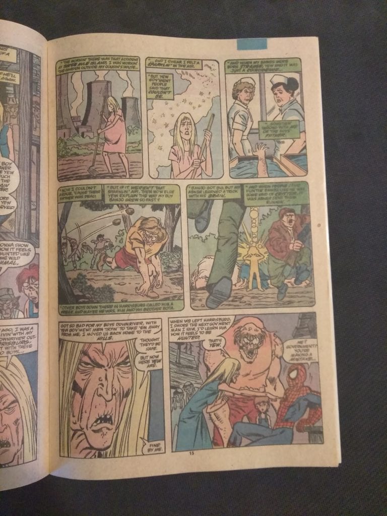
Written by Jeff Lemire, with art by Phil Hester, Eric Gapstur and Ryan Cody, and lettering by Steve Wands, Image Comics’ Family Tree: The Sapling does horror right. From the quiet beginnings, we are introduced to a family that stands out. A family that we want to see succeed and survive. So when Lemire tells us Apocalypse is on the horizon, we’re immediately hoping he’s lying.

Writing

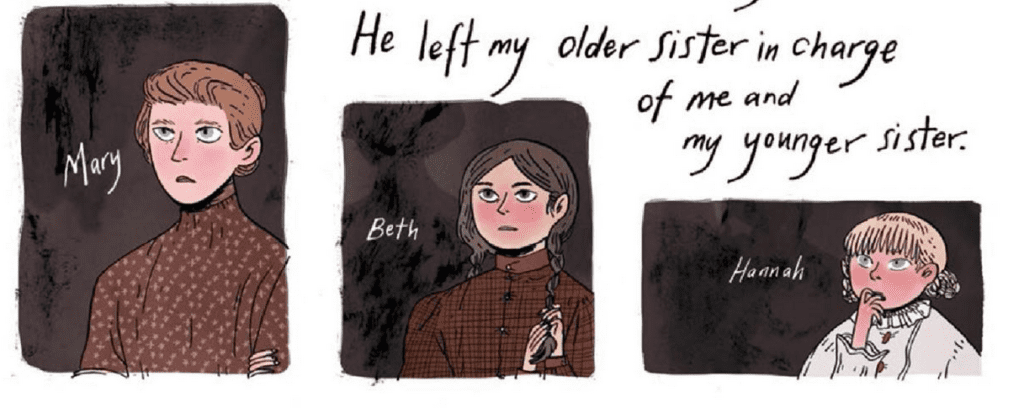
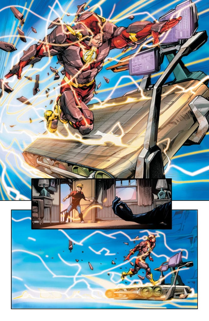
From page one, Lemire is telling us that we are watching how the world ends. So Lemire, in the rest of the series, has to make us give a damn. And his characters, who leap off the page straight away, do exactly that. Whether it’s Loretta, who can give as good as she gets, or Judd, who is THE person you want next to you during the end of the world, there’s always more to them than meets the eye. Loretta seems like a typical, tired mom character for all of two seconds before we see she doesn’t take anyone’s crap. Maggie is the whining little sister for only an issue before we’re aware of a deeper transformation going on within her. Lemire is constantly making us second guess what we think we know about these characters. He keeps the plot fresh and moving at full speed towards Armageddon.

Art/Coloring

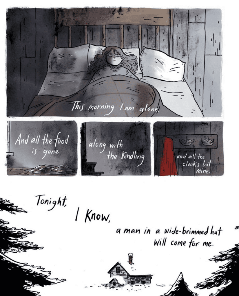
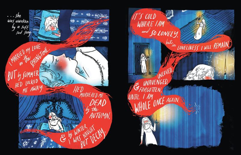
Hester, Gapstur, and Cody choose a brilliant minimalistic style for their art. It is their art that makes this world feel both familiar and mysterious at once. For one thing, we’re confident they’re giving us all of the details we need. Yet the stage they set is obscured enough by shadows and minimalism that they create a sense of mystery. The style also gives us a feeling of what characters in this world are like. Their jagged outlines feel like an extension of their personalities. Or at the very least, an exterior they have chosen to distract from what is going on beneath. The minimalist pieces and rough-hewn exteriors are carefully put together to create a beautiful whole.

The coloring used on each page tells us from panel one whether these characters are in danger or not. Much like color drains from someone’s face when they’re afraid, these artists use a paler palette for danger-filled scenes. It creates a sense of dread for every fight and each new horrifying discovery. But it also allows for the more colorful scenes to feel like a rest stop. When the characters’ faces are flushed, and their clothes are bright, we feel as though we can slow down our heart rate. We connect to these characters without fear of them being ripped away suddenly. At least not for a page or two.

Lettering

Wands’ lettering is quite straightforward. He divides a character’s lines up into several word balloons very rarely. It creates a sense of urgency for the series. Characters don’t dilly-dally. They say what they need to say before anything can interrupt them. What Wands does brilliantly, is he pulls back on the lines for the character Darcy. While Darcy has the potential to be a very frightening presence in the series, his lines are in small lettering. He’s also the only one whose lines aren’t in all-caps. Darcy feels less threatening and more calming. We set our fears aside for a second. The otherworldly becomes less terrifying.


Family Tree is a horror comic that is full of dread. But not dread born of gory violence or slobbering fangs, a dread that comes from loving these characters. The creative team behind Image Comics’ series Family Tree has given a human bridge into this disturbing world they’ve created. And with this writer and these artists, it’s anyone’s guess where it goes from here. The one thing we do know, it’s going to be great. This series from Image Comics is a must-read. See some more in-depth looks at each individual issue with Cat Wyatt’s brilliant articles, starting here.

Monkeys Fighting Robots Youtube

Review: THE FLASH #753 Sees Barry Searching For An Ally

Flash 753 cover

The Flash Finds Hope in an Enemy

Paradox has killed the Flash. That’s what it appears to be to Iris and Godspeed. After arriving in the present day, a new villain known as Paradox beats down Godspeed before blasting Barry with his energy. In actuality, the god-like villain has sent him into another dimension, disguised as the afterlife. Barry is able to piece this together quickly and proceeds to dismantle the charade. When he sees the actual dimension, he learns of how dangerous Paradox actually is. Realizing he can’t do this alone, he reconstructs the cosmic treadmill.

His mission is to find Eobard Thawne, the Reverse Flash. Will he succeed?

Flash 753 cover

**Some Spoilers Below**

Story:

After realizing Thawne is the best hope in facing Paradox, Flash uses the cosmic treadmill to head to the 25th century. When he arrives, Barry sees that with Paradox’s release, the world he had visited was now in shambles. Before he can fully assess the damage, Black Hole appears to capture him. They reveal that Paradox’s release, and the side effects to the time stream, are all Flash’s fault. As they prepare to imprison him, a temporal shift appears and allows the scarlet speedster to escape. While this is going on, Paradox forces Godspeed to take him back in time to kill versions of Barry Allen.

Flash 753 p1

This chapter of The Flash Age arc is definitely a slower one. There isn’t much in terms of action as Barry is trying to find help, and Paradox begins his plot. That said, Flash heading to the future to see it in shambles is a fantastic way to show off the threat of Paradox. With each passing issue, we learn more about the devastation of Paradox and wonder if he even can be stopped. This is only cemented when it’s revealed that he can absorb energies made from time paradoxes to power himself. Considering how many the Flash Family makes every year, this makes him a villain that builds on their mistakes.

The thing that really has me aching for the next issue, however, is a team-up nobody saw coming. By the end of the issue, it’s clear the only way to defeat Paradox is by teaming up with Eobard Thawne. Thawne is one of those villains you can’t trust, but unlike a villain like Joker, he is quiet about his schemes. We know he’ll betray him, but until then, let’s hope this team-up will be one hell of a show.

Flash 753 p2

Art:

While the story might have been slower than usual, the art keeps up its excellent quality. Howard Porter’s style continues to go above and beyond for the series. The most powerful page of the issue is near the end, where Barry stands outside his house. Readers will be able to feel the emotion in Barry as he listens to his mother’s death. He knows he can run in and stop it, but knows that it needs to happen.

We also get Brandon Peterson to tag in during Paradox’s attack on past Barry. It’s very well drawn, and I hope to see him again, illustrating future arcs.

Conclusion:

Overall, this chapter of The Flash Age is slower but still has some powerful scenes. While we don’t get a ton of action, we get to see what damage Paradox can do. It just helps cement his status as the Flash’s toughest challenge yet. Barry listening to his mother’s death, is heartbreaking and shows he has come a long way from Flashpoint. The art team continues to provide beautifully done pages, with menacing designs for the villain. It’ll be a while since we get the next issue, but I’m sure it’ll be worth the wait. 

Monkeys Fighting Robots Youtube

REVIEW: HAWKMAN #23 Reminds Us Of What We Can Control

Hawkman Venditti DC Comics

Written by Robert Venditti, with art by Marcio Takara, Fernando Pasarin and Oclair Albert, colors by Jeromy Cox and lettering by Rob Leigh, DC Comics’ Hawkman #23 takes a break from the main plot to remind us of what we are in control of in trying times. Whether the creative team at DC Comics added this story break recently, or whether it’s just coincidence, the story couldn’t come at a better time. We can’t control everything, this story tells us, but how we act with what we can handle matters most.

Hawkman DC Comics Venditti

Writing

Venditti introduces us to Carlo Salon, Hawkman’s lifetime during the Black Death. As a plague doctor, Hawkman goes from house to house, taking note of the deaths at each place. It’s a quiet issue. There isn’t a ton of dialogue, and Venditti’s writing actually kind of mimics the feel of a town on lockdown. In fact, the whole issue feels like a twisted reflection of our current state of affairs. But it also reminds us of a couple of things. First, things could be worse. And second, fear can make us do things that are far worse than what a plague can do. Venditti doesn’t pull his punches in making his point. He drives the point home overtly, with characters saying exactly what he’s getting at. It gives this issue a kind of “call to action.” Even if that action is just staying at home and looking out for your fellow man.

Art

Takara, Pasarin, and Albert switch art styles when we begin following Carlo Salon. These scenes in 1650’s Spain aren’t quite as anatomical as other chapters in the series. It lends warmth to each moment. The slightly more stylized outlines and details of the characters allow it all to feel more like a memory being sketched back out again. Yet the shadowy ambiance, which adds to the less detailed approach, give each moment a feeling of closeness and intimacy. It’s as though we see a profoundly personal dream from Hawkman’s mind. Our return to the present day, with the return of the old style of art, feels just like waking from a dream as well. The stylized gives way to realism.

Venditti Hawkman DC Comics

Coloring

Cox’s colors in this issue never let us forget what is going on for these characters. Nearly every page, once our setting has been established, is haunted by a tinge of red. Whether it’s the overt redness of a rose picked by Hawkman or the red glow of a sunset. Cox is reminding us that death is ever-present in these panels. It is always on the mind of these people, and so it’s continuously presented before our eyes. Yet the red evolves too. The red comes to signify the anger, born of fear, in the populace. Their red rage takes over. Only once the mobs have dissipated do the red torches and sunsets give way to a bright yellow sunrise. Cox ends Carlo Salon’s story by giving us something to hope for.

Lettering

Leigh imbues Hawkman with empathy in his lettering. While many of the townsfolk are scapegoating Carlo Salon in hurried speeches, Salon responds in measured dialogue. Not only are his responses parsed out into different speech bubbles, but a lot of air is allowed in between them. The mob brings their accusations against him in large chunks of text. But Salon’s response is often brief. When it isn’t, it’s followed by a space between each bubble. He is not reacting in fear but trying to have empathy for a clearly fearful group of people. We get the sense Salon is choosing his words carefully, not letting panic get ahold of him.


This creative team has empathetically tackled the idea of pandemics. Venditti asks us to take a look at ourselves and say, “What can I control in this time?” If the answer is just you, that’s good enough. This issue takes time out of the plot to tell us this side story. While a nice break from the main plot in most series is often welcome, this break in the plot feels particularly right. Hawkman #23 is out from DC Comics this week.

Monkeys Fighting Robots Youtube

AfterShock Exclusive Preview – GODKILLERS: WAR ON TERROR #3

AfterShock Exclusive Preview - GODKILLERS: WAR ON TERROR #3

Godkillers: War on Terror #3 comes out on June 24, but thanks to AfterShock Comics, Monkeys Fighting Robots has an exclusive four-page preview for you to enjoy.

About the issue:
Insurgents in Syria are using a djinn as a weapon of mass destruction.  Can the elite special forces unit known as the Godkillers help their Kurdish allies defeat this supernatural menace?  Or, like other foreign interventions, will they only make things worse?

Godkillers: War on Terror #3 is written by Mark Sable (Grounded, Fearless, Supergirl), with art by Maan House, Hernan Cabrera dropped some color, and you will read Thomas Mauer’s letters. Jeremy Haun, with Nick Filardi, created the main cover, and Charles Pritchett designed the logo and handled production.

Check out the Godkillers: War on Terror #3 preview below:


What comics are you reading while you’re stuck at home? Sound off in the comments!

Monkeys Fighting Robots Youtube

KILLING EVE – Slowly Slowly Catchy Monkey | TV Review

Everyone’s favorite Russian psychopathic assassin is back with the third season of Killing Eve. The first episode of the new season picks up after the events in Rome.

Following the botched mission in Rome, Villanelle (Jodie Comer) has gotten married. However, her wedding day gets interrupted when her former trainer, Dasha (Harriet Walter), arrives and recruits Villanelle back into The Twelve. Since being shot, Eve (Sandra Oh) has gone into hiding and works in a Korean restaurant in New Malden, London.

Within MI6, Carolyn Marten (Fiona Shaw) has been placed under investigation because of her unauthorized missions, whilst her son, Kenny (Sean Delaney), has left the service to work as a journalist. When Eve accidentally contacts Kenny, he reveals he has been investigating The Twelve despite the risk to his life.

“Slowly Slowly Catchy Monkey” essentially acts as a pilot episode. Its job was to re-establish the character and show what has changed between the seasons. Season Two picked up where Season One left, so it went straight into the action. The gap between Season Two and Three was much bigger, so there were a lot of changes for the characters.

Since the events of the Season Two finale, Villanelle’s life was on the up, and Eve went downwards. Villanelle had a luxurious wedding in Spain, and she makes a thinly-veiled speech about her past relationship and intentions, which the guests dismissed as humor. Eve has had to go off the grid, hiding with the immigrant community and lives in squalid conditions. It’s a pretty sad existence.

Eve’s husband, Niko (Owen McDonnell) has suffered a lot because of the events in Season Two. He has been institutionalized, and the intelligence services have covered up Gemma’s death as a suicide: an action that Niko objects for the sake of Gemma’s family.

Kenny was the driving force for this episode. He was the one who tries to get Eve out of lonely existence and get her involved in his investigation. Kenny’s fate at the end of the episode is going to be emotionally important for the rest of the season.

Killing Eve‘s big selling points were the violence and humor, and Season Three continues this. The episode opens with a flashback to 1970s Moscow, where the Young Dasha (Catalina Cazacu) beat-up a male gymnast. Villanelle gets to do a skull blasting when she returns to the assassination game. The wit was present with characters having some witty lines. My favorite moment was when Villanelle sees Dasha at her wedding.

“Slowly Slowly Catchy Monkey” does what it set out to do, reintroduce the characters, and set up the main plotline for the season ahead.

Monkeys Fighting Robots Youtube

I’d Buy That For A Dollar: THE SPECTACULAR SPIDER-MAN #156 (November 1989)

Spider-Man

Welcome to ‘I’d Buy That For A Dollar’ a column where I will be exploring the weird and wonderful world of dollar bin diving. The only rule is each and every comic is purchased for one dollar (or less!).

This week’s comic is The Spectacular Spider-Man #156.

Gerry Conway’s run with Sal Buscema on The Spectacular Spider-Man is one of my favorites ever. I discovered it at a young age and it’s darker tone, psychological themes and at times almost weirdo art really stuck with me. I’ve been grabbing any I see since then.

There are a ton of great issues, but #156 is a highlight for sure. Buscema, who can be as slick as can be, has created a very raw and rough-looking cover; the interior pencils carry the same feel. The whole issue has a strong EC Comics horror vibe, especially with the very muted color palette and character design. And it has heavy Texas Chainsaw and The Hills Have Eyes echoes; the story finds Spidey lost in Appalachian mountains and running into some scary, mutated locals.  It’s truly a great comic to read and flip through. Let’s look at some pages.


Spider-Man
Love the angular way Spidey looks here. This opening page just sets the tone!

The following image has a total EC Comics horror vibe.

Spider-Man
Buscema’s pencils are way loose here and it’s a great way to give this an odd vibe.
Spider-Man
Love the panel progression here! Buscema loves ending with those punches/slaps.
Spider-Man
Banjo is the “villain'” and he has a total backwoods horror vibe. He also ends up being somewhat sympathetic.
Spider-Man
The rounded edges on the flashback panels is a nice touch and a reminder that Buscema is a master!

See, that’s some great and very strange stuff for a mainstream Spidey comic. Again, the whole Conway/Buscema run is a real treat and well worth grabbing.

This issue also had a bunch of great videogame ads. Check them out:

Man, this game was hard!
Both these games were must-haves.
Remember these?!

You can find great dollar bins at almost every local comic shop. So find a shop, ask a comic clerk what they can do for you during this time and get some dollar comics! Pick them up curbside and have them delivered if you must!

Got your own awesome dollar bin finds? Toss them at me! 
Send emails to manny@monkeysfightingrobots.com
Follow me on Instagram: _idbuythatforadollar_
Tweet at me: @MannyG1138

Monkeys Fighting Robots Youtube

Longbox Legends: Why FALCON #1 (1983) Was A Step Forward In Social Commentary

FALCON #1, released in November 1983, was the first comic dedicated to Captain America’s high flying superhero partner. Readers in the past only saw the hero’s exploits in relation to his side-kick status with Cap. But this issue gave Sam Wilson his long-deserved due. What’s more, readers get a look at the hero tackling one of life’s all-pervasive problems: poverty.

Story

FALCON #1 places its focus on the two aspects of Sam that make him a hero: his superheroics and his commitment to social justice. The first scene places our hero in the middle of gang violence when a wayward teen, Miguel, drunkenly assaults a young woman named Lucia.

Sam uses a minimal amount of violence to contain the situation, but the hero, in awe-inspiring fashion, knows there’s much more to heroics than stopping crime. After hearing Miguel express his anguish at living in his poor area of the city, Falcon realizes more needs to be done.

Jim Owsley’s script is believable and engaging in its ability to portray a real world problem with grace and tact. Readers will find themselves in awe of Falcon’s care for these distressed teens. In fact, after saving Lucia and returning her to her father, he requests that he not go too hard on Miguel so as to give him hope for a future after getting his life straight.

Artwork

Paul Smith’s penciling, combined with Vince Colletta’s ink work, helps bring this story to life. We see realistic depictions of Miguel and the other characters, meshed with the fantastic outfit of Falcon. Christie Scheele’s coloring complements this with natural colors for the city streets and bright hues for Falcon’s classic costume.

Conclusion

FALCON #1 took a big step forward for its time, both in terms of Falcon’s status as a solo hero and, more importantly, as an examination of social status.

Did you think this was a worthy first  solo issue for Sam? Let us know in the comments below!

Monkeys Fighting Robots Youtube

Review: The Start of a Grimy Yarn in NOVEMBER Vol. 1

Writer Matt Fraction and artist Elsa Charretier have constructed a series of mysterious and shady tales with the first volume of “November.” Along with colorist Matt Hollingsworth and letters from Kurt Ankeny, this first chapter brings along a group of intertwined stories all caused or affected by one another. The grimy urban atmosphere and non-linear progression of the story make this conspiratorial plot a convoluted but riveting page-turner.

“The lives of three women intersect in a dark criminal underground. As fire and violence tears through their city over the course of a single day and night, they find that their lives are bound together by one man—who seems to be the cause of it all.”

Writing & Plot

Matt Fraction starts off “November Vol.1,” the first in a three-part series, by giving the reader both as much and as little information as possible to progress the story. The use of drug addiction, criminal manipulation, and police corruption dance about the plot in obscure shades that force the reader to put the pieces together themselves. This non-linear and purposefully obscure manner of crime noir delivery is sure to frustrate some, but it’s a riveting puzzle for those that wish to partake in it. The dialogue is varied greatly among the cast of characters, from the three protagonists and beyond. There is a sense of scale created by utilizing three people in different walks of life that makes the conspiracy feel giant despite the limited information given. The majority of the characterization is given via internal narration, which again is both obscure and tantalizing. There’s a deeply human tragedy running through at least two of the characters (especially the first woman) that makes the story feel all the more intimate. The ending is where much of what’s happening is put together more clearly and makes the desire to read the next entry all the more strong.

Art Direction

“November” Vol. 1 benefits greatly from having the unique artistic touch of Elsa Charretier. There’s a mixture of human detail and cartoonishness that brings to mind the work of Michael Avon Oeming in  Powers. The people and environments feel tangible and realistic despite their unique designs. A large part of the is attributed to the colorwork from industry veteran Matt Hollingsworth, who bathes whole sequences in matching dreary colors. Pale blues, dark oranges, and most commonly pale greys and blacks create a foreboding and dreary atmosphere for this tale of conspiracy and woe to take place in. Moments of existential dread, sorrow and panic are realized in broken up in sometimes seemingly inconsequential mages that still tug the story along with a methodical pace. This is a book that is as striking visually as it is in terms of the script.

An easy to overlook creative element to “November” that deserves mountains of praise is Kurt Ankeny’s lettering. All of the lettering is presented in a hand-written style that looks more like a stack of notes than comic lettering. Like reminders left on the refrigerator door, Ankeny’s letters deliver the scattered clues, thoughts and words to the audience in a fashion that brings more intimacy and atmosphere to the story.

“November Vol. 1: The Girl on the Roof” is an intriguing puzzle to begin a story with. Fraction’s script offers excellent characterization and dialogue while divulging just enough plot to keep the reader invested. The visual work from Charretier, Hollingsworth, and Ankeny offers a distinctly intimate and grim atmosphere that is perfect for the grimy urban conspiracy at play within these pages. If this sounds like the kind of comic experience you’re up for, this first of three parts is currently available for order from your local comic shop.


Monkeys Fighting Robots Youtube

Review: THE LOST CARNIVAL Is A Near-Perfect YA Graphic Novel

The Lost Carnival, Nuwer cover

THE LOST CARNIVAL, available from DC on May 5, is a YA-focused graphic novel about an adventure in the early life of Dick Grayson. Dick is feeling the call to see the world, away from his parents and the circus life, when a mysterious carnival appears on the scene. Is this book low-brow tweeny melodrama, or is the carnival ticket worth the price of admission? Let’s find out.

Writing

THE LOST CARNIVAL was written by Michael Moreci, and he sets a very high bar for YA novels set in the DC universe. There’s a tendency among YA authors to lean heavily on teenage angst and contrived drama for emotional impact, leaving the meat of the story for a distant second place. Teenage love triangles, falling in love with the bad boy from the wrong side of the tracks, mean girls bullying the new student, and on and on and on. Thankfully, Moreci avoids all of that here and focuses on a top-notch story that reads more like Romeo & Juliet crossed with an episode of Steven Spielberg’s Amazing Stories.

Plot (No Spoilers): The Flying Graysons are the headline act of a failing, traveling circus. Dick Grayon, about 17 at this time, is feeling a pull to see the world and all it has to offer. Frustrated by a life that never seems to change, Dick starts breaking a few family rules as he straggles with the need to feel independent and find his own way in the world. While dropping in on a party his parents don’t know about, Dick encounters the mysterious Luciana who is part of the nearby, competing carnival. It doesn’t take long for Dick to figure out Luciana and her carnival are not all that they seem.

Let’s set a few expectations. This Dick Grayson (known as the first Robin to Batman, and eventually Nightwing) is purely presented as the youngest member of the Flying Graysons. Aside from a brief interaction with a tarot card reader, nobody mentions Robin, Batman, or Gotham City. Effectively, Moreci’s story is Easter egg free and avoids any foreshadowing to Dick’s future, crime-fighting career. Got it? Good.

What you do get is a teenage love story wrapped in a supernatural mystery. There’s a little bit of magic, and yes, some family drama. More importantly for a mystery, Moreci wrote a twist on the bad guy reveal that I honestly did not see coming. It’s hard to surprise me with mysteries, so Moreci earns high praise for pulling a rabbit out of his hat that I didn’t expect..but truly works.

Another high point in Moreci’s writing is the dialog. Every conversation between Dick and his parents, between Dick and Luciana, between the carnival and circus folk, felt very natural and believable. I didn’t roll my eyes once during any of the exchanges. Moreci created characters that talk like real people in extraordinary circumstances, and that’s the best compliment I can give for dialog.

From start to finish, Moreci wrote an entertaining story that keeps a steady pace, is inhabited with interesting characters, and encompasses a solid mystery. Be warned – there’s a lot of crying, but it fit the story.

Pencils/Inks

Illustration credit goes to Sas Milledge with Phil Hester. Milledge does a tremendous job illustrating a fairly large graphic novel (175+ pages, not counting the covers and credits pages). This is a YA novel, so every scene is going to have somebody getting angry or sad or falling in love – in other words lots of emotion. Milledge deftly covers the range of expression on every characters face at the right time and in the right place.

The overall design of the characters and the setting gives the book a classic, B&W movie feel. Think about the simplicity and wholesomeness of the The Wizard Of Oz when Dorothy is still in Kansas. That tone works for the story and the setting perfectly.

There are two areas where Milledge’s art doesn’t quite work as well – the hair and the movement. Almost every character’s hair that isn’t cropped short seems to be constantly moving and in conflicting directions to what the character is doing. It’s a small thing but it stands out with so many close up panels. This could be improved by matching the hair movement to the motion of the character.

The other area is the movement of the characters. The Flying Graysons are acrobats, and Dick employs acrobatic movements in a few of his fight scenes. Milledge’s movement art tends to freeze the characters midway through their motion, and that kills the momentum of the panel. This could be improved by adding speed lines to the characters when called for.

Admittedly, those two points were minor distractions and were mostly prevalent in the first couple of chapters. Milledge’s art distinctly improved through the progression of the book, so it becomes less of an issue as you read through. Nice job, overall.

Favorite Panel/Page: Page 188 earns the favorite page spot for this book. Again, no spoilers. Dick has just lost something precious, and you see three successive panels where his expression changes from shock to shock to realization to grief. No dialog or narration, it all comes through by art, and it’s a gut punch.

Colors

The colors are sparse in this book as it’s drawn to mimic a B&W film, but that doesn’t prevent David Calderon from doing great work. What Calderon has done is use an old movie trick of using different filter colors to represent different settings. Dick’s circus is colored in all blue tones. Luciana’s carnival is colored in all sepia tones. Calderon’s color choice here infuses each setting with distinction, and actually helps inform where you are in the story. That’s something most coloring examples don’t do, so kudos to Calderon.

Lettering

Moreci gets praise for writing the dialog, but Steve Wands’ lettering helps bring the story to life. The word bubbles were as naturally integrated into each panel as the dialog itself. At no point did word bubbles crowd out the artwork or feel pasted on. With a few exceptions, there’s almost no narration, allowing the art to tell the story where words don’t. This was a wise choice because I never felt lost or confused by what was going on. Sometimes less is more, and this is as much a great example of lettering AND a great example of when not to letter anything at all.

Conclusion

THE LOST CARNIVAL is an almost perfect example of the type of YA novels the comics publishers should be putting out. Moreci’s story fits neatly within Batman canon so as not to put DC fans off, but it completely works if you have no knowledge of Batman lore. Forgetting a few nitpicks, the entire art team did a stellar job. Pick this book up, from DC on May 5th, for an enjoyable read.


Author’s Note: Local Comic Shops (LCS) are going through a tough time right now with the pandemic outbreak of COVID-19. Comics fans of every flavor that care about his or her LCS should try to do what they can. So, here’s my part:

If you’re in Northern Delaware, South East Pennsylvania, or Southern New Jersey area, please take a moment to visit Captain Blue Hen Comics in Newark, DE. Say ‘hi,’ pick up a book, order a book (they’re on Comichub.com), and let them know you support them.

If you’re nowhere near that area, please find YOUR LCS using Comic Shop Locator and lend your support.

Thanks, and stay safe.

Monkeys Fighting Robots Youtube

Longbox Legends: THROUGH THE WOODS – Storytelling At Its finest

Emily Carroll may not be a household name yet, but every comic she creates is a horror-filled masterpiece. My first brush with her name was 2019’s When I Arrived at the Castle, which became one of my favorite graphic novels of 2019. Ever since then, when I see her name on something, I can’t help but be excited. So, when I found Through the Woods at my local used book shop, I knew I had to buy it.

THROUGH THE WOODS IN FIVE TALES

Through the Woods contains five separate horror stories each created by Carroll, including woods to some degree. Horror seems to be Carroll’s forte, and this shows extremely in each tale. Whereas she could’ve had each story interact, or connect in some manner, she keeps them short, contained stories. That in mind, not much background is given, keeping each story mysterious. This works out great in her favor, as each story makes you think once you’ve finished it. Instead of giving to much in the way of plot, Carroll hides a lot, making you imagine a lot of the horror.

Emily Carroll

Nonetheless, when she does show the mysterious happenings, it’s equally terrifying. Yet, her horror isn’t just scary due to the mysterious, but for the real fears they draw upon. Through the Woods deals with isolation, a parent leaving, fear of the unknown, the guilt of killing someone, a body snatcher, and the woods. As Carroll say’s, “It came from the woods. Most strange things do.” As someone who lives next to woods, Carroll captures the creepiness in each story perfectly.

PLAYING WITH LETTERS

As a creator, Carroll has a lot of strengths. As she does every step herself, she knows what and how she wants something done. That in mind, her lettering has always been fantastic in her comics. The manner that she uses words, and the job of lettering vastly improves her stories. She not only uses this to portray what the character has to say but as a visual element as well. Her lettering is by no means the conventional manner you’d see in comics, and that’s what makes it stand out. She uses the element to its full extent to excel the story she is telling.

A fantastic example in Through the Woods is when a character say’s, “We were separated.” During this, the “We were” is outside of the panel, whereas “separated” is contained in the panel. This trick makes you pause in the middle, verbally making you separate the read. Carroll can make you feel the separation just by messing with the lettering. Nonetheless, this is but one moment of her fantastic lettering.

Lettering with rhythm
Emily Carroll

ART THAT SCARES

Carroll’s art is always a treat to indulge yourself in. Much like her lettering, she holds herself to no rules when it comes to storytelling. One page could contain a myriad of panels, yet the next could be empty except one panel, to emphasize what she is showing. This is what is exciting about her work. Each page is a visual phenomenon, where she uses the page to her advantage. One thing Carroll uses a lot is negative space. She uses this for different story reasons, yet never overuses it.

One scene in Through the Woods that deserves mention is when Carroll introduces three sisters. Although just looking at these characters, you could tell whose older; she uses panels to showcase even more. Carroll has the oldest sister in a bigger panel, with the sizes getting smaller for each younger sister. Nevertheless, this may not be the biggest visual achievement in Through the Woods, it’s a simple, effective one.

Panels grow smaller
Emily Carroll

HORROR THROUGH THE WOODS

Emily Carroll is a master at her craft. It’s hard to pick up any of her graphic novels and not fall in love, even if it isn’t your genre. Her writing is fantastic, yet combined with her masterful eye for visuals, you’re always in for an amazing read. She completely understands how to make a gorgeous comic. This skill is showcased in every aspect of Through the Woods. Even if you aren’t a fan of horror, these five tales are worth the read.

Monkeys Fighting Robots Youtube