After the detour to Russia, the third season of Killing Eve returns to its main plot with “End of Game.”
Niko had miraculously survived a pitchfork being shoved through his neck but left unable to speak and rejects Eve. Because of this Eve becomes demanded to bring down The Twelve and finds a potential lead to Dasha. Villanelle gets her first assignment as a Keeper but finds out she is still doing the same work. This time she must assassinate a Romanian politician. Konstantin prepares to escape The Twelve and go into hiding with his daughter. Whilst Carolyn finds out MI6 has withheld information from her.
I love Jodie Comer as a performer. As Villanelle she has shown an incredible range. In “End of Game” she was both hilarious and tragic. Comer had one of the funniest moments in the series so far when she attends a youth hockey match with an air horn and made a show of herself. She acted like a big child and I loved it.
The episode also saw Villanelle reunite with Irina. At the end of Season One they had a hilarious dynamic when Villanelle kidnapped the child and finds out that Irina’s was not easy to manage. Because of this Irina wasn’t keen on Villanelle coming back into Konstantin’s life, so Villanelle had to find a way to get into her good books. Because of Villanelle, Irina ends up exploring her own dark side.
Villanelle’s tragedy comes in two forms. Villanelle wants to run off with Konstantin and his family but Konstantin tells her she cannot. Konstantin’s rationale of not taking an unhinged psychopath with him was sound, but to Villanelle it hurts because Konstantin was the closest thing she has to a father. The other half of the tragedy was when Villanelle had to perform the assassination mission and it doesn’t go as plan, leading Villanelle to have a big realization.
The episode saw Eve and Dasha face off against each other for the first time. The attack on Niko ended up inspiring Eve and it surprisingly shook off her depression. She got her mojo back and was able to stand up against a ruthless assassin in an excellent scene at a bowling alley.
As well as the net tightening on Dasha, Konstantin feels the heat. His plans to go into hiding could suffer from two fronts. The first threat was Villanelle. The other threat was The Twelve who want to find out the $6 million from them, forcing the man to fast-forward his plans.
Fiona Shaw as Carolyn also had a chance to shine. In the past, Carolyn has been a tough stoic character with a sharp wit. Even after her son was killed, she maintained this image. But in “End of Game” this image finally broke and she revealed the grief she was feeling. Carolyn had to have a heart-to-heart about her feelings with her daughter.
“End of Game” worked as a character development episode and gave the main cast members a chance to shine.
On June 10th, AWA Studios will release the second issue of Archangel 8. It continues the story of Raziel, an angel on a mission, who must infiltrate a violent drug cartel and avoid the attention of others like himself.
It is relentless in its storytelling and barely gives the reader a moment to breath between action sequences. Even in those moments it does allow, they are filled with the effects of the violence portrayed elsewhere. Archangel 8 comes with a mature readers warning for a reason but it’s not just for the gory element. There are depths to this story. Layers to be stripped back and considered by the reader. AWA want to entertain but they also want their readers to think.
Archangel 8 #2 Credit: AWA Studios
Narrative Punches
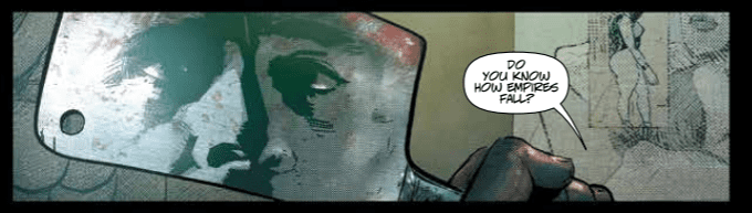
Despite the cover wearing it’s angelic wings with pride, very little of the actual comic makes reference to this supernatural element. Instead Michael Moreci focuses on portraying the violence inherent in the drug cartel that forms the main focus of this issue. Whether it’s directly from the criminal activity or the effects of their actions, each scene is soaked in spilt blood.
The opening sets the scene and illustrates the self importance of the cartel’s leader. Moreci has Delmar make a speech about Empire’s and perceived strength, linking the organisation to concepts of conquest and struggle. When in reality Delmar is a violent bully and a thug. Moreci wants the reader to see this contradiction in the villain because it plays a part later in the narrative when Raziel, or Archangel 8, is faced with a similar contradiction in his own way of life.
Moreci packs this issue with moral dilemmas and characters who act out of enforced instinct. Their actions are not really their own but a culmination of years of fear and repetition. The drug runners go through the motions as they have been trained without giving it a second thought. This is reflection on religious teaching and again is brought up later in the issue in regards to Raziel.
This issue’s main aim is to portray the violence that surrounds Raziel and force the reader to question the Archangel’s work. The reader is shown the actions and consequences of the world in which Raziel moves and lives. It is a constant deluge of horror with no respite for the characters or the audience.
Archangel 8 #2 Credit: AWA Studios
Realist Images
The art by C.P. Smith is gritty and realistic, as is the coloring by Snakebite Cortez. The overall look of the comic is cast in shadows with very little exaggeration. This is unusual for a vigilante comic as you would expect some of it, especially the violence, to be over the top and bordering on cartoonish. However, Smith’s work recalls the MAX Imprint Punisherseries written by Garth Ennis and illustrated by Laurence Campbell. The attention to detail in each panel and the focus on realistic interpretation add an extra level of discomfort to the scenes.
There are occasions where this realism falls away and Smith introduces an abstract image. The panel transitions or narrative help to explain the seemingly out of place image but the reader has to pay attention. To help the reading along, Smith employs simple page layouts with the image focal points central to the panels. The storytelling is easily accessible and generates a pace that keeps the reader turning the page.
Sal Cipriano’s lettering follows Smith’s structure allowing the reader to easily follow the speech through the panels. There is some manipulation of the text, with italic bold used on certain words, however, the majority of the character’s voice comes from the script and not it’s presentation. The only element of the lettering that doesn’t fit the style of the artwork as well is the sound effects. The stark white bubbled lettering is a fixture of superhero comics but with the adherence to realistic images in Archangel 8, the two styles don’t blend. The playfulness of the sound effects seem out of place with the brutal actions being displayed.
Archangel 8 #2 Credit: AWA Studios
Conclusion
AWA’s mature readers comic Archangel 8 fuses drug cartels with Angelic mythology to create a violent comment on society and religion. Less than subtle in most places, the comic draws on a history of excessive vigilantes, such as The Punisher, to produce the appearance of a comic typical to this genre. Underneath the blood and guts, however, is a deeper cut at religion . Moreci has his characters question the ineffability of God and His Word sin the hope that the readers will follow suit.
By itself this issue of Archangel 8 does not make any groundbreaking statements. The majority of the issue contains a lot of macho posturing and excessive violence that ultimately does nothing to enhance the experience. There is an element of shock for shock’s sake and is reminiscent of the Baseball Bat Meeting in the movie The Untouchables. Cliches that have existed in vigilante comics for decades are replayed here in this comic.
Where Archangel 8 exceeds other comics of this nature is in the longer story, the world building that Moreci is doing issue to issue. He is merging existential questions with societal dilemmas to elevate the conversation above the standard ‘right or wrong’ discussion that usually surrounds vigilantes. This is Lucifer crossed with Batman, Preacher merged with The Punisher, Good Omens made by Robert Rodriguez. Archangel 8 is an adult action story with a conscience and a point to make.
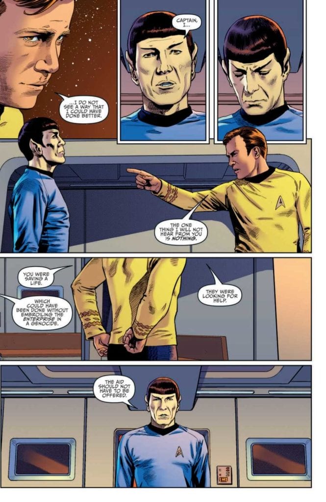
STAR TREK: YEAR FIVE #11 finds Captain Kirk and the Enterprise crew fighting former ally Gary Seven for control of the ship. Written by Jackson Lanzing and Collin Kelly with art by Stephen Thompson, the protector of the future must sacrifice his allies to prevent a cataclysm. Does he succeed, or will Kirk cheat death one more time?
Cover Art
Stephen Thompson’s cover art brings one word to mind: “mod”. It’s a perfect example of the elegant silhouette style that was so prevalent and popular in the 1960’s when the original Star Trek show was released. The shapes of the characters and ship are emblematic of the series, and the style captures the stylistic flavor of its time in a classic and classy way.
Writing
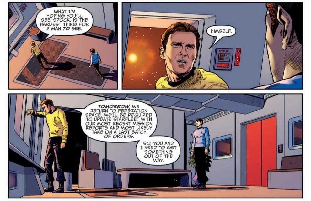
Jackson Lanzing and Collin Kelly’s story reads on par with an episode from the original series. There’s a character scene where Kirk is giving Spock a positive review for his performance, and in typical Spock fashion, he disagrees. The ensuing argument is as close to time traveling back to the 60’s to see the actors play the scene out in person as you can reasonably get. The dialog and tone is perfectly on-point.
The story also adheres closely to the vibe of the original series. Gary Seven uses his superior tech to invade Enterprise and take control of its systems. Kirk, in typical Kirk fashion, pulls off a minor miracle by isolating the invader and saving his crew. The final moments set up a one-on-one, showdown, cliffhanger that earns your anticipation for the next issue.
Looking at the story structure, it’s super lean. In essence, it would just qualify as the first half of an on-air episode. And that’s okay. Character introductions are simple and make perfect sense in context, the action pace is brisk. There’s no fluff here. Not one panel is wasted telling a good, old-fashioned space adventure story.
Pencils/Inks
Drawing a Star Trek comic based on real actors is a risky proposition. If Spock doesn’t look like Spock, that’s an immediate red flag. Thankfully, Stephen Thompson portrays the legendary characters with the right mix of homage and realism. These legendary characters aren’t rendered so hyper-realistic as to look like static portraits, but their renditions are just close enough to the real thing to pay respect to the original show.
Thompson does an equally admirable job rendering the look of the ship and its technology. The Bridge looks like the Bridge. Engineering looks like Engineering. Even the classic, albeit goofy, phaser rile makes an appearance in the hands of Lt. Chekov. All the little bits of Star Trek aesthetic are present to satisfy lovers of the show.
Favorite Panel/Page: The favorite panel of this issue is the external shot of Enterprise as the leaves in escape pods. There was no clear depiction of escape pods in the original series, so to show something “new” that organically matches the “old” style is impressive. Plus, who doesn’t love a great long shot of old NCC-1701.
Coloring
The original Star Trek designers were fond of primary colors for the shows design. Charlie Kirchoff’s coloring leans on the history of primary color uniforms and adds well-placed gradients and shading to give each character the right amount of depth and contour. The original shows lighting tended to be bright to the point of almost tacky, so Kirchoff wisely cools the lighting and adds a little extra shadow to infuse the panels with more drama. Nice work here by Kirchoff.
Lettering
Neil Uyetake’s lettering work is first rate. The human(oid) dialog is well-placed to keep the pacing up while letting the art tells the action parts of the story. There are some unusual designs for word bubbles that I’ve never seen before. However, they make total sense considering your have an 8-limbed alien speaking through a modified spacesuit into a universal translator. I don’t know what that’s supposed to sound like, but it’s believable in Uyetake’s lettering.
Conclusion
STAR TREK: YEAR FIVE #11 looks, reads, and feels like it was lifted directly from the original series. The dialog is realistic to the voices of the characters, the story is on the level of one of the better episodes, and the art hits all the right nostalgia notes. Highly recommended for any Star Trek fan.
Author’s Note: Local Comic Shops (LCS) are going through a tough time right now with the pandemic outbreak of COVID-19. Comics fans of every flavor that care about his or her LCS should try to do what they can. So, here’s my part:
If you’re in Northern Delaware, South East Pennsylvania, or Southern New Jersey area, please take a moment to visit Captain Blue Hen Comics in Newark, DE. Say ‘hi,’ pick up a book, order a book (they’re on Comichub.com), and let them know you support them.
If you’re nowhere near that area, please find YOUR LCS using Comic Shop Locator and lend your support.
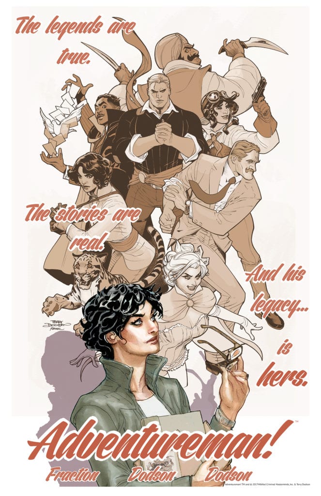
Image Comics’ new series Adventureman, written by Matt Fraction with art by Terry and Rachel Dodson, colors by Terry Dodson, and letters by Clayton Cowles, pulses with life from page one. It’s a story within a story. We first follow Adventureman and his steampunk-meets-Golden-Age-comics team. They fight bad guys to save the world. But it’s not long before we learn this is actually just a story being read by our real main character, Claire. Adventureman and his fellow heroes are just a work of fiction… or are they? These characters and the world this creative team has created is enchanting. There better be a lot more where that came from.
Writing
Fraction does what he does best in this series: he gives every character a quirky, charming voice. In the opening moments, Fraction’s writing shines. The characters are each given a brief description and we see them in action soon after. Their quips are just the right amount of self-aware. It all feels like an homage/satire of golden age comics, and it all lands well. But Fraction also suffers from a typical pitfall of creating a new world. After the opening moments, we are given lots of explanation. Narration tells us a more backstory than we need. What Fraction should know, though, is that this world and these characters speak for themselves. They are already clearly full of life and need no explanation to make us gravitate towards them. Fraction’s writing is strong as long as he doesn’t second-guess himself.
Art
The Dodson and Dodson duo help craft this new world with style. Their art style in and of itself is gorgeous. Whether they’re drawing a person or an animal, there’s a real sense of what that character is thinking. The Dodsons have a brilliant grasp of human expressions. And so, it’s interesting to see things as they are in Adventureman’s world. Everything is flashy and cool. Pages are filled with power poses and cool angles. But when we step out of that world into the “real” world, things are suddenly less polished. We get a layer of awkwardness and wry smiles that was missing in the pulpy world of superheroes. They give a charming quirkiness to the real world in this comic, and fill Adventureman’s world with a sense of drama and danger.
Coloring
Similarly, Terry Dodson’s colors in Adventureman’s world have an element of “mood lighting” to them. As we open onto a looming Armageddon, we know doom is coming before we’re ever given word. The commissioner’s office is colored in blues and greys. It’s like a cloud is over each page. But when the action picks up and characters are exchanging punches and retorts, the color begins to come back in. By the time the scene comes to an explosive conclusion, the colors are bright and the scene seems lit up by fire and destruction. In the real world, however, scenes are given equal treatment. Whether Claire is sitting in the bookstore or putting a foot through a bug-man, the color palette remains the same. It becomes a great visual representation of how Claire thinks about what she reads and how she lives.
Lettering
One of the coolest things that happens in this issue, happens with the lettering. We see this in the sound effects, drawn by Dodson and Dodson, and the lettering done by Cowles. The main character of the story, Claire, is deaf. Generally, this doesn’t seem to affect her much, as she has hearing aids that seem to work like a charm. But the thing is, Claire likes the quiet. Cowles takes up space with the lines of characters. It gives Claire’s scenes a sense of claustrophobia. There is noise everywhere. And at one point, as sound effects surround her, she turns her hearing aids off. Once she turns them off, the outline of the sound effects stay while the letters are gone. This tells us the noises are still happening, Claire just can’t hear them. And visually, though the sound effects and word bubbles once wrapped around her, they no longer get near her. She becomes blissfully unaware of the loud city in an island of silence.
Adventureman #1 is a brilliant start for a series. This creative team sets up two great stories that you invest in almost immediately. The characters are vibrant and full of life, and the world they live in is interesting. Adventureman #1 will be out from Image Comics on June 10th!
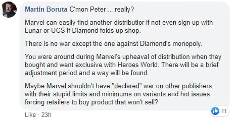
On Friday, June 5th, DC Comics sent ripples through the comic book industry by announcing it was dissolving its long-standing relationship with Diamond Distribution. First reported by the Hollywood Reporter, DC goes on to explain the change is made with the best interests of the Direct Market in mind:
“We recognize that, to many of you, this may seem like a momentous decision. However, we can assure you that this change in DC’s distribution plans has not been made lightly and follows a long period of thought and consideration. The change of direction is in line with DC’s overall strategic vision intended to improve the health of, and strengthen, the Direct Market as well as grow the number of fans who read comics worldwide.”
However, not everyone has expressed enthusiasm (to put it mildly) over DC’s decision to change distribution models. Peter David (“PAD”), respected and award-winning writer for Marvel, notable for his work on such titles as The Incredible Hulk, Aquaman, X-Factor and Star Trek, has taken to Facebook to express his view that DC’s move is a declaration of “war” on Marvel:
“DC has just declared war on Marvel Comics.
Oh, they aren’t framing it that way. But they have.
Because DC has just announced that they are severing ties with Diamond Comics, DC represents thirty percent of the market, and there is no way–simply no way–Diamond will be able to survive with that kind of come down in revenue. The mission here is to drive Diamond out of business, which will then cripple Marvel Comics.
And of course stores are now screwed, because they suddenly all have to open accounts with new unknown and untested distribution centers. The ones that managed to hold on during the Covid-19 closures will have considerable trouble surviving.
This is potentially catastrophic.
PAD”
As of this writing, David’s post has received 273 comments, both for and against his assessment.
Let us know what you think in the comments section below.
Do you think David’s calling out of DC is an accurate picture and will hurt everyone in the long run, or is his take a bit of hyperbole from the competition?
Getting people to accept comics as serious literature can be difficult. Part of this is because the only interaction that people have with comics is the numerous blockbuster movies that Marvel, and occasionally DC, release. It’s hard to hold something up for serious consideration when the pinnacle of experience is three hours of costumed muscle men punching each other.
Stereotypes and modern social symbols affect initial interpretations and can form a barrier to experimenting with new mediums. If all you see is one genre of a medium, why would you want to venture any further?
However, it’s not just the iconography that can create blockades for new readers, the structure of a comic can be challenging to translate, and itself be off-putting. When faced with a page of panels, often overlapping or with small inserts, it can be daunting to read.
Natural instincts will drive a reader to take the Z-Path reading approach through a page, starting at the top left and finishing at the bottom right. However, even comics with straight forward panel layouts aren’t always grammatically easy to read. How does one panel interact with another? Is the new row of panels a new idea or a continuation of the previous row? The different page and panel transitions can be complicated to follow if you are not au fait with a particular style of comic and, just like any storytelling medium, comics contain flashbacks, dream sequences, and changes of perspective, all of which can complicate things further.
In Understanding Comics*, Scott McCloud approaches Comics as if they have their own grammatical structure, containing signifiers specific to sequential art. Thierry Groensteen takes this concept one step further in his books**. He describes the structure of a comic as if it was a language of its own, made up of the same elements that make up any written language. He breaks comics down into paragraphs, sentences, and even verbs; an entire syntax that can be studied beyond image interpretation.
To explain the workings of a comic as language is not an easy task, it can appear as complex as learning any new language. However, as much of the comic language is visual in nature and created using concepts that readers are already familiar with in other mediums, especially prose novels, it isn’t as complicated as it first seems. Basic ideas can be demonstrated in simple ways if the right comic is chosen as an example. You can use comic strips like Peanuts orDick Tracy to easily explain the progression of images to build simple sentence structure; Neil Cohn does this wonderfully in his book The Visual Language of Comics***. Alternatively, you can look at the page layouts in a graphic novel such as Blue Is The Warmest Color and see how it follows a structured formula akin to a prose novel in order to tell it’s story.
By studying the different techniques that Julie Maroh uses in Blue Is The Warmest Color it will become clear that the graphic novel utilizes familiar and repeated structures to advance plot and enhance character. It does this in the same way that a movie or a prose novel uses techniques specific to those mediums to lead an audience naturally through the narrative.
* Understanding Comics Chapter 3: Blood in the Gutter by Scott McCloud, Published by William Morrow in 1993
**The System of Comics and Comics and Narration by Thierry Groensteen published by University Press of Mississippi
***The Visual Language of Comics Chapter 3: The Visual Lexicon part 2 written by Neil Cohn and published by Bloomsbury Academic in 2013.
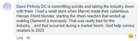
Page 8: From color to grey scales
Blue Is The Warmest Color*
Le bleu est une couleur chaude was first published in french in 2010. Written and drawn by Julie Maroh, it is a story about self discovery and social bigotry. The central character, Clementine, falls in love with an older teenager she glimpses briefly in the street and her life is changed dramatically by the relationship that follows.
Maroh’s art style is fairly expressive, reflecting the aesthetic of the 1990s, where most of the comic are set. The main character’s features are slightly exaggerated, giving each one a distinctive look, which is important because most of the story is set in grey scales with only a splash of color. This is because the majority of the story is told as flashbacks, through the use of a diary that one of the characters reads.
The contrast between the present day and the diary entries is reflected by the lack of color. It creates a clear distinction between the time periods with the written captions providing setting both physical and emotional. This is the first of many examples of Maroh using the structure of her graphic novel to aid the reading experience.
*Simply to be known as Blue from this point onward
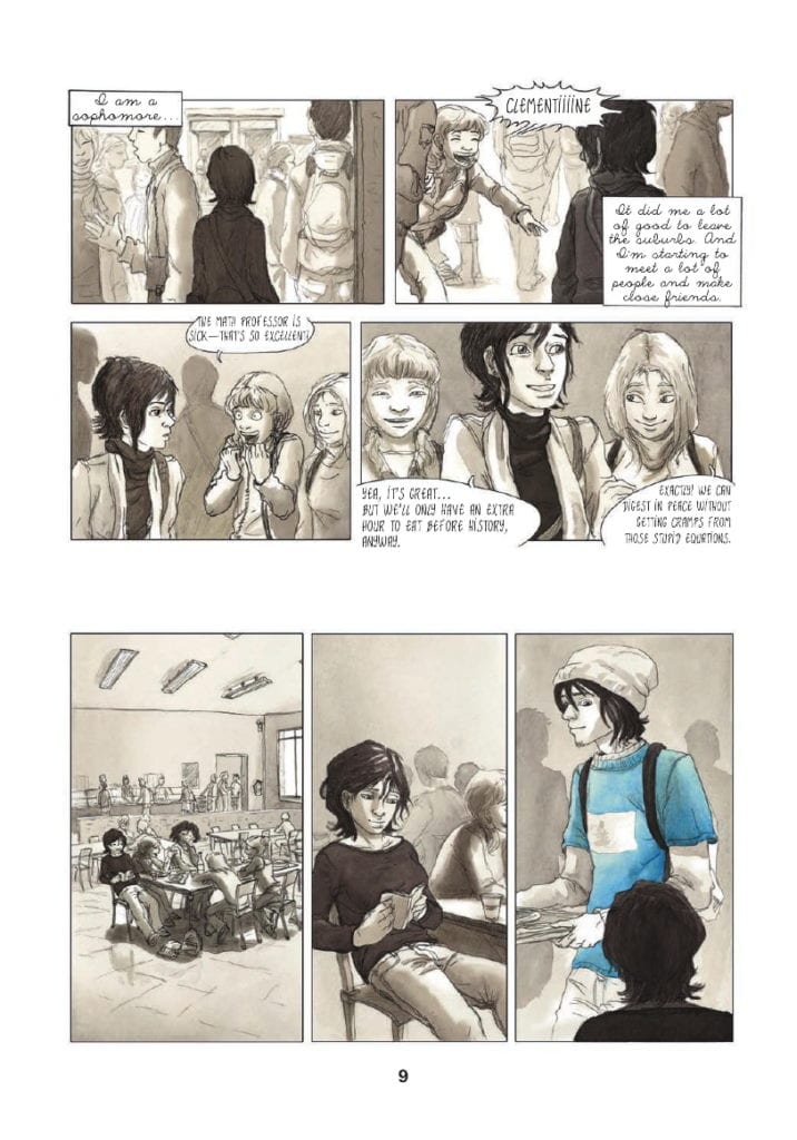
Page 9: Signalling a scene break
Scene Breaks
When you pick up a prose novel there are a number of structural elements that you would expect to find contained within the book. The narrative is often broken down into paragraphs and chapters, denoting moments of time and scenes from the characters’ lives.
A graphic novel or comic contains the same breakdown of narrative information; however, it might not take the same form as prose. The most obvious separations of time are between the panels themselves; however, the structure of sentences and paragraphs in a comic goes beyond single panels. A series of panels and gutters define a period within a scene, and the overall page structure reflects various lengths of time. In Blue, Maroh signifies time shifts in a visually obvious way, as I will demonstrate.
As already explained, Blue takes the form of diary entries to tell Clementine’s relationship with Emma. The book* opens with Emma visiting Clementine’s parents’ house and picking up a blue-covered diary that has been left for her. There is a somber mood which overshadows everything that is to come.
Early on, you get an example of how Maroh uses the space on the page to signify jumps in time or breaks in scenes. On page 9, the reader is introduced to Clementine in her school when one of her friends calls out her name. Two tiers of two panels reveal Clementine in a short character moment that also establishes her situation and location: she is a high school student on campus. In the scene Clementine and her friends discuss the bonus of having an extra hour for lunch. The scene then skips to the canteen where Clementine is sat with her friends, already well within the lunch period.
To illustrate the jump in location and the passage of time, there is an extended gutter between the two scenes. A gutter that is noticeably larger than the gutters between the four panels at the top of the page.
This extended gutter creates a larger time-lapse than the previous gutters suggest. At the top of the page, there are mere moments between each panel, even the move from the end of tier one to the start of tier two is representative of a shorter period of time. This is because the gutter is smaller between the panels and the tiers. However, the break between the end of tier two and the start of tier three is approximately four times the size. The physical time it takes the reader to get from panel 4 to panel 5 is longer and indicates that the journey Clementine took between the two moments is also longer.
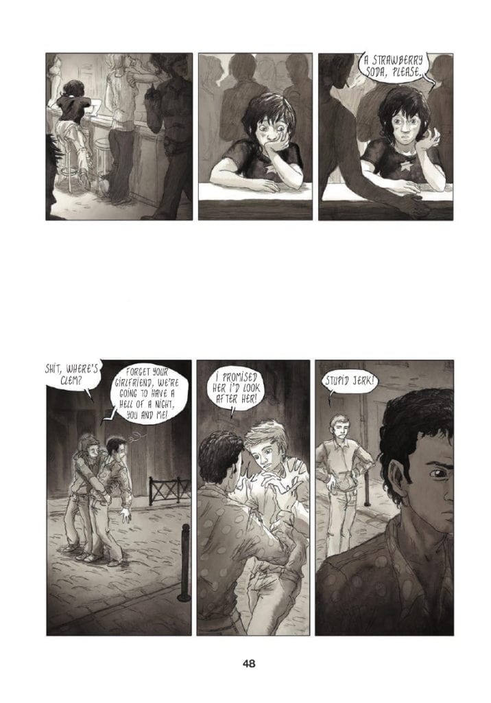
This approach to the layout continues throughout the novel with the gutters between scene changes altering in size, representing longer periods of time. Another great example of this occurs on page 48.
Clementine has been taken out by her friend Valentine for a night on the town, visiting the local gay bars. During the evening, Clementine starts to feel like a third wheel so she secretly splits off from her friends. She finds herself sitting alone at a bar where she orders a drink. This occurs at the end of the first tier of the page. There is then a break between the first and the second tiers when the focus shifts to Valentine realizing that Clementine has gone.
The gutter between the two tiers is especially large, almost big enough for another row of panels to be introduced. This large gutter represents two narrative elements, one physical and the other emotional.
In the first instance there is a shift in space/time between the characters. The action moves away from Clementine and focuses on Valentine. The size of the gutter infers that there is a lengthy time period between one ordering her drink in the bar and the other noticing he has lost his friend. There is also the indication that Valentine has traveled some distance away from his friend.
The larger gutter illustrates a psychological distance as well as a physical between the characters. Although they are friends, the evening is clearly more enjoyable for Valentine than it is for Clementine. She is uncomfortable and unsure of herself and her surroundings. Valentine on the other hand is in his element, enjoying himself. For Valentine, the large gutter is a visual indication of the phrase’ time flies when you’re having fun’.
Although the altering of gutter sizes is not unique to Blue, very rarely is it used so notably to reinforce the characters’ movements and emotions. The standard practice is to change a scene on a page turn, a technique Maroh employs; however she is able to add more narrative weight to the story by changing scenes mid-page.
*This article is based on the soft cover, Arsenal Pulp Press printing with the first edition in 2013. Any references to page numbers therefore refer to this particular print and may differ from other editions.
Page 48: Extended Gutters
Chapter Endings
Although not all novels, or graphic novels, are produced with chapters, there is always an element of significant narrative change where a character or plot reaches a point of no return. These usually take the form of some thematic breakthrough or mood change in the story.
Maroh chooses not to use formal chapter breaks, but there are sections of the book that perform the same function. These pages are notable because the structure of the page layout is significantly altered.
Throughout Blue, Clementine’s life and ideals are challenged and there are turning points where something important happens. These points are punctuated in the book in one of two ways. The first is via full-page spreads, that is, one image taking up an entire page. I will come back to these later.
The second technique that Maroh uses is to significantly alter the panel form and layouts. The alterations signify the importance of a moment of time as it stands out, not only on the page but in the rhythm of the novel as a whole.
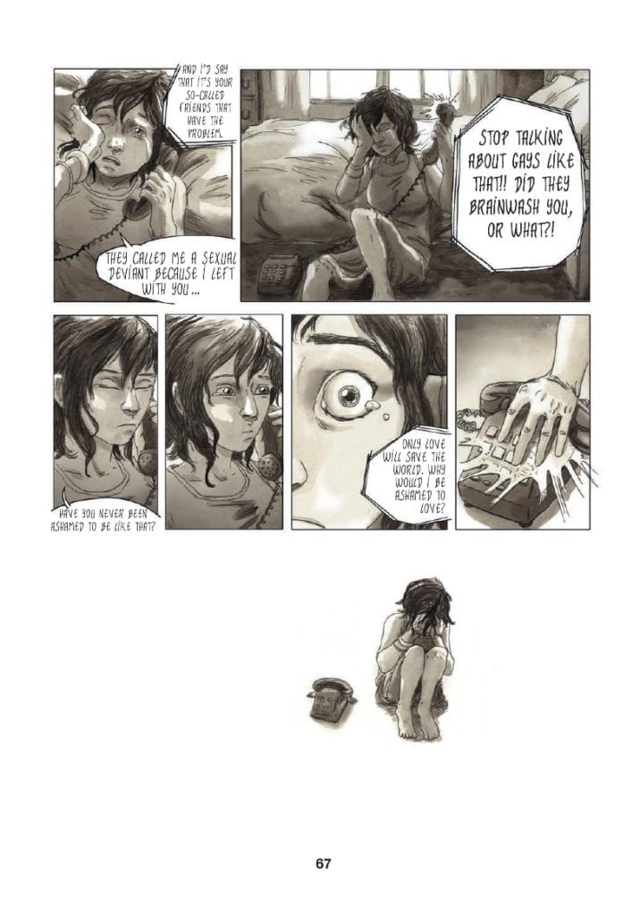
After a bad day at school, where Clementine is bullied by her once best friend because of rumors about her sexuality, she turns her frustrations on Emma. Via a telephone call, Clementine blames Emma’s indiscretions for the bullies’ behavior, and in return, Emma points out Clementine is hiding who she is. The scene, which reaches a climax on page 67, is a turning point for Clementine as she is forced to seriously face her sexuality and the implications it will have on her life. She has to accept who she is and how she is going to live her life.
The emotional moment of realization is the biggest turning point in her teenage life, so big that it cannot be contained within the borders of a panel. The top two-thirds of page 67 are laid out in the same formula as the rest of the novel, with tiers of panels placed next to each other. However, the end of the scene is of such significance that Maroh ends it by breaking her own structure. Even a large gutter is not enough to punctuate this moment.
Instead, the emotional Clementine is pictured by the telephone, a physical representation of her conversation with Emma, and nothing else. She is not situated in a location; there is no background or foreground, no set whatsoever. Even the conventions of the comic are stripped away by removing the panel borders and, by association, rendering the gutter obsolete. The bottom third of the page becomes an empty world only populated by Clementine and the memory of her argument.
Similar moments appear in the graphic novel, but not many. This visual representation is reserved for life-changing character moments. Maroh uses the technique sparingly, to punctuate the major narrative beats as if they were chapter endings. These moments are emphasized full stops and force the reader to contemplate the events leading up to this point.
Page 67: Broken Panel Structure
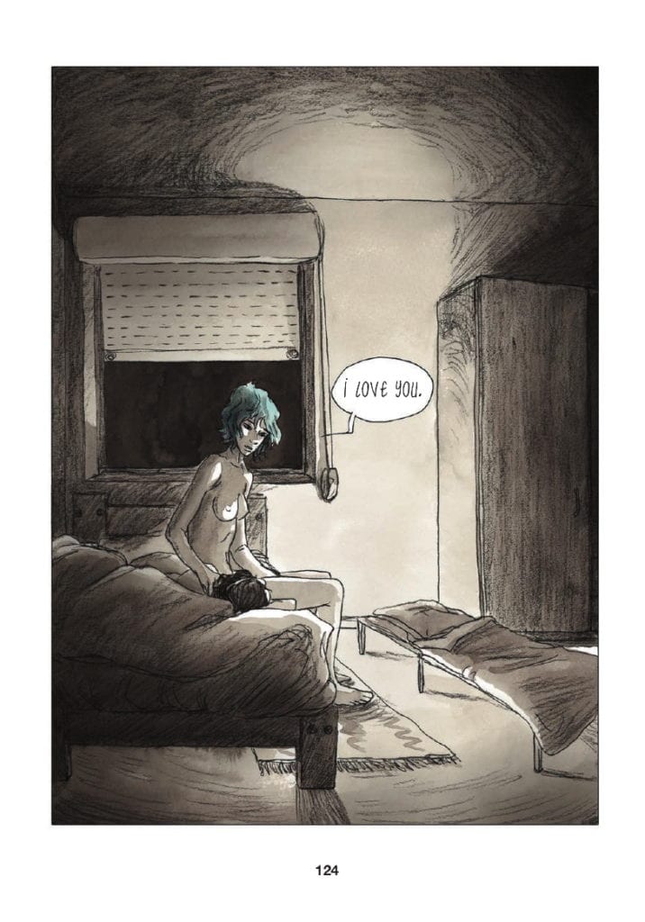
Splash Page Punctuation
I previously mentioned the splash page. Within Blue, Maroh uses the splash page sparingly and in a similar way to the ‘Chapter Ends’. It is a technique she uses to emphasise a specific emotional moment. Where the two techniques differ is that Splash Pages focus on Emma instead of Clementine. Although this is primarily Clementine’s story, it is also Emma’s.
The splash pages represent an emotional high, or extreme low, where Emma is the central concern. The first two such pages, pages 82 and 83, illustrate Clementine’s growing obsession with Emma, a focus of her love and attention. Page 124, which is arguably Emma’s breakthrough moment in the narrative, shows the older woman’s vulnerabilities but also her strengths.
She sits on the edge of the bed in Clementine’s parents’ house, naked and exposed. There is an element of risk in the scene as signified by the cot bed, where Emma should be sleeping.* The reader can barely see Clementine, only the top of her head is visible, but all of Emma is on display. The darkness outside and the surrounding shadows are reminders of the problems that the couple still have to overcome, but there is also a column of light, shining on Emma as if it were a ray of hope. The full-page is a character dissection of Emma, where she has been and where she is at that moment. In this sequence that changes Clementine’s life forever, the moment is writ large and focused, specifically, on Emma.
The next full spread, page 145, also focuses on Emma, but this time the image, almost black with scribbled pencil, represents the breaking of a heart. Page 124 endears Emma into the hearts of the reader, making the follow-up page, page 145, that much more painful. Despite it being a monumental part of Clementine’s life, it is almost as important to Emma. This is why Maroh chooses this technique to focus on the narrative and character.
The final full-page spread is also the final page in the novel. It is all-encompassing, signifying both the lives of the characters and a grander sense of immateriality. These moments, illustrated in the novel with such a presence, are the most important periods of time for each of the characters. The size of them makes the moments last long beyond what is expected, but are also just as fleeting. Each page is in actuality only one panel, but they contain so much more, physically, and emotionally.
* Clementine’s parents are homophobic and at this point in the story do not know that their daughter is gay
Page 124: A Splash Page highlighting character and narrative.
Conclusion
Everybody’s lives are made up of the mundane and the monumental. The passing of time can contain a vast array of experiences and emotions but just as easily be fleeting and forgettable. It is the job of the writer/artist to differentiate between those times and emphasise what is relevant for the narrative. In Blue, Julie Maroh employs different visual techniques to portray the moments in her heroine’s life.
Large gutters, layout alterations, and oversized panels all create different types of punctuation within her storytelling. Consistency with these techniques enhances the reader’s experience and understanding of the narrative. Very quickly, you become accustomed to Maroh’s style and the visual grammar she utilizes to reflect elements of character and plot. In the same way that you would instinctively understand the structure of a novel or the editing in a movie, Blue has a straightforward structure that the reader can follow to get the most out of the graphic novel without being overwhelmed by complex, medium-specific, constructs.
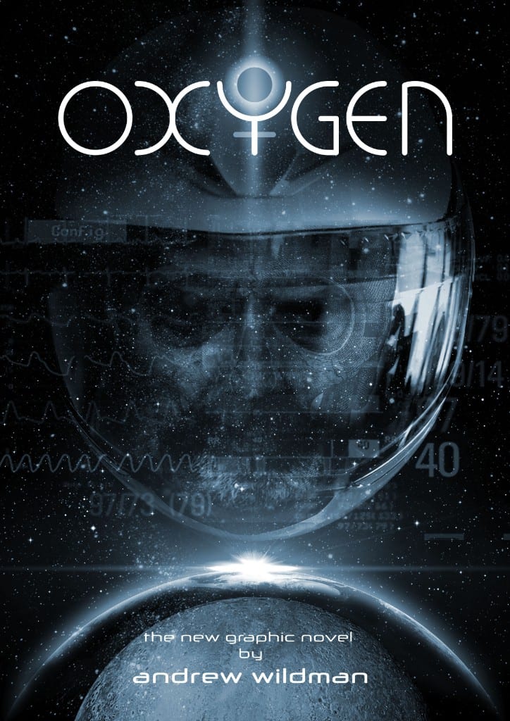
After years of working in the comic book industry, Andrew Wildman stepped back from the mainstream to work on personal projects. His latest, Oxygen, is a seven issue science-fiction mystery story which he is releasing digitally through his own website.
In recent years Wildman has worked as a story-boarder for film and television and the style of this comic is visually influenced by these working experiences. The plot and character are drawn from another aspect of Wildman’s life, his life coaching. Together these two aspects create a fascinating world of layers for the reader to unpick.
Oxygen Promotional Image Credit: Andrew Wildman
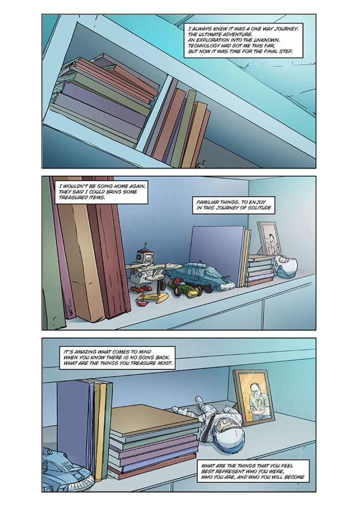
Reading Red
The first thing that becomes apparent when you start to read Oxygen’s first issue, entitled Red, is that each page has exactly the same layout. Three stacked panels of equal size greet the reader on every page. In the introduction to the comic Wildman states he wanted to ‘play out the whole thing as though it is a series of storyboards for a movie’. This is a bold move and one that Wildman pulls off perfectly.
Each panel acts like a television screen with Wildman as the director controlling the audience’s viewpoint. Where the comic has an advantage is that the images are static, allowing the reader to decide how much time they spend taking them in. Early on this makes the pacing slow because Wildman gives the reader a lot to digest. The first few pages are reminiscent of the opening sequence from Alien with the camera slowly panning around the Nostromo.
Wildman , however, has more control over the reader than you might expect. Once the central character is awake and the world literally starts to crumble around him, Wildman picks up the pace and pushes the reader through the panels. The reader becomes as helpless in the forward motion as the astronaut does in the story. Instinctively you find yourself zipping from panel to panel as the transitions become more and more dynamic. They stack up like animation cells ready to be run through a projector.
The narrative itself for this first issue is a simple affair with the central character reacting to a dire situation. Readers of Wildman’s last comic, Horizon, will know that the writer/artist always has a plan and many elements that you see in this first issue will take on different meanings as the story progresses. You just need to check out his blog posts to know that even the title and predominant color of this issue, red, has a significance in the story somewhere.
Oxygen #1 Red Page In Progress Credit: Andrew Wildman
Patreon and Production
Over the years Andrew Wildman has worked on some big titles for Marvel Comics, most famously a superb run on Transformers with Simon Furman. These exciting adventure comics required a certain level of dynamism that is evident in Wildman’s current work. Throughout Oxygen: Red Wildman is able to give the impression of movement as if the images have their own kinetic energy. The different levels of energy create the tension within the narrative, like the changing music in a movie. You understand the sense of danger and feel the spaceship breaking apart. This adds an urgency to the story that gets your heart beating.
Wildman’s sense of depth and perspective, shifting the viewpoints around like a steady-cam, produce a truly cinematic experience on the page. The build up in pace from the opening to the end is impressive and works on a subconscious level. To start with you take your time, picking details out of the panels, but before you realise it you’re at the end, lost on an alien world with the astronaut.
This is a comic you will instantly want to go back and re-read. And when you do you’ll start picking up on smaller details, questioning certain elements and art choices. Wildman has a plan for everything and nothing goes onto the page that doesn’t serve a purpose. On the opening page there are a collection of books and CDs, each chosen by the creator for a reason.This reason may serve the narrative or be autobiographical in nature but it has been specifically chosen by Wildman to represent something.
If you are the kind of person that likes to understand the choices that artists/writers make and the processes they go through, then Andrew Wildman is a perfect creator to follow. He has a regular blog where he constantly releases his thought processes and sketches, giving a great insight into how he works. His Patreon is an extension of this where he shares more works in progress and exclusive looks at upcoming pages and design. He posts regularly and it all adds something to the reading experience of Oxygen.
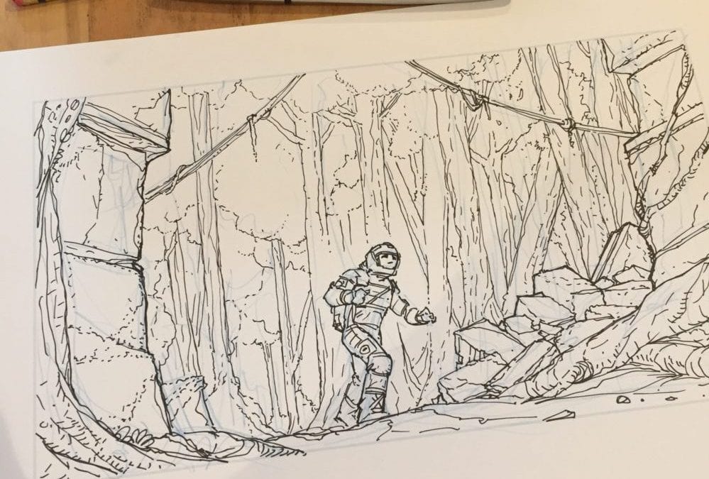
Oxygen Sketched Panel From A Future Issue Credit: Andrew Wildman
Conclusion
By itself, Oxygen is a surprisingly action paced comic despite the fact that it serves simply as an introduction to Wildman’s new world. There isn’t a lot of obvious character development but at the same time you can get to know the astronaut quite well if you take the time to pick the panels apart.
The driving force behind this comic is the design, especially the approach to layouts. By choosing the three stacked panel approach, Wildman has created a comic where he has complete control over what the reader sees and how the reader experiences the narrative.
However, one of the biggest selling points is Andrew Wildman himself. Most people who buy this comic will probably take a look at the production information that Wildman is posting and begin to lose themselves in the creative process. The creators Patreon page is a wealth of information that enhances the final product and is addictive in itself.
With 6 more planned issues, Oxygen is a triumphant of storytelling and production. At only £2 for the first downloadable issue, you’ll not find a better comic to spend your money on.
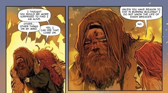
REAVER #8, out now from Image, brings the impish Rekala and gigantic Essen Breaker (“Ess”) back together to stop Stagger from abducting the townschildren. Justin Jordan’s writing and Niko Henrichon’s art combine for a high fantasy chapter that’s surprisingly introspective.
Cover Art
Becky Cloonan’s cover is mesmerizing. Rekala needs to bleed to stop the working, and yet her pose is calm rapture. The stark contrast of her bleeding arms, combined with her shock of red hair, turn a peaceful water scene into malevolent magic.
Writing
Justin Jordan picks up the story immediately where the prior issue left off. Rekala arrives to save Ess from Stagger, and she quickly proves that going with the smaller opponent is not always the best choice. After the rescue, Ess and Rekala catch each other up on their exploits while separated. The impact of their solo (mis)adventures cause them both to question their purpose and motivations on the current mission.
While there’s plenty of action in this book, it’s the character development that elevates the issue beyond your basic high adventure. Ess, in particular, has seen more than his share of violence and considers at what point does his life stop revolving around bloodshed. At what point does a soldier stop being a soldier, if ever?
Jordan catches you off guard with the giant’s thoughtfulness when you least expect it. This issue promises character development and maturity that’s more nuanced than you would expect.
Pencils/Inks
Nobody in Henrichon’s art is pretty, and that serves the issue well. From Stagger to Ess to Rekala, all of Henrichon’s characters are battle-weary, worn and scarred. The imperfections give each character more depth and authenticity to match the roughness of the harbor town they’re in. Henrichon has drawn warriors that look like they’ve been fighting all their lives.
Coloring
Henrichon’s color are largely muted throughout the issue. Instead of creating a bland atmosphere, the muted colors provide a harsh contrast to the bloody action. Reds pop violently for emphasis, and the harsh yellows of the orphanage fire practically make the characters sweat on the page form the heat. Excellent use of color for impact by Henrichon.
Lettering
In between action, Jordan has peppered in a fair bit of dialog for the characters to open up to each other. Henrichon’s lettering expertly moves the readers eyes through the panels to keep up the pace without interfering with the characters’ facial expressions. Faces are so important to the dialog delivery, and a lesser lettering job would have crowded out the “acting”. Not so here. Great job, again, by Henrichon.
Conclusion
REAVER #8 packs as much character development punch as action in a brisk 21 pages. The artwork pops precisely when it needs to for maximum effect and the story sets up a desperate showdown with Stagger. This series is improving with each issue.
Author’s Note: Local Comic Shops (LCS) are going through a tough time right now with the pandemic outbreak of COVID-19. Comics fans of every flavor that care about his or her LCS should try to do what they can. So, here’s my part:
If you’re in Northern Delaware, South East Pennsylvania, or Southern New Jersey area, please take a moment to visit Captain Blue Hen Comics in Newark, DE. Say ‘hi,’ pick up a book, order a book (they’re on Comichub.com), and let them know you support them.
If you’re nowhere near that area, please find YOUR LCS using Comic Shop Locator and lend your support.
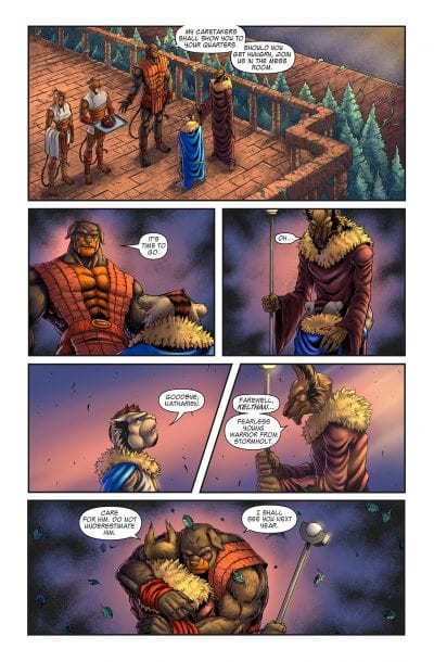
BATTLECATS: TALES OF VALDERIA #3, available from Mad Cave Studios on June 10th, tells the origin story of the next team to be promoted to the rank of protector over Valderia. Kelthan, the main protagonist of this issue, is educated on the rich history of Valderia as part of his training to become the next Battlecat. It may have not been intended, but BATTLECATS is a more worthy successor to Thundercats than the recent cartoon reboots.
Writing
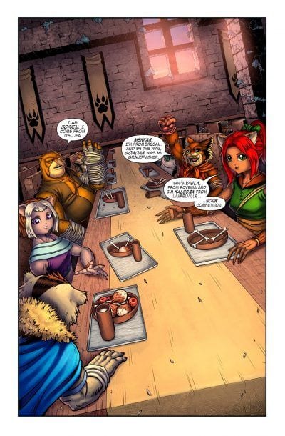
In the story, Zaphyra teaches young Kalthan about the workings of royal government. Kalthan aspires to become a Battlecat for the king, and he’s given the chance to pursue his dream. Along the way, he meets other students from diverse backgrounds but with similar goals. On every page, writer Mark London gives the reader digestible chunks of information about this world without making you feel overloaded.
London’s story of the team’s origins is, admittedly, thin. At best, this story barely qualifies as a prologue. That said, this is a perfect primer issue to educate the reader on Valderia, its menagerie of species, the customs and legacies of each character and their tribe, and give a glimpse of the future. If London had crammed all this world-building into a complete story in one issue, it would have either been twice as long or overstuffed with word balloons. London’s choice to create a story-thin but lore-rich issue was the right call and cleverly written in its setup.
Pencils/Inks
Michael Camelo’s art style is super clean and very imaginative. Valderia is not simply another planet. There are floating islands and landscapes with odd geometries that give you plenty of visual interest. The creature designs are equally imaginative, and Camelo’s style has a vaguely manga flavor that’s atypical for fantasy books of this sort. Camelo’s characters and worlds are high fantasy in nature, but the designs of the landscapes and costumes add a scifi element that’s wholly unexpected in the best way.
Coloring
Julian Gonzalez impresses with coloring that implies light, shadow and texture. All the characters in this issue are fur-based animals, so it would have been easy to defer all the fur texturing to the artist. Not so here. Gonzalez took the time to use multi-color fills and gradients to make the fur detail look finished without looking flat. It’s a strong bit of detail work that pays off in the end result.
Lettering
Miguel Angel Zapata’s lettering is clean, clear, and keeps the readers eye moving along the page to maintain pace. Camelo’s art is stellar in this issue, so the last thing you want is to have the panels crowded with poor word balloon placement. Zapata demonstrates exactly how to put a lot of that world-building exposition in place while letting the stellar art shine through.
The lettering, however, doesn’t completely work with the combination of font choice and the use of italics. In a few spots, Zapata’s use of italics made the stylistic font a little hard to read, especially with names. It’s a minor criticism which can be easily adjusted in future issues.
Conclusion
BATTLECATS: TALES OF VALDERIA #3, available from Mad Cave Studios on June 10th, is a strong setup issue for future tales. The artwork is gorgeous and the depth of history is impressive. If Mad Cave keeps turning out books like this, I’ll be sticking with this series for a long time.
Author’s Note: Local Comic Shops (LCS) are going through a tough time right now with the pandemic outbreak of COVID-19. Comics fans of every flavor that care about his or her LCS should try to do what they can. So, here’s my part:
If you’re in Northern Delaware, South East Pennsylvania, or Southern New Jersey area, please take a moment to visit Captain Blue Hen Comics in Newark, DE. Say ‘hi,’ pick up a book, order a book (they’re on Comichub.com), and let them know you support them.
If you’re nowhere near that area, please find YOUR LCS using Comic Shop Locator and lend your support.
HELLFIGHTER QUIN #2, available from Mad Cave Studios on June 10th, follows Quin through the first round of the tribunal. Every combatant wants the orbs power to defend their clan, and Quin forms an alliance to get it. Deadeye and Glass Assassin join the fight in an issue packed with fighting action.
Cover Art
Atagun Ilhan’s cover is coming at you with a dynamic action pose for Glass Assassin and Deadeye. There’s a risk using a solid blue background that you wind up with too much negative space. But Ilhan mitigates that problem by filling the voids with arrows and the characters’ limbs in forced perspective. It’s an exciting cover.
Writing
Jay Sandlin brings the competing warriors together to form an alliance in an “enemy of my enemy is my friend” scenario. The fellowship’s formation didn’t feel forced or rushed, and Quin goes along with his allies with enough awkwardness to make it feel believable.
There’s a lot of new pieces of information introduced in this issue, and despite it only being #2, the story doesn’t overload you with too many labels or jargon or context. Sandlin’s world-building feels very smooth and organic. I could follow the story and take in new bits and pieces about this world easily. The reader shouldn’t need to take notes to keep track of what’s going on, so Sandlin succeeds here.
Pencils/Inks
Atagun Ilhan drew the interiors as well as the cover, so the artwork is consistent, inside and out. There’s a lot of fight scenes in this issue, as you would expect for a battle tournament. Ilhan adds in plenty of violence without getting gratuitous. Every character looks like they’re constantly in motion to give the issue a rapid pace. This is a high energy issue.
The one area that doesn’t quite work in Ilhan’s art is the detail, especially with faces. On several panels, the faces look warped and ill-defined. This could have been a result of rushing due to lack of time, but the result is sub-par. For future issues, more attention is needed to getting details in the faces proportioned correctly, consistent and cleaned up.
Colors
Maria Santaolalla has a difficult task. Almost the entirety of this issue takes place in an underground labyrinth. Effectively, stone walls and darkness. Sanataolalla used a fairly wide spectrum of blues to maintain the sense of darkness while still giving illumination on the visual interest points in the background to give you something to look at. When blood flows, Santaolalla makes the reds pop without looking fake or out of place.
Combined with the critique about Ilhan’s work on the faces, the skin tones from Santaolalla are equally off. In several panels, the faces appear to be two-tone. It looks like it was an attempt to imply deep shadow, but the result looks more like the characters are wearing caked mud.
Lettering
Justin Birch’s lettering is the most exemplary art of the entire book. Birch’s choice of reverse-bolding with white letters contrasts well against the largely dark panels. The pop of red in the word box background anchors the continuity of Quin’s inner monologue all the way through the issue, and the red is a nice touch to pair with the gore of the situation.
Conclusion
HELLFIGHTER QUINN #2, available from Mad Cave Studios on June 10th, packs a ton of action and world-building into a brisk 21 pages. It’s easy reading with lots of visual interest. If the art team tightens up the minor issues with faces, this will be a very enjoyable series.
Author’s Note: Local Comic Shops (LCS) are going through a tough time right now with the pandemic outbreak of COVID-19. Comics fans of every flavor that care about his or her LCS should try to do what they can. So, here’s my part:
If you’re in Northern Delaware, South East Pennsylvania, or Southern New Jersey area, please take a moment to visit Captain Blue Hen Comics in Newark, DE. Say ‘hi,’ pick up a book, order a book (they’re on Comichub.com), and let them know you support them.
If you’re nowhere near that area, please find YOUR LCS using Comic Shop Locator and lend your support.