Home Blog Page 289

Review: STAR BASTARD VOL. 1 – Tacky & Unrefined…and Loving It!

Writer Andrew Clemson and artist Jethro Morales craft a 6-issue arc that’s equal parts Guardians of the Galaxy, Fear Agent, and a long night at the Mustang Ranch with Star Bastard Volume 1. Along with colors from Teo Gonzales, this crass comic full of lasers and space babes is a cliched and simplistic read but is still plenty entertaining due to its brisk pacing and stellar visual work.

“A foul-mouthed, over-the-top Sci-Fi romp, equal parts Red Dwarf and grain alcohol, Star Bastard follows a long-suffering mercenary crew as they stumble through the universe under the clumsy command of the loud, obnoxious (and invulnerable) Captain Greeves. Searching for clues to Greeves’ shadowy past, they leave a trail of lizard bounty hunters, angry alien empires, and unpaid bar tabs in their wake.”

Writing & Plot

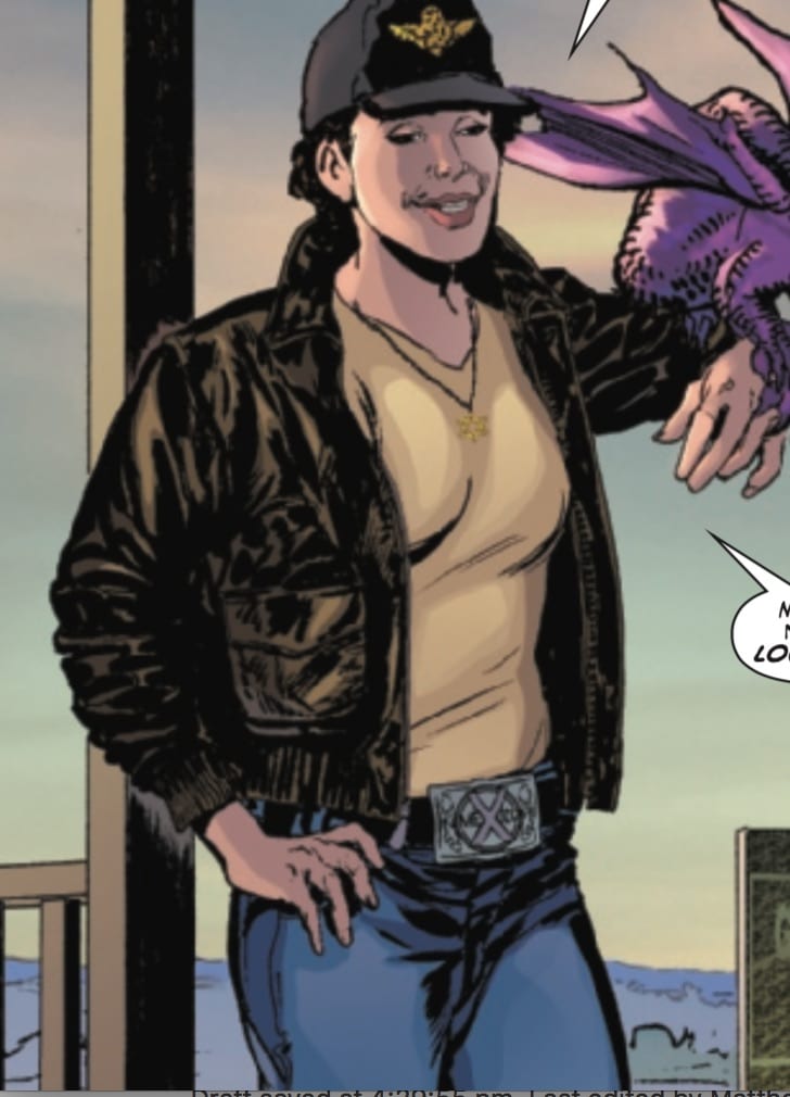
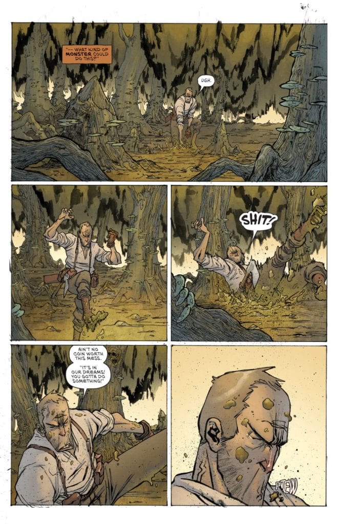
The first six issues in  Star Bastard Vol. 1 are an exercise in goofy simplicity. The mix of narrow escapes, bloody space-battles, and scandalous interactions make for a fun distraction of a read – even if it’s in no way original. Protagonist Captain Greeves is basically Chris Pratt’s Star Lord if he had impenetrable skin and if the MCU could get an R-rating. The supporting cast of characters, from the snarky cyborg Molly, to the hotheaded pilot, and the humorless engineer are all character types done time and time again.  There’s nothing wrong with a story that treads a beaten path, as it’s all about how the conventions are presented. Nothing in Star Bastard is all that surprising, but it’s like comfort food from a chain restaurant; you know exactly what you’re getting and what it tastes like, but it’s still tasty. Some of the more lewd moments are sure to make some eyes roll, but outside of that, this is a fun and well-paced bit of disposable comics entertainment.
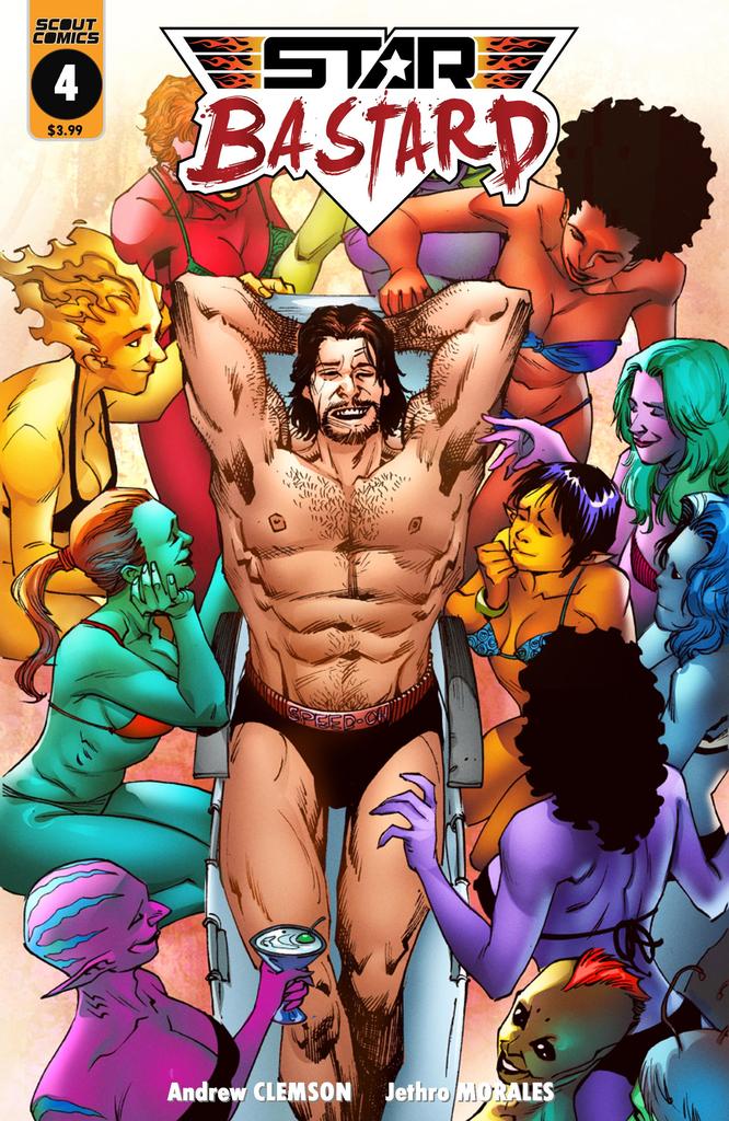
Art Direction

The real star of Star Bastard Vol.1 is the art of Jethro Morales. In terms of character art, action sequences, and world detail, his work here is consistently stellar. The lively, lighthearted animations in the character drawings effortlessly sell the comedy and action in the comic. The character designs themselves aren’t terribly unique, as most if the aliens look either mostly human or like an alien you’ve seen somewhere in a movie. Again though, this is easily forgiven just based on how good the art is. The colors from Teo Gonzales are an absolute standout as well, as they vibrantly pop off of every panel. Ship thrusters and cannon fire streak through space, while neon lights of planetary civilizations glow alight in dark backgrounds. Space-faring sci-fi comics are often made or broken by their artwork, so it’s extremely fortunate that Star Bastard has such a talented team working on its visuals.

Star Bastard Vol. 1 is a goofy, crass, fun romp with a colorful cast of sci-fi characters and excellent artwork. The writing isn’t anything groundbreaking, but it’s well-paced and humorous enough to make the story a page-turner. The art from Jethro Morales and Teo Gonzales is stunning and does a splendid job at bringing this absurd space adventure to life on the page. If this opening arc sounds like your kind of good time, preorder it from your local comic shop or Scout Comics’ webstore!

Monkeys Fighting Robots Youtube

DCeased Preview: DEAD PLANET #2

Dceased dead planet #2

The reviews are in for DCeased: Dead Planet, and now DC Comics has unveiled a look at some preview art for issue #2 ahead of its August 4 release:

DCeased: Dead Planet #2
Death Lies Around Every Corner

The sequel to the bestselling miniseries continues! The Justice League is trapped on Earth, and they’ve discovered that life still survives on this dead planet! Survival is precarious, though—and with billions of infected still roaming the surface, death lies around every corner.

But, it isn’t just the anti-living our heroes have to worry about, because John Constantine, Swamp Thing, and Zatanna are about to discover another evil growing…

DCeased: Dead Planet #2, written by Tom Taylor with art by Trevor Hairsine, Gigi Baldissini, Rain Beredo and Saida Temofonte hits shelves Tuesday August 4 with a main cover by David Finch, a card stock variant cover by Francesco Mattina and a card stock movie homage variant cover by Ben Oliver.

Monkeys Fighting Robots Youtube

Review: ALIENATED #4 Is Pleasing To The Eye But Heavy On The Heart

Alienated #4 cover
Alienated #4 Cover Credit:BOOM! Studios

Someone once said “with Great power comes great responsibility”, unfortunately they didn’t say it to the three Sam’s from Alienated. In this issue, which revolves around Samir and his abuse of Chip’s abilities, a search for the Truth leads to devastating consequences. The comic should come with a content warning because the narrative takes a disturbing, and shocking, turn.

Issue 4 of Simon Spurrier and Chris Wildgooses’ BOOM! Studios monthly comic up’s the ante and takes the reader places they probably weren’t ready to go. With strong opening issues, Alienated has set itself a high quality. Are the creative team able to maintain the same level or, dare we say, even improve on it?

Alienated #4 Credit:BOOM! Studios

Tales to Astonish

The plot of issue 4 is intense and emotionally moving. Spurrier handles it beautifully and with compassion. Samir’s journey to reconcile himself with his father is both touching and tragic. The whole sequence is about the consequences of the characters actions which resonates throughout the issue and into other elements of the narrative. Without wanting to spoil any of the twists, the selfishness of one character causes major disruptions for another character.

Over the course of this series Spurrier has pulled the three central characters apart to see what makes them tick. He has laid their souls bare on the page, warts and all, so that the reader can truly get to know them. These characters are not two-dimensional college kids as seen in any number of coming-of-age movies; it’s not as simple as the jock, the nerd, or the princess stereotypes. Each has a number of layers that create their personality and this is the crux of Spurrier’s story. He is dissecting the teenager, with the aid of his science fiction plot device, and getting to the heart of what makes the characters behave in the way that they do.

Things are not as simple as black and white when you are a teenager, there are so many shades of grey. Spurrier is portraying this and, with it, the darker side of growing pains. There is a lot going on in this issue but one element stands out and because of that you may find this issue of Alienated upsetting.

Alienated #4
Alienated #4 Credit:BOOM! Studios

Visual Disturbance

Chris Wildgoose’s layouts are focused and his art is expressive. He has a firm grasp on the storytelling aspect of the comic by making sure the reader can follow the flow of narrative across the page and through the issue. Each panel has a clear focal point and, even in the more complicated panels, the composition is easy to read with clear threads through the images. The reader is led into an image by Jim Campbell’s lettering and then just the right amount of pause is left for the visuals to soak in.

The color scheme both in the images by Andre May and the lettering by Campbell have been documented on numerous occasions throughout the series. In this issue the contrasting character hues seem to be even more evident. Large scenes and sequences take part inside the minds of the three Sams and it is always crystal clear whose mind the reader is seeing. The colors are bold and fitting, with each of the characters respective focus colors becoming more relevant to their personalities. As the plot unfolds, craft decisions made at the beginning of the series become more important.

There is a very poignant story full of pain and anger at the centre of this issue and the artistic flair does not detract from this but helps it flow more naturally. The harsher moments of the comic feel brief because of the superbly paced visual storytelling. Scenes that are distressing move fast enough for the reader to get the idea without having to linger on the imagery. You get the shock but pass it quickly without the need to unduly focus.

Alienated #4
Alienated #4 Credit:BOOM! Studios

Conclusion

Intense is the best way to describe this chapter of Alienated. The story is progressing down roads that you won’t expect which can have its downfalls. Parts of this issue could cause distress which is a testament to how natural and realistic the narrative feels. Similar story-lines in a lesser book could be written off as cheap sensationalism, but Spurrier writes such convincing characters that their emotional turmoil becomes a part of the reader’s emotional reaction to the comic.

The artwork continues to impress on every level and Alienated is a worthwhile comic. Where the story goes from here is important. For the bold choices in this issue to mean anything the fallout next month has to be dealt with in the right way. Based on what they’ve put out so far, I think the comic is in safe hands

Monkeys Fighting Robots Youtube

Review: BUFFY THE VAMPIRE SLAYER: WILLOW – Capturing Feeling Lost

Willow Cover

Buffy the Vampire Slayer: Willow #1 out this week from Boom! Studios takes the beloved character on a new path, while also giving an amazing portrayal of loneliness and feeling lost.

Page referencing Hellmouth

Buffy the Vampire Slayer: Willow Story

Buffy the Vampire Slayer: Willow #1 follows Willow Rosenberg after the Hellmouth 2019-2020 event, and as she attempts to distance herself from what happened in her past. She goes on a semester abroad to England and must deal with the feeling that there is no one she can talk to. Written by Mariko Tamaki, illustrated by Natacha Bustos, colored by Eleonora Bruni, and Lettered by Jodi Wynne, this issue does a beautiful job of capturing the essence of loneliness. It allows for an wonderful insight into Willow’s character before her new adventure kicks off.

Buffy the Vampire Slayer: Willow #1 features amazing internal dialogue from Willow that captures her feelings of loneliness and distance from others after she had recently suffered a great loss. Mariko Tamaki strings together sentences that flow easily and make Willow’s character clear to the reader from the very beginning of the issue. The pacing is slow enough to thoroughly develop Willow’s character, but not so slow that it bores the reader. The book picks up towards the end of the issue to excite the reader for what is to come.

Willow writing a postcard on her travels

Art

The pencils and inks are the most outstanding part of this issue, because of how Natacha Bustos frames the panels. There are several instances where Bustos takes advantage of the left-to-right reading nature of western audiences and how they observe panels. Many panels have people socializing in groups on the left side of a panel, only to have Willow by herself on the right side. This technique may go unnoticed upon a first read, but going back over the panels it is clear that Bustos intended for readers to observe everyone else in groups around Willow and use that as a contrast to her being alone once they eventually see the main character. This technique results in some truly outstanding images that emphasize the loneliness of the main character even more than most of the internal dialogue of Willow.

Willow surrounded by people who are socializing

The pages of Buffy the Vampire Slayer: Willow #1 is filled with a large variety of colors making the pages pleasant to look at and adds to the wonder of this fictional world in a few instances but does not offer anything notably spectacular. The colors are done very well, but nothing done by Eleonora Bruni necessarily makes the reader pause in appreciation. That being said, there is a very beautiful splash page near the end of Buffy the Vampire Slayer: Willow that exhibits the raw talent of Bruni, but the rest of the issue fails to have any outstanding moments that rely heavily on the coloring.

Jodi Wynne does a fine job of lettering the issue, allowing the pace of the story to flow as intended. There are no odd choices in lettering that would cause the reader to pause, but there is nothing especially noteworthy about the lettering that would give it a high rating. However, the lettering still does a wonderful job of complementing the rest of the issue, and allows it to come together to be truly enjoyable read.

Willow Variant Cover

Conclusion

Overall, Buffy the Vampire Slayer: Willow #1 is a thrilling start to the new journey Willow is embarking on. It raised questions to be answered, used framing techniques to tell parts of the story non-verbally, and had a wide variety of colors on nearly every page. These all came together to form an impressive issue that anyone who is a fan of Willow should definitely read.

Monkeys Fighting Robots Youtube

Review: X-MEN – GOD LOVES, MAN KILLS EXTENDED CUT #1 – Reframing a Classic…but for the Better?

X-Men: God Loves, Man Kills is considered a classic X-Men story. Originally published in 1983, and the fifth graphic novel to be released by Marvel Comics, writer Chris Claremont, along with artist Brent Anderson, colorist Steve Oliff, and letterer Tom Orzechowski’s classic X-Men tale (which inspired the movie X-Men 2) tells the story of the Reverend William Stryker, a fundamentalist television preacher who believes mutants are an abomination that God wants to strike from the Earth. With his militant Purifiers, he hunts, kills, and kidnaps various mutants, including members of the X-Men, for that purpose.

On July 8, Marvel Comics released part one of two of an Extended Cut of this classic story, with a new framing device (by Claremont and Anderson) that draws on one of Claremont’s more modern X-tales, X-Men Black: Magneto, a one-shot released in 2018, in which Magneto meets and befriends a young human girl named Kate.

Writing

X-Men: God Loves, Man Kills is indeed a classic tale, and while it suffers from some of the tropes of older comic books, like an overuse of narration, I still found my re-reading of the original version to be relevant to some of the conversations happening in today’s world around issues relating to marginal communities and religious fundamentalism.

The weight of this review, however, falls on the “extended cut” part of this issue, featuring new material from Claremont wherein Kitty Pryde visits Kate, the aforementioned human girl from X-Men Black: Magneto, to talk about how adults are stuck in the nightmare of the lives they’ve made, and kids have hope for the future…something like that. Honestly, it’s a bit contrived. It serves merely as a framing device for Kitty to tell a story about her younger years in the X-Men and her experience working with Magneto in God Loves, Man Kills.

I certainly hope the back end of the framing sequences redeems my attitude here, but for an extended cut, this framing sequence doesn’t really add anything to the original story. In fact, it might take away from it if this extended cut had been about Claremont and company adding in or fleshing out scenes they had wanted more room to add, that would’ve been one thing. As it stands, this extended cut reminds me of the first half of the animated version of Batman: The Killing Joke, adding an unnecessary sequence that in no way helps the original tale.

One thing I can commend about the writing here is the backmatter, which has interviews about the extended cut from Claremont and Anderson. Their insights into the original genesis of the story will be enjoyable to longtime X-Men fans!

Art

Anderson admits in the backmatter interview that he can’t really control whether or not the art for the framing sequence matches the original issue but that he tries to put just as much heart in it. And it is certainly at variance with the original. Where the original story had the addition of Steve Oliff’s brush strokes which gave the colors a painted canvas look (I believe Anderson in the backmatter actually talks about the unique coloring process for the original graphic novel), the colors in the new framing desire are a bit flat and digitized.

The character designs, especially for Kitty, are quite awkward looking.

Kitty consistently looks like she’s 40 throughout this sequence. Not that there’s anything wrong with being 40. And it isn’t that Kitty hasn’t grown up. But she is still a young adult. I’m not sure if Anderson’s design for her here really captures that.

The lettering is serviceable for this sequence, but I was left wondering, again, if this sequence even needed to exist.

I deeply enjoyed X-Men: God Loves, Man Kills, and to the extent that this book contains that original story, it’s great, and I’m glad new readers might get exposed to it through this issue. As an “extended cut,” however, I find the additional framing sequence unnecessary. Neither the story nor the art adds anything to the original graphic novel. Claremont aficionados may enjoy seeing Claremont tie the graphic novel into one of his more recent works, but beyond that, I don’t think the new framing sequence will be that enjoyable for most readers. My ratings for this book should be understood as not applying to the original story, but specifically to this framing sequence and the very need for having “an extended cut.”

What did you think of the X-Men: God Loves, Man Kills – Extended Cut #1? Tell us in the comments below!

Monkeys Fighting Robots Youtube

AERO, SWORD MASTER Solo Runs Return In August 2020

Aero cover
Aero #1

As the COVID-19 lockdown restrictions ease enough for publishers to start shipping comics again, Marvel Comics has announced their breakout books, AERO and SWORD MASTER, will be returning to digital and print starting this August. Eager to capitalize on the skyrocketing popularity of Manga, these two books represent a strong entry from Marvel in the Western Manga sub-genre and could bode well for Marvel’s expansion into previously untapped markets.

Aero first appeared on the scene as a government agent from Shanghai who developed Aerokinesis (wind manipulation powers) to combat demons. Sword Master follows the exploits of a young man wielding a magical sword left to him by his father. In both instances, the story narrative and art have heavy Manga/Anime influences.

The first book to return is AERO on August 26th. You can read all about it in the official Marvel press release below.

Are you looking forward to the return of these titles? Let us know what you think in the Comments, and please share this on social media using the links below.

New York, NY— July 7, 2020 — The action-packed stories of Aero and Sword Master, Marvel’s breakout heroes, will continue in the coming months with AERO #10-12 and SWORD MASTER #10-12. These previously announced issues will be available both in print and digitally so readers everywhere can see the startling climax of these beloved new heroes’ first solo adventures. Don’t miss the exciting return of AERO and SWORD MASTER and be on the lookout for more news about these beloved new heroes as they take their place in the greater Marvel Universe!

“From the day they debuted, Aero and Sword Master instantly resonated with readers and have seen their popularity grow as their adventures have brought them deeper into the Marvel mythos,” Editor in Chief C.B. Cebulski said. “I’m thrilled that their comics will be coming back and setting up the next chapter of the wind walker and blade bearer’s heroic journeys.”

Brought to you by an all- star lineup of local creators, writers Zhou Liefen and Shuizhu with artists Keng and Gunji, AERO and SWORD MASTER blend treasured elements of Chinese culture with the beloved storytelling Marvel is known for. These hit series have garnered millions of readers, making the wind manipulating Aero and the mystical sword-wielding Sword Master two of Marvel’s most promising heroes. See below for new on-sale dates for future issues of their debut series and keep your eye out for big news about upcoming Aero and Sword Master adventures!

Looking to discover more about the exciting origins of Aero and Sword Master? Check out the trailers for AERO VOL. 1: BEFORE THE STORM TPB and SWORD MASTER VOL. 1: WAR OF THE ANCIENTS, on sale now!

Wednesday, August 26:

  • AERO #10 FEB201008

Wednesday, September 2:

  • SWORD MASTER #10 FEB201009

Wednesday, September 16:

  • AERO #11 MAR201054

Wednesday, October 7:

  • SWORD MASTER #11 MAR201055

Wednesday, October 21:

  • AERO #12 APR201036

November 2020:

  • SWORD MASTER #12

To learn more about Marvel’s comic book release schedule, visit Marvel.com, and be sure to ask your local comic book shop about their current business policies to observe social distancing or other services they may offer, including holding or creating pull lists, curbside pick-ups, special deliveries and other options to accommodate. Find and support your local comic book shop at comicshoplocator.com or by visiting marvel.com/lovecomicshops.

Aero cover
Aero #1
Sword Master #1
Monkeys Fighting Robots Youtube

Advance Review: GRIT #1 By Brian Wickman And Kevin Castaniero Is BONKERS!

Grit #1, Castaniero cover

GRIT #1, available from Scout Comics on July 29th, is the inaugural story of a grizzled monster hunter cum backwoods pest exterminator that gets rid of your magical beasties for a modest fee. Brian Wickman’s writing and Kevin Castaniero’s art give birth to a new story that reads like a cross between The Witcher and A&E’s Billy The Exterminator visits Ash vs. The Evil Dead. In other words, Bonkers!

Cover Art

Castaniero’s cover gets right to the bloody bottom line with what you can expect in the issue. Old Man Barrow, the main character, looks gritty and determined to get the job done in a completely no-nonsense manner. Castaniero is also the internal artist, so the style is consistent from outside to in. Barrow’s design, costume, setting, and demeanor borrow heavily from the Southern loaner motif, and the closest comparison would be Clint Eastwood in any one of his better Westerns.

Writing [No Spoilers]

Wickman’s script is short on dialog and exposition, heavy on bloody action. The general premise centers on a grizzled monster hunter who’s periodically hired by the farm folk of his town to deal with pests. In this case, the pests are of the high fantasy variety: trolls, ogres, demons, and the like. When Barrow is summoned to help out with a “troll problem,” he quickly discovers the problem is a lot bigger (in more ways than one) than he was originally told. Mayhem ensues.

This issue is a standard 23 pages, and yet, it practically flies. There are several spots in the issue where the reader goes two or three pages without a single caption box or word bubble. Wickman’s script goes heavy on the action to tell the story and effectively tells you everything you need to know about how Barrow goes about his work and what a typical day-in-the-life is for him.

A final note about the tone: the setup and action are played straight. While the story is very amusing, it’s not silly or written for laughs. It’s horror with the occasional spot of black humor, and Wickman nails it.

Pencils/Inks

Castaniero’s art style for this issue adroitly blends Southern farmer charm with maximum amounts of gore. No limb is spared, and absolutely every type of living creature was harmed in the making of this issue.

Fantasy lovers will appreciate the sheer range of elements drawn in such a compact story. Everything from trolls, to goblins to apocalyptic cults to faceless demons are represented here in gory detail. Horror lovers will appreciate the matter-of-fact way Barrow hacks and slashes his way through the hordes that descend upon him. Through it all, Castaniero has created a near-eyeless look of grit (hence, the title) in Barrow that convinces the reader not a single horror presented in the panel phases him in the least.

Coloring

Simon Gough’s coloring here is practically a masterclass in contrast. Everything – from the woods to the local saloon to the farmlands and farmhands to Barrow himself — is richly colored in earth tones. However, there’s not a hint of drab or dullness in the setting. Then, when the action kicks in, The blood and gore stand out in stark contrast to the surroundings to make the violent outcomes all the more shocking, and therefore, effective.

Grit #1, coloring sample

Lettering

Admittedly, Micah Myers is not given a lot to do in this issue, but the scant lettering here is top-notch. Due to the high gore content, Myers is tasked with creating sounds through lettering that need to portray impacts that are…moist. And that they are. Heavy punches, sweeping slashes, and wet thuds are all amplified perfectly with Myers’ lettering.

Conclusion

GRIT #1, available from Scout Comics on July 29th, is what would have happened if Clint Eastwood were cast in one of Peter Jackson’s earlier gore films. The art is both rustic and dripping with fantasy gore. And the character introductions leave you wanting more.  I can’t wait for the next issue.

Monkeys Fighting Robots Youtube

BATMAN #96 Preview: Clownhunter Joins “Joker War”

Batman #96

After all the anticipation and buildup, “Joker War” is finally upon us. DC Comics has released a preview of the storyline’s second chapter in Batman #96, which also teases more information on the new character Clownhunter.

Here’s the lowdown and preview art:

With apologies to The Grateful Dead, The Dark Knight goes on his own “Long Strange Trip” and the mysterious Clownhunter is revealed in the pages of Batman #96, part two of “The Joker War,” by James Tynion IV, with art by Jorge Jimenez. Here’s your first look!

Reeling from the effects of the worst Joker toxin attack ever, Batman is on the run through Gotham City, pursued by the dark shadows and voices that haunt is past and present! As The Joker’s plan materializes, the only person who can save him from the brink of true madness is… Harley Quinn?

Plus, who is the mysterious figure known as Clownhunter?

BATMAN #96 (“The Joker War, Part Two)

Written by James Tynion IV

Art by Jorge Jimenez

Cover by Guillem March

Card stock variant cover by Francesco Mattina

1:25 Clownhunter card stock variant cover by Jorge Jimenez

On Sale Tuesday, August 4, 2020

$3.99 US/32 Pages

Card stock variant cover $4.99 US

Monkeys Fighting Robots Youtube

Interview: Tom Scioli on JACK KIRBY: THE EPIC LIFE OF THE KING OF COMICS

Kirby

Tom Scioli is no stranger to Jack Kirby and Kirby’s comics. In much of his work, like Godland and IDW’a Go-Bots, Scioli’s Kirby love is evident in the art. And then, of course, there is his recent Fantastic Four: Grand Design, where Scioli re-told those early Lee/Kirby FF’s through the Grand Design lens. Now the cartoonist is releasing JACK KIRBY: THE EPIC LIFE OF THE KING OF COMICS, an actual biography of the man himself. Tom took a little time to answer a few questions for us. Enjoy!


Monkeys Fighting Robots: So Tom, thanks for talking to us. How have you been holding up during this national crisis?

Tom Scioli: I’m hanging in there! How about you?

MFR: Not too bad! So last time we talked, it was about Fantastic Four: Grand Design. There you adapted a bunch of Kirby comics. But now, with your new book, Jack Kirby: The Epic Life of the King of Comics,  you are taking on the life of the man himself. Have you always wanted to do a Kirby biography? What led to it happening?

Scioli: It’s always been a dream of mine. I’ve always wanted to read a Jack Kirby comics autobiography, but other than one amazing short story (Street Code), such a thing doesn’t exist. So the next best thing is to make one. I started rolling it out on instagram and Twitter and my website ambarb.com around the time of Jack’s 100th birthday and it just went from there.

MFR: Why do you think a Kirby biography is so appealing? Especially a cartoon one like yours. 

Scioli: He’s one of the primary creators of the pop culture landscape we live in. Captain. America, Avengers, X-Men—the list goes on and on. It’s our modern mythology, and he created and co-created it in his basement. Its staggering when you look at it, one after the other. It’s his life story done in the medium he pioneered, using the tool he used, the pencil. He spent so many hours filling squares with visual story. This is the perfect marriage of form and content.

MFR: The way you draw Jack is very specific, especially compared to the other characters. What led to this wise decision? 

Scioli: The story is told in the first person. I wanted the reader to live Jack’s life, see things through his eyes. There’s a technique Scott McCloud refers to in Understanding Comics he calls the “masking” effect. Basically the simpler and more cartoony you draw a character, the more the reader will identify with them. When you put that character in a naturalistic environment, among realistic-looking characters, you have a strong identification with a detailed and sensual world to interact with and explore. There are lots of other effects that come out of that decision, but my main conscious reason for doing it was that.

MFR: Did you have a specific narrative style planned out, like a specific page layout, structure, panel size, etc?

Scioli: I mainly used the six-panel grid, which was Kirby’s preferred method during the ’50s, ’60s and ’70s. I like it for the same reasons Kirby did. It emphasizes the story and what happens within the panels rather than the panels themselves. It’s versatile and almost invisible.Kirby

MFR: What was your creative process on this like? Did it involve a lot of research?

Scioli: Yes nonstop research, checking and rechecking, figuring out what came when who was where. I was course-correcting and narrowing my focus as I worked on each page.

MFR: Did you get any feedback along the way from any Kirby scholars or people who knew him?

Scioli: I have a small group of people who I share my work with. The editor Patrick Barb and the team at TenSpeed were part of the process. The people I really would’ve liked to talk with are no longer with us.

MFR: How long do you think you worked on this from start to finish?

Scioli: I’ve lost track. All the years I spent studying Kirby’s life and work factor into this. I’ve been learning and relearning his life story since the 90s. Without that priming, this would’ve been a very different process.

MFR: Was there a specific period in Kirby’s life you were most excited to create on the page? Or a specific Kirby comic moment?

Scioli: I’m a huge fan of his 70s work so I was looking forward to that. All the Gangs of New York stuff from his childhood is so colorful and so much fun and works its way into his Kid Gang comics like The Newsboy Legion. The relationship with Stan is fun, the reversals of fortune, how Stan starts out as this annoying kid, the office boy, and then years later Kirby comes back to Marvel and Stan’s running the place. I had a surprisingly good time covering Jack’s tv animation work in the 80s. That was the stuff I grew up with and my first exposure to Kirby’s work. Stuff like Thundarr the Barbarian, the Mr. T cartoon and a Turbo Teen.

MFR: What was the hardest part of Kirby’s life to tackle? 

Scioli: I was not looking forward to covering his health decline and death. That was emotionally tough to draw and reckon with.

MFR: Do you have a personal favorite Kirby comic or image?

Scioli: My favorite Kirby comic is New Gods #7, ‘The Pact. When you asked that question, the first image that came to mind was the double spread of Metron and the Promethean Giant from New Gods #5. That’s my favorite Jack Kirby single image.

Kirby
Tom’s favorite Kirby comic!

MFR: Would you want to do any other comics-related biographies?

Scioli: Yes, but Jack Kirby is a tough act to follow.

MFR: Where can readers get a copy of Jack Kirby: The Epic Life of the King of Comics?

Scioli: Your local comics shop or bookstore is the best way to get it.

MFR: Are you working on anything new you would care to talk about?

Scioli: I’m in that in-between phase where I haven’t decided what my next project will be. I’m tinkering, playing with ideas hoping they’ll grow into something or point me in the direction of what the next thing will be.

MFR: Quick Cartoonist Kayfabe question. Are you going to be back regularly? 

Scioli: I was so busy working on this book and Fantastic Four: Grand Design that I was pretty unavailable. Once that wrapped, the pandemic hit. I was on an episode recently and I’ll probably do some more in the near future


Jack Kirby: The Epic Life of the King of Comics is out July 14th, 2020. 

Monkeys Fighting Robots Youtube

Review: BLACK PANTHER AND THE AGENTS OF WAKANDA #8 And Fin Fang Foom’s Self-Analysis

BLACK PANTHER AND THE AGENTS OF WAKANDA #8, available in stores on Wednesday, July 8th, is the conclusion to Jim Zub, Lan Medina, Craig Yeung, Marcio Menyz, and VC’s Joe Sabino’s Legion of Foom story arc. The dragon trio continue their assault on Avengers Mountain. But who is this “traitor” they speak of? Can our heroes prevent the destruction of their base?

Story

To the immense surprise of Broo, the dragon Fin Fang Foom is revealed to be hiding out in Avengers Mountain. While the rest of the Agents figure out a way to stop the three dragons’ rampage, our favorite scientist decides take a more psychological approach. That is, he probes the depths of Foom’s heart and mind.

Readers then receive a telling of Foom’s past unlike ever before. We learn about his origins on a distance planet and subsequent descent into despair. While seeking inner peace through self-analysis, the dragon inadvertently purged the rage, guilt, and selfishness from himself (which soon turned into the physical dragons assaulting the mountain). But rather than feeling empty, Foom tells Broo he’s never felt more alive.

Zub’s writing is simultaneously fast-paced, action-packed, and heartfelt. Rather than relying on the punch and smash style our Marvel heroes are known for, the character of Broo shows threats can be alleviated in more peaceful ways.

Artwork

Medina’s penciling, Yeung’s ink work, Menyz’s coloring, and Sabino’s lettering contributions were a thrill to behold. The dragons are highly detailed, showcasing glistening scales and flames full of vibrant warm colors. In addition, the lettering helps show Broo and Fin Fang Foom’s emotional exchange by using large fonts when needed.

Conclusion

BLACK PANTHER AND THE AGENTS OF WAKANDA #8’s unexpected ending made for the perfect conclusion to this arc. We’re excited to see what adventures–or misadventures–our Agents will get into next.

Were you satisfied with the conclusion of this dragon-filled arc? Let us know in the comments below!

Monkeys Fighting Robots Youtube