

Someone once said “with Great power comes great responsibility”, unfortunately they didn’t say it to the three Sam’s from Alienated. In this issue, which revolves around Samir and his abuse of Chip’s abilities, a search for the Truth leads to devastating consequences. The comic should come with a content warning because the narrative takes a disturbing, and shocking, turn.
Issue 4 of Simon Spurrier and Chris Wildgooses’ BOOM! Studios monthly comic up’s the ante and takes the reader places they probably weren’t ready to go. With strong opening issues, Alienated has set itself a high quality. Are the creative team able to maintain the same level or, dare we say, even improve on it?
Tales to Astonish
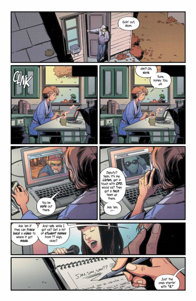
The plot of issue 4 is intense and emotionally moving. Spurrier handles it beautifully and with compassion. Samir’s journey to reconcile himself with his father is both touching and tragic. The whole sequence is about the consequences of the characters actions which resonates throughout the issue and into other elements of the narrative. Without wanting to spoil any of the twists, the selfishness of one character causes major disruptions for another character.
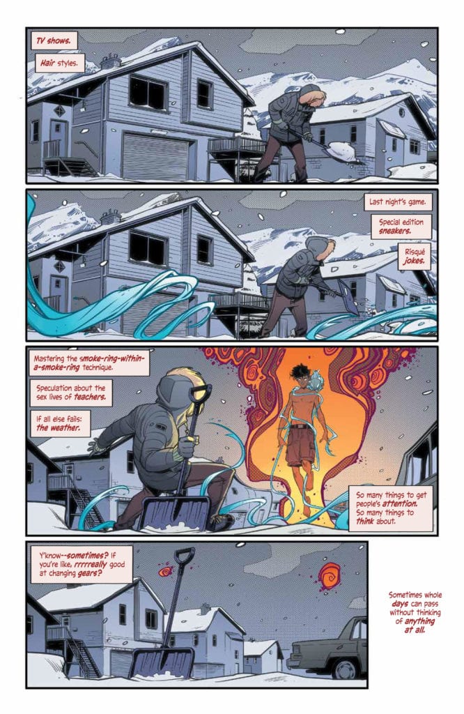
Over the course of this series Spurrier has pulled the three central characters apart to see what makes them tick. He has laid their souls bare on the page, warts and all, so that the reader can truly get to know them. These characters are not two-dimensional college kids as seen in any number of coming-of-age movies; it’s not as simple as the jock, the nerd, or the princess stereotypes. Each has a number of layers that create their personality and this is the crux of Spurrier’s story. He is dissecting the teenager, with the aid of his science fiction plot device, and getting to the heart of what makes the characters behave in the way that they do.
Things are not as simple as black and white when you are a teenager, there are so many shades of grey. Spurrier is portraying this and, with it, the darker side of growing pains. There is a lot going on in this issue but one element stands out and because of that you may find this issue of Alienated upsetting.
Visual Disturbance
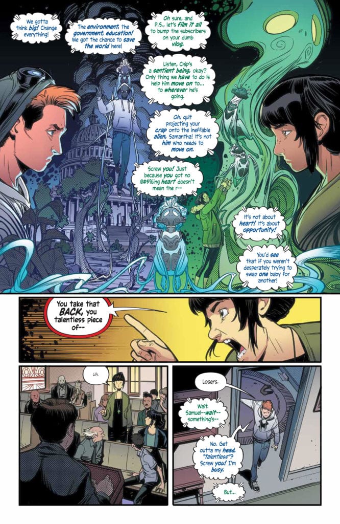
Chris Wildgoose’s layouts are focused and his art is expressive. He has a firm grasp on the storytelling aspect of the comic by making sure the reader can follow the flow of narrative across the page and through the issue. Each panel has a clear focal point and, even in the more complicated panels, the composition is easy to read with clear threads through the images. The reader is led into an image by Jim Campbell’s lettering and then just the right amount of pause is left for the visuals to soak in.
The color scheme both in the images by Andre May and the lettering by Campbell have been documented on numerous occasions throughout the series. In this issue the contrasting character hues seem to be even more evident. Large scenes and sequences take part inside the minds of the three Sams and it is always crystal clear whose mind the reader is seeing. The colors are bold and fitting, with each of the characters respective focus colors becoming more relevant to their personalities. As the plot unfolds, craft decisions made at the beginning of the series become more important.
There is a very poignant story full of pain and anger at the centre of this issue and the artistic flair does not detract from this but helps it flow more naturally. The harsher moments of the comic feel brief because of the superbly paced visual storytelling. Scenes that are distressing move fast enough for the reader to get the idea without having to linger on the imagery. You get the shock but pass it quickly without the need to unduly focus.
Conclusion
Intense is the best way to describe this chapter of Alienated. The story is progressing down roads that you won’t expect which can have its downfalls. Parts of this issue could cause distress which is a testament to how natural and realistic the narrative feels. Similar story-lines in a lesser book could be written off as cheap sensationalism, but Spurrier writes such convincing characters that their emotional turmoil becomes a part of the reader’s emotional reaction to the comic.
The artwork continues to impress on every level and Alienated is a worthwhile comic. Where the story goes from here is important. For the bold choices in this issue to mean anything the fallout next month has to be dealt with in the right way. Based on what they’ve put out so far, I think the comic is in safe hands