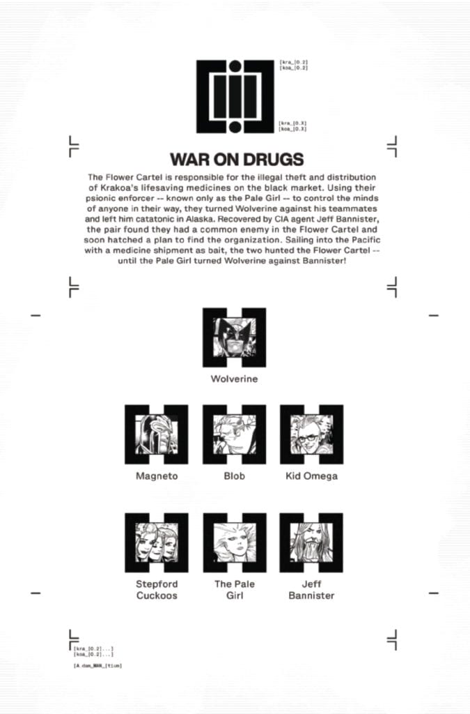
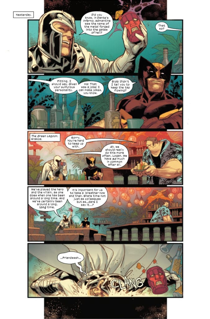
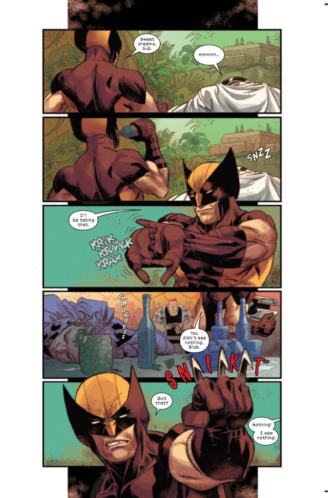
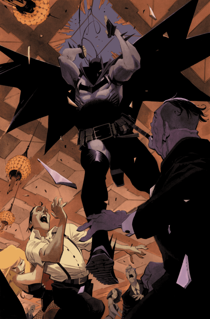
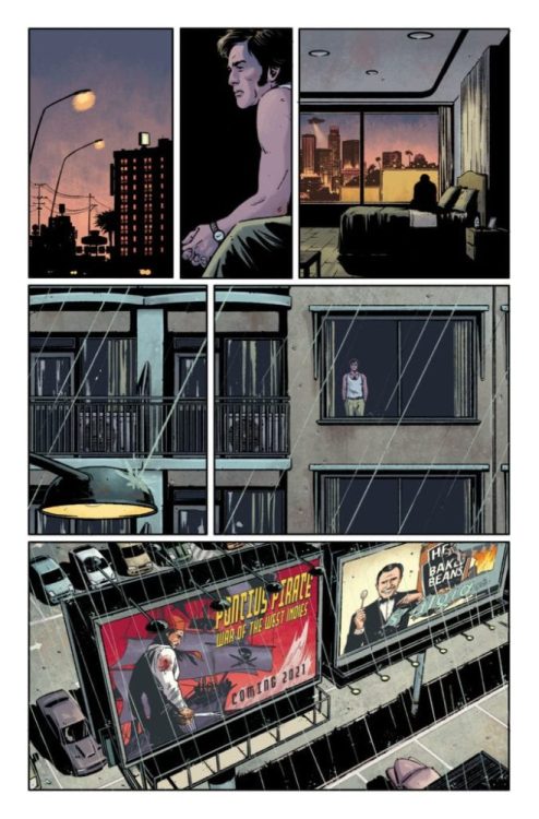
WOLVERINE #3 hits your local comic book store July 22nd, but thanks to Marvel Comics, Monkeys Fighting Robots has an exclusive two-page preview for you.
About the issue: WOLVERINE DIGS IN! The Flower Cartel and the Pale Girl seem to be one step ahead of Wolverine, but he has a plan. It’s a risky gamble that will take him into the heart of a larger criminal conspiracy even as it puts many mutant lives at risk.
WOLVERINE #3 is by writer Benjamin Percy and artist Adam Kubert, with colors by Frank Martin, and letters by Cory Petit. Kubert and Martin did the main cover. Tom Muller is the book’s designer.
The series is a part of the relaunched X-Men line being overseen by Jonathan Hickman. It will be part of the upcoming X OF SWORDS 24-part crossover.
Check out the WOLVERINE #3 preview below:
What is your favorite X-book of the new era? Sound off in the comments!
American Vampire will begin its final mini-series this October with AMERICAN VAMPIRE 1976. Reuniting writer Scott Snyder with artist Rafael Albuquerque, DC Comics is releasing the run to comic shop retailers on October 20th.
In this latest nine-issue run carrying the Black Label moniker (ages 17+), Skinner Sweet and Pearl Jones confront the nefarious Gray Trader before the world ends on the eve of America’s Bicentennial. You can read all about it and check out some nifty preview images from DC below.
Are you a fan of the American Vampire title? Let us know what you think about this new run in the Comments section, and please share this post on social media with the links below.
American Vampire Returns for Its Final Chapter!
Scott Snyder, Rafael Albuquerque reunite for American Vampire 1976
Nine-Issue Miniseries Launches October 20, 2020
BURBANK, CA (July 16, 2020) – America is broken. Trust between the government and the American public has crumbled. Paranoia reigns supreme. It’s 1976, not 2020, and this horrifying tale is the concluding chapter of the Eisner Award-winning American Vampire, reuniting Scott Snyder and Rafael Albuquerque for a nine-issue miniseries!
“Scott, Rafael, and I, we cut our teeth together on American Vampire 10 years ago,” said executive editor Mark Doyle. “Returning to finish the story we started a decade ago is a thrill. Working on American Vampire 1976 has been so creepy and cool, especially because the parallels between 70’s paranoia and today are really chilling…”
Skinner Sweet has exhausted all efforts to regain his lost immortality. With his powers and purpose gone, he is now determined to go out with a bang. At a seedy motorcycle rally in the desert where Skinner’s closer than ever to his death wish, Pearl Jones and a shocking partner track him down for one last, desperate mission: the force known as the Gray Trader and its minions are tunneling through the bowels of the world to unleash hell on Earth—just in time for America’s bicentennial. With catastrophe looming, it’s up to Skinner and Pearl to reconcile and change the course of history—or die trying.
“The characters in ‘76 are in a really dark place in terms of the fight against evil,” says Snyder. “The ’70s mirror our current era in many ways: the anxiety, the fear, and the re-examination of American identity. The book opens on Skinner Sweet working outside of Vegas doing death-defying Evel Knievel-style stunts, trying to die. There’s a kind of Son of Sam plot in New York City with Cal and Travis, a political thriller plot with Felicia, and all sorts of ’70s iconography. It’s my favorite arc so far.”
The series that launched the careers of superstars Scott Snyder and Rafael Albuquerque returns for nine final issues and the closing chapter of the legacy of American Vampire.
American Vampire 1976 #1 by Scott Snyder and Rafael Albuquerque will publish on October 20, 2020, and carry DC’s Black Label descriptor, identifying the content as appropriate for readers ages 17+. The book will retail for $3.99 with cover artwork by Albuquerque and a variant cover by Dustin Nguyen.
For more information on American Vampire, DC, and the World’s Greatest Super Heroes, visit the website at www.dccomics.com and follow on social media @dccomics and @thedcnation.
Planet DIVOC-91 Chapter 1 dropped on WEBTOON yesterday for FREE, and Monkeys Fighting Robots was able to catch up with the writer of the first issue, Sara Kenney.
About the series: PLANET DIVOC-91 is a new sci-fi comedy. The 9-part series is published monthly. This comic follows the adventures of Sanda Oung, a 23-year-old girl from the UK and Champo Oung, Sanda’s 19-year-old, non-binary sibling. Each chapter features the work of a different creative team and is interspersed with short interviews with experts about this pandemic, written by young adults.
Planet DIVOC-91 – Chapter 1: Transparency Is For Windows is drawn by Charlie Adlard, with colors by James Devlin, and you will read Hassan Otsmane-Elhaou’s letters work.
The goal of the series is to both entertain and build a community on WEBTOON where young adults can get empowered and drive positive change by helping direct research.
“We’re so excited to see Planet DIVOC-91 on WEBTOON CANVAS, not only because of the incredible talent behind it, but also because it’s an opportunity to educate WEBTOON readers in a fun and engaging way. We can’t wait to see what the series has in store!” – Danika Harrod, the Community Growth Manager for WEBTOON’s CANVAS platform.
Kenny has worked as a filmmaker on documentaries, drama, and animation (BBC, Channel 4, Discovery). In 2017, Image Comics published her first comic book, Surgeon X. Also in 2017, Kenny became a Wellcome Trust Engagement Fellow exploring comics, health, and the human condition.
Planet DIVOC-91 is a grand project as each chapter features the work of a different creative team and cover artist and is interspersed with short articles, links to videos, and other pieces of art by young adults about issues related to COVID-19, and mixes from DJs and Producers. Kenny is part of the production staff putting the book, but it is more than a book, together.
MFR: Sarah, thank you for taking the time to talk with me. The first chapter of Planet DIVOC-91 debuts on Webtoons next week (July 15), what’s your emotional state going to be like on this particular ‘new comic book day?’
Kenney:Well interesting, I’m actually writing this on launch day, and my emotional state is pretty, pretty good. Luckily, we have the brilliant Paolo Arru on social media, from Vocal the NHS Org who are producing with me – or I’d be having a middle-aged meltdown by now.
I’m most excited for the young adults tbh and the audience/ community we hope to build on Webtoon Canvas. We’re currently bombarded with so many grim and negative words and images during this pandemic, and it’s not good for the psyche. This project is here to offer hope – to help young adults find their power in all this. Like Sanda, our protagonist she has to figure out her power and how to use it. By that, I don’t mean superpower – she’s a down to earth girl from Birmingham in the UK. But she has no self-confidence, she’s afraid and also a bit paranoid, but this is all driven by her experiences in life. It might take traveling to another planet to change all this!
MFR: The first page encapsulates my feelings during the pandemic (alone, angry, helpless) – can you talk about what your script looked like for the first page?
Kenney:This might be more fun if you have space…
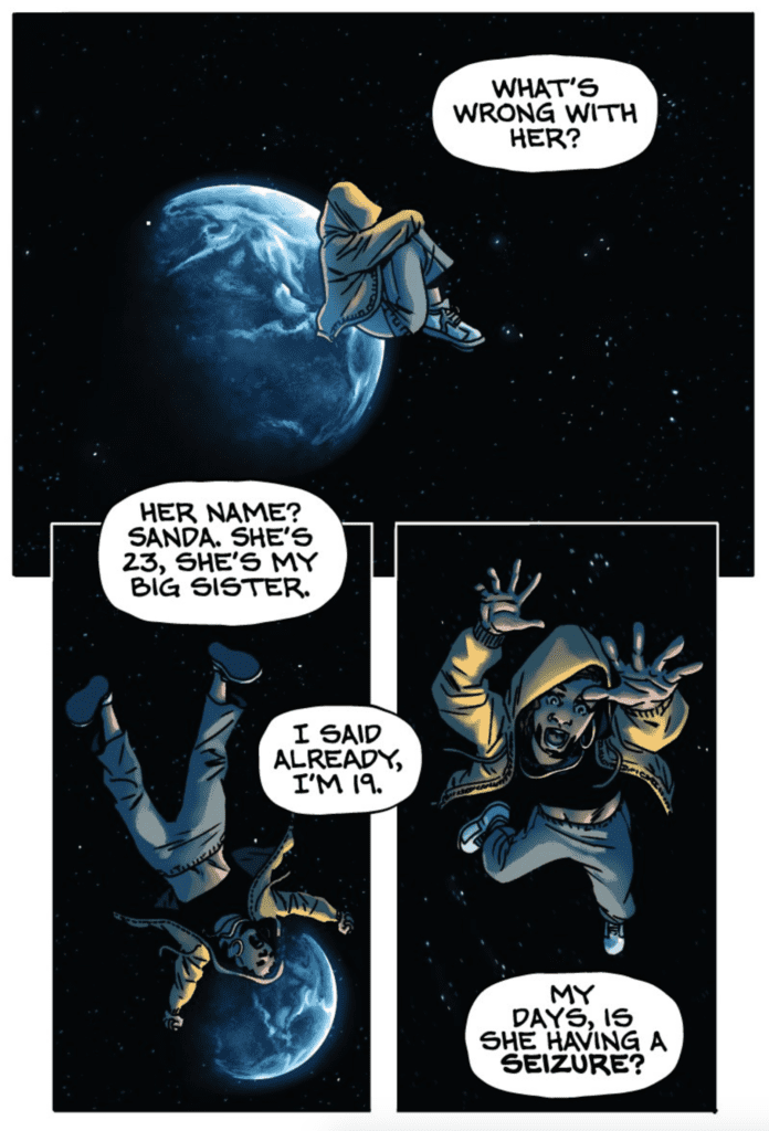
Page One, Panel One
It’s a gorgeous starry backdrop with Sanda (23), mixed black/Asian – in a fetal position floating in space.
No spacesuit or protective gear, Gen Z/ urban attire, floating – eyes closed, she’s framed by stars, serene. Earth in the background.
1) Champo (off-panel): She’s not a fainter. What’s wrong with her?
Page One, Panel Two
Sanda has her arms spread – she’s yawning, stretching, so relaxed, eyes still closed. Earth in the background.
2) Champo (off-panel): Her name? Sanda. She’s 23, she’s my big sister.
2a) I said already, I’m 19.
Page One, Panel Three
Sanda now hangs upright in space, she’s facing something we can’t see, her arms flailing in alarm, like she’s drowning in water. A terrified look on her face.
3) Champo (off-panel): My days, is she having a seizure?
I also had a character and story world document that I bounced back and forth with Charlie Adlard with more detail about the characters – their personalities and their favourite sayings, but Charlie designed their look of course!
MFR: Sanda Oung is a great lead character for the first issue, what are the elements used in creating a main character that readers can relate to?
Kenney:I’m from a TV background, so I’m still learning about what an audience responds to in terms of comics. For me, what makes Sanda endearing is that she’s outwardly tough and in control, but you can sense an internal struggle. Her desperation to get off the planet and back to Earth, her suspicious mind.
When I’m creating main characters, I think of people I know – their traits, their mannerisms. But I also love inventing new types of people based on characteristics that I think will be funny, interesting, sad, creepy – whatever. I’d spoken to a lot of young adults before I started writing, and all their thoughts were in my head. I hope people will relate to Sanda; she’s complicated, a product of what she’s had to face – people underestimating her, patronizing her, always thinking her sibling’s the smarter one. All stuff that both crushes her soul but also puts a bit of fire in her belly…
MFR: I’m starting to notice angst in comic books that reminds me of the grunge and hip hop movements of the early 90s. Sanda fits that mold, how’s the youth of the UK doing, and how has that influenced your writing?
Kenney:Ha well, I’m definitely a product of the 90s – Ride, The Pixies, Wu-Tang Clan, Massive Attack, Stone Roses, Aphex Twin, Beastie Boys, and Andy Weatherall all the way! Sorry just appeared to have a flashback! I’m actually writing a comic at the moment with James Devlin on art, which is set in the early 90s. A friend I know who is a historian of fashion Amber Butchard told me that fashion tends to run in 30-year cycles, so perhaps it’s the cyclical nature of life?
The youth of the UK, I imagine like young people around the globe are hanging in there, but research reveals that their mental health is being eroded. But some of the young people I spoke to are doing really well.
I think this influenced my writing by creating siblings that deal with their predicament in very different ways. One of them is struggling, while the other appeared to take it all in their stride.
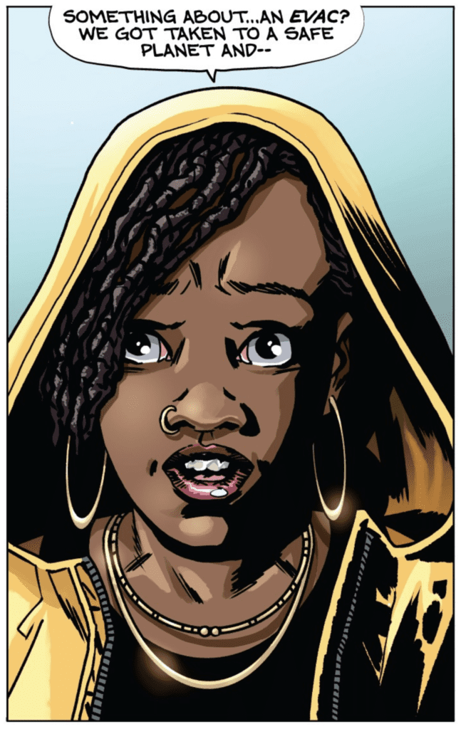
MFR: Page 4, is a full-page headshot on Sanda by Charlie Adlard, with colors by James Devlin – what was your reaction to the finished product?
Kenney:Just Wow! I’ve said this before, but Charlie is amazing at facial expressions. I wonder if he stands in front of a mirror pulling faces at himself and taking pics or if you get to a point where you can just imagine it?! I think what he captures here is a combination of emotions confusion, horror and uncertainty. Jimmy does such a good job with the colour – I love his work and also can’t wait for you to see his art too as he’s going to be drawing one of the chapters.
MFR: The last page of Planet DIVOC Part 1 had me grasping for the next part. How did you decide where to end the first issue so that Sanda’s words carried so much weight?
Kenney:Finding the right words for the end of a chapter can be agonizing. You know when it’s not working, and you just have to keep going back to it. I hope these words encapsulate this whole project well. Young adults in the age of a pandemic, are being told what to do on a constant basis – whether they can go to school, see their friends. Many no longer have control over their grades as exams get canceled, and minority groups tend to suffer more as evidence shows their predicted grades are often underestimated. That loss of control, isolation, loneliness, worry for family are all things the young adults, we are working with have talked about.
Part of this work is about strengthening resilience and encouraging good mental health for the young adults we work with. Services are all focused on physical health, and when people are dying, this is no surprise. But for our team, losing a young generation to poor mental health is not something we can stand by and watch. This is a big area of exploration for us going forward.
For this final scene, I also wanted the action of what Sanda does as well as what she says to mean something in this moment in time. It will be interesting to see how others interpret this ending!
MFR: It’s one thing to bring a pandemic influenced story to life, but when you add all the other elements to the mix (articles, videos, pieces of art by young adults about issues related to COVID-19, and mixes from DJs) – this is next level. Why was it important for you to go so big with Planet DIVOC-91?
Kenney:Well, it started as a comic, and I love a playlist or mix, and music often inspires ideas or scenes. We wanted to find a way for the young adults to be able to interrogate what’s going on and then respond to that – so interviews with experts and articles felt like a good way to do this.
The project has expanded in the last month to include a team in India and South Africa. When speaking to Sarah Iqbal from Wellcome Trust/ DBT India Alliance, we worked through what young adults in India might respond to, and she felt rather than articles that videos were the way to go as lots of YA in India have been expressing themselves through film. Nabeel Petersen from Interfer is our project lead in South Africa, and Nabeel works with young adults who use street art, poetry, music, and painting to shift narratives around health. Each country needed to embrace the art techniques that work for them, and we’ll be sharing all their outputs.
MFR: What’s the pressure like to put together a grand idea like Planet DIVOC-91, and how’s it feel when you have a big group of creatives rallying behind you?
Kenney:Massive pressure, but I also really enjoy collective working and pulling together teams full of good, creative, and kind people. For me, the best projects are always about amazing teams. I must admit I am often surprised when people say yes to my hare-brained ideas, but there you go! The great thing about this project was getting to collaborate with Bella Starling. She’s an inspiring leader and organizer of ideas – I think we work well together.
Writing a script for Charlie Adlard to draw, was of course, a lot of pressure. When we started, we had a tiny pot of money, so it was up to me to build the story world and get it up and running, or you might have seen a more famous comics writer work on Chapter 1. So this was a nice bit of situational luck!
David Hyde from Superfan Promotions brought on most of the cover artists bar VV Glass and Anand RK. What a superstar list of cover artists we have, and it will be amazing to see what they come up with.
MFR: We are in a time when the term ‘leadership’ is used loosely when talking about big government. Do you think we need more grassroots movements like your project to lead by example, and if so, why?
Kenney:Yes – because leadership, when it comes to a lot of governments, is clearly BROKEN. I’ve been talking a lot about power with another colleague working on this project called Anita Shervington. She is about as grassroots as you get and has been doing the work for decades. She runs an organization called Blast Fest, who take science events to carnivals and has been working around ‘science, social justice, culture and creativity, and the importance of STEM for sustainable development.’ We’ll be working with Anita to explore how the young adults can learn more about this grassroots work.
Why – because a friend Adeel Amini (works in TV) said recently, ‘we can no longer wait for a seat at the table, we need to build our own table.’
MFR: With a project like this, how do you measure success?
Kenney:The audience will let us know whether it’s successful.
It’s the usual metrics – but for us, it will be seeing whether we can provoke some positive change. That’s in terms of influencing research and policy and helping the young adults to take control of some of the narratives during this pandemic. This can be tricky to measure, but we have access to some experts to help with that…
MFR: Sarah, thank you again for your time, and best of luck with Planet DIVOC-91.
Kenney:Thank you for such brilliant and thought-provoking questions.
Did you check out Planet DIVOC-91 yet? Again, you can read it for free on WEBTOON. Comment below with your thoughts.
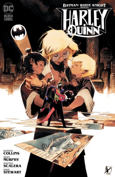
October is shaping up to be a VERY busy month for new titles. Before shuttering his personal Twitter account, Sean Gordon Murphy hinted at an upcoming spin-off title from the White Knight series. Now we know what it is and have a preview fresh off the presses just for you.
BATMAN: WHITE KNIGHT PRESENTS HARLEY QUINN, available in both print and digital on October 20th, is a “new-reader friendly” mini-series carrying the Black Label descriptor (ages 17+) that “takes place two years after Curse of the White Knight.”
You can read the full details in an official press release, and check out an early preview, from DC below.
Are you excited for a new Harley title set in the Murphy-verse? Let us know what you think in the Comments section, and please share this post on social media using the links below.
THE WORLD OF BATMAN: WHITE KNIGHT EXPANDS WITH A NEW SPIN-OFF SERIES,
BATMAN: WHITE KNIGHT PRESENTS HARLEY QUINN
Six-Issue Miniseries Features the DC Debut of Writer Katana Collins
Issue One Arrives at Comic Book Stores and Participating Digital Retailers October 20
BURBANK, CA, July 16, 2020 – The popular maxiseries Batman: White Knight and Batman: Curse of the White Knight thrilled comic book fans everywhere with their unique takes on Batman, The Joker, Gotham City, and the history of the Wayne dynasty. On October 20, the White Knight mythos takes another step forward with the launch of Batman: White Knight Presents Harley Quinn, a six-issue miniseries that expands and deepens the alternate universe created by writer/artist Sean Murphy.
Writing this new-reader friendly addition to the Batman: White Knight world is international bestselling author (and Murphy’s wife) Katana Collins. As co-plotters, this miniseries represents the first time the duo have worked together on a DC title. Collins, the writer of novels such as Callback and the Top 100 Amazon bestseller Capturing You, was also an associate producer for Nick News with Linda Ellerbee. During her tenure, the show won two Emmy Awards for the episodes “Kids and Autism” and “The Untouchable Kids of India.”
“Working with Sean has allowed us to leverage our creative partnership’s best advantages,” said Collins. “Living and working together lets us be constant sounding boards for each other and that back and forth feedback has been a huge help and inspiration in crafting my vision of Harley Quinn for this story.”
Batman: White Knight Presents Harley Quinn takes place two years after Curse of the White Knight. Azrael has wiped out criminals in Gotham, Jack Napier (formerly The Joker) is dead, Bruce Wayne (Batman) is in prison, and Harley Quinn is adjusting to life as a single mother, raising the twins she had with Jack. But as new villains arise, Harley is forced to dance with madness once again and confront her own past with The Joker and Batman while helping the Gotham City police and an eager young FBI agent uncover the truth behind a series of gruesome murders.
“While developing Batman: White Knight and Batman: Curse of the White Knight, it became clear that there were rich backgrounds and stories to explore beyond the main series,” said Murphy. “I couldn’t be more excited to work alongside Katana, Matteo, and Matt Hollingsworth to enrich and expand this world in a way that’s just as rewarding for new readers as it is for loyal Batman: White Knight fans.”
With breathtaking art by Matteo Scalera and Dave Stewart, stunning covers by Sean Murphy and Matt Hollingsworth, and beautiful variant covers by Scalera and Hollingsworth, Batman: White Knight Presents Harley Quinn is ready to take its place as the next great story in the rich universe created by Sean Murphy.
For fans who would like a taste of the kind of storytelling that they can anticipate this October, Collins and Murphy will be the featured team for Chapter Six of DC’s recently announced Digital First series, Harley Quinn: Black + White + Red, on sale at participating digital retailers on July 31.
Batman: White Knight Presents Harley Quinn debuts on Tuesday, October 20 and will carry DC’s “Black Label” descriptor, identifying this content as appropriate for readers 17+.
For more information on this series and the World’s Greatest Super Heroes, visit the website, www.dccomics.com, and be sure to follow on social media at @dccomics and @thedcnation.
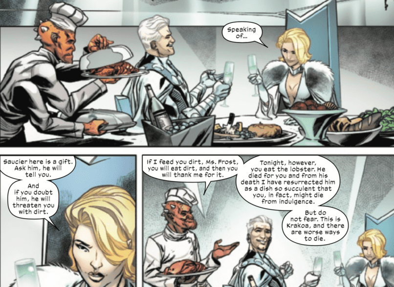
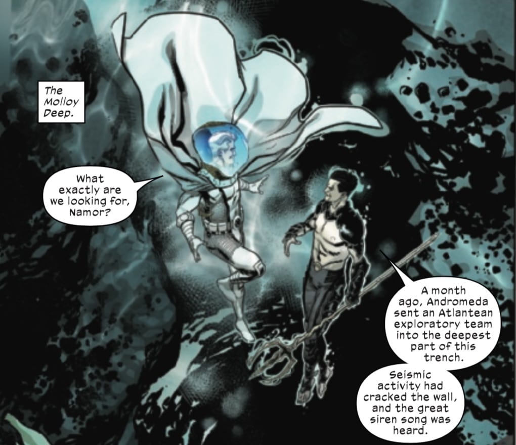
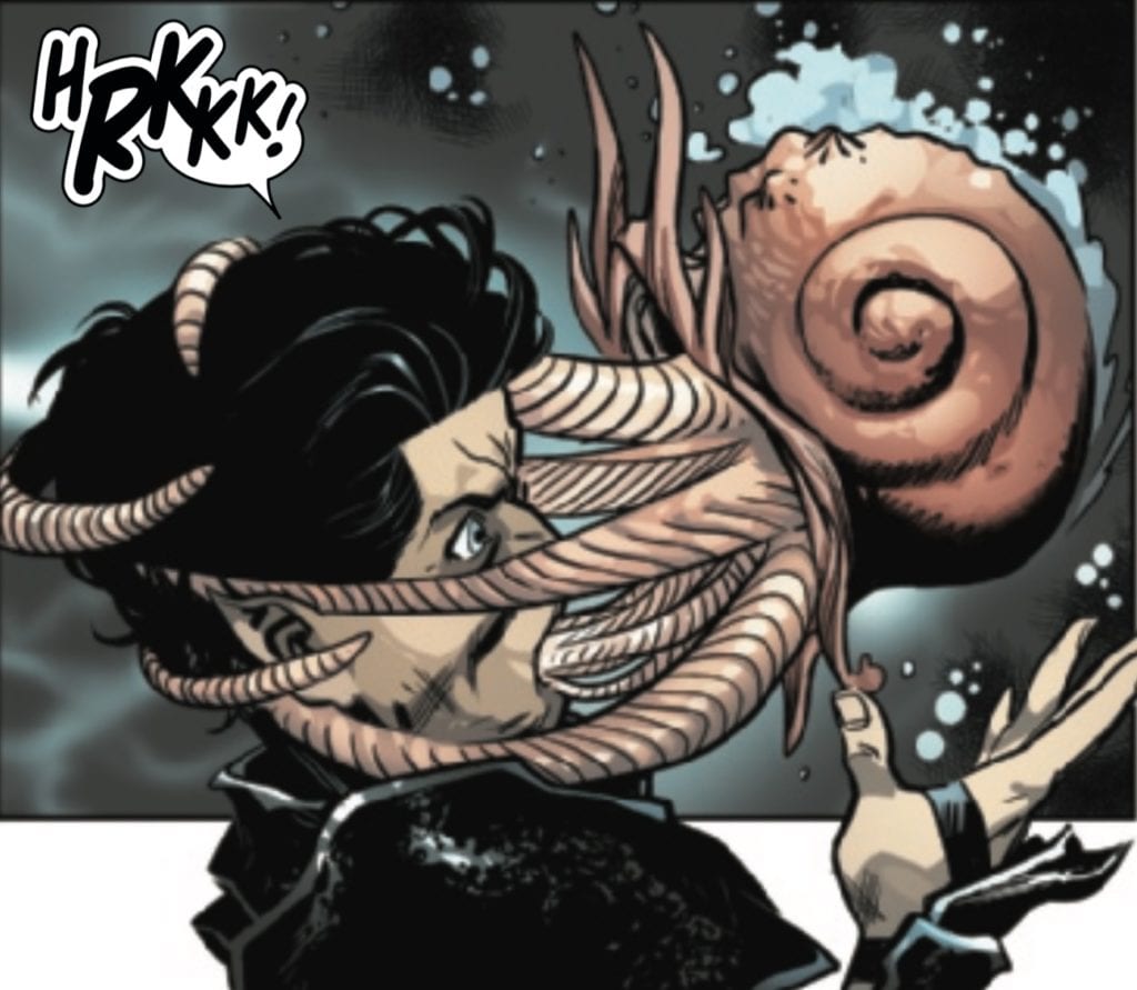
On July 15, Marvel Comics released their second Giant-Size X-Men issue: Giant-Size X-Men – Magneto #1, written by Jonathan Hickman. With art by Ramón Perez, colors by David Curiel, letters by VC’s Clayton Cowles, and design work by Tom Muller, this issue serves to plant the seeds for what are no doubt more mysteries and plot points in Hickman and company’s grand X-narrative.
Writing
I’m a bit confused about the point of these giant-size character-focused issues. This issue focuses on Magneto certainly more than Giant-Size X-Men – Nightcrawler focused on Kurt, but I question the need to have labeled them “Nightcrawler” or “Magneto.” Normally, naming issues in such a way usually means a deep dive into an individual character, their struggles, and their psyche. This issue, like the last one, certainly utilizes the title character, but as a part of a small ensemble that seems to be laying the groundwork for future plots more than really addressing the depth of the characters themselves.
Being a fan of Hickman’s work, I know that many of the plot threads he’s planted during his time as the “Head of X” will eventually come back around in significant ways. As big of a world as the X-titles have become; however, I just wonder if all of the mystery and plot-seeding will pay off. What is the significance of the new island Emma Frost got Magneto to help her acquire from Namor? Will the weird Kraken people under the sea re-emerge at a later time? I don’t know, but at this point, all the building up needs to pay off soon, hopefully with X of Swords.
Art
The art for this book is great. Perez is able to communicate a lot about Magneto’s character by how he draws him. As Magneto stares at the water, Perez captures his contemplative mood, the mood of a man who is comfortable in his own skin and seems to be enjoying a moment of repose as he waits for Namor. At other times, Perez can capture a bit of often-unseen joviality on Magneto’s part.
Maybe we’re just never used to seeing Magneto “with his hair down,” but living in a mutant utopian dream might allow someone like Magneto to relax and enjoy being with the only people he wants to spend time with–other mutants.
One does get a sense that the Magneto we’ve often seen as a villain over the years is a much different person around those he considers his friends.
One small, nit-picky mistake can be found on this page. See if you can find it.
Did you find it? (Tell us if you did in the comments below).
Colors
The coloring in this issue is solid, particularly the work that Curiel does with the icy depths of the ocean.
Curiel does an excellent job of portraying a watery environment, particularly one that is down in the depths where light can’t reach. Surrounding the characters with darkness with a slight surrounding barrier of water communicates the dark, oceanic environment well. The light beam shining down in the middle of the page, outlining the surrounding rocky depths, is also a nice touch, and a careful use of color and shading to portray this environment.
Letters
Cowles’s lettering is serviceable in this issue. It captures the small character interactions between Magneto and the island’s keeper, and it keeps the plot moving forward. There was also this quite enjoyable note of verbal surprise from Namor.
Couldn’t have happened to a nicer guy.
Conclusion
I love all things Hickman, but I’m a little confused about the purpose of these giant-size issues. Naming them after different characters makes the reader think that we might get deep inside the headspace of the particular X-character in question and how they are processing the new status quo in the world post-Krakoa. In Nightcrawler’s issue, I expected to see him pursuing his goal of starting a new Krakoan religion, but he is far from the central character in that story
The Magneto issue comes closer to making sense that it’s named after him, although he is joined by Namor and Emma Frost for huge chunks of the story, I’m not sure if there has really been anything about either of these giant-size stories that warrant marketing them as though they focus on one character. These could have been issues of the regular X-Men title and numbered accordingly.
Do you want to see a story that dives into the depths of Magneto’s psyche and whatever agenda he has for Krakoa? Move along. Do you want to see a run-of-the-mill adventure with Magneto as mostly-the-lead-character that is probably seeding even more future plot details in Hickman’s X-epic? Then yeah. Check out this story.
What did you think of Giant-Size X-Men: Magneto? Tell us in the comments below (along with whether or not you found that one art mistake).
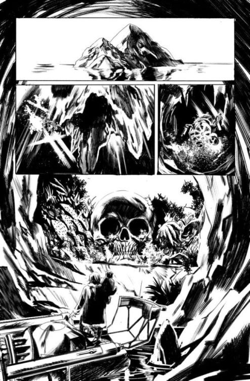
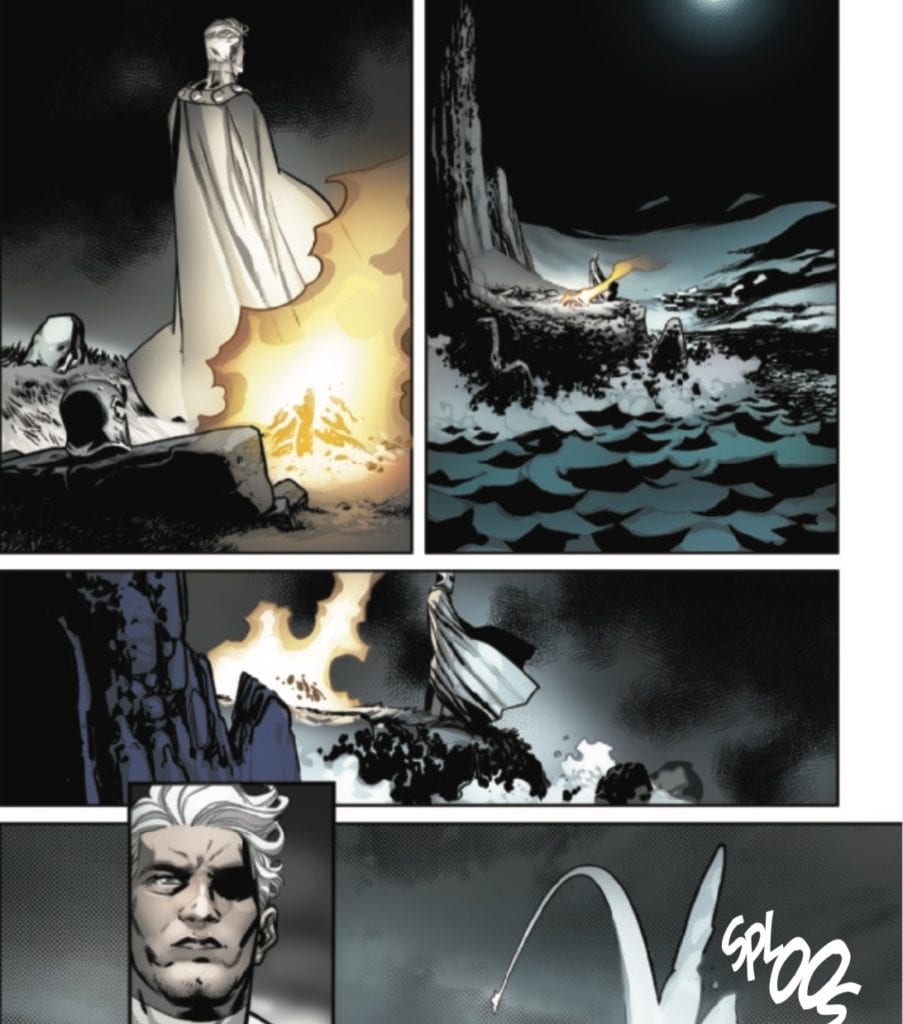
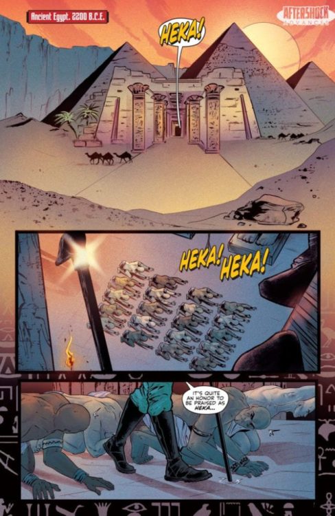
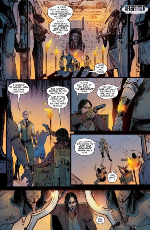
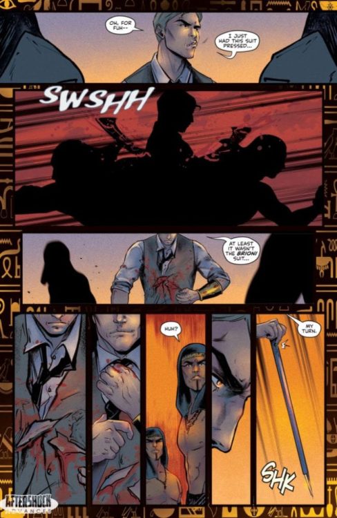
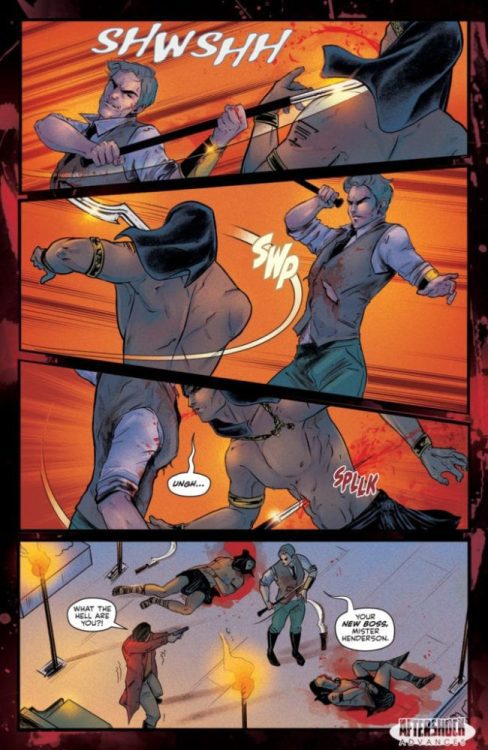
Artemis and the Assassin #4 hits your local comic book shop on August 19, but thanks to AfterShock Comics, Monkeys Fighting Robots has an exclusive four-page preview for you to peruse.
About the issue: The killer time-travel adventure continues with cowboys, ninjas, soldiers and even a trip to New York City’s Central Park! When Maya’s fellow assassins arrive to kill World War II hero Virginia Hall, Maya has to make a decision: Watch Virginia die, or turn on “friends” and get herself killed in the process?
Artemis and the Assassin #4 is by writer Stephanie Phillips and artist Francesca Fantini with colors by Lauren Affe and letters by Troy Peteri. Covers are by Phil Hester and Bruce McCorkindale with Mark Englert.
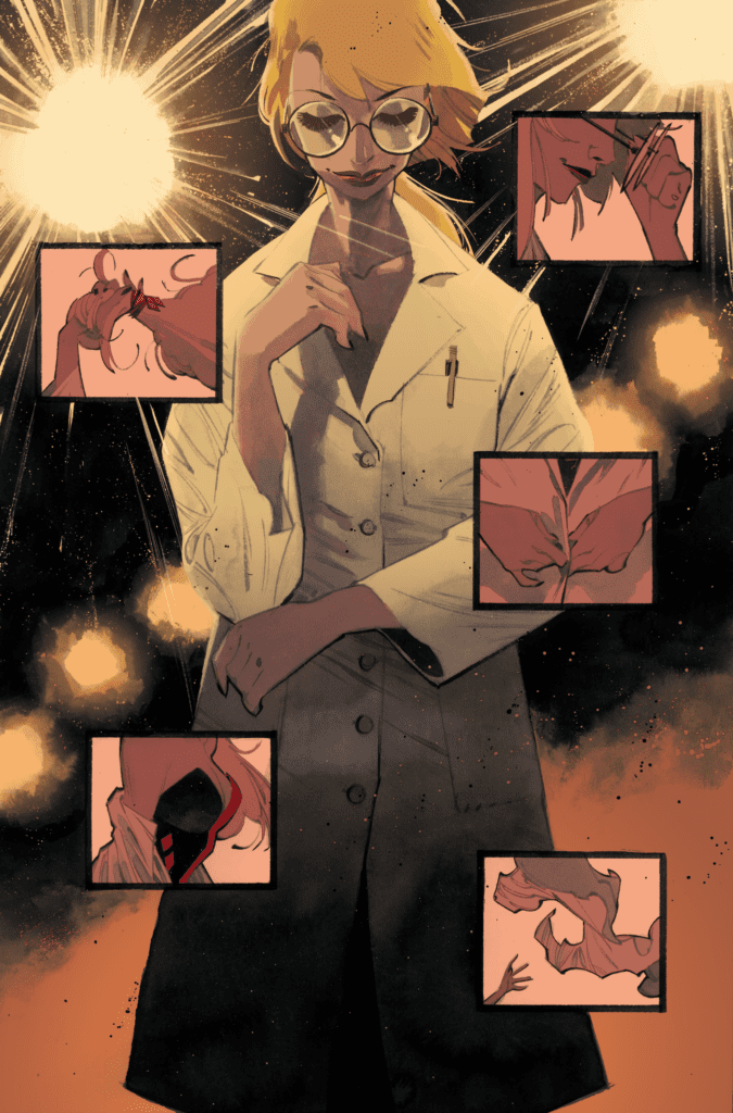
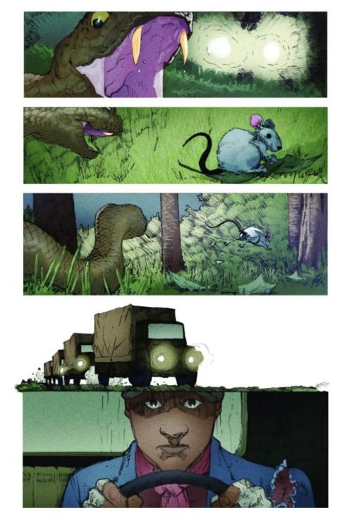
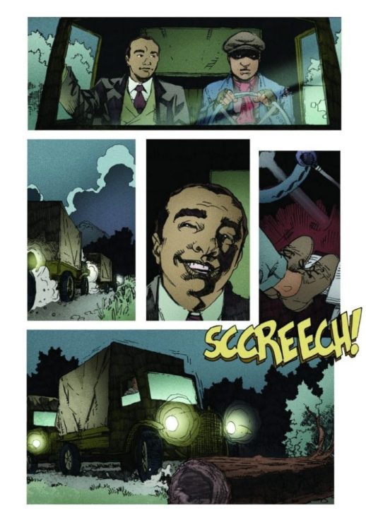
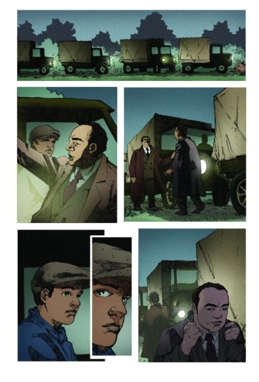
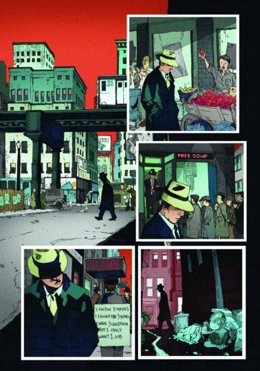
Still glowing from the critical success of THE LAST SPACE RACE, AfterShock Comics is releasing their second series from writer Peter Calloway early 2021, starting with SHADOW DOCTOR #1. SHADOW DOCTOR is the real-life adventure of Calloway’s grandfather who struggled to build his medical practice in 1930’s Chicago until he joined with an unlikely ally — the notorious Al Capone.
Calloway describes this comic as the embodiment of his family’s heritage. “This is my grandfather’s story — a Black doctor that, after graduating in the early 1930’s in Chicago, couldn’t find a job at a hospital because he was Black. He also couldn’t get a loan from a bank to start a practice, because he was Black. Desperate, he turned to the only other source of money in Prohibition-era Chicago: the Mafia.”
You can read all about it in the official AfterShock press release below along with previews of the first issue.
Are you excited for a historical comic told from a unique perspective? Let us know what you think in the Comments section, and please share this post on social media using the links below.
SHADOW DOCTOR #1 / $4.99 / 32 pages / Color / On sale February 2021
Writer: Peter Calloway
Artist: Georges Jeanty
Color Artist: Juancho!
Letterer: Charles Pritchett
Cover artist: Mark Chiarello
This is the true story of Peter Calloway’s grandfather, Nathaniel Calloway. A Black man, he graduated from medical school in the early 1930’s. Unable to get work at any Chicago hospitals (because he was Black), and unable to secure a loan from a bank to start his own practice (because he was Black), he turned to another source of money in Prohibition-era Chicago: the Mafia, run by none other than Al Capone.
PETER CALLOWAY ON WHAT THE BOOK IS ABOUT AND WHY HE’S EXCITED FOR IT TO BE RELEASED:
“This is my grandfather’s story — a Black doctor that, after graduating in the early 1930’s in Chicago, couldn’t find a job at a hospital because he was Black. He also couldn’t get a loan from a bank to start a practice, because he was Black. Desperate, he turned to the only other source of money in Prohibition-era Chicago: the Mafia.
What my grandfather did is something of a legend in my family. He faced enormous obstacles and overcame them, setting his children up for a better life than he had. That’s not to say he was a saint. He wasn’t. The choices he made had consequences for the rest of his life.
I guess what I’m saying is that — on the one hand — his story represents the promise of America. On the other hand, it also shows the worst of it. That, to me, is compelling, exciting, and ultimately important.”
PETER CALLOWAY ON SOME OF HIS INSPIRATIONS BEHIND CREATING THIS BOOK:
“One of the things I really wanted to do was to stay away from the tendency — in my family at least — to glorify what my grandfather did or what happened to him. He was bold and intelligent and savvy. But he was also flawed and did things that are — at best — morally questionable. To be honest, that’s the part that my family tends to shy away from. And those are the things I feel it’s necessary to explore.”
PETER CALLOWAY ON 3 REASONS WHY COMICBOOK READERS SHOULD PICKUP THIS BOOK:
1) If the collision of medicine, the mafia and race in America interests you, the book is for you.
2) It’s a fresh, unique POV — the eyes of a Black doctor — through the famed gangster era of the 1920’s and 30’s
3) These are stories that — even though they are almost 100 years old — are still playing out in one way or another today: from race, to crime, to economic uncertainty.
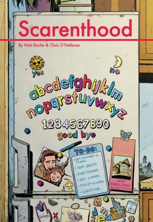
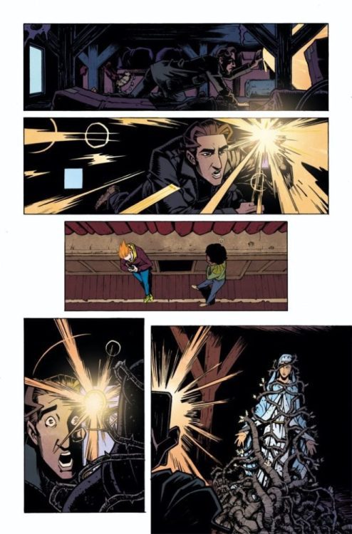
Just in time for Halloween, IDW Publishing is conjuring up a 4-issue series, from the mind of Nick Roche, about a group of parents who get into ghostly trouble called SCARENTHOOD. Written and drawn by Roche and colored by Chris O’Halloran, SCARENTHOOD tells the tale of “a group of parents [who] disturbs an ancient evil buried beneath the old Church Hall, unearthing a decades-old mystery about a missing child, and inviting something… hungry into their lives.”
October is shaping up to a be a strong month for new series in the Comics Industry, and IDW is getting in on the festivities. Roche, known for his work on multiple IDW Transformer’s titles, is sure to rustle up scares laced with mayhem. You can read all about it in the official IDW press release below and check out a few preview images.
Are you looking forward to a completely original horror title from IDW? Let us know what you think in the Comments section, and please share this post on social media using the links below.
Writer/Artist Nick Roche Reveals the True Terror of Parenting in Scarenthood
While the Kids are at Preschool, the Ghost Hunting Begins in IDW Publishing’s Spine-Chilling Four-Issue Comic Book Series!
SAN DIEGO, CA (July 15, 2020) – What would scare you the most: fighting demons… or letting your kids down? This Halloween, writer/artist Nick Roche (Transformers: The Wreckers Saga) dares to answer this troubling question in Scarenthood, a spine-chilling four-issue comic book series colored by Chris O’Halloran (Immortal Hulk) and debuting in October from IDW Publishing.
With their kids away on a field trip, a group of parents disturbs an ancient evil buried beneath the old Church Hall, unearthing a decades-old mystery about a missing child, and inviting something… hungry into their lives. Suddenly, their mornings go from playdates and peanut allergies to a battle for the souls of one broken family — and one child in particular.
“My generation grew up in what seemed like a haunted Ireland: superstition still abounded, and everyone had seen moving holy statues, or lived near a stately home that had been burnt to the ground in a Satanic visitation, or knew someone who chopped down a Faerie bush and lived to regret it,” says Roche. “Scarenthood is about realizing that some of those horrors from childhood are real, but nothing is more terrifying than ruining your own kid’s life. Also: there are funny bits.”
“I’m incredibly happy to be coloring Scarenthood,” says O’Halloran. “I’ve been an admirer of Nick’s work for a long time and working on a story set so close to home is a bit of rarity. The spookier elements are such fun to work on and getting those moments to hit right each time is a treat, but it’s the incredible character work by Nick, both as a writer and artist, that’s making this such a special project for me.”
“Through every project Nick Roche has done at IDW — Transformers, Monster Motors, and his cover work — he has brought an enthusiasm and viewpoint that greatly enriches the work,” says editor David Mariotte. “Having him and Chris O’Halloran bring Scarenthood to life (or afterlife as the case may be) here has been phenomenally exciting. They’re telling a story close to their hearts, which elevates the humor, the scares, and the quiet moments in an authentic and beautiful way.”
Scarenthood #1 will be available with two cover variations for retailers and fans to enjoy: Cover A by Nick Roche, and a Retailer Incentive edition by Declan Shalvey (Moon Knight).
For information on how to acquire copies of the Scarenthood comic books, please contact your local comic shop or visit www.comicshoplocator.com to find a store near you.
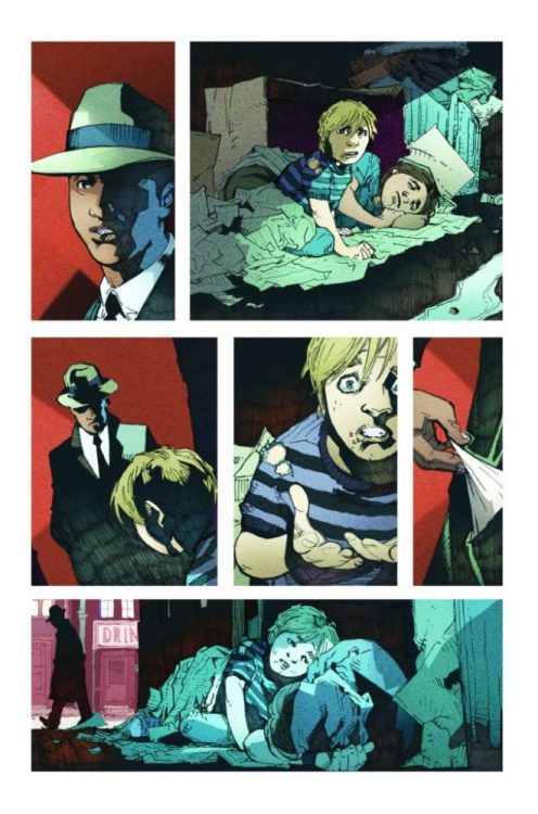
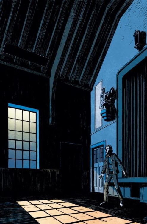
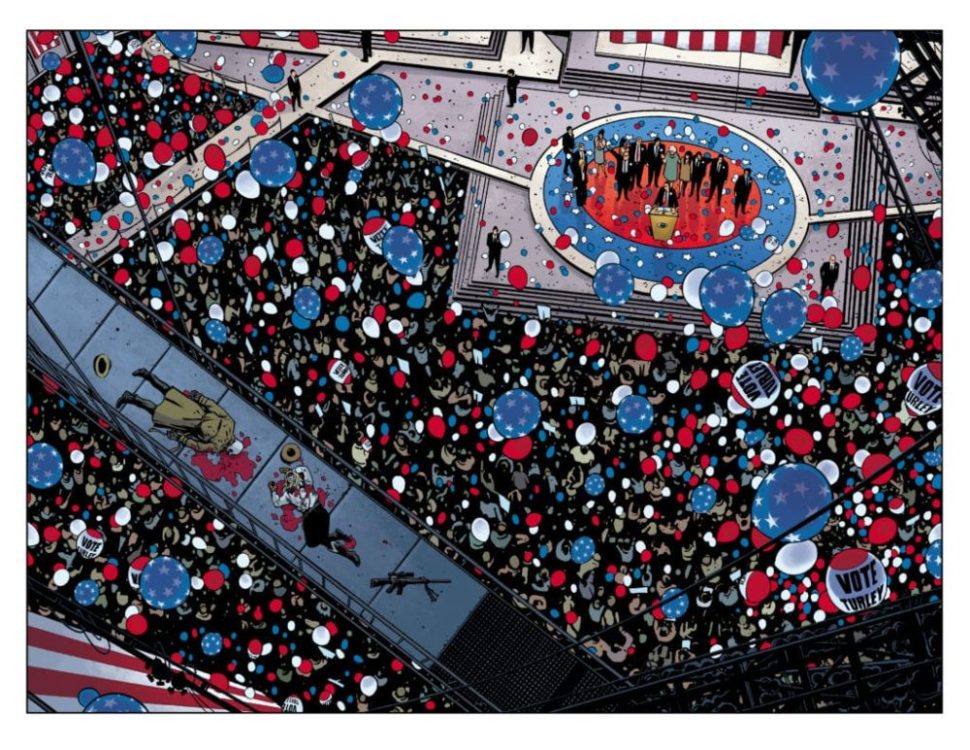
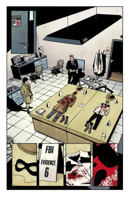
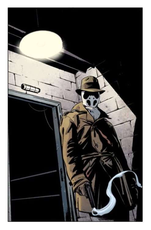
Fresh on the critical success of the HBO Watchmen mini-series, DC Comics has announced a Rorschach maxiseries from Tom King, Jorge Fornés, Clayton Cowles and Dave Stewart titled simply RORSCHACH. The titular character has seemingly returned from the dead as an assassin bent on taking out a presidential candidate.
Tom King describes the tone of the maxiseries: “It’s an angry work. We’re so angry all the time now. We have to do something with that anger. It’s called Rorschach not because of the character Rorschach, but because what you see in these characters tells you more about yourself than about them.”
Sounds like fun! You can read all about it in the official DC press release and catch a preview for the first issue, due in October, below.
Are you interested in exploring new corners of the Watchmen universe? Let us know what you think in the Comments section, and please share this post on social media using the links below.
Tom King and Jorge Fornés Present a New Vision
of One of the Most Riveting Characters from Watchmen…
Rorschach
Rorschach may have spoken truth, but he wasn’t a hero.
Set 35 Years After Dr. Manhattan Turned Rorschach to Dust,
New DC 12-Issue Maxiseries Begins Tuesday, October 13
BURBANK, CA (July 15, 2020) – DC proudly presents a new 12-issue maxiseries debuting this October by Tom King (Mister Miracle) and Jorge Fornés (Batman), together delivering a new vision of one of the most riveting characters from Watchmen—a figure in a fedora and a trench coat, loved by some, reviled by others—Rorschach.
It’s been 35 years since Ozymandias was exposed for dropping a giant telepathic squid on New York City, killing thousands and ending the public’s trust in heroes once and for all. The Minutemen are gone; only their memory lives on. Especially the infamy of Rorschach, who has become a cultural icon since Dr. Manhattan turned him to dust.
Rorschach may have spoken truth, but he wasn’t a hero.
“Like the HBO Watchmen show and very much like the original ‘86 Watchmen, this is a very political work.” said King. “It’s an angry work. We’re so angry all the time now. We have to do something with that anger. It’s called Rorschach not because of the character Rorschach, but because what you see in these characters tells you more about yourself than about them.”
So what does it mean when Rorschach reappears as part of a pair of assassins trying to kill the first candidate to oppose President Robert Redford in decades? Follow one determined detective as he walks backward in time, uncovering the identities and motives of the would-be killers, taking him deep into a dark conspiracy of alien invasions, disgraced do-gooders, mystical visions, and yes, comic books.
Writer Tom King joins forces with artist Jorge Fornés to explore the mythic qualities of one of the most compelling characters from the bestselling graphic novel of all time, Watchmen.
Rorschach #1, by Tom King, Jorge Fornés, Dave Stewart and Clayton Cowles, will publish on October 13, 2020, and carry DC’s Black Label descriptor, identifying the content as appropriate for readers ages 17+. The book will retail for $4.99 with card stock cover artwork by Fornés and a variant cover by Jae Lee.
Rorschach character co-created by Dave Gibbons.
For more information on Watchmen, DC, and the World’s Greatest Super Heroes, visit the website at www.dccomics.com and follow on social media @dccomics and @thedcnation.
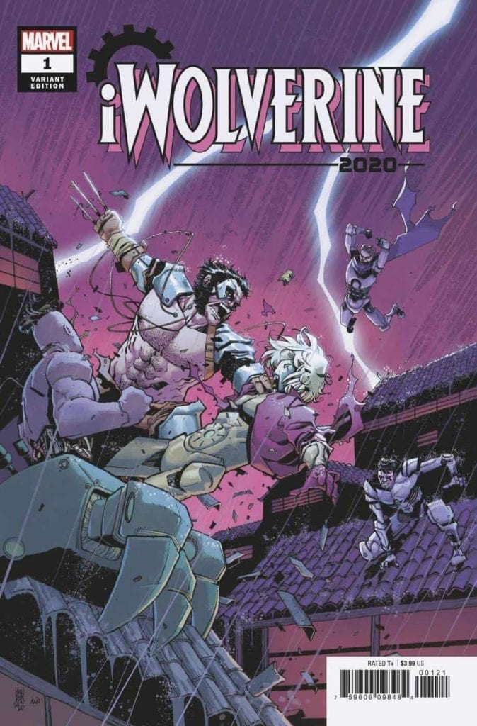
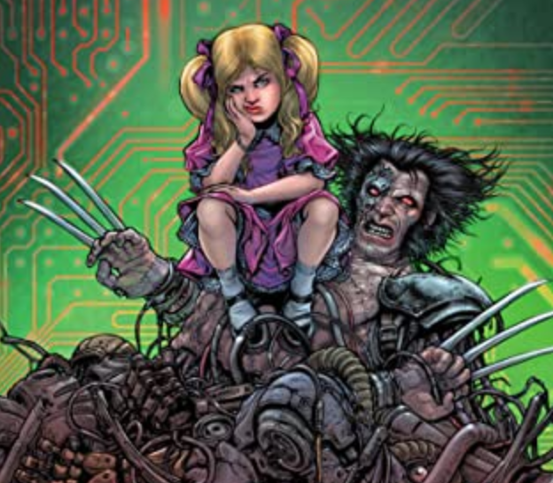
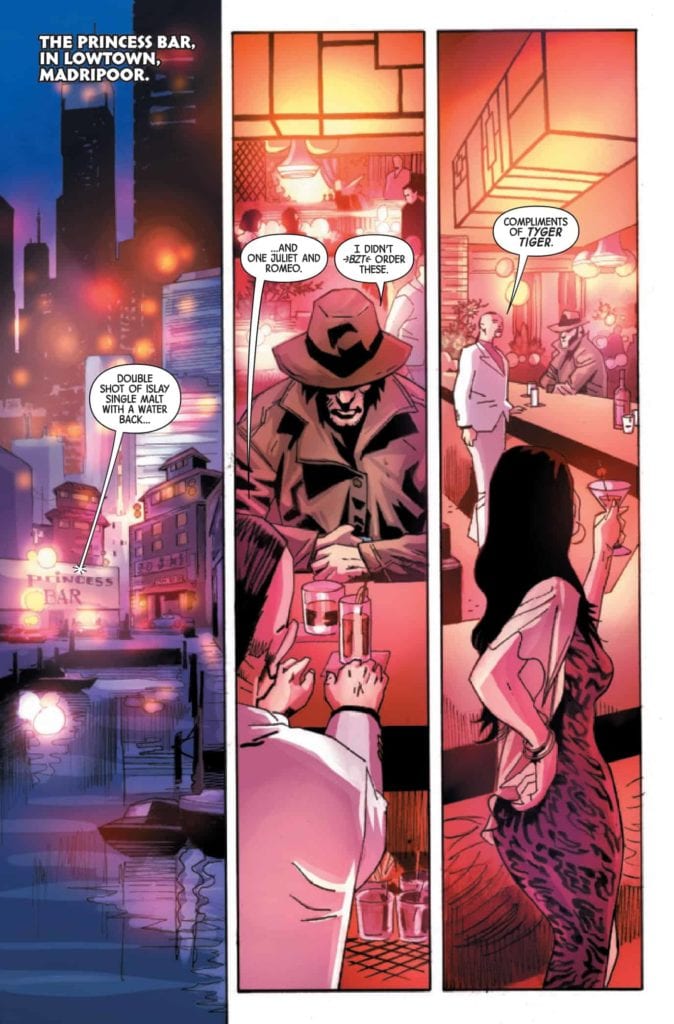
iWolverine 2020, published by Marvel Comics, tells a thrilling revenge story as Albert — the robotic Wolverine — goes on a quest to reunite the pieces of the child robot Elsie-Dee that have been scattered to several different people. The journey to reassemble Elsie-Dee is violent, exciting, and thoroughly entertaining.
About the book: There are people who seek to capitalize on vulnerable A.I.s. But there’s one robot doppelganger whose not willing to lie down without a fight — especially when there’s revenge to be had. Murder is on its way to Madripoor in the form of … iWolverine.
The writing of Larry Hama, the art of Roland Boschi, the colors of Andres Mossa, and the lettering of VC’s Joe Sabino come together to create a stunning visual spectacle with high energy and a thrilling revenge plot.
iWolverine 2020 #1 Story
Larry Hama begins this story with a conflict and characters that have been introduced in other issues, but that doesn’t have much effect on this issue. It is still made clear what events had occurred that led Albert on his mission of revenge, and the plot of this issue would still have worked if it had been standalone. This makes iWolverine 2020 very friendly to new readers who just want to enjoy an action-packed comic book. Characterization is light in the issue, but that is fine when considering this is not these characters’ first appearances, and the focus of the story is on revenge, which is a theme that requires less characterization and more action—something this issue certainly delivers on.
Art
The pencils and inks of iWolverine 2020 do wonders to complement the revenge story of the issue. Roland Boschi does a phenomenal job of portraying Albert as a hulking, muscular beast, and the action scenes are complemented by the dynamic poses that Boschi places the characters in.
Shadows are used heavily throughout iWolverine 2020, and serve two noticeable purposes. First, large muscle mass on characters such as Albert are given heavy shadow to highlight the many well-toned individual muscles, giving him a spectacular physique that many comic book heroes possess. The second, and much more useful in the narrative, is the use of heavy shadow on the face of villainous characters. Albert may have shadows when he is standing in certain positions or buried in a trench coat, but compared to the villains of the issue, his face is very well-lit. Elsie-Dee, the most innocent character we are exposed to in iWolverine 2020, is always shown with little or no shadow on her face. Shadows covering the face of a character is a subtle way to indicate maliciousness and is an interesting way for visual characterization.
The colors of iWolverine 2020, done by Andres Mossa, stand out from the typical coloring of modern-day superhero comic books. Mossa is able to work in many colors that don’t often appear in a city setting (where iWolverine 2020 takes place) by giving certain themes or areas a distinct color tone. For example, when Albert visits a place that creates robots to inquire about the whereabouts of Elsie-Dee, nearly everything is colored a shade of green. The walls, the machinery, and even the characters are all given a tint of green. This is later done in other areas with red and blue, and results in a pleasant, stylized look.
VC’s Joe Sabino does an amazing job of stylizing sound effects to complement the action. A wide variety of fonts and colors are used, and each one seems to fit wonderfully with the events happening on the panel.
Conclusion
iWolverine 2020 is certain to please any fans of comic book action and violence. The writing establishes circumstances for an entertaining revenge story and is complemented by the art, colors, and lettering. This first issue is certainly something worth checking out for those who are fans of heavy action.