Home Blog Page 233

Review: FRIDAY #2 Explains Just How It’s Breaking Your Heart

Friday Panel Syndicate Brubaker

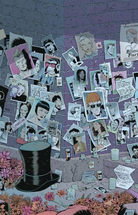
Panel Syndicate’s Friday defies definition. Not in that its influences aren’t clear. Writer Ed Brubaker, artist and letterer Marcos Martin, and colorist Muntsa Vicente have been pretty forthcoming about some of the YA mystery novels that led them here. But it’s the many pieces borrowed from multiple genres that shouldn’t fit together as they do. Friday #2 ups the occult factor of this coming-of-age story and doesn’t skip a beat in doing so.

Writing

The pages of Friday #2 may be home to ghouls and magic amulets, but all of those things are secondary to Brubaker. They’re the window-dressing – the MacGuffins. What Brubaker is interested in is Friday Fitzhugh’s loss of innocence. Our heart may beat fast when Friday’s being chased through the woods by a ghost, but not half as fast as when she’s fumbling around awkwardly with a boy she likes. Brubaker wants us to fear the ghosts, but not as much as we fear Friday’s looming adulthood. The mysteries she’s solving and the petty criminals she’s chasing are just representative of a simpler time—a time when anything was possible.

This is why all of these strange puzzle pieces fit together so well. Brubaker never loses sight of the true story that’s being told. This isn’t a story about ghosts or ghouls. This is a story about a girl growing too big for her hometown, with some ghoulish cameos. Moments of Friday talking about her sex life transition seamlessly to her fighting off monsters because the human heart of each moment is never lost. It’s not the sex that’s the point; it’s the lump in Friday’s throat. It’s not the monsters that matter; it’s the fact that they make this hugely courageous girl scared enough to run.

Friday Panel Syndicate Brubaker

Art

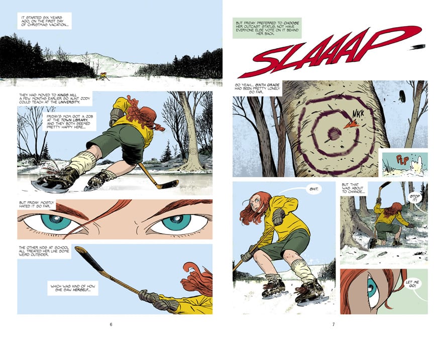
Martin knows that we won’t feel the pang of loss for Friday’s childhood if we don’t know what we’re losing. And so, this whole issue, Martin finds ways to connect Friday’s childhood to our own. Whether it’s the paperback YA mysteries, strewn across a desk, whose covers give us a highlight reel of Friday and Lancelot’s old cases, or the Archie-esque small-town diner, every page feels familiar. Martin is drawing on real experiences many of us have: Hardy Boys books, The NeverEnding Story, and Archie comicsEven the conveniently placed “Danger: Thin Ice” sign out on the lake feels reminiscent. It’s reminiscent of a time when we read stories that were a little less subtle. Stories where, as kids, we jumped at the hints of what was happening in the next scene, no matter how obvious they might be.

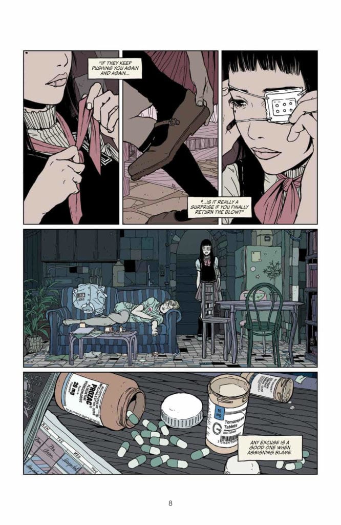
The strange placement of the sign stands out because Martin is such a subtle storyteller. With uncanny precision, he can show the closed eye and eyebrow of someone worried and disappointed in themselves when they should be relaxed and happy. The difference is almost imperceptible, but it’s there. And when Friday gets on a train to go to college, our hearts sink to our stomachs, just like hers has. Brilliantly, Martin has her face away from us. She can’t bear to look at us, or she might cry. Martin’s ability to balance these competing forms of storytelling, childlike simplicity, and adult subtlety makes this a wonderful issue. Because without a celebration of the childlike simplicity, we don’t see how oppressive adulthood can feel.

Coloring

Vicente immediately connects the color yellow to Friday Fitzhugh. When we first see Friday in this issue’s flashback, she’s wearing a bright yellow sweater in an otherwise muted scene. It stands out. And soon, we see that her bright sweater is an extension of who she is. She lobs a puck at a bully, and we see that Friday Fitzhugh is as loud and bright as her choice in clothing. But as the issue progresses, we begin to notice an interesting change. Friday wears her yellow jumpsuit to prom, but the overwhelming pink lights affect how we see it. Later, she’s wearing overalls with a shirt underneath that has only a couple of yellow stripes. And by the end of the issue, we see her back in the brown and cream-colored clothes from the previous issue.

Vicente shows us Friday losing her innocence. She shows us Friday growing up. The bright, loud girl that went mystery-hunting through Kings Hill is a thing of the past. It’s also interesting to note that pink always seems to be around when big things are happening to Friday. In the previous issue, Vicente associated pink with some of the more occult moments. But this issue, we see pink all over the place. At the prom, in the donut shop where she first gets to know Lancelot, or in the woods when she’s running from a ghost. One thing is certain; each of these moments leaves its mark on Friday. It’s like Vicente is highlighting these beats for us. Saying “Pay attention!” in the funniest way possible.

Friday Panel Syndicate Brubaker

Lettering

Martin works the lettering into the art so well. When Friday slams a puck into some guy’s face, the puck bouncing off him makes the exclamation point in the “Smaak!” And when we’re getting a walkthrough of Friday and Lancelot’s accomplishments as detectives, the lettering shows up as pages on a desk strewn with mystery books. But it’s the coloring of the word balloons, of all things, that stands out. Friday #2‘s word balloons have no border. It fits the art style brilliantly, but there should be problems when characters are having a conversation. Their word balloons would normally blend into one another, and we may lose who’s talking. But in Friday #2, when multiple characters are talking, one of their balloons is a different color. It’s an easy way to help readers distinguish which character is speaking, and it complements each scene’s color schemes.


Panel Syndicate’s Friday #2 is a joy. It’s reminiscent of days when all you had to worry about is if you’d saved up enough for the next Archie comic. But it’ll also break your heart. Writer Ed Brubaker, artist Marcos Martin, and colorist Muntsa Vicente have produced a wonderful addition to the world of comics, and this series is bound to be a classic. Get your copy at Panel Syndicate. Panel Syndicate is a digital platform for comics, straight from the creators, where you can pay what you want to. Please give what you can so we can continue to get more wonderful work like this!


Monkeys Fighting Robots Youtube

DC Preview: Ghost-Maker Wants The Title Of Gotham’s Protector In BATMAN #103

Batman #103 cover

Joker War may be over, but the fight over Gotham is just getting started. DC Comics has released an exclusive preview of BATMAN #103, available on November 17th, where Ghost-Maker faces off against Batman for the right to protect Gotham.

DC has released a few select pages, rendered by artists Carlo Pagulayan, Gullem March and Danny Miki. Says DC about the upcoming issue: “Batman and Ghost-Maker go toe-to-toe to decide which of them will remain Gotham City’s hero”

You can check out the gallery of preview pages and read the full DC press release below.

What did you think of Joker War? Are you excited for more Ghost-Maker? Let us know what you think in the Comments section, and please share this post on social media using the links below.

DC PREVIEW – BATMAN #103, on sale Tuesday, November 17!

If you thought that the end of “The Joker War” meant that Batman would be able to take it easy, guess again! DC has your first look at stunning artwork from Carlo Pagulayan and Danny Miki from Batman #103, on sale Tuesday, November 17, 2020.

Batman and Ghost-Maker go toe-to-toe to decide which of them will remain Gotham City’s hero. The city is changing faster than ever in the aftermath of “The Joker War,” and with this change comes increasing dangers as Gotham’s citizens demand that Punchline be released from prison! Plus, Harley Quinn faces certain death at the hands of Clownhunter!

BATMAN #103

Written by JAMES TYNION IV

Art by CARLO PAGULAYAN, GUILLEM MARCH and DANNY MIKI

Main cover by JORGE JIMENEZ

Card Stock Variant cover by FRANCESCO MATTINA

1:25 Card Stock variant cover by JORGE JIMENEZ

ON SALE 11/17/20$3.99 US |

32 PAGES | FC |

DC CARD STOCK VARIANT COVERS $4.99 US

Monkeys Fighting Robots Youtube

Review: THE WITCHES Can’t Deliver A Lasting Spell

The Witches is a flawed reimagining that will make everyone appreciate the original that much more. It is hard to not compare this film to Nicholas Roeg’s because every flaw draws you back to that magic from thirty years ago. While this telling of The Witches is closer to the source material, it strays into absurdity more than once. It is anchored by the solid performances and magical spectacles, but the horrendous effects and lackluster narrative harm this adaptation.

The thought of remaking The Witches was probably the first mistake, but that’s every failed remake’s mistake these days, the thought alone is a sin. It is a shame when you have talented actresses involved, but the material they are given is just rubbish. Directed and co-written by Robert Zemeckis, The Witches stars Anne Hathaway, Octavia Spencer, Stanley Tucci, Jahzir Bruno, and Chris Rock. Roeg’s original took place in England, but this new take venture to 1960s Alabama. After his parents are killed in an accident, Charlie Hansen (Bruno) is sent to live with his grandmother, Agatha (Spencer). While staying at a hotel, Charlie is transformed into a rodent after encountering a group of witches.

Anne Hathaway as Lilith in The Witches

Rock’s narration is completely unnecessary, not because it’s awful, but because of how it takes you out of the film. It gets to the point where you may think you are watching something else. He voices an older Charlie and he provides the opening exposition but overstays his welcome. One immediate standout is how the subplots in this film don’t amount to anything. For instance, Agatha is very knowledgeable on witches and educates Charlie throughout the film due to her experience with one. This experience is revisited many times, but when it is connected to the film’s conflict, it’s barely made to feel important. On a better note, The Witches does make a few changes to ensure it’s not a shot for shot remake. Still, it is unfortunate that Zemekis’ previous wizardry isn’t fully displayed in this film.

Zemeckis co-wrote the script alongside Kenya Barris and Guillermo del Toro. They offer enough details about Agatha and Chris’s past for them to be sympathetic characters but Hathaway’s character feels overlooked in many ways. She stars as Lilith and ties into a major subplot, but it goes nowhere. The Witches holds itself up with great performances, and while some are more over the top than others, it never gets out of hand. Spencer is the standout, she shines like she always does. She makes it easy for audiences to identify Agatha as a woman who is stuck in her ways but has a big heart. Hathaway is doing what she can as Lilith, The Grand High Witch. Her only downfall comes when she dives into the over the top portions of her act. Bruno is believable as Charlie, he pulls at your heartstrings by portraying this orphaned kid who is initially depressed but finds a new meaning to life by the end. 

Jahzir Bruno as Charlie in The Witches

Zemeckis has helmed many beloved films in the past, so it’s almost unbelievable that he directed this because it just isn’t that great. Luckily, some of the films redeeming aspects come from its vibrant score by Alan Silvestri and it’s gorgeous cinematography that highlights all of the extravagant costumes worn throughout. However, another issue with this film is its poor effects. The practical effects featured in Roeg’s adaptation will certainly be missed. The moments when characters transition to rodents comes off like the CGI wasn’t even completed. Hathaway’s character has these eerie smiles that stretch and it is just a horrendous visual.

The Witches won’t sit right with fans of Roeg’s adaptation, but this modern reimagining of Roald Dahl’s novel will still be a hit with children. It’s a subpar remake that won’t offer the same lasting impact. Perhaps if Zemeckis worked on the screenplay alone, it would have been written better. The Witches is effective enough, but Roald would certainly hate this film just as he did the original.

Monkeys Fighting Robots Youtube

Review: MIGHTY MORPHIN POWER RANGERS #55 Epic Giant Robot Fighting Abounds!

Review: MIGHTY MORPHIN POWER RANGERS #55 Epic Giant Robot Fighting Abounds!

Boom! Studios’ Mighty Morphin Power Ranger series has been a delight for fans for 54 issues, and the fifty-fifth issue is no different. Out this week, Mighty Morphin Power Rangers #55 serves as the series finale.

Well, it is actually a season finale as we know Boom! is relaunching its Power Ranger line next month with two titles, Mighty Morphin and Power Rangers. The creative team clearly understands how to wrap up a Power Ranger’s story and do it with style. This final chapter is one large Zord battle. The comic has been able to improve on from the show since it is not tied down with budget and technology issues, giving the readers amazing giant robot fighting action. This issue stands out in this regard. Each Zord gets a moment to shine as the Rangers take on Lord Zedd’s Dark Rangers. The battle is well-paced and leads up to the eventual combination of Zords to form the Megazord. The formula is cliche at this point, but it is a formula, Ranger-heads love. This comic does a masterful job of capturing the feeling the Zord battles gave you as a kid.

Writing

Ryan Parrot continues to show he knows how to write Power Rangers for a modern and older audience. As noted, this is the final issue of this story arc, so this is the payoff to close out the series. It is nearly non-stop action, and at this point, that has been earned. In the midst of the action, Parrot can slip in great character moments. We can see that even though Zedd’s Dark Rangers are a powerful menace, they are still rooted in the bumbling villains from the TV show. Parrot also does a great job of showing how the Power Rangers are growing together as a team. This story is set after the original red, black, and yellow rangers have left the team, and Rocky, Adam, and Aeisha struggle to take their place. While the TV show made the transition appear seamless, Parrot has shown that the team has struggled with the change. Even though this issue is filled with a gigantic explosive fight scene, we still get little moments to see these team members struggling to be a cohesive team, which greatly enhances the story.

The issue does miss a beat in terms of pacing at the end. The end of the battle feels rushed. The connection to Promethea corporation feels a little tacked on and an afterthought to the well-executed Zord battle. Promethea is used to introduce the mysterious new Green Ranger. This new figure’s identity, clad in familiar garments, is the end of season mystery compelling us to move on to the next issue. They are given a brief time to shine, and it comes at the cost of the battle’s finale. This issue could have benefited from a few more pages to flesh out this portion of the story.

ART

Moisés Hidalgo’s art does a great job of conveying the mood and tone of this issue. The art at times looks like it is jumping off a sketch pad. It creates a sense of chaos and almost feels like the action was happening in a way that the artist could barely keep up with it. It really helps the reader have a sense that at any point, the Power Rangers could be destroyed and erased from existence in this battle. The Thunder Zords are well executed on the page. They invoke our memories from watching the show, and they are conveyed with fluid action. These sequences are more likely to connect with the sense of awe and wonder one had to watch the show as a child than actually rewatching the show with modern eyes would. The Terror Zords are a great idea – giant monsters fighting alongside the Dark Rangers. However, it is sometimes hard to understand their relationship with the evil set of Rangers themselves. Are they being controlled, are they fighting alongside, or are they just agents of chaos employed by the Dark Rangers? The Terror Megazord’s design and presentation are fine, but it is not in the book long enough for the art to convey its power. Once again, the book would have benefited from a few more pages. The Dark Rangers’ design is a breath of fresh air into a concept that the show failed to deliver on. The original concept for the Dark Rangers was presented in the second season of the Power Rangers. The original versions looked like a Dollar Store Lucha Libre Halloween costumes. Here the Terror Rangers are given new identities, and while the outfits are reminiscent of the old design, the comic is able to make them look menacing. Each outfit does a great job of connecting with the villain underneath the mask and displaying what they would look like with a Power Ranger makeover. The page layout also does a great job communicating fast-paced action. Igor Monti chooses a more muted pallet than what we are accustomed to for Power Rangers, and it helps give the issue a sense that something could go very wrong in this final issue. The art is stellar in this series sendoff.

Lettering

Ed Dukeshire’s lettering does not take away from the story, but it does not take the issue to the next level. The use of black word balloons with white letters for the Dark Rangers does a good job of conveying their relationship to the original team, but the fast-paced action of the issue makes it easy to overlook. Alpha 5 and Zordon receive unique fonts for their voices, but once again, the moments are so brief it is easy to miss what Dukeshire is doing. It is curious who does not get unique lettering – Lord Zedd. Those who enjoy Lord Zedd from the show remember the unique voice Robert Axelrod provided. Why does that not merit special characters?

Conclusion

This is how a Power Rangers story arc and series should end. The Rangers fight evil in an epic battle in their Zords. While the end mechanism feels a little forced, it does not take away from the issue’s stars. This is giant robots fighting monsters to decide the fate of the universe. It is executed so well that readers will gladly hold onto their seats and follow the series into the relaunch.

Monkeys Fighting Robots Youtube

Review: SKULLDIGGER AND SKELETON BOY #5 Brings Pure Chaos

Dark Horse Skulldigger Lemire

Dark Horse’s Skulldigger and Skeleton Boy #5, written by Jeff Lemire, with art by Tonci Zonjic, and letters by Steve Wands, brings a brilliant dose of chaos to this series. All of the characters, their plans down the drain, are scrambling to get what they want at any cost. Be warned of major spoilers ahead! 

spoilers ahead

Writing

Lemire has brilliantly set up this issue to feel completely unpredictable. Even the characters don’t know what they’ll do next. As Detective Reyes drives away from the butcher shop with Skeleton Boy in tow, she’s trying to convince herself that she knows what she’s doing. It’s through her own self-assurance that Lemire shows us her fear. She’s consoling herself and trying to be strong all at once. As Skeleton Boy struggles against his chains, we begin to wonder, what on earth does he even want to get away from her for? Neither of them know what future they have. They’re both just pretty sure it isn’t looking bright for them.

In some ways, Skulldigger and Skeleton Boy #5 reads like a script that got away from itself. We no longer have the clear cause-and-effect of tidy storytelling. That’s a thing of the past, now. Instead, Lemire opts to tell a story that feels real. He allows the repercussions of past issues to land, and lets them take the script wherever it wants to go. The chaos of this issue brilliantly sets us up for a finale that’s going to be just as messy.

Dark Horse Skulldigger Lemire

Art

Zonjic reminds us of the moral ambiguity of this series. When someone finally catches up with Reyes and Skeleton Boy, we see Skulldigger’s mace hit the windshield. Zonjic deliberately omits any sign of who’s holding the chain, and in that moment we realize we’re worried no matter who it is. If Skulldigger has caught up with them, he may be as much a problem as GrimJim. After the windshield shatters, Zonjic makes the following pages look like shattered glass. The panels, like glass shards flying through the air, communicate the chaos of the scene by making the page as chaotic as the issue’s events.

Zonjic also brilliantly pushes against the emotion of each scene. Instead of filling Reyes’ and Skeleton Boy’s faces with dread and worry, he fills their faces with anger. But when Reyes steps out of the car to call her partner and explain what’s happening, we see her let her guard down suddenly. She looks worried and tired, for a brief moment while she thinks she isn’t being watched. Zonjic’s restraint, only giving us this moment of worry in the lead up, allows the emotion of the scene to stay bubbling beneath the surface.

Dark Horse Skulldigger Lemire

Coloring

Zonjic immediately hearkens back to Skulldigger and Skeleton Boy #4 with his use of red. As Reyes and Skeleton Boy drive away from the butcher shop, each panel is drenched in red. It’s the red of Skulldigger and Tex’s bloody lifestyle, the red that GrimJim brings with him everywhere he goes, and Reyes and Skeleton Boy have bought their way into this life of violence. But later, as Skulldigger gets up off the butcher shop floor, something is different. We see his red blood, smeared against the white tile, but when he goes into his basement, the coloring has changed. What once had a red glow is now blue and grey. It’s as though Tex and GrimJim’s influence on Skulldigger was bled out of him. He comes back from the brink of death as a new man, free of his past.

Lettering

There seem to be a few typos in this script. “I can’t not yet,” Reyes says over the phone, instead of “I can’t. Not yet.” It’s unclear if this was deliberate on Wands’ part, but regardless, there’s something about it that actually works. Reyes and Skeleton Boy are frantic. The lack of punctuation makes it feel as though their sentences are running into each other, like they’re breathlessly trying to keep up.

Wands works his sound effects seamlessly into the art. The smash of the windshield is almost hard to see it fits in so naturally. It looks like a glare on the glass, with cracks through it from Skulldigger’s mace. And as Reyes careens off the road in her car, the screeching sound of her tires mimics the tumble of her car. Wands uses a simple style, white or black lettering (with the exception of GrimJim’s purple), but incorporates it into the page in such stylish ways it always seems fun.


Dark Horse’s Skulldigger and Skeleton Boy #5 is stylish, chaotic and emotional. It brings this series to a boiling point, setting it up for a brilliant final issue. Lemire, Zonjic, and Wands continue to deliver and this series continues to be a must-read. Skulldigger and Skeleton Boy #5 is out October 21st from Dark Horse. Pick it up at a comic book shop near you!

Monkeys Fighting Robots Youtube

Review: YOU LOOK LIKE DEATH #2 Is Strange And Normal All At Once

Dark Horse You Look Like Death Way

Dark Horse’s Tales from the Umbrella Academy: You Look Like Death #2 — written by Gerard Way and Shaun Simon, with art and colors by I.N.J. Culbard, and letters by Blambot’s Nate Piekos — balances its weirdness with a shot of normal life. For every vampire-chimpanzee-crime lord, there’s a baby crying on a plane. This series makes time for the little moments, in the midst of unadulterated strangeness.

Writing

Way and Simon create a charming rhythm in this series. They seamlessly blend small moments with big, strange ones. As the Shivers follows Klaus to Los Angeles, we don’t skip to the big comic booky moment of their confrontation. Instead, we see Shivers being fitted for a suit. You Look Like Death #2 is interested in the stuff that usually gets glossed over. So while some of this issue is about vampires, hard drug use and ghosts, we also get to see people take their blood pressure medication and talk about the books they’re working on. It creates an exciting unpredictability. Are we going to see Klaus fight a giant robot, or is he just going to order another cup of coffee? Either way, Way and Simon know how to keep you glued to the page.

Dark Horse You Look Like Death Way

Art

Culbard shows us the world as Klaus sees it. As Klaus hovers above a party, we see the faces of all of the guests looking up at him and smiling. For the most part, they look almost identical. They’re smiling, that’s what matters. Klaus doesn’t care who these people are, he just cares that he’s entertaining them. And later, as Klaus is trying to put traumatic memories out of his mind, Culbard makes it so that his flashbacks interrupt the rest of the page. These flashback panels are superimposed over other panels so that they actually get in the way of some of the art. Culbard makes it so these memories are literally getting in the way of Klaus living in the moment. The only way he can escape them is by escaping reality altogether.

Coloring

So much of You Look Like Death #2  is shown in vibrant colors. We get the bright green ghosts, an almost neon shade of pink for Viv’s wallpaper, and the haunting blues of Klaus’s past. Sometimes it feels so bright you almost have to shield your eyes. But that’s Klaus’s life — a kaleidoscope of colors. So when he enters “the void,” Culbard’s palette feels comforting and toned down. Nothing but light blues, warm oranges and dark browns. It feels like walking into a dim room after straining your eyes at the sun. And just as it feels like a welcome change of color palette, Klaus feels like he too can finally put his feet up.

Dark Horse You Look Like Death Way

Lettering

Piekos tells us some subtle things about these characters with his lettering. At one point, the vampire crime lord named Sage is yelling at the Shivers for coming in and trying to take his territory. One of Sage’s men yells at him and slaps Sage across the face. Piekos writes this as him yelling “Snap out of it, man!” connected to another balloon that’s more calmly saying “The hell is wrong with you!?!” The first moment is yelled, and the second is spoken, with the “WAP” noise of Sage being slapped in the middle. This shows us how Sage’s men keep him in line. They yell some sense into him and then make sure their words got through.

Piekos also shows us an interesting relationship between Klaus and his channeling of ghosts. The tail of each balloon when he’s channeling someone is curved and wavy. It, in and of itself, kind of looks like a ghost. But when Klaus is injecting himself with drugs, his dialogue looks the same. It makes us wonder, does Klaus get some kind of high channeling the dead? And if he does, does that begin to explain some of his complicated relationship with his powers?


Dark Horse’s Tales from the Umbrella Academy: You Look Like Death #2 is charming and odd. Way, Simon, Culbard and Piekos blend quirky scenarios and strange characters with little moments of realism. Pick up You Look Like Death #2, out from Dark Horse October 21st, from your local comic book shop!

Monkeys Fighting Robots Youtube

Review: HEARTBEAT—A Teen Drama of the Gaze

Trade Paperback

Released September 30th by Boom! Studios, writer and illustrator Maria Llovett’s Heartbeat offers a new take on the teen romance. With lettering contributions from Andworld Design, a translation by Andrea Rosenberg, and inspired by poetry, Llovet creates a deeply personal narrative exploring the teen psyche.

I must admit, I’m an inconsistent fan of teen media. Simply put, I hate seeing the same cliché love triangles and awkwardness repeated over and over again, often without much reinterpretation, cleverness, or sensitivity. When it does work, however, teen dramas can be immersive psychological and social commentaries.

Llovet’s series, while difficult to relate to at times and deliberately discomfiting, successfully dramatizes a psycho-sexual love triangle between self-absorbed high school students and sympathetically illustrates a teenage obsession with death. Llovett delivers lots of style without compromising the character-driven story.

EVA GETS READY FOR ANOTHER DAY OF HELL.

High School Hell

Llovet employs quite a few cinematic techniques to create the mood of the series. First of all, her frequent use of Dutch angles lent visual gravitas to each major scene. The technique also added a sense of dread to the school setting. Eva, the protagonist, doesn’t fit into this rigid, upper-crust private school. She’s the only child of a working-class single mother who struggles to afford the school’s tuition even with Eva’s scholarship.

Thus, Eva’s poverty places her at the bottom of her school’s hierarchy. She dreams of being loved by the mysterious school hottie, Donatien. She wants to be friendly with Donatien’s aloof girlfriend, Amber and wishes to be free of Violetta’s bullying. The only person who acknowledges her in a normal way is Amber’s brother, Mackenzie. But even he disappoints Eva in the end.

Moreover, all of these dreams and desires are revealed through dream sequences and poetic narration. Despite the narration being esoteric and melodramatic, Eva would have been difficult to sympathize with without it. Reading the narration as removed from the story itself, reminded me of my own woe-is-me teen journals. When you’re a teen, everything feels big and dramatic. It was this reminder that helped me relate to Eva instead of judging her.

Voyeur

Artistically, the dream sequences, distinguished by the rounded corners of each panel, provide the same kind of intimate insight that fuses the real and the Romantic elements of character and story. Each dream sequence is like a painting, seemingly making a pastiche of Frida Kahlo and anime. This style epitomizes the disturbing beauty of the subject matter and characters. It’s uncomfortable to be inside the mind of a young girl. You may feel like a horrible voyeur and want to look away, but you can’t.

You can’t even look away from the multiple panels in which Eva undresses. Her vulnerability and fragility in these panels are discomfiting to witness, yet there’s beauty in her pathos. She’s like the motifs of butterflies and delicate flowers that adorn the panels’ backgrounds. The butterfly represents romantic desire and freedom. The flowers, which may be Hollyhock, generally represent romance and ambition. Sadly, Eva’s vulnerability gets exploited by Donatien after she witnesses him drinking blood from his dead girlfriend’s chest wound.

For anyone else, Donatien potentially being a murderer would be a huge red flag, but Eva is desperately lonely. Through Llovett’s six-to-twelve panel grids, we get montages that condense plot points. In the middle half of the book, the montage is used to show how Eva’s new relationship with Donatien affects her. At the beginning of the series, Eva’s diet consists almost entirely of chocolate bars. However, the later montage shows Eva smiling, sharing suggestive glances with Donatien, and eating a full meal. It’s a satisfying package of neat layout and storytelling.

Style and Substance

Like a bow on a gift box, Andworld Design’s lettering adds some stylistic flair with what little dialogue and effects there are. Most striking were the effects for phone sounds and crying. They were all drawn in bright blue and pink-colored cursive and sometimes took up more of the page than typical phone sounds in comics. Making those sound effects larger than life exaggerated the feeling of interruption. Drawing the effects in cursive taken in tandem with the narration added to the sense that we’re reading Eva’s diary. Therefore, each sound is as Eva heard it, whether big or small or flashy.

As a whole, Heartbeat is a heartbreaking gothic teen romance. Whether or not you love the story and characters or find it irredeemably disturbing, you will remember it long after you’ve read it. With all its dark style and psychological substance, it’s worth the read.

Monkeys Fighting Robots Youtube

REVIEW: COLONEL WEIRD: COSMAGOG #1 is a Gentle Masterpiece

It’s the job of any creative team to put you in the shoes of their characters. That’s not always much of a challenge. Some characters are just like you. But Colonel Weird isn’t much like anyone. Yet, in Dark Horse’s Colonel Weird: Cosmagog #1, writer Jeff Lemire and artist and letterer Tyler Crook make Weird feel like the lost kid in all of us. They take this wild, sci-fi adventurer and focus in on the man beneath it all. A man who feels like he’s at the whims of some cosmic storm and who wants to get home.

Writing

In the opening pages of this issue, Lemire immediately impresses upon us Weird’s confusion. “Abraham? Gail?” he says, the moment he shows up. “Hello? Is… anyone there?” Almost everything he speaks is a question. Even the ellipses scattered throughout his dialogue show how he forgets what he’s saying at the moment. “I am… thirsty,” is one of the first things we see Weird say instead of ask. He seems torn between these huge moments of sci-fi chaos, bouncing between realities, and his own humanity. He’s a man split right down the middle.

Like a victim of some trauma, Weird repeats over and over again, “I have seen the pattern of things.” In a way, Lemire actually creates a pretty terrifying horror story in these pages. It’s a horror story based on something that could actually happen: you could lose your mind and forget who you are. But Lemire presents it in such a gentle way, with the help of Crook’s gorgeous art, that you’re not afraid. By the end of this issue, Weird feels like a kindred spirit. He’s lost and scared, just like so many of us feel, more often than we’d like to admit. You hope Weird finds his way. Because if he can make it through, so can all the parts of ourselves that we see in him.

Dark Horse Weird Lemire

Art

Crook’s watercolors are jaw-dropping. Yet, at the same time, they feel so natural they almost don’t stand out. Crook whisks you away on this story, choosing to focus us in on all the right details, so you stop noticing the art. You’re too enthralled to see it anymore. In a way, we become Crook’s own Colonel Weird. So lost in the story, coming up for air only long enough to remember we’re not comic book characters, for seconds at a time.

Crook focuses on Colonel Weird’s shoes at first. In Black Hammer, we never seem to see Colonel Weird standing. He’s floating above everyone else, disconnected from reality. But Crook shows Weird’s shoes touching the ground. We watch Weird place quarters on counters and go fishing through fridges for ice-cold soda pops. It’s all very normal for this sci-fi hero. But when he’s whisked away to another time, Crook makes it look like Weird is pulled into another page. The doors that open into the Para-zone doors Weird literally falls through, look like panels on a comic book page. So when Weird exits, it’s like he’s exiting the page to pop out in the panel of another one.

Coloring

Crook’s mastery of color pulls us back and forth between the comic-booky, world-ending battles and normal, sunny days on abandoned highways. When we first see Weird, he’s alone. But there’s something so peaceful and relaxing about how Crook colors this moment. Weird’s suit is bright, and the sky is a comforting blue. When Weird is pulled into a confrontation with the Anti-God, the colors change. We see the green of the Para-zone and the yellow and orange of Anti-God’s destructive powers. When he bounces back, suddenly, everything does feel dark and lonely. It’s as though Crook is showing us how the big, colorful moments of Weird’s past, the moments where he feels truly significant, drain the color out of life’s simple joys. But as this issue ends, Colonel Weird weeps at the sight of a sunset. The sunset contains all the colors we’ve seen so far on one glorious page. Maybe Weird will find fulfillment from the simple moments, after all.

Dark Horse Weird Lemire

Lettering

Crook dials down Colonel Weird’s experiences. When Colonel Weird: Cosmagog #1 opens, we get all the sci-fi noises that are commonplace in Weird’s life. We see the “Shrack” of him bursting into reality and the “zzzzzzzzt” of his feet making contact. But later, all the noises begin to blend into the rest of the scene. The “gulp” of Weird downing a soda is almost hard to notice. These are the noises of normal life. But Weird still doesn’t quite fit in, and we see this in his dialogue. The tails of his word balloons are long and winding. It’s as though he’s almost getting lost on the way to everything he’s saying. It shows his lack of confidence, his fear to speak. It flies in the face of his younger selves, in flashbacks that speak in big word balloons with small tails. They get right to the point with a confidence that’s clear on the page. So what happened to him to rob him of his grit?


Dark Horse’s Colonel Weird: Cosmagog #1 is a masterwork in putting a reader in a character’s shoes. Colonel Weird, who should be too strange to comprehend, ends up feeling like a piece of the reader’s own soul. Jeff Lemire and Tyler Crook create a gorgeous beginning to what will undoubtedly be an excellent series. Pick up Colonel Weird: Cosmagog #1, out from Dark Horse October 28th, at your local comic book shop. I’d say it’s a “must-read,” but that doesn’t feel like it quite cuts it for such a beautiful issue.

Monkeys Fighting Robots Youtube

X-MEN #13: The Genesis Of Character For Apocalypse

X-Men #13 Cover

X-Men #13 continues the X of Swords event of Jonathan Hickman’s Dawn of X saga. This week has a special focus on Apocalypse, where artist Mahmud Asrar and colorist Sunny Gho gives the usually stoic mutant supremacist more emotional expression. VC’s Clayton Cowles and designer Tom Muller meanwhile fill in smaller details, so readers understand the full story.

Background And Recap

Apocalypse is a regular X-Men villain who serves as a mutant supremacist following a “survival of the fittest” mentality. Even after he joins Krakoa, Apocalypse’s ulterior motives to ensure his brand of supremacy remains. Unfortunately, this makes him a rather bland character. So diving into his backstory regarding Krakoa’s other half Arakko is a little necessary to see his motives. What better way to do that other than recovery from a beating from his grandchildren?

X-Men #13: The Tragic Apocalypse

Through Jonathan Hickman, Apocalypse gets some much-needed character development in X-Men #13. As Apocalypse takes a risk to recover from his injuries, he recalls his past. Back during the battle of Okkara (past Krakoa and Arakko), Apocalypse found his views affirmed. But not by his power; it was his wife Genesis he saw as the strongest. So when she has to leave to protect Arakko, Apocalypse has to remain behind. With this Apocalypse’s view of survival of the fittest means not just being powerful with followers to match but standing at the side of the person he loves.

Even his Khopesh Scarab is a testament to this. Muller fills the reader in on its backstory before Apocalypse goes to retrieve it. It was actually a gift from his sister-in-law to celebrate his and Genesis’ children’s birth, the original Horsemen. Apocalypse isn’t just fighting for supremacy but the memory of everybody he loved. This gives him much greater character than he ever had before as a force of nature.

How The Emotionless Emote

Mahmud Asrar goes to great lengths to show how the lack of Genesis in Apocalypse’s life affects him. Throughout X-Men #13, Asrar displays characters without pupils yet plenty of facial language. As Apocalypse remembers his old life, he begins in pain but nostalgic as he calms down when remembering Genesis. But upon recalling a personal tragedy from betrayal, Apocalypse cries for Genesis and the decision she made in reaction. His usually stoic look through the rest of X-Men #13 feels more like a defense mechanism afterward.

Sunny Gho decorates some of the less physically emotional parts of X-Men #13 with coloring to evoke moods. Purple evokes a sense of dread in all of its appearances. The beginning has Apocalypse close to death to the point of needing to be restrained. Threats in the flashback share this feeling as it looks like Apocalypse and his family are fighting a hopeless battle. Even after Apocalypse recovers, seeing these old memories remind him of what’s lost. As such, Apocalypse despite being alive, feels dead. So when he recovers Scarab, the yellow backgrounds indicate a mood of recovery, matching the energy colors of his restoration.

Designing X-Men #13

Clayton Cowles on lettering has to make sure he doesn’t overshadow the above artwork. The most notable uses come in two ways, a recycling use of dark red colored screams are trying to escape the word balloons, but doing so indicates that Apocalypse would die. Then there are the black word balloons with white fonts to indicate possession via a helmet that causes its wearer to decompose. This indicates that the vessel is in pain and the entity is a threat to those opposing it. But all of this pales in comparison to Tom Muller’s infographics that foreshadow appearances like Gorgon’s later in the issue via the swords he wields.

Witness Apocalypse In X-Men #13

X-Men #13 is a good piece about Apocalypse’s character, but one best used with full context. In most of his other appearances preceding Dawn of X, he’s not really that interesting. Here however, they see the usually stone-faced immortal mutant in a state of vulnerability. For once, readers see Apocalypse not as imposing, but something trying to live up to his own expectations. This new awakening and weapon leaves even more down the line. Only time can tell if this will lead to major developments.

Monkeys Fighting Robots Youtube

Review: JUGGERNAUT #2 Needs A Group Hug

Juggernaut #2, Shaw cover

JUGGERNAUT #2, available from Marvel comics on October 21st, pits the Juggernaut against the Hulk as a PR move. Juggernaut’s “agent” may not be giving him the best advice. Written by Fabian Nicieza and drawn by Ron Garney, this latest chapter demonstrates that doing the right thing is not always the best thing.

Cover Art

Geoff Shaw’s cover is raw, powerful, and dynamic. Two giants facing off in a fast-paced brawl make for an eye-catching cover.

Writing

Cain Marko is trying to make good on the past’s damage through some mildly fabricated good deeds. His PR agent, D-Cel, convinces him to go after the Hulk and bring him in to answer to a ‘Victims of the Hulk” support group. Needless to say, the plan doesn’t work out as intended.

Nicieza’s story has a great battle to kick things off, and there are interesting flashbacks to clue the reader in on how Juggernaut got his new armor. However, the highlight is Hulk’s dialog as the new Immortal Hulk that’s a blend of the mindless monster and Banner’s intellect. This Hulk is self-aware and brutal in an almost malicious way. Nicieza makes you fear the Hulk more than I recall in recent memory.

That said, D-Cel continues to be a mystery in this story. All of her suggestions turn out poorly, and Marko was never one to be led around by the nose as he is here. Up to this point, D-Cel is more annoying than additive, but hopefully, that will turn around in future issues.

Juggernaut #2, writing sample 1

Nicieza continues to build a surprising amount of sympathy for Juggernaut, and I hope the potential pays off in future issues as well.

Pencils/Inks

Garney’s art is rough, raw, and perfect for the grounded nature of this story. The highlight of this issue, unsurprisingly, is the fight between Hulk and Juggernaut in the opening scenes. When Hulk slams the ground with his fists, the panels practically shake. When a body hits the side of a mountain, there’s no doubt these are the strongest characters on Marvel’s Earth.

I was particularly impressed with the detailed work on Hulk’s anatomy. His limbs and torso are almost tree-like. Also, Garney went for a smaller chest in favor of more size through the ribs, giving the Hulk an authentic brawler physique. The characterizations are humanoid in form, but you can feel the weight of these giants in every panel.

Juggernaut #2, art sample 1

Coloring

Matt Milla’s coloring work is solid from start to finish. The issue’s overall look is muted, but colors pop when they need to, especially in panels with some kind of power beam or blast. Milla also made an interesting choice by tinting Hulk’s eyes an orange-yellow color, so they stand out more and, frankly, make him look a bit demonic. That was a nice touch.

Lettering

VC’s Joe Sabino’s lettering is clean, sharp, and keeps the pace smoothly. Sabino also does a great job with the assortment of smashing noises. They fill the panels to projects “big” sounds without crowding out the art.

Conclusion

JUGGERNAUT #2, available from Marvel comics on October 21st, pits two behemoths against each other in a titanic battle that ends badly, in more ways than one. The art team elevates this issue beyond the story for a decent read.

Monkeys Fighting Robots Youtube