Home Blog Page 23

Review: DUST TO DUST #1 – Bones in the Sand

From modern comics phenom J.G. Jones comes a Depression-era mystery with masterful art and writing in Dust To Dust #1. Co-written by Phil Bram, this opening chapter is a stellar work of historical fiction, with incredible visual work and impeccable scripting. A love-letter to both noir and the golden age of Hollywood, this is a must-read debut and one of the best opening chapters of 2024.

“In the darkest days of the Great Depression, death stalks the Dust Bowl. As towering dust storms blast the parched Oklahoma panhandle, farmers try to flee the failing town of New Hope, but no one gets far. Battling his own demons, Sheriff Meadows teams up with Sarah, a traveling photojournalist, in a desperate fight to stop a serial killer on the loose—the Death that rides the Dusters.”
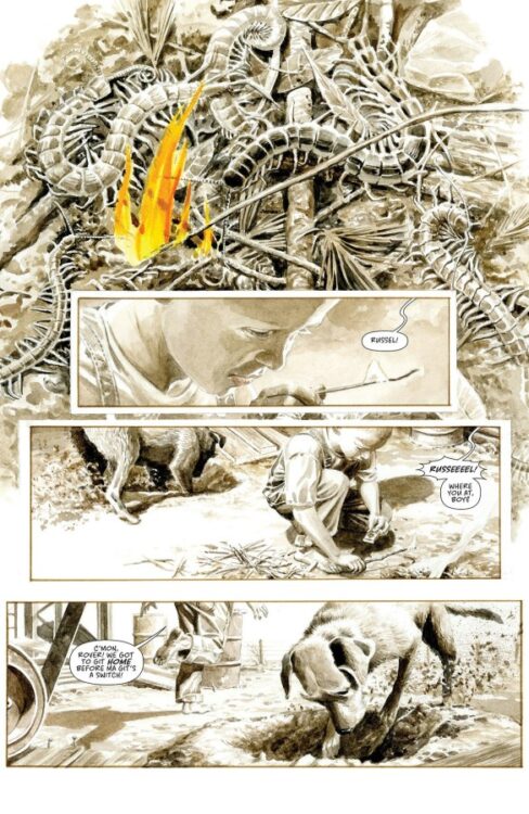
Writing & Plot

J.G. Jones and Phil Bram pull from the annals of Great Depression-era novels and classic film for inspiration in Dust to Dust #1. The character-centric script is immensely compelling, immediately placing readers in the desperation of this historical era while only hinting at the mystery to come. Jones and Bram’s dialogue here is spectacularly good; naturalistic with a flare of old Hollywood. Every character has a different manner of speaking, from the Sheriff’s wizened delivery to the fiery confidence of Sarah the photojournalist. Every detail about the town and the struggles in every aspect of life are made clear in the dialogue writing without ever dipping into exposition. Every conversation feels important and memorable, from the Sheriff’s farewell to a family trying to escape poverty to his arguments with a corrupt city official. Each piece of the puzzle has a weight to it – and we haven’t even gotten to the murder part in this chapter. Jones and Bram are clearly taking their time in delivering this tale, as anything involving a murderer is almost completely absent save one recurring detail. By not rushing into the main plot, Dust to Dust is given time to breathe and establish its full list of characters, making it a compelling character story first before a murder mystery.
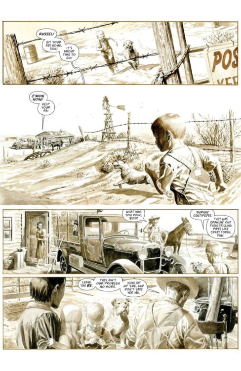
Art Direction

So much of Dust to Dust #1’s tone and pacing is due to J.G. Jones’ impeccable visual direction. His sepia pencils immediately place readers in the Oklahoma dust bowl of the 1930’s while channeling an aura of black and white Hollywood films. Jones’s direction feels reminiscent of a John Ford and Howard Hawks film, with his characters similarly drawing from the likes of Robert Mitchum and Lauren Bacall. His character animation here is a wonder in itself, with his detail looking as though they were stills from an old movie at times. The environmental art of the Oklahoma farm town, as well as the desolate land surrounding it, drive home this issue’s thematic core and conflict. Anyone who has read a J.G. Jones comic won’t be surprised at how stunning the visual work here is, but even so it may be some of the best in the artist’s career. Jones’s focus in this first chapter is building a cast of characters, and the sequential direction drives this home. Every sequence of interaction is expertly plotted and carefully paced to make sure each conversation – and observation – lands with memorable effect. The most effective bit in the comic, both visually and narratively, is the Sheriff occasionally pulling out and inspecting an “artifact” given to him in the book’s opening. Jones builds a sense of curiosity, then dread an unease, as the issue continues and it becomes readily apparent what the item actually is. The lettering (couldn’t find credits, unsure if it’s also by Jones or another talent) fits in beautifully with the rest of the visuals. The rough hand-drawn font conveys the dialogue’s tone, while the sand-worn SFX letters almost hide in the background as they craft diegetic noise. Overall, Dust to Dust is off to an incredible start in terms of visual direction.

Verdict

Dust to Dust #1 is a brilliant opening chapter to this murder-mystery story in the guise of a historical fiction comic. J.G. Jones and Phil Bram’s script is choke to the brim with sharp dialogue and carefully plotted storytelling, pulling influences from Dust Bowl-era literature and classic films. Jones’s visual direction is beyond stunning, capturing the humanity and tone of this story in a manner that makes every aspect of it immediately endearing to readers. Be sure to grab this outstanding debut issue when it hits shelves on December 26th!

Monkeys Fighting Robots Youtube

Marvel Comics Exclusive Preview: AVENGERS #21 — Avengers vs X-Men Round 2!

marvel comics exclusive preview avengers x-men

AVENGERS #21 hits your local comic book store on December 4th, but thanks to Marvel Comics, Monkeys Fighting Robots has an exclusive three-page preview for you!

About the issue:
AVENGERS VS. X-MEN!

Jed MacKay pits his Avengers against his X-Men in a story that sows the seeds for some major future developments! Captain Marvel and Cyclops square off! Scarlet Witch and Magneto finally confront their history! And Storm’s loyalties are put to the test…

The issue is by writer Jed MacKay and artist Valerio Schiti, with colors by Federico Blee, and letters by Cory Petit. The main cover is by Schiti and Blee.

Check out our AVENGERS #21 preview below:

marvel comics exclusive preview avengers x-men

marvel comics exclusive preview avengers x-men

marvel comics exclusive preview avengers x-men

marvel comics exclusive preview avengers x-men

marvel comics exclusive preview avengers x-men


Are you reading Jed MacKay’s AVENGERS and/or X-MEN? Sound off in the comments!

Monkeys Fighting Robots Youtube

Marvel Comics Reveal: STORM #4 Variants by David Nakayama and Karen Darboe

Marvel Comics Exclusive

STORM #4 is coming to your local comic book store January 15th, but thanks to Marvel Comics, Monkeys Fighting Robots has the exclusive first look at two stunning variant covers for the issue!

About the issue:
A FLAME IN THE WIND! DOCTOR DOOM is the SORCERER SUPREME. He has special plans for Earth’s mutants. He would like to discuss them with the beautiful STORM over fine cuisines and expensive wines. What could possibly go wrong? The epic saga continues – with this new installment featuring a battle that Latveria will never forget.

The issue is by writer Murewa Ayodele and artist Lucas Werneck, with colors by Alex Gomes, and letters by Travis Lanham. The main cover is by Mateus Manhanini. The variant covers revealed below are by David Nakayama and Karen Darboe, respectively.

Get your first look at David Nakayama’s STORM #4 cover here:

marvel comics exclusive storm x-men david nakayama

and check out Karen Darboe’s cover here:

marvel comics exclusive storm x-men karen darboe


Are you reading Marvel’s STORM? Sound off in the comments!

Monkeys Fighting Robots Youtube

Review: THE SEASONS #1 — A Colorful Darkness

seasons image comics advance review rick remender paul azaceta

From writer Rick Remender and artist Paul Azaceta comes The Seasons, a surprisingly dark mystery about the Seasons sisters: Summer, Winter, Autumn, and Spring, and a deadly horror that seems to be striking major cities. With coloring by Matheus Lopes and letters by Rus Wooton, The Seasons #1 is visually striking and gripping from the first page. With colors that would make Yellow Submarine look muted, this first issue hits the ground running, establishing a horror chasing our plucky heroine, and a vibrant yet complex world affected by it.

Writing/Plot

Issue #1 of The Seasons is mostly divided into three segments. It begins with an interesting premise: A blight has affected some large metropolises across the globe and effectively cut off all communication with those cities. While we are not shown the true reason behind this, a strange figure is seen lurking in the wake of the disaster, as a news report by Autumn Seasons narrates the horrific scene. Then we cut to Spring, who the readers follow for the remainder of the issue as she chases a runaway letter, in a style very reminiscent of comics like The Adventures of Tintin.

This issue is an enjoyable ride along with Spring, although the story feels like a reverse sandwich, with the plot mostly being provided at the starting and ending pages. This however does not detriment the story overall, as Remender does a great job of stating just enough to keep the attention on the overall mystery. He makes Spring’s personality and nature clear from her quick interactions with the townspeople, and establishes the overall feel of the world around by employing a wise, “show, don’t tell” approach.

Art Direction

For the most part, horror comics tend to revel in the darkness, using bright colors sparingly and often to signify blood or gore. Yet, The Seasons shifts this by having the colors be dazzlingly bright and inviting. Similarly to how Pennywise was a clown so that children would feel safe and want to follow it, the colors here have the same effect, making the populace want to follow and chase their coming demise. Azaceta’s character designs work perfectly with Lopes’ coloring, as they don’t seem out of place or jarring. Lopes, however, actually uses neon color surprisingly sparingly on a re-read, which increases its impact on the incredible 2-page spread near the end of the comic.

Although the entire artistic team was on top of their game for this issue, letterer Rus Wooton’s work was especially of note. Every movement flows dynamically, as impact effects seamlessly blend into the action. Each hit, fall, jump, and drop looks impactful and stand out clearly to show their weight, but also blend in perfectly with the style set forward by the rest of the team. The vibrancy of color within each background noise and frame also often indicates their volume, which does wonders for allowing the reader to feel the action alongside Spring.

Verdict

The Seasons #1 is a great start to what is hopefully a long journey. There are many cards up in the air, three Seasons sisters to meet, a dark mystery to solve, and a world to explore. This first issue expertly sets all that up with an impressively limited dialogue and exposition. Whatever comes next, this artistic team has truly crafted something special here.

Monkeys Fighting Robots Youtube

Marvel Comics Exclusive Preview: INCREDIBLE HULK #19 — Legacy #800!

marvel comics exclusive preview incredible hulk

THE INCREDIBLE HULK #19 (Legacy issue #800!) hits your local comic book store on November 27th, but thanks to Marvel Comics, Monkeys Fighting Robots has an exclusive eight-page preview for you!

About the issue:
CELEBRATING A HULK-SIZED ISSUE #800!

Has Hulk finally met one stronger than himself? After a crushing defeat at the hands of ELDEST, the Incredible Hulk is a slave, and the return of the Mother of Horrors is imminent! Hulk’s only hope is the newly resurrected Charlie Tidwell, who takes on the SKINWALKERS OF LYCANA to save Hulk… But what ancient power did the Skinwalkers awaken within her to bring her back? Can her mysterious new power give Hulk the edge he needs to defeat both the Skinwalkers and the immortal ELDEST?

PLUS: all-new tales of the extended Hulk family featuring She-Hulk, Braun and the Red Hulk!

The issue’s main story is by writer Phillip Kennedy Johnson, and artists Nic Klein & Danny Earls, with colors by Matthew Wilson, and letters by Cory Petit. The main cover is by Klein.

This 800 issue celebration will also feature backup stories by creators Torunn Grønbekk, Greg Pak, Benjamin Percy, Lan Medina, Geoffrey Shaw, Lynne Yoshii, Romulo Fajardo Jr., Bryan Valenza, and more.

Check out our INCREDIBLE HULK #19 preview below:

marvel comics exclusive preview incredible hulk

marvel comics exclusive preview incredible hulk

marvel comics exclusive preview incredible hulk

marvel comics exclusive preview incredible hulk

marvel comics exclusive preview incredible hulk

marvel comics exclusive preview incredible hulk

marvel comics exclusive preview incredible hulk

marvel comics exclusive preview incredible hulk

marvel comics exclusive preview incredible hulk

marvel comics exclusive preview incredible hulk


How long have you been reading THE INCREDIBLE HULK? Sound off in the comments!

Monkeys Fighting Robots Youtube

Review: G.I. JOE #1 — Pieces in Place

The next big title in the Energon Universe is finally here: G.I. Joe #1 from writer Joshua Williamson, artist Tom Reilly, colorist Jordie Bellaire, and letterer Rus Wooton takes every bit of setup from the past year and ties it together for a new beginning. Where Void Rivals handles the cosmic side of the universe, and Transformers working to tell the story of the Cybertronians, G.I. Joe pivots to tell us the story of what exactly the humans and US government are doing to combat these changes to their world.

The issue starts with a quick introduction of G.I. Joe. The team consists of Duke, Baroness, Stalker, Rock ‘n’ Roll, Cover Girl, and Clutch. They run a training exercise, but quickly realize that if it weren’t a simulation, they’d be completely and totally outmatched. On the Cobra side of things, we have Destro rallying troops while Cobra Commander tests out the new Energon powered weapons that Cobra has developed. Duke is given a pep talk from Hawk, the general behind the team. He tells him that the team may be outnumbered and outmatched, but says that as long as each member is the best version of themselves, they can succeed. This fires Duke up, and they go to be debriefed on the team’s first mission.

Duke's history is revisited
Duke’s History is revisited

WRITING

A few miniseries have released this year leading up to this issue. There’s been Duke, Destro, Cobra Commander, and Scarlett. Each had a fairly self-contained story that ended on a cliffhanger, leaving the door open for something big. G.I. Joe is that something. It’s impressive how Williamson was able to take most of those loose threads and not only create a self-contained first issue, but also respect the events of each series listed, acknowledging right off the bat that they happened and were crucial to this series’ story.

Every single character is properly introduced as though this is the first we hear of them, but Williamson uses the history crafted by himself and others to enhance everyone. This can be your first interaction with Duke, and he’s presented as a leader with a rough past. However, Williamson puts the issue together in a way where if you have read Transformers and Duke, everything his character does and has been through with his supporting cast feels like it reaches a strong new level that can only grow from here.

It’s a very well-written first issue. All the cards are on the table, it’s well-paced with some fun action, and it poses a couple of questions to be answered later. True to form, it almost has the pacing of a Saturday morning cartoon. We start with a fun action scene used to introduce each individual character with a little bit about their past, and then move onto the nefarious opposition in the form of Cobra with some other shenanigans taking place throughout. Williamson understands what this comic should be. He’s catering to older fans while not alienating a new potential audience. It’s a status quo that feels fresh for old fans, and exciting for new ones.

G.I. Joe in action
G.I. Joe in action

ART

If Williamson sets up the issue as a Saturday morning cartoon, Reilly helps in cementing that look. The art gives the impression that the book is serious in tone. It’s incredibly detailed, and the characters convey a lot through facial expressions and body language. Reilly also adds an animated layer to that. The characters feel expressive, and like they were pulled from an episode of a G.I. Joe TV show. The issue’s action is no exception to this. There’s one part where Duke jumps off a building to grab onto a helicopter, and the entire sequence from the buildup of the run to the action leap carries a suspense that defines the issue. Every sequence like this evokes some emotion that keeps you itching to turn the page.

The paneling is also really well thought out. More action-oriented scenes are choppier with smaller panels, while scenes featuring weighted conversations have taller and wider panels to give each character more space. It really helps connect us to the characters, because it feels like there’s room for the reader to really understand this team. A really clever thing here too is that when new characters are introduced, there’s a panel or set of panels after that establish the character or show a glimpse of their past. It helps in immediately connecting the reader to them, as well as instantly showing what part of their whole deal is.

The team faces off against some drones

COLORS

One specific fight scene about halfway through the issue really stands out, featuring a new character named Risk. He gets into a club and starts a fight, and then is called to retreat by some higher power. What makes it interesting is that it’s completely done in yellow and purple coloring. The placement of every color felt really special, and Bellaire uses that to immediately tell us something about this new character. The purple parts seem to represent what is in Risk’s control—what he anticipates and what he is determined to do. The yellow represents uncertainty. While it could probably just pass off as the club’s strobe lighting in-universe, the panel placement of each color felt very intentional. When Risk is searching for someone, it’s yellow. When he fights, it’s purple. Near the end of the scene, the yellow fades to a softer shade as Risk gets the message on his watch to leave, which is the only thing that appears in red. The entrance of a third party. It tells us right off the bat that the character is meticulous and collected, but can be impatient and caught off guard.

Bellaire also does a great job creating parallels between G.I. Joe and Cobra. There’s this great specific double page spread where Duke is on the left with blue shading covering him with a stripe behind him. On the same page on the right side stands Destro, covered in red with a red stripe behind him. It’s a simple contrast, but easily introduces us to the opposing forces, clearing up and questions about it.

More members of the team are introduced

LETTERS

The issue’s lettering really tops off the aesthetic. Wooton puts extra work in to give that cartoony feel, introducing each character with their own logo, regardless of their importance comparatively. The Joes all get logos in the same font, with Destro and Cobra Commander getting special ones reminiscent of their series logos. It keeps everything simple to keep track of doesn’t leave anyone out, no matter how small.

The onomatopoeia placement this issue is also very well done. In the scene with the helicopter mentioned earlier, there are sounds coming from above and below the chopper. The sounds above are the blades spinning, and those below are from the machine gun attached to it firing. The effects are placed accordingly, and strongly differentiates what exactly is doing what. It’s a very clear vision that Wooton executes well.

Baroness Improvises
Baroness Improvises

CONCLUSION

The issue has a clear mission and completes it efficiently. It has to introduce you to a new band of characters while not alienating those who already know the franchise inside and out. It has to sell you on a story that feels important enough to be told in the same universe as giant robot aliens and space wars. The team involved in making this checks every box here and impressively displays a debut issue that feels like a necessary and welcome addition to Skybound’s Energon Universe.

Monkeys Fighting Robots Youtube

Marvel Comics Exclusive Preview: STORM #2

marvel comics exclusive preview storm x-men

STORM #2 hits your local comic book store on November 20th, but thanks to Marvel Comics, Monkeys Fighting Robots has an exclusive four-page preview for you!

About the issue:
STORM is dying. An unknown form of radiation poisoning from the OKLAHOMA INCIDENT has turned her cells into ticking time bombs. As her final hours count down, will she find a cure for her illness at NIGHT NURSE’s new super-hero hospital, or will it require enchantments from DOCTOR VOODOO to save her life?

The issue is by writer Murewa Ayodele and artist Lucas Werneck, with colors by Alex Guimarães, and letters by Travis Lanham. The main cover is by Mateus Manhanini.

Check out our STORM #2 preview below:

marvel comics exclusive preview storm x-men

marvel comics exclusive preview storm x-men

marvel comics exclusive preview storm x-men

marvel comics exclusive preview storm x-men

marvel comics exclusive preview storm x-men

marvel comics exclusive preview storm x-men


Did you pick up the first issue of STORM? Sound off in the comments!

Monkeys Fighting Robots Youtube

Marvel Comics Exclusive Preview: SPIDER-GWEN: THE GHOST-SPIDER #7

marvel comics exclusive preview spider-gwen ghost-spider gwen stacy

SPIDER-GWEN: THE GHOST-SPIDER #7 hits your local comic book store on November 20th, but thanks to Marvel Comics, Monkeys Fighting Robots has an exclusive four-page preview for you!

About the issue:
DEADLY ATTRACTION!

Gwen has a new archenemy to add to her list – the all-new BLACK TARANTULA! He’s got his web strung through all manner of crime in New York City, and it would be much easier to take him down…if it were not for the undeniable spark between them!

The issue is by writer Stephanie Phillips and artist Von Randal, with colors by Matt Milla, and letters by Ariana Maher. The main cover is by Mark Brooks.

Check out our SPIDER-GWEN: THE GHOST-SPIDER #7 preview below:

marvel comics exclusive preview spider-gwen ghost-spider gwen stacy

marvel comics exclusive preview spider-gwen ghost-spider gwen stacy

marvel comics exclusive preview spider-gwen ghost-spider gwen stacy

marvel comics exclusive preview spider-gwen ghost-spider gwen stacy

marvel comics exclusive preview spider-gwen ghost-spider gwen stacy

marvel comics exclusive preview spider-gwen ghost-spider gwen stacy


Are you reading SPIDER-GWEN: THE GHOST-SPIDER? Sound off in the comments!

Monkeys Fighting Robots Youtube

Review: BLACK HAMMER: SPIRAL CITY #1 – When All the Heroes Have Gone

From modern icon Jeff Lemire (Sweet Tooth, Descender) and artist Teddy Kristiansen comes a dour new chapter in one of comics’ greatest original universes with Black Hammer: Spiral City #1. Featuring letters by Nate Piekos, this new issue sets up where the home of our favorite heroes is headed after the second cataclysm – and how much trouble the town is about to be in. With a compelling, storybook-like script and fitting visual work, this new era in Black Hammer is off to a strong start.

“Black Hammer: Spiral City picks up after The End, following the Second Cataclysm and the rearranging of the universe. Many of its lost heroes have returned, but there is no homecoming parade as anti-superhuman sentiment grows, fueled by recent events and stoked by Malcolm Gold, the former head of T.R.I.D.E.N.T, now running to become Spiral’s new mayor. Making matters worse, Spiral Asylum has shut down with many of its low-risk, mentally ill superhuman inmates being set loose into the streets. With this reshaped Black Hammer Universe as the backdrop, several new stories begin to unfold and intertwine, creating a rich portrait of some lesser-known inhabitants living on the fringes of Spiral City.”

Writing & Plot

Jeff Lemire brings readers back to the home of Abraham Slam and Barbalien in Black Hammer: Spiral City #1, but now the heroes are unwelcome. After the events of Black Hammer: The End, Spiral City is a place afraid of its own past and what heroes may bring. Many blame the catastrophes on the actual heroes, relegating the supers to 2nd class citizens. Lemire tackles this story with a combination of storybook-like overhead narration and his usual brand of naturalistic dialogue. Each character is introduced (or reintroduced) with their scene that sets the stage for the coming story and how they are coping in this new version of the world. Even with Lemire’s wording about the dire situation Spiral City faces, the narration feels neatly juxtaposed to the actual in-story sequences in a neat way to bring all the pieces together. All of the characters have intriguing stories going into the next chapter, but none can beat Inspector Insector. Other than the top-tier name, his friendly-noir attitude and dialogue being at odds with the conflict and refuse in Spiral City makes him immediately likable and charming. I would read an Inspector Insector solo series in a heartbeat.

Art Direction

Teddy Kristiansen’s visual work in Black Hammer: Spiral City #1 manages to nail a variety of thematic tones with unique artistic style. Kristiansen switches from a children’s storybook style while illustrating Lemire’s narrative introduction and transitions, to a more conventional (but still unique) comic-book form with ease. His thick, crayon-like linework is filled in by his watercolor styled hues, pulling readers into the dreariness of the wrecked, troubled city. His character designs are unmistakable, and his facial animation work is stellar. From Lemire’s original designs to the new characters like “the Princess,” but none can take away the spotlight from our trench coat-clad Inspector. Kristiansen’s panel direction is nothing out of the ordinary, but it carries the story along at a careful even pace. As great as the main story’s art is, the highlight is still the clever transition points. Kristiansen’s picture book art style in these sequences brings the cast of characters to life in a new light, with a brighter tone that offsets the sequences to show a more “idealized” reality for these superheroes. Nate Piekos’s lettering is another star in this comic. His word balloons are filled with tonally expressive lettering that fits the mod of every scene perfectly – but once again, it’s the transitions that really set his work apart. The children’s book aesthetic of Piekos’s lettering on these pages is the extra touch that makes the sequences work. Overall, Spiral City is a visually rich start to this series.

Verdict

Black Hammer: Spiral City #1 is an intriguing opening chapter to this new series in one of the best original universes in the comics medium. Jeff Lemire’s script is clever and compelling, crafting a dire situation and setting up tension for the new & returning cast of characters. Teddy Kristiansen’s visual work is thematically deep and detailed, perfecting the reading experience with his dour views of Spiral City and his stellar character work. Be sure to grab this debut issue when it hits shelves on November 13th!

Monkeys Fighting Robots Youtube

Marvel Comics Exclusive Preview: DEADPOOL #8

deadpool marvel comics exclusive preview

DEADPOOL #8 hits your local comic book store on November 13th, but thanks to Marvel Comics, Monkeys Fighting Robots has an exclusive four-page preview for you!

About the issue:
IT AIN’T EASY BEING DEAD(POOL)!

Ellie Camacho, Mini Merc with a Mouth, Regenerating Teen Degenerate… It’s no laughing matter wading into Wade’s wide world, but Ellie and her half sister symbiote-wolf, Princess, are going to kick butt and take names now that the original ‘Pool is out of the picture. And no one’s going to stand in the way of their REVENGE! But if Ellie can’t track down an OLD FRIEND of Deadpool’s, Ellie’s career just might end before it ever begins!

The issue is by writers Cody Ziglar & Alexis Quasarano, and artist Rogê Antônio, with colors by GURU-eFX, and letters by Joe Sabino. The main cover is by Taurin Clarke.

Check out our DEADPOOL #8 preview below:

deadpool marvel comics exclusive preview

deadpool marvel comics exclusive preview

deadpool marvel comics exclusive preview

deadpool marvel comics exclusive preview

deadpool marvel comics exclusive preview

deadpool marvel comics exclusive preview


Are you reading DEADPOOL? Sound off in the comments!

Monkeys Fighting Robots Youtube