Home Blog Page 18

Review: THE PALE KNIGHT #1 – Rendezvous With Death

From acclaimed writer Peter Milligan (Shade the Changing Man, Enigma ) and artist Val Rodrigues comes a grim piece of historical fiction/fantasy in The Pale Knight #1. Featuring colors from Cristiane Peter and lettering by Dave Sharpe, this opening issue pulls readers along on a bloody journey into Crusades-era medieval Europe full of regret and some proper supernatural turns. With a sharp, contemplative script and phenomenal and atmospheric visual work, The Pale Knight is one of the most compelling opening issues of the year so far.

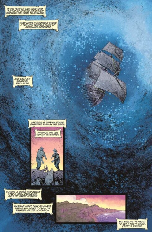
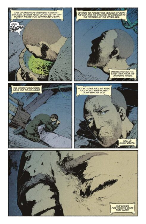
“England, 1349. Sir Hugh de Grey, the Pale Knight, returns from war to find a land ravaged by the Black Death, and his son dying of the plague. When he prays to God to save his son’s life, it is not God who answers–but Death himself. And Death is willing to cut a deal.”

Writing & Plot

Peter Milligan transports readers to a time in history filled with blood and pestilence in The Pale Knight #1. Sir Hugh de Grey, a particularly skilled English knight, is coming home from a vicious campaign across Europe slaughtering the Church’s enemies. As time has passed and he’s watched more of the land fall prey to a brutal plague, doubt and regret have sprouted in place of duty and faith. This begins his journey home to his wife and son – as well as an unexpected visitor. Milligan takes his time introducing the characters and state of the world within the pages of this comic. The script feels more drawn out than most comics, with a considerable amount of time spent on Grey’s dialogue with those around him. This allows readers to very easily get inside the knight’s head, and it lets Milligan sort of isolate the character from the world around him – especially since most other characters in the story are right bastards. Every conversation and inner thought feels important, and the atmosphere of the story begins to feel desperate and pained – all said as a positive. The Enigma writer retains all of the deliberate story craft and wit that he’s always had, and this book does feel like something that would have been released back in Vertigo’s heyday. Without getting into spoilers (if you could consider the appearance of a character on the cover a spoiler), a certain character’s manner of speech ends up being a delightful little subversion of expectation. If you’re familiar with Warren Ellis’s treatment of Death in Netflix’s Castlevania series, expect something similar. Overall, Milligan pens a tonally rich and intensely sharp opening chapter for The Pale Knight.

Art Direction

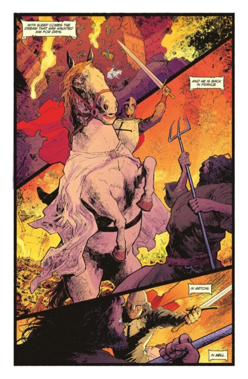
Val Rodrigues constructs a brilliantly atmospheric view into Medieval Europe within the pages of The Pale Knight #1. His visual style lifts from paintings and tapestries from this same era, but with the life an animation of great comics art. His treatment of the world and the cast is immensely detailed. Grey’s humanity leaks through as his stoicism fails and we see the doubt fill him – while we also see the apathy and concern of the characters around him. Rodrigues’s thin linework and unique use of hatching offer a sort of texture that makes this setting feel all the more lived-in. His style here is unlike anything I’ve read in recent memory, and much like Milligan’s script, is reminiscent of early 90’s Vertigo comics. The panel direction also allows the story to flow steadily, giving the story weight as it travels along to its grim (heh) conclusion. Christiane Peter’s color art seals the book’s tone, with an approach that also lifts from Medieval art to create an atmospheric period piece with room for the fantastical and supernatural. The colors here again reminds me of work in Sandman or Hellblazer, propping up a sense of realism while feeling strange enough that the supernatural pieces fit right in to the experience. Overall, The Pale Knight is one of the coolest and most fascinating comic of this year so far in terms of art direction.

Verdict

The Pale Knight #1 is an intelligent and compelling opening to this historical-fiction comic with a supernatural twist. Peter Milligan’s script is a great blend of grim brutality and humanity, with stellar dialogue and character work. The visuals from Val Rodrigues and Christiane Peters craft a phenomenal reading experience as both a comic and a period piece, and make for one of the most unique comics of the year so far. Be sure to grab this debut issue when it hits shelves on May 28th!

Monkeys Fighting Robots Youtube

Review: ABSOLUTE BATMAN #7 — Winter in Gotham

Absolute Batman #7 is the start of the comic’s next story arc. We take a break from the action and dive into a slower paced horror story that’s incredibly creepy right off the rip. Writer Scott Snyder, artist Marcos Martín, colorist Muntsa Vicente, and letterer Clayton Cowles show us a different side of this new Absolute Gotham. We get a better feel for the city, as well as a deeper understanding of the people inside it.

The issue starts with a flashback of a young Victor Fries in the car with his father on a road trip. Victor’s eyes begin to bleed, causing his father to freak out as he continues driving. We cut to Gotham City, in a dark alley where all of Bruce’s friends gather. They hold a small memorial for a friend of theirs named Matches Malone that recently died. Bruce appears, and tells the story of how he was the last one to see Matches alive—how Bruce needed Matches’ help, but Matches was scared. Matches died during that meeting as bloody holes appeared all over his body, and Bruce intends to find out how and why.

Young Victor is in a car with his dad.

WRITING

Snyder is doing his best to set up every single aspect of this new Batman. The first arc was an action story that showed what Bruce is capable of physically as well as his skill in engineering. This arc is taking a horror route that, so far, is showing off Bruce’s cognitive ability and his skills as a detective, and how he’s learning to be a better one. It’s really interesting how, in setting up this new character, Snyder is utilizing a lot of the main story themes that Batman is famous for. He’s done action and now horror, and using each story’s genre to showcase the hero’s different feats. It’s really smart to put this new character in situations familiar to us. It’s the best way for us to see how this new Bruce is when faced with the things that the main one has seen for years now.

Snyder introduces this new Freeze as a scientist, and a well regarded one. He only appears at the beginning and end of the story, but both interactions are already so different than his main universe counterpart. Snyder plays with the character’s motivations, which is incredible when the story of Victor and Nora has felt a little overused and tired in recent years. It’s a great reimagining.

Absolute Zero title page.

ART

From the very first panel, Martín’s art is haunting. He leaves an uneasy emptiness behind young Victor’s eyes. Even when he’s a kid, you can tell something’s not right with him just through his staring off into the distance. Matches Malone is another newly designed character, and Martín has to basically create this character from scratch, as the main universe counterpart is just an undercover Bruce Wayne. Matches looks weaselly and like he isn’t the most reliable, but in his interaction with Bruce, he’s scared. You get this from the wide eyes that Martín gives him.

Another thing that Martín does is show us this Bruce just swinging through the city, patrolling. In every other issue of the book so far, Bruce has been on a mission. We’ve hardly seen him patrolling in his downtime. He does here, and it adds a lot of personality to him as well as his suit and tools. We see how he uses them to move, and how deep his understanding of every part of his suit is. It’s really detailed.

Bruce's friends meet in an alley.
Bruce’s friends meet in an alley.

COLORS

When Bruce’s friends enter the alleyway, there’s a mixed blue and purple sky behind them. They’re silhouettes, entirely dark. As they move closer in, the only thing behind them becomes the blue, presumably the only color reflecting off the walls. When Bruce sneaks up on them and surprises them, his background his purple, signaling that he’s further behind them at the entrance. It’s one of the great ways Vicente really uses perspective to her benefit in the issue.

Vicente also really plays around with the city’s lights in the issue. Gotham feels like it’s vibrant after the attacks on the city. It’s a slight departure into the fantastical element of Batman and the city surrounding him, really giving this version of Gotham an older feel like the original comics had. It’s a nice touch.

Bruce appears behind his friends.

LETTERS

You can tell that Cowles really has fun lettering this book. The issue’s title card appearing with clear letters to show the art behind them is an amazing touch. It adds to the unsettling nature of it all. There’s a moment later in the issue where a character undergoes a transformation. Before that transformation, they come off as relatively normal. Their letters are like anyone else’s. After the transformation though, their letters are wobbly, and the bubbles are scratchy and not straight at all. They struggle to mimic normal human speech; it’s an incredible way of changing the character to this new version and showing that everything about them has changed, not just appearance.

CONCLUSION

Absolute Batman #7 strays from the explosions and big fight scenes to show Batman in a creepier, darker Gotham. Snyder, Martín, Vicente, and Cowles take us through this new and unfamiliar Gotham in a way that is totally different from what they’ve given us previously. The art shift for this storyline is amazing, and it would be incredible if they keep adding to this Batman’s rogues gallery in this way moving forward.

Monkeys Fighting Robots Youtube

Marvel Comics Exclusive Preview: SPECTACULAR SPIDER-MEN #14

marvel comics exclusive preview spectacular spider-men spider-man peter parker miles morales

SPECTACULAR SPIDER-MEN #14 hits your local comic book store on April 16th, but thanks to Marvel Comics, Monkeys Fighting Robots has an exclusive three-page preview for you!

About the issue:
How can the SPIDER-MEN hope to foil the ELECTROS’ sinister plan when they’re at the mercy of THE LIZARD?! Just when all hope of finding Billy Connors is lost…Peter and Miles make an unexpected ally!

The issue is by writer Greg Weisman and artist Andrés Genolet, with colors by Edgar Delgado, and letters by Joe Caramagna. The main cover is by Mark Bagley and Delgado.

Check out our SPECTACULAR SPIDER-MEN #14 preview below:

marvel comics exclusive preview spectacular spider-men spider-man peter parker miles morales

marvel comics exclusive preview spectacular spider-men spider-man peter parker miles morales

marvel comics exclusive preview spectacular spider-men spider-man peter parker miles morales

marvel comics exclusive preview spectacular spider-men spider-man peter parker miles morales

marvel comics exclusive preview spectacular spider-men spider-man peter parker miles morales


Are you reading SPECTACULAR SPIDER-MEN? Sound off in the comments!

Monkeys Fighting Robots Youtube

Review: THE AMAZING SPIDER-MAN #1 – Not-So-Friendly Neighborhood

From writer Joe Kelly (Deadpool, Uncanny X-Men) and artist Pepe Larraz (Thor, Wolverine and the X-Men) comes a bright new beginning for Marvel’s leading man in The Amazing Spider-Man #1. Featuring colors by Marte Garcia, lettering from Joe Caramagna, and a backup sequence drawn by the legendary John Romita Jr., this opening chapter manages to blend that familiar Peter Parker Spider-Man feeling with the new direction that Marvel has been taking the character in recent years. With a funny, sharp, and compelling script combined with Larraz’s phenomenal visual work, this opening issue is something new and returning Spider-Man readers can enjoy.

“ALIVE & THWIPPING! The next era of AMAZING SPIDER-MAN has arrived! Peter is, shockingly, without a job and looking for gainful employment, but his job search is interrupted by a RAMPAGING RHINO who is but the tip of a sinister iceberg. What major Spider-Villain is working behind the scenes weaponizing other Spider-Villains including one we haven’t seen in OVER SEVEN YEARS?! Also, what is that Goblin-free Norman Osborn up to anyway?”

Writing & Plot

Joe Kelly starts readers off with a familiar scene in The Amazing Spider-Man #1. Peter is out of a job and desperately searching for a new means of gainful employment. Right off the bat, Kelly greets readers with the slick and humorous writing we come to expect from great Spidey-books. This sequence also function as a great recap while setting the mood of the story. This is the sort of move that will no doubt reel in skeptical long-time Spider-Man readers while charming those new to the Webslinger in his original medium. Most of the staple familiar faces are here – Aunt May and Norman Osborn, to name a couple – while some are notably missing (if you’re expecting the classic Peter & MJ romance, you may want to recap the last couple years). Regardless of the cast, Kelly does a wonderful job of catching readers up while introducing a new plot point that *feels* like a Spider-Man book. Old villains return in new ways, and the schemes in the background all feel like classic Superhero-comic storytelling. Kelly’s script is loaded with dialogue, but the book never feels slow. Quite the contrary, as the staccato-delivery of the quips and quotes (with the help of Larraz’s focused sequential direction) carry the book along at a speedy pace. It can feel a little messy at points with so many word balloons (there’s a dinner scene that took me a couple passes to make sure I caught everything in the right order), but it’s not egregious enough to derail the conversation. Another note here is that this comic is effectively divvied up into 3 chapters. While the first 2 are very much relevant Spidey-stuff, the third feels a bit out of place – but it will surely make sense as the series continues. While the plot with the supervillains and Pete’s “Parker luck” troubles all come off as a bit safe thus far, it’s still a lot of fun to read. Joe Kelly’s introduction to this new era of Amazing Spider-Man is off to a solid start that many Spidey fans will be happy to jump into.

Art Direction

Pepe Larraz is one of the most talented artists currently over at Marvel Comics, so him being involved with The Amazing Spider-Man #1 seems like a no-brainer. His sharp linework and detail-rich inks and hatching make his work a stellar site to behold in every book he draws, and the same can be said about his work in this new chapter of Spider-Man. Larraz draws a spectacular (ahem) Spider-Man to be sure, but his Peter may be the highlight of this comic. Pete’s presented with a ton of charm and character here thanks to Larraz’s animations and direction, making the jumps from Spidey-action to jobless genius worth looking forward to. As they should be – a Spider-Man book is only as good as its Peter Parker, after all. Peter isn’t the only highlight here though, as every cast members personality is telegraphed perfectly. Larraz’s action sequences hit hard with momentum and great pacing due to his stellar sequential direction. The way he utilizes panels in this comic really carries the book along at a quick but deliberate stride. One of my favorite moments in the book is the previously mentioned dinner scene. There’s a moment where the panels tighten up around Pete and Shay’s faces, giving the two of them a moment right in the middle of the larger sequence. Larraz’s work here is completed by Marte Garcia’s dense colors that work great with the shading provided by the inks and hatching. While the comic is a little more on the dim side for a Marvel superhero book, it still works well. This main story very much fits into the house visual style Marvel has been aiming for over the last several years, but Larraz and Garcia make it fit into the upper tier of that aesthetic.

John Romita Jr.’s work in here fits with the characters and story he’s drawing – but it still feels like a strange offset compared to Larraz in the lead chapter. JRJR is a legend, no doubt, but his art style sticks out in a way that may be off-putting to modern comic readers. Finally, Joe Caramagna’s lettering seals the deal on the reading experience with stellar dialogue work and some fitting Marvel-feeling SFX letters. Overall, Amazing Spider-Man #1 is a great looking superhero comic with excellent character work and sequential direction.

Verdict

The Amazing Spider-Man #1 is a familiar but satisfying start to this new beginning for Marvel’s flagship character. Joe Kelly’s script sets up a familiar but still compelling story with classic villains and that that old Parker luck, full of the exact sort of charm you’d want from a good Spidey comic. The visuals from Pepe Larraz in the main story are stellar, with fantastic character detail and sharp sequential direction. The portions drawn by JRJR are solid as well, but it almost feels like the veteran artist’s style loses something with the modern inking and coloring techniques. Be sure to pick up this great debut issue when it hits shelves April 9th!

Monkeys Fighting Robots Youtube

Marvel Comics Exclusive Cover Reveal: DOCTOR STRANGE OF ASGARD #5

Marvel Comics Exclusive

DOCTOR STRANGE OF ASGARD #5 is coming to your local comic book store July 9th, but thanks to Marvel Comics, Monkeys Fighting Robots has the exclusive first look at the issue!

The issue is a tie-in for ONE WORLD UNDER DOOM, a “status quo shift” that began recently, the likes of which Marvel says hasn’t been seen since 2008’s Dark Reign.

About the issue:
WHO WILL BECOME ASGARD’S SORCERER SUPREME?

Doctor Strange finally uncovers the truth behind Hulda’s murder – but the true murderer may be closer than he thinks! A final confrontation leads to a magical showdown that will change the future of Asgard…

The issue is by writer Derek Landy and artist Carlos Magno. The main cover is by Geoff Shaw.

Get your first look at Shaw’s cover for DOCTOR STRANGE OF ASGARD #5 here:

marvel comics exclusive preview reveal doctor strange asgard one world under doom


Are you enjoying ONE WORLD UNDER DOOM? Sound off in the comments!

Monkeys Fighting Robots Youtube

Review: ABSOLUTE MARTIAN MANHUNTER #1 — Change in Occupation

Imagine if, instead of an alien from Mars, Martian Manhunter was just a distant father and husband whose mind has been invaded by a foreign being. If that sounds in any way appealing, then you’re in for one of the best debut issues of the entire year. Absolute Martian Manhunter #1 from writer Deniz Camp, artist Javier Rodríguez, and letterer Hassan Otsmane-Elhaou sets the stage for an incredible and innovative story that is easily the most intriguing of its Absolute peers. It strays further from the original character than any of the other series have so far. It’s a take no one in a million years would’ve thought up, and the most surprising part is that it works. Really well.

The issue starts with FBI agent John Jones being caught in an explosion set off by someone wearing an explosive vest. After that, he’s not quite right. He’s always been a distant father and not the best husband, but something is different now. He lies to his wife to get back to work as soon as possible, wanting any escape. He begins to see things that aren’t there. His perception of reality is now completely off, but it doesn’t seem to bother him much. He just tries to accept it. The problem grows larger and larger, slowly overcoming him.

John Jones caught in a blast

WRITING

Camp crafts something extremely thought-provoking here. You’re constantly questioning what’s real and what isn’t. Is what John’s experiencing real? What exactly is it? We don’t know, but Camp really leans into that by constantly contradicting what we see with how Jones experiences them. Camp uses his main character to his advantage. John’s not the most talkative; he doesn’t express himself much. We only get a glimpse of how he’s really feeling once it completely overwhelms him. It’s a smart way to introduce us to this other side of Jones.

The Martian Manhunter we know is a green alien who masquerades as a human. This Absolute version is just a regular man. He’s married with a wife and kid, but he’s distant. They call him “martian” because of that. It’s a really clever twist on the name. Camp also raises a fantastic question: Where does the Manhunter come in? The issue’s ending uses that in a really creative way, flipping it on its head again. We never truly know what’s going on, even in the end. It’s mind-bending every step of the way.

John recovers from his injuries

ART & COLORS

Rodríguez covers both the art and the coloring in this issue, and the way the artist plays with our perspective is something special. We spend the issue primarily in the real world, away from whatever thing is haunting John. Rodríguez gives us glimpses of how John has been seeing things to mess with us. Everything has been incredibly distorted for him; he can’t comprehend what he’s seeing sometimes and bottles it all in. Near the start of the issue, we see a sort of distorted image of his wife through his sunglasses. That’s how he’s seeing her, but it’s unclear if it’s the start of him viewing things different, or if that reflection is just how he really sees her, angry and demanding. The questions of “if,” “when,” and “how” the Manhunter is changing John’s view are really interesting ones. From the first page of the comic, you kind of get that John won’t be seeing things clearly. The explosion at the start of the issue is closer to one side of his face, so his eye is bandaged up with the other being able to see. It’s a nice little indicator that whatever John sees and experiences will not be with a clear mind. 

There’s some great coloring work present here. That panel mentioned earlier with John’s wife in the sunglasses is even more interesting with the added color. She comes through as a single shade darker purple, like he believes she’s poisoning his life almost. She’s something he wants to get away from. Rodríguez also separates color really interestingly while paneling. Later in the issue, all the colors John sees become too much to handle all at once. They begin to pop out of everything unconventionally, and those colors are what separate our panels. The colors never blend together either. It always shuffles between the same few, signifying that these’ll really be trippy and important ones for John moving forward. They represent something, like the small clay doll John’s son makes for him in the middle of the issue. Is that why the being takes on that form? With those colors? He asks us really intriguing questions through all this. 

John leaves the doctor

LETTERS

There are so many little lettering details in this issue that it’s almost hard to keep track of. Otsmane-Elhaou really messes around and plays with the weirdness of the story. Once John’s entire perspective changes and a room is filled with these foreign covers, the speech bubbles get a little background to them, almost like there’s an echo. It’s really cool because it’s telling you that, while there is a conversation still happening, John is trying hard to emphasize it as it’s taken a backseat with everything else going on. There’s also this really fun portion where John takes a ticket and waits for his number to be called, and the little boxes with a digital number displayed show up at the side of the panel to show the reader his progress. It’s fun little detailed stuff like that that really takes this issue to the top.

Absolute Martian Manhunter #1 Credits Page

CONCLUSION

Altogether, this is one of the best first issues of the year so far. It may be one of the best in general, first issue or not. It’s the first Absolute title to fully take the original character’s concept and flip it on its head entirely in a way that works and flows nicely. It’s off-putting and uncomfortable. It’s unconventional and doesn’t follow the rules of the other titles, and because of that it feels especially fresh and exciting. Camp, Rodríguez, and Otsmane-Elhaou hook us instantly and leave us all desperate for a second issue. 

Monkeys Fighting Robots Youtube

Marvel Comics Exclusive Preview: SPIDER-GWEN: THE GHOST-SPIDER #12

marvel comics exclusive preview spider-gwen ghost spider gwen stacy spider-man

SPIDER-GWEN: THE GHOST-SPIDER #12 hits your local comic book store on April 9th, but thanks to Marvel Comics, Monkeys Fighting Robots has an exclusive four-page preview for you!

About the issue:
GWEN BEYOND!

We now know the secret behind Gwen’s strange new power and why she left her home dimension behind…but what does all that have to do with Loki taking her on a journey across the stars? And what are Loki’s true intentions for her?

The issue is by writer Stephanie Phillips and artist Von Randal, with colors by Matt Milla, and letters by Ariana Maher. The main cover is by Mark Brooks.

Check out our SPIDER-GWEN: THE GHOST-SPIDER #12 preview below:

marvel comics exclusive preview spider-gwen ghost spider gwen stacy spider-man

marvel comics exclusive preview spider-gwen ghost spider gwen stacy spider-man

marvel comics exclusive preview spider-gwen ghost spider gwen stacy spider-man

marvel comics exclusive preview spider-gwen ghost spider gwen stacy spider-man

marvel comics exclusive preview spider-gwen ghost spider gwen stacy spider-man

marvel comics exclusive preview spider-gwen ghost spider gwen stacy spider-man


Are you reading SPIDER-GWEN: THE GHOST-SPIDER? Sound off in the comments!

Monkeys Fighting Robots Youtube

Review: VANISHING POINT#1 – “In Space, You Can Hear the Screams”

From acclaimed writer Mark Russell (Exit Stage Left: The Snagglepuss Chronicles, Billionaire Island) and artist Juan Doe comes a harrowing piece of existential science fiction in Vanishing Point #1, the first issue of Mad Cave’s new sci-fi anthology series. In this opening story, Russell pens a script with just the sort of illuminating and poignant writing we’ve come to expect from his work – but with more dread involved. Juan Doe’s visual work pulls readers in to this lonely piece of space terror, and the whole package makes for one of the most compelling pieces of sci-fi in the medium over the last few years.

“In “Screams”, the captain of a mining ship goes on a ten year solo mission to the Jupiter Asteroid Belt where he makes a horrifying discovery!

Vanishing Point is an anthology of short stories that are part science fiction and part existential horror. These are stories with a twist in which the twist is not the point of the story, but a beginning point from which to ask what it means to be alive.”

Writing & Plot

Great science fiction is almost always a discussion about the state of human society at a given point in time, and few writers comment on reality better than Mark Russell. The story for Vanishing Point #1, titled “Screams,” follows an space mining captain on a solo 10-year mission. As his mission progresses and he gets closer to his quota, he makes a harrowing discovery about the asteroids he’s harvesting. Russell has made his career about juxtaposing human nature with what capitalist society demands of people. Here, he captures the humanity of the captain and immediately makes the audience relate to his decision to work in isolation for 10 years. I never really pegged Russell as a science fiction writer, but here he nails the fundamentals of wat makes these stories important. His overhead narration is transfixing, almost poetic. This, combined with how he stitches scenes together, builds the story up to its jarring conclusion with masterful precision. “Screams” is unsurprisingly just as thematically relevant as any of Russell’s other works. The Captain’s mental journey as he does what he needs to provide for his family – whatever the cost – is something that is painfully poignant for our reality. Russell shows himself as a chameleon of genre writing, trading satire for phenomenal and relevant science fiction.

Art Direction

One of the most important measures of quality for a science fiction comic is how well it immerses the reader into its world and atmosphere. Vanishing Point #1 thankfully has the immense talent of Juan Doe crafting the space-drifting setting of “Screams.” His character animations and designs feel fittingly classical – like they were lifted from a Silver Age classic by the likes of Bradbury. The architecture of the ship, the retro-futurism of the onboard tech, and the alien wonder of the more “speculative” aspects all point to a bygone era of science fiction. Doe’s pacing carries the story along at a careful, tense pace, making the twists and revelations land with satisfying impact. As great as his pencils are, the real gem of the visual work here is Doe’s color art. Every panel is brought to life with a vivid feel thanks to Doe’s glowing, almost neon colors. Even the sequences full of space rocks and dull machinery still have a unique sort of energy to them due to how Doe both frames and fills the imagery. Finally, the lettering of Carlos M. Mangual finishes off the reading experience with a style that fits the story in stellar fashion. His word balloons are reminiscent of classic Silver Age style comics lettering, and his SFX work pops off of the page with explosions of color. Vanishing Point #1 is overall one of the most visually impressive sci-fi stories seen in recent comics.

Verdict

Vanishing Point #1 is an excellent opening chapter to Mad Cave’s new science fiction anthology series. Mark Russell’s script for “Screams” is every bit as poignant, relatable, and painfully human as a great sci-fi short should be, and exactly the sort of quality we’ve come to expect from the Flintstones writer. The visuals from Juan Doe are vivid and detailed, making for a reading experience that feels as tense as it does timeless. Be sure to grab this opening chapter when it hits shelves on May 7th!


Monkeys Fighting Robots Youtube

Marvel Comics Exclusive Preview: MOON GIRL & DEVIL DINOSAUR 10TH ANNIVERSARY SPECIAL

marvel comics exclusive preview moon girl devil dinosaur anniversary annual

MOON GIRL & DEVIL DINOSAUR 10TH ANNIVERSARY SPECIAL #1 hits your local comic book store on April 2nd, but thanks to Marvel Comics, Monkeys Fighting Robots has an exclusive five-page preview for you!

About the issue:
HAPPY 10th BIRTHDAY, LUNELLA!

It’s a birthday celebration a decade in the making, and the whole MARVEL UNIVERSE is invited! But MOON GIRL is bringing her own agenda to the party – what could her secret plans be? The mischievous IMPOSSIBLE MAN threatens to upend the festivities – unless LUNELLA can rally her guests the way only the SMARTEST PERSON IN THE MARVEL U can! PLUS: Who is DEVIL GIRL AND MOON DINOSAUR?!

The issue features two stories. The first is by writer Brandon Montclare and artist Natacha Bustos, with colors by Luis Guerrero. The second story is by writer Justina Ireland and artist Luca Claretti, with colors by Andrew Dalhouse. Both stories are lettered by Travis Lanham, and the main cover is by Nick Bradshaw and Rachelle Rosenberg.

Check out our MOON GIRL & DEVIL DINOSAUR 10TH ANNIVERSARY SPECIAL #1 preview below:

marvel comics exclusive preview moon girl devil dinosaur anniversary annual

marvel comics exclusive preview moon girl devil dinosaur anniversary annual

marvel comics exclusive preview moon girl devil dinosaur anniversary annual

marvel comics exclusive preview moon girl devil dinosaur anniversary annual

marvel comics exclusive preview moon girl devil dinosaur anniversary annual

marvel comics exclusive preview moon girl devil dinosaur anniversary annual

marvel comics exclusive preview moon girl devil dinosaur anniversary annual


Are you excited for Moon Girl & Devil Dinosaur’s 10th anniversary? Sound off in the comments!

Monkeys Fighting Robots Youtube

Review: NEWS FROM THE FALLOUT #1 – I Am Become Monsters

From writer Chris Condon and artist Jeffrey Alan Love comes a creepy and striking take on nuclear weapons in News From the Fallout #1. Featuring lettering from Hassan Otsmane-Elhaou, this debut issue presents readers with some familiar tropes shown in atmospheric and unique visual fashion and a sense of horror unlike what is usually seen in these kinds of stories. With a sharp, tense script and utterly fantastic visual work, News From the Fallout is off to a phenomenal start.

“In 1962 Nevada, a nuclear bomb test goes horribly awry and unleashes a contaminate into the atmosphere that turns people rotten. Otis Fallows, a private in the U.S. Army who is present for the test and is the only known survivor, flees the secret army base in search of a safe haven—but does such a place exist?”

Writing & Plot

Chris Condon’s script in News From the Fallout #1 works so well because of how much he *doesn’t* write. The main premise of the comic – insane general uses nuclear experiment to turn soldiers into monsters – isn’t especially unique. However, the tension introduced through Condon’s slow buildup and lack of exposition in the earlier pages of the story makes the issue much more visceral than you may expect. Fallout takes place from the perspective of one gasmask-laden Private who becomes woefully aware of the danger he and his comrades are in being so close to this strange nuclear blast. Condon keeps the story moving at a breakneck but decisive pace, keeping the reading experience taut from beginning to end. His dialogue feels naturalistic yet intentionally stereotypical. The General and all of the other soldiers speak exactly how you’d expect run-of-the-mill characters such as these to speak. This really isn’t of much importance, as all the the book’s most important moments have no dialogue in the first place. What makes this issue work so well is how Condon allows the art to tell the story, with the dialogue writing just adding a bit of context and flavoring.

Art Direction

Speaking of the art, Jeffrey Alan Love’s visual work is the true feature that will draw readers to News From the Fallout #1. His signature charcoal and fully blacked out character work brings this nuclear sci-fi horror story to life in all its dreary tension. Despite his art’s monochrome appearance, there’s a deceptive amount of detail in Love’s work. His close-up details of the General as the story commences immediately sets the tone, showing that some horribly wrong is occurring on this military base. Private Fallows’ gasmask-covered expression still showcases fear, with Love utilizing that Batman: The Animated Series style of white-eye coloring to show the protagonist’s range of emotions. Granted, that emotion is mainly fear. When the main horror of the story sets is, Love crafts fantastic and utterly unnerving panels with his specific style. His work reminds me of a mix between Stephen Gammell’s Scary Stories to Tell in the Dark and Manu Larcent’s adaptation of The Road. Adding to the impeccable presentation is Hassan Otsmane Elhaou’s lettering – specifically his scrawled SFX work. His style in these moments resembles carving message in wood with a razorblade, and they add even more atmosphere and tension to this comic. News From the Fallout’s stark presentation makes it one of the most visually compelling horror comics in recent years.

Verdict

News From the Fallout #1 is a surprisingly unnerving and striking first chapter to this new sci-fi horror series. Chris Condon’s script relies primarily on the art to tell the story, utilizing his co-author’s skill to craft something special out of a familiar premise. Love’s art, then, is a darkly unique and wonderfully compelling take on horror comics art, with his stark black and charcoal gray presentation making for one of the coolest-looking comic books in recent memory. Be sure to grab this debut issue when it hits shelves on June 25!

Monkeys Fighting Robots Youtube