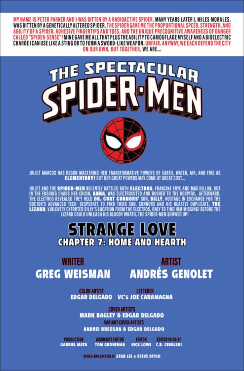
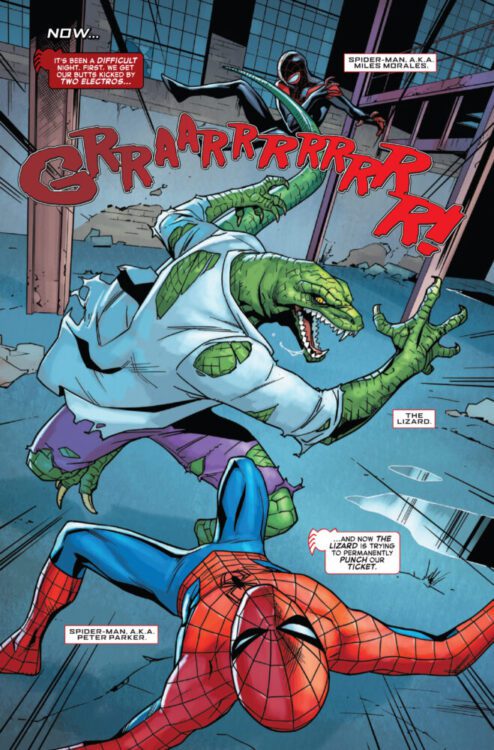
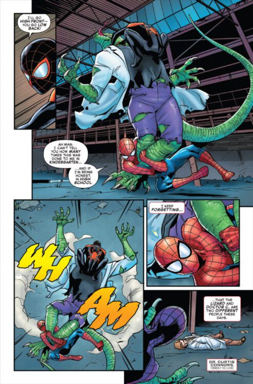
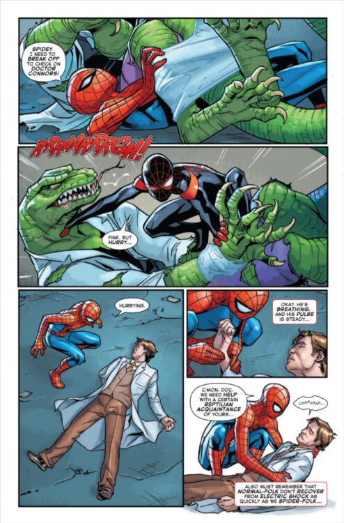
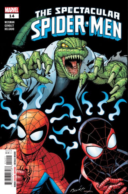
SPECTACULAR SPIDER-MEN #14 hits your local comic book store on April 16th, but thanks to Marvel Comics, Monkeys Fighting Robots has an exclusive three-page preview for you!
About the issue: How can the SPIDER-MEN hope to foil the ELECTROS’ sinister plan when they’re at the mercy of THE LIZARD?! Just when all hope of finding Billy Connors is lost…Peter and Miles make an unexpected ally!
The issue is by writer Greg Weisman and artist Andrés Genolet, with colors by Edgar Delgado, and letters by Joe Caramagna. The main cover is by Mark Bagley and Delgado.
Check out our SPECTACULAR SPIDER-MEN #14 preview below:
Are you reading SPECTACULAR SPIDER-MEN? Sound off in the comments!
From writer Joe Kelly (Deadpool, Uncanny X-Men) and artist Pepe Larraz (Thor, Wolverine and the X-Men) comes a bright new beginning for Marvel’s leading man in The Amazing Spider-Man #1. Featuring colors by Marte Garcia, lettering from Joe Caramagna, and a backup sequence drawn by the legendary John Romita Jr., this opening chapter manages to blend that familiar Peter Parker Spider-Man feeling with the new direction that Marvel has been taking the character in recent years. With a funny, sharp, and compelling script combined with Larraz’s phenomenal visual work, this opening issue is something new and returning Spider-Man readers can enjoy.
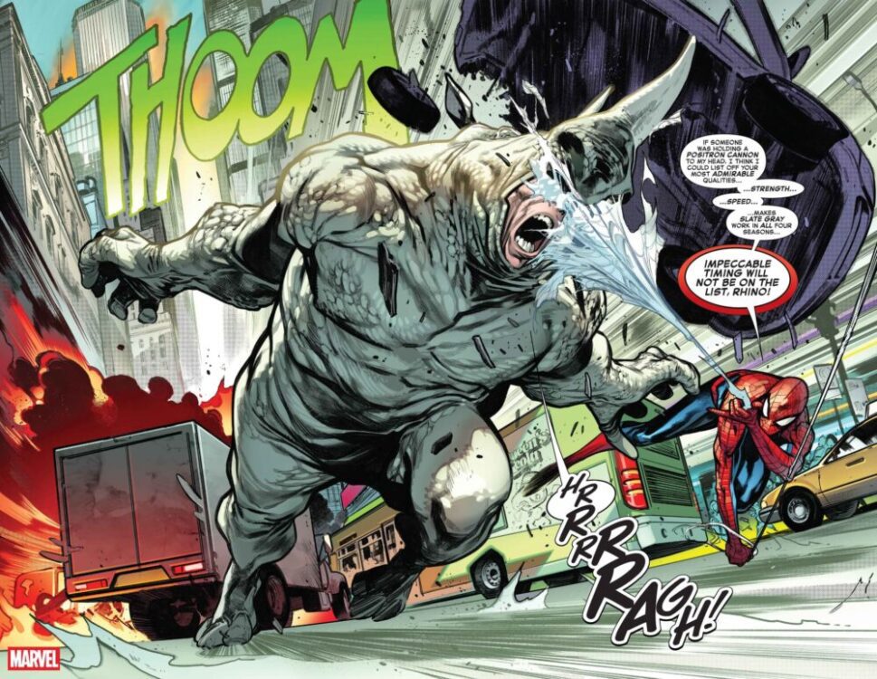
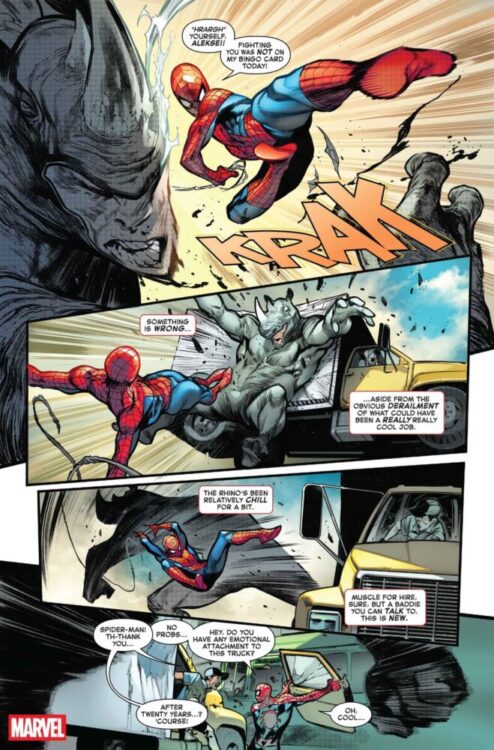
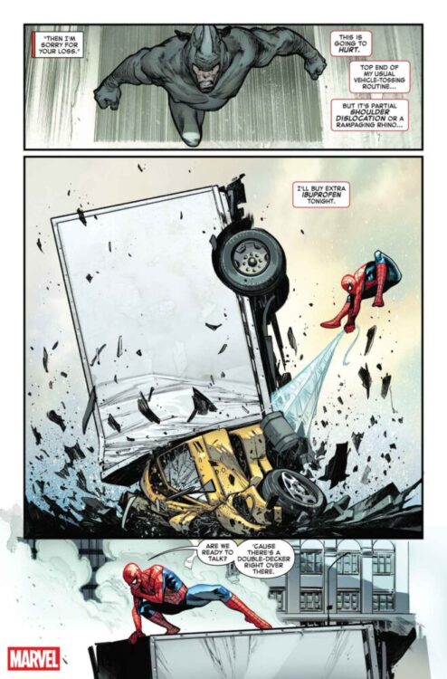
“ALIVE & THWIPPING! The next era of AMAZING SPIDER-MAN has arrived! Peter is, shockingly, without a job and looking for gainful employment, but his job search is interrupted by a RAMPAGING RHINO who is but the tip of a sinister iceberg. What major Spider-Villain is working behind the scenes weaponizing other Spider-Villains including one we haven’t seen in OVER SEVEN YEARS?! Also, what is that Goblin-free Norman Osborn up to anyway?”
Writing & Plot
Joe Kelly starts readers off with a familiar scene in The Amazing Spider-Man #1. Peter is out of a job and desperately searching for a new means of gainful employment. Right off the bat, Kelly greets readers with the slick and humorous writing we come to expect from great Spidey-books. This sequence also function as a great recap while setting the mood of the story. This is the sort of move that will no doubt reel in skeptical long-time Spider-Man readers while charming those new to the Webslinger in his original medium. Most of the staple familiar faces are here – Aunt May and Norman Osborn, to name a couple – while some are notably missing (if you’re expecting the classic Peter & MJ romance, you may want to recap the last couple years). Regardless of the cast, Kelly does a wonderful job of catching readers up while introducing a new plot point that *feels* like a Spider-Man book. Old villains return in new ways, and the schemes in the background all feel like classic Superhero-comic storytelling. Kelly’s script is loaded with dialogue, but the book never feels slow. Quite the contrary, as the staccato-delivery of the quips and quotes (with the help of Larraz’s focused sequential direction) carry the book along at a speedy pace. It can feel a little messy at points with so many word balloons (there’s a dinner scene that took me a couple passes to make sure I caught everything in the right order), but it’s not egregious enough to derail the conversation. Another note here is that this comic is effectively divvied up into 3 chapters. While the first 2 are very much relevant Spidey-stuff, the third feels a bit out of place – but it will surely make sense as the series continues. While the plot with the supervillains and Pete’s “Parker luck” troubles all come off as a bit safe thus far, it’s still a lot of fun to read. Joe Kelly’s introduction to this new era of Amazing Spider-Man is off to a solid start that many Spidey fans will be happy to jump into.
Art Direction
Pepe Larraz is one of the most talented artists currently over at Marvel Comics, so him being involved with The Amazing Spider-Man #1 seems like a no-brainer. His sharp linework and detail-rich inks and hatching make his work a stellar site to behold in every book he draws, and the same can be said about his work in this new chapter of Spider-Man. Larraz draws a spectacular (ahem) Spider-Man to be sure, but his Peter may be the highlight of this comic. Pete’s presented with a ton of charm and character here thanks to Larraz’s animations and direction, making the jumps from Spidey-action to jobless genius worth looking forward to. As they should be – a Spider-Man book is only as good as its Peter Parker, after all. Peter isn’t the only highlight here though, as every cast members personality is telegraphed perfectly. Larraz’s action sequences hit hard with momentum and great pacing due to his stellar sequential direction. The way he utilizes panels in this comic really carries the book along at a quick but deliberate stride. One of my favorite moments in the book is the previously mentioned dinner scene. There’s a moment where the panels tighten up around Pete and Shay’s faces, giving the two of them a moment right in the middle of the larger sequence. Larraz’s work here is completed by Marte Garcia’s dense colors that work great with the shading provided by the inks and hatching. While the comic is a little more on the dim side for a Marvel superhero book, it still works well. This main story very much fits into the house visual style Marvel has been aiming for over the last several years, but Larraz and Garcia make it fit into the upper tier of that aesthetic.
John Romita Jr.’s work in here fits with the characters and story he’s drawing – but it still feels like a strange offset compared to Larraz in the lead chapter. JRJR is a legend, no doubt, but his art style sticks out in a way that may be off-putting to modern comic readers. Finally, Joe Caramagna’s lettering seals the deal on the reading experience with stellar dialogue work and some fitting Marvel-feeling SFX letters. Overall, Amazing Spider-Man #1 is a great looking superhero comic with excellent character work and sequential direction.
Verdict
The AmazingSpider-Man #1 is a familiar but satisfying start to this new beginning for Marvel’s flagship character. Joe Kelly’s script sets up a familiar but still compelling story with classic villains and that that old Parker luck, full of the exact sort of charm you’d want from a good Spidey comic. The visuals from Pepe Larraz in the main story are stellar, with fantastic character detail and sharp sequential direction. The portions drawn by JRJR are solid as well, but it almost feels like the veteran artist’s style loses something with the modern inking and coloring techniques. Be sure to pick up this great debut issue when it hits shelves April 9th!
DOCTOR STRANGE OF ASGARD #5 is coming to your local comic book store July 9th, but thanks to Marvel Comics, Monkeys Fighting Robots has the exclusive first look at the issue!
The issue is a tie-in for ONE WORLD UNDER DOOM, a “status quo shift” that began recently, the likes of which Marvel says hasn’t been seen since 2008’s Dark Reign.
About the issue: WHO WILL BECOME ASGARD’S SORCERER SUPREME?
Doctor Strange finally uncovers the truth behind Hulda’s murder – but the true murderer may be closer than he thinks! A final confrontation leads to a magical showdown that will change the future of Asgard…
The issue is by writer Derek Landy and artist Carlos Magno. The main cover is by Geoff Shaw.
Get your first look at Shaw’s cover for DOCTOR STRANGE OF ASGARD #5 here:
Are you enjoying ONE WORLD UNDER DOOM? Sound off in the comments!
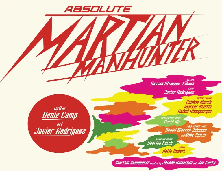
Imagine if, instead of an alien from Mars, Martian Manhunter was just a distant father and husband whose mind has been invaded by a foreign being. If that sounds in any way appealing, then you’re in for one of the best debut issues of the entire year. Absolute Martian Manhunter #1 from writer Deniz Camp, artist Javier Rodríguez, and letterer Hassan Otsmane-Elhaou sets the stage for an incredible and innovative story that is easily the most intriguing of its Absolute peers. It strays further from the original character than any of the other series have so far. It’s a take no one in a million years would’ve thought up, and the most surprising part is that it works. Really well.
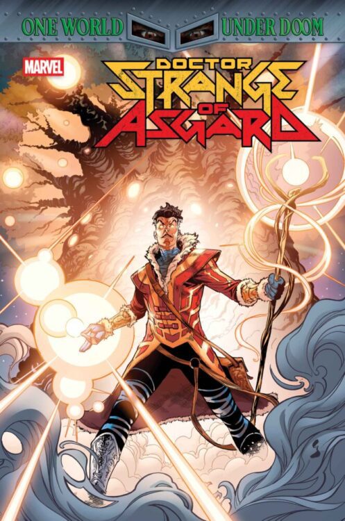
The issue starts with FBI agent John Jones being caught in an explosion set off by someone wearing an explosive vest. After that, he’s not quite right. He’s always been a distant father and not the best husband, but something is different now. He lies to his wife to get back to work as soon as possible, wanting any escape. He begins to see things that aren’t there. His perception of reality is now completely off, but it doesn’t seem to bother him much. He just tries to accept it. The problem grows larger and larger, slowly overcoming him.
John Jones caught in a blast
WRITING
Camp crafts something extremely thought-provoking here. You’re constantly questioning what’s real and what isn’t. Is what John’s experiencing real? What exactly is it? We don’t know, but Camp really leans into that by constantly contradicting what we see with how Jones experiences them. Camp uses his main character to his advantage. John’s not the most talkative; he doesn’t express himself much. We only get a glimpse of how he’s really feeling once it completely overwhelms him. It’s a smart way to introduce us to this other side of Jones.
The Martian Manhunter we know is a green alien who masquerades as a human. This Absolute version is just a regular man. He’s married with a wife and kid, but he’s distant. They call him “martian” because of that. It’s a really clever twist on the name. Camp also raises a fantastic question: Where does the Manhunter come in? The issue’s ending uses that in a really creative way, flipping it on its head again. We never truly know what’s going on, even in the end. It’s mind-bending every step of the way.
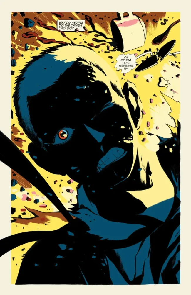
John recovers from his injuries
ART & COLORS
Rodríguez covers both the art and the coloring in this issue, and the way the artist plays with our perspective is something special. We spend the issue primarily in the real world, away from whatever thing is haunting John. Rodríguez gives us glimpses of how John has been seeing things to mess with us. Everything has been incredibly distorted for him; he can’t comprehend what he’s seeing sometimes and bottles it all in. Near the start of the issue, we see a sort of distorted image of his wife through his sunglasses. That’s how he’s seeing her, but it’s unclear if it’s the start of him viewing things different, or if that reflection is just how he really sees her, angry and demanding. The questions of “if,” “when,” and “how” the Manhunter is changing John’s view are really interesting ones. From the first page of the comic, you kind of get that John won’t be seeing things clearly. The explosion at the start of the issue is closer to one side of his face, so his eye is bandaged up with the other being able to see. It’s a nice little indicator that whatever John sees and experiences will not be with a clear mind.
There’s some great coloring work present here. That panel mentioned earlier with John’s wife in the sunglasses is even more interesting with the added color. She comes through as a single shade darker purple, like he believes she’s poisoning his life almost. She’s something he wants to get away from. Rodríguez also separates color really interestingly while paneling. Later in the issue, all the colors John sees become too much to handle all at once. They begin to pop out of everything unconventionally, and those colors are what separate our panels. The colors never blend together either. It always shuffles between the same few, signifying that these’ll really be trippy and important ones for John moving forward. They represent something, like the small clay doll John’s son makes for him in the middle of the issue. Is that why the being takes on that form? With those colors? He asks us really intriguing questions through all this.
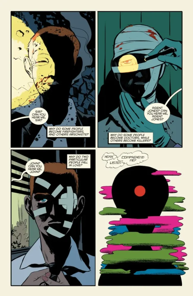
John leaves the doctor
LETTERS
There are so many little lettering details in this issue that it’s almost hard to keep track of. Otsmane-Elhaou really messes around and plays with the weirdness of the story. Once John’s entire perspective changes and a room is filled with these foreign covers, the speech bubbles get a little background to them, almost like there’s an echo. It’s really cool because it’s telling you that, while there is a conversation still happening, John is trying hard to emphasize it as it’s taken a backseat with everything else going on. There’s also this really fun portion where John takes a ticket and waits for his number to be called, and the little boxes with a digital number displayed show up at the side of the panel to show the reader his progress. It’s fun little detailed stuff like that that really takes this issue to the top.
Absolute Martian Manhunter #1 Credits Page
CONCLUSION
Altogether, this is one of the best first issues of the year so far. It may be one of the best in general, first issue or not. It’s the first Absolute title to fully take the original character’s concept and flip it on its head entirely in a way that works and flows nicely. It’s off-putting and uncomfortable. It’s unconventional and doesn’t follow the rules of the other titles, and because of that it feels especially fresh and exciting. Camp, Rodríguez, and Otsmane-Elhaou hook us instantly and leave us all desperate for a second issue.
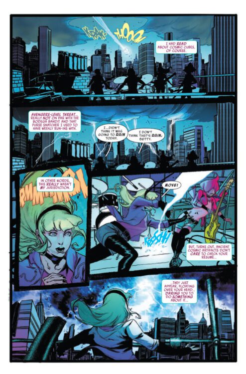
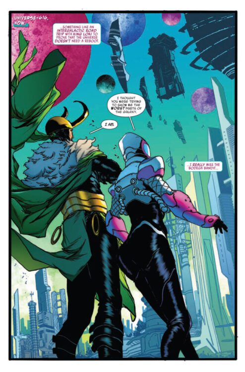
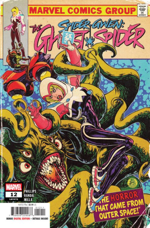
SPIDER-GWEN: THE GHOST-SPIDER #12 hits your local comic book store on April 9th, but thanks to Marvel Comics, Monkeys Fighting Robots has an exclusive four-page preview for you!
About the issue: GWEN BEYOND!
We now know the secret behind Gwen’s strange new power and why she left her home dimension behind…but what does all that have to do with Loki taking her on a journey across the stars? And what are Loki’s true intentions for her?
The issue is by writer Stephanie Phillips and artist Von Randal, with colors by Matt Milla, and letters by Ariana Maher. The main cover is by Mark Brooks.
Check out our SPIDER-GWEN: THE GHOST-SPIDER #12 preview below:
Are you reading SPIDER-GWEN: THE GHOST-SPIDER? Sound off in the comments!
From acclaimed writer Mark Russell (Exit Stage Left: The Snagglepuss Chronicles, Billionaire Island) and artist Juan Doe comes a harrowing piece of existential science fiction in Vanishing Point #1, the first issue of Mad Cave’s new sci-fi anthology series. In this opening story, Russell pens a script with just the sort of illuminating and poignant writing we’ve come to expect from his work – but with more dread involved. Juan Doe’s visual work pulls readers in to this lonely piece of space terror, and the whole package makes for one of the most compelling pieces of sci-fi in the medium over the last few years.
“In “Screams”, the captain of a mining ship goes on a ten year solo mission to the Jupiter Asteroid Belt where he makes a horrifying discovery!
Vanishing Point is an anthology of short stories that are part science fiction and part existential horror. These are stories with a twist in which the twist is not the point of the story, but a beginning point from which to ask what it means to be alive.”
Writing & Plot
Great science fiction is almost always a discussion about the state of human society at a given point in time, and few writers comment on reality better than Mark Russell. The story for Vanishing Point #1, titled “Screams,” follows an space mining captain on a solo 10-year mission. As his mission progresses and he gets closer to his quota, he makes a harrowing discovery about the asteroids he’s harvesting. Russell has made his career about juxtaposing human nature with what capitalist society demands of people. Here, he captures the humanity of the captain and immediately makes the audience relate to his decision to work in isolation for 10 years. I never really pegged Russell as a science fiction writer, but here he nails the fundamentals of wat makes these stories important. His overhead narration is transfixing, almost poetic. This, combined with how he stitches scenes together, builds the story up to its jarring conclusion with masterful precision. “Screams” is unsurprisingly just as thematically relevant as any of Russell’s other works. The Captain’s mental journey as he does what he needs to provide for his family – whatever the cost – is something that is painfully poignant for our reality. Russell shows himself as a chameleon of genre writing, trading satire for phenomenal and relevant science fiction.
Art Direction
One of the most important measures of quality for a science fiction comic is how well it immerses the reader into its world and atmosphere. Vanishing Point #1 thankfully has the immense talent of Juan Doe crafting the space-drifting setting of “Screams.” His character animations and designs feel fittingly classical – like they were lifted from a Silver Age classic by the likes of Bradbury. The architecture of the ship, the retro-futurism of the onboard tech, and the alien wonder of the more “speculative” aspects all point to a bygone era of science fiction. Doe’s pacing carries the story along at a careful, tense pace, making the twists and revelations land with satisfying impact. As great as his pencils are, the real gem of the visual work here is Doe’s color art. Every panel is brought to life with a vivid feel thanks to Doe’s glowing, almost neon colors. Even the sequences full of space rocks and dull machinery still have a unique sort of energy to them due to how Doe both frames and fills the imagery. Finally, the lettering of Carlos M. Mangual finishes off the reading experience with a style that fits the story in stellar fashion. His word balloons are reminiscent of classic Silver Age style comics lettering, and his SFX work pops off of the page with explosions of color. Vanishing Point #1 is overall one of the most visually impressive sci-fi stories seen in recent comics.
Verdict
Vanishing Point #1 is an excellent opening chapter to Mad Cave’s new science fiction anthology series. Mark Russell’s script for “Screams” is every bit as poignant, relatable, and painfully human as a great sci-fi short should be, and exactly the sort of quality we’ve come to expect from the Flintstones writer. The visuals from Juan Doe are vivid and detailed, making for a reading experience that feels as tense as it does timeless. Be sure to grab this opening chapter when it hits shelves on May 7th!
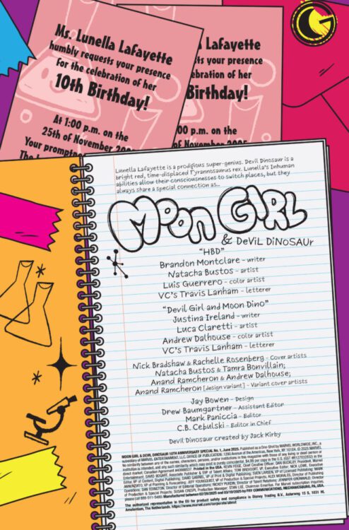
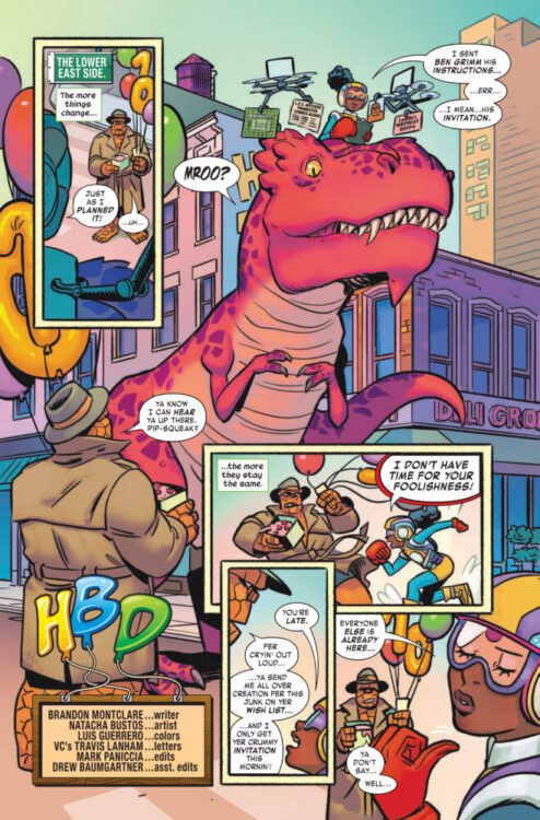
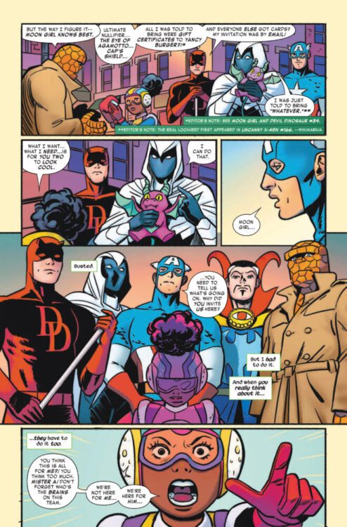
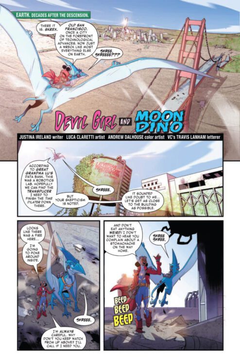
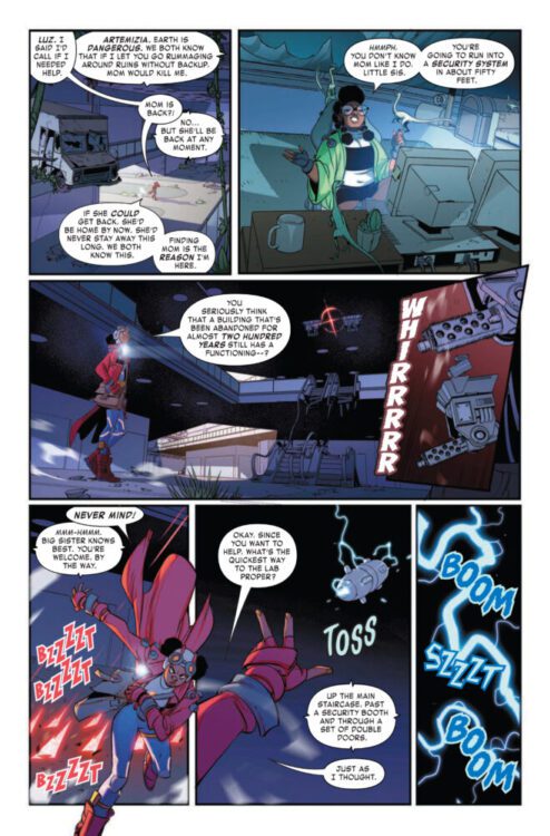
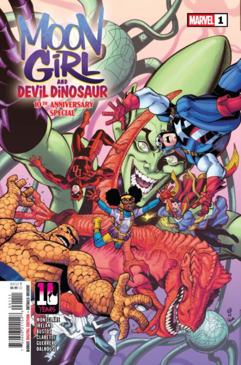
MOON GIRL & DEVIL DINOSAUR 10TH ANNIVERSARY SPECIAL #1 hits your local comic book store on April 2nd, but thanks to Marvel Comics, Monkeys Fighting Robots has an exclusive five-page preview for you!
About the issue: HAPPY 10th BIRTHDAY, LUNELLA!
It’s a birthday celebration a decade in the making, and the whole MARVEL UNIVERSE is invited! But MOON GIRL is bringing her own agenda to the party – what could her secret plans be? The mischievous IMPOSSIBLE MAN threatens to upend the festivities – unless LUNELLA can rally her guests the way only the SMARTEST PERSON IN THE MARVEL U can! PLUS: Who is DEVIL GIRL AND MOON DINOSAUR?!
The issue features two stories. The first is by writer Brandon Montclare and artist Natacha Bustos, with colors by Luis Guerrero. The second story is by writer Justina Ireland and artist Luca Claretti, with colors by Andrew Dalhouse. Both stories are lettered by Travis Lanham, and the main cover is by Nick Bradshaw and Rachelle Rosenberg.
Check out our MOON GIRL & DEVIL DINOSAUR 10TH ANNIVERSARY SPECIAL #1 preview below:
Are you excited for Moon Girl & Devil Dinosaur’s 10th anniversary? Sound off in the comments!
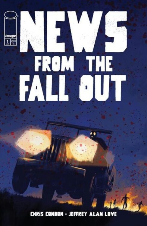
From writer Chris Condon and artist Jeffrey Alan Love comes a creepy and striking take on nuclear weapons in News From the Fallout #1. Featuring lettering from Hassan Otsmane-Elhaou, this debut issue presents readers with some familiar tropes shown in atmospheric and unique visual fashion and a sense of horror unlike what is usually seen in these kinds of stories. With a sharp, tense script and utterly fantastic visual work, News From the Fallout is off to a phenomenal start.
“In 1962 Nevada, a nuclear bomb test goes horribly awry and unleashes a contaminate into the atmosphere that turns people rotten. Otis Fallows, a private in the U.S. Army who is present for the test and is the only known survivor, flees the secret army base in search of a safe haven—but does such a place exist?”
Writing & Plot
Chris Condon’s script in News From the Fallout #1 works so well because of how much he *doesn’t* write. The main premise of the comic – insane general uses nuclear experiment to turn soldiers into monsters – isn’t especially unique. However, the tension introduced through Condon’s slow buildup and lack of exposition in the earlier pages of the story makes the issue much more visceral than you may expect. Fallout takes place from the perspective of one gasmask-laden Private who becomes woefully aware of the danger he and his comrades are in being so close to this strange nuclear blast. Condon keeps the story moving at a breakneck but decisive pace, keeping the reading experience taut from beginning to end. His dialogue feels naturalistic yet intentionally stereotypical. The General and all of the other soldiers speak exactly how you’d expect run-of-the-mill characters such as these to speak. This really isn’t of much importance, as all the the book’s most important moments have no dialogue in the first place. What makes this issue work so well is how Condon allows the art to tell the story, with the dialogue writing just adding a bit of context and flavoring.
Art Direction
Speaking of the art, Jeffrey Alan Love’s visual work is the true feature that will draw readers to News From the Fallout #1. His signature charcoal and fully blacked out character work brings this nuclear sci-fi horror story to life in all its dreary tension. Despite his art’s monochrome appearance, there’s a deceptive amount of detail in Love’s work. His close-up details of the General as the story commences immediately sets the tone, showing that some horribly wrong is occurring on this military base. Private Fallows’ gasmask-covered expression still showcases fear, with Love utilizing that Batman: The Animated Series style of white-eye coloring to show the protagonist’s range of emotions. Granted, that emotion is mainly fear. When the main horror of the story sets is, Love crafts fantastic and utterly unnerving panels with his specific style. His work reminds me of a mix between Stephen Gammell’s Scary Stories to Tell in the Dark and Manu Larcent’s adaptation of The Road. Adding to the impeccable presentation is Hassan Otsmane Elhaou’s lettering – specifically his scrawled SFX work. His style in these moments resembles carving message in wood with a razorblade, and they add even more atmosphere and tension to this comic. News From the Fallout’s stark presentation makes it one of the most visually compelling horror comics in recent years.
Verdict
News From the Fallout #1 is a surprisingly unnerving and striking first chapter to this new sci-fi horror series. Chris Condon’s script relies primarily on the art to tell the story, utilizing his co-author’s skill to craft something special out of a familiar premise. Love’s art, then, is a darkly unique and wonderfully compelling take on horror comics art, with his stark black and charcoal gray presentation making for one of the coolest-looking comic books in recent memory. Be sure to grab this debut issue when it hits shelves on June 25!
Second Shift Cover art
Credit: Avery Hill Publishing
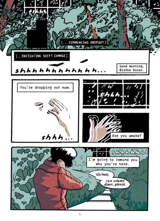
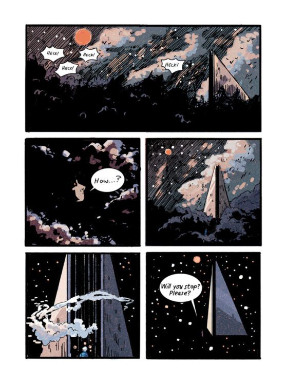
Since the dawn of science fiction, the concept of isolation has been a central theme. Whether it is a lone traveller on the verge of discovering new worlds, or the creation of something new thrust into a world it doesn’t understand and left to its own devices to discover who they are, these stories persevere. The outcast status of the central character allows creators to examine complex emotional feelings and philosophical concepts through a focal point that connects directly with the audience. This can be seen in one of the first science fiction novels, Mary Shelley’s Frankenstein, and also in Avery Hill’s upcoming new graphic novel Second Shift, written and illustrated by Kit Anderson.
The pitch is straightforward enough: volunteers work for the company and spend their lives on distant terraforming outposts processing incoming asteroids referred to as the payload. The workers work their shifts in turns, spending their downtime in suspended isolation. But what if you find something that challenges the world around you, and makes you question the reality of your situation? This is exactly what happens to Birdie Doran in Second Shift when she discovers another processing centre nearby, devoid of life but full of mysteries.
Second Shift Interior art Credit: Avery Hill Publishing
Second Shift begins with the central character, Birdie Doran, being woken up by the station’s AI in a sequence that is a mix of a system reboot and flashes of memory. This moment is a juxtaposition of science and nature, with the text representing the background code of a computer system while the images show a slowly emerging natural world. Anderson then uses this awakening to introduce the reader to the character and setting, allowing both character and audience to acclimatise to the situation together. This technique is a tried and tested science fiction trope that allows creators to drop an audience into any fantastic world and control the culture shock that is inevitable. You just need to see the introduction of the Nostromo crew in Ridley Scott’s Alien, or Jinn and Phyllis’ holiday cruise in Pierre Boulle’s novella La Planète des singes, to see how effective this kind of introduction can be. In Second Shift, Kit Anderson effortlessly introduces Birdie Doran, the station where she lives and works, and the few other characters that she interacts with, most notably the constantly form-shifting AI interface referred to simply as Station.
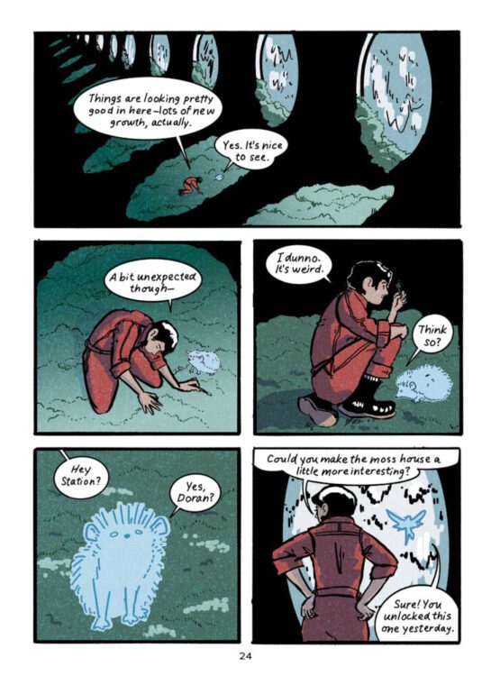
This opening sequence establishes Birdie’s relationship with the setting, and Anderson delays giving the reader a good look at the character until the scene has been set. Her artwork is very deliberate with sturdy lines that create shapes for the colouring to define. There is an ironic distinction between the machines that Birdie interacts with and the natural elements that fill the background of many panels. The manufactured elements are comprised of clean cut straight lines, coloured white or grey. The human elements, such as clothing, is more brightly coloured, and the natural world is less defined, with lines indicating the boundaries of the plants. But the colour does most of the heavy work, shaping the landscape that fits around Birdie and the machines. Complicating this neat separation of the manufactured and the natural is the AI interface. On the one hand, it’s clearly artificial, as signified by its ghostly colouring and ability to switch form at will, but the forms it takes are of creatures you might expect to find in the natural world depicted in the opening pages. This mix of natural and artificial acts as a link between the characters and their environment, a link which becomes more and more important to the narrative as the comic unfolds and Birdie’s world is turned upside down.
Second Shift Interior art Credit: Avery Hill Publishing
For a story so deeply tied to the control and reliance of Artificial Intelligence, the opening is surprisingly emotional, as it focuses heavily on the relationship between Birdie and Heck. An ongoing conversation between the two characters stretches over several pages, highlighting the difference of opinion between the two and their connection to Station. Anderson focuses the reader’s attention beautifully on this conversation, gently emphasising elements of the speech by subtly changing the background colour. Throughout much of this sequence, the unreality of the comics form is manipulated to enhance the speech and character acting. Heck’s posture speaks volumes, while Birdie’s gestures and quirky smiles enable Anderson to show how Heck’s words begin to get beneath Birdie’s skin. The backgrounds disappear, leaving panels empty of props and distractions, allowing narrative focus and character development to take place.
Second Shift isn’t your high octane, violent, action science fiction of 2000AD, but is a subversive emotional study about the effects of isolation and paranoia. The close relationship between Birdie and Station has a lot in common with the character work in comics such as Alex+Ada, except where Jonathan Luna and Sarah Vaughn’s comic from 2013 focuses on the emergence of humanity within a machine, Anderson’s work examines the effects that constant AI support has on the human spirit. It is a story about rediscovering humanity after the negative effects of technology. One of this book’s strengths is using the format of comics to highlight the contrasting worlds of technology and nature. The sterile, almost empty panels early in the book become the scene of some reality bending sequencing that calls back to outlandish science fiction sequences from such groundbreaking movies as 2001: A Space Odyssey. The cold and clinical is replaced by the mind bending and emotional.
Second Shift Interior art Credit: Avery Hill Publishing
This is a comic about contrasts, which suits the medium perfectly. There is the surface level “nature versus machine” concept, and just below that is the “emotional” compared to the “detached.” But the more you dig, the more you discover. There is science fiction jostling with fantasy, realism against surrealism, and even the artwork is constantly battling between reductive and highly detailed. Virtually empty panels on one page are followed by complex landscapes on the next. All of these choices feed back into the narrative, and make the reader question what they are seeing with their own eyes, and you become more attuned to the importance of the characters’ speech. Comics are a visual medium, and this is demonstrated perfectly by this story. Without the visual guides highlighting the duality of the narrative elements, the overall story would lose some of its power. Also this story would suffer as cinema because the reality of that medium would defuse the ambiguity of images throughout this book.
Second Shift is a seductive, albeit melancholic, graphic novel, that draws you in through the visuals before gripping your emotions and twisting them. Kit Anderson toys with the characters and readers alike, misleading both with the cutesy AI interface and the contradiction of image and text. Anderson plays with the visuals and occasionally changes the format of the page so a particular panel will lack its borders, forcing the image to bleed into the gutters, giving it a significance on the page. As engaging as the narrative is, its true beauty lies within the clever visuals and the underlining stories and ideas that these juxtaposed ideas create.
Second Shift Interior art Credit: Avery Hill Publishing
Avery Hill are currently running a kickstarter for Second Shift which can be found here!
This contains a gorgeous little animated video promoting the work, along with a number of backing options that include PDFs, physical books, and prints.
Second Shift is due for general release on May 7th, 2025.
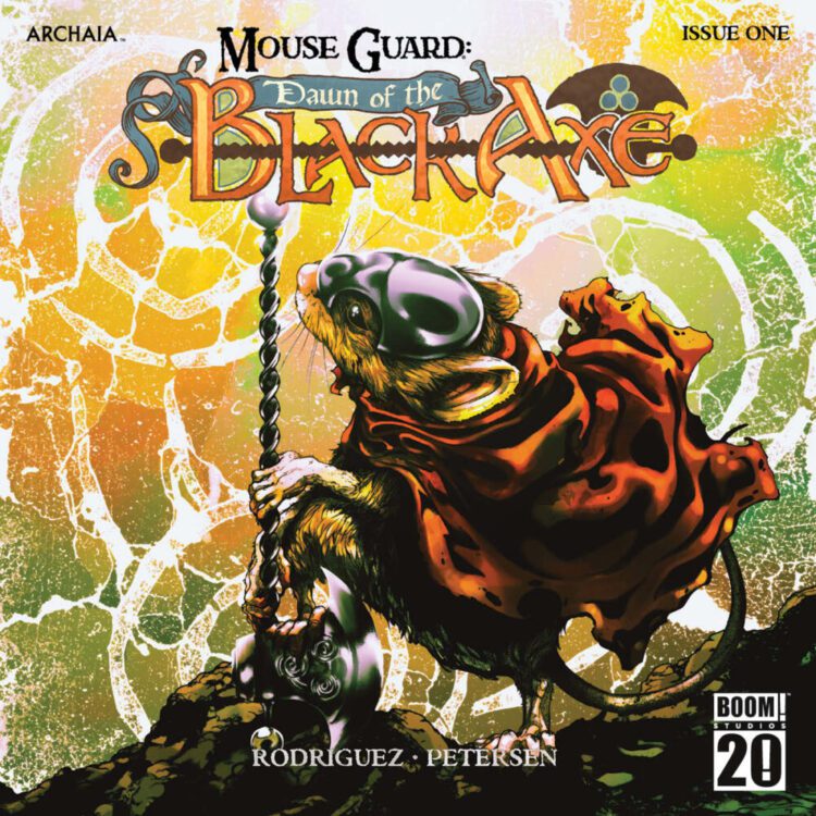
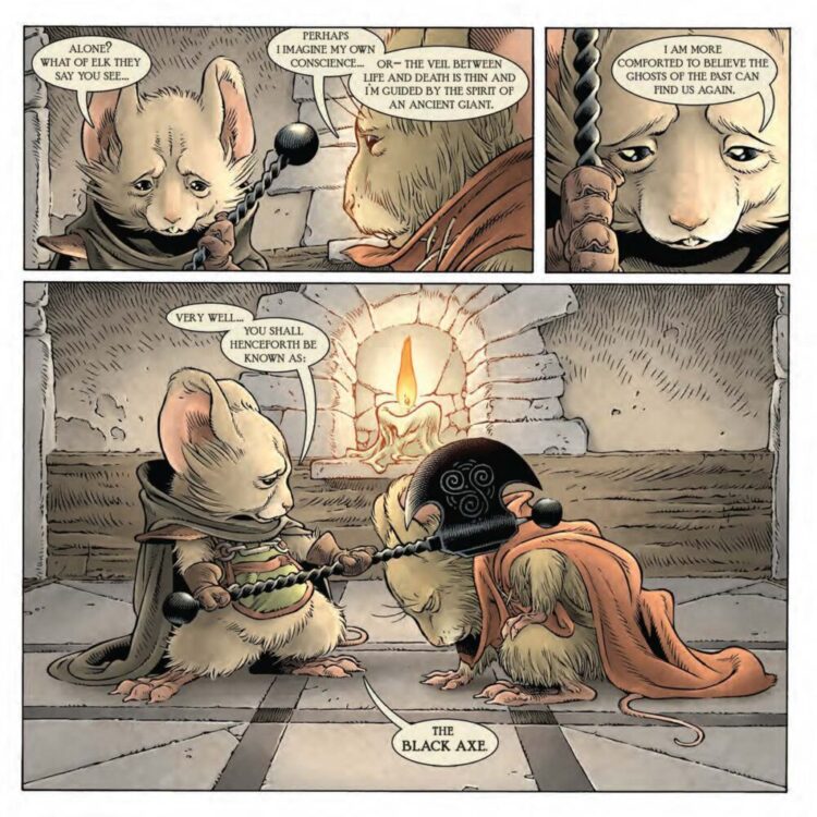
Mouse Guard: Dawn of the Black Axe
Credit: Boom! Studios
Who can resist high adventure and historic-fuelled legends acted out by tiny rodents in a world of imposing nature? As a pre-teen, I grew up reading Robin Jarvis’Deptford Mouse books, a very English series of fantasy books containing medieval type wars between mice and stoats. This led me into the world of Redwall by Brian Jacques, whose books were compared to JRR Tolkein’s famous fantasy series, The Lord of the Rings.
So, it will come as no surprise that when David Petersen began releasing his Mouse Guard series through Archaia Studio Press in 2006, I was waiting with open arms. The comics were appealing on a number of levels: art, design, and magnificent storytelling. However, the initial appeal was the cast of central characters, each one a striking individual, even though they were just mice. Over the years, I have loved and re-read the comics already available, becoming a big fan of Petersen and his errant rodents, so much so that I named the players in my last Blood Bowlleague team after his enchanting characters.
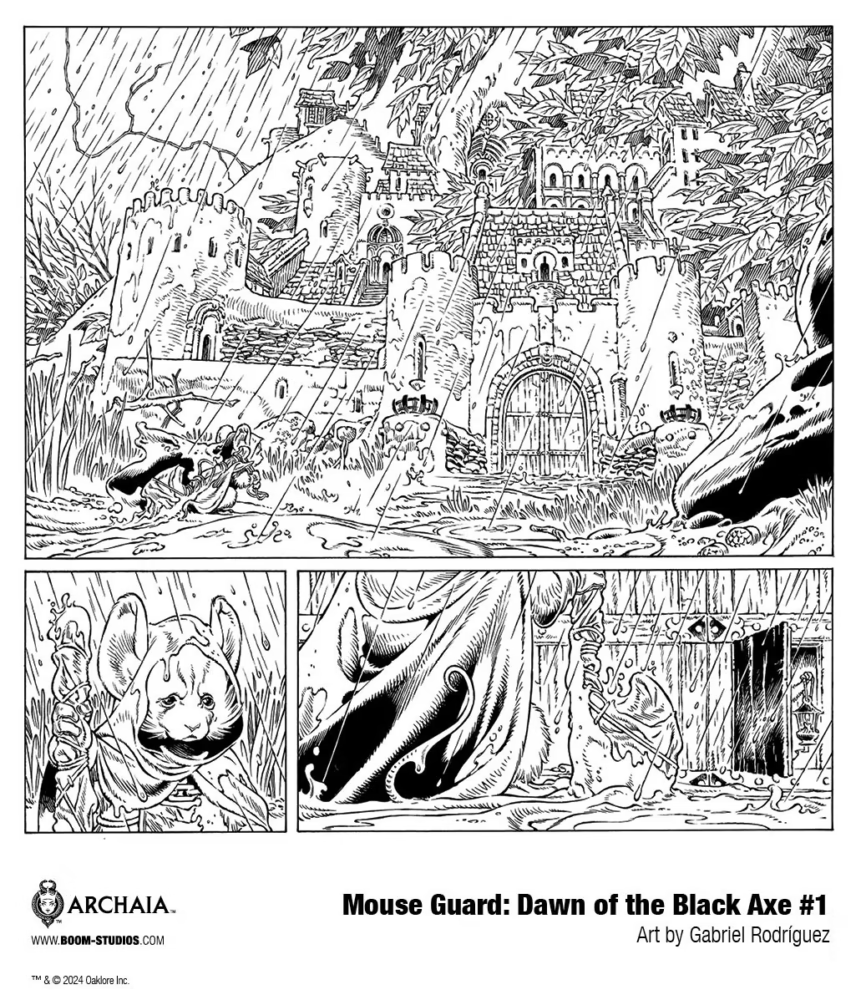
On March 19th, 2025, in conjunction with BOOM! Studios, a new Mouse Guard saga begins; an historic tale set before any of the other comics that have been released. Dawn of the Black Axe starts with the introduction of a metalsmith, Farrer, who is travelling to Lockhaven in the middle of the storm. He brings with him The Black Axe, forged by himself in a fit of vengeance aimed at the snake Langtspyd who killed all of his family. But the weapon is too heavy a burden for the metalsmith, and he drags it across the kingdom in search of a champion to wield it. Initially, the request for one of the Mouse Guard to assist him is rejected, but Bardrick steps up—a noble, honourable mouse who will risk banishment to protect all mice.
And so begins the legend of the Black Axe and Bardrick, its first wielder.
Mouse Guard: Dawn of the Black Axe Credit: Boom! Studios
Dawn of the Black Axe is the first in (hopefully) a line of miniseries set in the Mouse Guard world. Each series will see David Petersen work with a different artist to tell new stories while maintaining the same, hypnotically natural aesthetic that has come to define the Mouse Guard books. Over the years Petersen’s work has been captivating, blending together lyrical narratives with beautiful artwork. And the inclusion here of a new artist, Gabriel Rodriguez, does not diminish any of this. Rodriguez adopts the style from the previous books with fine line work and highly detailed panels. The characterisation is wonderful but the true beauty comes from Rodriguez’ ability to make them act on the page. Extravagant gestures, solid posturing, and some of the best facial mouse expressions ever are committed to the page. This comic is Shakespearean in staging and delivery. It is perfect for the story that Petersen is telling.
It is impressive how much story Petersen can make you think you have read. This first issue of Dawn of the Black Axe is fairly straightforward with two, arguably three, major scenes, however Petersen is able to pack the comic with an abundance of history and set up. The metalsmith has a small role but he is a fully rounded character with a tragic past and a determination to his present. We only need a quick glimpse of the matriarch Siobhan to get a full understanding of her character and how she treats her subjects. She is a strong leader, able to control a room, but there are hints of her clever manipulation of the other characters she interacts with. Returning once more to Shakespeare, Siobhen inhabits a presence on the page equal to any of the bards most famous female characters: the Lady Macbeth, Gertrude The Queen of Denmark, or even Titania herself. Siobhan is a pillar that the story revolves around while maintaining physical and emotional distance from both the other cast members and the readers. Both Petersen and Rodriguez understand this and chose her place within a panel accordingly. They have also designed her so that she stands out on the page, even when she is hiding in the shadows.
Mouse Guard: Dawn of the Black Axe Credit: Boom! Studios
Speaking of shadows, Rodriguez uses a lot of heavy black spaces to represent the shadows within the comic, especially in the halls and candle-lit rooms of Lockhaven. This produces very atmospheric scenes and gives the comic a shifting tone as the adventure moves from the fabricated walls of the city to the open expanses of the surrounding woods. It also makes the first half of the comic very staged, as if it is a performance to be viewed. When the readers follow Bardrick out of the city to hunt down the snakes, we transition from audience to companion. We stop merely watching the action unfold and become more like a squire to the questing knight where we get thrown into the action on the ground level. It is a strong emotional shift that brings us closer to Bardrick and we understand the sacrifice he has made and the danger that he now faces.
There is so much going on within each page, but it somehow seems simple and dreamlike, almost uneventful. It is possible to sum up the storyline of this comic in a single sentence, but to explain what happens, to give someone an idea of how the story is told, would take you so much longer. There is a depth to Dawn of the Black Axe that you often see with this type of story. It is like a lake—the crisp shimmering of the surface is flat but enticing, and the closer you get the more you can see happening beneath the surface, drawing you in until you are submerged in an expansive, beautiful world.
Mouse Guard: Dawn of the Black Axe Credit: Boom! Studios
The Mouse Guard series has always had a bi-monthly, if not longer, release schedule, and it has been nearly 10 years since any new Mouse Guard comics have been published. However, it is always worth the wait, especially when Petersen himself is involved. Mouse Guard: Dawn of the Black Axe is a magnificent comic that will draw any reader in, whether you are new to the series or an obsessive. David Petersen, with Gabriel Rodriguez’ help, has created a beautifully styled, performance-esq, legend narrative that compliments his ongoing series perfectly.
And I’ve not even mentioned the superb design of the product itself. There is something satisfying about the square format of the comic that allows for some wonderful storytelling but also, of itself, produces a fantastic reading experience. I have always found the reading of comics a very tactile experience, having the physical product in my hands, and this is enhanced when the product challenges our expectations. By simply changing the size and shape of the comic, we interact with it in a different way and accept that what we are reading is different to our usual comics. It has a physical impact that creates a memory specific to that comic. And any time a comic tries to interact with you in a new and physical way, it is worth your time.