Home Blog Page 16

Review: THE GODDAMN TRAGEDY Sends Shivers Through Your Bones

The Goddamn Tragedy Cover Art Credit: ONI Press

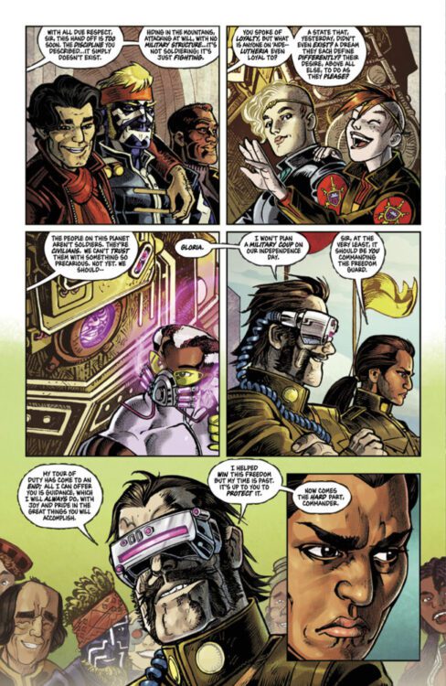
When talking about popular culture, it is quite easy—especially with a medium like comics—to put everything under a cozy label or fit it into a comfortable genre. You have standard superhero comics, science fiction adventures, tales of horror, the list goes on. But, in reality, nothing is ever that simple, and the most intriguing comics tend to straddle several genres and styles. One such example of this is Oni Press’ upcoming one-shot The Goddamn Tragedy by Chris Condon and Shawn Kuruneru. The comic novella, which features 48 pages, is an unsettling ghost story mixed with a territorial western. And so much more.

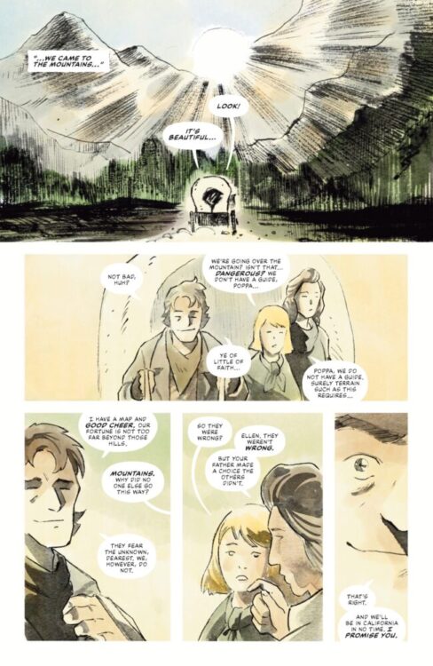
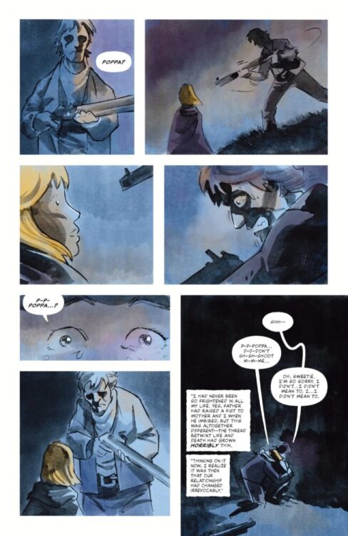
The story opens in San Francisco in 1894, with a lady walking into the office of Mr. J.M. Rapp, a writer of fiction and journalistic articles for national magazines. The lady is Ellen Janson, the central character in one of Rapp’s previous publications, and she has come to set the record straight. What follows is her first hand description of what occurred to her and her family 48 years earlier as they made their way across the country, through the wild mountains.

The Goddamn Tragedy Interior Art
Credit: ONI Press

The initial set up is a standard western story of frontier people and the chase for the gold rush. The opening page features wooden housing, and characters dressed in long dresses and large brimmed hats. The silhouette of a horse walks across the foreground while a horse and carriage leaves the scene in the background. The first two panels are sketched onto the page in blocks of gray watercolour forming the images of city life. Negative space creates the sense of sunlight drying the street scene and, despite the muted colour, there is a warmth to the page: a stifling, dry, and dusty warmth. This is the first indication that there is going to be more to the story than at first you might presume, and little hints and motifs are peppered throughout the comic linking scenes and narrative threads together.

Before I continue, I have missed something crucial: the cover. If the opening scene sets up a classical western, then the cover screams traumatising horror. The blood red streaks painted across the full width of the cover with two wide, horrified eyes is unnerving enough, but then the ghostly face carved out of the central “A” like a jack-o-lantern ready for Halloween sends a shiver down your spine. To flip from cover to first page and back again is to create an unnerving contrast of both narrative and theme. Just like the movies Bone Tomahawk and High Plains Drifter, The Goddamn Tragedy is one thing disguised as another: It is a horror disguised as a western. There are glimpses in the first few pages, beyond the cover, that give you a clue, and as Ellen begins to tell her story, the narrative doubles down on laying the groundwork for the impending horror. But before you get there, writer Chris Condon and artist Shawn Kuruneru are going to embed you in the Janson family’s life.

The Goddamn Tragedy Interior Art
Credit: ONI Press

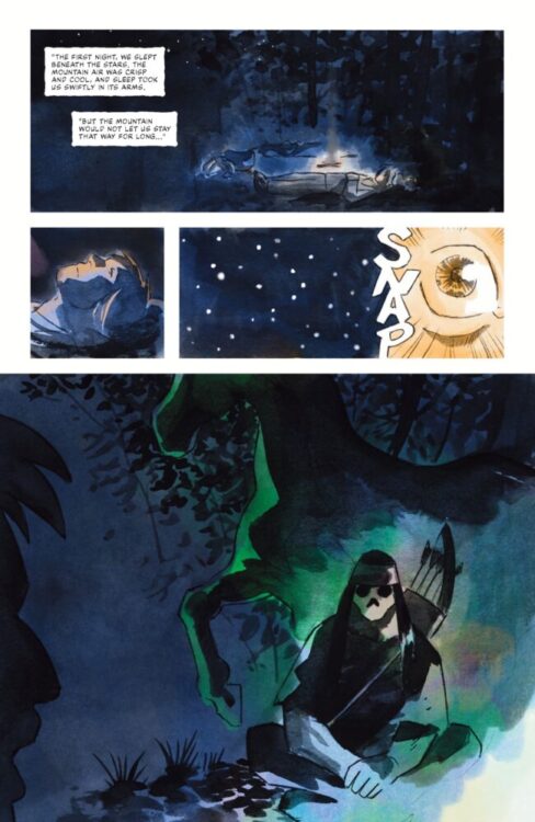
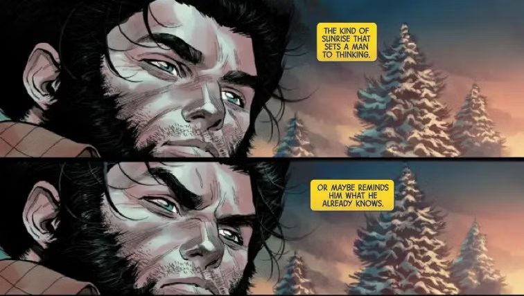
The first few pages of Ellen’s story are open and bright, with Kuruneru using very pale colour washes for the background, meaning that they almost blend with the gutters on the page. The lack of bold panel frames is more at home in a memoir comic, where true events unfold, and that lends itself perfectly to this comic. The setup challenges the contrast between truth and fiction. Rapp’s original story was a lie, we are told by Ellen, but we have not seen or heard any of it. We are then given the true story with no frame of reference, but instinctively a narrative is created in our minds. The concept of legends and western myths isn’t new to us, the audience, so when the character in this story insists on telling us the truth, we conjure up this wild, outrageous horror story and prepare for any supernatural elements to be explained. But Chris Condon is smarter than that. The tables are turned and we are presented with a western comic closer in style to Stanley Kubrick’s The Shining. There is an open dissertation on the traumas of family life, and the relationship between Ellen, her mother, and her father is explored, warts and all. There is even an element of survivor’s guilt from Ellen, and this is explored as well through the telling of her tale. Those beautifully painted setup pages pull you so deeply into the lives of the Janson family that their trauma becomes yours. Even as you fight against the decisions that are made by several characters, there is no way you can change their fate, unless you close the comic and stop reading. Suddenly you have become the scream queen running up the stairs instead of out the front door.

Kuruneru takes the reader on a dangerous journey, away from the safety of numbers and into the wild west. But the wide, dusty landscapes often associated with the western are replaced by wooded mountains and snowy nights. Kuruneru’s visuals are mesmerising and the snowstorm scene is a triumph of disorientation and panic. This scene is only topped, visually, by the creepy night sequences which contain such a depth of colour. It is at these moments that the comic becomes its most macabre, with one page packed with more tension than anything I’ve read in a comic since Negan played baseball with Glenn’s head. Kuruneru captures the out of control emotions of his characters perfectly, making you believe for a moment that anything, no matter how horrible, could happen.

The Goddamn Tragedy Interior Art
Credit: ONI Press

There are many layers to The Goddamn Tragedy. The narrative weaves different genres together creating a wondrous tapestry of a story, brimming with visual tropes that never pass over into cliche. Then stitched into this are a handful of themes, some more obvious than others, some directly linked to the story, while others make statements about different genres and mediums. It is truly a comic that contains something for everyone. Personally, the most impressive aspect of the comic is how it challenges the conceits of biographical comics. The Goddamn Tragedy adopts the visual styles of biographical comics, with white pages, no panel borders, a voiceover narrative, and a more traditional art style. The story has a subjective view, one that the audience is told at the outset is the truth, and we don’t have anything to contradict this, except for an off hand remark made by the writer Rapp. The comic is emotional and deals with some traumatic experiences, and not the kind you might be expecting, but the validity of the tale can still be questioned. Whether we should question it or not is up to us, but the challenge is there, set by writer Chris Condon. Ellen tells us of scenes she wasn’t witness to, incidents she learned second hand. All of this feeds back into the myth making of the comic and the concept of legends that is inferred from the opening.

The Goddamn Tragedy Black & White Variant Cover
Credit: ONI Press

Chris Condon and Shawn Kuruneru tell a magnificent story. The artwork is dreamlike and shifts so easily into the stuff of nightmares, but not the schlock horrors of EC’s rebirth, but almost folk horror in nature instead, with a disturbing touch of the psychological. I once again refer to Kubick’s The Shining as that is what the themes of this comic remind me of the most. There is an encroaching terror that builds up through the pages and, as the characters’ mental states begin to waver, so does the safety of the narrative. At times it’s as brutal as the modern television westerns such as the Yellowstone prequel 1883. At other times it captures the unimaginable beauty of the landscape as well as Greg Ruth does in Indeh. Horror comics are currently in vogue, and there are plenty currently on the shelf, but very few match the adrenaline rush produced by this intoxicating page turner.

Monkeys Fighting Robots Youtube

Review: THE AMAZING SPIDER-MAN #3 — Up The Water Spout

The Amazing Spider-Man #3 dives deeper into the new relationships Peter Parker finds himself in, but also provides a deeper context and understanding of his older ones. Writer Joe Kelly, artist Pepe Larraz, colorist Marte Gracia, and letterer Joe Caramagna all work together to show us more of Peter’s past, while working to give us a compelling story in his present as well, tying it all together beautifully.

The issue starts with a flashback of Peter wearing Uncle Ben’s old military jacket, but something doesn’t feel right. Aunt May attacks him in the flashback, causing him to wake up in the present. He’s currently fighting Itsy Bitsy, a clone of Deadpool and himself. Peter tries to protect Rhino while fighting Itsy Bitsy, and keeps having flashbacks of Uncle Ben and Aunt May while doing so. She’s poisoned both him and Rhino, causing them to hallucinate. The two continue fighting until she eventually flees, leaving Peter in the water as he tries to pull himself together. He manages to escape himself, making it to Aunt May’s apartment to try and rest as well as figure out what’s wrong with him.

The opening credits page.

WRITING

Kelly has found a terrific voice for Peter Parker. He remains his quippy self that we all know and love, but Peter is at his best when his thoughts go deeper than that. Kelly displays Peter’s genuine worry and concern for those around him, as well as showing how serious he takes each situation that calls for it. Kelly does a good job showing how Peter’s a symbol of hope not just through his actions, but through his words as well. There’s a scene where Peter is talking to a reformed Norman Osborn that’s trying to help him figure out the source of the hallucinogen. At the end of the interaction between the two, Peter tells him how being good suits him. You can tell that it really sticks with Norman, and the reassurance sticks with the reader as well.

Kelly also manages to pack so much important exposition in each page without it feeling overstuffed. Every interaction between characters feels heartfelt and necessary, like we’ll always have time for it. It’s a really important skill to master when doing a Spider-Man book, and Kelly’s done it. What makes Peter Parker so special is that, even when he fails, he’s still there for everyone and is as invested as he can be. Kelly really works hard to show you that.

Young Peter steals Uncle Ben's jacket.
Young Peter steals Uncle Ben’s Jacket.

ART

Facial expressions always seems like the hardest thing to do in Spider-Man comics. An artist has to be able to tell so much story just through his expressive eyes. Larraz takes a crack at that here and excels. You can always tell through the mask whether Peter is determined, afraid, shocked, or hurt, all through his expressive eyes that either squint or widen in certain ways. Larraz conveys each emotion wonderfully through that, but it doesn’t stop there. He’s just as good as capturing the emotion outside the mask. There are flashbacks through the issue that focus on Peter’s past, and in those you can tell that he’s been defiant recently just through his posture and facial expressions. It’s a tough thing to convey, especially for such a heroic character. Larraz, however, knows exactly how to set up each character in each panel that tells you exactly how they feel without any words being spoken whatsoever.

Itsy Bitsy vs. Spider-Man.

COLORS

In this run so far, we’ve gotten a few chunks of what Peter’s past looked like. Everyone knows the general origin of Spider-Man, but the team digs deeper here into areas we otherwise haven’t really seen before. Gracia does a great job of making each flashback sequence feel dreamlike, but also like something isn’t right in them. There are a lot of whites and grays that could just be generic backgrounds, but then you see these detailed gray shadows behind each character. These really add depth to each panel, showing that the characters are somewhere real, but not incredibly detailed. In one flashback, May grabs Peter in a rough way. In this panel, Gracia emphasizes that through shading over Peter completely when he’s been otherwise clear, showing a departure into unknown territory.

Gracia’s coloring of the actual Spider-Man suit is beautiful. It’s a really satisfying red that, with the right lighting on it, mixes with blue to give a great purple shine. There’s also this scene where a wet and cold Peter Parker marches to Aunt May’s apartment, and both what he wears and the room around him both just look really flat and gray, signifying that this isn’t really supposed to be Peter’s most flattering moment. It’s some really great and expressive storytelling.

Spider-Man fights Itsy Bitsy

LETTERS

There’s some really nice lettering touches in this issue from Caramagna, specifically with Itsy Bitsy. Everyone has the sort of standard text bubbles, except for her. Hers are inverted to be these scratchy and wobbly black bubbles with a sinister white text inside, making sure you know that she sounds scary. It’s a great way of differentiating her from everyone else, despite her being a half clone of Peter. The lettering also really stands out in the flashback sequences. Aunt May and Peter speak with such an urgency in those occasionally that it feels like the text is popping out of the bubbles, a second red layer sometimes appearing around each bubble. The motivation of each sentence spoken feels clearly defined because of this.

Spider-Man takes a big hit.

CONCLUSION

The Amazing Spider-Man #3 really makes the run feel like it’s starting to find itself. Kelly’s Spidey voice is amazing, Larraz’s expressions are impressive, Gracia’s colorwork is consistent, and Caramagna’s lettering is descriptive. Each character’s actions and intents are displayed in full force through all of these aspects on every page. The team should be proud of the work they’ve done here. If they keep this pace going forward, this could be one of the best Spider-Man runs in recent memory.

Monkeys Fighting Robots Youtube

Marvel Comics Exclusive Preview: ONE WORLD UNDER DOOM #4

marvel comics exclusive preview one world under doctor doom dormammu

ONE WORLD UNDER DOOM #4 hits your local comic book store on May 14th, but thanks to Marvel Comics, Monkeys Fighting Robots has an exclusive four-page preview for you!

About the issue:
Sensing vulnerability, Dormammu has attacked Earth – and only Doom stands in his way!

Dormammu has banished all other heroes to a pocket dimension, leaving Doom to stand alone against the Dark Lord of Chaos. But on the other hand…Doom has never needed allies in order to ensure that his will is done. It’s the ultimate showdown between two titans – with an ending you won’t see coming.

As Earth hangs in the balance, it all comes down to DOOM VERSUS DORMAMMU.

The issue is by writer Ryan North and artist R.B. Silva, with colors by David Curiel, and letters by Travis Lanham. The main cover is by Ben Harvey.

Check out our ONE WORLD UNDER DOOM #4 preview below:

marvel comics exclusive preview one world under doctor doom dormammu

marvel comics exclusive preview one world under doctor doom dormammu

marvel comics exclusive preview one world under doctor doom dormammu

marvel comics exclusive preview one world under doctor doom dormammu

marvel comics exclusive preview one world under doctor doom dormammu

marvel comics exclusive preview one world under doctor doom dormammu


Are you reading Marvel’s ONE WORLD UNDER DOOM? Sound off in the comments!

Monkeys Fighting Robots Youtube

Review: CAPTAIN PLANET #1 – Enter the Planeteers

From writer David Pepose (Space Ghost) and artist Eman Casallos comes the return of a generational classic with Captain Planet #1. Featuring colors by Jorge Sutil and lettering from Jeff Eckleberry, this first chapter sets up the familiar struggle of 5 environmental warriors and their power rings against the forces of capitalist greed. With a fun script and solid – if not a bit inconsistent – visuals, this opening issue is a cool and relevant trip down memory lane.

“Five special young people have been empowered by Gaia, the embodiment of the Earth’s spirit, with an aspect of our world’s elemental forces: Earth, Fire, Wind, Water, and Heart. When the five powers combine, they summon the world’s greatest champion – Captain Planet!
But before these would-be eco-warriors can combine their newfound abilities in pursuit of environmental justice, they will have to learn to trust each other – and with each member drawn from different (and sometimes mutually antagonistic) corners of the globe, that’s easier said than done.
Unfortunately, time is not on their side. When Gaia is kidnapped, the inexperienced Planeteers are forced to come together – whether they’re ready or not – to face the well-financed might of Lucian Plunder! Even with the five-fold power of Captain Planet on their side, will it be enough to stop the ruthless ingenuity of Earth’s exploiters?”

Writing & Plot

David Pepose brings readers right back to both the 90’s and the Silver Age of superhero comics with his script for Captain Planet #1. His work here feels familiar both as a reintroduction to the character of Captain Planet, as well as how the idea borrows from superhero comics of years prior. Just like in the original cartoon, Gaia assembles five brave and worthy heroes to hold the five power rings that combine to create the titular Captain Planet, a hero who protects nature from the evils of greed and late-era Capitalism. Reading this opening issue, it is almost funny how much Captain Planet borrows from concepts such as Green Lantern and He-Man: Masters of the Universe. Much to the book’s own credit, reading Captain Planet feels like embarking on an old journey for the first time. The writing does feel dated, but it will work for the crowd that is likely going to jump into this issue. The villain and main cast all feel like cookie cutter Saturday morning cartoon characters, but again, that works in the book’s favor given the crowd that will do doubt be ready to jump back into some nostalgia. Pepose’s writing borrows from both the tone of the original show and the work of Stan Lee and Gil Kane, wearing its influences on its sleeve to deliver a comic that feels almost frozen in time. This is a fun read, with Pepose nailing the feel that a classical-feeling comic book story like this should have.

Art Direction

A comic like this needs an artist with an eye for classic material, and Eman Casallos is on hand to provide just that for Captain Planet #1. Casallos’s work here does a solid job of both recreating the feel of the 90’s cartoon while still offering a more modern reading experience – even if some of the visual experience overall is a bit inconsistent. Casallos’s character work is well-detailed, making each main character’s appearance in this first chapter leave a strong impression even if they’re only on a couple pages. His sequential direction really carries the story along well, letting the action hit hard where it needs to while giving each Planeteer’s introduction the proper amount of weight in the story. Even with all of the new characters and the reintroduction of Captain Planet and Gaia, nothing in this 22-page chapter feels rushed. The color art from Jorge Sutil fills in Casallos’s pencils with a vivid color palette, though the deeper detail and shadow work on characters sometimes leaves a bit to be desired. Overall, this debut issue has a solid visual presentation that delivers on both action and character-focus.

Verdict

Captain Planet #1 is a fun hit of nostalgia that does a great job of bringing the 90’s icon back to life in a new medium. David Pepose’s script is a cool mix of Saturday morning cartoon cheese and Silver Age heroism, making for a comic that proudly and effectively wears its influences on its sleeve. The visuals from Eman Casallos and Jorge Sutil let the action hit hard and are well directed so that each character has their own memorable moment to shine. Be sure to grab this debut issue when it hits shelves on May 7th!


Monkeys Fighting Robots Youtube

Review: WOLVERINE: IN THE BONES — From the Ashes of Krakoa

marvel comics review wolverine logan

From the ashes of Krakoa, a new Wolverine series begins, from writer Saladin Ahmed, artist Martín Cóccolo, colorist Bryan Valenza, and letterer Cory Petit. Volume one, “In the Bones”, is in stores May 27th.

As the story opens, Wolverine has retreated to the wilderness and cut himself off from his family and friends. But when old threats resurface (with some fresh twists), the hero realizes that he can’t hide from the world forever.

“In the Bones” is a solid start to this new Wolverine run. In some ways, it feels very familiar: Logan isolates himself from the rest of the X-Men, viewing himself more as an animal than a human. He faces off against other adamantium-based villains who he has history with, and even a Wendigo. There’s a comfort to the familiarity. But then there are the aforementioned “fresh twists.” There’s a new puppet master behind the old villains, one who promises big changes for Wolverine’s story. The Wendigo, meanwhile, turns out to be a teenager who Logan decides to help instead of kill. These changes to the familiar keep the story interesting.

marvel comics review wolverine logan

Ahmed is writing a smaller, more personal Wolverine story here—at least in this first arc—with a bigger action story building in the background. He leans heavily into the “animal instincts versus humanity” theme, and to great effect, especially with the addition of the Wendigo. Here, Ahmed gives Logan the opportunity to tame a savage beast and teach it how to be human again, a responsibility Logan does not take lightly given his own history. There’s plenty of action in this new Wolverine series, but the scenes of Logan helping the Wendigo are where the book shines. Sometimes they’re humorous, sometimes they’re heartfelt, but they always stand out and make you care about both characters.

And that’s due in no small part to Cóccolo’s artwork. Yes, the action sequences are exciting and dynamic, and the motion is fluid, but the real story here is being told in the facial expressions and close ups. Cóccolo is able to say volumes through these characters’ eyes, especially Logan’s. Even when the cowl is up and his eyes are whited out, you can still feel the Wolverine’s rage. But when the cowl is down, there’s a softness to Cóccolo’s faces where you can almost read Logan’s mind through his eyes. You can sense his concern, his fear, and his pain. As mentioned, this is a more personal Wolverine story, and Cóccolo’s work is what builds the emotional connection with the readers.

marvel comics review wolverine logan

Valenza’s colors set the atmosphere for the story. “In the Bones” largely takes place in the Canadian wilderness, so Valenza utilizes a heavy amount of blues, especially in the opening chapters. This adds a cold, isolating feeling to the book (while also allowing Wolverine to pop off the page in his yellow costume). When the action picks up and Valenza starts mixing in more reds and oranges, it creates an explosive sensation and adds an impact to the battles.

Ahmed, Cóccolo, Valenza, and Petit have started a Wolverine run here that seeks to explore all different facets of Logan’s being, and add new depth to the character’s long history. There’s plenty here to enjoy whether you’re an old fan or a new one, and you’ll definitely be coming back for volume two!

Monkeys Fighting Robots Youtube

FREE PLANET #1: World-Building On A Frank Herbert Scale

FREE PLANET #1

FREE PLANET #1 hits your local comic book shop this week from Image Comics The first issue is a dense world-building comic that feels like everything that happens after RETURN OF THE JEDI with a HEAVEY METAL meets DUNE twist.

Matthew Sardo and Anthony Composto take a deep dive and examine every panel of the first five pages and try to find the hidden meaning in every detail. There is one double-page spread that is overwhelmingly good. Did you read FREE PLANET, what are your thoughts?

About FREE PLANET #1:
The first completely free planet in human history has won its independence. Now, a group of revolutionary heroes must defend the planet’s unique energy source from a pair of hostile intergalactic powers while determining what complete freedom actually entails.

CREATIVE TEAM
Artist: Jed Dougherty
Writer: Aubrey Sitterson
Colorist: Vittorio Astone
Letterer: Taylor Esposito
Designer: Mark Kaufman

FREE PLANET #1

FREE PLANET #1

FREE PLANET #1

FREE PLANET #1
FREE PLANET #1

Monkeys Fighting Robots Youtube

TV Review — DOCTOR WHO: THE WELL

Doctor Who enters into horror territory with its latest episode, “The Well.”

The Doctor and Belinda are still struggling to return to Earth in 2025. They end up on Planet 6767 with a platoon of soldiers investigating a mining colony that has stopped communicating. The only survivor is Aliss (Rose Ayling-Ellis), a deaf canteen worker, who has a strange entity attached to her.

“The Well” was a traditional “Monster of a Base” story. It’s a story template that the show has used many times before, and it has led to some great Doctor Who episodes, like “Dalek” and “Water on Mars.”

“The Well” can stand alongside those classics.

“The Well” had the same setup as Aliens, where a platoon of soldiers investigates an industrial space facility and finds out about a sort of catastrophe. Aliens was a great reference since it’s such a great movie, and “The Well” shared the industrial setting on a dark, desolate planet. “The Well” does have differences from Aliens since the episode was more of a mystery. The Doctor and soldiers came across a crime scene, and the entity was a supernatural being that caused fear to those around it.

The twist in “The Well” was the reveal that it was a sequel to “Midnight.” “Midnight” was a bottle episode, and it was considered one of the best episodes of Series 4, which was quite an achievement considering that season had ”Silence in the Library”, ”Forest of the Dead”, and “Turn Left.” “The Well” was a little more expansive than “Midnight” because of its setting, and the platoon could retreat and abandon Aliss if they wanted to.  The use of soldiers going to an abandoned world did make “The Well” feel like another sequel episode, “The Time of Angels”/”Flesh and Stone,” which followed “Blink.” That Series 5 two-parter was a great follow-up to one of the most well-regarded Doctor Who episodes.

“The Well” still had a claustrophobic feel since most of the episode took place in one room as The Doctor, Belinda, and the soldiers tried to figure out the rules. There was a lot of tension and atmosphere throughout the episode. “The Well” was the most mature episode Doctor Who has produced in recent years since the humor and colors were dialed down, and the fear factor due to the characters sensing a presence. It was an episode that relied on fear of the unknown.

Ncuti Gatwa got to show his more dramatic side as The Doctor. He bonded with Shaya Costallion (Caoifhionn Dunne), the platoon leader. He experienced terror because he was facing a creature from his past. One of the most striking moments in the episode was when The Doctor spoke to the creature, and the reaction on his face said it all.

As well as being a strong horror story, “The Well” continued the season-long storyline. The Doctor and Belinda find out from the platoon what they didn’t know about Earth or human beings, and they deduce that something bad had happened to the planet. It was a classic mystery box, like ‘Bad Wolf’ in Series 1 and the disappearing planets in Series 4. The disappearance of Earth felt like the reverse of the Series 5 season arc, where cracks across the universe erase everything but Earth. Series 5 was my favorite season, so I am interested to see where this storytelling is going.

“The Well” was a simple, restrictive episode that had a lot of tension and could easily have filled in Russell T Davies’ first era of Doctor Who. It’s an episode that can win back audiences who have stopped watching. The IMDB score shows there’s a lot of love from the fans.

Monkeys Fighting Robots Youtube

Context Is Key: Superhero Event Comics Hit Their Mark

Crisis On Infinite Earths cover art Credit: DC

If there is one thing that will get fans of superhero comics talking and (most likely) arguing, it’s a big crossover event. Probably more than any other comic book run, a crossover event will divide a fandom and even entice non-fans to get in on the conversation. Unfortunately, a lot of the dialogue, especially in the internet age where anyone can post their thoughts online, comes from a negative place, often disparaging the story, criticising the character representation, and calling the publishers out for their blatant marketing ploy. However, the fact that the “event comic” exists at all is most likely a marketing ploy, mixed with a wider publishing decision, and it is this thought that shapes the event’s narrative and characters, not the decades of comics that came before it. The simple reason for this is that the publishers want to change something about the current direction of a particular comics series, or even their entire publishing line.

Do you think it was Jonathan Hickman’s idea to destroy the Marvel Multiverse and restart it? Was Mark Millar badgering the Marvel offices with his magnificent idea of forcing the superheroes to fight against each other? Did Geoff Johns and Andy Kubert hate the Flash so much they wanted him to run the multiverses to death? No. All of these, and most other event stories, were born out of publisher necessity or desire, and it was the creators who had to sell it to the readers.

Crisis On Infinite Earths cover art
Credit: DC

But before we start piling all of the blame on the publishers, let’s not forget that it was the fans, and the creators who grew up reading superhero comics, that necessitated the first in-world shake up event: Crisis on Infinite Earths. The story goes that in 1981 Marv Wolfman received a letter from a fan asking why a character did not recognise Green Lantern in a comic that he had edited, even though the characters had met before. Wolfman did not have an answer, but it did raise the issues of a) why he didn’t know, and b) why there was no way for him to check this information. After several decades of ongoing comic titles, continuity was becoming a problem, especially at DC, who hadn’t really linked their comics into a shared universe in the same way as Marvel. Benjamin Woo has noted that “Comics were not only sequestered from the media choices readily available to most people but also increasingly incomprehensible to anyone uninitiated into the culture of fandom” (1). This situation had occurred because of the changing comic book landscape in North America from the 1950s to the 1980s. Publishing had changed, distribution had changed, and fandom had changed.

From the very beginning of comic book publishing, money has been a driving force; “Comics as a medium in the United States have largely been produced within a business environment, where profit is the ultimate goal, and the creation of good comics is a by-product of that goal” (2). This can be seen dating back to the original comic strips, where the infamous Yellow Kid was so profitable that newspapers fought over the rights to publish it. Then, in the 1950s, the comic scare was used as a way for a small number of publishers to gain control of the market, introduce the Comics Code Authority, and force other publishers, most noticeably EC Comics, out of business. This shrinking of prominent publishers, along with the rise of the direct market and specialist comic shops that catered to a specific audience, created a fandom that was obsessed with characters, titles, and continuity, most notably for the main two publishers, Marvel and DC. By the early 1980s, most of the people working within the comic book industry had grown up with and been fans of comics. The comic book world was made up of “organised fan groups, professional collectors and sellers, and observable groups of readers” (3). This, ultimately, meant that when errors in continuity turned up in the monthly books, there were enough readers out there who would notice.

The Flash #123
Credit: DC

Marvel turned this continuity spotting into an unofficial competition and issued what they referred to as “No Prizes” to fans who wrote in. Marv Wolfman, however, was surprised that no one at DC had thought about doing something about the complex history of their characters. At first, he suggested The History of the DC Universe as a way of simplifying the decades long back catalogue, but, partially influenced by Flash of Two Worlds (an early comic and the start of all of DCs continuity problems), Wolfman’s comic evolved into DC’s first major event maxiseries and was to change the landscape of the DC universe.

Crisis on Infinite Earths was born out of a creator’s desire to simplify a publisher’s continuity, and make their comics more inviting and easier to follow. The publisher saw the opportunity to make changes to the entire line of comics, making it more streamlined and easier to sell to new readers. This housecleaning becomes the backbone of each successive big “Crisis” event story published by DC. The success of these event stories is debatable, but the driving force behind each one was the same: “The multiverse and the clean-up of it were attempts to deal with what it meant to have popular symbolic characters with long histories, but who were timeless in appearance” (4).

Secret Wars #8
Credit: Marvel Comics

In comparison, Marvel were less obvious with their clean ups than DC. Almost from the beginning, Marvel promoted the shared universe idea and seemed to keep a better in-house record of their history. However, this does not mean they did not make changes, even if a number of these were subtle, or relating to only one family of titles. Every time The Punisher‘s origin story was told, small changes would be made to make the story fit the era in which it was published. For example, the Vietnam War became the war in Afghanistan, and then finally an all-encompassing, unnamed war. Characters would have their histories rewritten, in story, so that they could return from the dead, or just become more interesting characters. See the Hobgoblin saga in the Spider-Man comics for an example of this, as that character’s real identity was revealed several times, each time rewriting the previous reveal.

There are two big moments in modern Marvel history that were born out of the publishers desire to reinvigorate their comics and make them more appealing to a new audience: The Amazing Spider-Man: One More Day, and Jonathan Hickman’s Secret Wars. The former rewrote the central character’s history, basically stopping him from getting married, as it was deemed by the editors at the time that no one would be interested in a superhero who was married (they claimed it aged the character too much and made it less appealing to the younger fan base). The latter, meanwhile, was a sweeping event story, like Crisis on Infinite Earths, that allowed Marvel to streamline the history of their characters and, most importantly, merge several of their universes so that popular characters from their fringe comics could become a part of their mainline titles. Part of this shift was to allow the comic book universe to align more with the Marvel Cinematic Universe, which reaches a much larger audience. Marvel wanted the cinematic audience to be able to pick up a comic and understand and recognise the characters, making the transition from one medium to another as smoothly as possible.

This link between mediums and event comics is also not a new phenomenon. In fact, Marvel’s first crossover story, and arguably the starting point for Marvel’s love of event storytelling, only came about because of a deal with Mattel regarding a new line of Marvel based superhero toys. Just like The Transformers comic starting in 1984, the 1980s Secret Wars (not to be confused with the aforementioned comic of the same name) was actually a promotional pamphlet for the new line of toys, with Mattel providing guidance to the creators regarding the title of the comic and the design of the characters within it. The Secret Wars comic was an advert for toys, and this informed the way that the comic told its story, just like Crisis on Infinite Earths was an in-house restructuring of DC’s comic titles.

Secret Wars cover Art
Credit: Marvel Comics

I started this article by saying that Jonathan Hickman wouldn’t have gone to Marvel with the idea of doing Secret Wars. However, evidence shows that Hickman originally conceived his concept of a shrinking multiverse and the inevitable end of all things for his Fantastic Four run. He even introduced the idea at the start of his Fantastic Four series. But at the time, Marvel didn’t want to use the idea for that comic. When they offered Hickman the Avengers titles a few years later, however, the concept was reintroduced, this time with the long term aim being the Secret Wars crossover. The aim suited Hickman’s ongoing narrative, and in fact produced a conclusion to his many Marvel comic series. It also suited the publisher. At the time Marvel wanted to promote something world shattering to a) compare to the cinematic universe, and b) create a situation where the publisher could bring back some much loved comics characters/stories from its past and reinvigorate or reboot the existing line of comics. It was a win/win situation for the creators and the publisher.

If you only look at the narrative of an event comic for insight into whether or not the series is successful, you are actually missing out on the real world events that led to the event and the aftermath of the short lived comic book series. In short, you are missing out on the very reason that particular comic exists. Those few issues may help form your opinion of the story, but that is different from whether or not the comic was a success. It has been 40 years since Crisis on Infinite Earths was released, and no matter what you think of the story, the fact it had such an impact on the comic industry, and the fact that people still talk about it today, means that on many levels the event was a success.

It is important to remember that “as much as readers might like to romanticize the comic book business, it’s still just that: a business” (5), and many academic books that you can read about the industry makes this point abundantly clear. In fact, one of the best is Comic Books Incorporated by Shawna Kidman, which delves into the murky backroom of the business side of the comic book industry. Love them or hate them, event comics exist for a number of reasons, and the reader’s enjoyment, which may seem like the most important, more often than not is actually quite low on that list. It is easy for people, especially reviewers, to focus on narrative and the art of a comic, but I think it is also important to look at the situation in which a particular comic was created, especially if we are looking back on old comics.

Remember, context is key.


Notes
1 from Comics Studies: A Guidebook edited by Charles Hatfield and Bart Beaty page 118,

2, 3, and 4 from Critical Approaches to Comics: Theories and Methods edited by Matthew J. Smith & Randy Duncan pages 145, 159, and 164

5 from Slugfest by Reed Tucker page xi

Monkeys Fighting Robots Youtube

Exclusive Preview: DEADPOOL KILLS THE MARVEL UNIVERSE ONE LAST TIME #2

marvel comics exclusive preview deadpool kills the marvel universe one last time

DEADPOOL KILLS THE MARVEL UNIVERSE ONE LAST TIME #2 hits your local comic book store on May 7th, but thanks to Marvel Comics, Monkeys Fighting Robots has an exclusive four-page preview for you!

About the issue:
Wade Wilson has a lot weighing on his conscience, like a universe’s worth. In fact, like a specific universe’s worth… What kind of evil could Deadpool destroy to even that out? And why is this universe’s S.H.I.E.L.D. dressed in HYDRA unifo-? Oh… That’ll work.

The issue is by writer Cullen Bunn and artist Dalibor Talajić, with colors by Lee Loughridge, and letters by Joe Sabino. The main cover is by Davide Paratore.

Check out our DEADPOOL KILLS THE MARVEL UNIVERSE ONE LAST TIME #2 preview below:

marvel comics exclusive preview deadpool kills the marvel universe one last time

marvel comics exclusive preview deadpool kills the marvel universe one last time

marvel comics exclusive preview deadpool kills the marvel universe one last time

marvel comics exclusive preview deadpool kills the marvel universe one last time

marvel comics exclusive preview deadpool kills the marvel universe one last time

marvel comics exclusive preview deadpool kills the marvel universe one last time


Are you reading DEADPOOL KILLS THE MARVEL UNIVERSE ONE LAST TIME? Sound off in the comments!

Monkeys Fighting Robots Youtube

TV Review: DOCTOR WHO — LUX

Following a standard opening episode, the 15th season of Doctor Who continues with one of the series’ most ambitious episodes in a long time.

The Doctor is unable to take Belinda back to 2025, and he is forced to go the long way round. They land in Miami in 1952 and discover an abandoned movie theater where people had disappeared. The Doctor’s curiosity gets the better of him, and he wants to investigate.

“Lux” was the episode in this season that I was most interested in. This was the episode that featured the cartoon character Mr. Ring-a-Ding (played by Alan Cumming), and the trailer made it look like Cuphead crossed with Ringu. It looked like the episode that this season spent a lot of money on. This was an episode with a lot of visual effects, animation, and a big-name guest star.

The episode was mostly confined to the movie theater, but it was still a technical achievement for Doctor Who. The mix of live-action settings and 2D characters looked fantastic, and could match family classics like Pete’s Dragon and Who Framed Roger Rabbit. Mr. Ring-a-Ding was influenced by 1930s animation, particularly the works of Fleischer Studios, and as stated, he looks like he could be a boss in a Cuphead game. Mr. Ring-a-Ding’s transformation will induce nightmares.

“Lux” was a continuation of the Pantheon of Discord storyline. Mr. Ring-a-Ding was really Lux, the God of Light craving light and a power source. Like The Toymaker and Maestro, Lux was a campy, theatrical villain, although the animated being could instantly turn more sinister. “Lux” did mirror “The Devil’s Chord”, since both were the second episode of their respective seasons and featured a villain who was entertainment adjacent. “The Devil’s Chord” had a fourth wall break at the beginning of the episode, and “Lux” doubled down on the meta-approach. The Doctor and Belinda ended up trapped in a movie world, which led to the Doctor breaking through a TV and finding himself in a living room with Whovian. It will be a divisive scene.

“Lux” was the most self-aware episode released by the Rebooted series. Yet, the episode does go down a familiar route when it comes to how The Doctor and Belinda overcome Mr. Ring-a-Ding. The resolution was a cop-out.

“Lux” was used as an opportunity for The Doctor and Belinda to get to know each other. Belinda was forced to go on an adventure since The Doctor couldn’t take her home. When The Doctor needed to confide in Belinda about him being the last of his people, it was given a narrative purpose, since he had to share personal information to get out of a trap. It was more than The Doctor just reciting information that fans of the show already know. Gatwa shows off his strengths as The Doctor: his enthusiasm and intelligence. When The Doctor found out about the mystery of the theater, his reaction was glee and childish enthusiasm. It was a puzzle to solve. He showed his awareness about the surroundings, picking up on small details others would miss. Belinda showed her compassionate side when she saw The Doctor’s injury, and her nursing training kicked in.

“Lux” was an episode that walked the tightrope between being ambitious and familiar, and it managed that for the most part. It was an entertaining episode due to the team facing an over-the-top villain and showcasing The Doctor figuring out a mystery. It was a strong family episode and an improvement over “The Robot Revolution.”

Monkeys Fighting Robots Youtube