Home Blog Page 153

Review: THE HITMAN’S WIFE’S BODYGUARD Thrives In Ridiculous Action

The Hitman’s Wife’s Bodyguard is just as ridiculous as its predecessor and more convoluted. The star power is enough to warrant laughter thanks to the chemistry between the film’s leads, but it doesn’t excuse its underwhelming story. The Hitman’s Wife’s Bodyguard could be considered more fun than the original and that’s mostly due to the comedic banter between Ryan Reynolds, Salma Hayek, and Samuel L. Jackson. Hayek joins Jackson and Reynolds full-time for this outing and her addition makes the film better. If not for these three and the hilarious adventure they tackle, the film would be a complete misfire.

One improvement from the original film is the attempt to flesh out the characters beyond their professional titles (hitman, con-woman, bodyguard). While Jackson and Reynolds played off each other’s personalities very well, The Hitman’s Bodyguard never made either of the two the most interesting characters, which left the film forgettable. The Hitman’s Wife’s Bodyguard isn’t that much better as a whole, but the added backstories are appreciated. Directed by Patrick Hughes and written by Tom O’Connor, Brandon Murphy, and Phillip Murphy. The film stars Ryan Reynolds, Samuel L. Jackson, Salma Hayek, Antonio Banderas, Frank Grillo, and Morgan Freeman. The Hitman’s Wife’s Bodyguard reunites Michael Bryce (Reynolds) with Darius Kincaid (Jackson) and his wife Sonia (Hayek). Michael is supposed to be on a break from bodyguarding but is recruited by Sonia to help save Darius, his favorite hitman. This obnoxious adventure leads them to mafia kingpin, Aristotle Papadopolous (Banderas), who shares a history with Sonia.

Ryan Reynolds as ‘Michael Bryce’ and Samuel L. Jackson as ‘Darius Kincaid’ in The Hitman’s Wife’s Bodyguard

Adding in Sonia from the bleacher’s assists in making this film more enjoyable than it should be. Hayek’s over-the-top behavior makes up for the atrocious dialogue unleashed by Sonia. Michael and Darius, arguably the most uninteresting frenemies to date have their relationship enhanced by Sonia’s presence. Darius is once again displayed as nothing more than Jackson portraying himself. The dialogue in this film grows tiring, specifically Jackson’s overuse of his favorite word that audiences know and love. Michael’s sabbatical from work is short-lived after Sonia reels him into Darius’ latest troublemaking. Details about Michael’s past are uncovered once the dysfunctional trio meets Michael’s father, Senior (Freeman). A moment that is sure to spark laughter with audiences, after meeting Michael’s father it is revealed that his mother died in a bizarre freak accident. This adds motivation behind his bodyguard career since he blames himself for his mother’s demise.

Sonia and Darius’ reckless love for each other is put to the test by Aristotle, who promises Sonia the family she desperately wants, which Darius can’t provide due to his unfortunate medical condition brought on by Michael’s impeccable marksmanship. The Hitman’s Wife’s Bodyguard embraces the goofiness of its story, but it fizzles out into being a mess for the most part. There is far too much being juggled, with little room to digest the important plot elements. Europe has a virus on the way, Michael’s father is ashamed of him, and Aristotle’s role as the primary antagonist is forgettable due to the poor time management of this narrative. Jackson, Reynolds, and Hayek deliver exhilarating performances as this unusual trio of characters. Their chemistry is the film’s greatest asset and makes up for the narrative shortcomings. Hughes keeps the film exciting with its fast pacing and eye-catching action sequences. However, tonally the feel can be uneven at times due to its constant desire to crack a joke, some that aren’t very funny.

Salma Hayek as ‘Sonia Kincaid’ and Ryan Reynolds as ‘Michael Bryce’ in The Hitman’s Wife’s Bodyguard

The Hitman’s Wife’s Bodyguard coast on star power to hide its unoriginality and shoestring plot. It may be nostalgic for those who grew up with films like this from the 1980s, but it’s ultimately just a dumb, fun, action-comedy. It builds on the goofiness of its predecessor and doesn’t overstay its welcome like the original film. The Hitman’s Wife’s Bodyguard requires very little brain activity and delivers an action-packed time at the theater.


Monkeys Fighting Robots Youtube

Review: THE SECRET LAND #1 – Nazis, Long Distance Love, And Cosmic Horror

Writer Cristofer Emgard and artist Tomas Aria blend genres in the opening chapter of their 4our issue mini-series in “The Secret Land” #1. Lettered by Mauro Mantella, this WWII romance and espionage story collides with hints of cosmic horror to make for one of the most intriguing debut issues I’ve read in 2021. With an intelligent and perfectly-paced script and outstanding artwork, this is a series I can’t wait to watch unfold.

“Hitler’s dead. Ben and Katherine are supposed to be together, happy. Instead, Ben fights the war in the Pacific with the reckless heroism of one who believes his fiance killed in action. Yet, Katharine lives, undercover and about to arrive at the Third Reich’s last bastion. Something is waiting for her there, for all of them, and it is hungry.”

Writing & Plot

It’s a pretty incredible feat just how much Cristofer Emgard manages to pack into the script of “The Secret Land” #1 without the story ever feeling like it’s too bloated. He immediately sets about crafting the longing tone of the comic by introducing the challenging and unfair love of our two protagonists separated by a war on two fronts; Ben is the head of a special operative task force fighting in the Pacific during WWII (a la The Losers), and Kat is a top tier spy keeping track of what the Nazis are up to after their defeat at the hands of the Allies. While Ben’s story is cool enough, the real focus of the book is Kat’s espionage in the Nazi stronghold. This is where the book’s larger struggle comes into play while also revealing the strange cosmic horror element in the plot. Emgard focuses on the continuing evil of the Nazis especially in defeat, and also hints at this side of reality that they are fumbling at but cannot even begin to understand. The way the plot is handled is excellently intriguing, as the script never gives away too much of the larger plot and there is very little exposition. The human characters and their personal efforts in this conflict, and their own human struggles, never get lost in the shuffle of war and impending supernatural threats. This is an airtight script for one of the most promising debut issues I’ve read in 2021.

Art Direction

Of course none of the solid writing would matter much if the visual end couldn’t hold up its end of the bargain. Luckily, “The Secret Land” #1 has Tomas Aria on hand for the artwork. Aria’s visuals are crisp and clean in a highly professional looking manner, reminiscent of a modern era Marvel comic. However, the art still surprises beyond its normal character and environmental beauty with some grotesque shock popping up in the big “oh this is a horror comic” scene. Facial animations and designs are all stellar, with every person looking and being presented completely uniquely from one another. The environments are cleanly drawn and well-detailed as well, from the Naval ships on the open ocean to the secret labs of the Nazi’s hidden base. His coloring is also bright and intensely vivid, breathing more life into the panels with an adaptive palette.  My one issue here is that the art sometimes comes out as a bit *too* clean. I don’t think I’ve ever seen a comic hit the area of the uncanny valley before, but this one comes close at a couple of points. The letters from Mauro Mantella are classic and professional looking, which makes the reading experience easily enjoyable. This is, for the most part, a stellar looking comic that brings together the action, thriller intensity, romantic intimacy, and shocking horror in a way that gels together under the same dynamic aesthetic.

“The Secret Land” #1 is a rich, fascinating, and engaging opening chapter to this WWII story/cosmic horror mini-series. Cristofer Emgard’s script is stacked with intimate character moments, espionage thriller tension, and surprise flashes of grotesque terror that all come out well-paced and not overstuffed. The visuals from Tomas Aria are well-directed, sharp, and (mostly) gorgeous to look at, crafting this comic’s sense of pace and tension wonderfully. If this sort of comic strikes your fancy, be sure to grab it when it hits shelves on 6/9!

Monkeys Fighting Robots Youtube

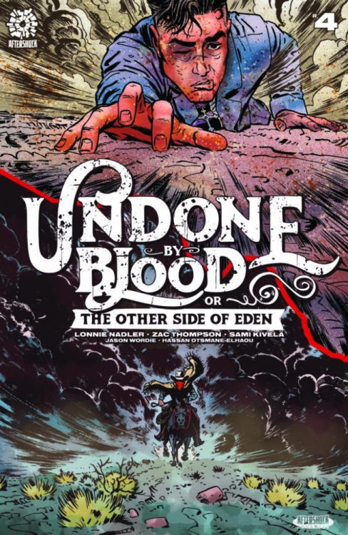
AfterShock Comics Exclusive Preview: UNDONE BY BLOOD OR THE OTHER SIDE OF EDEN #4

undone by blood other side of eden #4 aftershock comics exclusive preview

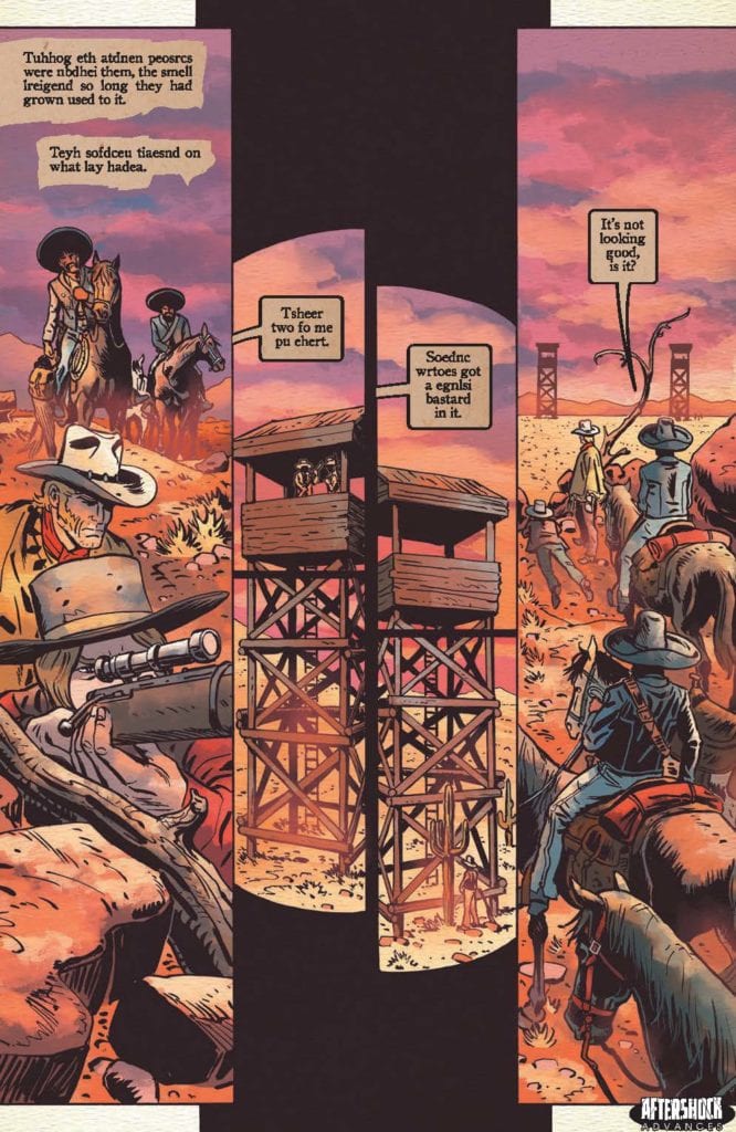
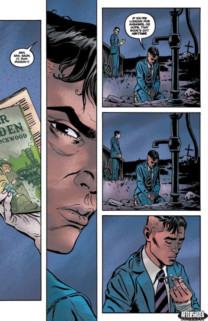
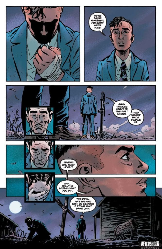
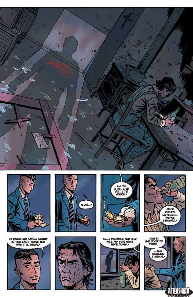
UNDONE BY BLOOD or THE OTHER SIDE OF EDEN #4 hits your local comic book store June 30th, but thanks to AfterShock Comics, Monkeys Fighting Robots has an exclusive four-page preview for you.

About the issue:
In the wake of tragedy, Silvano makes his way across the border only to discover that nothing ever works out quite the way we expect. Meanwhile, Solomon Eaton makes a border crossing of his own, forgetting his moral compass on the other side.

UNDONE BY BLOOD or THE OTHER SIDE OF EDEN #4 is by writers Lonnie Nadler & Zac Thompson and artist Sami Kivelä, with colors by Jason Wordie, and letters by Hassan Otsmane-Elhaou. The cover is by Kivelä with Wordie.

Check out the UNDONE BY BLOOD or THE OTHER SIDE OF EDEN #4 preview below:

undone by blood other side of eden #4 aftershock comics exclusive preview

undone by blood other side of eden #4 aftershock comics exclusive preview

undone by blood other side of eden #4 aftershock comics exclusive preview

undone by blood other side of eden #4 aftershock comics exclusive preview

undone by blood other side of eden #4 aftershock comics exclusive preview


Have you been reading UNDONE BY BLOOD from the start? Sound off in the comments!

Monkeys Fighting Robots Youtube

Review: BUFFY THE VAMPIRE SLAYER #26—New Frenemies

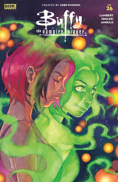
If we learned anything from Ghostbusters, it’s that you should always look out for demonic dogs. That demon dog might actually be your best friend. Available now from Boom! Studios, Buffy the Vampire Slayer #26 deals with the immediate aftermath of last issue’s ’90s multiverse weirdness. Returning writer Jeremy Lambert teams up with new illustrator Marianna Ignazzi of An Unkindness of Ravens fame. Also returning are colorist Raul Angulo and letterer Ed Dukeshire.

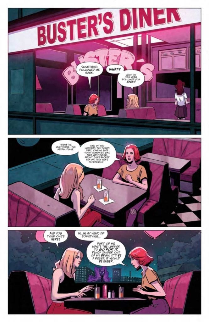
The previous issue gave us only a sampler for what messing with the multiverse can do. Now Willow’s got a ghost demon dog stalker, Anya’s true motives are up in the air again, and the art style has reverted us to the ’60s. It’s a whirlwind for sure, but the basic plot keeps us trucking along with the Scooby Gang.

Lambert’s pace speeds up and slows down, seemingly as dictated by page count. Twenty-four pages may sound like a lot in comic book terms, but it hardly gives readers time to breathe, let alone the characters. Is this entirely a bad thing? No, the fast pace keeps things exciting. However, for the long-time reader, it’s like speeding down a scenic route. How are we supposed to immerse ourselves in the world and characters when we spend the movie equivalent of half a second on getting real?

Artistic Differences

Despite my frustrations over the fast pace and plot focus, I believe Lambert does his best in striking the right balance within the constraints. We still care about these characters, and the plot is strong enough to sustain readers long-term.

On the illustration side, Pinti’s ’90s style character design is out and replaced by an older, late-1960s look by Ignazzi. What this means is everybody looks vaguely like a Hanna-Barbera cartoon character. This is a fun change, but the style falls short in recognizing Ethan and Wesley. I had to do a double-take because the face shape or hair wasn’t quite what I was used to. Nonetheless, the new style adds to the sense of warped time and space in the multiverse.

Lurker
WILLOW’S GOT A NEW DOG (AND STALKER)

Colors and lettering follow Ignazzi’s ’60s style in their own way. Angulo uses less purple, red, and blue than usual in favor of dull brown, gray, and black, which signal the issue’s sinister tone. The darker colors are also practical as this issue involves less action and more sit-downs in offices and the like. Moreover, these less saturated colors contribute to the dusty, ’60s color TV look.

Looking Sharp

Letter Dukeshire uses small tweaks to great effect. He uses SFX sparingly but with sharp edges while the dialogue bubbles are mostly centralized to let the eye flow down and naturally leave ample room for action to speak louder than words. Overall, Dukeshire’s lettering is smooth and symmetrical. If I can say one thing on behalf of long-term Buffy readers, I’ll say Dukeshire’s been a reliable constant that makes up for any writing or aesthetic-related inconsistencies.

We may not have seen much of the multiverse, yet we know its effects are here to stay. But multiverse hiccups are only one of many obstacles on the way to facing the “big bad” that Anya’s been teasing. Is it the mayor, perhaps? Or someone else that the council is puppeting? Whatever it is, the Scooby Gang has to overcome their squabbles to fight it. Buffy the Vampire Slayer #26 keeps us on our toes as we look forward to the next reveal.

Monkeys Fighting Robots Youtube

DELICACY: How Passions And Love Can Turn Into Spite

Delicacy Cover

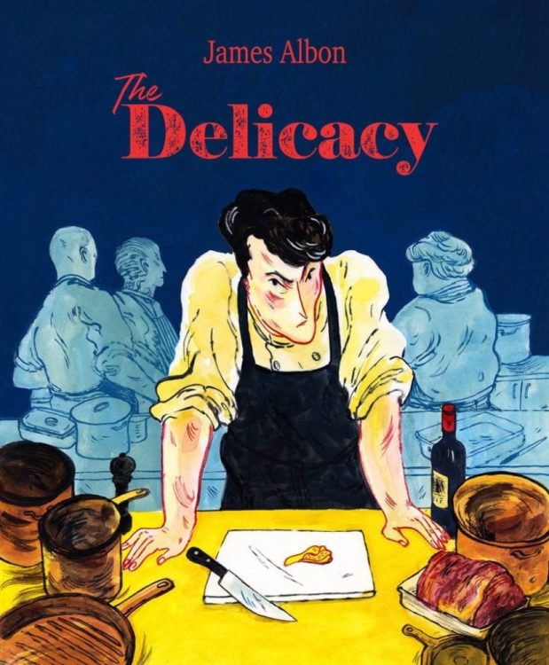
Delicacy comes to comic stores on June 9 from IDW’s Top Shelf imprint. The creator, James Albon, thanks to some food industry insights, crafts a unique tragedy.

Delicacy With A Passion

Albon pulls a lot of influence from some friends in the restaurant and gardening markets to make a believable falling out story. Delicacy is ultimately about peoples’ struggles with hustle culture and how it can ruin relationships. From just the first pages, readers feel a struggle that brothers Rowan and Tulip inherent from their mother and aunt. The reader can’t help but empathize with the brothers as they seem to find a way to live their dreams. Tulip feels torn about his passions as a cook with his dishes’ detail and a restaurant owner’s financial worries. In juxtaposition is how Rowan’s rural lifestyle isolates him. The need for stability genuinely feels out of reach between them.

Innocence Turns Dreadful

Albon illustrates Delicacy like a children’s book that brings about a sense of innocence. The bright colors of some decor match the dishes that Tulip prepares as if trying to match qualities. In this way, Tulip presents to his patrons a sense of joy that he hopes to convey through more than one sense. As the bright colors become more frequent, it begins to evoke a sense of intoxicating euphoria. As if all of the efforts to keep such a feeling going leads to mental degradation. Meanwhile, Rowan’s rural surroundings have tranquil aesthetics that feel comforting. Only to show bitterness with how the brothers’ mother hides anything man-made. Despite both settings trying to push each other away, they hide a mutual ugliness.

Taste The Delicacy And You Won’t Get Enough

Delicacy is one of the best releases to come out this year. The efforts to evoke the main tragedy come off as genuinely authentic. From the attention to detail to character dynamics, this story is one to remember.

Monkeys Fighting Robots Youtube

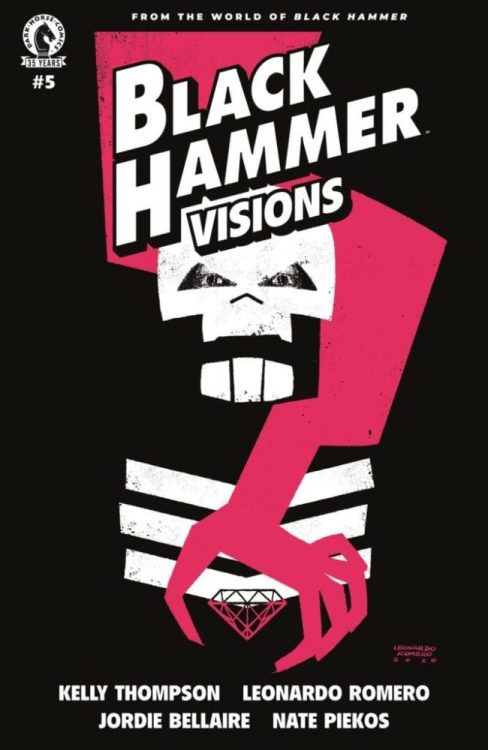
Review: Fun and Death in BLACK HAMMER: VISIONS #5

Black Hammer Thompson Dark Horse

Dark Horse Comics’ Black Hammer Universe has given its take on classic characters like Captain America and Martian Manhunter. Skulldigger and Skeleton Boy showed us the Black Hammer version of Batman and Robin. And with Dark Horse’s Black Hammer: Visions #5, we revisit that little corner of this universe to see what a Batman and Catwoman dynamic would look like in Spiral City. Writer Kelly Thompson, artist Leonardo Romero, colorist Jordie Bellaire, and letterer Nate Piekos tell a tale of fun and death.

Writing

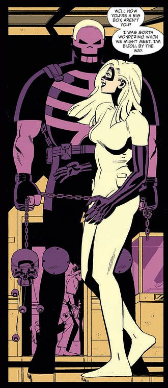
Thompson gleefully shakes up the status quo. In fact, “glee” might be the perfect word for it. We see Skulldigger, living his life as he always has. He’s silent, violent, and filled with rage. But then Bijou comes on the scene. She’s the Catwoman of Spiral City, forever breaking the law and having fun doing it. And so much changes in Skulldigger’s life when he meets her. The writing goes from feeling demure to vibrant. This violent vigilante is having fun, despite himself. But, of course, this is Spiral City. Thompson reminds us that doom is around every corner here. She brings us to joyful heights, just so that the fall back down hurts all the more. It’s beautiful, tragic, and fantastically written.

Art

Romero immediately shows us the life that Bijou brings into Skulldigger’s world. Our first glimpse of Skulldigger is a 9 panel grid where he’s washing his face. While the page is subtle and beautiful, it also feels ordered and lifeless. The very next page, we see a spread of Bijou jumping over rooftops. And from then on, the pages are playful and versatile. Some images work as a backdrop to other panels, some panels are dedicated to a single sound effect. All of it is fun. But as we end the issue, Romero brings us back to the original image. We see Skulldigger looking into the mirror, but it has new meaning to it now. As he opens the door to walk down the stairs, the light behind him casts a crooked silhouette on the wall next to him. It makes it feel as though his life was once ordered, now it’s all out of whack.

Black Hammer Thompson Dark Horse

Coloring

Bellaire uses an extremely minimalistic palette for each scene. When we first see Skulldigger, the whole page is blue. And when he chases Bijou into a museum, the page is colored in different shades of purple and yellow, and that’s it. It’s an interesting approach, because it both sets a mood for each scene and also makes the issue feel very colorful. Sure, individual moments are monochromatic: Bellaire shows entire scenes in green or pink or red. But together, like ribbons on the page, the issue feels vibrant and beautiful. It’s only when Bijou and Skulldigger briefly meet each other out of costume that the page feels colorless. Bellaire shows us that their late night escapades are like a drug to them. It brings color to their life, a color that changes how they see everything.

Lettering

Piekos uses a uniform style in the lettering of this issue. The smash of a window is shown just like the boom of an explosion. The font looks tidy and retro. It makes us feel like these characters are living in some other world. Even the sounds of violence are neat and easy to digest. It’s only right at the end that Piekos adds the slightest variation. With one devastating sound, he adds an exclamation point and capitalizes the first letter. It stands apart from the other sounds of the scene, yet nearly blends together with the other noises of this world. Piekos seems to be showing how those innocuous sounds lead to big, devastating ones like this. And even when devastation happens, it’s hard to tell the difference from the status quo of their lives.


The Black Hammer Universe has always had plenty of fun. But, as a whole, it leans towards dark, philosophical storytelling. This creative team took the grittiest of Black Hammer‘s characters, Skulldigger, and filled his life with fun. It not only works well, this issue really is a lot of fun, but it sets us up for some devastating heartbreaks. Pick up Black Hammer: Visions #5, out from Dark Horse Comics June 9th, at a comic shop near you!

Monkeys Fighting Robots Youtube

ANT #12: Nailing Down A New Status Quo For Developments

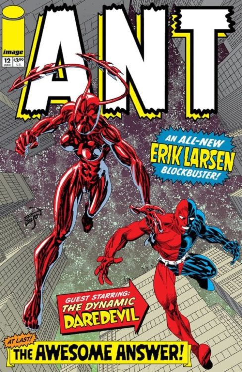
Ant #12 Cover

Ant #12 comes to comic stores on June 9 from Image Comics co-founder Erik Larsen. Joining Larsen in this long-awaited finale is flats artist Mike Toris and letterer Ferran Delgado.

Background

The Ant is a character with a surreal background of publishing rights and backstory. Created by Mario Gully for Arcana Studios, the character is a power fantasy for coping with harsh realities and turning life around. Following Hannah Washington’s alter-ego, she constantly struggles with how her reality shifts. This state all but reflects the behind-the-scenes drama, including premature cancellations. Gully ultimately sells his character’s rights to Larsen after seeing the Savage Dragon creator’s passion.

Ant #12: Ending As A Prologue

Larsen’s plans for Ant #12 is ultimately a slate cleaning prologue for a new series. It’s actually set up kind of nicely for readers not too familiar with the title character. The reader can seem just as confused and frustrated as Hannah is. There’s something big going on, and instead of something big and dramatic, Larsen cleans the continuity slate. Keeping what works like Ant’s enemies and rejecting what doesn’t is vital to starting anew. Without much of the backstory baggage, Ant now shares space with the likes of the classic Savage Dragon.

Part of Something Bigger

To help ease Ant into Larsen’s storytelling, Larsen employs several clever techniques. Ant #12 is a display of anticipative movement where actions have an impact. The way Larsen draws Ant climbing walls and fighting enemies evokes a sense of wonder, and her red costume and visual flair against muted backgrounds adds to the excitement. Which does come with the implication that Larsen put more effort into the coloring details of Ant than anything else. He happens to have help from Toris with basic flats. It also comes with enemy designs and machinery that evoke a campiness reminiscent of Jack Kirby.

That’s all to say nothing of the lettering by Ferran Delgado. Not only do the word balloons, captions, and sound effects match Larsen’s art style, they add to the narrative weight. In a two-page spread with actions going on, the change of speech becomes apparent as one-word balloon changes to another. After the attacks of these characters move with these characters’ speech, the captions going down slows it down. This adds to how heavy Hannah feels in the moment while demonstrating the scale she’s facing.

Keep An Eye Out For Ant #12

Ant #12 will be a satisfying read for people following this character and be a good introduction for new readers. With Larsen taking creative duties, this prologue will give readers something to look forward to.

Monkeys Fighting Robots Youtube

Review: FISHKILL VOL. 1 — Schlock, Pulp, And A City Of Blood

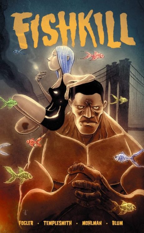
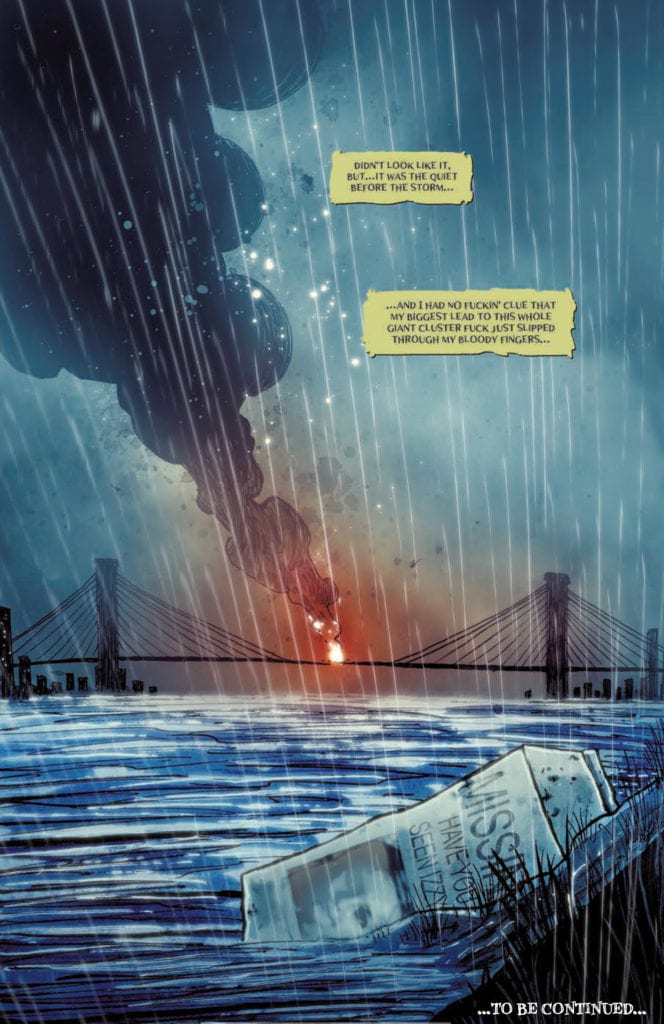
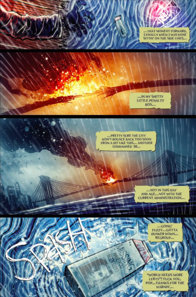
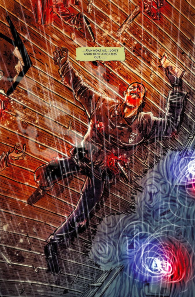
From writers Dan Fogler and Laurence Blum and artist Ben Templesmith comes a bleak, brutal, and madness-filled look at a NYC militarized disaster zone through the lens of a slightly insane, somewhat addled detective in Fishkill Vol. 1 from Heavy Metal publishing. This over-the-top neo-noir is an assault on the senses, grabbing the reader by the shirt collar and dragging them along in a manner that evokes Miller’s Sin City and the best 2000 A.D. Dredd stories. Although this comic comments on some pretty questionable subjects and can’t quite hold all of its narrative quips together, it’s got enough style and atmosphere to make this volume a rough-edged winner that demonstrates the kinds of stories that can only be told in the comics medium.

A love story wrapped in a modern noir that takes our hero down the conspiracy rabbit hole where he starts to question his own sanity. FishKill is a love story wrapped in modern noir that takes our hero, Detective Bart Fishkill, so far down the conspiracy rabbit hole that he starts to question his own sanity, even to the point of wondering whether if he isn’t the villain in the first place.

Writing & Plot

Dan Fogler and Laurence Blum’s scripts for Fishkill Volume 1 are a motley mix of clichés, unhinged dialogue, and even bits of rhyme and verse that make these issues a familiar but still grotesquely enthralling read. The plot unravels through the murky perspective of our protagonist Bart Fishkill, flavoring the story with a sort of nonsensical madness that rumbles along on its violent trajectory through the comic’s dystopian events. The way the narrative builds is reminiscent of Marv’s story in Sin City, and the state of New York City in the story fuels that further. Fishkill himself is a unique protagonist for a neo-noir in how he finds himself being propelled through the story. He doesn’t have Marv’s sinister drive, nor the surprising intelligence of Eric Powell’s The Goon (another obvious influence on the comic), but is instead carted along by his mental imaginings(?), unable to fully grasp what is going on in his life or to his city as it falls into an authoritarian regime. Fogler and Blum’s writing comes across as noise, with a dozen sounds and clues going off at once and leaving the audience — along with Fishkill himself — to figure out just what the hell is happening here. The scale of the events going on beyond Fishkill’s grasp makes for a head-spinning but enticing read and the dark fall of a city is entertaining in a disturbing way.

Not everything here is a complete win, though, as there are enough awkward and questionable bits to throw off the pacing. Some parts seem to leap out of the story as paranoid preaching rather than just pieces to a puzzle. There’s also a young girl who tags along with Fishkill a couple of issues in, and how she’s handled is a bit questionable — and more than a little off-putting. This is not a book of subtlety, and there’s no requirement that it has to be. However, such a tool can work in a story’s favor, especially when you’re trying to handle hard moral no-go topics. This all being said, this comic has such a unique flavor to its narration and dialogue that it warrants giving it a go on its script alone.

Art Direction

Fishkill volume 1 is blessed with the unmistakable style of Ben Templesmith’s artwork. His unique visuals swing between caricature and immaculate detail, all while maintaining a consistent tone and quality within the book. The grimy and fog-covered New York descends into dark chaos in dementedly beautiful fashion, with art that is somehow both over-the-top and subdued. Fishkill himself is a hulking mass of a man with insane proportions and an equally ugly mug; in other words, a perfect protagonist for a dark neo-noir tale. The various villains and side characters look like your bog-standard heads of conspiracy types but are menacing enough to be memorable. Templesmith takes his dark and beautiful style to the architecture, with its landmarks displayed in a dour and ironically oppressive manner to match the regime that has come of the story’s conspiratorial acts, and they show in the background of the small streets and apartment building where faceless and heavily armed police carry out their work. Templesmith’s hazy style here makes the uncertain reality of Fishkill’s perspective all the more believable and effective as well, with specters of memory popping in and out of the story in a way the comes off as surprising (as it should) but also fitting. It adds more uncertainty to the comic’s already shaky reality.

Templesmith also handles the lettering, which comes out as varied and stylized as the rest of his work. Fonts swing wildly from character to character, from scratchy scribblings cursive prose to other fonts I’ve never even seen in a comic before. There’s nothing familiar or formulaic about the letters here, which may bother some but honestly is a welcome sight. He uses the sing-song and rhyming recitations as an excuse to use a lot of lettering styles, and it works pretty damn well. This is a fantastic-looking comic, with a visual style that stands amongst its peers and stands out from the rest of the crop.

Fishkill Vol. 1 is a knockdown, drag-out, grimy, and gritty neo-noir comic book that wears its influences on its sleeve while still staying original and interesting in its own ways. Fogler and Blum’s writing questions the reliability of the story’s own narrative and tosses you down a conspiratorial rabbit hole. There are certainly some bumps and questionable turns in the road, some of which detract from the book’s enjoyability, but this stays a solidly written experience through these first 4 issues. Templesmith’s art is a brilliantly macabre revelation, with a sort of uncanny beauty in its unorthodox character designs and intelligent direction. This is a delight of a neo-noir story, and if you’re a fan of the genre, you owe it to yourself to pick up this first volume, available now!

Monkeys Fighting Robots Youtube

Review: RORSCHACH #9 Invites Us Deeper Into the Madness

Rorschach King DC Comics

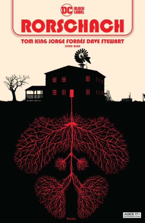
DC Comics’ Rorschach is turning out to be one of its most experimental titles. Writer Tom King, artist Jorge Fornes, colorist Dave Stewart, and letterer Clayton Cowles are always finding new ways to push the plot and medium in new directions. DC Comics’ Rorschach #9 takes some of the ongoing concepts of the series and uses them in their simplest forms.

Writing

King brings us back to the house that was discussed in the last issue. He shows The Kid and Rorschach as they train and talk there in the past. But he also shows us the detective that’s piecing this all together in the present. He walks through the property, looking for clues of what might have gone on. King shows us what Rorschach and The Kid said to one another, but the detective mostly stays silent. In a way, we begin to see the detective’s own similarities to Rorschach. And just as we begin to connect the two in our minds, King adds another element to the detective’s life. An element he accepts calmly and without pause. In fact, it leads him to talking through what he’s seeing out loud. It’s an unsettling thing that happens, yet it makes him feel at home. It speaks volumes about his character.

Rorschach King DC Comics

Art

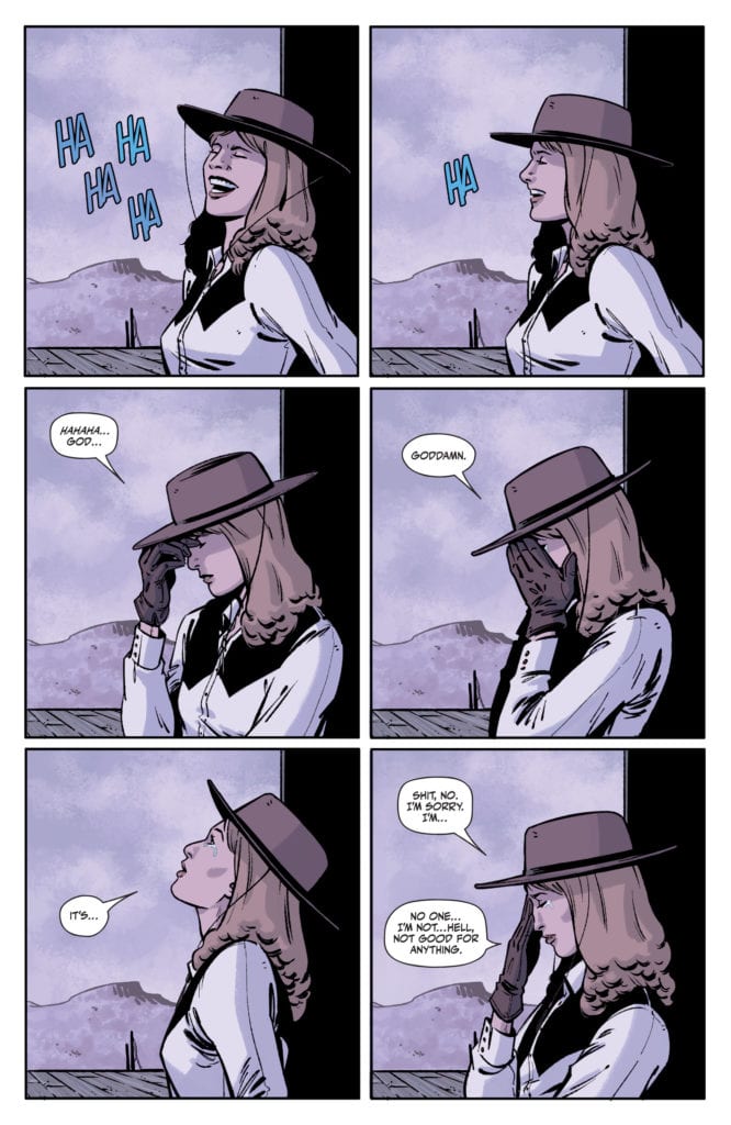
Fornes makes a point of slowing down the pace in this issue. Fornes shows us multiple versions of what feel like the same moment. We watch Rorschach walk through the house, and on the other half of the page we see the detective do the same thing. They’re different characters, at different times, but their actions and movement are the same. But Fornes also shows us small changes from one panel to the next on some pages. When Rorschach tells the Kid he thinks she’s a good shooter, Fornes gives us 6 panels to show her reaction. She seamlessly goes from laughing, joyfully, to crying at her own ineptitude. This issue feels incredibly slow, but it mirrors the gradual descent into madness that the characters are feeling. Fornes pulls the pacing back, so we can feel just as the characters do.

Rorschach King DC Comics

Coloring

Stewart’s approach to this issue is refreshingly simple. He uses a straightforward color palette for the detective’s scenes, with an emphasis on yellow. These scenes show the detective walking through the house in the light of the day. He sees everything as it is, with no filter and no distortion. But the scenes with Rorschach and the Kid are shown through a purplish-blue haze. It has the look of watching a surveillance tape off of an old TV screen. It adds to the feeling that the detective can almost see into the past, that he is somehow privy to the same information we are. And so, Stewart’s coloring brings the walls down between these scenes. It acts as a marker for which scenes are present day and which are in the past, while simultaneously making it feel like a character can look from one time into another. How Stewart is able to do these seemingly contradictory things, and so simply, is anyone’s guess.

Lettering

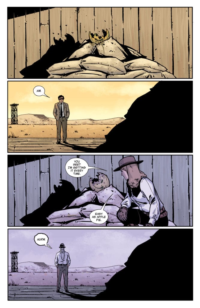
Cowles lures us into thinking of Rorschach and the detective as one and the same. The “Hm” of the detective is placed in the exact same part of the panel as Rorschach’s “Hurm,” two panels later. The same is true when they each use the phone. We see it from the same angle and their dialogue is placed in the same spots. And as the issue comes to a close, Rorschach sits down with the Kid at a table, grabs her hands and says “It will be good.” We see the detective sitting at that same table just a panel later. He looks down at the same spot where the lettering was a second ago, but nothing’s there. Just like Stewart, Cowles blends these times together and visually shows us how one time informs another.


Rorschach continues to be a fantastic series. The fact that it has the power to do jaw-dropping issues like issue 7 and simple, quiet, slow issues like this one, shows its incredible range. Pick up DC Comics’ Rorschach #9, out from DC Comics June 8th, at a comic shop near you!

Monkeys Fighting Robots Youtube

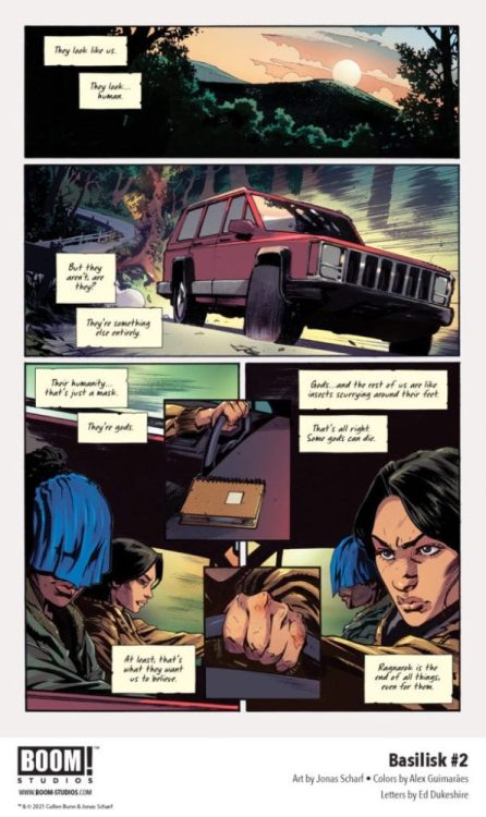
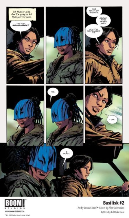
Exclusive Preview: BASILISK #2 From BOOM! Studios

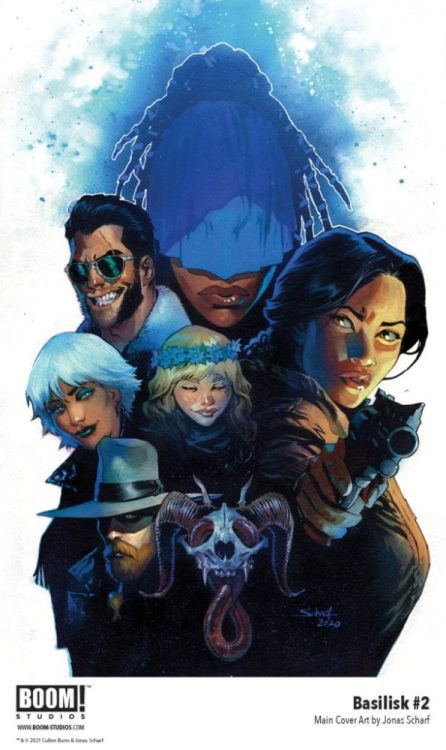
Exclusive Preview: BASILISK #2 FRom Boom! Studios

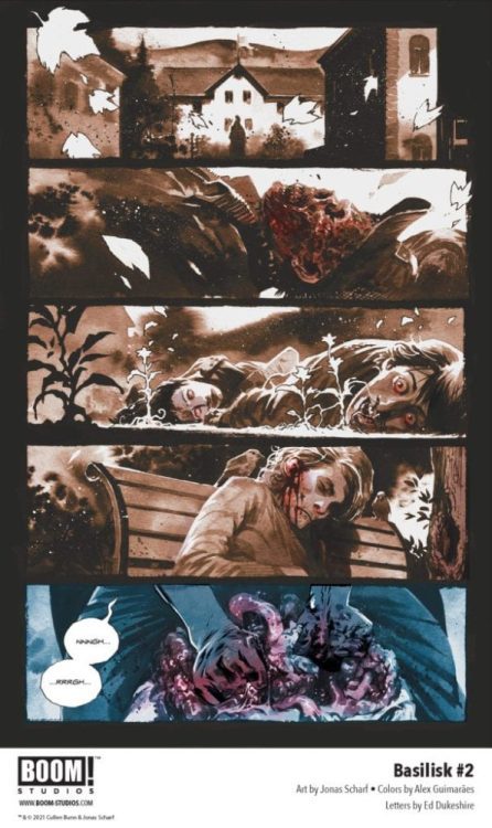
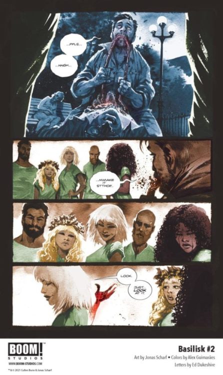
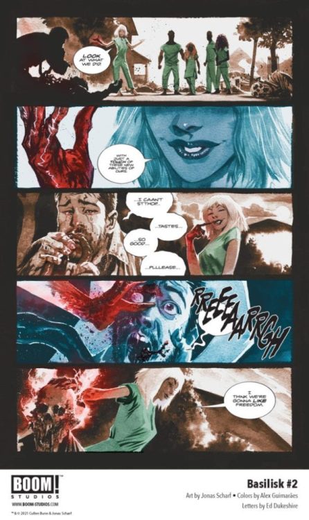
BASILISK #2 hits your local comic shop on July 7, but thanks to BOOM! Studios, Monkeys Fighting Robots has a five-page preview for our readers.

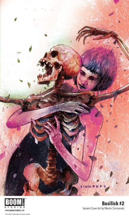
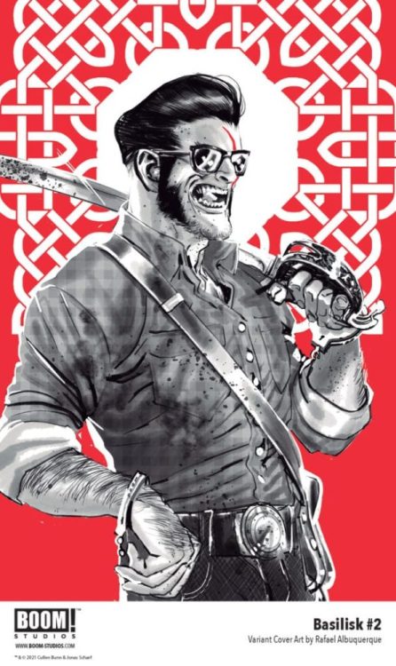
The supernatural horror series is written by Cullen Bunn, with art by Jonas Scharf, Alex Guimarães drops the colors, and you will read Ed Dukeshire’s letter work. The main cover art is by Scharf, and the variant covers are by Martin Simmonds and Rafael Albuquerque.

About BASILISK #2:
Is redemption possible if it is coerced? Forced to confront the horrors of her past, Regan hits the road with Hannah – a victim from her past – who has her own set of secrets. Meanwhile, the other four remaining members of the Chimera find themselves tired of hiding from the world and move to reignite their reign of terror and death.

Check out the preview below.

Monkeys Fighting Robots Youtube