Home Blog Page 14

Review: BLOOD TYPE #1 — A New Vein Of Horror For EC

Blood Type #1 Cover Credit: Oni Press/EC Comics

Imagine being an outcast, feared by those around you, and stuck on an inhospitable island where you are hunted, where even the sun could kill you? That is (kind of) the premise behind the new Oni Press/EC comic Blood Type, written by Corinna Bechko and illustrated by Andrea Sorrentino. Blood Type is a landmark for the EC publishing line, because it is the first serialised story that the publisher has ever produced. Moving away from short, one-off stories in anthology comics, Blood Type is a miniseries with an extended story over several issues. The comic promises the “Terror in a Jugular Vein” that the readers have come to expect from EC, but just more of it.

The story is actually a continuation of an entry written by Bechko and illustrated by Jonathan Case for issue three of Epitaphs from the Abyss. In that short, the feisty central character Ada runs from a screaming mob and stows away on a luxury yacht that is hit by a terrible storm. Over the course of five days, stranded on a lifeboat in the middle of the ocean, the survivors keep themselves alive by drinking each other’s blood. Ada is the one to suggest this course of action because her survival is paramount to her and, in the very first panel of the story, she is introduced as a blood sucking vampire.

Epitaphs From The Abyss #3 Cover
Credit: Oni Press/EC Comics

That initial story, and this first issue of the follow up, focuses on Ada and her adventures as she is chased, at first, out to sea, and then eventually stranded on a hot, vacation island amidst holiday makers and local superstition. Bechko uses the first section of the story to give the reader some insight into Ada’s powers and needs. This leads into the vampire’s exploration of a new landscape and its inhabitants. Because the reader follows Ada, she becomes almost sympathetic, and the problems she faces just trying to survive create the drama of the story. The first issue of Blood Type leans more into creating this sympathy for the character than the initial short story. In Epitaphs from the Abyss, Ada was a nameless blood sucking party goer who happened to find herself in an awkward predicament. There is no reason for the reader to care particularly for her or those she encounters. In Blood Type #1, the stakes seem higher, as the reader is presented with a more rounded character whose survival is in jeopardy, and the creators attempt to make us care about the vampire’s life.

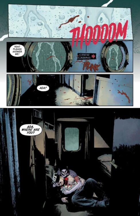
A large portion of Bechko’s script is engaging, especially around the character of Ada herself. Bechko gives the vampire a distinctive voice that creates a layered character who is brimming with attitude and cockiness, but there is—in moments—a vulnerable side to her. Unfortunately, this characterisation doesn’t stretch to all of the extras within the story. The opening sequence with the ship reads brilliantly and the tragedy that befalls the crew is evident. Despite some dark humour, the reader is actually conflicted between cheering for the primadonna vampire and the lives of the sailors. However, when Ada’s adventure moves to the island, not all of the characters are as well managed as the protagonist, with it becoming difficult to understand what some of them are doing and why they are doing it. Part of the issue lies with the layouts by Sorrentino, which I’ll come back to, and partly because the narrator, the Grave-Digger, is intrusive in the narrative. It is not always clear when he is present, although an occasional image of the character’s face next to a caption box helps, and the voiceover becomes muddled between the characters. The knock-on effect is that you can’t always tell if someone is talking, if it’s an internal monologue, or if it’s a third person perspective after the fact. Trying to pick this apart ruins the flow of some pages, damaging the character work that Bechko is aiming for. In short, after the Last Voyage of Demeter-esq opening, it becomes increasingly difficult to care for any of the characters, which diminishes the overall narratives effectiveness.

Blood Type #1 Interior Inked Page
Credit: Oni Press/EC Comics

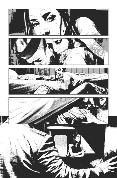
As I have already stated, part of the problem lies with Sorrentino’s artwork. For the most part, the artwork within the panels is excellent. The gritty, heavily shadowed present day on the doomed ship creates the perfect atmosphere for the story. Sorrentino creates a depth to the images that draws the reader in and then repels them with each act of terror. This contrasts superbly with the flashback sequences where Ada first arrived on the ship. In these moments, the line work is very fine, defined but not overdrawn, and there is a distinct lack of shadows. The colouring by Dave Stewart also helps distinguish between present day and the past. He uses dark, heavy colouring for the present where Ada is at her most destructive, and lighter, pastel colours for the flashbacks, when everything was rosier, at least for the sailors.

This contrasting styles continues throughout the comic, with Ada’s present always depicted in the same heavily shadowed way, and the flashbacks or stories told by other characters appearing in the muted, pastel format. From a storytelling point of view, this is wonderful. It makes the reading simpler and creates a distinct atmosphere between the truth of the moment and the potential narrative bias of the past. You can’t fault Stewart’s colouring or Sorrentino’s draughtsmanship. Where the problems start, however, is on some of the more ambitious pages where the layouts divert from the standard comic format.

There are a couple of double-page spreads where Sorrentino plays with the panel layouts. In the first, he attempts to create a feeling of disorientation as the ship sails into the harbour, but the feeling doesn’t carry over into the narrative at that point, causing a conflict between art and story. The second instance has to be praised for its ingenuity: Sorrentino overlays the main page artwork with a series of small panels, each representing a bat in flight, but unfortunately it makes the reading of the page very difficult. Not only does it make it difficult to follow the flow of the narrative, but it once more does not instinctively relate to the scene. Other than the vampire characteristic of turning into a bat, the narrative does not correspond with the design of the layouts. It looks really good, but does not help the telling of the story.

There are pages where the layouts work more in line with the narrative and still challenge the standard grid format. One such page consists of a single image spread across two pages, with panels picked out using thin white borders. The panels simulate the passage of time across the picture, as the narrative follows a character making her way through the landscape. It helps to show the desperation and hopelessness of the character’s journey because the landscape is all consuming; the single image demonstrates how the woman’s presence doesn’t affect the landscape. It is unchanged by her journey and her ultimate fate. There are other pages that have similarly eye-catching layouts, with some working better than others.

Blood Type #1 Interior Art
Credit: Oni Press/EC Comics

Overall, Blood Type #1 is a fascinating start to a miniseries, and the bold choices made by Sorrentino do succeed more often than they fail. There are some pages that have magnificent page layouts that drift from the norm and work brilliantly for both story and art. The confusion caused by occasional layouts and complicated character captioning isn’t enough to make you stop reading, because the story itself is engaging and draws you in. The opening few pages that link the original short story to this miniseries are by far the best part of the comic. They build character, set the tone, and gives the reader something spectacular to look at. Blood Type is a good dark comedy/horror comic by a team that knows how to play with expectations and against type.

Monkeys Fighting Robots Youtube

Context Is Key: How Racial Intolerance Killed EC

Weird Fantasy #18 published by EC

On Wednesday, April 21, 1954, the United States Senate Subcommittee on Juvenile Delinquency convened to discuss the impact of comics on American society. In the same month, Entertaining Comics (EC) released a number of horror and crime based comics, including issue 41 of Tales from the Crypt, issue 36 of the Vault of Horror, and issue 14 of Shock SuspenStories. In the latter comic, there is a story about a young girl who kills her father and frames her mother so that she can go and live with her favourite aunt.

The fact that EC played a big part in the subcommittee hearing was probably not surprising, as they dominated the release schedules of the time with a number of titles covering a variety of genres. In the decades that followed, they have become best known for their horror and crime comics, but EC also published romance books, westerns, and sci-fiction. And it would be a story published in April 1953, in Weird Fantasy #18, that would ultimately lead to the demise of EC comics. But it wasn’t the government that caused the problem, or the legions of anti-comic protests across the country, but the comic industry itself and the big, corporate publishers who reigned supreme.

Photograph from the Senate Subcommittee hearing on Juvenile Delinquency

Background

Today, looking back, it isn’t surprising that EC is eternally linked to the Juvenile Delinquency hearings of the 1950s. They are famously known for their shocking horror comics which have survived the test of time thanks to the talented artists who worked on them and the notoriety they have gained. However, when the subcommittee was formed and comics were introduced to the agenda, thanks in part to Senator Estes Kefauver who was eager to make a name for himself, the contents of the comics were only a small part of the inquiry, and it was acknowledged that only a small proportion of the comics in circulation contained questionable material. Part of the hearing was handed over to the infamous Fredrick Wertham, whose testimony, based mostly on his book Seduction of the Innocent, was primarily focused on the superhero and crime genre. It’s also worth noting that Wertham wasn’t the influential figure that history has comic book fans believe. As noted in Shawna Kidman’s Comic Books Incorporated, “Despite Wertham’s role in getting comic books on the public agenda, his ideas were not universally or even widely embraced” (1).

The other infamous testimony at the hearings was of EC owner Bill Gaines, whose cross examination made headlines at the time, and is still a major focus of any discussion about the hearing today. But, just like Wertham, other than making eye-grabbing headlines, his testimony had virtually no bearing on the rest of the hearings. The two of them were figureheads, and surprisingly similar in that neither owned their narrative going into the committee hearings. Kidman says of them, “They were both in opposition to the most powerful forces involved in this controversy, specifically, the bigger companies” (2).

It has been incorrectly insinuated over time that Bill Gaines was the only member of the comic book industry to attempt to defend their industry at these hearings, but he was in fact one of many. The difference is that, while Gaines argues the specifics of physical comics and their contents, the rest of the hearings focused on the corporate aspect of the comic book industry and it was becoming apparent that “the industries distribution infrastructure was breaking down. There was an oversupply problem with physical and financial repercussions, reports of entrenched anticompetitive practices, and souring relationships between distributors and retailers along delivery routes” (3). The comic book industry had to tighten its infrastructure, as well as provide the impression that they were in control of the content of the comics being released. It was this need to streamline that led to the creation of the CMAA (Comics Magazine Association of America) and who implemented the CCA (Comics Code Authority) that would, in its way, lead to ECs demise.

At the time of its creation, Time magazine described the CMAA as a group of “publishers of ‘good’ comics” who “hope to police themselves and avoid being put out of business” (4). In a later statement from Bill Gaines after leaving the CMAA (he was in fact the instigator behind the formation of the association, but that in itself is a long story), he accused them of lacking “sincerity” and using the committee as a “smokescreen to deceive the public” (5). As Kidman explains in her book, “in creating a code of ethics, the other publishers planned not to eradicate harmful comic books, as the publicity claimed, but merely to print deceptive covers with innocuous titles while publishing the same old material inside” (6). It is worthy to note that, before forcing Bill Gaines out, the CMAA was chaired by John Goodman, publisher of Archie Comics, and contained special committee members from National Comics (who became DC) and Atlas (who became Marvel Comics), three of the publishers that would thrive under the new Comics Code.

Title Page of Judgement Day! published by EC

The Comic, the controversy

In 1952, EC published Judgement Day! Written by Bill Gaines and Al Feldstein, and illustrated by Joe Orlando, the story told of an astronaut who was sent to a distant planet to assess if they were ready, as a culture, to join the Great Galactic Republic. Tarlton, the Earthen inspector, is given a tour of the mechanical planet by one of the orange robots. He is shown the city, the centres of diplomacy, and the factories that create everything the planet needs, including the next generation of robots. At first Tarlton is impressed by what he is shown, especially the free enterprise society that they appear to have created. But this opinion begins to change when he asks to go to Blue Town. This is the area of the city where the Blue robots are created and live. It is during this part of the tour that Tarlton realises that the mechanical city endorses segregation between the orange and blue robots. Despite the fact that the factories use the same equipment and designs to create the blue robots, their outer plating is differently coloured and their choices in life are limited. When Tarlton brings this up with his guide, the orange robot makes excuses and falls back on the “this is how it has always been” argument. Ultimately, Tarlton denies the planet’s entry into the Great Galactic Republic and leaves for home, removing his helmet for the first time during the story, revealing a man clearly of African descent.

At the time the comic was published in Weird Fantasy #18, cover dated March/April 1953, it was greeted with positive reviews. The EC offices received a number of letters praising them for such a powerful story. In issue 20 of Weird Fantasy, the publishers printed a letter from Ray Bradbury, whose work was often adapted by the EC writers and artists, which stated: “Judgement Day! should be required reading for every man, woman, and child in the United States. You have done a splendid thing here, and deserve the highest commendation” (7). This high praise was also met in other publications and newspapers. In an editorial for the Chicago Defender published on February 7, 1953, the newspaper praises EC, saying, “when an unusual strip appears which cleverly combines the lure of color and fantasy with educational propaganda, it is worthy of special citation” (8). What is especially important about this is that the Chicago Defender is one of the most successful African American-owned newspapers in the United States. The story was a critical success.

Letters Page from Weird Fantasy #20 published by EC

However, this was pre-comics code, and there was no regulation of the comic industry at that point. A mere two years later and the comic industry landscape had changed. New York magistrate Charles F. Murphy was tasked with enforcing the Comics Code Authority, and he oversaw an office of administrators who reviewed and adjusted every comic that was submitted. In his book The Ten-Cent Plague, David Hujdu examines the organisation behind the code and, more importantly, demonstrates why the Code was so important to the industry, especially the smaller publishers. In the book, Hujdu quotes an anecdote told by Herb Rogoff, a creator who worked for Atlas from the late 1940s:

“Why don’t we just tell them to go foof themselves?” I said. “Oh,” the big boss said, “The printers won’t print.” I said, “Are you kidding?” He said, “No. They’re too scared. They won’t print without the seal, and the distributors won’t ship without the seal. Without the seal, we’re out of business.” (9)

This anecdote is important for two reasons. Firstly, it ties directly back to the subcommittee hearings and the fact that the majority of the inquiry was about the business side of the comic industry. When the CMAA incorporated in September 1954, 26 publishers were signed up, along with 19 companies involved with technical operations and distribution. The seal was more than a sign of moral content, but also a symbol that the comic book—and its publisher—were a willing participant in the industry, a part of the larger team. Secondly, it demonstrates why a publisher like EC would submit their comics in the first place. They needed the stamp of approval in order to get the distribution required to reach the audience. No stamp, no distribution, no revenue.

Final Page of Judgement Day! published by EC

So when the code was introduced after the senate hearings in 1954, EC had to change almost their entire range of comics in order to meet the new rules. For approximately two years, EC and Bill Gaines struggled against the code and the committee that set it up, but the final straw came with issue 33 of Incredible Science Fiction, due for release in February 1956, and this is where all the threads of this article come together. When Incredible Science Fiction #33 was issued for review, EC were told that one of the stories, An Eye For An Eye by Angelo Torres, could not be included in the comic, so the editors needed to find a replacement. The story chosen was Judgement Day! It had been a hit originally and worth reprinting. However, Charles Murphy initially rejected this story as well. Allegedly the comic was rejected on the grounds that the story humanized its black protagonist, and Murphy insisted that the central character had to be changed to a white man in order for the story to go to print. Gaines and Feldstein argued with Murphy on the telephone, almost screaming that the judge was missing the point of the story, until finally Murphy relented by asking that the sweat be removed from Tarlton’s face. This was too much for both Gaines and Feldstein who threw obscenities at the telephone before hanging up. They went on to print the story anyway, as originally drawn, and it turned out to be the last EC comic published. The experience had soured Gaines enough to withdraw from the comic book industry. After the release of Incredible Science Fiction #33, EC stopped producing comic books. There was a short period of picto-fiction books, which were heavily illustrated, but these lost money so Gaines eventually moved his entire focus onto Mad Magazine, a publication that fell outside of the Code’s remit.

Incredible Science Fiction #33 published by EC

Conclusion

While examining this part of comic history, Shawna Kidman writes “Feldstein himself later acknowledged that Murphy’s response to his story was basically ‘illogical’ and ‘had nothing to do with the code.’ The dispute was really about business” (10). This idea is backed up in Paul S Hirsch’s book Pulp Empire where he discusses the changing face of comics in the mid 1950s. Hirsch notes that, after the introduction of the code, most crime and horror comics disappeared and were replaced with a new generation of superheroes, all coming from the same few publishers who had, in the forties, made their name with superhero comics. These same companies had seats on the special committee with the CMAA, and owned the printing and distribution companies that decided what comics got published and sent to retailers. Hirsch also points out another disturbing trend in the new comics: “Comic books, never flush with non-white characters, also became ‘whitewashed.’ The code banned racist imagery, and as the comic industry had little interest or practice in providing nuanced, sophisticated non-white characters, it responded by eliminating nearly all of them” (11).

In an attempt to publicly clean up the comic publications, the CCA actually provided the opportunity for the most powerful publishers to dictate their own morals and standards and shut out any other voices. This led to a comic that challenged segregation, and the inherited racism within society, to be technically banned for not meeting a perceived level of good taste. But beneath that, at the true heart of the matter, the companies in charge wanted to limit the competition and control comic book distribution. The CCA was a front used to demonstrate to the United States Government that the industry could regulate itself, while a few publishers maintained the corporate monopoly. This attitude can be seen later in the 1960s with the rivalry between the two big publishers DC and Marvel (12), but in the 1950s it meant that small, independent, and creatively challenging publishers just didn’t stand a chance. Bill Gaines recognised this during his fight over the reprinting of one of the best comic stories that EC had ever produced and he knew it was time to leave the business.

EC produced some grotesque and violent comics, there is no doubt about that, and the call for some regulation about the sale of such comics is understandable. But they also produced some of the best stories ever printed, from a creative and sociological point of view. It is no wonder that the big corporations would be concerned, even afraid, of such competition. It also explains why a comics authority would go to any lengths to subjugate a small publisher, even go as far as attempting to ban one of the most important comic stories of the 1950s that dealt with racial intolerance.


References

1 – from Comic Books Incorporated by Shawna Kidman pg 57
2 – from Comic Books Incorporated by Shawna Kidman pg 63-64
3 – from Comic Books Incorporated by Shawna Kidman pg 49
4 – quoted in The Ten-Cent Plague by David Hajdu pg 293
5 & 6 – from Comic Books Incorporated by Shawna Kidman pg 68
7 – from Weird Fantasy #20 published by EC
8 – quoted in EC Comics: Race, Shock, & Social Protest by Qiana Whitted pg 132
9 – from The Ten-Cent Plague by David Hajdu pg 310
10 – from Comic Books Incorporated by Shawna Kidman pg 69
11 – from Pulp Empire by Paul S Hirsh pg 266
12 – see Slugfest by Reed Tucker for a detailed look at the publication and distribution of Marvel and DC comics in the 1960s

Monkeys Fighting Robots Youtube

Review: THUNDERBOLTS* — Marvel Finds Its Focus

The Marvel Cinematic Universe post-Avengers: Endgame has been a somewhat chaotic and divisive era among fans. Between real-life tragedies and scandals causing narrative shifts in the MCU’s larger plan, as well as complete fatigue from Marvel enthusiasts and more casual viewers, it seemed that Marvel had a lack of direction to address. Thunderbolts* gives hope that Marvel is finally back on track, narratively speaking. This is not to say that Thunderbolts* has been the only great product Marvel has put out since Endgame, but as far as the world-building and thread connection that Marvel has prided itself in creating since Phase 1, Thunderbolts* is easily their most thought-out and well-set-up project of the post Endgame era.

The movie works in a variety of ways, the first of which being the team dynamic. All of the pieces of the Thunderbolts puzzle work really well together, due to a sort of joint trauma. It’s an interesting juxtaposition from the original Avengers team, where unlikely albeit heroic people joined together to face a threat for the sake of humanity and peace. These Thunderbolts are a group of misfits, some of whom have given up entirely on the concept of heroism, and are more focused on just living their everyday lives. When they finally do band together, it is not the idea of saving humanity or the city that drives them: It is to rescue a friend, who is falling into the same darkness they recognize so well.

The film is co-written by Eric Pearson and Joanna Calo, who crafted some of the most naturally funny dialogue Marvel has created, without being hammy. While the film has intense action and great fights, it’s the quiet moments that speak the loudest, and it was these small conversations and interpersonal moments throughout the film that quickly gave heart to all of the characters.

One of the highlights of the movie is Florence Pugh’s Yelena. She carries the tone of the film with every word she speaks, and while the whole ensemble does heavy lifting, watching her grow throughout the film as slivers of her heroic potential seep out, it makes me sure that Marvel is setting her up to be the face (and heart) of this new era.

Thunderbolts* is the first MCU film that made me glad I watched its supporting Disney+ shows. Having the background on Wyatt Russell’s John Walker felt crucial to me. He was one of the more showcased characters, and they did a great job here of cleaning him up a bit from his fall in Falcon and the Winter Soldier without making it seem like he changed entirely. He is still cocky, bitter and rash, but you can see the moments that made the government consider him as Captain America.

Overall, Thunderbolts* is heartfelt and heroic. It makes you root for these people, not because they are godly, super, geniuses, or even that capable, you root for them because they are trying, just so hard to be a little be better than they were, and in turn lifting each other in the process. The MCU has started a new roadmap with this team, and I am very excited to see where it leads.

Monkeys Fighting Robots Youtube

Review: ROBOWOLF #1 — The 90s Are Back In Action

From writer/artist Jake Smith (Godzilla: War for Humanity) comes RoboWolf, an action-packed, neon-colored nostalgia fest published by Dark Horse Comics. RoboWolf follows, you guessed it, RoboWolf, a robotic wolf who leads a gang of bank robbers in the city of Sunset Hills. This first issue opens up the story with literal guns blazing and an impressive array of characters and settings with so much 90s influence, you’ll want to pound Surge soda, neglect a Tamagotchi, and sit way too close to the TV on a Saturday morning.

WRITING/STORY

RoboWolf isn’t really one story; it’s more like four stories in a trench coat trying to sneak into the arcade. It immediately throws out so much information, silly lines, and at least five separate backstories that you have no idea which way anything can go. It’s absolute lunacy from the first page, and it should feel disjointed, but it doesn’t. You end up caring about RoboWolf, his daughter, their luxurious beachside condo, his weird past with a Russian general, and even why RoboWolf’s wheelman has a floating skull for a face and used to work with a two-headed man. All of these elements, strangely enough, work in perfect tandem, perhaps because Smith has amped up the weirdness so high that it all feels fitting.

The writing here is also masterfully hilarious and over-the-top. The clear use of action movie one-liners, product placement, and witty puns also continues the pre-established nostalgia flair that runs alongside every page of this comic. RoboWolf works well as even in the most emotional or high-octane moments the comic has to offer. It never once allows itself to stop hammering the reader with silly jokes or intentionally corny monologues worthy of fold like Cobra Commander or Skeletor.

ART DIRECTION

If you could somehow impose an audio volume onto a printed page, RoboWolf would be loud. It’s got popping neon colors with every single page, keeping with the 90s theme. The opening pages are reminiscent of an arcade machine opening sequence, where you find out what the story is before you can pound bad guys. The colors are hardly ever muted, and the pages are often riddled with oranges and reds, showing the hilariously obvious reference that they reside in ‘Sunset’ Hills. Though these colors make it extremely easy to track characters on screen and follow the impressive amount of detail on every panel.

The characters are all designed very in theme with the comic, and each one feels like they were plucked straight from a Teenage Mutant Ninja Turtles writing room floor. This is not to say they don’t feel unique in their own ways, but rather to compliment how well these brand-new characters feel so familiar immediately upon appearing. There’s obviously heavy influence and spoofing happening here, but RoboWolf never allows it to be hacky or uninspired. One stand-out to me in this comic was the lettering, which really brought all of the elements of the comic together. The lettering seems to invade the page at times, it’s so overtly drawn and large, with ridiculous sounds like “ka-shatter,” “buddabuddabudda,” and “shrasplort” that really accentuate the action, but also allow even the most gruesome scene to feel irreverent and funny.

VERDICT

RoboWolf is a rare comic that crams every page so absolutely full of information, color, goofiness, and character, yet somehow doesn’t feel overwhelming. As a reader, you follow these insane lines spoken by these bizarre characters you’ve never been introduced to, and somehow it still makes complete and utter sense in this world. After the first few pages, I was concerned that this comic may have leaned too much into its 90s nostalgia, making it difficult to craft its own identity. I am happy to have been dead wrong in that regard. Smith weaved with familiarity by taking these familiar shapes and concepts and allowing them to feel fresh and unique, which resulted in this first issue of RoboWolf being an absolute success.

Monkeys Fighting Robots Youtube

TV Review: DOCTOR WHO — THE INTERSTELLAR SONG CONTEST

The sixth episode of Doctor Who’s fifteenth series coincided with Eurovision 2025, which is used as an inspiration for “The Interstellar Song Contest.”

The Doctor and Belinda land on a space station/arena just as the Interstellar Song Contest is about to start. The pair decide to stay, but their visit is disrupted by a terrorist attack committed by an alien called Kid (Freddie Fox).

Doctor Who can be a campy show, especially during Russell T. Davies’ first time as the showrunner, and Eurovision has been seen as the carnival of camp, so the two seem like a perfect match. It wouldn’t be the first time Doctor Who has made a sci-fi fantasy twist to real events like the voyage of the Titanic and popular British TV shows like Big Brother and The Weakest Link. “The Interstellar Song Contest” did lean into some campy aspects: the presenters Rylan Clark and Graham Norton had cameos, and the episode did highlight the crowd, scale, and elaborate costumes. People who hated “Space Leia” in Star Wars: The Last Jedi will hate what The Doctor does with a confetti cannon.

The episode’s writer, Juno Dawson, described “The Interstellar Song Contest” as Die Hard meets Eurovision. That was an apt description since the episode had a Die Hard setup, although it was condensed for a 45-minute runtime and had much less action (The Doctor has never been an action hero). “The Interstellar Song Contest” was a restrictive episode, even with all the CGI spectacle. An intended consequence was the episode reminding me of the Rick and Morty episode “Rick: A Mort Well Lived” where Summer had to live through the Die Hard monomyth.

“The Interstellar Song Contest” aimed to give villains some depth. Kid and Wynn (Kiruna Stamell) were Hellions, horned humanoids who were discriminated against because of rumours they destroyed their home planet. Wynn’s boss in the control room pointed out that she took a chance hiring a Hellion since no one would hire Hellions. One Hellion had to mutilate itself to hide their true identity. There was more to the story than what the public believed, and it explored typical themes for Doctor Who regarding racism and corporate exploration. Kid was a radicalized fanatic who wanted brutal revenge, but the rest of the Hellions were more sympathetic. Hellions were meant to be a stand-in for displaced people whose homelands have been exploited and forced to take extreme actions, so paralleling recent conflicts. The episode was using The Hellions to take the light-hearted setup down a more serious route.

The other aspect of the episode was the character development. The relationship between The Doctor and Belinda has been key during the season. Belinda was forced into adventuring with The Doctor, but as the series progressed, she enjoyed the adventures and started to care for The Doctor. In the previous episode, she rushed to help The Doctor in the barbershop, and in “The Interstellar Song Contest”, Belinda grieved when she thought The Doctor had died. Gatwa’s version of The Doctor has been shown to be a fun-loving character, but in this episode, he showed his dark side when confronting Kid. Gatwa was excellent in showing The Doctor being more vengeful, but it was underdeveloped why Kid would get the brunt of The Doctor’s wrath when he has been in darker places mentally and faced much more dangerous villains.

Finally, the episode had an excellent mid-credit scene and set up the finale. It whets the appetite.

“The Interstellar Song Contest” was a solid if unremarkable episode of Doctor Who. It had strong characterisation whilst it looked at familiar topics and was tonally mixed.

Monkeys Fighting Robots Youtube

Marvel Comics Exclusive First Look: THE VISION & THE SCARLET WITCH #2

marvel comics exclusive preview vision scarlet witch wandavision first look

THE VISION & THE SCARLET WITCH #2 is coming to your local comic book store June 25th, but thanks to Marvel Comics, Monkeys Fighting Robots has the exclusive first look at the issue!

About the issue:
Vision and Wanda deal with the explosive fallout of a spell gone wrong. Will the latest fiasco draw them closer together or further apart? And what will they find on the other side of the Grim Reaper’s mysterious black doors?

The issue is by writer Steve Orlando and artist Lorenzo Tammetta, with colors by Ruth Redmond, and letters by Travis Lanham. The main cover is by Russell Dauterman.

Get your first look at THE VISION & THE SCARLET WITCH #2 here:

marvel comics exclusive preview vision scarlet witch wandavision first look

marvel comics exclusive preview vision scarlet witch wandavision first look

marvel comics exclusive preview vision scarlet witch wandavision first look

marvel comics exclusive preview vision scarlet witch wandavision first look

marvel comics exclusive preview vision scarlet witch wandavision first look


Did you pick up the first issue of THE VISION & THE SCARLET WITCH earlier this week? Sound off in the comments!
Monkeys Fighting Robots Youtube

Marvel Comics Exclusive Preview: DAREDEVIL: COLD DAY IN HELL #2

marvel comics exclusive preview daredevil cold day in hell

DAREDEVIL: COLD DAY IN HELL #2 hits your local comic book store on May 28th, but thanks to Marvel Comics, Monkeys Fighting Robots has an exclusive four-page preview for you!

About the issue:
THE DAREDEVIL HAS RETURNED!

The city is in danger, and a Man Without Fear is once again swinging through the air. He will soon discover that he should have been afraid.

The issue is by storytellers Charles Soule (dialogue) and Steve McNiven (art), with colors by Dean White, and letters by Clayton Cowles. The main cover is by McNiven.

Check out our DAREDEVIL: COLD DAY IN HELL #2 preview below:

marvel comics exclusive preview daredevil cold day in hell

marvel comics exclusive preview daredevil cold day in hell

marvel comics exclusive preview daredevil cold day in hell

marvel comics exclusive preview daredevil cold day in hell

marvel comics exclusive preview daredevil cold day in hell


Did you pick up the first issue of DAREDEVIL: COLD DAY IN HELL? Sound off in the comments!

Monkeys Fighting Robots Youtube

TV Review: DOCTOR WHO — THE STORY & THE ENGINE

After the Doctor-lite episode “Lucky Day”, the Doctor and Belinda return and see the Time Lord go to a new location, Nigeria’s biggest city.

The Tardis lands in Lagos in 2019, and the Doctor sees it as an opportunity to visit his old friend, a barber called Omo (Sule Rimi). When the Doctor arrives at the barbershop, he finds that Omo and his patrons are held hostage by a being called The Barber (Ariyon Bakare), and the barbershop feeds on stories. The Barber wants The Doctor’s stories since he has them in abundance.

“The Story & the Engine” was written by Inua Ellams, a British playwright from a Nigerian background. His biggest plays, The Half God of Rainfall and Barber Shop Chronicles, have focused on African themes and settings, and “The Story & the Engine” gave him a chance to bring these themes to a wider audience. “The Story & the Engine” was an episode that aimed to show Nigerian culture to the masses: oral storytelling, local gods and beliefs, and even African hairstyles. “The Story & the Engine” was the first Doctor Who episode to feature a cast made up of a majority of people of color.

“The Story & the Engine” felt like an episode made during the Chris Chibnall era. During his tenure as Doctor Who’s showrunner, he expanded the show beyond European and American settings. One of the best episodes during his run was “Demons of the Punjab,” which was set during the partition of India, and “The Story & the Engine” borrowed some stylistic images from the episode “Can You Hear Me?” Ellams came from a similar background to the writers who worked under Chibnall, since many were playwrights or were known for writing dramas.

“The Story & the Engine” shared some of the same issues as the affected episodes during the Chibnall era. “The Story & the Engine” was a restrictive episode since most of it took place in the barbershop, and it was a dialogue-heavy experience. This showed the writing’s stage origins, but this made the episode into a long debate. It was hardly compelling TV.

Even though “The Story & the Engine” had a new setting, it revisited ideas that were explored before in Doctor Who. There have been many episodes where entities fed on stories, and The Doctor has lifetimes of them. The Series 7 episode “The Rings of Akhaten” explored those ideas where people had to sing to their sun. The Barber was revealed to be a godlike being, and the Disney+ era has become dependent on godlike villains. The Fifteenth Doctor has already faced four members of the Pantheon of Discord, and The Barber has taken the identity of many trickster gods.

“The Story & the Engine” was a noble attempt to expand The Doctor’s horizon on Earth, but it was lackluster because of its undercooked ideas. The episode did not live up to its potential.

Monkeys Fighting Robots Youtube

Marvel Comics Exclusive Preview: HULK & DOCTOR STRANGE #1

marvel comics exclusive preview hulk doctor strange

HULK & DOCTOR STRANGE #1 hits your local comic book store on May 21st, but thanks to Marvel Comics, Monkeys Fighting Robots has an exclusive five-page preview for you!

About the issue:
TWO DEFENDERS REUNITE FOR A JOURNEY INTO THE PSYCHE OF BRUCE BANNER!

When BRUCE BANNER needs help, he goes to the only doctor who is willing to see him: DOCTOR STEPHEN STRANGE! Travel back to the origin of THE INCREDIBLE HULK with J. MICHAEL STRACZYNSKI and GERMÁN PERALTA as they answer the question: Can you truly change the past?

PLUS: MAY PARKER and AGATHA HARKNESS team up in the most unlikely manner – THE MIGHTY MARVEL MANNER!

The issue is by writer J. Michael Straczynski and artist Germán Peralta, with colors by Guru e-FX. The backup story is also written by Straczynski, with art by Natacha Bustos and colors by Ian Herring. Travis Lanham letters both stories, and the main cover is by Terry and Rachel Dodson.

Check out our HULK & DOCTOR STRANGE #1 preview below:

marvel comics exclusive preview hulk doctor strange

marvel comics exclusive preview hulk doctor strange

marvel comics exclusive preview hulk doctor strange

marvel comics exclusive preview hulk doctor strange

marvel comics exclusive preview hulk doctor strange

marvel comics exclusive preview hulk doctor strange

marvel comics exclusive preview hulk doctor strange


Are you picking up HULK & DOCTOR STRANGE? Sound off in the comments!

Monkeys Fighting Robots Youtube

Marvel Comics Exclusive Preview: THE THING #1

marvel comics exclusive preview the thing fantastic four

THE THING hits your local comic book store on May 21, but thanks to Marvel Comics, Monkeys Fighting Robots has an exclusive six-page preview for you!

About the issue:
THE THING CLOBBERS THE MARVEL UNIVERSE!

Ben Grimm may be the strongest member of the Fantastic Four, but once upon a time, he was just a scrawny kid from Yancy Street. When an unexpected visitor from his past sends him on a search for a missing child, the Thing must unravel the mystery even if that means becoming a wanted man! Get ready to see the Ever-Lovin’ Blue-Eyed Thing versus every super-powered criminal and bounty hunter in New York City!

Writer Tony Fleecs (Stray Dogs) and artist Leonard Kirk (STAR WARS: THE BATTLE OF JAKKU) give a glimpse into the history of the Thing that reminds you why Ben Grimm is the heart of the Marvel Universe…and why you don’t want to let him hear you say that!

The issue is by writer Tony Fleecs and artist Justin Mason, with colors by Alex Sinclair, and letters by Joe Caramagna. The main cover is by Nick Bradshaw and Rachelle Rosenberg.

Check out our THING #1 preview below:

marvel comics exclusive preview the thing fantastic four

marvel comics exclusive preview the thing fantastic four

marvel comics exclusive preview the thing fantastic four

marvel comics exclusive preview the thing fantastic four

marvel comics exclusive preview the thing fantastic four

marvel comics exclusive preview the thing fantastic four

marvel comics exclusive preview the thing fantastic four

marvel comics exclusive preview the thing fantastic four


Are you picking up THE THING #1 next week? Sound off in the comments!

Monkeys Fighting Robots Youtube