Home Blog Page 126

Review: Marvel’s ETERNALS Has A Lot To Say About Humanity

Review: Marvel's ETERNALS Has A Lot To Say About Humanity

Marvel’s Eternals has a lot to say about what it means to be a human. This film brings the visual spectacle you’d expect, but it unpacks a deeper message about humanity. The amount of heart found at its core is what makes Eternals different from other Marvel films. It might not always hit the mark with its humor, but this is another solid addition to the Marvel Cinematic Universe.

Director Chloe Zhao helms this ambitious film that provides a rich lineup of characters to invest in. At times, it can feel as though Eternals wants to juggle too much. The narrative utilizes flashbacks to catch viewers up on the reunion of these immortal beings. However, these glimpses of past events seem to take up more time than the current events. The film wants to establish who the Eternals were and who they are today and it doesn’t always work. Since the characters are so likable, it makes up for the uneven narrative of past and present.


Ryan and Kaz Firpo collaborated on penning this latest addition to the MCU. Eternals stars Gemma Chan, Richard Madden, Angelina Jolie, Salma Hayek, Kumail Nanjiani, Lia McHugh, Brian Tyree Henry, Lauren Ridloff, Barry Keoghan, and Don Lee. These immortal beings that were created by the Celestials reunite to protect humanity against the Deviants. The Eternals consist of Sersi (Chan), Ikaris (Madden), Kingo (Nanjiani), Sprite (McHugh), Phastos (Henry), Makkari (Ridloff), Druig (Keoghan), Ajak (Hayek), Thena (Jolie), and Gilgamesh (Lee).

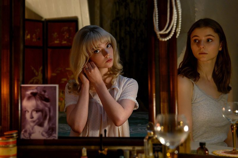
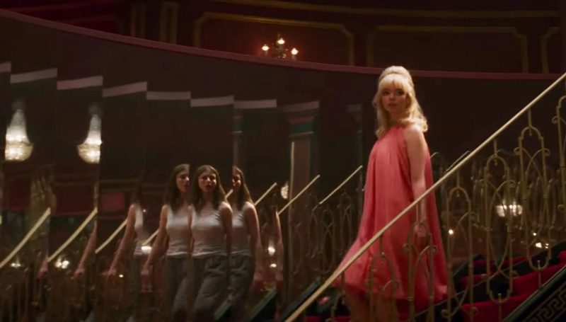
Each character is written in a manner that makes it impossible to not feel invested in their progressions. Sprite, who can project impeccable illusions, desperately wants to be a human. Her entire arc emphasizes the themes of humanity and the importance of cherishing every minute of life. Trapped in the appearance of a child, she struggles to live forever due to her mentality maturing but not her appearance. Sprite was my favorite member because of the inner turmoil that is brought to life through McHugh’s amazing performance.


There are some bits of dialogue from Sprite that lack subtlety, so perhaps Eternals not centering on her was for the best. Sersi (Chan), who has the power to manipulate through physical contact, is portrayed as the film’s focus. While I didn’t find it difficult to relate to her, the other Eternals getting more attention would have been nice to witness. All of the performances are incredible, some more emotionally draining than others. Jolie impresses as Thena, the Eternal with the power to craft weapons out of cosmic energy. Jolie captures Thena’s confidence and inner struggles tremendously.

Eternals does suffer from its pacing towards the middle, the film lasts for over two hours and it will be felt. These characters help keep you engaged, and the breathtaking action sequences assist in that too. The downtime from its blockbuster-worthy fighting is only at its best when exploring the life of Kingo, who is another standout thanks to Nanjiani’s performance. Kingo has made it as a hit actor for many centuries, and his charisma makes him someone you want to see more of. In between though, Eternals does encourage detachment from its narrative with the humor that doesn’t always stick. 


Ramin Djawadi’s score adds weight to the high stakes found in the film’s central conflict. Particularly during Eternals’ final battle to save humanity, which includes some of the film’s most impressive visuals. Marvel has a formula that audiences are used to and I’d say this was a solid change of scenery while still including aspects of previous Marvel films. Eternals was an effective film overall and only lost its footing with narrative and pacing issues.


Monkeys Fighting Robots Youtube

AfterShock Comics Exclusive Preview: MOTHER F. GOOSE

aftershock comics exclusive preview mother f goose

MOTHER F. GOOSE hits your local comic book store December 8th, but thanks to AfterShock Comics, Monkeys Fighting Robots has an exclusive four-page preview for you.

About the issue:
The Three Little Pigs are gluttonous casino owners. Little Miss Muffet is a hard-nosed cop with arachnophobia. The Three Blind Mice are ocularly impaired assassins. Puss in Boots is a feline-faced scumbag. 

Welcome to MOTHER F. GOOSE, where your favorite fairy tales are turned into twisted characters right out of a Tarantino movie. Picking up from “LITTLE RED HOOD” (SHOCK) and “ALONG CAME A SPIDER” (AFTERDARK), we will make you a promise: this is the book that will ruin your childhood. Sorry, kids!

The prestige format one-shot is by writer Frank Tieri and artist Joe Eisma, with colors by Matt Herms, and letters by Carlos M. Mangual. The main cover is by Eisma and Herms; there is also an incentive variant by Amanda Conner.

Check out the MOTHER F. GOOSE preview below:

aftershock comics exclusive preview mother f goose

aftershock comics exclusive preview mother f goose

aftershock comics exclusive preview mother f goose

aftershock comics exclusive preview mother f goose

aftershock comics exclusive preview mother f goose


Are you looking forward to MOTHER F. GOOSE? Sound off in the comments!

Monkeys Fighting Robots Youtube

Marvel Comics Exclusive Preview: SHANG-CHI #6 — Versus Thor!

marvel comics exclusive preview shang-chi thor

SHANG-CHI #6 hits your local comic book store November 17th, but thanks to Marvel Comics, Monkeys Fighting Robots has an exclusive four-page preview for you.

About the issue:
SHANG-CHI VS THOR! For several months, Shang-Chi has reintegrated himself into the Marvel Universe by bumping heads with the likes of Spider-Man, Captain America, Wolverine, the Fantastic Four, and Iron Man. And each time, he has proven to be the unstoppable force his father trained him to be. But his dad never taught him how to defeat a god… Don’t miss the end of the first arc, Shang-Chi vs. The Marvel Universe!!!

The issue is by writer Gene Luen Yang and artist Dike Ruan, with colors by Tríona Farrell, and letters by Travis Lanham. The main cover is by Leinil Francis Yu and Sunny Gho.

Marvel Studios’ Shang-Chi and the Legend of the Ten Rings hit theaters earlier this year, introducing the Master of Kung Fu to the MCU, and was a critical and financial success. The film drops on Disney+ tomorrow, November 12th.

Check out the SHANG-CHI #6 preview below:

marvel comics exclusive preview shang-chi thor

marvel comics exclusive preview shang-chi thor

marvel comics exclusive preview shang-chi thor

marvel comics exclusive preview shang-chi thor

marvel comics exclusive preview shang-chi thor

marvel comics exclusive preview shang-chi thor


Are you reading SHANG-CHI? Sound off in the comments!

Monkeys Fighting Robots Youtube

INTERVIEW: Writer/Director Theo Francocci Became The Demon In NYCTOPHOBIC

nyctophobic-horror-film-interview

Nyctophobic is a horror short film by writer/director Theo Francocci (Rick & Morty) about a woman battling inner demons while real demons, both human and other, run amuck. 

The film begins on a dialogue-less scene that delivers a gruesome reality through creepy camera work, great performances, and an ominous painting hanging in the background. The painting is The Nightmare by Harry Fuseli, and in the short sequence, the film delivers its antagonist, the demon inside the artwork. Alex Knell (Baker’s Dozen) plays Stacy, a woman with a fear of the dark. She’s spending a quiet night with her ex-boyfriend Mark played by Theo Francocci. The dark story plays out between Mark’s tough love and supernatural horrors.

PopAxiom spoke with Theo Francocci about going from being an audio description writer on projects like Rick and Morty and The Royals to creating the horror of Nyctophobic.

Sound & Story

“One of my dreams was to become a singer/songwriter,” filmmaker Theo Francocci begins. “So, I moved to London in 2010 to study sound engineering. While there, I discovered sound design.”

Theo fell in love with creating sound for pictures. “I met the right person at the right time and had the right connections and ended up at Studio Marinelli in Rome, Italy. They were famous sound designers with a massive history working with Fellini, Antonioni, and Leone. Masters of the time. I learned the job there and so much about the history of film.”

“Sound plays such an important role in making a story unique.”

nyctophobic-interview-director-theo francocci

About Nyctophobic

Years, projects, and some film schooling later, Theo conceived Nyctophobic. “It connects to COVID very much. The pandemic made our fears emerge. We were lonelier and surrounded by a world that seemed more hostile. I like to get into the psychology of things, so I reassessed my traumas. That’s where the characters came from; my fear of darkness as a kid. I attached that fear to the protagonist Stacy. That fear of darkness is so relatable; I think everyone had it at some point. It’s profound.”

“So, I asked,” he continues, “‘What if this character is so traumatized that it affects her life; her relationships and work?’”

The process started around October of 2020 while Theo was in school. “We had an exercise to try and describe a scene with dialogue only. No action lines. That was the beginning of their script and the dialogue while they were sitting on the floor.”

The exercise was complete, but Theo “felt that dialogue could be developed more, so that’s what I did. I finished it on Halloween of 2020. I made a pact with myself to start the production and have a premiere by next Halloween.” Mission accomplished.

Making Nyctophobic

“I wanted that scene to be visual and live on those sound effects of the footsteps and the crackling,” Theo says about the haunting opening scene. “It wasn’t complicated to shoot, but it was tricky to get the sensation. So, we worked with the actors to get the movement. Then later in post-production with the sound and camera effects.”

Theo says, “being on set is problem-solving from the moment you arrive to the moment you leave. So, rehearsals are so important for me because I want to get to set and just know that the actors are comfortable with what they’re doing.”

“Delegating and trusting your people is vital,” he continues,” You have to trust the people you’re working with and make sure they trust you and see your vision.”

Theo plays one of the two primary characters in the film. But that wasn’t the plan. “I didn’t want to be the lead. Being the director is already so much work. It’s a lot.”

So, what changed? “I had an actor that I liked, but the timing didn’t work out. He got a better offer for a TV show, so we were happy for him. But it was two weeks before shooting, and I was trying to recast quickly. So, I had a conversation with Matt [Richardson], my co-producer. He said, ‘no one knows the character like the writer.’

“So, I thought,” he concludes, “‘well, this character’s going to have an Italian accent.’”

The star of Nyctophobic went to Alexandra Knell, who Theo says “was perfect for Stacy. She’s got so much experience and talent.”

alex knell-nyctophobic-horror-film

The Creeps

Nyctophobic is the best kind of horror that blends real fears with supernatural frights. It all starts with the painting. “I love that painting; The Nightmare by Henry Fuseli that was there since the script. It gives me the creeps. I fought to have that painting.”

“We got in touch with the LA School of Makeup,” he says about creating the demon’s design, “we had a sort of casting. So we asked everyone to submit what a demon of darkness would look like. We received a lot of incredible designs. But Yun Nam blew us away.”

The final look “had that Voldemort nose but was very much like a scaly reptile for Theo. She understood all that.”

In Nyctophobic, there’s a moment that’s a clear reference to The Shining, “Why not? I love Kubrick, and I wanted to do that as precisely as possible.”

Inspirational Cinema

We discuss cinema worldwide, and Theo shares his thoughts about his homeland “Italian cinema is a lot about style, especially in horror. We’re able to make good movies with very low budgets. It’s a necessity that I think we mastered along the way.”

“Korean films,” he continues, “like Parasite blew my mind. They have a huge history and tradition in films. Now they’ve blown everyone away with Squid Game.”

As for the US, Theo says it “is the driving force of the entertainment industry. Whatever gets made here sells all over the world. I love the direction into more diversity and embracing different styles.”

“It’s always great to let these incredible pieces of art from these incredible places inspire you.”

The art is an inspiration, as are the people creating it. “We spoke a lot about Italian masters, but Roberto Benigni is one of those actors/directors that I carry in my heart. Life is Beautiful is one of my favorite movies ever made.”

“Katherine Bigelow … Strange Days and Zero Dark Thirty were so intense,” he adds, “I love the realism and darkness.”

“Martin Scorsese. I need to say, Jordan Peele. He’s a beast. He can do comedy, horror, whatever he wants. Tim Burton. Christopher Nolan. Ridley Scott. I’ll stop there,” Theo laughs.

Wrapping Up

Asking Theo about a dream project prompts a quick answer. “I wrote a pilot for a TV show last year, and it’s about the death of Julius Cesar. That would be one of my dream projects. I love culture and ancient Rome. Building a set that would be authentic and the costumes. At the same time, having VFX, beasts, animals, ghosts, gladiators. Make it feel like fantasy, but it’s history.”

Nyctophobic is making the rounds at film festivals. So, what’s next for Theo? “I’m always working on something else. That’s how creativity works. You’re focused on this, but your brain is like, ‘but what if we do that?’ So I’m working on another short film called Living in Color.

Is Nyctophobic on your watch list?  

Thanks to Theo Francocci and Lumos PR
for making this interview possible.

Read more PopAxiom interviews from Ruben R. Diaz here! 

Monkeys Fighting Robots Youtube

Review: THE UNBELIEVABLE UNTEENS #4 Is A Charming Yet Predictable Finale

Another chapter of the Black Hammer universe comes to a close with The Unbelievable Unteens #4. Writer and series creator Jeff Lemire and artist Tyler Crook end this mini-series with a charming yet safe. However, with endearing creative choices and outstanding visual work, this chapter is still a worthwhile entry into the Black Hammer mythos.

“Unbelievable Unteens comic book artist Jane Ito finds her world turned upside down after discovering her comic book creations were real and she was one of them. As she and the Unteens reunite and put the pieces together they take on the forces that disbanded them for one final fight.”

Writing & Plot

On the whole, Jeff Lemire’s work on The Unbelievable Unteens has been compelling and intimate, if not just shy of the main series’ quality. This final issue truly encapsulates this. The Unteens come back together for one final bout, they defeat their old foe, and it all end in melancholy. There are some great quiet moments among the main cast. Lemire installs a constant feeling of complicated camaraderie here. Every character feels like a person, with their own quandaries and hidden traumas from what they experienced as a teen superhero team. Watching these people struggle to make peace with themselves and each other is genuinely engaging. This is especially impressive since we’re only given four issues to experience their story.

That last point is also this finale’s main problem. Despite the buildup we’ve gotten for this final fight the battle itself is rather anticlimactic. After the battle, the rest of the issue plays out in a satisfying but predictable manner. It’s a sweet ending, but not one that will be remembered. All in all, Lemire pens an entertaining but somewhat forgettable ending to this mini-series.

Art Direction

Tyler Crook does what he does best in The Unbelievable Unteens #4. The Harrow County artist provides every bit of the visual experience here, including the pencils, colors, and lettering. Crook’s unique care he puts into character art shines in this comic. Those who have read Harrow County understand just how essential his work was for bringing that cast to life. The same goes here in Unteens. The full range of human emotion is captured near-perfectly in every moment on every panel. Each member of the Unteens is presented uniquely, with the weight of their struggles and how they handle them together plainly painted on their faces. There’s an undeniable charm to Crook’s representations that makes these characters easy to like and interface with.

Crook’s action scenes, albeit short-lived, have a kinetic punch, and his set pieces are cool and convincing. My favorite part in this issue comes by way of a very Black Hammer-style nod to a classic coat-and-hat-clad  comics wanderer (no spoilers). Crook knocks this Easter egg out of the park with a design that is obvious, but different enough not to cause confusion to the unwary. His watercolor style never gets old, either. This unique approach nails the tone of the more personal sequences and also adds life and energy to the big action scenes. His choice of dark greens and greys for scenes in Jane’s apartment really craft a feeling of quiet solitude. At the same time, the fire-y action scenes explode with power in an over-the-top power struggle.

Lettering

Crook’s lettering is always solid, with some cool speech-bubble choices being the highlight in Unteens. His font approach is a noticeably hand drawn but professionally legible approach. He has a certain character’s speech as a pretty neat white-on-purple bubble. This will likely draw comparison’s to Todd Klein’s work on Sandman, but it’s still a cool touch. All in all, Tyler Crook nails every end of this comic’s visual storytelling experience.

Verdict

The Unbelievable Unteens #4 is a compelling and entertaining, if not predictable and rushed, end to this mini-series. Jeff Lemire’s newest chapter in the Black Hammer universe ends with some charming, intimate, and sweet character moments, but is marred by an anticlimactic final battle. Tyler Crook’s pencils, colors, and letters are gorgeously animated and tonally stellar, as we have come to expect from him. If you’re a fan of the world of Black Hammer, be sure to grab this finale when it hits shelves on 11/10!

Monkeys Fighting Robots Youtube

HEAVY METAL Exclusive Preview: NEVER NEVER #5 (OF 5)

HEAVY METAL Exclusive Preview: NEVER NEVER #5 (OF 5)

Never Never #5 hits your local comic book shop and digital platforms on November 10, but thanks to Heavy Metal, Monkeys Fighting Robots has an exclusive preview for our readers.

The book is written by Mark McCann, with art by Phil Buckenham, Agnese Pozza drops the colors, and you will read David Withers’ letter work. Christopher Lair created the cover.

About Never Never #5:
In the final issue of the series, armies of killer king Petros strike the heart of the pirate stronghold, and Winter must make a last effort to free the denizens of the Never and get back home. Aided by the fairies, will it be enough to get past legions of feral boys and the killer king himself?

Enjoy the preview below.

The second printing of Never Never #1 drops today with a special cover by series artist Buckenham.

HEAVY METAL Exclusive Preview: NEVER NEVER #5 (OF 5)

Monkeys Fighting Robots Youtube

Review: THE THING #1 Celebrates Old Comics in a Modern Way

The Thing Mosley Marvel

“Brooklyn, New York. Years Ago.” So starts writer Walter Mosley’s script for The Thing #1. Letterer Joe Sabino shows the dateline in a large, yellow, almost goofy font. With these small things, Mosley and Sabino create a time capsule to campy 60’s comics. Yet, the image that artist Tom Reilly and colorist Jordie Bellaire present, on the first page, is anything but campy. A hooded figure stalks a dilapidated neighborhood. The background characters are quiet, silenced by a hushed terror. The hooded figure does a mysterious yet horrifying act, and then we’re met with a smiling Ben Grimm in a fisherman’s outfit.

The Thing #1, from Marvel Comics, is a wild blend of 60’s stories with a modern temperament. Writer Walter Mosley, artist Tom Reilly, colorist Jordie Bellaire, and letterer Joe Sabino manage to have the best of both worlds.

Writing

Mosley’s range is shocking and brilliant. One might thing that Mosley, a celebrated novelist, would tend towards having a more text-heavy script. But The Thing #1 is wonderfully paced. Mosley, on multiple occasions, will blast us through an action sequence that has little dialogue at all. And his wordier scenes have a joyful silliness to them. By setting this issue “Years Ago,” Mosley gives himself the perfect opportunity to celebrate old comics, by matching their tone and style. Yet he’s always bouncing back to scenes of a deeper and darker nature. Mosley really has found a fantastic balance of fun and depth.

The Thing Mosley Marvel

Art

Reilly brings in so much of the wonderful silliness of The Thing #1 with his art style. Every emotion the characters feel is amped up to 11. When Ben Grimm and Alicia Masters get into a fight, it escalates immediately. In one panel, Ben looks angry with his arms crossed, in the next they’re both yelling at each other with their whole bodies contorted in fury, in the full throws of an all-out shouting match. And when Ben is talking to someone about his strengths and weaknesses, he’s a whole tableau of emotions. He’s depressed then deep in thought, satisfied then totally discouraged. All of it is plain as day on his face.

Reilly gives these pages a really melodramatic tone, matching the time period these scenes are celebrating. But the truly emotional moments, Reilly slips under the radar. When Ben is trying to be strong, or when he’s facing away – almost like he’s too hurt to face the reader at all – that’s when your heart breaks. Reilly hides it among the flashy fun that he provides so well, but it’s the beating heart of the story.

Coloring

Bellaire shows what each scene is about in the color palettes that she chooses for them. When we open on the hooded figure, the scene is grey and lifeless. Soon, it evolves into something red and violent. Later, when Ben has a nightmare, his dream is colored in that same tint of red. But when we first see Ben, he looks like himself. He’s wearing orange coveralls and looking happy. The color palette is warm and welcoming. As Ben begins to feel more and more isolated, the color palette turns to a cold blue. Ben is always a character who wears his heart on his sleeve. Thanks to Bellaire, The Thing #1 follows Ben’s example!

The Thing Mosley Marvel

Lettering

Just like everything else in The Thing #1, the lettering has a great way of bouncing between styles. Even at the beginning, the dateline is in big, yellow bubble letters. Sabino makes it feel and look like an old comic. The big sound effects that follow, like the “KRASH” of a door bursting into pieces, adds to what could almost be called the “60’s Batman” effect. But just a few pages later, it’s the thin white lettering of “KNOCK KNOCK” that stands out. It’s eerily quiet compared to everything else we’ve seen. And soon we see why. The lettering for the “BTHMP BTHMP” noise of a beating heart is just as subtle. Sabino makes the most horrifying moments the most understated and it has a brilliant and terrifying effect.


Marvel’s The Thing #1 is a ton of fun. But hidden between the laughs and the action is a really emotional story too. This creative team is somehow having their cake and eating it too. They’re celebrating old comics, in all their campy glory, and creating a timely narrative of heartbreak and disillusion. Pick up The Thing #1, out from Marvel Comics November 10th, at a comic shop near you!

Monkeys Fighting Robots Youtube

LAST NIGHT IN SOHO Is A Haunting #MeToo Era Horror Flick

LAST NIGHT IN SOHO Is A Haunting #MeToo Era Horror Flick

Whenever Edgar Wright makes a film, there is always interest from film aficionados. His latest film sees the filmmaker make a dark and intense horror film.

Eloise ‘Ellie’ Taylor (Thomas McKenzie) moves to London after being accepted by the London College of Fashion. Despite Ellie dreaming of becoming a fashion designer, she struggles to adapt to life in Halls and moves to a Bedsit in Soho. At night she develops a psychic connection to Sandy (Anya Taylor-Joy), a confident singer in the 1960s. But the journeys to the ’60s end up taking a dark turn.

Wright is no stranger to the horror genre. Shaun of the Dead was a horror comedy and Hot Fuzz and The World’s End had horror elements. Nor is he a stranger to have some pathos in his films – like the reveal in The World’s End that the main character had tried to commit suicide. Last Night in Soho marked Wright’s first seriously toned horror, and he showed he had no problem stepping out of his comfort zone.

LAST NIGHT IN SOHO Is A Haunting #MeToo Era Horror Flick

Last Night in Soho was a perfect cocktail of acting, writing, and direction and was a mainstream horror with a lot of substance. It was a horror film about sexualization, sexual abuse, and mental health. There has been a rise of #MeToo influenced films, and Last Night in Soho is one of them.

The #MeToo elements mainly come from Sandy’s half of the story. She’s an aspiring singer who was confident to go into one of the biggest clubs and states she wants to perform. However, Sandy was being harassed by older men in the club, and it gets worse for her as the film progressed. She was made to perform as a backup dancer in a highly sexualized show, and she was made to impress men to help advance her career. A horrific sequence was when Ellie was backstage and saw the backup dancers perform sex acts or take heroin to dull their pain. It pulled back the glamorous curtain.

Even in the present day, Ellie suffered at the hands of sexism. She was on the receiving end of inappropriate comments when she arrived in London and saw leaflets for prostitutes in a phone box. Ellie saw one of the venues Sandy performed in had turned into a massage parlor.

Ellie and Sandy’s experiences in London play into another theme of the film: there was a lot of sleaze underneath London’s flashy facade. Both go to London with high hopes and discover that the city’s bright lights are not what they seem. Ellie’s story does play like an inversion of the old British horror trope that the countryside is scary. Ellie moves from a lovely little house in Cornwall to the horrors of the British capital.

Mental health was also a significant theme of the film. Early in the movie, it was stated that Ellie and her mother had issues with mental health. Ellie’s mum committed suicide, and Ellie sometimes sees her in the mirror. Ellie struggled and was trapped in a waking nightmare. Many characters ask if she’s okay and tell her it’s okay to ask for help. It was easy to feel for Ellie and her struggles because she’s a nice girl who can’t escape the haunting.

Ellie’s struggles to adapt to uni life felt believable. She’s a quiet girl from the countryside who’s made to live with a load of overprivileged people who want to party. It was hard for her to acclimate, and she had few interactions with her fellow students. Her only friend at university was John (Michael Ajao). Synnøve Karlsen deserves a lot of praise for her role as Ellie’s roommate, Jocasta, because she was so repulsive. She was a vain and callous posh girl who deserved an unpleasant death.

Wright made a tremendous and thoughtful genre film. and shows he can adapt by making a serious female-centric film.

Monkeys Fighting Robots Youtube

Review: MAZEBOOK #3 Is Impossibly Fascinating

Modern comics heavyweight Jeff Lemire (Sweet Tooth, Black Hammer) continues his fascinating meditation on grief and dreams with Mazebook #3. With lettering from Steve Wands, this series continues to get more and more compelling. With outstanding character writing, increasingly mysterious plot developments, and pitch-perfect visuals, Jeff Lemire may be in the process of crafting his best work yet.

“Will’s a melancholy building inspector who’s been grieving the loss of his puzzle-loving daughter for years. After getting a mysterious phone call from a girl claiming it’s her and that she’s trapped in a labyrinth Will sets off on a journey fighting through the corridors, tunnels, and monsters of his city on a mission to bring her back home.”

Writing & Plot

No one should be surprised at Lemire’s ability to write and construct a plot when they open up Mazebook #3. He’s one of, if not arguably the, most accomplished comics creator of the last 15 years. So the fact that I was still taken aback at how great elements of the writing are just goes to show how delightfully surprising this comic has been. Will’s oppressive sadness that turned into desperation in the past 2 issues has finally morphed into a sense of resignation. We see him give up on reality to give himself over the the strange, almost supernatural world that his daughter has been seemingly contacting him from. Witnessing Will do this is strangely cathartic. The notion of him leaving the melancholic half-life he had had to give himself over to mystery is honestly the healthiest decision he could make.

Lemire makes these developments feel so natural. Every plot event has come across with a sense of perfect pacing.

The real surprise and treat here is Lemire’s wonderful dialogue writing. There’s a scene between Will and his neighbor that goes on for a few pages that is perfectly constructed. His dialogue is both realistic and charming, like we’re witnessing an actual conversation between two people. The word choices are perfectly manicured and structured for normal speech and it makes for some of the most convincing dialogue I’ve read in a comic. Jeff Lemire is running at his absolute best in this series, and his work in this issue propels Mazebook to near the upper class of his work overall.

Art Direction

Jeff Lemire’s art continues to be the perfect visual touch in Mazebook #3. His rough, unconventional style adds a heart and character to the book that comes through despite it’s comparatively odd aesthetic. What really sticks out about his work are his character expression details. Lemire has always managed to craft intimate character moments through his facial expressions. His wiry linework makes for convincing emotional moments, and in this case work wonders during that quiet conversation scene I mentioned earlier. His work also manages to maintain a gloomy, mysterious atmosphere through a lack of detail in the environment. This touch makes even more sense the further away from reality Will becomes.

Lemire’s use of color in this series is unique and beautifully melancholic as well. Instead of filling the lines with color, the pages are semi-saturated in a single tone. Most of the book has a sheen of light patina. This will change over to light blues and greens, with splashes of color on an important detail. Lemire’s visuals will no doubt rub some people wrong, but they’re the perfect touch for his own work.

Verdict

Mazebook #3 makes an already intensely fascinating comic series considerably more so. Jeff Lemire writes a compelling, expertly paced issue with great, naturalistic dialogue. His unmistakable visuals are the perfect vehicle with which to tell this story. This is fast becoming one of Lemire’s best works yet, so be sure to grab this issue when it hits shelves on 11/10!

Monkeys Fighting Robots Youtube

Review: WHAT’S THE FURTHEST PLACE FROM HERE #1 – 11 Kids Walk Into An Apocalypse

Tyler Boss and Matthew Rosenburg, the creative team behind Four Kids Walk Into A Bank, come back together for a story of angst, music, and gang violence in the apocalypse in What’s The Furthest Place From Here #1. With lettering from Hassan Otsmaine-Elhaou, this opening chapter is a unique and brilliant fusion of youthful rebelliousness and apocalyptic desperation. With mysterious storytelling, standout characterization and kickass visual direction, Boss and Rosenburg likely have another absolute wonder on their hands.

“The world has ended. All that remains are gangs of children living among the ruins. But Sid believes there must be something more out there. When she disappears into the wastelands, her gang will risk everything to bring her home. A story about the things that matter most—your survival, your loved ones, and your record collection.”

Writing & Plot

The joint storytelling effort of Tyler Boss and Matthew Rosenburg makes for a singular comic read with What’s The Furthest Place From Here #1. Post-apocalyptic stories are so popular and prevalent in every medium that it’s hard to imagine how new and unique ones can be created. Boss and Rosenburg answer this problem with a perspective, style, and tone unlike any other story of its kind. Our protagonists are a group of punks known as “The Academy.” Their main enemies are the other rival gangs in the neighborhood, and the idea of growing up. This opening issue sets up a fair amount of mystery going forward. We don’t find out how the apocalypse began, or why these “kids” (who appear to be in their late teens/early 20’s) fear growing up so much. These are secondary concerns, though. What matters most is what these characters do with the lot they’re given.

Boss and Rosenburg have made a point of advertising just how important music is to this comic series. Hell, the “Deluxe” edition of each issue comes with a 7″ vinyl with tracks selected by the creators. The branding of each individual’s personality by a record they select from the record store they shelter in is such a punk teen and comic book move. The record choices work as a backdrop to the character’s actual personalities. Each member of The Academy has their own quirks and concerns that are naturally worked out through interaction amongst each other, and with their enemies. Boss and Rosenburg craft these characters with such a distinctive voice that it’s impossible not to feel the tone of every moment. There’s an inescapable attitude that this book has that is just so damn rad.

Art Direction

Surprising no one, Matt Rosenburg’s art direction in What’s The Furthest Place From Here #1 is just as cool as the plot construction. There’s so much to unpack in character design, settings, color choice, and panel direction here. First off, the very nature of this comic’s concept demands a roster of easily recognizable hooligan survivalists. Rosenburg & Co. deliver. Characters are inked and drawn with immaculate detail to bring them to life. The Academy as a whole looks like the same folks who you see at your local underground punk/hardcore/ metal venue. Considering the music Boss and Rosenburg admit to listening to while making this comic, this visual choice makes to much sense. Every alt hairstyle meshes with shredded jeans, fishnets, torn tank tops and olive-colored cargo jackets. Ah, I can smell the PBR and American Spirits.

Panel Direction

The real treat in this comic’s visuals is its direction. There isn’t an adherence to a specific panel structure. Really, in that regards it’s relatively bog-standard. However, it’s clear that the intention was just to use however many panels it took to do the job. Close-ups on important detail pieces that we will need to remember are balanced out by sometimes lengthy conversation pages. The shifting perspectives from different people in a conversation, or even panels focusing on a group as a whole, really set a sense of place and noise within the setting.

There’s a party scene in the record store where everyone in the party is being shown even though the dialogue focus is only on two or three characters. Rosenburg and Boss give the whole group attention, even if only a couple are moving the narrative forward. This actually gave me the impression of a Robert Altman film, where so much is happening and the setting is full of noise, making the comic feel more alive.

Colors & Lettering

The coloring (with assistance from Claire DeZutti) is tonally rich and varied from scene to scene. There’s a sort of flat tone carried over each page, but it changes drastically in each setting. The record store has a constant red tinge to it that is reminiscent of a film developing room – or even more fitting, the backlighting of an underground venue. Every surface pops in its own right, and every panel looks like it could be an alt album cover. The lettering from Hassan Otsmaine-Elhaou is distinct and perfect for this comic. There’s a definite hand-drawn feeling to the font and how dynamic it is. The text in the word bubbles flows with its size and bold changes in a way that is difficult to describe without actually experiencing it. Every aspect of this comic’s art is absolutely top-tier, and is a massively cool piece of creativity altogether.

Verdict

What’s The Furthest Place From Here #1 is, in my professional opinion, an absolute ripping ass-kicker of a comic. Boss and Rosenburg are two creators at the height of their storytelling creativity and this issue shows. A mix of The Warriors, Mad Max, and the sensibilities of My Chemical Romance’s Danger Days, this is an impossibly cool mix of styles and mediums into comics. Please be sure to grab this comic when it hits shelves on 11/10!

Monkeys Fighting Robots Youtube