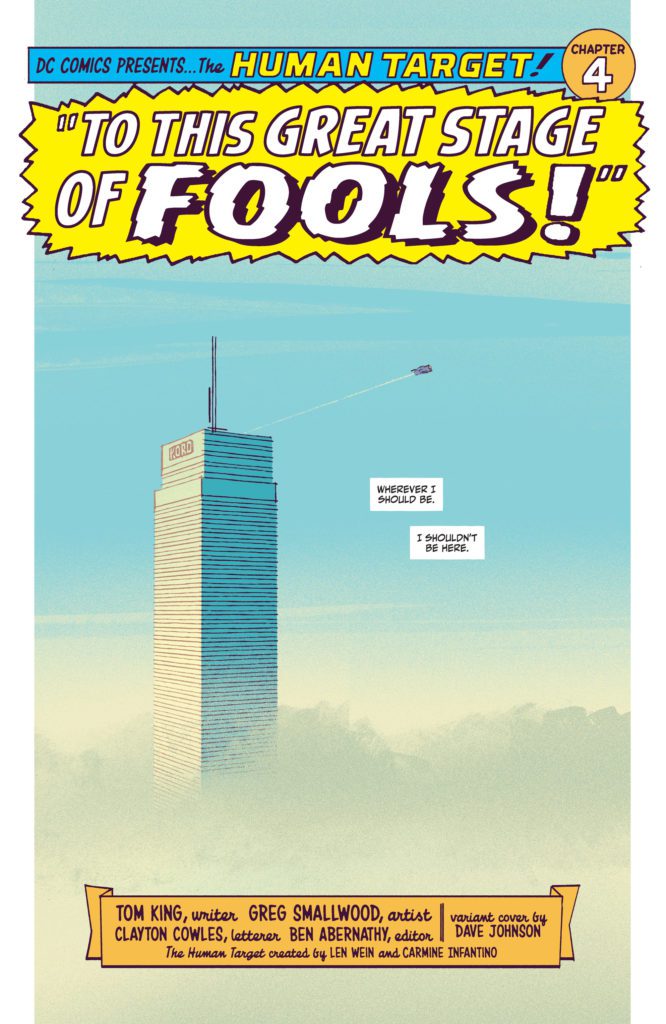
Home Blog Page 115

Review: PEACEMAKER: DISTURBING THE PEACE #1 – Peace Through Childhood Trauma

Comics legend Garth Ennis (Preacher, The Punisher) and artist Garry Brown (The Massive) team up for a brutal, smart, and darkly hilarious opening issue with Peacemaker: Disturbing The Peace #1. Featuring colors by Lee Loughridge and letters from Rob Steen,  this DC Black Label comic fuses Ennis’s twisted humor and sharp military & political writing with a top-notch visual aesthetic to create the perfect start to a story reintroducing America’s favorite peace-loving professional killer.

“Long before joining the Suicide Squad, Christopher Smith, code name Peacemaker, meets with a psychiatrist—a woman dangerously obsessed with his bizarre and violent past. From his tragic childhood to his military service overseas to his multiple missions with Special Forces, Smith has more than his share of skeletons in the closet. But who’s actually analyzing whom? And will this trip down memory lane result in yet more fatalities?”
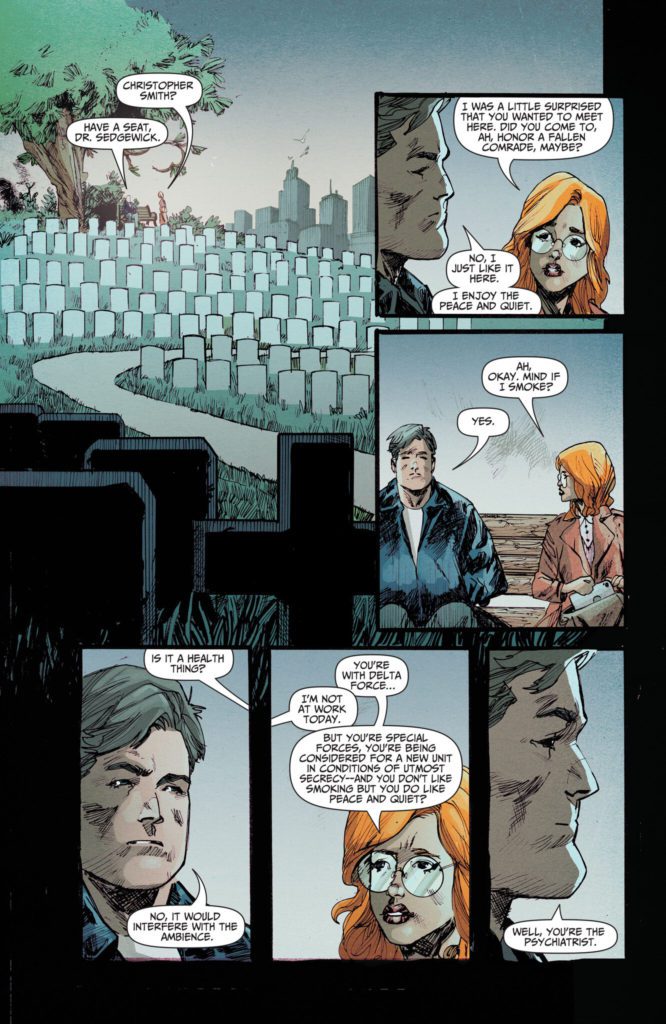
Writing & Plot

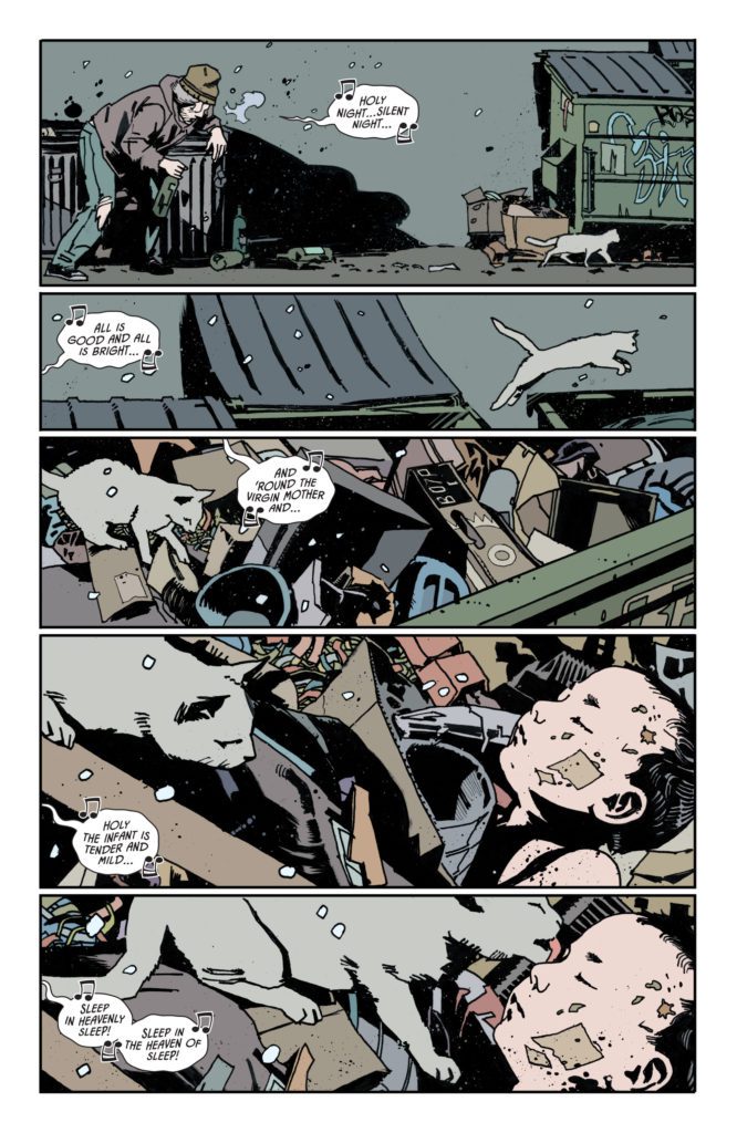
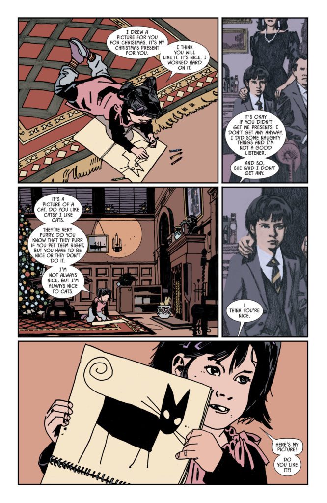
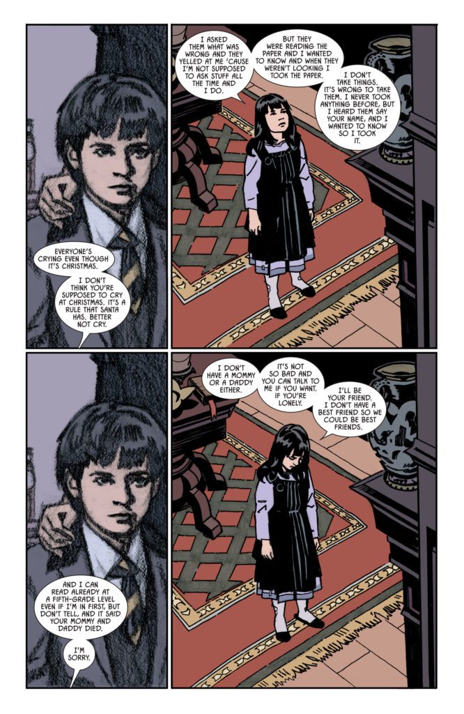
I imagine Garth Ennis was grinning like a madman as he was penning the script for Peacemaker: Disturbing The Peace #1. The fact that he hadn’t written a Peacemaker comic until now seems strange, as I could scarcely imagine a better melding of writer and character. The narrative here takes place in the form of Christopher Smith – a.k.a. Peacemaker – meeting a psychiatrist as she evaluates him before he is permitted to join a U.S. Special Forces team. The rest of the story works as a semi-frame narrative consisting of flashbacks to Smith’s traumatizing early life and prior military engagements.

Ennis is able to perfectly navigate both the twisted humor and surprisingly cool intellect of our deadly protagonist. The humor doesn’t come as much of a surprise, between Ennis’s own history and the applauded live action interpretation of the character via James Gunn. However, it’s the shocking and smart delivery of the Preacher writer’s brand of gallows humor that really sets this comic apart. The psychiatrist who comes to see Christopher serves as the audience character. Her morality would tend to mirror ours. But because we are seeing these insane acts of over-the-top brutality from our readers’ perspective, they come off as humor juxtaposing the psychiatrist’s horror.

Ennis, in his signature style, also offers incisive bits of brutal commentary on our government’s military. I’m not going to get into spoilers, but makes some pointed remarks through his plot about recruiting and ignoring/hiding the ugliest sides of international military operations. Ennis has always excelled at criticizing world governments for how they conduct their armed forces. I’m pleased to report that he is still at the top of his game in this regard – if not better than he’s ever been.
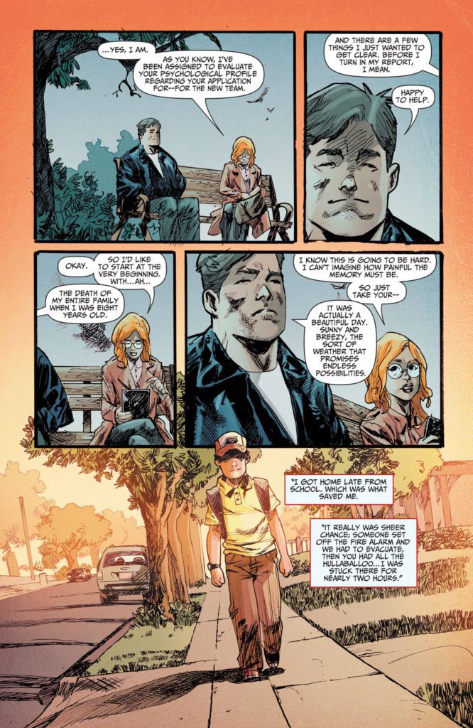
Art Direction

Artist Garry Brown brings a gritty, almost 90’s Vertigo aesthetic to the grim and darkly humorous events of Peacemaker: Disturbing The Peace #1. Brown’s heavily crosshatched pencils bring a sense of menace and foreboding to every scene. Whether this was the intended effect or not, Brown’s style is a clever touch for keeping this comic mired in unpredictability. He utilizes a great amount of detail in his character animations and designs, especially for a bunch of figures who are dead/dying/going to die. His visual direction is busy yet easy to follow, with panels being laid over each other as he bounces from present day to flashback. Brown fits in well among other artists who have worked with Ennis, with a definitive style that serves the story well.

Lee Loughridge’s colors finish off the visual style with a smoky, semi-watercolor look. He complements Brown’s work by using the darker end of every color he chooses. This is stellar for setting the tone for every page. One that really sticks out is near the beginning when Christopher arrives home from school on a um…fateful day. The room he walks into is colored with a hazy, almost sick-looking shade of light green. Another is a gorgeous shot of a purple early morning sky when Peacemaker is on an op as he looks over a beach he just swam to. His work here is some truly fantastic stuff. The letters from Rob Steen have a classic design to them, with some great and well placed SFX letters as well. Visually, this team puts together a fantastically designed comic that serves the story immensely well.
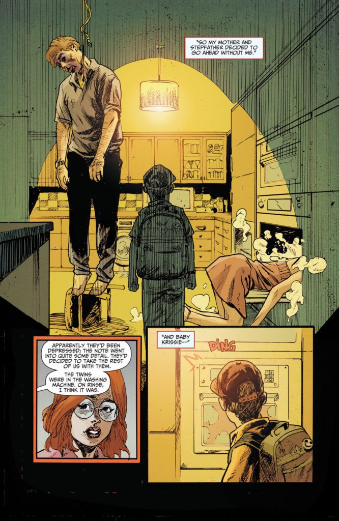
Verdict

Peacemaker: Disturbing The Peace #1 is a deviously funny and immensely entertaining start to this new mini-series starring DC’s funniest sociopath. Garth Ennis’s script shows the Irish legend is still in top form, with his signature blend of gallows humor, naturalistic dialogue, and ever-incisive political commentary. The visuals from Garry Brown and Lee Loughridge are detailed, gritty, and well directed and give this opening a great artistic aesthetic. Be sure to grab this new #1 when it hits shelves on 1-25!


Monkeys Fighting Robots Youtube

Review: BATMAN/CATWOMAN SPECIAL #1 — A Meditation on Grief

Batman/Catwoman Leon DC Comics

DC Comics’ Batman/Catwoman Special #1 is a tough read. Don’t get me wrong, it’s beautifully written and masterfully rendered by all the creators involved. But, as many know, this particular issue saw a big change in its creative team during production.

Originally, Batman/Catwoman Special #1 was to be drawn by a giant in the comic book industry: John Paul Leon. But 13 pages into this issue, along with breakdowns and covers completed, John Paul Leon died of cancer. Writer Tom King brought artists Bernard Chang, Shawn Crystal, and Mitch Gerads, along with colorist Dave Stewart, and letterer Clayton Cowles, on board to finish the issue. Instead of a simple history of the Bat and the Cat, Batman/Catwoman Special #1 became a meditation on grief and loss, dedicated to John Paul Leon. Some spoilers ahead for this issue.

Writing

King takes us through a history of Selina Kyle’s life. We see her as a young orphan, growing into the role of Catwoman. King’s tone is empathetic and warm. We don’t judge Selina for her choices. Instead, we understand why she chose a life of crime. In fact, it’s hard not to respect her for it. But King, in the latter half of his script, makes a change. He begins to focus on the trials of old age and the heartbreak of loss. Selina carries Bruce through his last days as his health deteriorates. Eventually, she stands by his grave. There, Selina tells Bruce that he’s wrong. There’s nothing noble or beautiful about grief. Grief sucks. Perhaps King is expressing some of his own frustrations in this moment. His script, following Bruce’s decline, seethes with emotion and rails against the idea of accepting that these things just happen. King beautifully and devastatingly communicates his sadness and fury at losing a friend and collaborator.

The beauty of this script, beyond its connection to John Paul Leon, is in how King writes Selina Kyle. We see her grow from a curious little girl into a tired old woman. But when she’s young, there’s a wisdom that’s beyond her age. When she’s old, she has the mischievousness of a toddler bent on wrecking havoc. King’s Catwoman is a wonderful paradox. Only a character like this, so rounded and human, could feel the weight of the grief King is portraying in this issue. But “feel” might be the wrong word. King doesn’t show Selina in tears or screaming in anger. She stuffs the many, complicated emotions down. She’s too strong — or maybe, more accurately, too cowardly — to truly feel them. It’s grief in a nutshell: realistic and upsetting in its depiction.

Batman/Catwoman Leon DC Comics

Art

John Paul Leon’s finished pages are mesmerizing. He pulls you into the world he’s creating and you become completely immersed. Leon had the ability to include all the right details, and let everything else fade away. In some of the most emotional sequences, Leon’s backgrounds disappear altogether. Yet, in other scenes, we see Selina balancing over a detailed cityscape. He also makes subtle choices in drawing Selina, which speak volumes about her. In Leon’s pages, Selina rarely looks at the “camera.” She looks down and away, often with her eyes closed. She’s a girl who is full of shame and fury. When she does look at us, her eyes are brimming with tears. But she looks concentrated, even mad. Honestly, it’s hard not to cry reading these pages. Not only because it’s proof of the beauty John Paul Leon brought into the world, not only because these pages show what a giant we’ve lost, but because Leon was such a powerful storyteller and he gets you to feel as the characters do.

Chang and Crystal’s pages have an unmistakable Leon flavor to them. Leon completed the breakdowns for the pages that Chang and Crystal finished. You can see Leon’s visual language at work. Some panels have no background, while others focus on nothing but details in the background. Yet, there’s an immediate change in the art too. Not only do the faces of each character look quite different, (Chang and Crystal show us characters that have more prominent features than in Leon’s work). But we also see a release of emotion. Where Leon pulled back and away from the reader, Chang and Crystal push forward. We see Selina looking right towards us, with a sorrowful expression on her face. In the middle of this rather muted issue, we get an emotional storm. Coming on the heels of Leon’s pages, it feels like Chang and Crystal are allowing the characters to mourn the loss of the pen that depicted them only pages before.

While Gerads does work with his own breakdowns in the final half of this issue, he also employs the visual language of Leon’s works. Remove some of the creases on the characters faces, some of the patterns on their clothes, and you could almost be made to believe these were Leon’s pages too. Yet there’s also Gerads’ own ingredients that are added into the mix. We see a touch of levity sneak in. There’s a celebration of the characters’ highs before the onset of grief. We see interlocked panels: panels that show characters looking at something, what they’re looking at, and then back to see their reaction. It has an almost comedic affect at times. And Gerads actually feels like the perfect choice to be doing these final scenes. There’s a stark reality to them that Gerads’ style works brilliantly for. Every wrinkle, every wart, every grimace, every smile is shown in an unadorned realistic art style.

Batman/Catwoman Leon DC Comics

Coloring

I can’t speak to the timeline of when decisions were made by this creative team, but I have a hunch about the coloring. John Paul Leon’s cover to this issue has a very different color palette to the interior pages. The cover is warm and nostalgic. The inside pages, perhaps colored by Stewart after Leon’s death, feel muted and sad. Regardless, there’s an intimate, candlelit feeling to this issue. Stewart turns the lights down, making every scene feel like a quiet chat between friends. Gerads adopts this same palette for his pages too. The few exceptions are the bright orange jumpsuits of Selina’s stay in prison, the vibrant red of wrapping paper, the shocking red of Selina scratching someone in a fight, and the neon yellow on the front of Helena’s batsuit. But these aren’t the halcyon days of dazzling costumes and glittering action sequences. Stewart and Gerads make it clear, this is the twilight of these characters’ lives.

Batman/Catwoman Leon DC Comics

Lettering

One of the most stunning things about Cowles’ lettering is how he changes his sound effects to match the style of each artist. Often, the sound effects in John Paul Leon’s pages are shown in big, hollow block letters. Cowles manages to achieve the feeling of a big noise, while avoiding covering much of Leon’s artwork. In one case, Cowles uses thin black letters that actually mimic Leon’s lines. Later, in Gerads’ more lifelike, wrinkle-filled pages, Cowles uses a messy font for one of his sound effects. The sound of a scratch almost looks like it has been scratched into the page. And when Selina speaks to Bruce’s tombstone, her word balloons come down in columns on each side of the page. Visually, it almost looks like the words are hugging his grave.


DC Comics’ Batman/Catwoman Special #1 is truly something special. For fans of John Paul Leon, this is a celebration of the artist’s life and a furious mourning of his death. Complete with essays by folks who knew Leon, and variant covers that many artists used as a way to pay tribute, this issue is heartbreaking and beautiful. It’s out from DC Comics on January 25th, at a comic shop near you.

R.I.P. John Paul Leon: April, 1972 – May, 2021

Thank you for inviting us into countless worlds and making us feel at home there.

Monkeys Fighting Robots Youtube

Review: THE HUMAN TARGET #4 – Silver Age Shenanigans

Human Target King DC Comics

Bank robberies, robot samurais, and bears, oh my! DC Comics’ The Human Target #4 is full of surprises. Writer Tom King, artist Greg Smallwood, and letterer Clayton Cowles bring their neo-noir sensibilities to the land of Silver Age shenanigans. WithThe Human Target #4, they celebrate the wildness of old comics, while pointing out their many absurdities.

Writing

King’s writing style for this issue feels split right down the middle. On one hand, we have the noir narrations of Christopher Chance’s inner monologue. He’s subtle and cynical. On the other hand, we have Blue Beetle and Ice, falling back into the dynamic of their glorious Justice League International days. As they fight off various threats to the mankind, Blue Beetle rambles on in the Silver Age “let’s explain everything as it happens” fashion. With this, King nails the character of Ted Kord. He’s intelligent yet simple. He may be incredibly educated and successful, but he’s still naïve. Chance, however, is too smart to let the flashy fights distract him. He sees through the theatrics, picking apart the intricacies of each encounter. King highlights the differences between Kord and Chance, making us love each one of them all the more.

King is also really funny in this issue, but not in an in-your-face way. As Kord changes into his Blue Beetle duds, he worries that he can’t prove to Chance that he’s innocent. Butt naked, he turns to Chance and says, “There’s just not really a way to show you I have nothing to hide.” The irony doesn’t even occur to Kord. This whole issue is full of clever jokes and double entendres. King perfectly executes the tone of a noir mystery.

Human Target King DC Comics

Art

Smallwood isn’t interested in the punchy action sequences of superhero comics. He’s more interested in honing in on the human elements. When Ice and Beetle go to stop a bank robbery, Smallwood doesn’t show us how the fight goes down. Instead, we see Chance looking on, sipping from a flask and waiting for the fight to be over. As the issue continues, Smallwood particularly focuses on the flirty banter between Ice and Chance. We see them slowly becoming comfortable with one another. It’s in Tora’s eyes, as she shyly looks over at Chance as he’s sleeping, that Smallwood says so much. She gets braver and more playful as the issue goes on. Once, Smallwood had his characters’ faces always obscured or only shown in part. Now, these pages are full of Ice and Chance’s various expressions. They’re the focal point of this series and their charged exchanges are what will have you on the edge of your seat.

Coloring

Smallwood covers this issue in blue and yellow, the colors of Ted Kord. Right off the bat, Smallwood creates a Silver Age feeling. The fluorescent colors of Kord’s secret lab feel like something out of a Kirby-era Fantastic Four comic. And the color pallets help us to feel like we’re watching the characters throughout the whole day. Smallwood starts us off with a warm, morning glow that washes over the scene. Then we get the vibrant colors of midday. And as the color pallet settles, the blues are still there. The dark blue of the night sky streams in through the window, matching the color of Kord’s suit. Smallwood makes us feel the time pass. And not only from morning to night, but from 1960 to 2022.

Human Target King DC Comics

Lettering

The letters for this issue are incredibly fun. Even the title page, dramatic and colorful, is something right out of the 60s. When Ice and Beetle stop a bank robbery, and we’re focused on Chance’s reaction to the scene, the sound effects are the only things we get that hint at the wild action going on. So Cowles doesn’t hold back. The “KRRAK!” “POW!” “BLAM!” noises are shown in big, bright, bubble letters. Some have lightning bolt edges, others look like they’re cracking. It’s the perfect way to say “You really wish you could see what’s going on, don’t you?” Cowles whole approach to this issue feels joyfully theatrical.


DC Comics’ The Human Target #4 is a celebration of days gone by. It’s goofy, yet grounded. We might be dealing with characters that were punching baddies in the 80s, but there’s an unmistakable 60s flavor to this issue. This creative team uses the tropes and language of the Silver Age to unleash all kinds of chaos onto the page, all while Chance watches with a wry smile and a stiff drink. Pick up The Human Target #4, out from DC Comics January 25th, at a comic shop near you!

Monkeys Fighting Robots Youtube

Review: X Lives of Wolverine #1- A Trip Down Memory Lane

Fresh off the heels of Inferno, this week we are treated to another X-related event: X Lives of Wolverine #1. With Wolverine and X-Force writer Benjamin Percy continuing his story, he’s joined by Jossua Cassara on art, Frank Martin on colors and Cory Petit on letters.

WRITING

Benjamin Percy has been writing Wolverine for quite some time now, and his grasp on the character is apparent. How he handles Logan, gentle with a “don’t mess with me” edge, is exactly how I like my Wolverine. Percy starts this issue off fast. We’re thrown into Wolverine’s past as he battles possessed characters under the spell of Omega Red. This is a tough spot for Logan because these are still people. If he kills them, we are made aware that Omega Red can jump bodies, so the person is lost for good. Percy makes the initial set up interesting enough to keep the reader engaged as well. We want to know why Logan is going through his past lives. We want to know why Omega Red is body hopping and trying to kill Charles Xavier. The issue takes over two different times in Logan’s life, the past, and his current life on Krakoa. While Percy shows us that Logan’s past is dangerous and filled with deadly villains, like the body-jumping Omega Red, we also see that things are not perfect on Krakoa right now either. Percy is crafting two separate stories that both spell danger for the mutants. In the present, Omega Red is uncovering secrets on Krakoa that will eventually come to a head at some point in the near future. Percy leaves us wanting more as we finish this issue off. Where things go from here are unknown, but they seem dangerous for mutant kind.

ART

It’s nice to see Joshua Cassara back on pencils with Benjamin Percy. Cassara has a clean style that is easy on the eyes. In the panels from the past, Logan fighting the Omega Red gardener character is an easy fight to follow due to Cassara’s strong line work. Your eyes can effortlessly flow from panel to panel. Cassara also gives us some memory burning panels, like Logan unleashing his bone claws while attacking the Omega Red gardener character.

The colors by Frank Martin are essential to this issue too. Martin’s work leaps off the page with his vibrant colors and dark backgrounds. As Omega Red hops from body to body, little details like the Omega mark on someone’s forehead glowing will catch your eye every panel. The difference in atmosphere between Krakoa and the past are recognizable too with Martin. The Krakoa pages are lighter and brighter with the sun shining, while the pages from the past are dark and dire.

Cory Petit’s letters compliment the art in this issue. As Charles Xavier’s father gets hit over the head with a musket, a “KRAK” can be seen. Any great Wolverine story has to have the famous “SNIKT” in it, and Petit does a great job of placing it in the perfect spot as Logan unleashes his claws on a villain.

CONCLUSION

X Lives of Wolverine #1 sets the stage for another classic Wolverine story. Where things go from here is anyone’s guess, but the stage has been set perfectly by Benjamin Percy to give fans an adrenaline pumping book. X Lives of Wolverine is on sale now at your local comic shop.


Monkeys Fighting Robots Youtube

How THE MAXX Changed My Concept Of What A Comic Book Could Be

Sam Kieth’s The Maxx delivered best on Image Comics’ mission statement. It gave an artist his own book and helped him discover his voice in the process.

To a teenager, The Maxx makes one hell of a first impression. A proud display of Kieth’s influences, it combines Frazetta-Esque grassy landscapes and musclemen, Vaughn Bode’s style of simple, squishy critters, and Frank Miller’s hard-boiled noir dialogue. From the beginning, there are signs that the use of these influences isn’t going to continue to be quite as straightforward.

An old hand at the industry, William Messner-Loebs was brought on by Kieth to be the writer on The Maxx, and has openly talked about how much of his job was trying to piece together narratives from what Kieth wanted to draw. But Messner-Loebs’  experience gave him the perspective to push back against some of Kieth’s impulses and add his own touches. The Maxx sets the tone on the opening page by mumbling to himself in noir-ish prose. Except it’s about how he misses watching the show Cheers. When given Carte Blanche to write whatever he wanted on the back of The Maxx‘s official trading cards, Messner-Loebs decided to reveal that the story took place in a filthy, dilapidated city because the citizens had all stopped paying taxes. Touches like these showed that Messner-Loebs wasn’t taking the noir stuff all too seriously.

But sometimes, his input could be on the more serious sides of the story. For example, when Kieth wanted to shock audiences by introducing a character and having her commit suicide in the same issue, Messner-Loebs flatly refused. This refusal greatly benefitted the comic in the long run, as Sara would go on to inherit the comic’s starring role. It also pushed Kieth away from big, shock-value twists and more towards the small-scale drama that would come to define his later work.

After the conclusion of the comic’s first long-running story arc, Messner-Loebs decided to step back so that Kieth could control the direction of the comic himself. The comic then began to shift from superhero noir towards relationship drama between middle-aged couples with a magical-realist twist.

By the end of its run, The Maxx had begun to collapse under its own weight. Storylines would start and stop almost at random, Kieth admitting in the letter pages to loss of interest in certain stories, and fear of rejection for others. But even deprived of clear beginnings or endings, the small-scale human interactions he was showing offered a template for what his career would become moving forward. Despite his frustration with the narrative, Kieth’s influences had started to blend together into a stronger artistic voice, his fascination with human drama and surreal fantasy feeding more directly into one another, rather than literally occupying separate worlds.

Before reading The Maxx, I was a bit more strict about stories having to follow more traditional structures, showing clear follow-through and intent. But for all the different directions The Maxx pulls itself, something beautiful and human manages to shine through. The growth of its artist became a story in itself. And that was always enough to keep me reading.

Monkeys Fighting Robots Youtube

INTERVIEW: Cinematographer Jorel O’Dell Discusses Horror Film HURT

hurt-interview-jorel odell-cinematographer

A former soldier encounters a horrific hayride in the horror film HURT from director Sonny Mallhi (Family Blood) and starring Emily Van Raay, where cinematographer Jorel O’Dell draws out the tension and fear.

Emily Van Raay (Thank You for Your Patience) is Rose, a woman living paycheck-to-paycheck while her soldier husband Tommy, played by Andrew Creer (You), is away on deployment. Rose goes about her business, first watching a horror movie, then working at a convenience store when Tommy makes a surprise appearance. He’s back from the war and ready to settle down. However, Tommy’s living with PTSD and the sights and sounds of the world around him sometimes compound and challenge his mental state. Things get violently worse for Tommy and Rose when a hayride on Halloween transforms the couple forever.

PopAxiom spoke with Jorel about his cosmic name, taking his camera everywhere, and the process of making Hurt.

Is Jorel named after Superman’s father?

I was named after Marlon Brando from Superman. My whole life, no one said anything about it. But then Russell Crowe played him, and suddenly I couldn’t make a reservation at a restaurant without people commenting. I was well into my 30s at that point. Thanks, Russell.

Jorel’s been a musician and actor on stage and screen. Why did he become a cinematographer?

I understood nothing but the director. It was a very auteur-driven industry. Even in film school, we’d study the great directors. I don’t think the curriculums were as advanced then as they are now. I didn’t understand cinematography even though I’d been shooting stills my whole life. I’d been processing and developing my photos since I was six. My dad taught me exposure by drawing out the triangle. I was viewing the world through lenses. But I also played music and was an actor performing worldwide in theatre productions. The whole time I took my camera everywhere, it was the one constant.

hurt-interview-cinematographer

Hurt’s production wrapped in 2018, and the original cut premiered to mixed results. What was that experience like?

The cut at Fantasia Film Festival was basically unwatchable. It got torn up by critics, and none of us were very excited when we left the theater. So it’s not the same film that you see today. But it’s the classic story; it happened to Star Wars. First, the film was too long; it didn’t make sense, then Marcia Lucas edited it into the Star Wars that we have today that changed the world. But Sonny brought it home in the new cut. I’m so proud of what he accomplished. It’s a slow-burn kind of horror with an ending that punches viewers in the gut and stays with you.

Early on, Rose and Tommy share a character-driven scene outside at a picnic table at sunset. So what are the challenges of shooting outdoors?

In that sequence, we have the front of the house, the back of the house, and the inside. Those were three different geographical locations shot over four weeks. Each area had a different orientation to the sun too. So, we had to make continuity choices in our scheduling days. That backyard section goes from late afternoon into the sunset into the evening. So, we planned for a day where we’d shoot that at sunset, and I rode the exposure. There’s a shot of Tommy alone drinking a beer in the film. That’s all-natural light. As it gets darker, I influenced it with light by using two M18s bounced into an Ultrabounce. That’s all the light that I had.

As a micro-budget film, Hurt shot over a short period. How does that affect the process?

It was fast, furious, and limited. We had incredible limits that forced us to make quick decisions. I wasn’t just changing from a wide lens to a long lens but from a wide anamorphic lens to one of two long spherical lenses. I’ve got to protect those images so that I don’t take the audience out of the anamorphic experience when switching to a spherical lens. So we’re constantly navigating limited tools, limited time, and limited hands.

What references entered the early conversations while making Hurt?

Texas Chainsaw was a big part of the conversation for two reasons. One because of the film’s opening, which I won’t give away. And two, Sonny’s making a commentary on slasher films and showing an understanding of the genre. It was such a new take on slasher films invested in its characters. There are also similarities in the sort of world Texas Chainsaw and Hurt were made. Both are gritty, low-budget, run-and-gun kinds of films.

Is Hurt on your watch list?

Thanks to Jorel O’Dell and Projection PR
for making this interview possible.

Find more interviews from Ruben R. Diaz here!


Monkeys Fighting Robots Youtube

Revenue To Expected Revenue Ratio: Casino Industry Trends

Revenue in the casino industry has been inconsistent and unstable due to the impacts of the Covid-19 pandemic. The Global Casinos and Online Gambling Industry market research report announced that in August of 2021, revenue levels had fallen throughout 2020. The website https://top-canadiancasinos.com/real-money-casinos/ and any other gambling facilities that organize and provide wagering and other betting services, including slots machines in addition to hospitality services. The decrease in revenue went down to $202.54 million in 2020 from $265.93 million in 2020, as Statista reports. The market research further shows expected revenue for the year 2021 remained at a middle level between the past two years at $230.86 million, according to Statista.

But, the Gambling Global Market Report 2021 reported that the industry is expected to reach $516 billion worldwide by 2021 and an estimated $674.7 billion by 2025. Here are some of the contributing factors to the expected growth in revenue in the casino industry:

  1. Rise of esports betting;
  2. Changing from Las Vegas to Macau as the largest casino market;
  3. Impacts of legalization of the casino and gambling industry;
  4. Growth in technology.

Rise of Esports Betting

European Business News, an online news website, reports that crypto casinos and games directly relate to the improved revenue levels. The changing gaming atmosphere in online casinos, especially with “branded online slots games” instead of regular and traditional games, has significantly impacted gambling. Branding has added a customization factor where players can identify with specific themes and thus, increase subscriptions and gaming potential. At the same time, gambling means and habits have also changed and become dynamic, adapting to the changing technologies. In the past, individuals could only play on desktops or visit a physical brick-and-mortar casino to enjoy a few gambling games. However, you can access several gambling options such as esports and sports betting, casino games in totality ranging from table to slots, and live casinos using your mobile phone!

The casino industry game collection and genre are dynamic. The dynamism resulted in e-sports gaming after social distancing and other strict Covid-19 rules came into law enforcement. Since regular sports were no longer practical with the pandemic, the esports industry took over, the fear of infection rates rising; the esports industry took over. PR News, a market research website, reported expected revenues of over $8 billion in e-sports wagers based on the $1 billion earned in 2019. In the United States alone, the revenue is expected to rise to $560 million representing an industry growth rate of 7%.

Changing from Las Vegas to Macau as the Largest Casino Market

Market reports indicate that the overall casino industry worldwide profits are expected to rise to $159.3 billion by 2027. The casino industry contributing the most in terms of revenue to these general profits is the Asia Pacific region at a rate of 4.5% in the coming six years. America will contribute $68.9 billion while Europe and Canada will bring in 3.3% and 3% consecutively. The drop in contributions can be associated with the changes in casino markets over the past few years since 2006, according to Statista.

The Research website reports the continuous rise in commercial gambling centers and increased investment in Macau, China, where legal gambling surpasses Las Vegas. In addition, the reports indicate a thriving tourism industry in Macau. For example, fortune, an online news website, reports that “Tables at Macau’s 41 casinos generated six times the revenue of the 144 casinos in Las Vegas, racking up $36 billion in revenue in 2019.”

As a result, gambling is the main economic activity in the region contributing $54 billion to the city’s GDP, 7% of employment in Macau, which is half a million of the residents of more and tax revenue of 80% going to the governing authorities.

Impacts of Legalization of the Casino and Gambling Industry

“Legal gambling status” is what many online and land-based casinos look forward to in a bid to increase revenue generated. The commercial aspect of the casino aspect has undergone “Tremendous change” in the last few decades, resulting from the continuous legalization in various parts of the world. Therefore, new gambling markets are rising, and revenue is generated periodically. By mid-2020, the revenue generated had been increased to $227 billion, accounting for only online casinos as brick and mortar casinos seem to have fallen a little in revenue.

For instance, flexibility in gambling laws in some states in America has diminished operations by physical gambling sites casinos. However, it has led to increased mobile-based gambling activities, far more reach, and revenue collection. The study resulting in these facts was done in the State of Nevada. In Canada, the gambling laws are more flexible and friendlier to gamers than in the United States. The country classifies gambling as a “Recreational activity,” and players do not pay taxes from winnings.

The law has given leeway to gamblers, leading to increased gambling and revenue generated. In Europe, specific countries are tackling gambling laws independently, with some having strict enforcement of gambling rules and other countries relaxing their rules a little. However, countries such as Italy, Spain, and Germany have legalized online gambling to allow the gambling industry to grow. In the UK, younger people gamble in two ways: playing the latest casino games or as spectators viewing others. These elements have added to the revenue generated using casinos in the country with various specific themes, for example, the Wizard of Oz theme.


Growth in Technology

Technology changes have had an extensive impact on gambling in online casinos. The accessibility of a smartwatch, phone, or tablet has improved gaming online by inducing convenience. Statista reports that over 6 billion people across the globe own or have access to smartphone devices. A total of 8.9% of the entire world’s population owns a smartphone. Thus, online casinos have taken advantage of this fact and optimized the online mobile sites for use on any smart device. For instance, you will find an online mobile application for a specific website. Individuals only need to download the app and install it.

The following process is simplified by creating a mobile casino account, and gaming commences. Plus, there are many mobile-enabled online banking options for any interested parties. Players can make payments or cash out winnings conveniently. Plus, intelligent devices are portable due to their compact nature, and thus, gaming can occur anywhere and anytime.

Summary

Casino trends keep changing, and with each change, the impacts on expected revenues can be either negative or positive. In the past few years, the results have been inconsistent as the economy across the globe has been unstable. However, we expect the economy to stabilize shortly.

Monkeys Fighting Robots Youtube

Review: THE HARBINGER #4 — The Battle Of The Self

The Harbinger #4 cover

The Harbinger #4, releasing on January 26 from Valiant Entertainment, completes this story arc on self-reflection.

Background

Peter Stanchek is back from the dead without any memories. He doesn’t have any of his old life’s baggage weighing him down, and is trying to do right as a hero. But with him comes a villainous counterpart, the Renegade, harboring all of Peter’s rage.

Being Better Is Enthralling

Writers Collin Kelly and Jackson Lanzing tell a compelling story about the layers of Peter Stanchek. While Peter is trying to do good as the titular Harbinger, the Renegade serves as an enthralling foil. Unlike the optimistic blank slate Harbinger, the Renegade retains all of Peter’s traumas. The hostility the Renegade shows the Harbinger feels like a state of self-loathing conflicting with a need to be whole. Because of this, two different sides of the same person are beginning to tell the whole story. All of this results in a satisfyingly conclusive answer to where their memories went and the direction of the rest of the series. From the look of things, it’s going to be something to follow.

Looks Better Too

Some good page construction in interaction
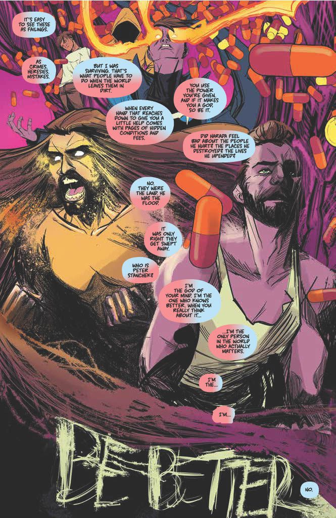
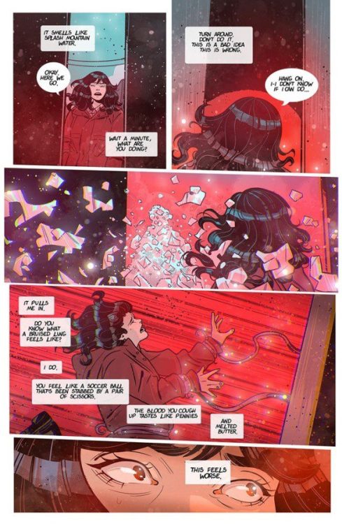
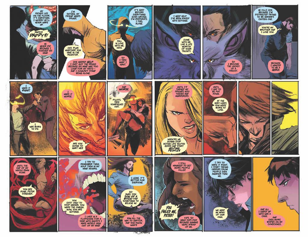
Throughout The Harbinger #4, artist Robbi Rodriguez uses the page spaces to present abstract talks between Harbinger and Renegade. In one of the two page spreads, the amount of panels and expressions tell stories of different intensities. Plus the way Rico Renzi’s colors are used evoke the dynamic between the two sides of Peter. Whenever Harbinger speaks alone, he’s in a dark place as though he’s helpless. Meanwhile when the Renegade speaks up, he feels like he’s in a line of fire with the mostly red colors surrounding him; it makes these stressful instances feel like he’s fighting for his life.

The Harbinger #4 climax

Hassan Otsmane-Elhaou probably demonstrates his best lettering in the one instance where the Renegade and Harbinger come to an understanding. When they’re speaking, they share a word balloon with their respective colors of red and blue. It feels like a full acknowledgment of their past and one another. That is until the Renegade’s influence starts to corrupt the Harbinger as the balloon distorts. It shows off an enthralling look into the relationship between these two halves of Peter Stanchek, especially once a typeface interrupts the corruption, allowing the Harbinger to overpower the Renegade with a blue word balloon.

Harbinger #4 Is All The Better

Harbinger #4 feels like a genuine highpoint in the development of Peter Stanchek. Both the Harbinger and the Renegade make up a great self-reflective dynamic. Despite them being the same person, they feel well thought out enough to exist independently. It feels like a classic archenemy relationship that will bring this series to great heights.

Monkeys Fighting Robots Youtube

INTERVIEW: Kids Imagine Nation Creates Educational Musical Theatre Magic

interview-kids imagine nation-entertainment

Kids Imagine Nation is a trio of former Disney performers making vibrant, head-bobbing, visually exciting entertainment for kids and the whole family. It’s equal parts educational and undeniable fun!

Seconds into any Kids Imagine Nation (KIN) video will have viewers bobbing their heads. The music is something that people of any generation can relate to, making Aaron, Rachel, and Beatz the Robot stand out as a kids entertainment troupe. KIN covers topics ranging from colors to creativity, consistently delivering it with energy fueled by the singing and dancing and thriving on a growing narrative between the characters and the world they inhabit.

PopAxiom spoke with Rachel and Aaron about the trio coming together, the process behind creating Kids Imagine Nation. Unfortunately, Beatz, the Robot, was unavailable due to the interview taking place during his recharging cycle.

Happiest Place

Aaron and Rachel have been into musical theatre since a young age. So, where did the trio meet? “We all met through Disneyland,” Rachel says. “We were all performers. Aaron and Beatz the Robot were musicians, and I also performed there. We were passionate about creating our original music and show.”

Aaron continues, “Beatz the Robot and I started writing music for kids. We wanted to keep that energized element because our band (Suburban Legends) is a ska band. But we wanted to make sure rock is there and musical theatre to get kids to see the love of creating.”

“It’s a culmination of everything we love to do,” Rachel adds, “It keeps us young and in the mindset of the kids.”

Kids Imagine Nation packs a lot of electric entertainment into a small package. “At the root of it, we’re storytellers. We write a new summer musical every year. So, we said this year was going to be about ‘saving imagination,’ and so we created a great theme song for that.”

kids imagine nation-interview-rachel-aaron

The Process

Kids Imagine Nation features original music, singing, dancing, creativity, and education for a relatively small operation. “We follow a traditional film organization with pre-production, production, and post-production,” Rachel answers when asked about their process. “We try to think as outside the box for each video as possible so that they are all unique. That’s part of imagination, so we want to inspire people to get creative. Whatever you can bring to the table, there’s no right or wrong with art.”

One video, Colors, examines the spectrum of reflected light. “For Colors,” Aaron shares, “we had that idea for two years before we could do it.”

“That’s a big factor,” Rachel affirms, “pulling all the pieces together to do the video. For Colors, we needed someone that would let us throw paint around.”

Videos on their YouTube channel or website contain plenty of creative filmmaking. Aaron explains, “We do use green screen which allows you to do a lot of stuff. We sometimes build tiny sets, sort of dioramas and green-screen ourselves onto it which allows us to make some elaborate stuff.”

Rachel happily declares, “We stumbled on that, but it goes so well with our theme of imagination. It shows that we can do anything with just this little box.”

Creating their storylines includes a lot of magic. “We wanted magic to be such a huge part of our show. But we also wanted to sort of normalize it; it just sort of happens. We don’t make a big deal about it or react because we just disappeared. It’s part of our world.”

kids imagine nation-interview-music

Creating Music

Kids Imagine Nation has a lot of music. The group creates YouTube content but even more content on their website plus live shows. “We were writing a lot of music in the beginning just to get us going for our live shows,” Aaron explains. “We decided to take that and make it our TV show. When we started writing actual episodes, we said, ‘we want a song there, and it’s about having a bad day, so we’d write a song for that so that it flows.”

Rachel adds, “So, some of our songs already existed from our live repertoire, and some we do write specifically for episodes where it needs a ‘musical theatre moment.’”
The trio sits down to write songs together, sometimes in as little as two hours. “Beatz the Robot produces all the music.”

“Beatz the Robot’s production is incredible,” Rachel says.

The process continues when Beatz “… brings a microphone where we are,” Aaron says, “We write. Beatz goes , yeah, that’s me making music. That’s how we musicians do it. We record the vocals and film the next day.”

YouTube & Beyond

Rachel and Aaron love YouTube. She says, “It opens up what we can do. Instead of having to fill a box of what a network might require, there are so many people out there with a voice and a space to be creative.”

Being a part of YouTube means understanding the state of its inner workings. “For two years,” Aaron shares, “we were doing something every week because the algorithm at the time said that’s what you do. We’d do a story episode that was about 7-15 minutes long, which were our adventures, then we’d do these educational vignettes. I’d teach musical instruments, and Rachel would interview guests for her tea party. Beatz was doing curriculum for ages 3 and 4.”

“Those vignettes would focus on one character,” Rachel continues. They were “easy to film,” according to Aaron, and Rachel affirms, “We’d do three at a time sometimes.”

Aaron would have musicians “… come in every hour, film [the vignette] real quick, get those out and new people in.”

The trio made content in batches; Rachel explains, “… a lot of the filming, we’d do every Saturday and Sunday for a month. So we have a lot of stuff on our website.”

Current fans and future fans of Kids Imagine Nation can catch them on YouTube, but the website is where even more magic happens. Both beam with the excitement to share, and Aaron begins, “The way we do our live streams on our web channel, it’s all our content for kids. When we go live, it cuts into that channel. We do transitions; we go outside and inside; we play games. All the while, there’s a chatbox.”

“It’s a sort of choose your own adventure too,” Rachel joyfully adds.

Aaron ends by saying, “So, maybe someone says ‘Zachary loves the trumpet’ so we say ‘I love the trumpet just like Zachary!’

Wrapping Up

Kids Imagine Nation inspiration in every corner of the entertainment spectrum; Rachel says, “I’m inspired by musical theatre, especially modern musicals like Legally Blonde, Wicked, or Hamilton. Anything that’s a current modern pop musical we love so much.”

“Also, anything that Disney does,” she continues, “Their musical animated movies; the magic, joy, and positivity of that we love. We’re always looking for inspiration. Canadian rock band Marianas Trench makes very story-based albums, which inspired us to do the same with our albums.”

Always at work, Kids Imagine Nation has a new album coming. “Our newest album is a musical. So, if you play it from top to bottom, there’s a sort of radio play that comes between the music.”

Aaron adds mention of some pop-culture inspirations. “Doctor Who, Ghostbusters, Back to the Future. I love science fiction. To take that and meld it into something new for kids is what I want to put that out to kids.”

What’s next for Kids Imagine Nation? “A million dreams keep us awake,” Rachel utters with a smile. “We’re working on a few new albums and pre-production on our next web series. Then, of course, our streaming service always has the things we learn and share because we’re always traveling.”

Get creative with Kids Imagine Nation!

Thanks to Rachel, Aaron, and Impact24 PR
for making this interview possible.

Read interviews from Ruben R. Diaz here!

Monkeys Fighting Robots Youtube

Review: BOLERO #1 – Angst, Heartache, And Doing It All Over Again

From writer Wyatt Kennedy and artist Luana Vecchio comes Bolero #1, a debut comic with a serrated edge dipped in young love, heartache, local punk, and interdimensional travel. While it certainly has some rough edges, this issue keeps its audience engaged with great characterization and perfectly fitting visual design.

“A woman running away from a broken heart discovers a mother-key into parallel universes. The rules are: The key can work on any door. The mother will only let you visit 53 universes. Do not ask to speak to the mother. Never hop more than 53 times.”

Writing & Plot

Wyatt Kennedy’s script for Bolero #1 fuses relatable character drama with crazy sci-fi hijinks in a compelling – if not a bit stilted – manner. Our protagonist Devyn is like a romanticized version of a person you have most definitely met. In fact, almost everyone in this book is like that. If you’ve ever been to a local band’s show in a dingy venue that used to house a random small business but is now empty and smells like piss and PBR, you have met these people. Devyn’s fractured relationship with her parents and fiery (yet doomed) new romance and tattoo apprenticeship are semi-relatable…in a very vibes kind of way. This comic feels like an episode of Euphoria, but with hints of Saga and Scott Pilgrim Vs. The World. This is a comic made for the current generation and their sensibilities, but with the neon-tinged lens of Gen Z L.A.

The main character storytelling is so compelling that by the time the interdimensional stuff shows up, it feels like a distracting afterthought. Don’t get me wrong, I quite like the sci-fi elements this comic brings in. I was just so invested in Devyn and her trials & massive screwups that I wanted to hurry through the weird stuff and back to her grimy L.A. life. The core premise of the series is presented at this point, and it is one built on this character’s pain and all the failings that have happened to her. The chance to start over blank slate is one many can relate to, and while it’s immediate presentation felt almost like an interruption, I’m thoroughly compelled by where this story will go.

There’s a note I feel I should add regarding a writing decision made towards one of the characters. Devyn’s romantic partner Natasha happens to be a trans woman. The way we find this out is through a a single ham-fisted line regarding her dead name (that is, the name Nat would have used before she transitioned). I understand that writing a trans character and making it known that they’re trans is a bit tricky without falling into any stereotypical issues. It has to be said though, Devyn noting that she “didn’t ask for her (Nat’s) deadname” as if that’s a major feat, was definitely not the way to go. This could be a character flaw – I mean, Devyn is made out to be a very flawed, broken individual. Regardless, let this be a lesson.

Art Direction

Artist Luana Vecchio brings the exact mood, tone, and aesthetic to life for Bolero #1. Every panel looks like it is made of solidified dream-stuff. Her sense of detail in the environments screams that she knows *exactly* what each of these moments looks like. It’s proof of good visual reference. Her character’s outfits are like this as well, with clothing that looks like the stuff worn by the folks who go to local shows with no A/C and $2 beers.

Her colors are what really bring this book’s aesthetic together. Vecchio brings consistent neon hues to every page, typically consisting of deep greens, light blues, purples and pinks. We in the twitter-sphere know this as “bisexual lighting.” It’s a look that very much fits the exact vibe this comic goes for. Her panel design is unpredictable and brilliant. She often overlays panels showing simultaneous events, but in non-parallel ways. She never loses sight of the story’s trajectory though, and the plot is always easy to follow.

The only complaint I have would be regarding her character designs themselves. Her animations are solid. However, she runs into the not uncommon problem of a “sameness” across the facial designs of multiple characters. Their overall feature set and individual aesthetics makes them easy to tell apart in everything else, but when you look at two characters next to each other it becomes a bit obvious. Overall, Vecchio crafts a visual tone that captures the exact vibe this comic goes for and is sure to attract a dedicated readership.

Verdict

Bolero #1 is an atmospheric and compelling opening chapter of young angst, pain, and the longing to leave town and do it all over again. Wyatt Kennedy’s script makes a couple faux pas, but still comes across as heartfelt and will no doubt be relatable to a large portion of a generation. Luana Vecchio’s visuals, while a little same-y in regards to facial design, are detailed and aesthetically nail the neon-doused mood that is draws the audience in. If this brand of alt-tinged and emotionally heavy sci-fi is your cup of tea, be sure to grab a copy when it hits shelves on 1-19!


Monkeys Fighting Robots Youtube