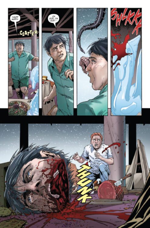
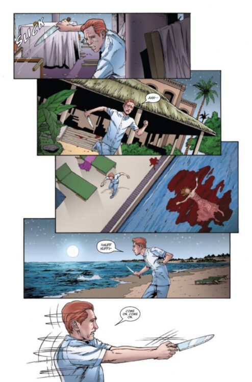
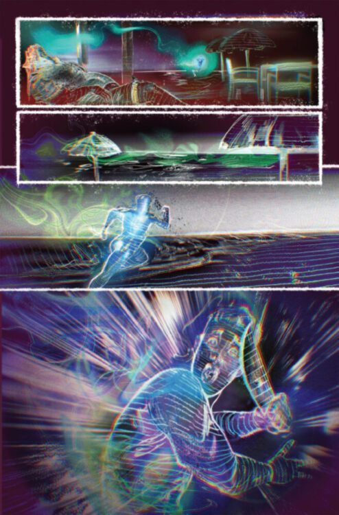
WELCOME TO THE MAYNARD #1 hits your local comic book store on November 27th, but thanks to Dark Horse Comics, Monkeys Fighting Robots has an exclusive five-page preview for you!
About the graphic novel: “Welcome to the Maynard!”
The Maynard is a hotel unlike any other, a place where every guest and staff member has magic in their veins. It’s a hotel for magicians, witches, and otherworldly beings. It’s also where Phillipa (Pip) Dale begins her first day as the hotel’s new bellhop (and trainee house detective). She’s immediately sent on the hunt for a magical hotel thief whose daring thefts are part of a much bigger mystery, one that could turn deadly at any moment. And that’s just one of the many challenges and perils Pip must face in her new job in the magical Maynard Hotel, a wonderful, thrilling, fun place… so please come in and stay a while.
The fantasy mystery series reunites Eisner Award-winners James Robinson and J. Bone. Joining the duo are Ian Herring on colors and Jim Campbell on letters. The main cover is by J. Bone, with a variant cover by Chris Samnee. There is also a FOC variant available by Fábio Moon.
“It’s a thrill to be reunited with my dear friend J. Bone,” says Robinson. “I love his art and his collaborative spirit, both, so Welcome To The Maynard has been a joy to write. I’m also excited to do a series (akin to Leave It To Chance, back in the day) that can be enjoyed on different levels, by readers young and old.”
While WELCOME TO THE MAYNARD has magical mystery and danger, it is also a book filled with hope and joy, and is written to appeal to all ages. The miniseries will run for four issues.
Check out our WELCOME TO THE MAYNARD #1 preview below:
Final Order Cutoff (FOC) for WELCOME TO THE MAYNARD #1 is this week, so call your Local Comic Shop today and tell them you want it!
From two of the DC legends behind Blackest Night, Geoff Johns and Ivan Reis present the highly anticipated horror series Hyde Street. Featuring inks by Danny Miki, colors by Brad Anderson, and letters by Rob Leigh, all of whom (along with Johns and Reis) are co-founders of the media company Ghost Machine, with Hyde Street being one of four shared universes in their slate.
Hyde Street #1 follows the sinister Mr. X-Ray, a 60s era con man who made his living selling fake products to children in the back of comics and magazines. His penchant for targeting kids in his schemes—and overall lack of conscience—eventually lead him onto the titular Hyde Street, a limbo of sorts for all wrong-doers, where people are sent to get tortured or become torturers themselves. Hyde Street houses a variety of creatures and monsters, one of which is Pranky, a boy scout who revels in punishing those who target children. Pranky and Mr. X-Ray, along with many other inhabitants of Hyde Street, all perform their role for an unknown entity, who scores the amount of souls they torture, with the promise of release to the most successful.
Writing/Story
This first issue jumps right into the horror of Hyde Street, with an opening that swiftly introduces the monsters who inhabit that place and the consequences of finding yourself there. While much is still to be revealed, the characters really are what bring this series to life. Mr. X-Ray, while not having a chance to necessarily be a tormentor as his role on Hyde Street dictates, does get a clear and concise backstory in this first issue. Foil to him is Pranky, who is portrayed as evil incarnate in a cherubic body. Their relationship is tense and combative, and it makes for a great dynamic as it’s easy to foresee both possible team-ups and fights.
As the title dictates, the street itself is a character, akin to a different plane of existence. And while there is much to yet be revealed in this story, there is a clear understanding from the authors that less is more. This first issue leaves many questions open as it introduces a variety of characters and concepts, but it never feels heavy-handed or done for effect, it’s as if the reader also stumbled upon the street and is learning its secrets in real-time.
Art Direction
As mentioned, Hyde Street itself feels like a character in the story, and that is largely due to how vividly it is portrayed. There is no lack of detail and focus in each part of the story. As early as the first few pages, characters are portrayed up close and hyper realistically, and there are clear and bustling environments behind them. On a second read, it is easy to spot shadowy figures lurking behind places, and lights on in apartments — all small but important details that make the street be alive.
When showing horror, the features are intense and bold, with certain characters inhabiting shadows and becoming demonic. Eyes are specifically used for effect a lot in this issue, with the combination of colors, placement on the page, and overall design, allowing for some very unique and memorable spreads and panels. Blood is used surprisingly scarcely in this first issue, but when it is, it is done so very boldly, drawing the viewers’ eyes to it with the vibrant red that is used. The whole of the issue is a bit muted in terms of color, but it allows for these impactful pops of vibrancy when needed. The coloring also works perfectly in tandem with the lettering. The text boxes in which Mr. X-Ray and other characters scream are visceral. As characters engage in the evil that Hyde Street demands, it’s very interesting to follow how their speech bubbles mirror their emotional state.
Verdict
Hyde Street #1 is this creative team showcasing their talents to their max, and what their respective arts can look like outside of the traditional mainstream setting, all in full horrific glory. Overall, this entire team came together to bring a work of art from Ghost Machine, and after reading Hyde Street #1, I’d say they succeeded. This is the comic to read as Halloween approaches, and pretty much any other time too.
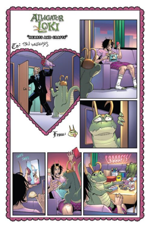
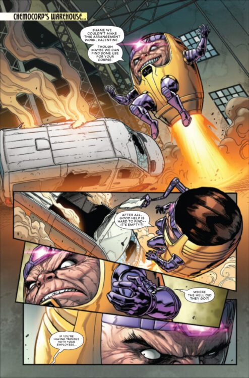
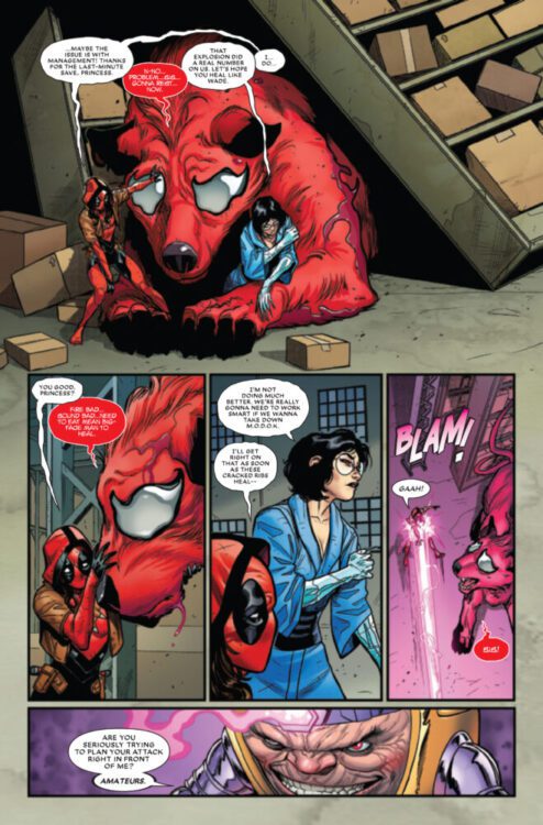
NEGASONIC TEENAGE WARHEAD #1 hits your local comic book store on November 6th, but thanks to Marvel Comics, Monkeys Fighting Robots has an exclusive six-page preview for you!
About the issue: SPOTLIGHTING THE LOVEABLE PUNK!
Ellie Phimister is under arrest! When the Time Variance Authority accuses Negasonic Teenage Warhead of a crime she has yet to commit, she’ll have to go on the run to stop herself before the TVA does. It all comes down to a single moment in time, a choice Future-Ellie must face… Which means Now-Ellie has one hour to find Yuki Ohara, her girlfriend from the future who she’s never met, kiss her and save the Multiverse. Good thing she has allies like – wait, no. Deadpool is NOT going to be helpful. Is anyone else available?!
Collecting the hit web series Marvel’s Voices Infinity Comics: Negasonic Teenage Warhead #44-49 for the first time in print, plus, a brand-new story by the returning creative team!
The issue is by writer Andrew Wheeler and artist Eleonora Carlini, with letters by Joe Sabino. The main cover is by Paco Medina and Jesus Aburtov, and there will also be a variant cover by Audrey Mok.
Check out our NEGASONIC TEENAGE WARHEAD #1 preview below:
Are you picking up NEGASONIC TEENAGE WARHEAD #1 on 11/6? Sound off in the comments!
ENDLESS #4hits the internet October 8th, but thanks to Comixology Originals, Monkeys Fighting Robots has an exclusive five-page preview for you.
About the series: When a heist to steal an expensive piece of scientific technology goes wrong, Henry Quan, a selfish career criminal, is unmoored in both space and time. Thrown in and out of parallel lives across the multiverse, he struggles to find his way back home and find out what exactly happened to him. Each issue: A new life in a new universe, drawn by a different amazing artist. Endless is a showcase for a diverse array of the best new talent comics has to offer.
Everything Everywhere All At Once meets Quantum Leap in this exciting new comic extravaganza!
About issue #4:
Starlight Over Texas. The Ballad Of Henry Quan.
Issue #4 is the final issue of the series. It’s from writer Curt Pires and artist Ryan Quackenbush, with letters by Micah Myers. The main cover is by Quackenbush.
Check out the ENDLESS #4 preview below:
Have you been reading ENDLESS on Comixology? Sound off in the comments below!
STAR WARS: EWOKS #1 hits your local comic book store on October 9th, but thanks to Marvel Comics, Monkeys Fighting Robots has an exclusive four-page preview for you!
About the issue: CELEBRATING THE 40TH ANNIVERSARY OF CARAVAN OF COURAGE, THE EWOKS RETURN IN AN ALL-NEW MINISERIES SET AFTER THE EVENTS OF RETURN OF THE JEDI!
A team of Imperial-led BOUNTY HUNTERS and scavengers arrive on the Forest Moon of Endor searching for a secret cache of Imperial weaponry! Are they prepared to face off against the battle-ready Ewoks who took down so many of their ranks? Who is the mysterious new warrior Ewok returning to Bright Tree village, and what is their connection to WICKET W. WARRICK?
The issue is by writer Steve Orlando and artists Álvaro López & Laura Braga, with colors by Antonio Fabela, and letters by Joe Caramagna. The main cover is by Pete Woods (paying homage to Cynthia Martin).
Check out our STAR WARS: EWOKS #1 preview below:
Are you picking up STAR WARS: EWOKS #1 next week? Sound off in the comments!
STAR WARS: THE BATTLE OF JAKKU — INSURGENCY RISING #1 hits your local comic book store on October 2nd, but thanks to Marvel Comics, Monkeys Fighting Robots has an exclusive five-page preview for you!
About the issue: NEW REPUBLIC STAVE OFF AN UNEXPECTED – AND DEADLY – NEW THREAT?
A DEFIANT IMPERIAL takes center stage – and goes on the offensive against the NEW REPUBLIC! LEIA makes a startling discovery in the forests of ENDOR! Who are the mysterious and deadly ACOLYTES OF THE BEYOND?! What is the new villain’s connection to DARTH VADER? All this as the post-Return of the Jedi storytelling BEGINS!
The issue features two stories, both written by Alex Segura and lettered by Joe Caramagna. The first story is drawn by Leonard Kirk, with colors by Rachelle Rosenberg; the second is drawn by Stefano Raffaele, with colors by Alex Sinclair. The main cover is by Phil Noto.
Check out our STAR WARS: THE BATTLE OF JAKKU — INSURGENCY RISING #1 preview below:
Are you excited for the new era of Star Wars comics? Sound off in the comments!
From French cartoonist Manu Larcenet and publisher Abrams ComicArts comes a stunning adaptation of one of the most brutal and unflinching novels ever written. Cormac McCarthy’sThe Road: A Graphic Novel Adaptation takes the work of one of America’s greatest writers and applies the atmosphere, pacing, and thematic weight of arguably his darkest work beautifully. Larcenet’s careful restructuring of McCarthy’s prose mixes in with his gorgeously unsettling visuals to craft an excellent adaptation.
McCarthy’s Words to the Comic Panel
Cormac McCarthy’s prose in his post-apocalyptic novel The Road feels almost tailor-made for the comics medium. Manu Larcenet takes the original author’s vivid descriptions of a burned world and paints them to life with tremendous detail and careful consideration. McCarthy’s novel uses very little dialogue. Most of the original The Road is made up of lengthy descriptions of what the two main characters see and interact with in this burned-out world. What dialogue is there actually breaks the conventional rules of writing – McCarthy never uses quotes for character speech. Larcenet manages to take McCarthy’s approach to prose and repurpose it on every panel. What little dialogue there is sticks out and stays memorable due entirely to its context within a sequence, and Larcenet’s placement on the page. The actual dialogue is flat and standard, like the speech of a normal person – which is why it works so well in context. With his interpretation of the original work’s dialogue and writing style, Larcenet shows that he understands what makes The Road and McCarthy’s own writing style special.
The real star here is, of course, Manu Larcenet’s incredible visual work. The ash covered, dilapidated vistas and landscapes of rotting steel craft a nightmare vision interpretation of McCarthy’s The Road. While John Hillcoat’s 2009 film adaptation does a solid job of visually interpreting McCarthy’s work, it doesn’t come close to what Larcenet is able to do with his pencils and inks. There’s a dark beauty in the utter destruction and decay Larcenet presents McCarthy’s descriptions in, with everything from the great steel of construction cranes, to crumbling skyscrapers, and even old advertisements casting a constant, frightening reminder of the world that once was. A real treat here in Larcenet’s adaptation is his interpretation of the two main characters – the old man and his son. Both characters spend most of their time wrapped in layers of clothing, their faces hidden under hats and obscured by ash. When we are shown their faces, the facial detail and animation does incredible work in showing how tired and almost beaten they are – but how they also still retain their humanity. Small moments of joy still find their way into the story; going for a swim, finding an unexpected stockpile of supplies, or even just the discussion of a hopeful future, shows readers that humanity still exists in this shell of a world. Much of this adaptation, and of the original work as well, is a true horror story. The depictions of violence inhumanity in this story are chilling and genuinely vile. Larcenet captures the brutality of this future with grotesque, shocking artistry. There are panels I will likely never unsee, in keeping with one of The Road’s constant motifs. Manu Larcenet’s work here is astonishing, showing an understanding of McCarthy’s writing that allows for tiny glimmers of hope under the devastation and terror this story has to offer.
Verdict
Manu Larcenet’s adaptation of Cormac McCarthy’s The Road is a beautiful work of post-apocalyptic desolation and terror. The French artist understands how and when to show the underlying humanity present in the original work, and carefully depicts every moment and dialogue choice according to McCarthy’s prose. While it’s no replacement for Mccarthy’s novel, Larcenet has crafted a phenomenal adaptation.
DC’s current Outsiders comic has come to an end. Outsiders #11 from writers Jackson Lanzing and Collin Kelly, artist Robert Carey, colorist Valentina Taddeo, and letterer Tom Napolitano is an oversized conclusion to the comic this team started almost a year ago. We say goodbye to not only the team, but the cast of characters as well.
The issue starts with Jakita Wagner facing off against the Carrier, a powerful being that fights to keep the timeline intact. She stops Wagner from completing her plan, and in doing so, takes the Outsiders from each of their respective endings Jakita has set for them in order to bring them together once more and face off against Jakita.
WRITING
Lanzing and Kelly work together seamlessly here. Every word feels like it’s from one mind; this duo really understands one another. It feels like they speak through Carrier in this. They’re the ones telling Wagner that she’s wrong. That these worlds shouldn’t end and that no one should be destined to any one thing. They quite literally provide the Outsiders with a blank page, and the freedom to explore the unknown and not be bound to any predetermined end they may have.
Batwoman and both Luke and Lucius Fox all have their own parts to play, but Lanzing and Kelly do well in giving them autonomy. They act for themselves. They work together, but each character still works and strives towards what they want and need as individuals. Each character’s ending share the idea that they’re fitting, but don’t feel quite right—like their story isn’t over yet. And so when the Carrier pulls them out, their connection feels complete. They feel like they really control themselves, that there is no writer behind them. That’s the best thing a writer can do for any character.
ART
Carey does great work this issue, especially with his paneling. Everything feels carefully placed and exactly where it belongs. However, when Carrier tries to bring the Outsiders together, she turns to shards and then those shards become the panels. They’re messy and rigid; they’re not set in stone. They’re ever-changing, and that’s important to the message Lanzing and Kelly pose. And then the team bursts through those shards, no longer confined to those boxes.
Not only that, but Carey produces some gorgeous backgrounds. Everything is detailed, but there isn’t too much. There’s enough to tell you where these characters are, like when they’re standing on a building with others behind them, but not so much that it crowds the page. Carey is really good at making the world feel just as important as the characters.
COLORS
Taddeo’s colors are immaculate here. She not only gives personality to the characters through their shading and shadows, but she assists in making Carey’s environments feel impactful and rich—specifically the library where the majority of the issue takes place. It’s this sort of ethereal silver that almost engulfs the characters near the beginning. As the cast gains their autonomy later though, it morphs to exist around them instead. They’re well defined, with the colored background less detailed than it was before. The coloring just adds to what makes the character work of this issue so great.
LETTERS
Napolitano’s approach to lettering this series has remained engaging the entire way through. The shift from regular text boxes to the narration in the written brown box style is amazing every time, especially when it’s used to further explain and cement the emotions of the characters as it does in this issue. It feels like it comes from a higher plane than the rest of the comic, more detached. Because of that, it feels like the words carry more weight. It was a really smart choice.
CONCLUSION
This team has created a beautiful story about destiny and loss for almost a year now, and they really stuck the landing well here. Every character gets the ending they deserve, as well as a new beginning. Diving into Planetary stuff through the series was definitely a bold choice from the team, but they handled it with care, and this issue is no exception to that. Lanzing, Kelly, Carey, Taddeo, and Napolitano should be proud to have worked on such a meaningful story regarding fate, as well as how you should face it.
From the mind of iconic webcomic creator J.L. Westover, comes Mr. Lovenstein Presents Feelings, a compendium of over a hundred of his Mr. Lovenstein comics. Though not following any overarching plot, each comic is guided by the central theme of emotions and features a variety of zany characters as they each experience their feelings in their own wacky ways.
Writing/Story
For those unfamiliar with Westover’s work, each Mr. Lovenstein comic typically features two overexpressive (and by his own admission, sweaty) characters, engaged in conversation. The comics are usually 3 to 4 panels long, though included in this book are also Mr. Lovenstein’s signature bonus panels, which typically add a secondary punchline to the previous comic. The jokes here are all relatable, ranging from intrusive thoughts, nihilistic tendencies, to just simply absurd scenarios. At first glance, Westover’s book seems like just a collection of his comics, bundled together wholesale, yet after diving in, you can see a clear vision and flow to properly present the promised feelings. The author himself states they tend to write from a layer of separation from the work, to not allow themselves to bleed too far into it, yet the comics clearly show otherwise. As a whole, the book is an invitation to the reader to smile more, to cry more, and to generally feel more.
Art Direction
While the book is by no means meant to be sad, it can tackle some difficult feelings, and this is when Westover’s over-the-top, near-caricaturistic style shines. The characters are generally just funny to look at, and in many examples, juxtapose the emotion being portrayed, and some panels are full visual gags with no written punchline. Westover also has perfected the art of making his characters cute and endearing, making it difficult to not build an instant connection to them. While the art is objectively simple, there is a clear eye for detail (or lack thereof) which Westover expertly chooses to accentuate whenever funniest.
Coloring and Lettering
Westover’s choices in coloring are fairly subtle, as his characters come in all colors the backgrounds typically contrast them to make them pop. However, they are also used to guide the reader through the emotion the character may be feeling through the comic, especially when the punchline is delivered, a color change may happen to accentuate it. The lettering is used to a similar effect, remaining mostly in his traditional font, with the occasional break for the sake of joke delivery and character emphasis. These two elements are extremely well-polished in Westover’s work, so much so that it can be easy to overlook them on initial reads. Yet that showcases why they work so well. They guide the readers to the joke and boost both the comedy and the flow in a non-distracting manner.
Verdict
This compilation book is more than just an amalgamation of his years of work, it’s blood, sweat, and tears (with copious amounts of the latter two). Westover is at his most vulnerable, yet he illustrates it all with relatability and optimism. Above all else, Mr. Lovenstein Presents Feelings, is a pure enjoyable read that readers will devour, only to return to their favorite comics right after.
WOLVERINE: REVENGE #2 hits your local comic book store on September 25th, but thanks to Marvel Comics, Monkeys Fighting Robots has an exclusive three-page preview for you!
About the issue: LOGAN: OUT FOR VENGEANCE!
The unspeakable has come to pass, and now SABRETOOTH, OMEGA RED and DEADPOOL WILL PAY! Jonathan Hickman and Greg Capullo raise the stakes for WOLVERINE as his near-death experience sends LOGAN toward untempered vengeance on his enemies. You won’t want to miss this key chapter of this prestige miniseries, destined to live on as one of Wolverine’s all-time most brutal tales!
The issue is by writer Jonathan Hickman and artist Greg Capullo, with inks by Tim Townsend, colors by FCO Plascencia, and letters by Cory Petit. The main cover is by Capullo, Townsend, and Plascencia.
Check out our WOLVERINE: REVENGE #2 preview below:
Did you pick up the first issue of WOLVERINE: REVENGE? Sound off in the comments!