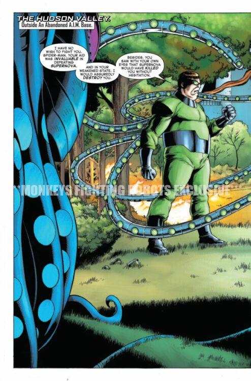
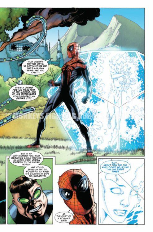
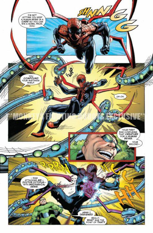
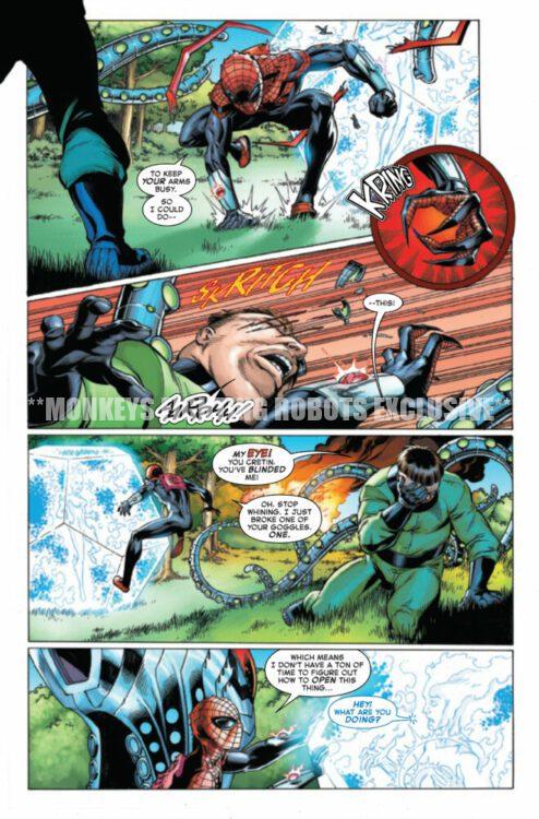
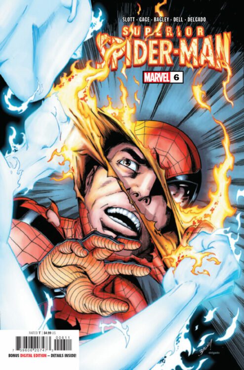
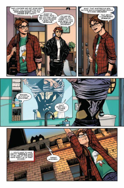
SUPERIOR SPIDER-MAN #6 hits your local comic book store on April 24th, but thanks to Marvel Comics, Monkeys Fighting Robots has an exclusive four-page preview for you!
About the issue: A final showdown will determine once and for all who is truly the Superior Spider-Man!
The issue is by writer Christos Gage (from a story by Dan Slott) and artist Mark Bagley, with inks by John Dell & Andrew Hennessy, colors by Edgar Delgado, and letters by Joe Caramagna. The main cover is by Bagley and Delgado.
Check out our SUPERIOR SPIDER-MAN #6 preview below:
Are you reading SUPERIOR SPIDER-MAN? Sound off in the comments!
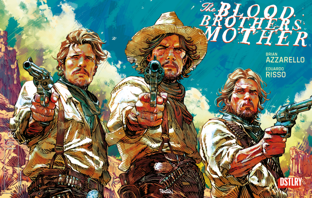
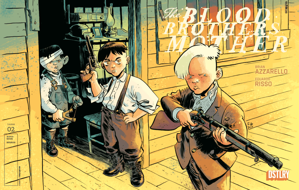
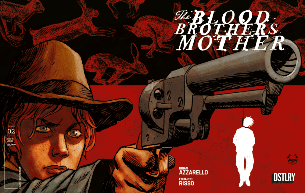
From the creator-centric publishing house of DSTLRY Comics comes a series of insane new variant covers for The Blood Brothers Mother#2. The 2nd chapter from Brian Azzarello and Eduardo Risso’s brutal new Western series gets some incredible new art from the likes of Fabio Moon (Daytripper) and the iconic Dave Johnson!
The hit Western from DSTRLY by Brian Azzarello and Eduardo Risso – the
legendary creative team behind the seminal crime series 100 BULLETS – keeps
on charging!After the brutal murder of their step-father and the willful abduction of their mother, the
three Blood brothers set off in hot pursuit…but their way is fraught with killer bandits,
battle-scarred soldiers and female preacher that’s not at all what she appears!
In the tradition of The Searchers, The Outlaw Josie Wales and Blood Meridian comes a
brutal new western series from writer BRIAN AZZARELLO and artist EDUARDO RISSO
– the Eisner award-winning team behind the Vertigo crime classic, 100 BULLETS and
Image Comics’ MOONSHINE!For fans of YELLOWSTONE 1883, CLINT EASTWOOD, TRUE GRIT.
Cover B by Dan Panosian
The A and B covers are from Risso and Panosian respectively, while Moon takes the 1/10 C Incentive cover and Johnson is behind the 1/25 D variant. As you can see here though, every one is worth picking up.
Cover C 1/10 Variant by Fabio Moon1/25 Cover D Variant by Dave Johnson
The Blood Brothers Mother #2 hits shelves on 7/3, but be sure to contact your local comic shop or hit up dstlry.co before the FOC on 5/19 to lock in these exclusive incentive covers!
Avengers Inc.: Action, Mystery, Adventure is out next week from Marvel Comics, and it’s perfect for any readers looking for a bit more intrigue in their superhero books.
The series is by writer Al Ewing and artist Leonard Kirk, with colors by Alex Sinclair, and letters by Cory Petit. The covers are by Daniel Acuña, and artist Belardino Brabo assisted Kirk with inks on issue #3.
After a string of supervillains are murdered under suspicious circumstances, Janet Van Dyne (aka The Wasp, founding member of The Avengers) opens up Avengers Incorporated, dedicated to solving superhero mysteries. Joining Janet is the curious Victor Shade, whose name might sound familiar to you, but he’s not the Vic Shade you think you know.
And that’s all you really need to know going into Avengers Inc., because, as you’ve probably surmised, this is a mystery comic, and figuring out what the heck is going on is half the fun.
Writing an interesting mystery story must be a daunting task, but Ewing is (not surprisingly) able to deliver. This five-issue series feels like a season of classic procedural television. Each chapter features its own intriguing case (how does one get murdered in Valhalla?) while a larger riddle continues on in the background, and you get a number of cameos from Jan’s super-friends (think of them as your “weekly guest stars”).
Mysteries need to lure you in and keep your interest; you can’t let your audience get bored with the story, and Ewing sure doesn’t. These cases keep your mind working as a reader—you’re trying to solve the mystery yourself alongside Jan and Vic. Plus, there’s still plenty of superhero fun to satiate any Marvel fan.
Kirk is given the big challenge, being asked to draw a superhero book where the emphasis is less on action and flashy costumes. In fact, due to mandates from former Mayor Wilson Fisk, costumes are outright forbidden for Janet and Vic. However, they are never missed, as Kirk and Sinclair are able to keep Avengers Inc. a visually engaging comic. It’s not devoid of action by any means, but even in more dialogue-driven scenes, you’re kept invested by the characters’ expressions and the dynamic color palette. And between Kirk’s panel layouts and Petit’s masterful lettering, there’s never a lull in the story. You can read this in one sitting (which also makes it an easy re-read when you’re jonesing for some superhero intrigue).
The only major downside to the story is that it wraps up somewhat quickly and abruptly, which is probably due to the creative team discovering issue five would be their final one. This isn’t an uncommon happening in comics, but at least here it’s handled with grace and doesn’t feel clumsy. And, though it might end quicker than you’d like, at least you can go into Avengers Inc. knowing that you’re getting a complete story.
Avengers Inc.: Action, Mystery, Adventure is out April 23rd. If you like superhero stories that take risks and try new things, be sure to pick it up so we can continue to get comics like this.
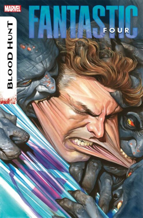
FANTASTIC FOUR #22 is coming to your local comic book store July 24th, but thanks to Marvel Comics, Monkeys Fighting Robots has the exclusive first look at the issue!
About the issue: BLOOD HUNT TIE-IN: ONE LAST HOPE!
Alicia Masters and Reed Richards – and the survivors of New York – are lost, alone against the vampire menace, and Reed’s exhausted. But they still need to survive – and avoid being turned into undead blood parasites. Reed has one last desperate hope, and it’s not guaranteed to work – but there is at least a chance…if he can survive long enough to test it!
This conclusion to our BLOOD HUNT tie-in ends in a twist that you will NOT want to miss!
The issue is by writer Ryan North and artist Ivan Fiorelli. The main cover is by Alex Ross.
Get your first look at Ross’ FANTASTIC FOUR #22 cover here:
Are you excited for BLOOD HUNT? Sound off in the comments!
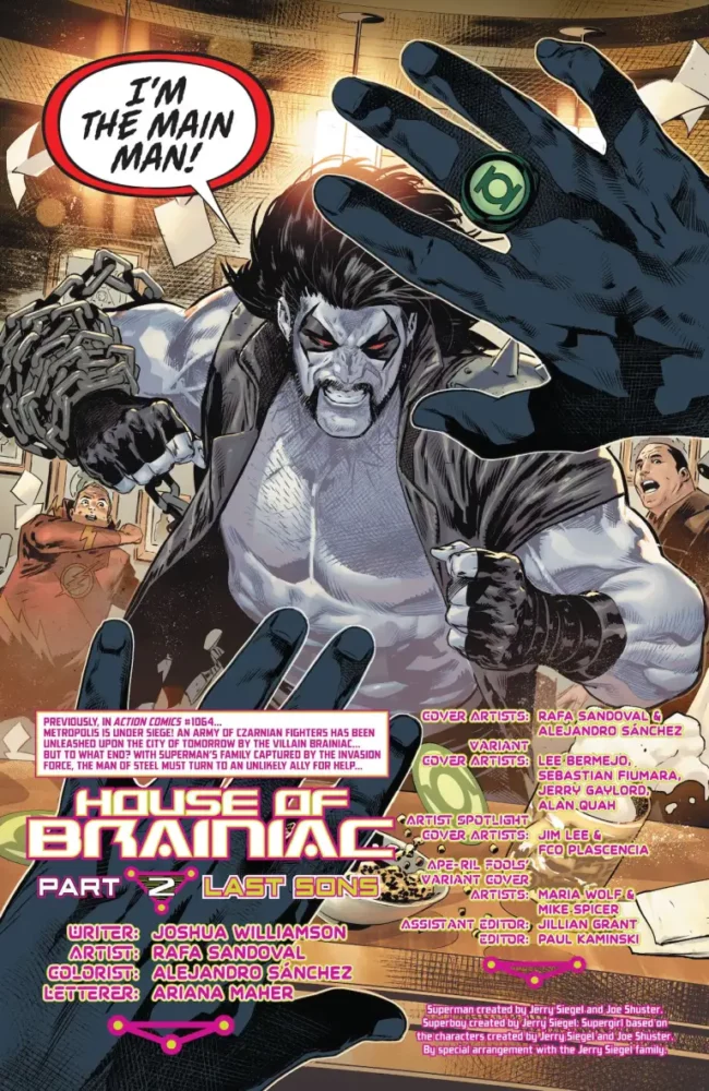
Superman #13 is the second installment in DC’s “House of Brainiac” crossover story from writer Joshua Williamson, artist Rafa Sandoval, colorist Alejandro Sanchez, and letterer Ariana Maher.
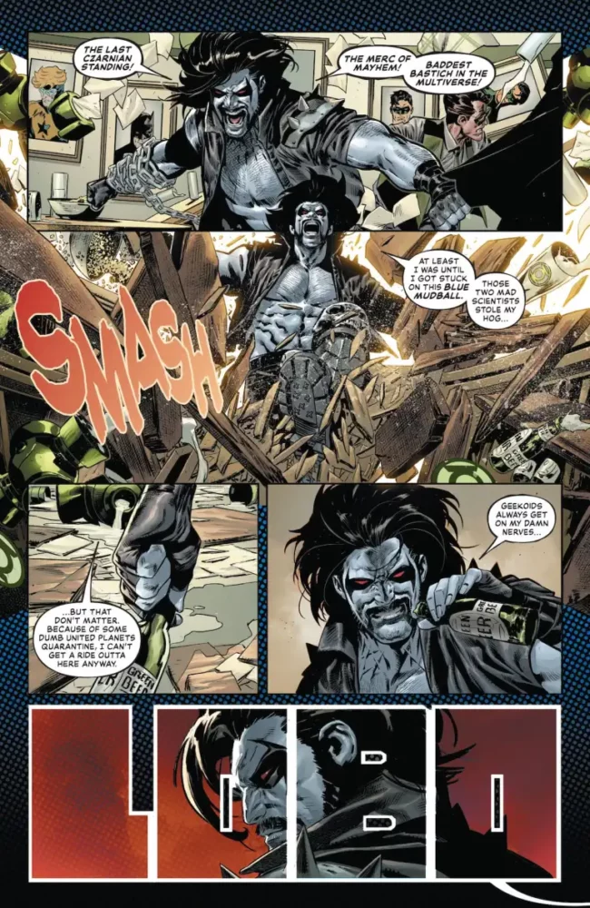
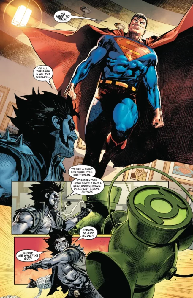
This issue picks up back on Earth after Action Comics #1064’s cliffhanger. Superman is on the search for Lobo and finds him in a Green Lantern-themed bar in Coast City. The two battle it out while Brainiac is up in space, holding superpowered individuals from Metropolis hostage and using them to power up some mystery weapon. Lobo teams up with Superman, and the two head to space to confront Brainiac and his army of Czarnians.
WRITING
Williamson writes a sterner Superman than we’re used to here, but it fits considering the situation. Williamson allows the reader to see how emotionally taxing Brainiac’s assault is for Superman, letting us see a more vulnerable side of him that doesn’t often emerge. To establish this, he has the issue open with a battle between Lobo and Superman. The regenerative Lobo was a great choice for this, as he provides an outlet for Superman’s anger, as well as information to help move the plot forward. It does take Williamson a while to find his footing with Lobo. The character’s presence in the first chunk of the issue feels too convenient, but smooths out over time as Williamson successfully incorporates him into the plot as a whole. The Czarnians that Williamson uses in the story feel as though they connect to Lobo naturally. It’s absolutely believable that Brainiac has an army of this long extinct race trapped in his ship, and given the competitive and reckless nature of Lobo, the two parties butting heads seemed inevitable.
Lobo wrecks a bar.
Brainiac himself is the star of the show here. He doesn’t necessarily explain his plan, but he does explain what he needs for said plan to come to fruition. There’s a lot of mysteries surrounding Brainiac in the early chapters of this story. There’s clearly something wrong with him, but we’re unsure to what. Williamson uses the Super Family members in Brainiac’s captivity to move the story forward, getting information out of the villain while also asking who these other Brainiacs are, and what his endgame is. Williamson doesn’t waste a single character. It constantly feels like everyone has their own role to play, which is impressive with a cast this large.
ART
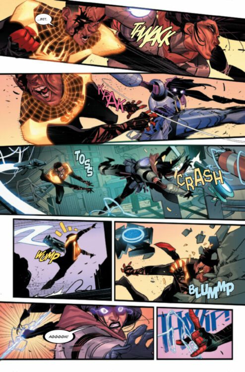
Sandoval seemingly has a lot of fun with this issue. He draws and details this Green Lantern-themed bar in Coast City with a plethora of neat little details. What he details just as well is Lobo’s rampage through the bar. There’s a weight and power that’s felt behind every blow, the broken furniture really allowing you to feel the impact from every hit. Where Williamson lays the groundwork for a ticked off Superman, Sandoval follows up on it with menacing facial expressions that show he’s not messing around.
Superman confronting Lobo.
Sandoval generates these intimate moments between members of the family in Brainiac’s captivity. A lot is said through facial expressions that enhances the scenes they’re present in as a whole. There’s a page where a few of the characters from Superman’s supporting cast are trapped in these tubes, and you really get a sense of urgency through their expressions. Whether it be Supergirl’s looks of strategizing, or Mercy trying to test the limits of the prison she’s in, there’s always something important happening for each individual character. Sandoval really allows that to come across in his art.
COLORING
Alejandro Sanchez does some really beautiful work on coloring this issue. Where the first part of this event was bright and hopeful, this issue is dark and malevolent. The setting of Brainiac’s ship is really creepy. Various shades of purple fill not only the room itself, but sometimes the actual page that the panels lay on top of as well. The purples and blues that the ship radiates blend together really well in a way that really strongly connects you with that specific location. Now, whenever we return to it, it feels almost familiar. The light that emits from Brainiac’s body is especially interesting. Sanchez uses the lighting in a really intriguing way where a character can be lit from a purple prison cell from one direction while also being lit in another purple light relative to wherever Brainiac is standing. It fills out character faces nicely. The lights also seem to be tied to Brainiac’s status. If he’s rejuvenated, they seem brighter than they would be if he wasn’t operating at full capacity. There’s lots of attention to detail in Sanchez’s coloring here.
LETTERING
Maher knocks it out of the park here. Starting with Lobo, everything said feels loud and rowdy because of those big and bold bubbles that accompany nearly every word he says during his introduction. It helps to establish the character for readers unfamiliar with him. With Brainiac, Maher is smart about differentiating the different versions of him present that were seen in the last issue. All the Brainiacs have the same black speech bubbles with green lettering and outlines, but the actual shape of the bubbles is different depending on the Brainiac. For the main one, They’re these sort of smooth circles indents on the top right and bottom left corners. With another, it’s this octagonal shape. It helps to separate each one. So much personality for these new characters is brought forth through this thoughtful lettering.
Lobo causing chaos in the Lantern bar.
CONCLUSION
Williamson, Sandoval, Sanchez, and Maher continue the arcs established in the first issue while also skillfully weaving new characters into the mix. They really hit the ground running with this event. Superman #13 is a strong second entry in what is shaping to be one of Brainiac’s most compelling stories.
MILES MORALES: SPIDER-MAN #19 hits your local comic book store on April 17th, but thanks to Marvel Comics, Monkeys Fighting Robots has an exclusive four-page preview for you!
About the issue: FALLOUT FROM ISSUE #300!
The climactic events of issue #300 have FOREVER CHANGED Miles Morales! But a SPIDER-MAN’s job is never done. And in fact, learning to live with the consequences of his actions might be the greatest job of Miles’ life. Who will survive? What has the battle cost him? And what does the future look like for Miles Morales: Spider-Man?!
The issue is by writer Cody Ziglar and artist Federico Vicentini, with colors by Bryan Valenza, and letters by Cory Petit. The main cover is by Vicentini and Richard Isanove.
Check out our MILES MORALES: SPIDER-MAN #19 preview below:
Are you reading MILES MORALES: SPIDER-MAN? Sound off in the comments!
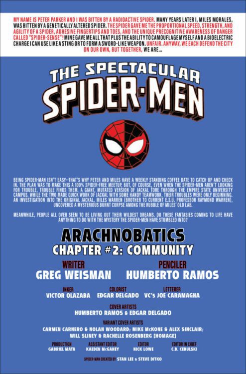
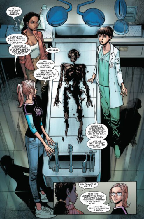
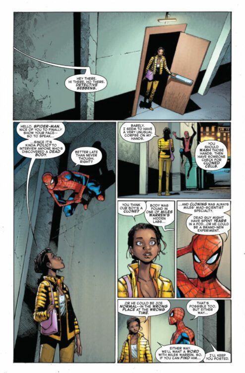
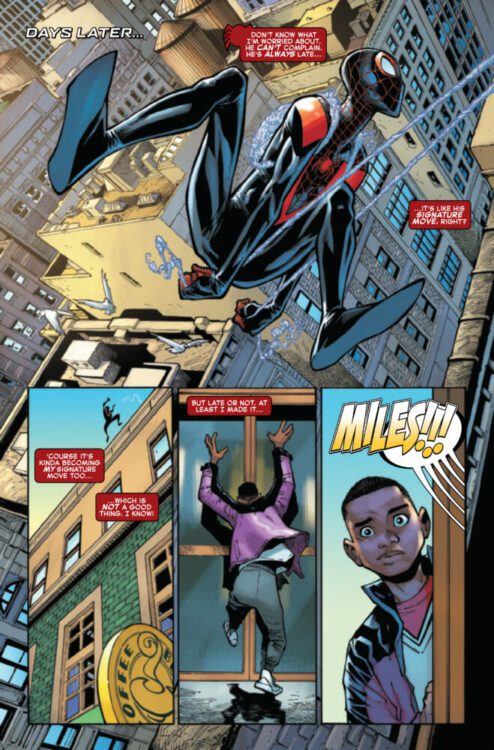
SPECTACULAR SPIDER-MEN #2 hits your local comic book store on April 17th, but thanks to Marvel Comics, Monkeys Fighting Robots has an exclusive four-page preview for you!
About the issue: “ARACHNOBATICS” CONTINUES!
Surprising anyone who knows Peter Parker (but probably not those who know Miles Morales), the Spider-Men have been keeping up their weekly meetup at the Coffee Bean! Sadly, that hasn’t given them any insight into the machinations of the Jackal!!! And what do all these mysterious interludes add up to?
The issue is by writer Greg Weisman and artist Humberto Ramos, with inks by Victor Olazaba, colors by Edgar Delgado, and letters by Joe Caramagna. The main cover is by Ramos and Delgado.
Check out our SPECTACULAR SPIDER-MEN #2 preview below:
Are you reading SPECTACULAR SPIDER-MEN? Sound off in the comments!
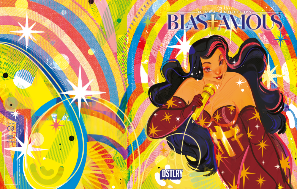
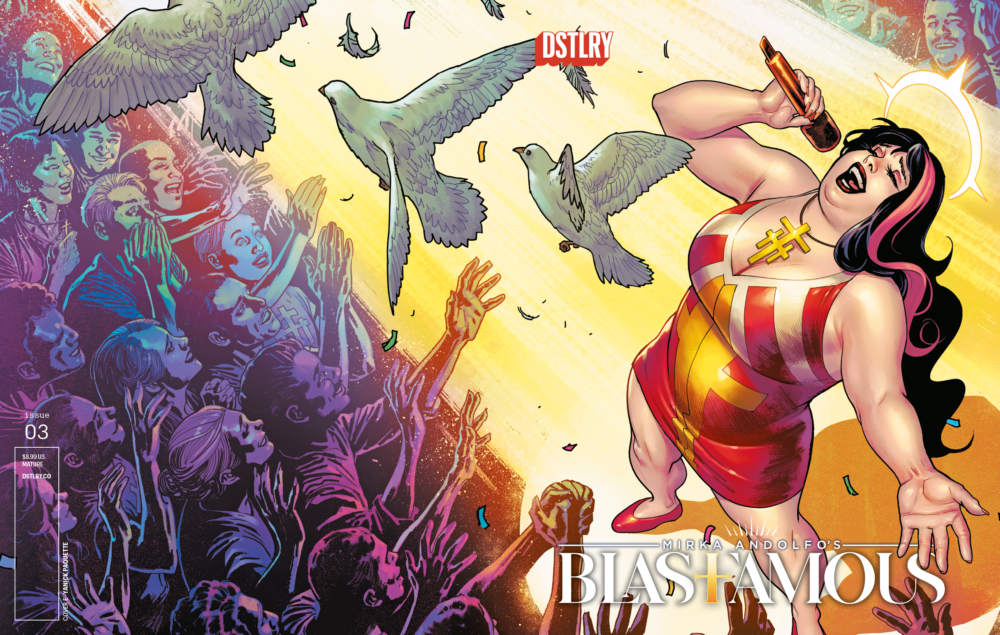
The third and final issue of Mirka Andolpho’s imaginative pop music and religion-inspired series Blasfamous is almost here via DSTLRY. To mark the occasion, DSTLRY Comics will be debuting 3 new variant covers: a 1/10 from Nicoletta Baldari (Spider-Man), a 1/25 from Derrick Chew, and a 1/50 from Yanick Paquette (Wonder Woman, Swamp Thing).
The new, exciting series from international superstar Mirka Andolfo (SWEET PAPRIKA, MERCY, UNNATURAL, HARLEY QUINN, PUNCHLINE).
In this final issue, pop icon Clelia faces a crisis after uncovering rival Dorothy’s identity. Broken physically and spiritually, she and Father Lev battle against forces of… goodness? As Clelia’s world teeters, the righteousness of maintaining the status quo is threatened! Offering an intense exploration of personal and societal values in the glamorous yet ruthless pop industry, Blasfamous comes to a breathtaking, intense climax!
Cover C – Nicoletta BaldariCover D – Derrick ChewCover E – Yanick Paquette
FOC is on 5/12, with the release date landing on 6/26, so be sure to head to your local comic shop or DSTLRY’s home page to order a copy!
Ultimate Spider-Man #3 came out last week, and I sat down with MFR editor Zac Owens to discuss the issue!
About the story: PETER PARKER’S NEW LIFE GETS EVEN MORE COMPLICATED… Spider-Man sizes up the new hero Green Goblin! As they team up to fight a new super villain, secrets about the corporations running North America are revealed… And you’ll never guess who discovers Spider-Man’s secret identity!
The series is by writer Jonathan Hickman, artist Marco Checchetto, colorist Matthew Wilson, and letterer Cory Petit.
Warning: Spoilers Ahead
Anthony Composto: Zac, you’re our resident Hickman fanboy here at MFR. How is Ultimate Spider-Man stacking up against your favorite Hickman runs so far?
Zac Owens: Honestly, I feel like a fraud, having only read House of X/Powers of X of his X-Titles. But compared to what little I know of that, plus my comprehensive knowledge of his incredible Fantastic Four run, his psychedelic run on S.H.I.E.L.D., and of course the entire arc he created with Avengers, The Ultimates, and Secret War, this feels… different? It’s one of those things where I almost don’t even want to “stack it up” against any of his other works, because it feels like it occupies a whole other space. Which is even cooler to me, because he led into this whole thing with Ultimate Invasion and Ultimate Universe, which are very “Hickmany” books. So this change of tone is obviously incredibly deliberate. I’m loving the light-hearted feel here.
Anthony: Yea, I love how much fun Hickman and Checchetto are having with this book. We have all the moments between Peter and his daughter, or between Ben and Jonah, and then you have pages like where Spider-Man is bored out of his mind on a stakeout. Do you think we’re being lulled into a false sense of comfort, though? Are we going to have the rug pulled out from under us soon?
Zac: I think that’s entirely possible. For one thing, my theory is that with this Ultimate Universe, Hickman is doing the opposite of what they did in 1610. (Sorry for the shameless plug, I couldn’t help it.) Instead of making comics that are aiming towards a younger audience, 6160 is gearing itself towards a more mature demographic. Momoko’s X-Men, which is subtle and deeply haunting, is a great example. Hill and Caselli’s Black Panther is about terrorism and political war games. Ultimate Spider-Man sticks out like a sore thumb, and yet it’s the one series so far that’s actually penned by the architect of this new universe. I don’t know what it will be, but something is brewing on the horizon. That’s my guess, at least.
Anthony: Well, speaking of things brewing on the horizon, we get a lot of hints to the Maker’s Council in this issue, reminding us that there is a larger, overarching story happening in this new Ultimate Universe. I’m interested in that story, but I also really like the idea of Ultimate Spider-Man being in its own little pocket where I can enjoy its story each month without having to read a bunch of other titles and tie-ins. Is that a concern for you with these new Ultimate titles, that the greater threat of the Maker is going to disrupt the flow of the individual stories?
Zac: Aaaaaah! You’re killing me here. I’m very much in the other camp. I love the Maker, I loved the worldbuilding that happened in Ultimate Invasion and Ultimate Universe. I want all of that stuff to start affecting everything. I want it all to feel like one big story.
Anthony: I think I’m just burned out on big crossovers where you have to read a bunch of tie-in issues to get the full picture.
Zac: Yeah, I get that.
Anthony: I’d like to read an intimate story about Spider-Man and his family for a little while longer before he gets dragged into Tony Stark’s war.
On the topic of Spidey’s family, as of this issue, May is still the only member of the Parker household who knows Peter’s secret. Do you think they need to keep this going for a while to maintain some dramatic irony, or do you want MJ and Richard to find out soon?
Zac: I don’t know? I think there’s lots of room for storytelling to take place in Peter trying to figure out how or if he should tell them. But then again, that all feels a little “been there, done that.” So you know what? I’ve convinced myself. Yes, I would like them to rip the band-aid off. I think it would be more interesting to see MJ grappling with the news, and all of its implications, than to see Peter agonize over his secret.
Anthony: Yea, we’ve had decades of stories concerning Peter (and a million other heroes) trying to conceal a secret identity. If they bypassed that sooner than later, I’d welcome the change. This isn’t the Spider-Man origin story that we’re used to, but there’s still a clear love and reverence for the source material here. I geeked out on page three when Peter is trying out different suit styles, and they’re variations on classic Spider-Man costumes. I’m glad they landed on the iconic red and blue, but do you think they should have taken more liberties with the suit for this new universe?
Zac: See, this is absolutely your domain, my friend. I know some classic Spider-Man stories, but I am not familiar enough with the webslinger to recognize all those references. I don’t usually care too much about suit designs, but I did like the black suit a lot. The black suit era is one I’ve actually read, and I thought it was interesting to see the costume re-introduced, but in a world where it doesn’t have the same baggage. In a way, it was like a secret Hickman and Checchetto had with the reader. Like it was foreshadowing a dark twist long before it happened.
Anthony: The black suit holds a very special place in my Millenial heart. I loved seeing it for a second, but again, I’m glad the final Spider-Man design is faithful to the classic design.
I also really dig the variations to Green Goblin and Bullseye’s costumes. They’re familiar, yet modern. Something as small as a mouth covering takes Bullseye’s iconic suit from goofy to intimidating. It’s just scarier that you can’t see his eyes or any part of his face. What are your thoughts on the costume variations we’ve seen so far?
Zac: I think costume designs, in my mind, come down to what they have to add to the story. You mentioned this to me before, that you noticed there are more designs in this universe that fully cover each person’s face. And that makes a ton of sense. This is a more realistic version of 616, they would be thinking about things like that. Similarly, the Iron Man-esque Goblin suit, while I definitely prefer the classic look esthetically, adds a lot of layers to what’s going on. Where did he get this tech? Did Osborn work with Howard Stark? Did Oscorp steal the tech? One way or another, this creative team is flagging to us that the Starks and the Osborns have a connection in this world.
That was a whole thing. Next time you ask me a question like that, I’m just going to say “Yep.”
Anthony: I have the same questions! How was Harry able to control Peter’s suit? How is it proprietary to Oscorp if Tony stole it out of the Maker’s vault? I need to know, Hickman!!
So what do you think the deal is with this Green Goblin? I think it would be a really interesting turn in this universe if Spider-Man’s iconic archenemy was truly changed into an ally.
Zac: Yep.
Anthony: You’re the worst.
Zac: Just kidding. We both know I can’t help myself.
Well, I think we’re not going to have a cut-and-dry answer to that question. I hope that Green Goblin turns out to be enough of a layered character, that we get people on both sides of the conversation. Some who trust him and some who don’t. First impressions, do you trust him?
Anthony: All of my instincts (Or should I say my Spider-Sense? No, I should not.) keep me from trusting an Osborn in a goblin suit. But my more critical brain really hopes for a fresh and interesting take on this dynamic, even if it ultimately ends with the Goblin as a villain.
I want to talk about the art, because it’s some of the best work Marvel is putting out right now. With all respect to Hickman and Petit, I have to say that I feel like Checchetto and Wilson are the MVPs of this title. I’ve wanted these guys on a Spider-Man book since they did Daredevil together, and they’re exceeding my greatest expectations. The action sequences are full of energy, but I’m in love with their small character moments, like the aforementioned stakeout scene, or the scene between Peter, Ben, and Jonah. I feel like these moments are even harder for artists to pull of than action, because you have to nail the characters and the tone of the scene and keep your readers’ interest without the aid of superheroics, which Checchetto is able to do through sympathetic faces and Wilson can do with bright, yet soft color choices. Do you have a favorite, “small” moment from this issue?
Zac: Checchetto and Wilson are superb. I think my favorite small moment is when Peter asks Ben and Jonah about the map on their wall, and they get all shifty about answering the question. It’s a funny moment, but it also suggests that we might be in for an espionage story on top of the action-packed stuff we’re used to. I’m excited to see more of what Ben and Jonah get up to.
Anthony: Yes! Give me a Front Line spinoff series (assuming that’s what Ben and Jonah name their company). Great moment. The action sequences are pretty great too, though. I keep coming back to the page turn where Spider-Man punches out Bullseye. There’s so much power and momentum throughout the whole fight, culminating in that awesome moment. Did that hit you the same way it hit me?
Zac: Well, I ducked in my chair while I was reading, so yeah! I think there’s this awesome wind up that happens in the page before. The biggest panel you have in that previous page is really zoomed out, so there’s a ton of dead space. And then the next page, it’s Spidey sending Bullseye flying in our direction, like he’s bursting out of the art. So. Freaking. Good.
Anthony: SO freaking good. And, of course, Petit rounds out the art team with his lettering, which complements the work perfectly and keeps those fight sequences moving along at a fast pace.
The smaller, lowercase lettering is something that’s set the Ultimate comics apart from the mainstream Marvel comics for years. How do you feel about the Ultimate lettering style?
Zac: I like it, because it leaves more room for a letterer to work. Even simply having the choice of putting something in all-caps. I love the rhythm and versatility Petit shows in this issue. Yes, the Ultimate-style lettering is subdued and small, but Petit’s sound effects are not at all. Everything from the giant but see-through “CRASH” letters of a crane hitting the ground (you hear the noise, so deafening that it almost seems hollow) to the colorful lettering of Green Goblin’s suit blasts. And I love that little “THWIP” that shows up, so small on the page, when Spider-Man is trying to nab one of Bullseyes’ cards. It feels so cheeky.
Anthony:Ultimate Spider-Man has genuinely become my favorite monthly title that Marvel is currently putting out. I still have a million questions about this new universe, and about the ramifications of Peter not being bit by that spider as a teenager (what happened to Gwen??), but I’m not even sure I need the answers. I’m just happy to be along for this ride.
Zac: It is such a fun ride. This creative team is killing it, and I think that with people as amazing at their jobs as Hickman, Checchetto, Wilson, and Petit, things are only going to get better from here!
EDGE OF SPIDER-VERSE #3 hits your local comic book store on April 10th, but thanks to Marvel Comics, Monkeys Fighting Robots has an exclusive five-page preview for you!
About the issue: INTRODUCING STAR-SPIDER! Your neighborhood can be a few blocks long, or it can be the size of an entire space station. STAR-SPIDER slings through the stars in her Silk ship helping those in need, thwipping through alien cityscapes. Don’t miss the coolest new Spider-hero to grace the comics page!
Also in this issue, WEB-WEAVER RETURNS! One of the coolest new characters of the Spider-Verse is back! Kicking butt, taking names and looking good while doing it!
The issue features two stories, one by writer Justina Ireland and artist Peter M. Woods, and the other by writer Steve Foxe, artist Kei Zama, and colorist Antonio Fabela. Joe Caramagna lettered both stories, and the main cover is by Chad Hardin.
Check out our EDGE OF SPIDER-VERSE #3 preview below:
Are you reading EDGE OF SPIDER-VERSE? Sound off in the comments!