Home Blog Page 15

Review: SARU NO WAKUSEI — “Planet of the Apes” Adaptation At Its Best

Cover Art for Saru no Wakusei - 1971

It’s very difficult to be on the ball in the comic review game—to be up to the minute, or even ahead of the curve. Most comics are sent out to review in the same week that they are published and, for a lot of people, if you don’t have the book on order, you have to get to the shop on the day of release or miss it forever. That means waiting for the reviews to come out, to see what people are saying about a specific comic, will mean that it may be too late to pick up the ones that are getting the good reviews.

I know what I like, and I have certain titles that I will look out for, in Previews or publisher announcements—certain comics that I know I’m going to buy long before they come out so that I can make sure I get them on a pre-order. There aren’t many, but I know them when I see them. Dick Tracy from Mad Cave comics was one such title. And pretty much anything with Planet of the Apes in the title. Unfortunately, I missed out on Saru no Wakusei (the first Japanese adaptation of Planet of the Apes written by Kuroda Minoru) on account of not being born yet when it released in 1971. Luckily for me, after many years of hearing about, and seeing glimpses of artwork, Hunter’s Planet of the Apes Archives have recently made a full PDF available for download. And to say I was excited, is an understatement.

A vast Ape City

A small confession to start with, but one that’s important to this review: I can’t read Japanese. You would think that should be instrumental to the review of a Japanese comic and, in a way, I would agree. However, I am not aware that any English translation exists for Saru no Wakusei, and this allows me to ignore one aspect of adaptation that can prove to be a contentious point. Often, with adaptations, an audience can become fixated on the fidelity of script, of the actual speech within any given text. You can see this in Zack Snyder’s Watchmen where lines from the comic are spoken almost word for word in the movie, or in Marvel’s adaptation of Blade Runner, where the incessant voiceover from the film is placed into caption boxes throughout the pages of the comic. This obsession with accuracy highlights the limitations of one medium, and/or shines a light on the problems of one of the versions. To expand on the two examples given: the Watchmen movie demonstrates how the spoken word has different uses in comics than it does on film, thus repeating the comics script seems ungainly and awkward coming out of the actors’ mouths. In a film when character A bursts through a door and punches character B in the face, character B falls to the floor and says “ you punched me in the face,” the line is superfluous, unless you are going for a comedic angle. In a comic, one panel can have character A bursting through the door and panel be can have character B on the floor, speaking the same line. This time, the line acts as information, telling the reader what just happened without the need for a string of action panels. Also the line becomes less cheesy and lacks the comedic element it would on film because the audience reads it as information and therefore gives it a different tone.

The second example, Blade Runner, illustrates how cumbersome and intrusive the voiceover is in the movie. The comic book adaptation works beautifully, with the rolling inner monologue adding to the reading experience; even Harrison Ford hated the voiceover in the film. Which is why you should always watch the director’s cut.

But back to Planet of the Apes: Without needing to worry about looking for those famous lines represented within the pages of the comic, I can instead focus on the artwork and the layouts of the book, which is the real reason I’ve always wanted to read it. I know the story, I’ve seen the film hundreds of times, read the original novel a handful of times, and read the various adaptations from different publishers over the years. My interest here is the visual difference between the 1971 Japanese version and those that I am already familiar with.

Gorilla violence in the pages of Saru no Wakusei

The first thing that is noticeable is the cartoon style of the characters. They are more simplistic than, for example, the Marvel Comics interpretations in 1974, which could be classed as more realistic in representation. Saru no Wakusei demonstrates the reductive quality of the comics medium, proving that less can sometimes be more. There is a character guide in the first few pages which compares photo images of the characters from the movie with the drawn characters in the comic. This makes it easy from the start to see who are the main characters, but it’s not needed. It’s more of a presentation feature than a true guide. Following the story through, it’s easy to see who is who and, if you want to match them to the film, even without speech you know which ape is Zira and which is Zaius.

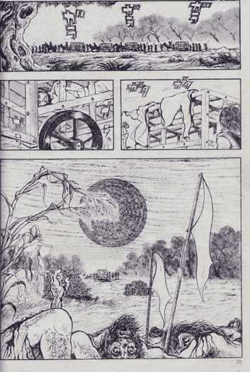
As stated, the characters are simplified, which allows for more panels on a page, or larger populated panels that aren’t too busy. There is also a lack of backgrounds, focusing instead on the characters, their actions and reactions. Marvel’s Planet of the Apes is highly detailed with quite complex settings; Saru no Wausei uses establishing panels at the start of a sequence to set the scene and then drops the backgrounds. This style is more often seen in earlier Western comics or cartoon based comics, such as children’s anthologies and the underground comix of the 1960s. This style is still very popular in modern manga and is one of the major differences between eastern and western comics.

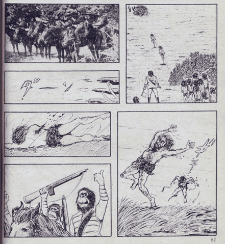
Despite the characters being simplified, they still have a lot of life in them, as is illustrated when the Icarus crashes near the beginning of the comic. Throughout the sequence, the characters express shock at finding their crew mates dead, surprise as water bursts into the cabin, urgency in their attempt to escape, and are mournful for the loss of their ship and colleagues. All of this comes through the art work, the emotive facial drawings and the clever mix of close up and medium view panels.

The brutality of Saru no Wakusei demonstrated

The narrative follows the same structure as the original movie, however some scenes in this adaptation are extended to include longer, more drawn out fight sequences. The human space travelers especially put up a more of a fight than in the movie. When Taylor and the other astronauts run from the hunting gorillas, they just run in the movie, attempting to escape the unbelievable situation they have found themselves in. In Saru no Wakusei, they turn and fight the gorillas, standing up to them, at first in defiance and then in desperation. In turn, the gorillas are much more sadistic in their approach to the hunt. We see glimpses of pride and enjoyment in the movie, with the apes taking photos of each other with their human trophies, but again Saru no Wakusei is more violent, more brutal. The gorillas turn the hunt and their prey into a mindless sport. They allow the humans to run for their lives, two at a time and then gun them down before they can escape. They cheer and celebrate the brutality but are mortified when the violence is turned against them.

In this sequence, the creators are highlighting a much deeper difference between the astronauts and the apes on this new world. Where the original touched on elements of physical difference and racism, this Japanese translation extends the comparison to internal beliefs and actions. The apes don’t just look different but have a different philosophy and moral judgment to the humans. This is demonstrated later on in the comic when the apes scientists are shown to be experimenting on the humans—not just studying them like in the movie, but experimenting with their physiology, and grafting parts of the humans together to create monstrosities.

One of the major differences between the manga and the film, at least in the visuals, is how violent Saru no Wakusei is. The treatment of the humans by the gorillas is one thing, but the visual effects following the hunt are disturbing, with corpses left to rot in the beautiful landscape. In the labs, a monstrous creature literally tears itself apart, and a table is covered in the remains of a human body, dissected and tinkered with. And poor Taylor is constantly being violently hit on the head with a club. The fact he doesn’t suffer from some permanent brain damage is a miracle.

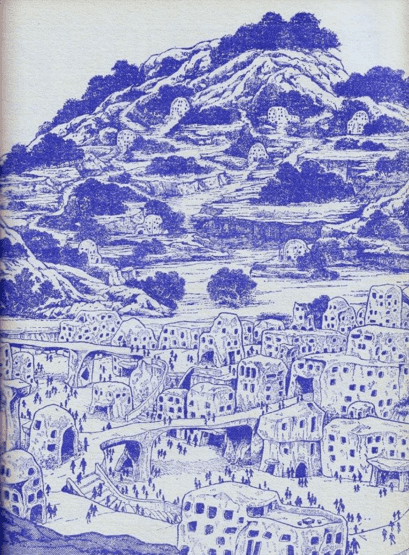
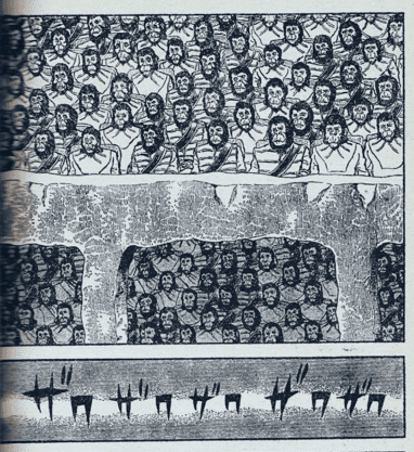
The highlights of this comic are the beautiful vistas that fill half pages, full pages, and even double page spreads. Although much of the comic features characters only in the panels, when the settings are used, they are outstanding. Ape City is a massive, tall, and imposing city, not the collection of small dwellings as seen in the film. It is befitting of the term city. When Taylor is put on trial, there are some amazing courtroom images, with hundreds of ape faces staring out of the page or, in one outstanding double page spread, the circle of apes stare inwards towards an ominous looking stone pulpit in the center of the image where the human Taylor is being led. The sense of scale really grabs you as you realize the size of this city and the vast number of inhabitants. The film uses long sequences of places, each populated with a few apes, to give the sense of size, but in this comic the true scale of the city can be expressed in a single, awe inspiring image.

An example of the superb crowd scenes in the comic

At over two hundred and fifty pages, Saru no Wakusei is a fascinating adaptation of the American Planet of the Apes movie. It has some oddities, such as the inking changing color from black to red or blue for large sections, mostly in chapters 2 and 3. There are also the occasional still images from the movie inserted into a panel to replace the drawing that you would expect. There doesn’t appear to be any pattern to these inclusions and they are few and far between, but they do leap out when you get to them. The visuals in this comic are amazing and it is definitely worth looking at, even if, like me, you can’t read the text. A general knowledge of the movie will allow you to navigate the many pages but, in all honesty, the spectacular artwork and page layouts make up for any lack of understanding of the language. That said, I would love to get my hands on a translated version to read the script and see how it differs from the western versions that have appeared over time.

Photo images were mixed with traditional drawings

It may seem odd to recommend a Japanese comic that is over 40 years old, but Saru no Wakusei is visually beautiful, often harrowing, and a fascinating comparison to existing Planet of the Apes adaptations. If you are a fan of Planet of the Apes, then it is a must see and you need to get over the Hunter’s Planet of the Apes Archives and check it out. And while you are there, check out the vast collection of other Apes related things. There are some amazingly fascinating comics from all over the world.

And I will wait patiently for someone to translate this wonderful looking comic so that I can get the most out of this gorgeous piece of history.

Monkeys Fighting Robots Youtube

Marvel Comics Exclusive Reveal: VENOM WAR: VENOMOUS #2

Marvel Comics Exclusive

VENOM WAR: VENOMOUS #2 is coming to your local comic book store September 18th, but thanks to Marvel Comics, Monkeys Fighting Robots has the exclusive first look at the issue!

About the issue:
BEWARE THE SYMBIOTE STING OF THE BLACK WIDOW!

BLACK WIDOW gains new symbiote allies – FLASH THOMPSON, AGENT ANTI-VENOM, and LIZ ALLAN, MISERY – in the VENOM WAR! And they’re winning the fight – until they come face-to-face with the ZOMBIOTE HORDE swallowing all of New York! One of Widow’s teammates may hold the key to victory – but the price they’ll need to pay may be too steep!

The issue is by writer Erica Schultz and artist Luciano Vecchio. The main cover is by Leirix, and the variant cover is by David Lopez.

Get your first look at Leirix’s NAMOR #2 cover here:

marvel comics exclusive preview cover reveal venom war venomous black widow leirix

And see Lopez’s variant cover here:

marvel comics exclusive preview cover reveal venom war venomous black widow david lopez


Are you excited for VENOM WAR? Sound off in the comments!

Monkeys Fighting Robots Youtube

Dark Horse Comics Exclusive Preview: KILLER QUEENS 2: KINGS, NOT WINGS

dark horse comics exclusive preview killer queens 2 kings not wings pride month

KILLER QUEENS 2: KINGS, NOT WINGS hits your local comic book store on June 19th, but thanks to Dark Horse Comics, Monkeys Fighting Robots has an exclusive ten-page preview for you!

The trade paperback includes issues #1-4 of Killer Queens II.

About the series:

The Galaxy’s sassiest (and GLAAD-nominated!) assassins are back!

Join rising star David M. Booher (Canto, All-New Firefly, Rain, Specs) and an all-LGBTQ creative team as they tackle issues of identity, family, and freedom in this hilarious and heartfelt sequel.

During a day of questionable choices at Space Pride, Max & Alex bump into their old boss, Bieti and his new-and-improved hench bears. The grumpy little simian tries to get them back on his team to chase down a runaway heir to the throne of Sarelia, an alien planet ruled by a brutal patriarchy. Little does he know that the heir in question happens to be Alex’s younger sibling. And they have… wings.

Turns out, a genetic quirk gives some of their race wings when they’re born. But on a planet that lives by the motto “Kings, not wings”, those born with wings are required to have them cut off. It’s supposed to make them more “masculine.” The king is doing all he can to get his youngest heir back on the butcher block and restore the line of succession.

As Alex and Max race to save Alex’s sibling from Bieti, the king’s guard, and a galaxy-wide bounty hunt, they’ll dredge up Alex’s past and confront her planet’s misogynist present. If that means burning the patriarchy to the ground, well, get out the torches.

The series is by writer David M. Booher and artist Bradley Clayton, with colors by Harry Saxon, and letters by Lucas Gattoni. The cover is by artist Chris Ables.

Check out our KILLER QUEENS 2: KINGS, NOT WINGS preview below:

dark horse comics exclusive preview killer queens 2 kings not wings pride month

dark horse comics exclusive preview killer queens 2 kings not wings pride month

dark horse comics exclusive preview killer queens 2 kings not wings pride month

dark horse comics exclusive preview killer queens 2 kings not wings pride month

dark horse comics exclusive preview killer queens 2 kings not wings pride month

dark horse comics exclusive preview killer queens 2 kings not wings pride month

dark horse comics exclusive preview killer queens 2 kings not wings pride month

dark horse comics exclusive preview killer queens 2 kings not wings pride month

dark horse comics exclusive preview killer queens 2 kings not wings pride month

dark horse comics exclusive preview killer queens 2 kings not wings pride month

dark horse comics exclusive preview killer queens 2 kings not wings pride month


Are you picking up Killer Queens 2? Sound off in the comments!

Monkeys Fighting Robots Youtube

Marvel Comics Exclusive Preview: GIANT-SIZE DAREDEVIL #1

marvel comics exclusive preview giant-size daredevil kingpin

GIANT-SIZE DAREDEVIL #1 hits your local comic book store on June 12th, but thanks to Marvel Comics, Monkeys Fighting Robots has an exclusive four-page preview for you!

About the issue:
SIN WILL FIND YOU OUT, DAREDEVIL!

He’s on the hunt: One of DAREDEVIL’s deadliest and most dangerous foes, empowered by forces unknown even to himself, prepares for the kill. Yes, none other than KINGPIN, stalking the streets of Manhattan by night. And no matter the speed with which Daredevil moves…there will be blood.

PLUS: Includes a reprinting of DAREDEVIL #170 by Frank Miller – A.K.A. “THE KINGPIN MUST DIE!” – get your Fisk fix here, fearless fans!

The issue is by writer Saladin Ahmed and artist Paul Davidson, with colors by Matt Hollingsworth, and letters by Clayton Cowles. The main cover is by Bryan Hitch and Alex Sinclair.

Check out our GIANT-SIZE DAREDEVIL #1 preview below:

marvel comics exclusive preview giant-size daredevil kingpin

marvel comics exclusive preview giant-size daredevil kingpin

marvel comics exclusive preview giant-size daredevil kingpin

marvel comics exclusive preview giant-size daredevil kingpin

marvel comics exclusive preview giant-size daredevil kingpin

marvel comics exclusive preview giant-size daredevil kingpin


Are you reading DAREDEVIL? Sound off in the comments!

Monkeys Fighting Robots Youtube

Review: PROFANE #1 — A Mysterious Man In A Dangerous World

Profane #1 Credit: Boom! Studios

Comics and crime stories are a match made in heaven, like Laurel and Hardy, burgers and chips, or Zack Snyder and extended cuts. The noir aesthetic and inherent violence of hard-boiled detective novels suited the cheap pulp comic productions of the 1940s and 1950s and, once the Comic Code Authority lost its influence and power, it was natural for violent crime to return to the pages of comics. In truth, the whole superhero genre is just crime stories dressed up in tights and extravagance, and played out in the bright lights so it’s not as upsetting for people who are easily offended.

In BOOM! Studies’ new crime comic Profane — written by Peter Milligan and illustrated by Raὒl Fernandez, with colors by Giada Marchisio, and letters by Jeff Eckleberry — the title character finds himself drawn into a meta murder mystery that is as much a puzzle for him as it is for the reader. Memory loss, femme fatales, and murder make up the dangerous game, but Will Profane is going to discover more about himself than he was ever wanting to know.

Profane #1 Cover art
Credit: Boom! Studios

The opening of Profane reads like the opening of a classic murder mystery novel—one written by Raymond Chandler or Mickey Spillane, who gets a mention later in the comic. The classic voiceover cliche is presented here in caption boxes by letterer Eckleberry, who gives them the feeling of being ripped from a novel. The typeface and caption box design encapsulates the sense of reading a classic pulp magazine, if only the comic could be printed on the cheap, ink-running paper that those magazines used to be printed on. Reading a traditional comic is a tactile experience, and the need to produce the highest quality product often undermines the artistic decisions made within the comic itself. To really get the feel for Milligan’s story, this comic should be printed on newsprint, where the ink rubs off onto your fingers, sharing the grime from the narrative with the reader. As good pulp fiction is immersive, the experience of reading it should also be so.

Product design aside, Milligan demonstrates his passion for crime stories throughout this opening issue. References to famous novels are plentiful, whether they are straightforward name drops like the use of a Mickey Spillaine book, or more obscure background references, such as the bar from The Big Sleep. However, the most impressive aspect is Milligan’s ability to weave his way around a mystery while embracing all of the cliches of classic detective fiction. At points, it’s almost cheeky how the writer incorporates the tropes of crime fiction into the comic while maintaining a serious story. It’s like removing the jokes from a Robert Rankin novel and pushing it as serious literature. You can never quite tell if Milligan is messing with you or not. Some of his previous work has been outstanding, and he has a proven track record for writing compelling, well-constructed short stories. From his early work on 2000AD and Rogan Gosh in Revolver comic, through his Vertigo work for DC, and an exceptional four issue run on Hit Girl, Milligan has always produced intriguing, thought provoking, and challenging work. Profane is no different. There is a passable surface story but, even within this first issue, layers become apparent and are slowly stripped away to reveal more and more beneath. The narrative unfolds to embrace a greater meta-narrative that isn’t bogged down in cheap fourth wall breaks. There is an element of Paul Auster’s City of Glass in these pages but focusing on character instead of writer.

Profane #1 Alternative Cover art
Credit: Boom! Studios

Just like the narrative, the artwork is deceptively straightforward. Raὒl Fernandez has a classic comic book style with bold shapes, heavy outlines and chunky areas of shadow. Each page has a clear line of focus, often running down the center of the page, which leads the eye naturally from one panel to the next. However, the nature of the story and the mystery that is constantly referred to, forces you as a reader to stray from the focal line. This creates a forced tension between what you as a reader should be doing and what you want to do. For example, on the opening page, the visuals follow Profane as he enters a house and moves from one room to the next. Your eye is drawn down the center of the page with each door that is opened, however Fernandez fills each panel with objects and images that could be relevant to the plot. As the voiceover mentions private detectives and solving cases, your brain naturally starts to look for clues and items of significance. Fernandez litters the pages with such clues, or possible red herrings, turning each page into a cornucopia of possibilities. Is that slightly out of focus poster relevant? Do I need to identify the women in each of the photographs that Profane passes?

If you pick up a comic, flick through it to get a general gist, then chuck it to the side, classing it as read, then you are missing out, especially in comics like Profane. This has been designed to be pawed over and scrutinized. The creators are expecting you to look into each nook and cranny, peer into the shadows to look for shapes, and study each face in the background to see if they reoccur elsewhere. From the opening page, the narrative puts you on guard to watch every little step which in turn means that you appreciate the art of this comic so much more. The clever scripting, with its deliberate cliched styling, and detailed panel work means that there is a lot packed into this first issue. There is a lot to digest and examine, and then re-examine when you reach the cliffhanger ending with the first, of what I expect to be many, major twists.

Profane #1 Sketch Cover art
Credit: Boom! Studios

Profane is a visual treat, with Marchisio’s colors helping to control the number of time jumps, flashbacks, and shocking memory revelations. A change in color wash separates the various aspects of the narrative so that the narrative never becomes muddled or confusing. Marchisio uses subtle changes in tone between objects in panels but also picks one color as a standout to follow from panel to panel, across a page. This creates another focal point on a page, sometimes helping Fernendez’s reading pattern, sometimes complicating it. It is yet another layer to this multi-layered comic.

If you’re not yet convinced, I’m not sure what else I can say. It’s a murky world out there, and sometimes it’s good to get lost in a good book or, in this case, comic. The creators tell their story and pack it with brilliance and wit. Profane has a strong opening narrative, great artwork from all involved, and a comic that wears its inspiration on its sleeve. This will appeal to crime enthusiasts, comic book historians, and fans of good stories told well.

Monkeys Fighting Robots Youtube

Comixology Originals Exclusive Preview: HARD STYLE JUICE #3

comixology originals exclusive preview hard style juice

HARD STYLE JUICE #3 hits the internet June 11th, but thanks to Comixology Originals, Monkeys Fighting Robots has an exclusive five-page preview for you.

About the issue:
Kris goes into business for herself and gets information on her brother’s death in a brutal fashion. But she’s about to find out that information might just cut deeper than any piece of barbed wire.

HARD STYLE JUICE #3 is by writer Clay McCormack and artist Ricardo López Ortiz, with colors by Heather Moore, and letters by DC Hopkins.

Check out the HARD STYLE JUICE #3 preview below:

comixology originals exclusive preview hard style juice

comixology originals exclusive preview hard style juice

comixology originals exclusive preview hard style juice

comixology originals exclusive preview hard style juice

comixology originals exclusive preview hard style juice

comixology originals exclusive preview hard style juice

comixology originals exclusive preview hard style juice


Are you reading HARD STYLE JUICE on Comixology? Sound off in the comments!

Monkeys Fighting Robots Youtube

Review: TEENAGE MUTANT NINJA TURTLES: ALPHA – Back From the Sewers

From writers Jason Aaron and Tom Waltz, & artists Chris Burnham and Gavin Smith comes the prelude for a brand new start for one of the most iconic series in all of comics with Teenage Mutant Ninja Turtles: Alpha. Featuring color art by Brian Reber and Ronda Pattison wit lettering from Nathan Widick, this issue is the starting point of the two leading series from IDW’s TMNT relaunch: the main Teenage Mutant Ninja Turtles series from Jason Aaron and Joelle Jones, and Mutant Nation by Tom Waltz and Sophie Campbell. This opening preview lays groundwork for these new titles that is both intriguing and a blast to read. Turtles fans are in for an absolute treat.

“What’s the world like without the TMNT? Since their time-spanning victory over Armaggon, the Turtles have started to pursue other interests, leaving a void in New York among humans and mutants alike. This special issue explores the effects this change has on those connected to the brothers, from Old Hob to Jennika, across the five boroughs and all the way through Mutant Island. It’s hard to tell how important someone is until they are gone.”

Writing & Plot

Both Jason Aaron and Tom Waltz have the unenviable tasks of following up the last 10+ years of TMNT comics with a fresh take with their start here in Teenage Mutant Ninja Turtles: Alpha. Fortunately, these snippets of the journey to come are both pretty great. Jason Aaron begins his run on the new main TMNT title by picking up with Donatello just after the end of the previous series. After tumbling through time, Donny’s lost in a mental fog, trying to remember who he is and where he’s from. He’s being held captive to fight for sport, and waiting for the right opportunity to break out and search for his lost brothers. This snippet of the coming story has that perfect mix of grimy darkness and genuine hope that readers expect from a TMNT comic, meaning Aaron is off to a strong start.

The meat of Alpha comes from the Mutant Nation prelude story. While Aaron’s main TMNT book is meant to be a restart point for newcomers and old readers, Mutant Nation feels more like it’s meant for longtime fans. Tom Waltz, veteran TMNT writer, pens this new series following fan-favorite characters like Old Hob and Jennika as Mutant Island starts to secure itself as an official NYC borough. Of course it can’t be simple, with some mutant monster and government agency antics popping up to get in the way of the new mini-nation establishing itself. Waltz treats this world and these characters like old friends, with their distinct personalities shining through and immediately endearing them to readers new and old. There’s a perfect blend of genuine character drama, gruesome creature-horror, and comics-specific wackiness that really sets the world of TMNT apart. Both Aaron and Waltz have scripted preludes that offer a ton of promise for their respective new series.

Art Direction

Much like the Mignolaverse, Teenage Mutant Ninja Turtles has always had a requirement that the art follows in the stylistic footsteps of original creators Kevin Eastman and Peter Laird. Teenage Mutant Ninja Turtles: Alpha does just that, with Chris Burnham and Gavin Smith’s respective styles lining up with the long tradition of TMNT’s unique aesthetic while still retaining each artists’ distinct look. Chris Burnham’s heavy hatching and character design makes his entry in Aaron’s TMNT story fit in perfectly with the whole series’ aesthetic. His work really just feels like a modernized Eastman & Laird comic. Equally impressive is Gavin Smith’s work on Waltz’s Mutant Nation story, with his eye for animation and character action delivering a fantastic looking comic story. Where Burnham relies more on heavy hatching, Smith leans more on thicker lines and inks to maintain that distinct Turtles aesthetic. The color art from both Brian Reber and Ronda Pattison helps perfect the visual unity of these two stories, with their dense, rich palettes nailing that unmistakable TMNT look. Finally, Nathan Widick’s lettering finishes off the reading experience with classic approach to the dialogue, and a minimalistic look to the SFX that does the job brilliantly while blending in with the art. Overall, Alpha is a stellar looking comic in every regards. It’s a bit sad that Burnham and Smith won’t be the artists on the two actual series, but Joelle Jones and Sophie Campbell are no doubt up to the task for the future of these new TMNT comics.

Verdict

Teenage Mutant Ninja Turtles: Alpha is a great read on its own, and a stellar sign of what’s to come for the next era of TMNT comics. Jason Aaron and Chris Burnham’s story is a deeply compelling and slightly sad opening that will leave readers desperate for more of Donatello’s journey to get back to his brothers. Tom Waltz and Gavin Smith’s opening to Mutant Nation is a blast of a prelude aimed at the supporting cast of the last decade of TMNT stories. Be sure to grab this fantastic one-shot when it hits shelves on June 5th!

Monkeys Fighting Robots Youtube

Review: THE BOY WONDER #2 — Demons Inside

The Boy Wonder #2 is the second issue in DC Comics’ mini-series following Damian Wayne and his adventures with some of the other previous Robins. The issue is both written and drawn by Juni Ba, with colors by Chris O’Halloran and letters by Aditya Bidikar.

The issue starts with a young girl being held hostage by a man named Joe. The two are both bored, so the girl continues telling him the story that she started last issue. She tells the story of the Red Hood, Jason Todd. She talks about how people are scared around him, and how people believe he shouldn’t be idolized. Damian Wayne appears to Jason and tries to get him to come out on a mission with him, which Red Hood reluctantly agrees to. They depart and find themselves against a demon instructed with helping show them what they run from.

WRITING

Ba’s selected narrator should be a topic of discussion. It’s not one of the Robins themselves, but rather a little girl being held hostage by a generic criminal. She’s not a scared little girl, just a bored one. How she knows these stories of Damian and his brothers, we don’t yet know. Something interesting is that she never directly references the story of the Batfamily. She speaks of kingdoms and kings and sons and apprentices, but not once of Gotham or Batman. She uses this metaphor, and displays Jason, “the second son of the king,” as coarse and bitter. Jason is shown living a hard life, but it’s not told in an unfair way. Ba acknowledges the hardship that Jason has faced and uses that to educate the reader. He’s not just grumpy to be grumpy. He’s actually fairly passive for the first chunk of the issue. We’re given context clues through the narration, but also through the world around him. How people react to him and how he reacts back shows how the public views him, but also how he can’t help but let it get to him no matter how hard he tries.

A criminal asks his hostage to tell him a story

Ba compares and contrasts the Robins on a deeper level than what we’re used to. The story isn’t really told through Damian, but through Damian’s relationship with the other characters. This shows the similarities between Jason and Damian that Ba succeeds in highlighting. Jason reacts to the world around him because of how it acts towards him. Damian reacts to Jason’s story because of how he feels connected to it. Neither can run from their demons. It’s an interesting contrast from the last issue, where Damian was trying to prove himself to be better than Nightwing. Ba understands Damian’s nature, and his desire to be accepted by his mother and father. He understands that Damian believes he can only achieve that by being the best, and shows us that.

ART

Ba also draws the issue, and that really helps him in telling the story. He’s able to juggle this deep and sometimes dark storytelling with these highly expressive characters, but it doesn’t feel out of the ordinary. Well, it does, but that’s because it’s supposed to. It feels almost like a storybook. The reader isn’t being shown what’s happening, but we’re being told from a different perspective. We’re told the story of a king, his sons, and his kingdom, and we’re shown these characters in that style. You could rip any single panel out of a medieval storybook and it would fit. Ba shows how the world and what happens around each character affects them in an exaggerated way, but one that really gets the point across. Jason’s mask is more scribbled the more frustrated he gets. Damian is passionate and emotional when things don’t go his way. Ba is a reactive storyteller, and he makes that clear in this part of his story.

Red Hood after a battle

COLORS

With O’Halloran on colors, new life is brought to the comic. He especially excels in displaying Jason’s trauma. There’s a scene where Jason is forced to relive a moment from his past, and everything around him is flooded with green. It returns to normal, but when it’s brought to his attention again, we’re faced with that same green once more, only cracked this time. There’s a moment where Jason is with Damian and a black background is behind him. Damian says something that catches Jason off guard, and so the black background behind him shatters to show a red behind it. It’s who Jason is, but he covers it up behind this mask he puts on. O’Halloran excels with these small details, and the issue is better for it.

LETTERS

Bidikar is on the lettering for the issue, and a really interesting part of his work is the storybook narration. With the young girl narrating this story, the text boxes almost seem aged and torn. When introducing Jason, however, the box tears further in order to take on the shape of a bat. Later in the issue when Jason is hallucinating, nothing is right. All the text boxes are shaky and sinister. Jason isn’t sure what’s real, and those bubbles make the audience unsure of what they’re seeing as well.

CONCLUSION

Every single aspect of this comic ends up elevating whatever came before it. Every new layer manages to expand on the last, and strengthen the overall message of the story. This team worked together to create a story that acts as a look into the grief and trauma of these characters, while also showing what drives them. It’s a powerful issue that tells the story of two brothers who are more similar than they’d like to admit, and it doesn’t shy away from showing us that with some dark examples. If the first issue didn’t hook you, this one is sure to.

Monkeys Fighting Robots Youtube

Review: SCARLETT #1 – Double Oh Joe

From acclaimed writer Kelly Thompson and artist Marco Ferrari comes the return of G.I. Joe’s crossbow-wielding spy in Scarlett #1. Featuring color art from Lee Loughridge and lettering by Rus Wooton, this new chapter in Image/Skybound’s Energon Universe does a solid job of reestablishing Scarlett as a staple G.I. Joe character by giving her a unique espionage story that feels like an important building block to the larger connected story.

“Shana “Scarlett” O’Hara is about to take on the most dangerous black ops mission of her career: infiltrating the mysterious rising power in Japan known as Clan Arashikage. Her one lead is her former partner—Jinx—turned Arashikage enforcer.
Now, Scarlett must use her very particular set of skills to survive undercover…and discover a shocking weapon that could change the balance of power on Earth.”

Writing & Plot

Kelly Thompson brings back a classic member of the G.I. Joe cast by writing a proper espionage comic in Scarlett #1. Every aspect of this issue feels like a mixture of Fleming’s 007 and Marvel’s Black Widow. The opening sequence is right out of your average spy story – a big party for the ultra rich are bidding on attractive human stock. The details that arise here, however, and the aftermath of this scene, are what really set Scarlett apart. Scarlett’s friend and former partner, Jinx, makes an appearance, and much of the comic studies the pair’s backstory. Thompson uses this pair to build an emotional core to carry us through the rest of the series. It’s easy to become fully invested in Scarlett and Jinx’s backstory, with their personal puzzle pieces and shared experiences filling in gaps that make the story feel like a whole character-focused journey. Don’t worry though, because the action/spy stuff still hits plenty hard too. Thompson’s use of other classic Joe characters – including a last page reveal that put a big smile on my face – will please many-a fan while keeping them wholly compelled by the actual story. Kelly Thompson really knocked Scarlett’s reintroduction out of the park.

Art Direction

Despite the lofty espionage and franchise heights Scarlett #1 has in store, it retains a sort of grounded visual approach thanks to Marco Ferrari’s pencils and Lee Loughridge’s color art. Ferrari takes us along from luxurious manors full of armed guards to an unforgiving ninja-filled tundra fortress, and it’s all delivered with the scope of a big-budget spy movie. Ferrari’s character animations make for great fight choreography, and his designs make every classic Joe character instantly recognizable for long time fans. His panel direction stays pretty standard, with wide panels being punctuated by splash pages in a structure that makes the combat feel almost rhythmic. Character-focused dialogue scenes are broken into smaller panels to make scenes feel more intimate and break up the pacing. In this way, Scarlett’s pacing is basically perfect, making a 32-page comic feel like a full story. Lee Loughridge’s practiced color style is the perfect tonal match for this visual experience. His flat palette fills in Ferrari’s thin penciling perfectly, and makes for a unique approach to this spy comic that separates it from other works in this genre. One note I have to make is that, while his pencils are generally solid, they can be a bit inconsistent. There is one specific panel in the opening pages that I have not been able to get out of my head – and not in a good way. It’s a notable weakness in an otherwise stellar comic that is set to be a focal point of Skybound’s relaunch of G.I. Joe in this medium.

Verdict

Scarlett #1 is a blast of an opening, both as a Joe comic and as a spy story. Kelly Thompson’s script brings the staple character back to the forefront with a story that is fun, character-focused, and feels like a proper espionage comic. Despite some inconsistencies with the penciling, Marco Ferrari and Lee Loughridge’s visual work is brilliantly directed and offers a unique look for this kind of comic book. Be sure to grab this new chapter in Image/Skybound’s Energon Universe when it hits shelves on June 5th!

Monkeys Fighting Robots Youtube

Review: BEAR PIRATE VIKING QUEEN #2 – Vengeance of the Conquered

Writer Sean Lewis (Bliss, Above Snakes) and artist Jonathan Marks Barravecchia continue their chaotic story of conquest and retribution on the open sea with Bear Pirate Viking Queen #2. This issue focuses in on the comic’s true Viking protagonist as he sails towards those who took his land from him – with only blood on his mind. With a ponderous and inventive script and more of Marks’ staggeringly unique visual work, Bear Pirate Viking Queen #2 is a gripping follow-up to a thunderous first chapter.

“The Viking has taken control of the boat, and through the tempest, he heads to England. It’s a land he has ancient history with, and a land whose queen is dressing for war with him. With the Bear, he stalks its streets destroying British soldiers. Until he finds a home—and a whole other story to take out on the British flag.”

Writing & Plot

Sean Lewis elaborates on our new protagonist and his ocean-faring tale of vengeance in Bear Pirate Viking Queen #2. After killing the pirate captain that led most of the first chapter – one of the best opening comic issues I’ve ever read, mind you – the Viking sails for Britain, the land that conquered his own home and so many others. Aiding him are a pair of witches he has enslaved in his own conquests, and together they head for a battle with the very Queen of England herself. The brazen madness Lewis presents us with in the first issue is sharpened to a fine point here in part 2. He shows readers where the Viking came from and just how powerful a figure he once was in his own society. The most effective sequences in the comic come from the opening, where we get the Viking’s origin (we get his name too, but that’s a spoiler if you know anything about mythology), as well as a part in the middle where he basically gives his manifesto. The Viking speaks of conquest and glory as a savage right of passage and power while using child’s toy ship as a physical prop. Lewis poses the Viking’s brutal, simplistic view of conquest against the Imperial takings of the British, and the comic begins to come to the correct conclusion – that these are one and the same, but on a different scale.

It’s a bit funny seeing the Queen of England as some fearsome monarch and not the useless prop we know they are now. In context though, at the time this comic takes place, the head of the British Empire may very well have seemed like some ineffable threat to those subjugated by their forces. Lewis posits in this issue that the thing empires fear most is their past and the desperation the British show once the Viking show up demonstrates this perfectly.

Art Direction

As with the first issue, Bear Pirate Viking Queen #2 is brought to visual life by the insane talent of Jonathan Marks Baravecchia. His thin pencils and watercolors combined with this collage-esque sequential direction make for a comic that is best described as well-conducted chaos. The drawings of the Viking towering over the British he’s “visiting” make him appear like some sort of invading god, especially while walking astride a bear. Barravecchia presents him in an all-white aesthetic, making him shine like a beacon against the backdrop of industrial England. Certain beings are contorted into monstrosity, with a sort of scrap-paper Dave McKean style to make them seem more inhuman. While this issue lacks the monsoon of thunderous entropy that the opening chapter does, Baravecchia’s artistic style is still utilized to its fullest in more subtle ways. His intricate character models make the conversational pieces in this issue really stand out, which is especially impressive since most of the visuals are in the realm of fever dreams. His lettering is just as much a part of the art as his pencils and colors, with ever-shifting hand drawn fonts that rarely use speech boxes or bubbles. Bear Pirate Viking Queen #2 is yet another staggering work of visual art from Barravecchia.

Verdict

Bear Pirate Viking Queen #2 is an incisive 2nd chapter that adds some subtlety to Lewis and Barravecchia’s narrative about conquest and imperialism. Sean Lewis’s script paints a brutal and frightening picture of our Viking protagonist, at the same time offering an examination of the world he lives in opposed to the British Empire. The visuals from Jonathan Marks Barravechia are stunning and complex, with a singular visual direction that sets this series apart from anything in the medium from the last few years. Be sure to grab this new chapter when it hits shelves on June 5th!


Monkeys Fighting Robots Youtube