There are hundreds of comics released every month. Some have been going for years whereas others disappear into the night to be forgotten like a mid-series filler episode of Supergirl on CW. The ones that stand the test of time, that have a long run or become the much sought after comics, are the ones that have characters who resonate with the readers. These characters hit it off with the reader and instantly feel like a best friend, or old friend that you can’t escape. They are not always the nicest person in the world but have a depth of personality that makes them more relatable. After-all, no-one is perfect.
Most people who pick up a Marvel or DC superhero comic will most likely know something about the characters in the comic before they even open it up. Spider-Man, Batman, or even a lower tier character like Jessica Jones, tend to attract new readers from elsewhere; either movies, television shows, or other comics. Introductions are therefore slim, if present at all.
With new comics and brand new characters, it’s a different kettle of fish. The creators have to pull the reader into their world in the first few pages by presenting an exciting story, an intriguing world, and most importantly, a relatable central character. It’s not an easy task and one that faces all of the creators working with AfterShock Comics.
AfterShock’s brand revolves around new, exciting projects and they don’t have a backlog of characters to draw from. Instead the creators have to start from scratch and build the character in front of the reader, making sure that they have enough personality and intrigue to make the reader come back month after month. So, how do they do it? Let’s look at the first issue of Lonely Receiver to see how Zac Thompson and Jen Hickman literally build the character from the ground up.

The Introduction
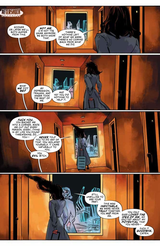
The story opens with a character leaving. As a reader we watch her walk away, arguing with another character who is out of shot. The placement of the word balloons, with their tails leading off the bottom of the panels, makes it feel like the argument is with us, the reader. Thompson’s deliberately non-specific script combined with Simon Bowland’s cleverly placed speech balloons change us from observer to active participant. Within the first page we have been brought into the story on a very personal level.
This means that when we turn the page and see our heroine for the first time, we already have a connection with her. We’ve been a part of her breakup and have been forced to share those difficult emotions with her. A page of grief follows, cementing the emotional bond between character and reader. Images of pain and loneliness accompany a voice-over of desperate defiance.
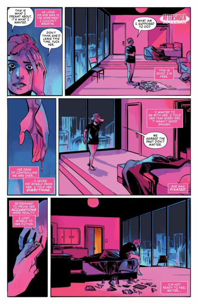
Artist, Jen Hickman, splits the second page into six panels. On the left, leading down the page, are close up images that represent the pain and loss that the character is going through: a tear streaked face, blood running from a cut wrist, and the removal of personal jewellery. On the right of the page, the larger panels represent the loneliness and space left by the breakup. Hickman uses long shots to show the vast, empty apartment. Catrin becomes lost in the space, surrounded by flat fields lacking any detail. Hickman washes the page in icy blues and cool pinks. The visual impression mirrors the narrative that Thompson has already forced the reader to endure.
The strong emotional context creates immediate empathy and is something that everyone can relate to on some level. Reader and character are bound by grief.

Growth by Repetition
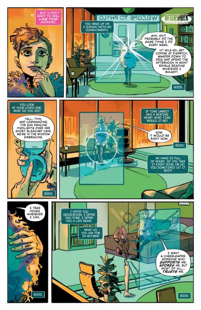
The second page turn gives the reader a different experience. The third page of the comic has a completely different feel, with a warming sensation smiling out from the first panel. Thompson introduces Catrin at her lowest and then builds her up, taking the reader along for the ride.
In order to enforce the turn around in emotions Hickman uses the exact same layout on page 3 as she did on the previous page, even copying the view points almost beat for beat. Only the final panel on the page has a different angle. At rock bottom Catrin was hunched, facing away from the reader, whereas at the start of her new life she sits upright, looking towards us.
The three left panels contrast the previous page, featuring the same close ups but with different emotional connotations. The first panel has a close up of Catrin, this time smiling with a hint of excitement. The second panel focuses on her hands, busy with her mobile phone. This shot serves two functions; firstly it draws the reader’s attention to the mobile device which becomes central to Catrin’s new obsession; and secondly it shows the scar on her wrist. The mark relates to the previous page and shows that Catrin is healing. Time has passed and she is moving on with her life. The third panel on the left again focuses on Catrin’s personal belongings, this time a fluffy coat that is wrapped around her. It is representative of her new life, symbolised by new objects of desire and obsession.
These two pages, identical in layout, show the reader Catrin at her worst and her best. The contrast in color and the comparable panels allow the audience to experience the characters life on a very personal level. For example, note the difference in backgrounds on between the pages in panels two, four and six. Page two is empty while page three is busy and bursting with life. Meanwhile, the overlaying speech relays further information about Catrin’s wants and desires. On page two the script focuses on Catrin’s loss, her past, whereas page three is full of her hopes and dreams.

And Then There’s Rhion
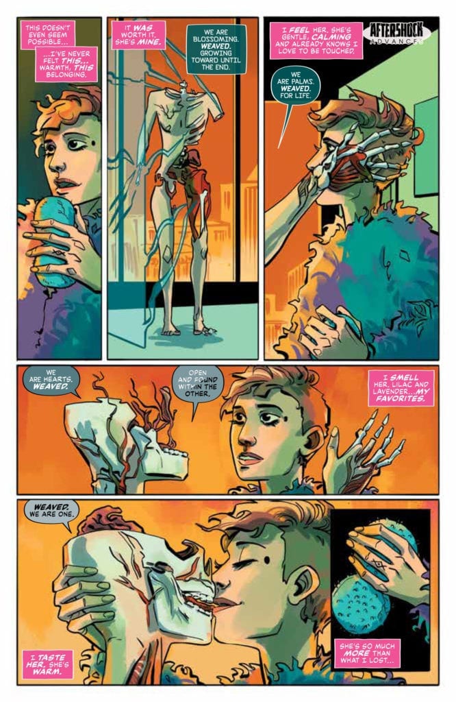
Catrin is the central character but she needs a foil, another character who acts as a catalyst for the story. Enter Rhion. Rhion is a physical representation of the personality constructed by Catrin on her PHYLO X11 mobile phone. The interaction between Catrin and Rhion are central to the narrative and in order for the story to flow the reader has to understand their relationship. Thompson achieves this by focusing the majority of this issue on their time together. He gives the reader their entire relationship, every good and bad aspect, mental and physical interaction. By the end the audience feels as though they have experienced the relationship just as they experienced Catrin’s breakup on the first page.
For the experience to work, Rhion has to be as fully formed a character as Catrin. Thompson and Hickman have already proved they can create a character’s personality in two pages. With Rhion they go one step further. They literally show her being constructed from the inside out. As she is built to Catrin’s requirements, the creators again use voice-over to give the reader a deeper insight into the character’s personality.
We are also shown the transition from idea to reality through the speech balloons. Bowland changes the color of the font as Rhion’s construction is complete, switching from black to white. He also slowly changes the color of the balloon symbolising the transition from machine to person.
Page four starts and ends with a panel prominently featuring the mobile device in order to remind the reader where Rhion comes from. This is important because after the page turn, onto page five, Rhion is fully complete and the relationship between the two women appears like any other relationship. It is not until later in the issue that Rhion’s origin plays a part and by then the reader is completely committed to the character’s and their relationship.

Emotional Connections
Lonely Receiver is about the building and breaking of a relationship that includes a dramatic twist at the end. It is a science-fiction horror story that relies heavily on the reader’s connection to the central characters. For the narrative to be believable, and provide the shocking elements successfully, it is imperative that Thompson and Co. draw the audience into their world completely. They do this by making the reader connect instantly with their lead characters.
Across five pages, the creators build and portray the relationship between two fully formed characters in recognisable terms, despite the futuristic way that one of the characters is introduced. The opening pages bind reader and character together by being rich in personality and emotional symbolism. Lonely Receiver creates a narrative version of ‘love at first sight’. We instantly connect with Catrin and Rhion and not only do we become friends, but it feels like we have know them all our lives.
AfterShock Comics are not beholden to a particular genre, although they do favour mature and cerebral stories, but one element that unites their output is Strong Central Characters. Comics like Undone by Blood and Disaster Inc. are very different narratively but they succeed because of the characters that the writers and artists have created. Lonely Receiver by Zac Thompson, Jen Hickman, and Simon Bowland is a prime example of superb character building where the reader becomes emotionally attached to the central cast and, as a result, committed to the story.

