

…Make You Reach For Vogon Poetry
Forty-two years ago a brand new radio drama, one that mixed science-fiction and comedy, was first aired on BBC radio. It was a risky venture and a bit of a gamble by the radio drama department, however, The Hitch Hiker’s Guide To The Galaxy was a massive success. Over the years it has spawned more radio series, a T.V. show, a movie, the trilogy of 6 books, and even a towel.
It was inevitable that one day it would become a comic book and in 1993 DC Comics worked with Byron Preiss Visual Publications to publish the first of a 3 part adaptation. This too would have sequels and all three serials were released in a prestige format.
This look back at the the series was due to coincide with the original air date of H2G2 but, as is fitting with anything Douglas Adams related, the deadline went flying passed like a spaceship in hyper-drive. Although a number of perfectly good excuses could be created to explain this, the truth is writing about the comic book adaptation is difficult. Out of all of the related interpretations of the original radio series, the comic is possibly the most disappointing. Even more so than that towel.
Initial Concept
If you don’t know the story of The Hitch Hiker’s Guide To The Galaxy it all starts with the End of the World. You may think it’s difficult to get 6 books worth of material from the debris of such destruction but for Douglas Adams, Earth was just this an insignificant little blue-green planet from which to launch his adventures.
“Space” Douglas Adams wrote, “is big. You just won’t believe how vastly, hugely, mind-bogglingly big it is. I mean, you may think it’s a long way down the road to the chemist’s, but that’s just peanuts to space.”
The above quote sums up H2G2 perfectly. Adams’ ideas were vast and infinite, but his humour was intrinsically very British. Fleets of massive space ships would fill the air hell-bent on destroying an entire planet but not out of hatred, or for war like reasons, but simply because the planet was in the way of a new hyperspace bypass. The situations were outrageous but the jokes were humble and the gags twee. This is why H2G2 was, and is, such a relatable success.
Script Like A Brick
Enter writer John Carnell and the DC Comics adaptation. Carnell was a writer known in British Comic book circles, having written for The Real Ghostbusters comic, Doctor Who, and was the creator of the much loved Sleeze Brothers; a science-fiction version of The Blues Brothers.
Carnell had the job of translating a radio series into a comic; on the surface this could potentially be difficult. However, in an interview with Douglas Adams for the BBC Radio 1 Book Club series Adams insinuates that writing the book was easier because of the existence of the series. The difficult part, the speech and conversations, were already there. Carnell had a script to work from and, reading the comic, much of his job seemed to be editing rather than writing. Unlike the 2005 Movie which incorporated some of Adams’ unused ideas and brand new material, the comic adaptation is a cut down version of the radio series and book. All of the scenes and warmly remembered jokes are there but it does feel a little empty.
Part of this is due to the artwork, which I will get onto, but it is also to do with timing. H2G2 has immaculate timing in most of its forms. Adams’ novel is one long, expertly executed joke that hits each beat perfectly. It is a dream to read out loud because it leads the reader with it’s inbuilt tempo. The comic is missing that timing.
Carnell has to incorporate a whirlwind of ideas and jokes into a visual format but is, to a certain degree, limited by space. All of those grand ideas should allow for some beautiful design work in the comic, which technically has a limitless budget, but this has to be balanced by the Earthiness of the humour. Carnell never quite gets this right. Often the narrative joke, which builds up to a punchline, is edited for space and reaches the pay-off to quickly. This turns a number of really funny moments into something akin to a gag reel: a series of one liners quickly following each other.
Part of this may be due to limited space within the comic however, reading it today, it feels that it has been simplified for a different audience. An Americanisation of the language appears to have seeped into the humour as well. Everything is shorter, quicker, in a rush to get to the point so that the next idea can be introduced. This is not how Adams wrote the original as everything gently flowed into everything else to create a slow moving, sleepy river which the reader could gently sail down. The comic adaptation is more like fast moving rapids that the reader is thrown down towards the climactic finale.
Artistic Endeavours
A number of artists worked on the H2G2 comics, with different writing and artist teams working on the sequel miniseries. The main illustrations were provided by Steve Leialoha who inked his pencils along with Steve Baskerville and Art Nichols.
Leialoha’s pencils comprise of mainly fine lines with detailed backgrounds and simplified figures. Facial definitions are kept to a minimal, instead relying on silhouettes to differentiate between characters. For the most part this is successful, especially as the narrative progresses and many of the characters are aliens with distinctive body shapes.
However, what is lost is the subtleties of personalities and emotional reactions. Each of the characters are appear as if they are over acting, with wild gestures and overtly expressive faces. The reader can tell when a character is raging with anger or extremely upset but H2G2 is about mild reaction: someone being slightly put out, or a little bit annoyed.
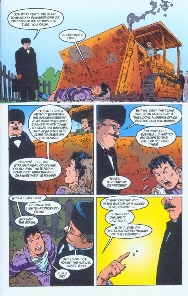
Arthur Dent, the leading character, is the very definition of Englishness which means he bottles up all of his emotions, deep down, out of sight. Even when an uncaring council are attempting to knock down his house he is still trying to rationally negotiate the situation with the frustrated foreman. It’s true that he does lose his temper throughout the story but only after his house, his garden, everyone he knows, and the very planet he lived on has been destroyed and the only person he knows who is left alive is pushing a fish in his ear while saying “Don’t Panic”.
Simplified Re-designs
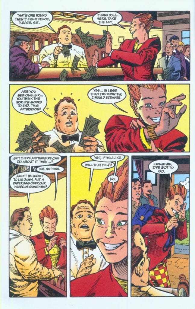
One of the drawbacks to the comic is the design work. The world of H2G2 was, and is, a sprawling, all encompassing, universe of possibilities and ideas. Arthur Dent is the grounding brick by which the narrative, and reader, can encounter everything that is happening without losing control. In this adaptation, Arthur Dent is too young and too cool, and ultimately isn’t that solid foundation needed for the story to work.
This is a problem throughout the rest of the comic. None of the characters really fit their personalities. It’s like when a movie company adapts a novel and casts entirely the wrong actors for all of the parts.
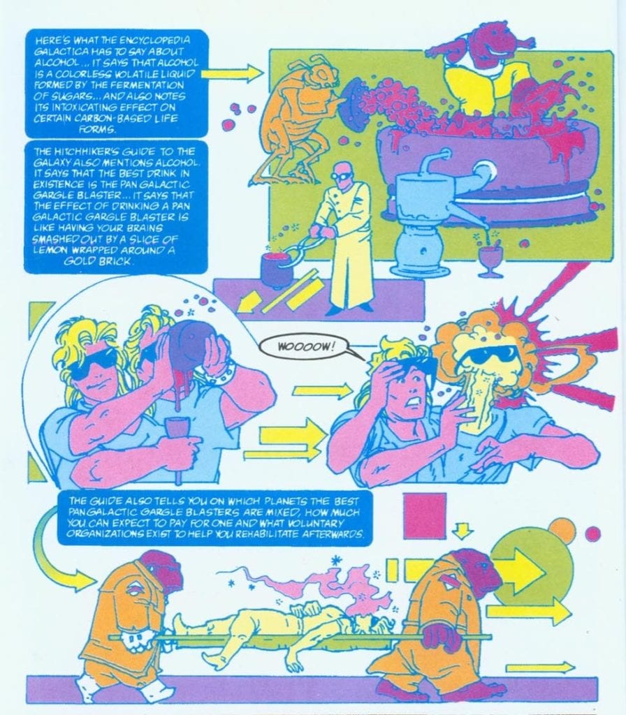
That is not the worst piece of design in this comic. One of the main features of the story, and arguable one of the best characters, is the Guide itself. In the radio series it is performed by the wonderful Peter Jones. In the T.V. series from 1981 a magnificent animation is added to Jones audio. It still holds up as one of the best fake computer animations ever committed to film. In the comic, slightly faded, fluorescent colors represent the screen effects of the digital guide. Compared to the previous efforts, it is underwhelming at best.
For the central element of the narrative, the Guide in the comics is the least effective. It looks gimmicky and out dated. It is also the part of the comic where the script edits are most notable. The coloring is provided by Lovern Kindzierski who does an amiable job on most of the pages, creating a pleasing contrast between Arthur’s blandness and the exotic space aliens and settings.
This does make you wonder if it was Kindzierski’s decision to color the Guide in this way. The Guide panels sit next to the rest of the narrative like interlopers at a formal event dressed in fancy dress. The pencils don’t differ from the rest of the comic, and Todd Klein’s lettering is pretty much the same, except for the color.
Klein is a recognisable name, as much today as it was in the early 90’s. He has lettered some of the best comics ever to be published and won enough awards to fill several shelves. However, looking at his work on H2G2 you might not be able to reconcile the two. The lettering is ‘okay’, and that is it’s biggest crime. For a man who was designing genre changing lettering techniques for comics such as The Sandman, H2G2 feels like he was just phoning it in.
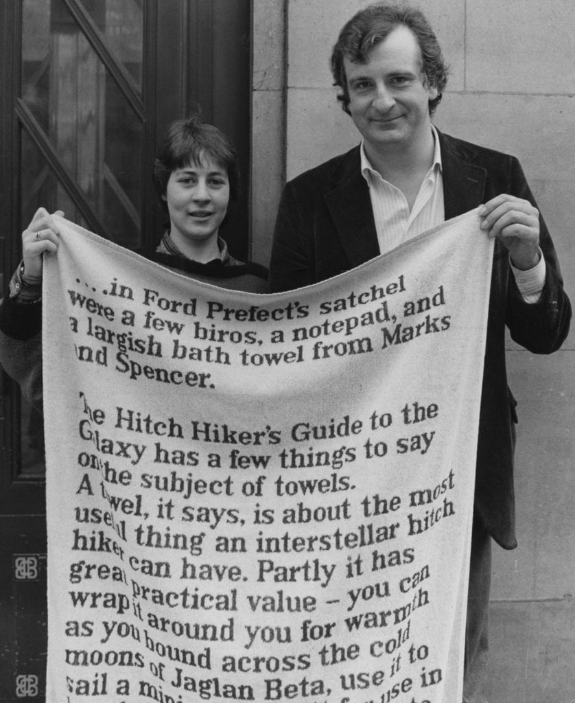
Image: Tim Roney / Radio Times / Getty Images
“So this is it,” said Arthur
There is no panache, no excitement in these page. Here is a comic screaming out for experimental art, whether it’s design, coloring or lettering, but for the most part it’s very much box standard, business as usual. When you turn the pages and read through the steady paced panels, the slight sense of disappointment makes you think of the other versions of this story.
The uneven timing reminds you how good the original radio series was. The outdated Guide design makes you want to reach for the DVD of the T.V. Series. Even the unconvincing personalities of Zaphod Beeblebrox make you beg for Sam Rockwell’s enchanting performance in the movie.
This is like the Friends version of H2G2, with the punchlines being more important than the jokes, and a young trendy cast replacing character and depth. Another BBC comedy hit of the late 1980’s, Red Dwarf, suffered a similar fate when an America TV company decided to remake the series. The result was recognisably Red Dwarf but at the same time lacked the series’ soul.
The Hitch Hiker’s Guide to the Galaxy comic takes the ideas of a brilliant work of fiction and turns them into ‘funky’ highlights for a new audience. Often, having a simplified version of something is a good way to introduce a new audience to your product. With H2G2, this actually does the opposite. People who enjoy this comic book adaptation will probably not enjoy any of the other related products.
After all of the above you’d think this reviewer would advise against reading this comic. However, there are some moments of charm on these pages and the result of reading this is that you will revisit all of the other H2G2 products. You might think you are not in the mood to reread the novel or watch the T.V. Show, but after the comic I guarantee you will be.
Ironically, the comic book adaptation of The Hitch Hiker’s Guide To The Galaxy is for the hard core fans of the franchise. Not because it’s any good, the opposite in fact. The disappointed feeling you get when reading this helps you to appreciate everything else. Including the official towel.