I read AfterShock Comics’ The Heathens #1 about a week ago. Since then, I’ve found myself at a total loss for words about it. It’s not that The Heathens #1 isn’t fantastic. In fact, it’s the kind of comic you feel like you’ve been waiting to see, you just didn’t know it yet. It scratches an itch you didn’t know you had. The problem for me, with The Heathens #1, is it so masterfully immerses you in its world, it’s hard to even talk about the nuts and bolts of it. It doesn’t feel like a comic, like words and pictures. Writers Cullen Bunn and Heath Amodio, artist Sami Kivela, colorist Jason Wordie, and letterer Simon Bowland throw readers into a living, breathing, fully fleshed-out world. You’re guaranteed to get lost in its pages.
About THE HEATHENS #1 (from AfterShock Comics)
When evil men and women escape from the depths of the eternal abyss, the Pirate Queen Lady Shih is sent to retrieve them. But when one of history’s most notorious killers breaks free, even she needs help. Enter the Heathens: Shih, Lucky Luciano, Bumpy Johnson, Sofia the Golden Hand, and Billy the Kid. From Hell they came to mete out a justice as dark as their own tormented souls.
Writing
The concept of The Heathens is brilliant from the get-go. Bunn and Amodio have created a League of Extraordinary Gentlemen type of cast, except it’s populated by history’s damned souls. Joseph Stalin, the Zodiac Killer, Jack the Ripper and more stalk these pages. But it’s more than just the concept of The Heathens that makes this issue so brilliant. It’s that readers are thrown into a world that’s already been set into motion. Bunn and Amodio do no handholding, they offer no exposition dumps. Readers are greeted by two dead bodies, a couple anachronisms, and a mysterious chat between a hunter and her prey. The sheer intrigue and “What’s going on?” of it all will pull you in and it won’t let you go.
Art
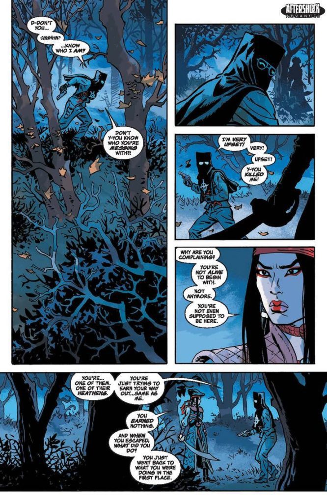
Kivela has a stunning knack for the theatric. On one page, Lady Shih unsheathes her sword and swings it through the air. The whole page is interrupted by a severed hand, flying through the page’s center. Often, panels bleed – quite literally – into one another. Not only does this have a really cinematic effect, but when there’s no gutter between panels Kivela makes these characters seem like they can almost be two places at once. When we get a brief rundown of Lady Shih’s tumultuous history, the page is as rocky and chaotic as her life. Kivela makes each panel look like a wave that washes away the panel before it. Every page layout is brilliantly set up to focus readers in on the most important parts of the scene. Kivela’s tools are order and chaos. He uses both in equal measure, to devastating effect.
Coloring
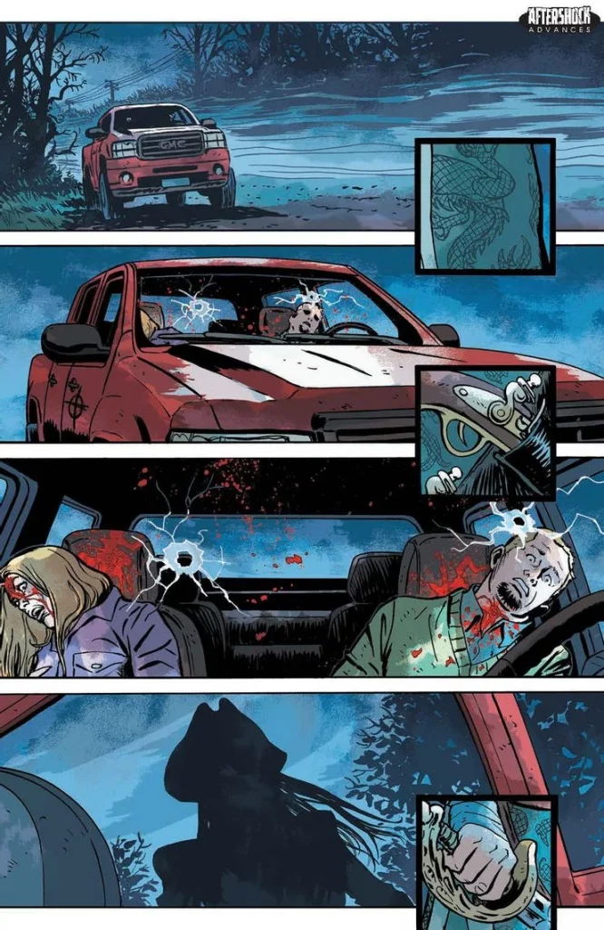
Wordie uses plenty of red for this issue. And in the first scene, he makes sure we know why. The scene is cast in a subtle blue light. Everything in the panel is affected by the darkness of the nighttime, except for one thing. Two bodies sit in a car, bullet holes through their heads. Their blood stands out in brilliant red. It sets the tone for the issue, but also gives the color red a poignancy. So when we see Lady Shih is dressed fully in red, or the heathens all against a red background, it speaks to us of the blood on their hands. Wordie makes every seen come to life on the page, while also adding that simple but brilliant flare of meaning to each page.
Lettering
Bowland’s lettering gives this issue a clear rhythm. The first letters we see in The Heathens are in a big yellow “BLAM.” Lady Shih dodges the bullet, whispers to herself in small font, and then returns fire with a single “WABOOM.” The W and A are skinny, and the BOOM stretches out in thick, orange bubble letters. You can hear the power behind the shot, you can listen for the echo. As the issue continues, the fonts change constantly. Shih’s prey, ranting anxiously, talks in small font before he dies. The use of bold and the parsing out of the dialogue makes it so that our cast of characters has a patter to what they say. Bowland creates a dynamic between these characters, showing how casually they address one another.
But one of the most impressive feats of lettering comes in the last couple pages. The Heathens breaks from its narrative, interrupted by pages from Stalin’s journal. The pages look stained, with creases and what looks like hand lettered font. At the top of each page is typed “JOURNAL OF JOSEPH VISSARIONOVICH STALIN.” But if you look closely, the alignment for the lettering is off and differs on every page. It’s a fantastic effect, mimicking the look of a page written through an old fashioned typewriter. Even in the smallest details, this issue delivers.
AfterShock’s The Heathens #1 is more than just a story. It’s a world to get lost in. Bunn, Amodio, Kivela, Wordie and Bowland are doing stunning work. Pick up The Heathens #1, already out, at your local comic shop! And check out the preview for The Heathens #2.