

Sinister War #1, out now from Marvel Comics, is an intense arc filled to the brim with villains you love and is pointing the storyline towards some significant changes in Spider-Man’s life.
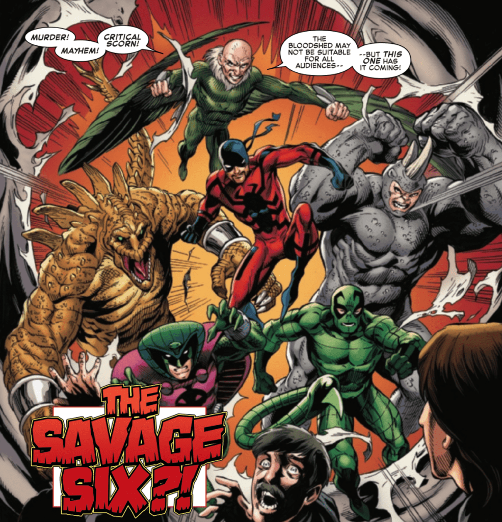 Nick Spencer has done a brilliant job answering questions throughout his run as he has raised new ones. There is a twist in the midst of being revealed and another being developed at any given point, resulting in a continuously engaging series. This is also true of Sinister War #1, which entertains readers through the number of villains appearing and heavily advancing the story of Kindred that has been present throughout Spencer’s run. Every time we get a small understanding of what is going on, a new revelation appears that completely offsets it. One problem with having such a large cast of characters is that we don’t have the chance to spend much time with many of them outside of bombastic fight scenes. It’d be insane to expect individual focus on each of the villains present in the issue. Still, there are questions to explore with Doc Ock, the Lizard, and Mysterio that were barely touched on because the focus was more on characters punching each other.
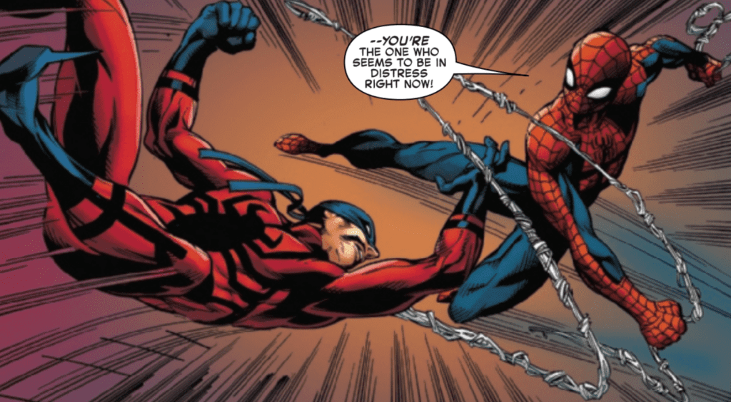
Sinister War #1 relies heavily on the art. With so many insane fight scenes full of iconic characters, the quality of the issue is mainly dependent on the pencils of Mark Bagley and the inks of Andrew Hennessy, John Dell, and Andy Owens. This group turns Sinister War #1 into the enthralling experience that it is and brings to life many of your favorite villains. There’s plenty of brilliant splash pages that are sure to wow the reader, and whenever there is combat, the poses are impressively dynamic. Of course, this is all without mentioning techniques used, such as a character overlapping a panel’s border, which causes the reader to feel more immersed in the issue.
Brain Reber’s colors in Sinister War #1 do justice to the iconic villains present in the issue. He keeps the palette deeply vibrant so that the tone of a scene doesn’t dull the character’s colorful costumes, which allows for some stunning splash pages. Of course, when a scene’s mood changes drastically, the palette will change to reflect, but the costumes are a priority for Reber, which is highly important when dealing with such flashy villains.
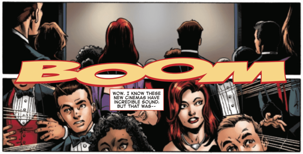
VC’s Joe Caramagna once again shows off his brilliant lettering talents in Sinister War #1. Methods such as changing the color of a font to show that a character is otherworldly or increasing the width of a speech bubble to emphasize a line of dialogue are in constant use. Whenever Caramagna creates captions for sound effects, he always does so in a way that the direction of the sound moves with the reader’s eyes across the page, allowing for the issue to flow smoothly.
Sinister War #1 is a fun excuse to see a massive portion of Spider-Man’s rogue gallery engaged in combat. Still, it also does a phenomenal job of moving forward Spencer’s story of Kindred. If you’re a fan of Spencer’s run of Spider-Man or a fan of Spidey’s villains, you do not want to miss this story.