

Radiant Black #2, out now from Image Comics, establishes the unique and fascinating nature of this new superhero series.
 Kyle Higgins has created a glorious story with this series, and he develops further it in Radiant Black #2. The previous issue introduced us to Nathan Burnett and his life circumstances, but we now get to see a deeper look into his morals and his relationships with his parents. His backstory is so easy to relate with since a significant component of it is him encountering a roadblock while chasing his dream. Nothing is easy in this world, and if you’ve ever had a passion, you’ve come across obstacles while pursuing it. There are also his parents, who he has just moved back in with. The dialogue from Nathan’s father is so realistic and gets across some complex emotions. When he and Nathan have a chat about Nathan’s financials, the father has an outward attitude that he understands, but there is a clear feeling that he doesn’t relate. As if it’s been so long since he’s been young that he’s forgotten what it’s like to have aspirations. We later get to see another side of him, highlighting how three-dimensional Higgins’s characters are and how easy it is to emphasize with them.
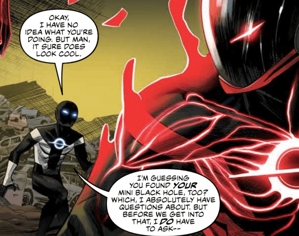
Radiant Black #2 is filled with gorgeous art from Marcelo Costa, who brings life to this new superhero. There are several multi-action splash pages in this issue with such beautiful composition that it would be a crime not to take an extra moment or two to appreciate them. The emotions of the characters are so well-expressed that readers quickly become immersed intense scenes. One page has no dialogue but perfectly conveys Nathan’s dilemma through emotions expressed through his mask. Costa’s art is utterly amazing, and it’s even more impressive that he is responsible for the book’s colors as well. The palette of cooler colors is a perfect complement to the art and quickly defines the series’ tone. From the spectacular fight scenes to the costume design, the art screams a sleek and modern design. This new hero is a hero for the present that isn’t just an echo of past comic book superheroes. Radiant Black is something all its own, and I’m excited to see what other breathtaking art this series will yield.

Becca Carey’s lettering of Radiant Black #2 complements the style of the art phenomenally, which assists in immersing the reader. The sound effects used don’t use over-sized fonts but instead match the sleek design of Radiant Black. Sound effects also often overlap panel borders, which makes them stand out and emphasizes the noises. Speech bubbles are placed in a manner that allows the dialogue to flow smoothly, and overall the lettering is a remarkable companion to the art and writing.
While I enjoyed the first issue of the series, Radiant Black #2 is what makes me thrilled to continue following the series. The art is stunning, the story effortlessly draws you in, and every page is a glorious experience. If you had any doubts about the series, reading issue #2 is sure to make you a fan.