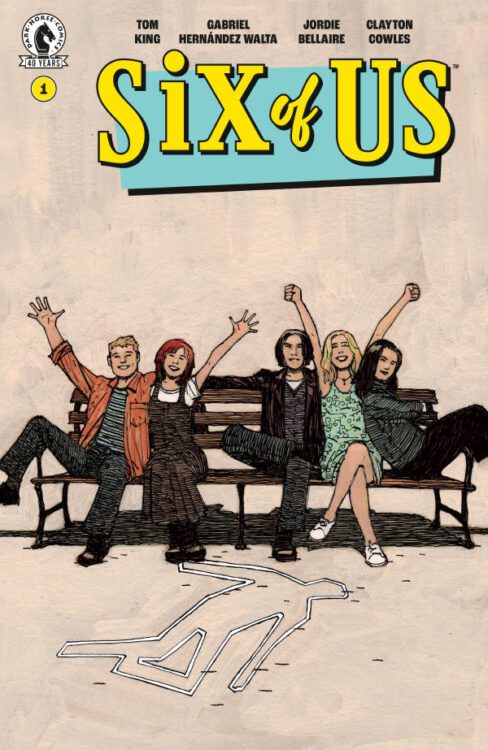
Writer Tom King, artist Gabriel Hernández Walta, colorist Jordie Bellaire, and letterer Clayton Cowles — the team behind Marvel’s smash hit The Vision — reunite to deliver a gut punch of a first issue with Dark Horse’s Six of Us #1.
Synopsis of Six of Us #1 from Dark Horse Comics:
Six actors built America’s favorite sitcom. Millions tuned in. Billboards lit the skyline. Then one of them died . . .
A beloved cast member of a hit ensemble sitcom dies under mysterious circumstances, sending shockwaves through Hollywood and revealing the secrets, betrayals, and desires lurking beneath the glittering facade. As the surviving cast members confront their past; old rivalries and hidden truths emerge and the line between life and performance begins to blur.
Writing
It’s tempting to say that Six of Us is just Sunset Boulevard meets Friends. Six actors are part of a popular sitcom, and years after it has ended, one of them is found dead at the bottom of his empty pool. It’s all there. But King’s pop culture references, in many ways, are more red herrings than anything else. They’re simply the means through which King is telling a deeper story. Something that’s more human and nuanced than a couple nods to TV and film.
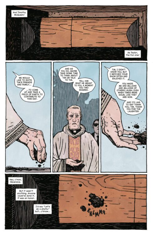
In many ways, it feels like Matthew Perry is present in this comic. Tim, the character found dead in his pool, was the funny one on the show. The one whose career never quite reached the heights it should have. Like Perry, Tim struggled quietly behind the scenes, hoping for more. It must feel a little scary, telling a story that so parallels events in real life. But it also feels important. King’s tone is empathetic, nuanced, and human. And while I’m sure the more we learn about Tim’s life in the coming issues, the less he will seem like Matthew Perry, it still feels as though there’s overlap between the two. With Tim’s funeral, which opens the book, the reverend in charge tosses some dirt onto the coffin.
“Tim, I didn’t know you.” The reverend says. “But I watched your show often and enjoyed it. You made me and millions and millions of others laugh, even when times were dour, like they are now. I’d like to say thank you, Tim. Thank you for the laughter.” I think that King’s words here aren’t just directed at Tim. I don’t think it’s just Tim’s funeral that the reader attends either, it’s more than that. It’s not even just Matthew Perry’s. It’s Robin Williams’, Catherine O’Hara’s, Tim Curry’s, Dolly Parton’s, and more. The page is brief, but it’s moving. King invites us to throw a little earth on the coffin and whisper words of thanks to all those who are now gone, who got us through hard times.

Art
Hernández Walta’s art elevates King’s script beautifully. So much of what makes this comic feel like it lives in the worlds of Friends and Sunset Boulevard comes from Hernández Walta’s deft ability to recreate those places on the page. The intro sequence to the in-comic show “The Six of Us” has the cast looking at the lion statue outside the Art Institute of Chicago, before sitting on a bench all together in a playfully chaotic way. The entire sequence is just as Chicago-y as Friends‘ intro is New York-y. Hernández Walta walks the line perfectly, making his own thing while leaving no doubt in the minds of the readers what it is he’s nodding at. The Sunset Boulevard reference is even more on the nose. Hernández Walta actually recreates Norma Desmond’s house from the movie perfectly. He wants us in that headspace. He wants us thinking of Tim as Joe Gillis. The effect is instantaneous.
But it’s in the smaller places that his art shines just as brightly. When two cops at the scene of the crime look down at Tim’s body, one of them asks the question “He jumped?” And yet Tim’s dead body has a frozen look of terror on its face. You see the panel and your stomach twists. No way he jumped, is your first thought, all according to Hernández Walta’s design. And later, in a flashback, when Tim asks “Isn’t there supposed to be something more than this?” Walta places Tim as a tiny character on the page, surrounded by the beautiful opulence of his home and swimming pool. He’s a man in paradise who’s miserable. Similarly, when Tim should be happy for one of his friends getting an award, Hernández Walta places dozens of smiling faces in the background, highlighting the strangeness of Tim’s scowl.
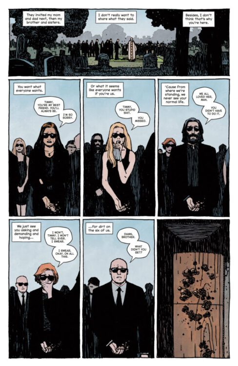
When the page layout is setup to show each of the characters, two rows of three, it’s Tim’s coffin at the funeral that breaks the pattern, making his absence feel even more wrong. Hernández Walta is constantly creating tensions, juxtapositions, and contradictions on the page. It’s truly visual storytelling at its finest.
Coloring and Lettering
Bellaire’s colors and Cowles’ letters are just as methodical as everything else in this issue. When we see a flashback of our main characters about to get their big break, the scene is cast in the pale glow of the early morning. The page is washed in the potential of what will be. The discovery of Tim’s body, however, is shown amidst what looks to be close to sunset, the sky is dark and there’s a shadow over everything. All of the scenes set in between these two moments are mostly bright, sunny, and vibrant. These simple color choices perfectly communicate to us the time in these characters’ lives. With a single glance we can see whether we’re witnessing their start, their peak, or their quiet and muted end. But even horrible scenes, like the discovery of Tim’s body, are rendered in such a rich tapestry of hues, that it makes the darkest moments of this comic feel strangely beautiful.
When Cowles’ writes Tim’s narrations in caption boxes throughout the comic, it’s written normally. All other dialogue, SFX, and music is written in all caps. It’s a simple choice that makes Tim feel quieter and more natural than the world he inhabits. When Tim’s body is discovered in the pool, the page is divided into four panels, one long panel for each row. Each panel has three caption boxes, equally spaced apart, and the final has one, all the way over to the right, in the bottom of the pool with Tim. The caption box shares that space with Tim, almost feeling like the words are the only thing still keeping him company. Other times, Cowles’ captions give Tim a wide berth. When he dives into his pool in a flashback, his small form flying through the air is far from the captions that occupy the corners of the panel. In that moment, he’s unencumbered by his own thoughts. He’s free of his constant self-recrimination.
Conclusion
With this debut issue, Six of Us is a reminder of why this award winning creative team is so unstoppable. It’s a human story about the importance of creating art, but the cost of it too. Six of Us #1 invites us to consider what true fulfillment looks like, and whether it has anything to do with success. Six of Us #1 is out from Dark Horse at a comic shop near you and you won’t want to miss it.