

Crossover #5, out now from Image Comics, is the penultimate issue of the series’ first arc and features many events that have been set up and foreshadowed, taking fruition at once.
Crossover #5, written by Donny Cates, is full of action. It seems everything that the series has been building up to has been set off at once, and the first arc is reaching its climax. There are so many insane moments that make this issue a thrilling read but to give all of these important moments enough emphasis, the art needs to be larger, making the issue an incredibly quick read. The issue contains multiple single and double splash pages that allow the art to shine but have the consequence of making the issue pass by rapidly. The art is amazing and well worth the issue’s price, but some readers may feel cheated by the lack of new story developments, only tiny instances where events that have already been set up begin to play out.
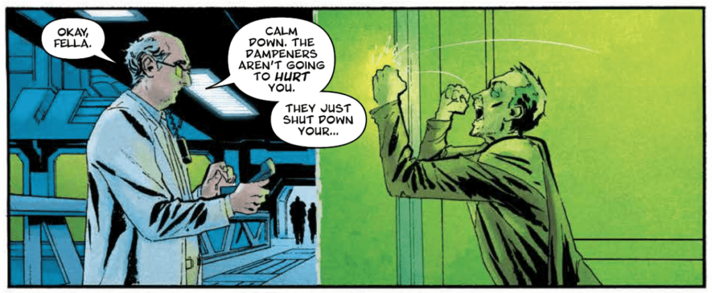
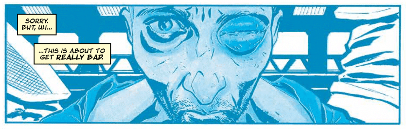
Geoff Shaw pulls no punches in Crossover #5 and provides a visual spectacle. Cates gives Shaw many opportunities to showcase his wonderful talents in a multitude of splash pages, which are impressive enough to take any reader’s breath away. Shaw’s characters are expressive, and the characters that are from fictional comic books all look like they could have been real superheroes. Every form is incredibly dynamic, which makes this climactic issue an absolute joy to read.
Crossover #5 comes to life through the coloring talent of Dee Cunniffe. The entire issue comprises a wide and vibrant color palette, which adds to the characters’ fantastic elements. Cunniffe’s characters that aren’t from a comic book have a much darker tone and palette that provides an amazing contrast between them and the comic book characters. Cunniffe also uses lens flares in this issue, emphasizing the panels it is used on since the effect is not often used in the series.
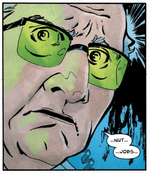
John J. Hill’s lettering in Crossover #5 is an excellent complement to the issue’s art. When the event happening on the panel is big, so is the font, and the style reflects the moment as well. Some characters have a different color scheme for their speech bubbles, and there are times where the words extend past the borders of a speech bubbles. Both of these are small ways that Hill is able to clarify the way that certain lines are said, and it has an enormous effect on the quality of the issue.
Crossover #5 is an issue where all the dominoes fall, and we creep towards the end of the series’ first arc. It is fast, action-packed, and a whole lot of fun.