Crossover #4, out now from Image Comics, is a bombastic issue with such a gripping ending that will leave you with a need to continue following the series.
Donny Cates does a lot of things to keep this series’ story exciting, and Crossover #4 is where everything really starts to pick up. The issue continues to feature an incredibly nonchalant narrator, who will do things such as interrupt a scene, misremember the sequence of events, or have a character’s dialogue alter what they were in the middle of saying. This peculiar narration style is quite comedic and makes reading exposition a more entertaining experience. Another aspect of what makes this issue so notable is its ending — or should I say endings? I wouldn’t dare spoil such an exciting reveal, but rest assured, Crossover #4 is worth purchasing to see the insane new path the story will be taking.
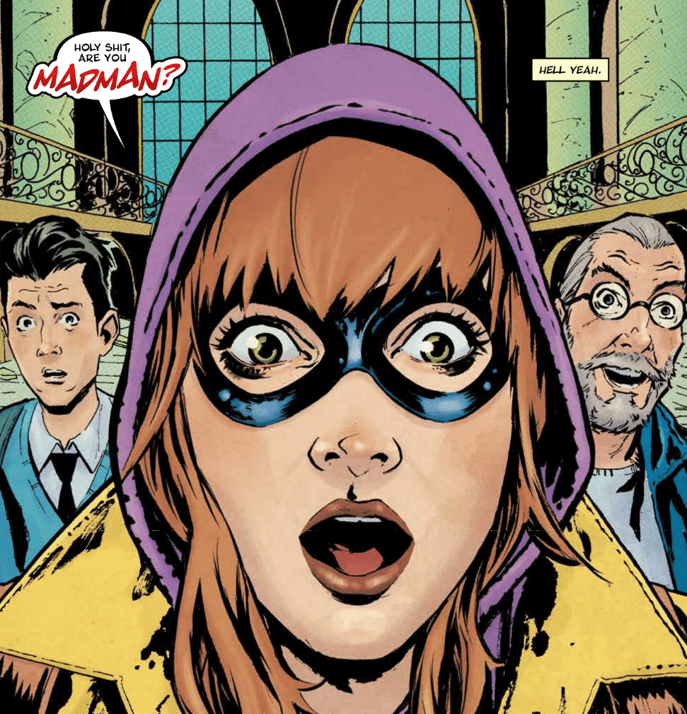
Geoff Shaw’s contrasts between comic book characters and the characters from the real world are astounding. The comic book characters have an idealistic physique and a naturally heroic attitude that distinctly sets them apart from the real-world characters, who have various statures and physiques. For almost all characters in Crossover #4, it would be easy to tell which characters belonged to which world even without the dotted design placed on the comic book characters. The issue also features a brilliant double splash page of Madman in combat. It shows multiple actions at once and is a fun moment with a classic comic book feel.
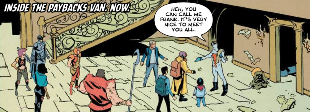
Crossover #4 wouldn’t be nearly as enjoyable without Dee Cunniffe’s colors. He does such a phenomenal job at giving the comic book characters a classic feel and the real world a grim one. The contrast of the colorful comic book characters against the bleak background creates a unique style that helps the book stand out.
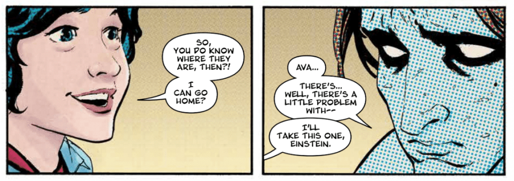
John J. Hill makes the dialogue of Crossover #4 pop. Whether that be through applying emphasis to specific words or giving a unique font to essential characters and items when they first appear, Hill makes sure that the reader clearly comprehends critical moments in the dialogue. Hills also gives some sound effects a color that heavily contrasts with a scene’s background, which adds energy to the moment.
Crossover #4 may be the best issue in the series yet, and it paves the way for many exciting things to follow. The art and colors work together to make a fun and unique style for the comic book characters interacting in the real world, and the lettering assists the story so that it can flow uninterrupted. This is one issue you do not want to miss.