

There’s a new big bad in town and he’s unlike anything Buffy and the gang have ever faced. Available from Boom! Studios, Buffy the Vampire Slayer #27 is written by Jeremy Lambert with art by Carmelo Zagaria. Contributing colors and lettering are Raul Angulo and Ed Dukeshire respectively.
Lambert manages to insert a couple of twists per issue and #27 is no different. We finally learn how Dorothy, head of the Watcher Council, has a deeper connection to the Scooby Gang. But the biggest reveal was the new big bad, Silas. What’s funny about the latter reveal is Anya’s been saying it, but Giles doesn’t seem to believe her. It takes mishap in Ethan’s magic training with Willow to convince him.
These twists are especially exciting because of the amount of planting Lambert has done. No matter how frustrating the delayed reveals are, all suspense is worth the eventual twist. Besides, it’s the build up that makes the reveal even bigger than expected.
Expressionist
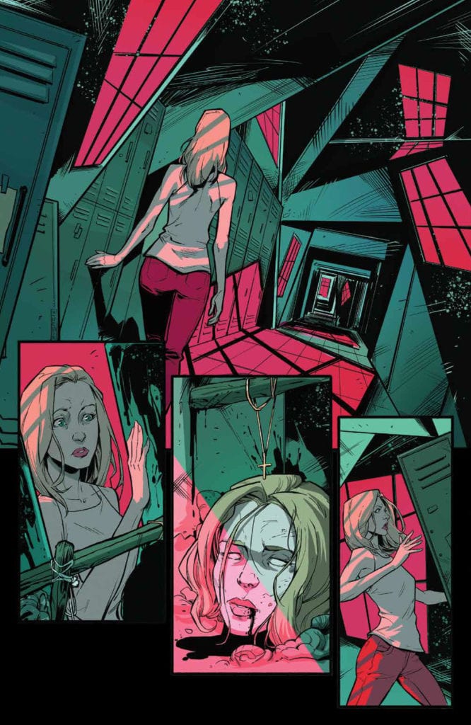
Big art follows big reveals. To that end, Zagaria draws with expressionistic flare. Each frown is accentuated with thin, scratchy lines. A stunning dream sequence in which Buffy’s fears are exposed feels straight out of The Cabinet of Dr. Caligari. It’s all Dutch angles, rough shadows and stark expressions. Such dramatic and film-like choices heighten the terror and sadness of the story.
As issue #27 explores Buffy’s fear of death, Zagaria’s expressionistic choices suit its tone. After all, the stakes are apocalyptic now. Thus, Angulo’s colors reflect such depth of feeling. In Buffy’s dream sequence, dark green and red carve through the black background. Later, brown and blue dominate the palette. No colors are quite cold, but they’re not altogether warm. All this to say that the color heightens the emotion where appropriate. However, the palettes also imbue the book with a quality of earthiness. It’s at once grounded and surreal.
Dukeshire’s lettering, on the other hand, does the work of capturing a lighter energy in his dialogue bubbles. Contrasting the previous issue, he uses no SFX. Instead, Dukeshire uses lots of long, panel-hopping tails and overlapping bubbles to communicate the frenetic energy of the characters. He does especially well in breaking up extended sequences of dialogue—of which there are many. In that case, Dukeshire does quite a bit to brighten up the issue using very little, and without imposing upon the narrative and illustration.
Changes
With every change in illustrator or writer, I find myself appreciating the Buffy series as a whole even more. Each creator adds so much character and style that freshens up the story. This issue in particular feels the most tense and high stakes partly because of newcomer Zagaria.
Nonetheless, the tensest moments have yet to come as we still don’t quite know who Silas is. Whoever he is, he’s already done a lot of damage to the morale of the Scooby Gang. So, whoever takes on the art of the next issue, I hope we see Silas’ in all his ugly villain glory. The enemy’s at the gate, and all we have is the hope that Buffy’s strength will prevail over death.