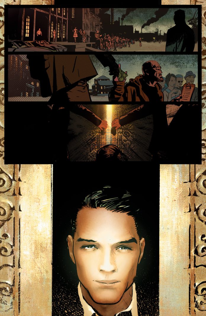
New comics publisher AwA Upshot release Archangel 8 #1 this week. One of four brand new titles launching the publisher, Archangel 8 is written by master storyteller Michael Moreci with art provided by CP Smith, Snakebite Cortez, and Sal Cipriano.
A realist looking, gritty thriller, Archangel 8 has a twist in its tale, one that is not apparent until the final page of issue one. Described as the Punisher meets Hellblazer, the style of this comic matches what you would expect from the member’s of AwA’s Creative Council. With names like J. Michael Stracynski, Reginald Hudlin, and Garth Ennis, working behind the scenes it’s not surprising that there is a Mature Readers tag on the front of this comic.
Producing a first issue is hard enough but acting as one of the front runners for a publisher? There is a lot riding on Archangel 8. The question is, does it deliver and give AwA Upshot a high flying launch?

Writing/Story
Michael Moreci has written some engaging, outstanding comics in recent years and if you are not familiar with his name I recommend you hunt down some of his work. If he experienced any additional pressure working on this title for a new publisher then it’s not noticeable in the comic.
The general plot is straight forward. Number 8 is a hired mercenary brought in to do a job. It’s not a pleasant job and the nitty gritty of his instructions are slowly unravelled as the plot progresses. In essence, it is like the movie Gross Point Blank minus the love story. And the jokes.
The twist in the tale is kept hidden until the end of the first issue, where a splash page reveals an entire new perspective of the story. Unfortunately, outside of the comic pages, the twist isn’t quite as secret as it should be. Press releases and solicitations give too much away so that the reader goes into the comic looking for the clues and references. Even the cover is a give away. If you can avoid anything about the nature of this comic before reading it, I would highly recommend doing so. I would also highly recommend reading the comic.
Moreci centres the plot around Number 8 and the mission he is given. The situations and locations that Moreci puts the character in helps to define the world that Archangel 8 is set in but also the personality of Number 8. The reader learns about the violent nature of the job through visual metaphors and stark imagery. Number 8’s distance from the world and his, seeming, emotional detachment are evident in his conversations where he starts to question something but he is quickly subdued.

Art Style
This first issue sets the scene early on and then spends the remaining pages constructing a tone. Number 8 is very similar to Marvel’s Frank Castle. He has a confidence that can easily be mistaken for arrogance, and appears to be a magnet for violence. The darkness that surrounds the character and the locations create a moody, almost melancholy atmosphere. This is accentuated by the constant autumnal references and imagery.
CP Smith’s art is outstanding, especially with Snakebite Cortez’s colors over the top. In places it is almost photo-realistic but in others expressionist and even abstract. The inks and the color create the autumnal feel, with the warmth of the summer ebbing away to leave a coldness. This combines with the central characters voice-over to produce a darker overall tone.
There are moments of artistic brilliance within these pages. There are panels that work within the context of the story on a number of levels and often stand out on the page. Smith has clearly designed his layout around these images, purposefully drawing the reader’s attention to certain panels, even before the page has been read. This forces an idea or emotion on the reader even before they have started to read.
So much of Archangel 8 #1 is about atmosphere, something which the artwork pushes off the page into the heart and mind of the reader. Cipriano’s lettering tempers some of the harshness in Number 8’s world. He uses rounded caption boxes for the voice over, immediately giving it a softer edge than expected. The reader becomes drawn to this hit-man, soothed by the eloquence depicted by the style of the caption boxes.
In addition, the speech is rendered in a naturalistic way. It’s straightforward and evenly displayed. You get the sense of realism that comes from most of Smith’s art. Occasionally the sound effects are comical, reflecting the action, while others are harsh and violent. Cipriano adopts a similar realistic/abstract approach taken by both Smith and Cortez.

Conclusion
If you can avoid spoilers for the twist and don’t mind violent thrillers, then this comic will be a wonderfully, satisfying read that leaves you begging for more. This is definitely a comic that will be appreciated by fans of the Punisher, Simon Spurrier’s recent Hellblazer, and Vertigo comics in general. It put this reviewer in mind of Garth Ennis’ Unknown Soldier mini-series or J. Michael Stracynski’s Ten Grand.
A successfully engaging first issue with gorgeous artwork and smart lettering throughout. Archangel 8 does everything you would expect a first issue to do and announces the arrival of a new publisher in style. Moreci continues to impress and the cliffhanger at the end of this issue leaves this series wide open for the rest of it’s run.
If Archangel 8 sounds like your type of comic I would highly recommend it. Not only do you get an amazing read but you also get to support a new publisher. A win/win situation.

