

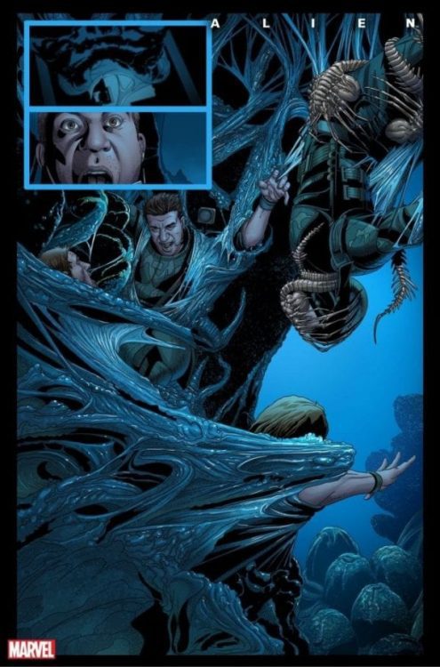
You can’t keep a good Xenomorph down and when the license for the Alien franchise moved from 20th Century Fox to Disney/Marvel, you knew a new comic release was on the horizon. There were initial announcements that Marvel would release an Omnibus of Dark Horse’s original serials but attention soon turned to the all-new Alien title written by Phillip Kennedy Johnson, with art by Salvador Larroca.
Both creators are excited to be working on the project, with Johnson exclaiming, “Ever since seeing Ridley Scott’s Alien at way too young an age, I’ve been OBSESSED with the xenomorph, the single most iconic representation of terror on film.” There is a lot of expectation from this comic and a long legacy to live up to. The question is, does this first all-new issue get to the core of the terror or leave the readers unperturbed?
In Space..
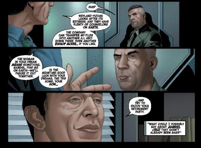
Johnson’s opening story is a simple one. Set 21 years after the events on LV-426, as shown in the Aliens movie, the plot follows Gabriel Cruz and his move back to Earth. He is a retiring mercenary who worked with the infamous Weyland-Yutani company and has disturbing memories of violent encounters with the Xenomorphs. The main focus of the story is Cruz’s rehabilitation back into society, and his attempts to reconnect with his estranged son. There is a subplot that brings a more obvious conflict into the narrative and will, no doubt, facilitate the introduction of the alien antagonists.
With the plot focused heavily on Cruz and the memory of his harrowing experiences, Johnson is able to examine post-traumatic stress disorder from a soldier’s point of view. The reader is shown the glimpses of Cruz’s disturbing memories but also the emotional strain these memories cause. It is clear that this man is adrift in civilian life and this echoes Ripley’s uncomfortable transition, at the start of the second movie. Johnson is reminding readers that interaction with the Xenomorphs changes your life, in much the same way the writer’s own life was touched when he saw the original movie.
Hiding in the most terrifying place of all
The inclusion of elements from the franchise, such as references to the Nostromo, Hadley’s Hope, and using the artificial Bishop as a central character, helps to cement the canonical aspects of the story; this isn’t a new world, completely wiped clear. But at the same time, it avoids referencing the previous comic book series. When Dark Horse originally began production of the Aliens comic there was a decision from the beginning not to have an ongoing title but instead to produce several mini-series allowing the creators freedom to play in the Xenomorph’s world. It would appear that Marvel may be attempting something similar, which will allow them to pick and choose aspects from the extensive back catalogue.
It is also telling that Marvel intends to produce an Omnibus containing a large selection of the Dark Horse’s publications. The book, priced at over $100, is clearly aimed at collectors and not meant for fans needing to catch up with the story. From this opening issue, it would appear that Marvel are forging their own world off the back of the original movies.
Witness the Resurrection
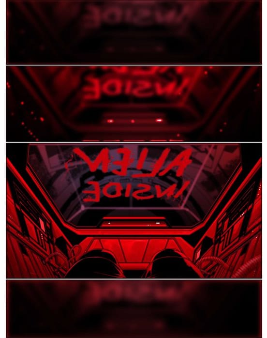
One of the most striking elements of Alien #1 is the lettering by VC’s Clayton Cowles. The placement of the word balloons and caption boxes not only lead the reader across the page but, by jutting up against the panel borders and crossing over each other, they provide a sense of diminished space. In a story where large vistas of the galaxy are visible on the page, it is impressive that Cowles is able to bring the reader into a closed environment, reminding them of the limitations of the technology and, it would appear, the human spirit. The lettering in the dream sequences are especially effective because Cowles has inverted the standard black on white. It may not be a new trick in comics, but Cowles uses it well. The overriding darkness of the word balloons forces the reader into the pages and into the disturbing memories of the central character.
These dream sequences are the most effective element of the comic. They tie directly into the tropes of the franchise and introduce the horror aspect in an expressive way. By using dreams, the creators can use exaggerations and distortions to emphasize the horror, without having to break any real world rules. Everything becomes about the perspective of the narrator and Johnson can lead the reader via the eyes of the protagonist.
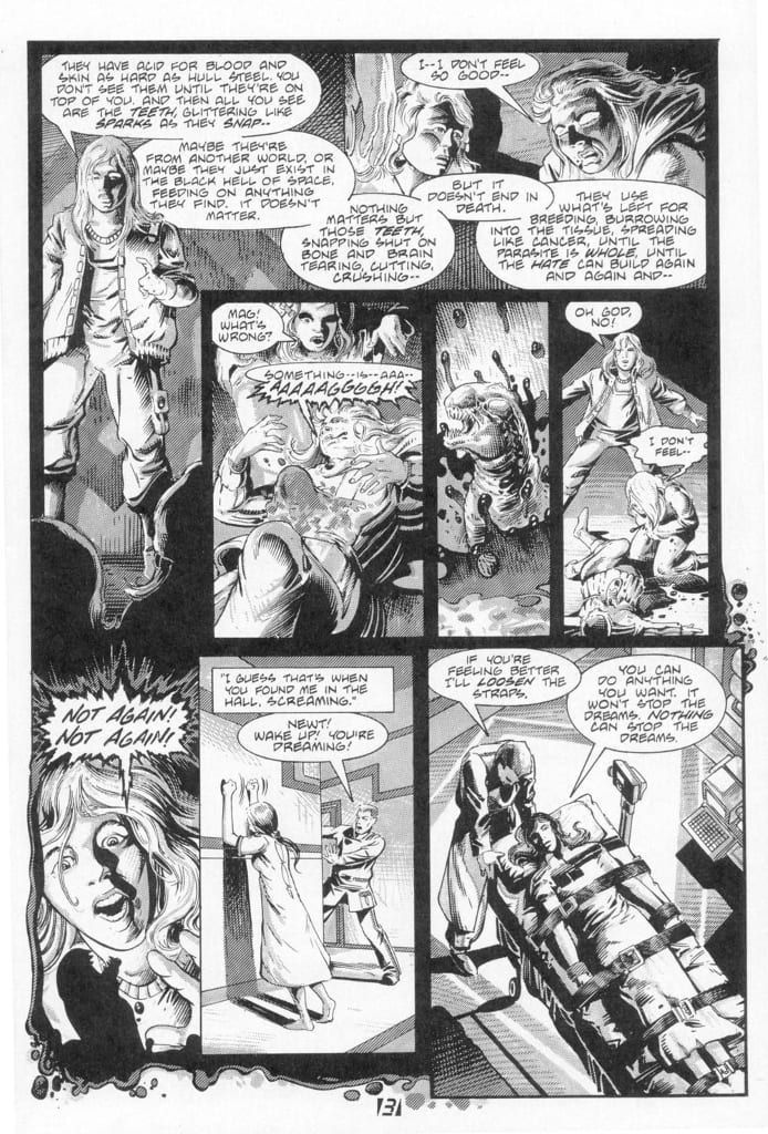
Unfortunately, outside of the dream sequences the visual tone does not provide an immersive reading experience. When the original Aliens strip was released in 1988, written by Mark Verheiden and drawn by Mark Nelson, it was in black and white. The story started in a similar vein to Johnson’s story here, with a psychological examination of a traumatised patient, but the visual element was more unnerving. It gave the impression of a darkness being all around, slowly closing in. The stark contrast between the white, the grey, and the black created a harsh reality for the characters to live in. This original series has been colored since publication and there have been numerous color Aliens comics since, but the best, most striking, of these retain the stark contrast between light and dark. The movement away from a realistic image serves the horror of the story better.
In this new Alien comic, Larroca’s art style is smooth and leans towards an element of realism. Ironically, this leaves the characters emotionless and flat for many of the scenes as it becomes impossible to distinguish from the artificial Bishop and the traumatised Cruz. The detailed scenery helps to create a sense of location but the minute that a character is dropped into the panel it becomes overcrowded. There is always something going on in the foreground and the background with a marked separation between the two. The effect is of actors on a stage.
This unnatural visual doesn’t allow the tension to build through the story and any jump scare moments are signaled too early. With the black and white of Nelson’s artwork each panel is all consuming and draws the reader into the melee. Larroca’s style pushes the reader away from the action, making them a spectator and therefore distant to the atmosphere Johnson is trying to create.
Conclusion
Alien #1 introduces the Xenomorph, creates a reason for the protagonist to get involved, and hints at larger conspiracies behind the scene. From this point of view it sets up the series very well. The Alien threat isn’t shied away from or played as a tease, it uses the Hollywood Blockbuster approach of getting straight to the point in the opening act so that it can follow a line of non-stop carnage from here on. The few characters that are introduced have just enough personality that the readers can understand their actions but the differentiation between synthetic and human is difficult to notice.
Unfortunately, it is the artwork that stops this comic from becoming engaging. Larroca is a good artist and works in a realistic style that is just not suited to this story or this franchise. The best of the Aliens comics that have been released over the years have included experimental, expressionistic art work. Even the original, which is more like Larroca’s overall visual, is able to create an unwelcoming atmosphere through the visual choices that were made, i.e. no color. After the initial opening dream sequence, the art and color seems to boast of it’s realism but then lacks narrative creativity. Ultimately, the artwork shows us the narrative but it does not tell us the story.
Over time, the art style may settle down or readers may become used to this form of storytelling. In the first issue, however, the visual decisions make the comic difficult to read and highlight the lack of dimension in the characters and the plot. There is a lot of scope within this franchise, as has been proven in the past, and it’s a shame that this first offering from Marvel feels held back.