The premise is simple: read one comic every day for the entire year. It seems like a simple task but there is no way that I read 365 comics last year, even if you count the individual issues in collections. So, this year, I am committing myself to this reading challenge, in the hope that I can broaden my reading habits and fully engage with my favorite hobby again.
It has been a quiet week for me, especially in the comic reading department. A delivery of new books at the end of last week means I have some new things on my table, and I’m already a good chunk into Titan Publishing’s Planet of the Apes Omnibus 4. I’ve also started on Monsters: A Fan Dilemma by Clair Dederer, which is proving to be intriguing and I will definitely be discussing alongside some comics in a few weeks.
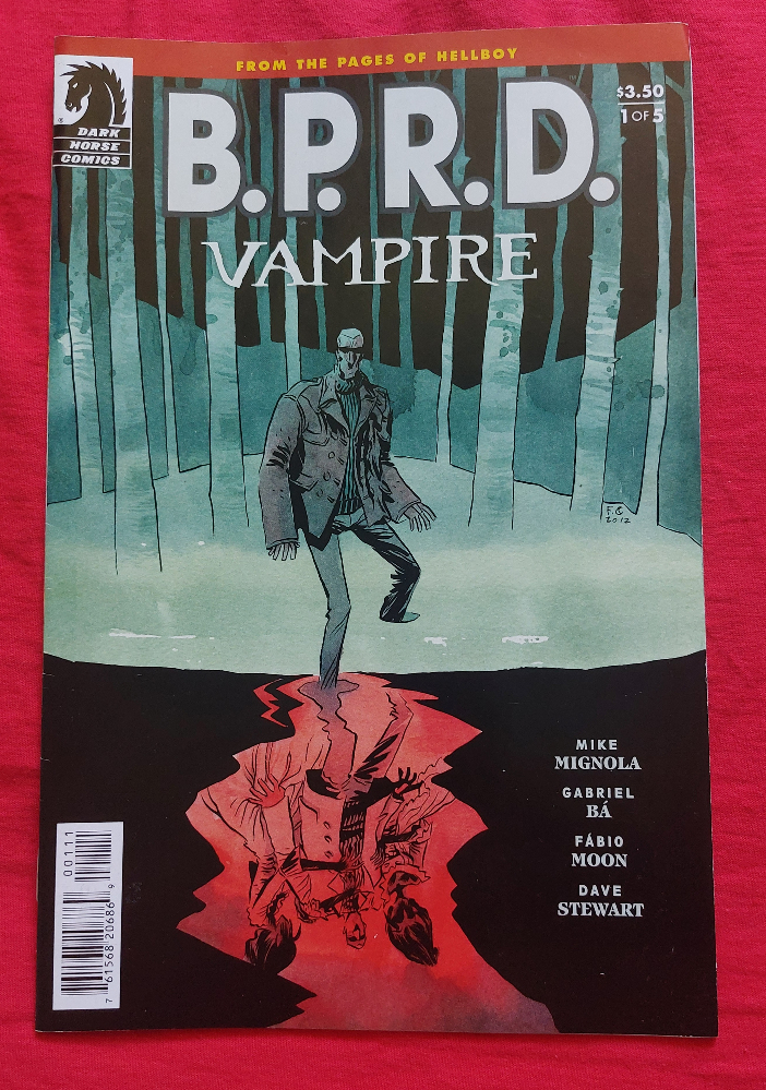
On the comics front, I started the week with B.P.R.D. Vampire from Dark Horse Comics. This five issue mini-series is part of the Hellboy universe and is set when the red demon is a child. Hellboy himself features only in passing, but Professor Bruttenholm’s role in the comic allows Mike Mignola to explore the seeds of the relationship that the professor and Hellboy eventually have.
Credit: Dark Horse Comics
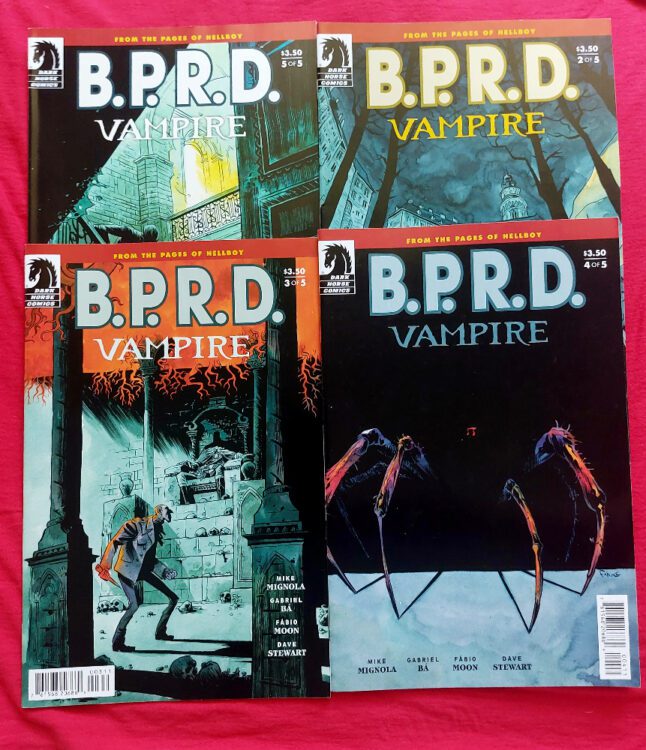
In Vampire, Simon Anders, an agent in the B.P.R.D. journeys to Czechoslovakia on the trail of vampire legends, searching for an answer to dreams that plague him. The comic is a sequel to the B.P.R.D. 1947 series from three years earlier and explores the consequences of that story, at least for one of the characters. It is supernatural horror at its best. Gabriel Ba and Fabio Moon’s artwork is exquisite from the opening splash page of a bloodied hand trailing through black water, to the complex yet quaint scene setting location panels. The character design falls just short of caricature but this is a part of Ba and Moon’s theatrical style. Their work is dynamic and engaging, bordering on expressionistic in places, and this really brings out the magical essence of the story.
This narrative features vampires, witches, Gods, and massacres. It also has strong characters who evolve throughout the five issues. The villains and the supporting cast are just as important as the central protagonist and Mignola gives them the attention they deserve. In the end, two of the characters clash but not in a grand violent fight sequence, instead arguing reason with each other. The human world and the supernatural world collide and attempt to find balance, as is often the way in the Hellboy universe. Anders’ fate is left open but the experience has touched Professor Bruttenholm and the parent/child bonding between him and Hellboy begins to make a little more sense.
Credit: Dark Horse Comics
I adore this mini-series. The artwork is superb and the composition in the panels with the layout design is theatrical and delightful. Every movement, every transition, has been clearly thought through. Dave Stewart’s color work adds emphasis to the pages like punctuation in a novel. It creates atmosphere and highlights location changes. The colors are so important in this comic, without them so much of the magic would be lost.
And finally, Clem Robins’ lettering suits the artistic style brilliantly. In a comic that has art with such a visual impact, the lettering can easily disappear into the background, and that is the beauty of Robins’ work here. The reader doesn’t notice the lettering creeping in on page 6, which is the first page to contain any speech or text. Your head is full of the sounds of nature from the desolate opening images and the first speech balloon, with the letter “s” repeated, fits naturally into the visuals we have already seen. That first balloon is also the only time that the speech crosses over the panel borders and should stick out like a sore thumb, but it doesn’t. The large balloon with its flicked tail and short line of text through the middle, exactly at the point where the panel gutter would be, matches the thematic visuals of this comic perfectly.
The entire five-issue run is impressive. I’m not a particularly big fan of Hellboy, but I can’t fault comics like this.
Credit: AfterShock Comics
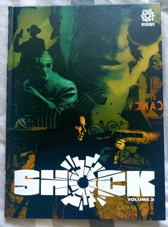
Shock Volume 2 is a collection of short stories published by AfterShock Comics. The talent on display in this over sized, hardback anthology is impressive — Jim Starlin, Garth Ennis, Marguerite Bennett, Jill Thompson, Phil Hester, and Ray Fawkes to name just a few. There are 18 stories in total, all different genres and styles, and each with a twist at the end. It’s kind of like the comic book version of Inside No 9 or The Outer Limits.
Some of the entries, like The Handshake by Juan Doe, are fun, B-Movie type stories with obvious horror cliches, but told in a charming and entertaining manner. Others are more disturbing, like Joe Pruett and Szymon Kurdranski’s The Playground which is a black and white ghost story about a child killer returning to the scene of his crimes in an attempt to put his nightmares to rest.
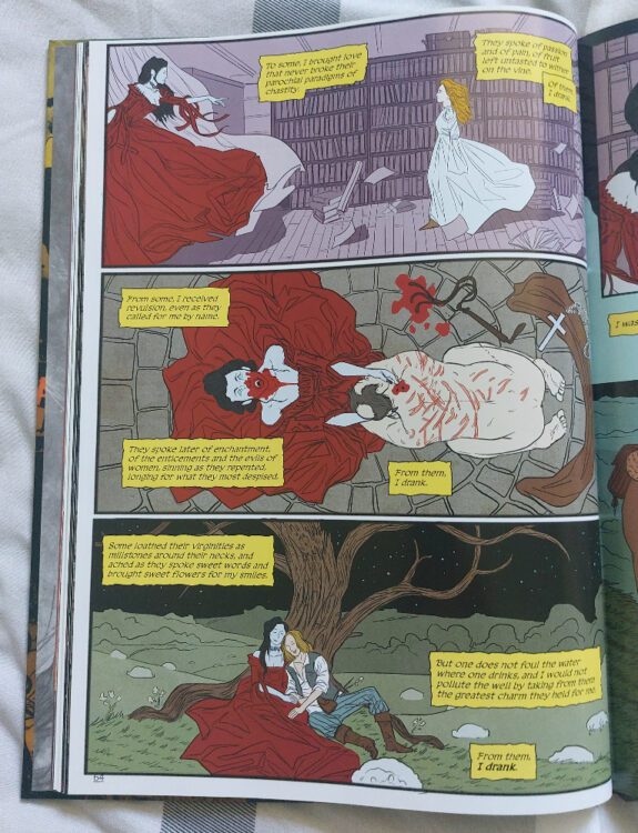
The artwork on Marguerite Bennett’s The Vampiress stands out in the book as it is brash and bright. Artist Zachariah Roane uses thin, deliberate lines to etch out the characters and the scenery. They use large panels, averaging four per page, to create a sense of awe, whether it’s for moonlit landscapes or interactions between two characters. However, it is Patrizia Comino’s color work that makes the pages pop from the book. Large, flat areas of vivid color shape the characters and their surroundings. It is reminiscent of Francis Coppola’s movie Bram Stoker’s Dracula in its treatment of visual spectacle.
Credit: AfterShock Comics
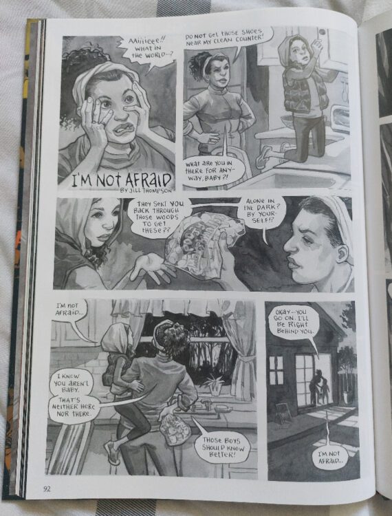
My favorite stories in this collection are the simple ones, the straightforward ones that tease the reader with an established horror trope — tales like I’m Not Afraid by Jill Thompson. This is one of those stories that you tell around a campfire. A simple set up with a not unexpected twist but it is the execution that makes the comic so appealing. The artwork is gray-scale with no color and the shadows are dark gray instead of black. The combination of white gutters and no panel borders creates a dream like quality to the few pages which is quickly subverted in the final panel on page two ready for the reveal on the final page where the shadows get darker and the light contrast becomes starker. Jill Thompson has designed a horrendous creature that would have fitted perfectly into my discussion on monsters in a previous week. It’s all teeth and bony limbs.
Overall, Shock Volume 2 is a wonderful read. Some of the stories read like introductions to ongoing series (and I believe that is the case for some of them) but the ones that work the best are short and to the point. Over the years, AfterShock Comics have published some of my favorite comics. Series like Babyteeth, Stronghold, Jackpot, and one of my all time favorites Undone by Blood, have all been exceptional reads that have challenged particular genres and tested the limits of comic book storytelling. This anthology is more of that kind of commitment to comics and the narratives that the creators want to tell. What’s more is that the production of the book, in its over-sized format, is immaculate. It sits on the shelf, enticing people to pick it up and flick through it. Then, once it is in your hands, it pulls you in until you have read each and every story. It is a shame that they haven’t published more in this format.
Credit: AfterShock Comics
And ending the week, I looked at another vampire title: 30 Days of Night issue 1. The movie version is magnificent, one of the best vampire movies ever made and, in my opinion, one of the best comic book adaptations because it takes the essence of the comic and creates a cinematic equivalent without being obsessed with fidelity to the source material. It is also a movie I will watch whenever I come across it on TV no matter how long it has been on… which is what happened this week. I caught it from the point where the vampire hoard are trying to coax the humans from their hiding places by using live bait; humans they have captured just to send down the main street in floods of petrified tears.
The film is brutal, and so is the comic that spawned it. Steve Niles captures the claustrophobic horror of being trapped, not only in confined places but also within a location, cut off from the world in every conceivable way. Imagine sitting in your home, unable to leave, knowing that death is coming to your door? In the first issue Niles demonstrates the brutality of the vampire’s, demonstrating the threat in the clearest and most violent way possible. These aren’t the types of vampire that jump out of bushes and give you a jump scare ala Buffy’s foes, or the twinkly love struck teenagers of Twilight. No, these vampires tear off heads and feed on the spurting fountains of blood. These vampires are more like the blood lusting creatures from the movie Vamp starring Grace Jones. However, there is an organization to their feeding frenzy, a conspiratorial nature to their existence which is more befitting of the X-Files than the hidden-in-dusty-castles myths from tales such as Dracula.
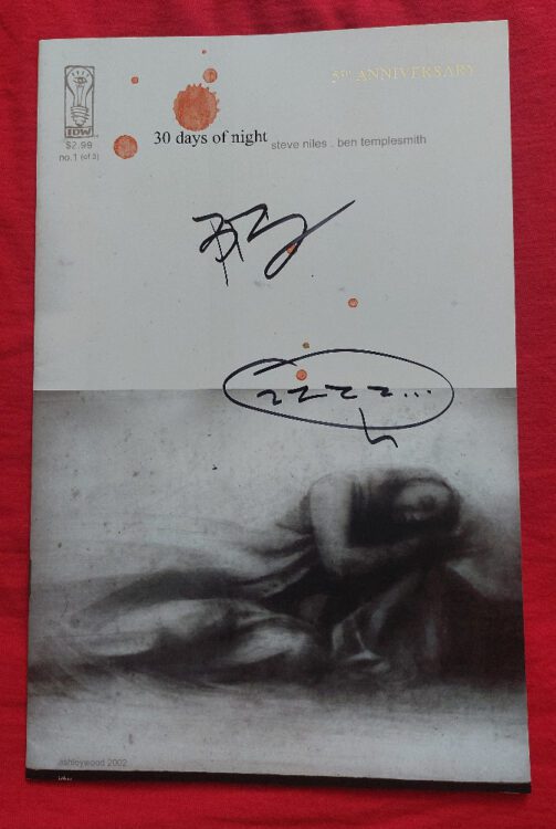
Credit: IDW Publishing
Although the story is packed with horror and moves at a pace that never allows boredom to settle in, it is fairly straightforward. The real reason that this comic has become a classic, and caught the eye of Sam Raimi leading to the movie version, is the visual interpretation of the narrative by artist Ben Templesmith. The artwork here is outstanding. Templesmith draws atmospheres and then scratches out locations and characters in hair thin lines. The characters shift from detailed, emotive figures with elaborately drawn faces to smudges with only the implications of features. If it’s fair to describe the work in Vampire (above) as verging on expressionistic, then some of Templesmith’s art crosses over into abstract expressionism. If you were to remove the characters from the page, you would be left with the impression of a world soaked in terror. The very first page is a prime example because it contains no characters, instead plumbing gray clouds slowly reveal dark stains that could be dwellings and only the caption box confirms this.
30 Days of Night originally came out in 2002 as a three issue mini-series and has spawned a string of sequels over the years written and illustrated by different people. Steve Niles even wrote a rebooted version of the story, fleshing out the original idea and giving the narrative a twist or two. The concept endures because it plays on a natural, identifiable terror of hopelessness and being trapped. The vampires are visual representations of all predators, animal or human, and illustrate how overwhelming forces can crush spirits and hopes even before any personal attack happens.
We fear the oncoming storm.
So, that’s my week in comics. Five issues of Vampire, a horror anthology, and issue one of 30 Days of Night. Comics numbered 182 to 188 ticked off. Next week we might find something meatier, but Wimbledon is on, the only sporting event that I really make an effort to watch, so I might not have time for intense reading. Any suggestions for comics that might complement a week of tennis? Let me know below.