One of the industry’s fastest-growing independent publishing companies, AfterShock, is gearing up audiences for a ‘dangerous’ year of reading in 2019.
The publisher’s new slogan, ‘Read Dangerously’, will be supported by a robust marketing campaign, that will serve as a rally cry advertising initiative to keep readers engaged throughout the year.
Over the past few years, having produced such fan-favorite books like Animosity, Dark Ark and A Walk Through Hell, the publisher will look to push the envelope this year with upcoming projects from bright new creative teams, on series like Stronghold, Horde and Oberon.
“AfterShock was created to push new boundaries by giving the comic world’s most creative writers and artists free reign to blow readers’ minds,” said Publisher and CCO Joe Pruett. “As a result, we’ve published some of the industry’s edgiest and most compelling content since our launch in 2015 and inked deals over the past year to bring a few of our flagship titles to the big screen with major studio partners. With groundbreaking new titles set for debut this year, there has never been a better time than right now to discover all that AfterShock has to offer.”
Click HERE for the official release on AfterShock’s The Year of Reading Dangerously.
The publisher has also announced its 2019 addition to Free Comic Book Day. More HERE.
Star Trek: The Q Conflict brings together characters from various iterations of the Star Trek Universe and pits them against their most powerful foe. It is an ambitious undertaking but with Scott and David Tipton at the helm, IDW Publishing are sure to have a hit on their hands.
Star Trek has a long history of crossover events with characters from different aspects of the series meeting up. They did it during the The Next Generation TV run and then on each subsequent series. There are a number of novels and comics already out there that adopt this narrative. The key is to be able to juggle all of those massive egos (i.e. The Captains of the Star Ships) while maintaining an exciting story without descending into a crossover for a crossover sake. Something that the movie Star Trek Generations was guilty of.
The Tipton’s have been writing Star Trek for IDW for many years now and this isn’t their first crossover story-line. In fact, they have written crossover events featuring the Star Trek characters meeting people from Doctor Who and Planet of the Apes. But The Q Conflict is an ambitious attempt to bring characters from four series (at least) together. Can they pull it off or have they attempted too much Trek at once?
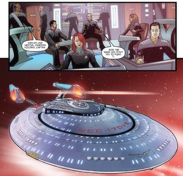
Star Trek: The Q Conflict cover art. Credit: IDW Publishing
The Writing/Story
As The Enterprise (NCC-1701-E), under the command of Captain Picard, speeds through space on a rescue mission, the crew witness first hand an unexpected Supernova. This is just one of a number of such unnatural occurrences within the Beta quadrant and not even Data can come up with a possible explanation.
The Tipton’s open up their new Star Trek adventure in a usual and comforting fashion. The Enterprise is mid adventure and the reader is thrown in the deep end. The mission is slowly revealed at first via the standard briefing room scene then by a related distraction; the nearby Supernova. As the crew arrive at Cestus to assist in the evacuation of a planet there is another unexpected occurrence followed by the arrival of an old friend: Q.
The pacing of the adventure is perfect Star Trek as a minor revel happens in the middle of the issue followed by a bigger reveal, and the essence of this series, right at the end to create a gripping cliff-hanger. There’s no surprise that the always enjoyable Q is going to turn up because of the title of the story but that doesn’t mean that there can’t be some mysteries to uncover or surprises to be had. The Tipton’s handle this element of the comic very well, keeping the narrative intriguing and moving along at a steady pace.
The characters are written really well with dialogue that fits their personalities. Q has the arrogance that is associated with the character and the banter between him and Picard plays out wonderfully. The reader gets the sense that these two characters have a long and complicated history even without having to know anything about them. This comes from the Tipton’s familiarity with the characters. It is obvious that they have spent years writing these characters and their knowledge and understanding is evident on the page.
Star Trek: The Q Conflict Credit: IDW Publishing
The Art
The panel layouts in The Q Conflict give the scenes a dynamism necessary for what is in essence a very static story, especially in the opening sequences. The ridged Starship setting is brought to life by the sense of depth provided by David Messina’s pencils and Elisabetta D’Amico’s inks. Solid thick lines define the characters giving them a strong presence on the page even against the highly detailed backgrounds.
The one artistic choice that does become noticeable as you read is the decision not to have a single character open their mouth. This may not seem like a problem but it soon becomes apparent, especially as there is a lot of conversation in this issue. It makes for an eerie atmosphere. The result is that the figures end up having an element of mannequin about them which is unintentionally unsettling.
Aside from this one aspect, the figure work is impressive, helped by the color work by Alexandra Alexakis. Alexakis’ work really begins to excel when the different Star Trek Series characters begin to interact with each other. The attention to detail in the uniforms, for example, is exemplary.
The lettering by Neil Uyetake also comes into its own when certain characters interact. Each of the Omnipotent Beings has their own typeface making each character individual and, most importantly, differentiating them from the Humans. This lettering decision creates the necessary distance between the All powerful characters and the Federation regulars.
As with the Tipton’s attention to detail in the narrative, the art work expresses the creators love for the series and their commitment to this story.
Star Trek: The Q Conflict Interior Art Credit: IDW Publishing
Conclusion
In 1994 Peter David wrote Q-Squared, a non-cannon story that attempted to link Q from The Next Generation to the Squire of Gothos from the Original Series and a whole bunch of stories in between. The Q Conflict appears to be broaching on similar themes but with a wider net. By bringing together so many aspects from the full history of Star Trek you would think that it’s appeal would narrow. This is not the case with The Q Conflict for two reasons.
Firstly, Star Trek fans, especially those who indulge in the expansive universe, already know a great deal about each series. This allows the Tipton’s to use that knowledge in the narrative to build expectation and even throw an occasional curveball just for those in the know.
Secondly, all of the creators working on The Q Conflict understand that this might be someone’s first venture into the Star Trek world and the entire comic is designed around that concept. Some of the nuances of narrative may be lost by not knowing who everyone is, but the story uses natural dialogue to explain what is going on as it progresses.
The two aspects may seem to be contradictory but that is where the clever scripting really shines because, not only are the Tipton’s balancing a wide range of characters, they are aiming the comic at a large audience. And the first issue of The Q Conflict is a success in this regard.
The only complaint to be levelled at this first issue is the lack of emotion in the characters faces. The expressions and reactions are wooden and the fact that no-one opens their mouths is surprisingly off putting after the first few pages.
Where the story will go and whether it can maintain the wide appeal that this first issue has is yet to be seen but The Q Conflict has set off in the right direction.
Wyrd #1 introduces readers to Pitor Wyrd, a seemingly-immortal paranormal agent. Described by Dark Horse as “James Bond meets The X-Files,” the Feds call-in the cynical and smarmy Wyrd to clean things up when a situation gets too messy for normal means.
This issue opens with Wyrd’s attempt at suicide, which is something that seems like a regular occurrence for him. After immediately recovering from his injuries, Wyrd’s handler tasks him with taking out a secret bioweapon gone berserk in Crimea. We feel out the character’s outlook and attitude here, providing a backdrop for the narrative of the four-issue miniseries.
The Writing
Curt Pires keeps his cards close to the chest about the broader story in Wyrd #1. However, we can parse out enough critical information to avoid being lost in this first issue.
The writer lays the groundwork for some interesting ideas throughout. Of course, we’re left wondering about the titular character’s apparent immortality, though there may be certain clues laid by the creature Wyrd confronts on assignment. The intrigue on the periphery of the story is enough to make readers want to keep turning the page.
Pitor Wyrd is a character in the mold of John Constantine; a noir figure in a paranormal setting. They have similar mannerisms, attitudes, habits, and manners of speech. Of course, the downside to this being the character suffers a bit by comparison. We get plenty of characterization for Wyrd, but little genuine emotional weight until the last few pages of Wyrd #1.
That issue is compounded by the fact that Wyrd is surrounded by flat, nameless and unimportant characters. Wyrd’s handler, a little girl, and even the monster he confronts have little development. The most we get is from the solider who picks Pitor up at the airport and who muses for a few panels on local mountains. We can hope future issues will resolve this problem. In Wyrd #1, though, the lack of emotional stakes keeps the reader from getting fully invested.
The Artwork
The artwork provided by Antonio Fuso is a strong point for the book. The work employs a combination of sketchy, minimal styles and highly-detailed illustrations in equal balance, lending the book a unique and interesting aesthetic.
Some of the action panels in Wyrd #1 are a little lacking in kinetic energy. However, anything the artwork lack in terms of dynamism, it more than makes up for in style. Fuso’s artwork, overall, is a treat to look at.
Stefano Simeone’s color work presents an important contribution to the overall work as well. Softer, washed-out tones dominate most of the book, though moments of vibrant and saturated color cut through, providing contrast and highlighting some striking imagery from Fuso.
Final Thoughts
Wyrd #1 is a solid start to the four-issue limited run. We can hope subsequent installments delve deeper, though, giving the reader some of the pathos and development missing here.
Doctor Strange #400 sees current creative team Mark Waid and Jesus Saiz, along with some classic Strange artists, bringing readers a true milestone of a celebratory issue.
Someone has been working in the background since the first issue, chipping away at Doctor Strange and other magicians, undercutting and depleting their magic, and the other shoe finally drops. Does Strange stand a chance against someone who can take his magic away with the snap of their fingers?
Doctor Strange #400
Written: Mark WaidArt: Jesu Saiz (with Kevin Nowlan & Jim Campbell; Butch Guice & Carlos Lopez; Tom Pamer & Daniel Acuna)Letters: VC’s Cory Petit
Writing
The so-called ‘Milestone’ issue is something that gets thrown around a lot in comics. Sometimes that can mean an overpriced and overstuffed fill-in issue, and sometimes it’s something appropriately special. Thankfully the latter is the case with Doctor Strange #400, which finds a way to not only be accessible to new readers (like this reviewer) but to also reward recent readers of the current arc as well as celebrating the character with back-up stories that actually BACK-UP the character and not just fill-in pages. For those who had been reading the current arc, this chapter finally brings a confrontation between Stephen Strange and the ‘Magic Accountant’ that has been plaguing the Sorcerer Supreme. What’s great about this fight is that it forces Strange to use skills other than magic to defeat his enemy; in this case a mean combo of some bad-ass kung-fu along with a surgeons knowledge of the human body. It’s a great sequence that shows how well Waid knows this character as it’s classic Stephen Strange, filled with a touch of humor and more than a little arrogance. The main reveal here though is the cliffhanger ending, which is setting up one hell of an idea…SPOILER ALERT…it seems Stephen’s recent trip through different realities to gather magic has left more than one realm claiming a debt. But the one that does come collect is a doozy; none other than the home of Dormammu himself, the Dark Dimension. And it’s not just the Dreaded one that is showing up…it’s his whole race of beings. How Doctor Strange and allies are going to fight this is going to make one hell of an issue next month. The ending really does feel epic, and as someone who had not been reading this arc so far, it has grabbed me, and there is no way I am sitting out what happens next.The rest of the issues is filled with shorter stories illustrated by some of the classic artists that have worked on this book. We get a moving story about bullying (House Call by Waid with art by Butch Guice and Carlos Lopez) and The Lever (again by Waid with art by Kevin Nowland and Jim Cambell) which manages to re-tell the origin of Doctor Strange, yet bring in a small detail that changes the dynamic between Stephen, his mentor The Ancient One and his rival Baron Modo. The Lever is fast, funny and fun.
Art
Jesus Saiz creates some truly beautiful and elegant art. His ability for clean, slick layouts makes for a smooth reading experience. He also knows how to balance a splash page with a more traditional paneled page, which only adds to the narrative pacing. It reads quick, but it’s still impactful. Saiz understands the events in this issue are meant to be fast and intense.The back-up stories also feature some great art, excellently showcasing how Doctor Strange can be rendered by different styled artists yet still retain something that makes him weird, magical and of course strange!
Conclusion
Doctor Strange #400 is the kind of anniversary issue all celebratory chapters should strive to emulate. It pushed the current story forward toward a huge moment, yet also has some nice, quite callbacks and stories that give credence to the timelessness of the character in question.
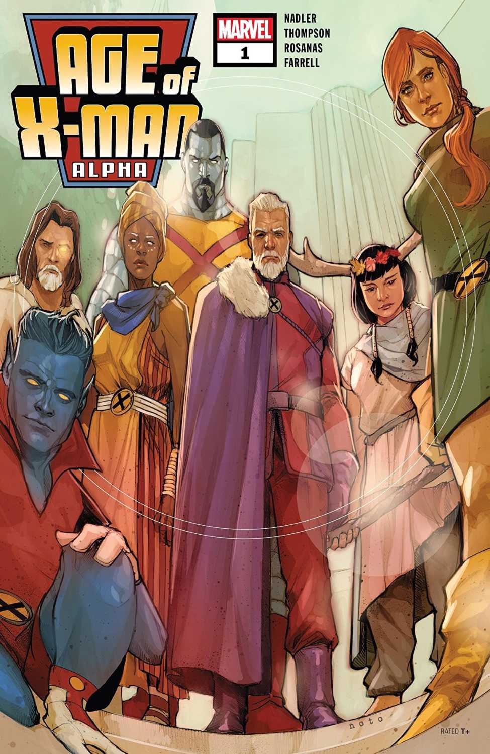
A world where mutants are no longer feared and hated, rather they are the reigning species. Enter the dream of Nate Grey, enter the AGE OF X-MAN…
***SPOILERS LIE AHEAD***
Nate Grey was able to pull off his extremist dream of crafting a utopia world for mutants. AGE OF X-MAN: ALPHA is our introduction to this world that will be consuming Marvel’s line of X-Men comics. The brilliant writing duo of Zac Thompson and Lonnie Nadler (CABLE: Past Fears) are back to share an ambitious vision.
We dive right into this strange new world where mutants reign supreme and the X-Men are celebrated heroes. Our lineup of main heroes, led by Nate Grey, are more relaxed than ever. There’s no incoming apocalypse, no mobs promoting hate, and mutants are healthy in number.
This is a peaceful world, but one with plenty of rules to follow. The biggest rule being a ban on romantic relationships–a rule that Bishop and Jean Grey apparently take no part in. There’s something sinister and eerie underneath the beautiful and cheery surface. Seeing Bishop taken away and Jean’s memory wiped gives us our first glimpse into the darker side of this bright utopia.
As we tour our new landscape, we meet some new characters and get treated to the redesigns our old favorites. The roles our X-Men find themselves in are interesting, we barely scratch the surface.
Like any “Alpha” primer issue, we’re exposed to our new setting along with teases for all of the peripheral tie-ins. Thompson and Nadler sprinkle in the tie-in incentive quite masterfully. Whether it’s a major plot point like Bishop’s incarceration or a horrifying look in Glob’s eye, there appears to be plenty of story to tell in this Age Of X-Man.
The sentiment felt by X-Men fans in Thompson and Nadler’s brilliant five issues of Cable carries over here. These creators have a deep love for these characters and have no problem expressing that through plenty of quieter character moments. There’s not much action to this issue and the story is better for it.
They may be remodeling the mindsets and priorities of these characters, but they’re able to do so without raising any more questions that the characters won’t ask themselves. Something is amiss in this perfect world and it’s not just the reader than can feel that.
This is uncharted territory for X-Men comics, we’ve never actually seen a world like this. When Nate claims this is not Xavier’s dream realized but his own, that’s when you realize that we really don’t know what to expect going forward.
As far as event kick-offs go, this checks all the boxes without over-the-top drama and action. There’s tension and mystery to Age Of X-Man Alpha built strictly out of intrigue. Despite the slight shades of Age Of Apocalypse and House Of M that you may have felt from solicitations, this is a beast of a different color.
Artist Romon Rosanas and colorist Tríona Farrell wonderfully immerse us in this new land of mystery. The peaceful but uneasy tone is illustrated perfectly. Page layouts and panel angles are cinematic and colorful. The art makes it feel like a dream, with the proper dose of nightmare lurking in the background.
Thompson and Nadler’s vision is getting the treatment it deserves in both scope and execution. AGE OF X-MAN: ALPHA is loaded up with plenty of reasons to stay along for the full ride.
Check out a great interview with Zac Thompson and Lonnie Nadler on the Battle of the Atom Podcast where they talk all about AGE OF X-MAN! Long live the “Cable Boys!”
The animated Space Battleship Yamato series originated in Japan in the early 1970s, where it grew into a cultural phenomenon. In 1979, the show arrived in the U.S. retitled as Star Blazers. Now Dark Horse Comics is getting into the Yamato game with the release of Star Blazers: Space Battleship Yamato 2199, based on the anime. The first volume of the new English omnibus edition lands in stores this July.
Here’s the publisher’s official synopsis, followed by the Japanese cover:
Aliens from the planet Gamilas have devastated the biosphere, determined to reshape our planet into their new home. But an emissary from the distant Iscandar has given humanity the means to defeat them. If the crew of the Yamato can battle its way through the Gamilas fleet to reach Iscandar, their technology can heal the Earth—but the odds against them are literally astronomical…
Star Blazers: Space Battleship Yamato 2199, adapted to manga by Michio Murakawa (Imaginary Spirit), with covers by Junichiro Tamamori, arrives in a double-sized English omnibus edition. Translated by Zack Davisson (Captain Harlock) and with an afterword by animator and Yamato fan Tim Eldred, each omnibus volume will contain two Japanese volumes’ worth of story in its 344 pages as well as an extensive bonus section featuring Earth and Gamilas spacecraft diagrams!
Longtime Star Blazers fans might remember this isn’t the first time an American publisher has brought the Yamato crew’s adventures to comics pages; now-defunct Comico produced two series back in the 1980s.
Space Battleship Yamato Volume 1 goes on sale July 31 for $19.99.
Are you excited for the Yamato omnibus, and do you think it will be a success for Dark Horse? Comment below!
Comedian Bill Maher was at it again Friday night trying to tear down the medium of comic books as childish and informing the world to grow up. Last year, Maher used the death of Stan Lee to pen three paragraphs poking fun at the fans who enjoyed and appreciated Lee’s work.
“I don’t think it’s a huge stretch to suggest that Donald Trump could only get elected in a country that thinks comic books are important,” said Maher.
The problem with Maher’s comments this week and last year are they don’t come from a place of fact. They are designed for a cheap laugh and to ruffle feathers. He’s acting more like Trump than the fanbase he’s attacking.
One positive that has come out of this is that a very talented writer penned his own opinion article on the subject and knocked it out the park. Peter David posted to his Facebook on Saturday a statement that defends the medium and puts everything into perspective.
Check out the statement below:
“Bill Maher has informed us, both on Twitter and again last night, that comic books are for kids and that fans of them are basically stunted individuals who are unable to accept adulthood.
So let’s talk about fans.
Fans love to argue. They are particularly big on arguing who their heroes can defeat. And periodically they gather in large crowds, sometimes numbering over 50,000. They pay ridiculous entry fees to get in, and many of them dress up like their favorites. In the places where they gather, they cheer on their respective faves, chant together, eat and hang together. They buy a ton of merchandise, dropping hundreds of dollars at a time. And if they’re lucky, they get autographs and go home happy. Hell, on rare occasions they even attend parades dedicated to their heroes.
And that’s just Mets fans.
It’s also Yankees fans, and Phillies fans, and Dodgers fans, and Jets and Giants fans, and Knicks fans, and so on throughout the country.
Hell, Bill Maher even profits off it, since he bought a minority share of the Mets in 2012.
And all these games…they involve balls. Isn’t that interesting? Large ones, small ones, that get bounced or hit or thrown. Balls, which are–as you know–one of the favorite toys of babies.
Yet interestingly no one, not even the profiting Bill Maher, ever accuses sports fans of being juvenile. Of being overgrown children. Get a whole bar riled up about Yankees versus Red Sox and no one is going to say, “My God, grow the hell up.”
That’s because, as Neil Gaiman pointed out, if you have stories told via words alone, that’s books and the realm of adults. Have pictures by themselves and that’s art, and also for adults. But the moment you combine words and pictures, assholes believe that that makes it entertainment purely for children.
I’ve said this before but it bears repeating: comic books aren’t juvenilia. Comic books are modern myths. The definition of a myth is something that is defined within its own essence. If you ask someone, “Who is Gomez Addams?” they will reply, “He’s a character created by cartoonist Charles Addams.” IF you say, “Who is Superman?” people will likely respond, “He’s a superhero, the last son of Krypton, with the secret identity of Clark Kent.” In the same way that if you ask who Hercules is, you’ll be told that he is a half-god born of Zeus having an affair with a mortal. You don’t put it in context of its creation; you define it as itself. People who find Spider-Man fascinating are just as valid and adult in their interests as someone who studies Arthurian legend. The fact that it’s happening in modern time and we know who the creators are doesn’t make it any less mythic.
Nor is the multi-billion dollar success of their movies proof of their crossover appeal, according to Maher. “They’re all the same!” he declares, asserting that ALL comic book movies are about superheroes fighting over “glowy” things (like athletes fighting over a ball, remember.). The short answer is, Yeah, right, “Black Panther” is just like “Wonder Woman” (neither of which involved anything glowing.). The longer answer is, Yeah, right, super heroes fighting over glowing things is sure an accurate description of Men in Black. Or Road to Perdition.. Or Kingsmen. Or V for Vendetta. Or From Hell. Or 300, Sin City, American Splendor, Atomic Blonde, Ghost World,Dredd, Scott Pilgrim vs the World, and on and on.
BUT, Maher further asserts, comics aren’t literature. Well, let’s figure that out. The dictionary definition of literature is: written works, especially those considered of superior or lasting artistic merit. So what’s lasting merit? It seems reasonable to assume that it’s obvious: something that lasts. That transcends generations. So since Action Comics #1, which was produced over eighty years ago, still has resonance, that would seem to satisfy the definition, as does Spider-Man who was created fifty-five years ago. But perhaps it’s deeper than that. Perhaps to be literature, it must be critically acclaimed. Like Watchmen was when it won the Hugo. Like Sandman when it won the Bram Stoker award. Like Maus was when it won the Pulitzer.
How many Pulitzers do you have on your shelf, Bill?
I’m not pissed off with Maher because he went off on a rant about fans. God knows I’ve done that myself. I’m pissed off because he went off on a rant that was factually wrong, demonstrably inaccurate, and incredibly unfair. His words come from ignorance, and I wish to God he would do something, anything, to educate himself.”
What do you think of David’s statement? Comment below with your thoughts.
Coming from the Berger Books imprint of Dark Horse Comics, The Girl In The Bay is a mature readers comic that blends aspects of Birthright with The Crow. A brutal attack leads the central character on a journey beyond anything she could imagine as she is forced to face herself, literally, and seek revenge against the man who left her for dead.
An Eisner Award winning writer, J.M. DeMatteis (The Amazing Spider-Man, Justice League Dark), has teamed with an excellent artist, Corin Howell (Ghostbusters: Answer the Call), to bring this new four-part dark adventure to the shelves. Magic, mayhem and murder, what more could you possibly want?
The Writing/Story
The Girl In The Bay opens in 1969 with a young woman sinking into the depths of the Sheepshead bay, a trail of blood seeping out of her. Her name is Katherine Sartori and she is about to tell her story from beyond the grave but is she really dead or has something else happened to her?
The early part of the story is set in the changing times of the late 1960’s and the writer, DeMatteis contrasts the turbulent world with the innocence of youth. Panels featuring the Manson Family sit above panels of teenagers chilling out in a cosy bedroom. DeMatteis first introduces the central character by showing the reader the horrible death that awaits her before leading us through the last day of her life. However, because the voice over is Katherine’s, the reader already knows that the scene from the first page isn’t the end of the story. Unless you assume a posthumous narrative ala American Beauty.
DeMatteis introduces the characters that Katherine interacts with on a daily basis and depicts her life as that of a normal, albeit rebellious, 1960’s teenage girl. She is experimental, self-assured and comfortable with her life. Katherine is an independent and positive young woman which makes the betrayal of trust that leads to the attack on her even more upsetting. Just as the decade is emerging from playful innocence into darker times, so to Katherine’s youthful optimism is exploited by a cruel and merciless figure.
There is a romanticism to the opening of this comic that is reflected through the poetic nature of Katherine’s inner monologue. This changes halfway through The Girl In The Bay when the story catches up with the opening page. The second half is shrouded in confusion and mystery. The voice over disappears for a while leaving the reader in the dark just like Katherine and when it returns it has a darker tone: there is an element of cynicism to it.
DeMatteis wants the reader to be separated from their comfort zone just like Katherine is and the subtle change in the narrative voice ensures this.
The Girl in the Bay #1 Credit: Dark Horse Comics
The Art
There is a darkness to the art work throughout The Girl In The Bay. Howell’s figures are very well defined. She uses delicate inked lines to form the characters and then heavy shadows to reflect emotional states. Often characters, especially Katherine, are cast in all consuming darkness sometimes foreshadowing the twists in the narrative and at other times highlighting despair or loneliness.
Howell adds a lot of detail into the scenery. This helps to create a firm setting but also helps with the contrast between the 1960’s and the present day. It is clear that the landscape has changed, again illustrating the move from innocence to experience; that classic poetic discourse made famous by the likes of William Blake.
More contrasts can be seen in the color work of James Devlin. There are some subtle shifts in the color palettes, most notably when the romance element turns to violence where the soft pinks become harsh reds. But there are also starker color choices that set the tone for the page. A three-page sequence, for example, is made up of a page of soft, romantic colors, followed by a page of cold blue and finally the shift to a warmer aquamarine page. The narrative beats for these pages are expressed through the color choices; love followed by violence followed by an ethereal acceptance. In The Girl In The Bay Devlin displays a fine example of how to use color to enhance the emotional aspects of the narrative.
Clem Robins also does a great job of visually expressing the emotional aspects of the narrative through the lettering. Although it is not as obvious as Devlin’s colors, Robins’ lettering picks up on moments of surprise and realisation in the dialogue and translates this into a visual element of the panels. A prime example of this is when Miss Horowitz, Katherine’s neighbour, thinks she recognises Katherine. Robins changes the font and the speech balloon to emphasise this recognition from one panel into the next by shifting from a smaller font in a small balloon to a bold font in much bigger balloon.
Robins also gives Katherine her own typeface in the narration, differentiating this from everyone else in the comic. This makes the reader understand that the narration is separated from what they are seeing and acts like a voice over in a noir movie. The narrator has knowledge that the characters and the reader doesn’t have which means that you automatically take more notice of what is being said.
Conclusion
Although this story may be building towards a ‘revenge from beyond the grave’ tale like The Crow, it is also a reflection on history and how the world has, or hasn’t, changed. The story opens on a turning point between ideologies; the innocence of the 60’s is about to disappear with the arrival of the 70’s. This change is reflected in Katherine as she is thrust from her home into the strange new world of the future.
Although the narrative is very personal, it’s all about Katherine, the comparisons with the world as a whole are there. The World moves on, forgetting the tragedies of the past. Just like Miss Horowitz, the World has aged and become more disorganised.
The Girl In The Bay is an intriguing read with a lyrical script and Art to match. The narrative flows through the panels and across the pages like the stanzas of a poem. Howell’s artwork is a beautiful accompaniment to DeMatteis’ dialogue. This is an excellent first issue and promises to be an exceptional series.
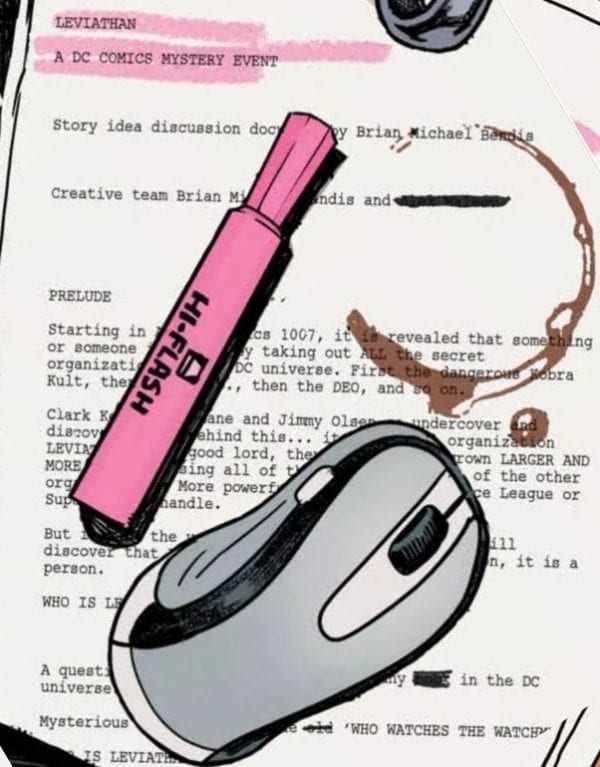
Brian Bendis has revealed his plan for a new DC Comics event called Leviathan. The information comes courtesy of the Jinxworld newsletter in the recent Cover #5 by Bendis and artist David Mack. Bendis’s Scarlet partner, Alex Maleev, will be joining him on this new venture.
We wrap up [SCARLET] with issue #5. Then Alex has asked me to do some DC comics with him. He’s always wanted to do DC comics with me. He’s always wanted to do Batman and other characters with me. He’s talked about it for years. So when I was coming to DC Comics, we knew we were going to bring our creator-owned stuff with us, but we also knew that there was an itch that needed to be scratched.
So our personal reward for finishing the fully painted SCARLET VOLUME 3 graphic novel is our fully painted contribution to DETECTIVE COMICS #1000. Our first proper Batman story in this landmark publishing event. We are so honored. It’s already done, and it’s gorgeous. I’m very excited to be part of that project. ACTION COMICS #1000 and DETECTIVE COMICS #1000. Self-high-five!
After DETECTIVE #1000, Alex and I will be embarking on a major DC project. It’s called LEVIATHAN. You will soon hear a lot about it. It’s something so big, so monumental to the DC Universe; it was worth pausing our numerous creator-owned stuff for. This special event story lets Alex do everything he’s ever wanted to do at DC.
Leviathan — the criminal enterprise that both creates genetically altered metahumans and brainwashes ordinary people into working on its behalf — debuted in Grant Morrison’s Batman Inc; Bendis has recently woven the organization into his runs on Superman and Action Comics.
DC readers may remember Bendis’s tease for “Leviathan — A DC Comics Mystery Event” on the splash page of Action Comics #1003, which begins:
Starting in Action Comics 1007, it is revealed that something or someone is stealthily taking out ALL the secret organizations in the DC universe.
Are you looking forward to Bendis’s first DC event since he joined the publisher? Comment below!
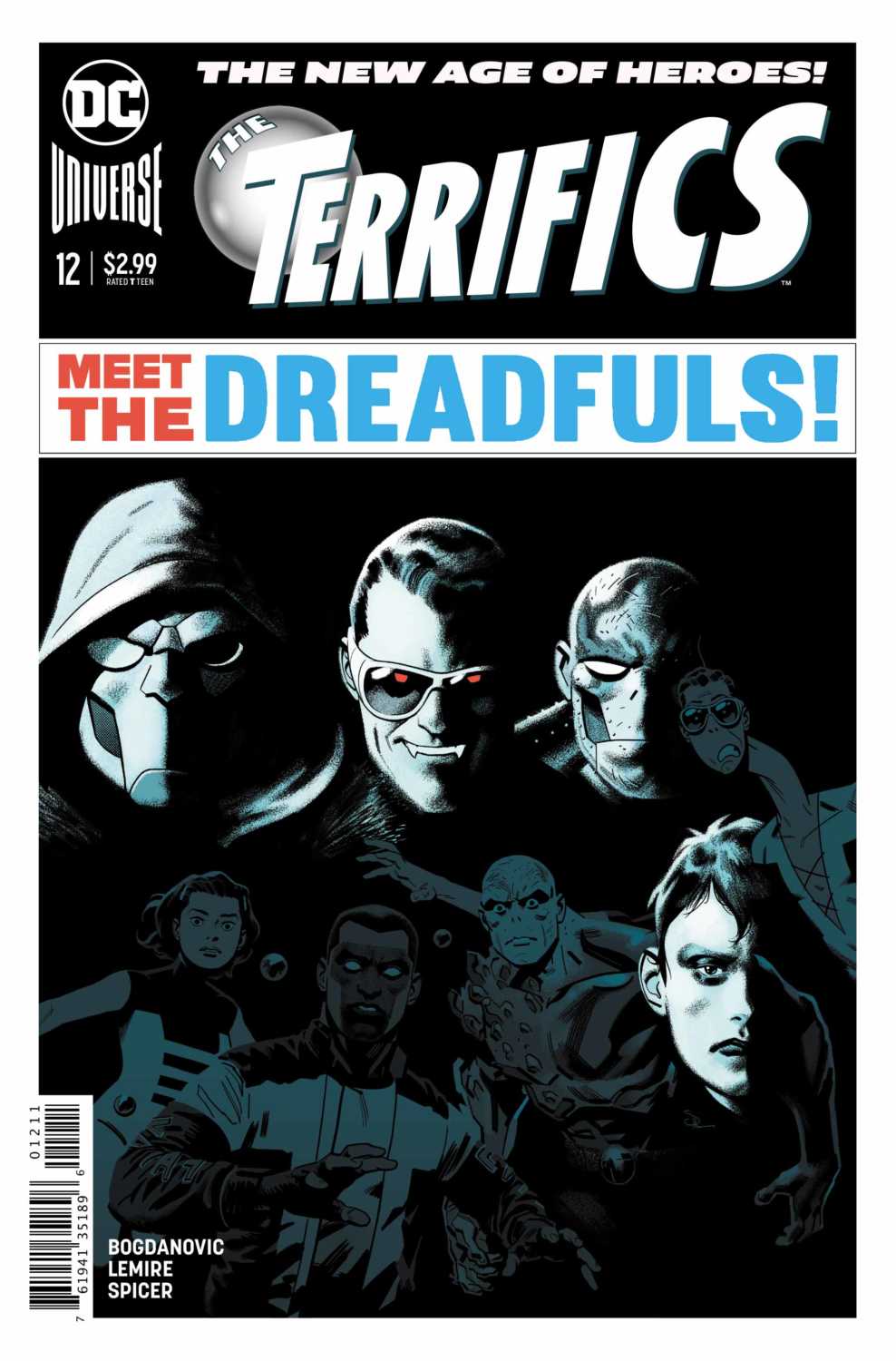
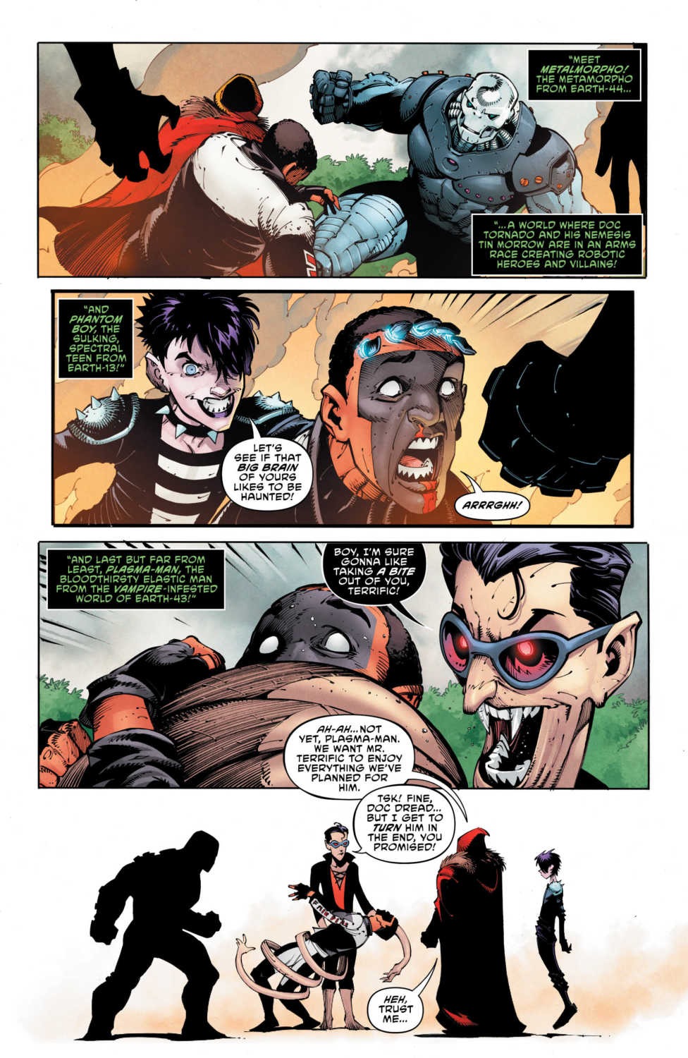
THE TERRIFICS #12 hits your local comic book store on January 30, but thanks to DC Comics, Monkeys Fighting Robots has an exclusive five-page preview for you.
About the issue: The Terrifics disband, but they’re going to need to get back together if they’re going to save Mr. Terrific from Doc Dread’s new team, the Dreadfuls! Plus, Rex Mason takes a huge plunge, Phantom Girl bolts Bgztl and Plastic Man stretches out the family drama with his son Luke, who’s struggling with his own super-elastic powers. Will our heroes reunite in time to save Mr. Terrific—from an evil version of themselves?!
The Terrifics is written by Jeff Lemire, with art by Viktor Bogdanovic, Jonathan Glapion helped out on inks, Michael Spicer worked on colors, and Tom Napolitano lettered the book. Evan “Doc” Shaner scared us with his “Meet the Dreadfuls” cover.
Bogdanovic’s art is straight from Todd McFarlane’s playbook of amazing facial expression with a slight bend towards caricature. The art in the first page starts in realism with an extreme closeup, but as the book continues you will notice the emotion of each scene takes over and pushes the art in a different direction.
Check out the preview below:
Do you have The Terrifics on your pull list, what do you think of Bogdanovic’s art? Comment below with your thoughts.