Home Blog Page 470

Review: BATMAN #68 is…An Odd Choice

Monkeys Fighting Robots

Batman #68 brings us part six of the Knightmares storyline, Solitude.

Bruce is still trapped somewhere, forced to experience nightmare after nightmare as a form of psychological torture. As mentioned in the review for the previous chapter, a lot of Knightmares is starting to feel like filler. To be frank, this is a storyline that’s overstayed its welcome at this point.

The Writing

The contrasts between Bruce and Selina’s pre-nuptial partying drive our story. Lois and Selina trash the Fortress of Solitude while Bruce and Clark have an awkward, uncomfortable evening at home. There are a few chuckle-worthy moments here and there. Overall, though, the book reads largely like a passable sitcom episode, at least until the illusion of the dream is broken, only for it to go unremarked upon.

Characterization was also an issue in Batman #68. While most of the characters are awkward and uncomfortable, Lois actually comes across very cynical, even bitter at the state of her life.

The book’s core seems to be a representation of Bruce’s anxieties regarding what his life is outside of Batman. It’s natural for a character like Bruce to probe his own motivations, but the answers that turn up in Batman #68 don’t really sit right.

As one character explains it, “You hate being Batman. But you love that you have to be Batman.” The book suggests Batman derives his value from the fact that the world needs a Batman. However, that analysis doesn’t really seem to hold up. If anything, it seems antithetical to Bruce Wayne’s character; under all the gadgets and grimness, the defining trait which motivates Batman is compassion. It’s not a sense of masochistic responsibility. Thus, even if Knightmares is about probing into Bruce’s deepest anxieties, this one doesn’t feel especially motivated.

The Artwork

Amanda Conner takes on the bulk of the art duties for Batman #68. Her more wide-eyed, cartoonish style allows for a wide range of expression, driving a lot of the story. Conner also does a great job of laying out the pages to create a smooth transition between the two narratives.

The colors credited to Paul Mounts, John Timms, and Jordie Bellaire complement the art style. They’re bright and vibrant, which works alongside Conner’s rounded character designs. The colors also do an excellent job of defining the dual narratives, often matching the tone in a transition panel to the colors in the previous one.

Final Thoughts

The last several issues of the Knightmares story arc produced diminishing returns. The misses in characterization in Batman #68, plus the foreknowledge that it’s all a dream—let’s call it a “reverse-St. Elsewhere”—makes it pretty easy to skip.

Monkeys Fighting Robots Youtube

Review: SUPERMAN #10 And Being Present For Family

Monkeys Fighting Robots

Jon Kent has been busy explaining his recent troubling family issues to his parents. Traveling through space with grandfather Jor-El, who’s been undergoing a slight mental breakdown, wasn’t all it was cracked up to be. What’s worse, an unexpected appearance of a wormhole transported Jon into another dimension and held him there for years. And he’s ready to tell his parents the truth of what happened there.

SUPERMAN #10 cover art of superman and jor-el

Story

Jon’s recollection of his adventures is a particularly effective storytelling technique on Brian Michael Bendis’ part. It slowly reveals more and more pertinent details to explain the hero’s surprising predicament. This way readers are able to step into Clark and Lois Kent’s shoes as they nervously anticipate each shocking new story detail.

While traveling through space with his mentally unstable grandfather Jor-El, Jon describes being transported to an alternate dimension full of evil versions of his family. He narrowly escapes their clutches after years of imprisonment.

Jon versus evil Lois Lane Jon escapes and returns to Earth

The interaction between Jon and his parents unleashes a whole host of emotions. One can sympathize with the parents’ sense of loss time. Missing out on so many years in their child’s life would be an unbearable experience. It’s enough to make a parent feel like a failure.

According to Jon, Jor-El arrived on the scene just in time. His time spent searching the multiverse for Jon paid off, but a sense of loss nonetheless accompanies the rescue. Jor-El, like Lois and Clark, must come to terms with the lack of presence in his grandson’s life. What’s more, an army of invaders from the alternate dimension has set its sights on the House of El. We’ll have to wait and see if the family can come together and resist falling apart under the weight of these problems.

Superboy escaping through space

Jor-El saving Superboy

Art

The artwork in this series installment is remarkable as always. Brandon Peterson and Ivan Reis provide action-packed fight scenes that the extent of Superboy’s powers, especially in his battle with the evil Lois. At the same time, Alex Sinclair uses a wide variety of colors to fully immerse the reader in the outer space setting.

The issue’s inking was performed by Oclair Albert and Joe Prado. Each artist finds a way to alternate between thick and thin lines to offer multifaceted and realistic illustrations.

Josh Reed’s lettering worked well with all of this artwork. His dialogue boxes do a great job of outlining the characters.

The issue’s main cover was created by Prado, Reis, and Sinclair, which depicts a fantastically illustrated fight between Kal-El and Jor-El that blends well with the interior artwork. Adam Hughes’ variant edition takes a different approach, using pastels to depict a version of Superman lost in thought while saving train passengers. This highlights his distress upon hearing of Jon’s troubles in space.

Conclusion

This was the issue readers have been waiting for, revealing the final stretches of Jon’s journey with Jor-El. It’ll be interesting to see how Clark, Lois, and Jor-El respond to their much-older son and confront the imminent threats posed by those who followed him back to Earth.

What did you think of Jon’s final details to his crazy adventure? Let us know in the comments below!

Monkeys Fighting Robots Youtube

Review: RONIN ISLAND #2 Asks Who We Really Care For

Monkeys Fighting Robots

RONIN ISLAND #1 introduced us to Kenichi and Hana, two budding warriors training to become full-fledged samurais. But just as they’re undergoing initiation a samurai named Sato shows up and demands their allegiance to his Shogun and help them fight an army of zombie-like Byonin. Now the young warriors must join the fight and learn what it means to fight for a cause larger than Ronin Island itself.

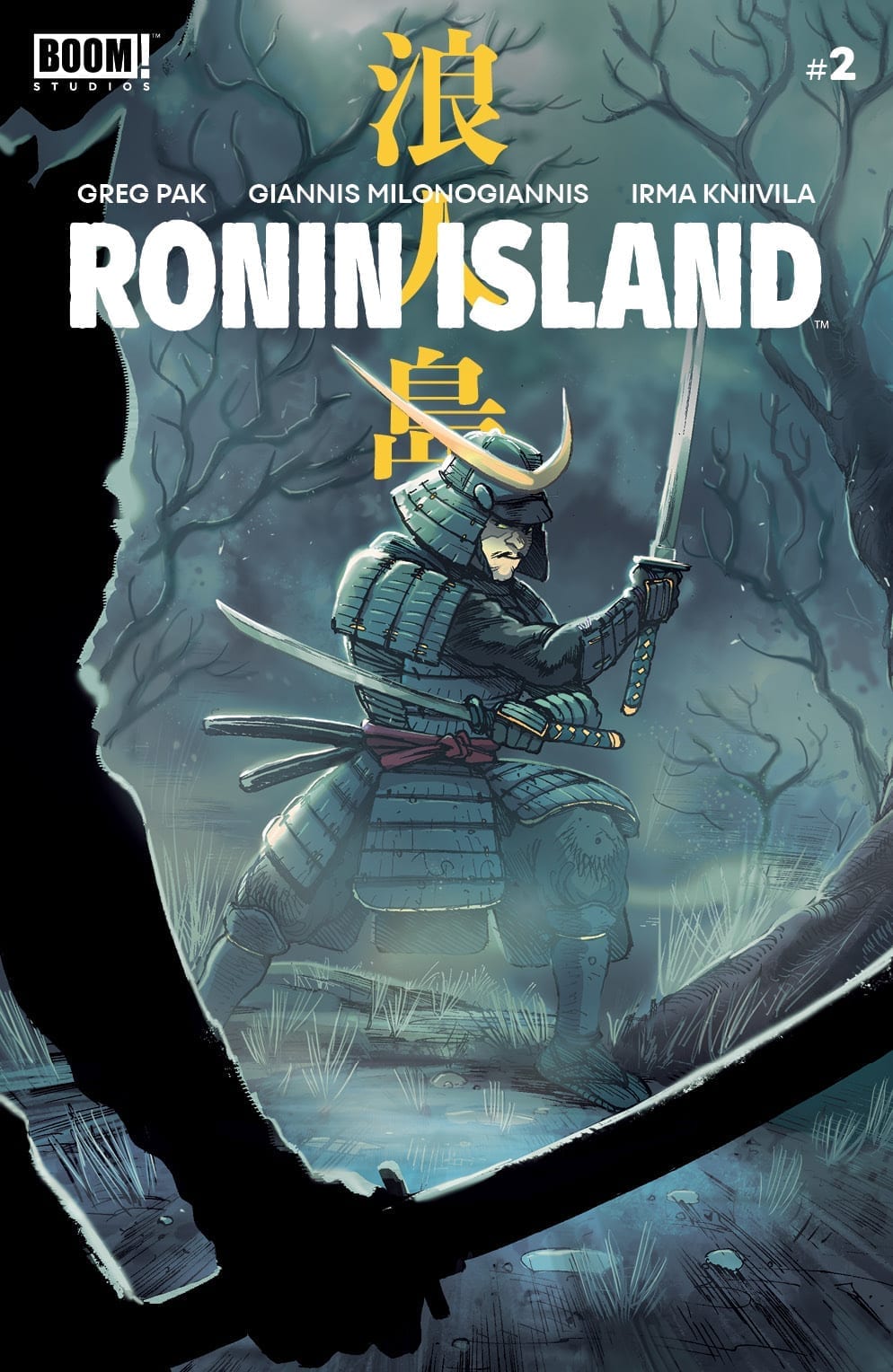
RONIN ISLAND #2 main cover

Story

The community of displaced peoples on Ronin Island is in shambles. The Byonin are attacking villagers while a menacing army of samurais, lead by the General Sato, is forcing everyone to join their ranks. Elder Jin and Master Ito reiterate their community’s independence and free status, but Sato will have none of it. He believes they should be subjugated to his shogun, and he’ll use the Byonin threat as an extortion tool if necessary.

the islanders and general Sato the islanders and general Sato 2

the islanders and general Sato fight with monsters

After fighting the Byonin, Elder Jin decides to give into Sato’s demands for the sake of her people. Thus, the once free Ronin Island warriors become subjects of the samurai and the unknown shogun. Hana and Kenichi, appalled at their people’s predicament, spend the next month plotting their escape from the island.

Elder Jin’s famous mantra “Together in strength,” emboldens Hana and Kenichi’s resolve to free their people. But while attempting to escape Sato makes a surprisingly heartfelt plea, reminding them that his shogun’s people need help just as much as they do.

Greg Pak poses an interesting moral quandary with this statement. Do the people of Ronin only care about their own community? Does working together only apply to people in your group? Readers will join Hana and Kenichi as they consider how far their compassion actually reaches, especially in the midst of difficult situations.

Art

The three covers for RONIN ISLAND #2 place emphasis on a few of the more antagonistic figures in this series. Giannis Milonogiannis and Msassyk’s main cover and Kris Anka’s unlocked retailer variant cover both depict images of General Sato. The main cover shows the samurai in a defensive posture as a Byonin closes in. Anka’s Sato appears more menacing with his head tilted down and sword drawn. These covers show the different sides of Sato and emphasize how he’s become such a multifaceted character.

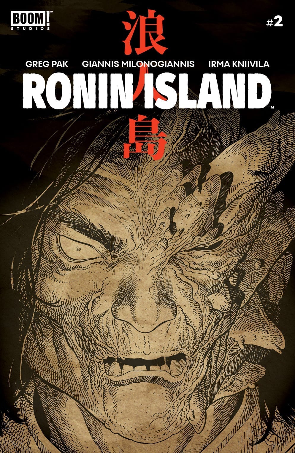
Ethan Young also lends his preorder cover to mix. His work features a close up view of the Byonin’s face, giving readers a closer look at the formerly-human creature.

RONIN ISLAND #2 cover b preorder

The artists telling the story of Ronin Island take this issue’s illustrations to a new level of gruesomeness with their depictions of the Byonin. Giannis Milonogiannis’ penciling highlights every gory sword slash as the islanders resort to such brutal tactics for survival. Irma Knivila applies various shades of orange to the Byonin blood to show how far they’ve moved beyond their human forms.

Simon Bowland’s lettering does a great job of complementing Milonogiannis’ action scenes. He transitions font styles and sizes seamlessly to produce battle sounds and cries in reader imaginations.

Conclusion

RONIN ISLAND #2 shocks us, but not so as to drive one away. It’s a shock that, much like a doctor’s defibrillator, wakes us up to a world in pain. Compassion has no limits, and sometimes it takes a menacing General Soto to remind us.

What did you think of General Soto’s character development in this issue? Let us know in the comments below!

Monkeys Fighting Robots Youtube

Review: CULT OF CARNAGE Deftly Delivers A Solid Horror Story

Monkeys Fighting Robots

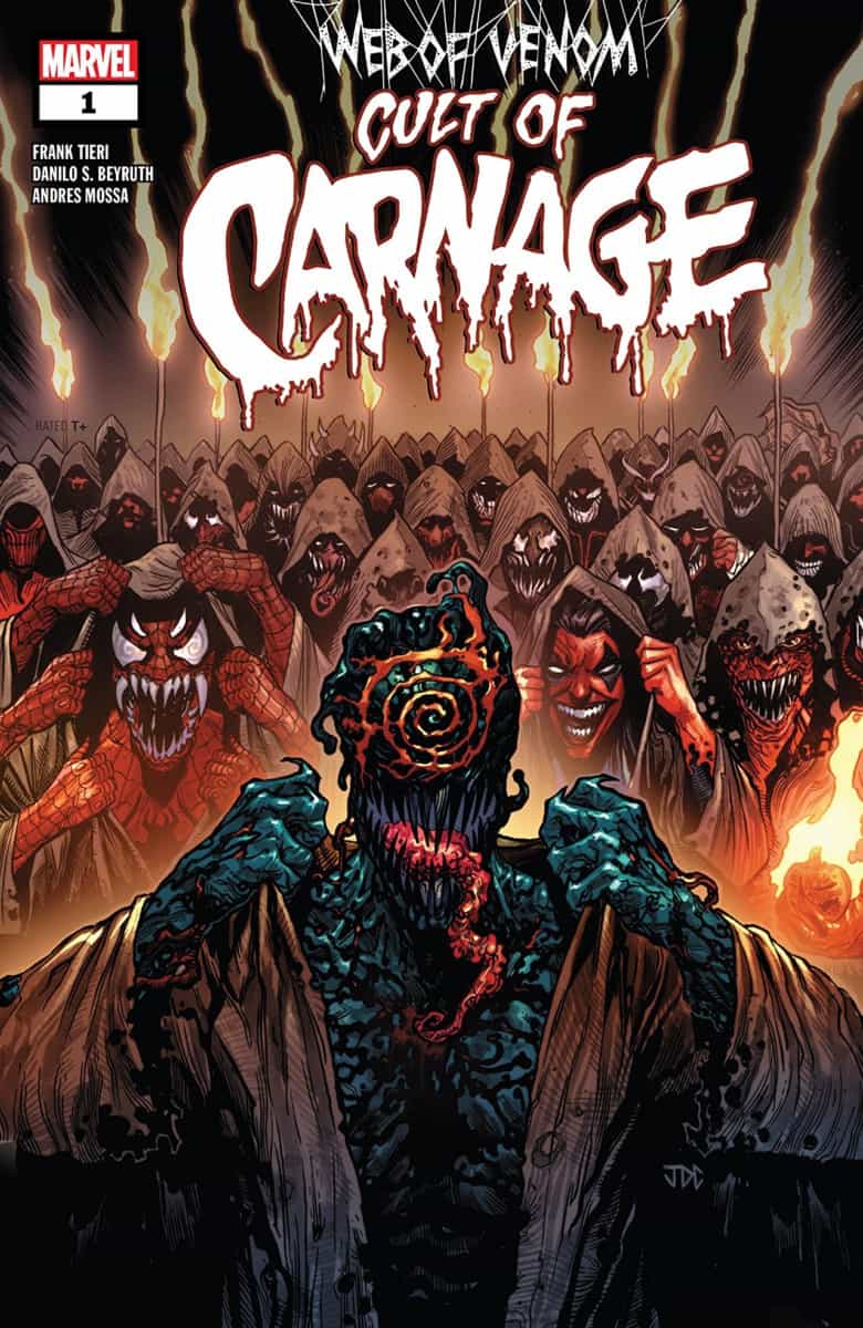
Web of Venom: Cult of Carnage by Frank Tieri, Danilo S. Beyruth, Andres Mossa and Clayton Cowles deftly continues to expand on the horror-tinged mythology the various symbiote books have been creating.Carnage

Web of Venom: Cult of Carnage
Written by: Frank Tieri
Art by: Danilo S. Beyruth
Colors by: Andres Mossa
Letters by: Clayton Cowles

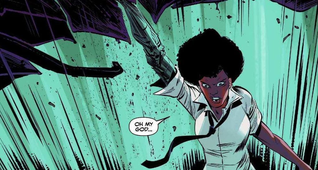
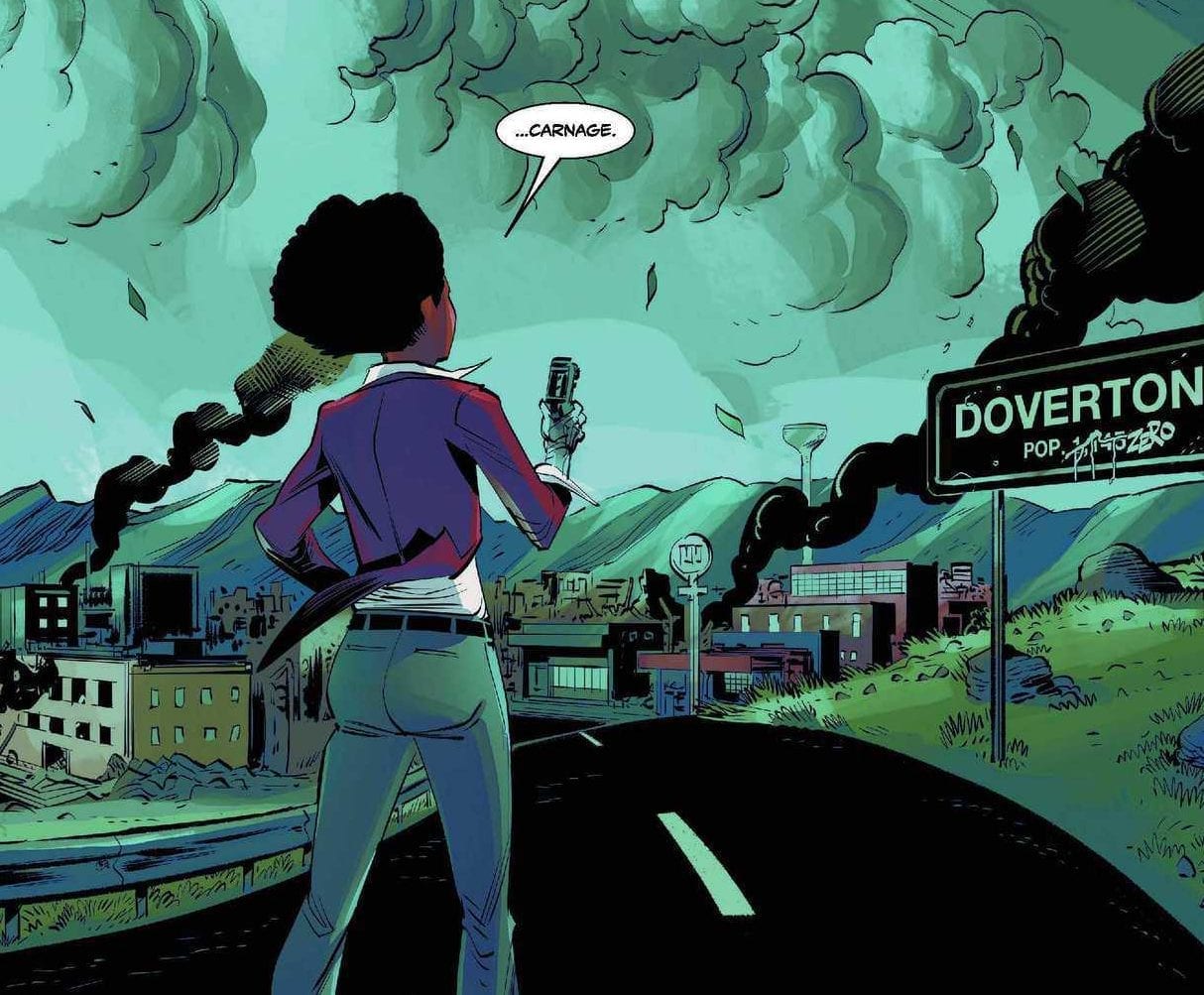
Misty Knight heads into Doverton, Colorado, where years ago the evil symbiote Carnage took over the entire population, slaughtering the rest. As Misty searches for the missing John Jameson (aka Man-Wolf), something sinister brews in the background. Dead bodies, missing their spines, begin to pile up. Just what is The Church of The New Darkness up to? And where is Carnage and the symbiote god Knull is coming!?

Writing

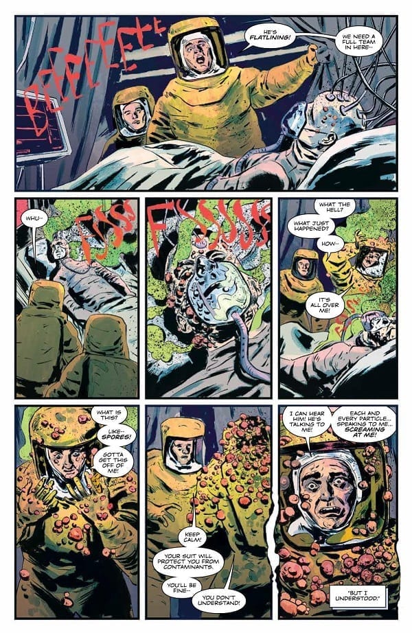
Frank Tieri is no newbie when it comes to horror, and that’s a good thing because Cult of Carnage is not a superhero book. It’s a straight-up horror story that continues the modern mythology of the symbiotes that Marvel has been building for years now. Using just a bit of exposition, Tieri is able to catch readers up and dive us into the heart of Cult of Carnage, and that is where the horror lies. The story includes robed cultists, dark rituals, and spines being ripped out. It also does not skimp on the blood and gore; it pushes that envelope farther than any other mainstream Marvel book.Carnage

Tieri also wisely uses some surprising characters. The protagonist here is Misty Knight. And we also quickly get John Jameson (who gets his origin explained briefly). There are two more characters that make an appearance, but that’s better left unsaid as old-school Carnage fans will want to turn the page on these two themselves.

Art

Danilo S. Beyruth and Andres Mossa create a deceptively light look at first. The line work feels loose and the colors are not the usual horror comic garish. There’s almost a Jeff Lemire quality in the faces and figures. But then they turn around and give us some truly horrifying images. It’s a balancing act that works and gives the story a nice vibe that makes it feel very unique.Carnage

Conclusion

Cult of Carnage is well worth checking out. Die-hards are going to dive right in, and even casual Marvel fans will find a neat little horror book set in their favorite universe. It’s a solid book and must buy.

Monkeys Fighting Robots Youtube

Review: DETECTIVE COMICS #1001 is a Great Start to the New Era

Monkeys Fighting Robots

Peter J. Tomasi cements the new era in Batman’s legacy with Detective Comics #1001. Picking up from his story in Detective Comics #1000, Tomasi introduces the Arkham Knight from the similarly-titled video game as the chief antagonist of his new story.

Batman investigates some strange bat-related phenomena occurring throughout Gotham. In the midst of this activity, though, the Arkham Knight and his army decide to strike.

The Writing

It’s worth noting that readers who haven’t played the Batman: Arkham Knight game can feel slightly lost from the outset. However, it’s nothing a few minutes on Google can’t fix.

Detective Comics #1001 effectively showcases the Arkham Knight as a genuine threat. The character has fanatical followers, powerful weapons, and incredible technology…all aimed at taking out Batman. It was interesting seeing Arkham Knight’s impression of the role Batman plays in Gotham in our last issue. Now, the scope of what the character seems to have planned is impressive indeed.

The storytelling in Detective Comics #1001 is compelling stuff. Presumably, the figure under the mask is not the same assailant as in the game, forcing us to guess who could have taken up the Arkham Knight persona. Even beyond that mystery, Tomasi’s writing is suspenseful, intriguing, and leaves you wondering what will happen next. He reveals enough to keep readers engaged, but keeps his cards close to the chest about what’s really going on.

The Artwork

The artwork by Bradley Walker is strong here. He has a fine eye for dynamic movement, which he showcases in the book’s action-driven second half. He lays out pages during quieter moments in more regular squares. When the action picks up, though, page layouts become much more chaotic and unpredictable to match the pace.

Walker’s design for Batman in Detective Comics #1001 harkens back to an older, early ’40s-inspired look. Along with inker Andrew Hennessy, the pair delivers something that feels classic, yet not out-of-place in modern context.

Colorist Nathan Fairbairn employs an uncommonly-bright color palette for a Batman book. While it feels unconventional, it largely works within the context of the book.

Final Thoughts

Detective Comics #1001 suggests the future of the Caped Crusader is in good hands. Definitely recommended.

Monkeys Fighting Robots Youtube

AMAZING SPIDER-MAN #19 – Vulture Takes Charge

Monkeys Fighting Robots

We’re well into “The Hunted” now with AMAZING SPIDER-MAN #19 and Nick Spencer is just getting started.

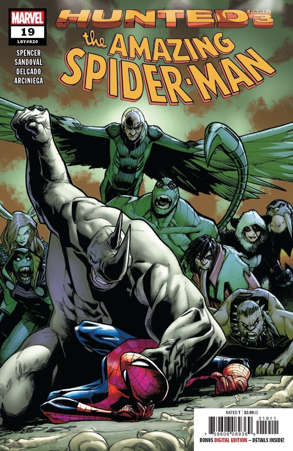
asm 19 cvr

***SPOILERS LIE AHEAD***


Spider-Man is in way over his head, trapped in a Central Park cage with all the animal-based super villains from all over the world. On the outside, Kraven Jr. voices his disapproval of his father’s plan while MJ is being watched by the mysterious new villain.

Amazing Spider-Man #18.HU showed us the heartbreaking demise of Gibson thanks to a betrayal by Vulture. This issue we see the crooked, winged senior spin that story in a more heroic way to gain the favor of a collection of villains he intends to lead against their captors.

Of course Vulture is eventually going to betray everyone to benefit himself, but it’s going to be a wonderful ride getting there. Adrian Toomes is an all-time great Spidey villain, it’s satisfying to see him used in a way that is both effective and not overly-dramatic; also without making major changes to him.

“The Hunted” has been moving along smoothly, the tie-in issues have actually mattered and added more color to this story by shedding light on what’s happening in the shadowy corners. Writer Nick Spencer has utilized the tie-in issues in the way they should be, to further the story and provide a payoff for every reader willing to dish out the extra money.

When Taskmaster shows up to deliver Lizard, we immediately want to see how he ended up captured along with everyone else. Perhaps he’s here on purpose to find his son? We’re already so invested in the Conners family, the next .HU issue will likely be worth our time.

Spencer has been telling this story without leaning too heavily on Spidey himself. Most of the action and drama happens without webs even being spun. The dynamic between Kraven and his clone son continues to develop in an interesting way.

If anyone is going to remind Kraven of who he is and what he’s truly driven by, it’ll be a clone of him in his prime that’s desperate to prove his worthiness. The great hunter’s true motivations and plan are still very much shrouded in mystery, further adding to the suspense in seeing how this one shakes out.

Spider-Man is basically along for the ride with the reader. He hasn’t quite figured it out and is one step behind everyone else it seems as he just tries to keep more people from dying. Peter dropping in on the villains gathered to try and convince them that Vulture is full of sh*t is a Spencer moment we’ve come to expect; it’s enjoyable as always.

Now that Black Ant has been betrayed by his partner in crime and joining the rest of the animal kingdom, we might be getting the inside scoop on what’s really going on. As sad as it is to see Black Ant and Taskmaster’s bromance come to an end, him taking a more important role in this story could be great news. Nick Spencer always makes a character like Black Ant into something so much more than ever before.

Amazing Spider-Man #19 sees Gerardo Sandoval step in on pencils, he proves to be a great choice with a similar style to Ryan Ottley. Sandoval is like a hybrid of the series’ two main artists Ottley and Humberto Ramos, but with a much sharper edge when it comes to the details of darker characters.

Edgar Delgado and Erick Arciniega provide great color, bringing to life this massive collection of animal-based characters. Billy’s fear, Kraven Jr’s doubt, Kraven Sr’s anxiety all take shape in the shading and color.

Amazing Spider-Man #19 is another solid chapter of what is turning out to be the great Spidey story we were hoping for. There’s clearly so much more ahead, but even in the quieter moments of this story it’s highly entertaining.

“The Hunted” is classic comic book fun for anyone who’s ever enjoyed the web-slinger or his colorful gallery of rogues.


Monkeys Fighting Robots Youtube

SYMBIOTE SPIDER-MAN #1: Back In Black…Again

Monkeys Fighting Robots

Veteran Spidey scribe Peter David tells a story about when Peter first brought the alien suit back from Battleworld. SYMBIOTE SPIDER-MAN #1 pits the wall-crawler against Mysterio.

symbiote spidey 1 cvr

***SPOILERS LIE AHEAD***

Welcome to a time when Spider-Man and Black Cat were dating, Peter didn’t know his costume was a living alien, and Mysterio couldn’t stomach blood. If this is supposed to be right after Secret Wars, it would be 1984 but it certainly doesn’t look the part.

The lack of era identification in this issue is distracting; make up your mind!

Mysterio plans a bank heist that goes wrong and an innocent woman is killed. Our old pal Quentin Beck (ahead of his MCU introduction in Spider-Man: Far From Home) can’t handle having blood on his hands. This is puzzling given how long Mysterio should’ve been a crook for at this point.

Spider-Man is in his symbiote-bully phase and gets a bit too aggressive with Mysterio. Meanwhile, Felicia attempts to appreciate the Peter Parker side of dating Spidey.

Writer Peter David is no stranger to web-slingers; his familiarity with these characters allows him to effortlessly jump right into this story. This was a fun time for Spider-Man comics. Symbiote Spider-Man #1 doesn’t just retell an old tale, this is new material.

Diving deeper into Peter and Felicia’s relationship is almost always a healthy exercise for creator and reader. Despite the timeline questions one might have with Mysterio’s development, Peter David creates an interesting dilemma for the master of illusion to deal with.

The graveyard scene is fantastic, with Felicia getting stuck with Aunt May alone and their enjoyable banter. Felicia and Peter’s chemistry is also every bit alive as it was back in the era this story takes place.

Peter David does a fine job taking us back to a very specific era in Spider-Man comics to tell a very specific story. He does so with the charm and flair that he always features in his Spidey work. The problem with Symbiote Spider-Man #1 is not the story or script.

Greg Land is not a comic book artist with the greatest reputation. At the beginning of this issue, his trademark tracing and recycling are nowhere to be found (or at least hidden well) and it’s quite enjoyable. However, as the issue progresses, it all goes downhill.

Starting with the look of Quentin Beck, he’s way too handsome and young and I don’t care if Jake Gyllenhaal is playing him in the movie. It’s also that he looks like completely different people in the beginning and end of this issue.

When we start to spend time with Peter and Felicia, the worst of Greg Land’s cliches rear their ugly head. It only gets worse from there as you start to remember these exact images and poses from other books. It makes the enjoyable story feel cheap and thin by proximity.

If you don’t have an issue with Greg Land’s work, or have never been exposed to it, Symbiote Spider-Man #1 is an enjoyable trip down memory lane. Peter David’s work on this title will never reach it’s true potential while being dragged down by the distraction and baggage that comes with Greg Land’s artwork.

Land’s fully-masked and costumed panels are much less distracting than those with facial expressions. Mysterio and Spidey both look fine during their action scenes, it’s almost like Greg Land is capable of delivering fine art but doesn’t have the time to do so.

Spidey’s encounter with The Human Fly is a highlight. It features some great banter, a solid pun, and very little recycled art. If Spidey hadn’t “swatted” the Fly maybe he would be appearing in Nick Spencers current ASM arc “The Hunted.

I don’t know what the purpose of this series is, but there’s enjoyment to be found here if you can ignore Greg Land’s art travesties.

Monkeys Fighting Robots Youtube

Advanced Review: Intrigue And Spectacular Vistas In INVISIBLE KINGDOM #2

Monkeys Fighting Robots

Soaked in a world of color, Invisible Kingdom combines everyday problems with religious dogma and corporate interference. Set in a world that is both visually unfamiliar and yet instantly recognisable, the Berger Books Imprint of Dark Horse Comics challenges the readers understanding of the world around them.

Writing/Story

Vess gave up everything to follow the path of the Invisible Kingdom, including bitterly fighting with her parents who just couldn’t understand what she wanted to do. Now she has uncovered a shocking secret about the monastery and she finds herself doubting the very religion she sacrificed so much for. Alone and desperate who can she turn to?

Captain Grix of the delivery ship Sundog has also discovered a secret, one which may determine her fate as well as that of her crew. Fearing that there is a spy upon her very own ship, Grix must make a difficult choice but time is running out as they head towards the head office of Lux.

This issue is about comparing and contrasting not only the central characters but also the spheres they move in. G. Willow Wilson has created two very different characters and put them in very similar situations. This enables her to use their personal dramas to compare the worlds of religion and corporate commerce. The two landscapes may at first seem very different, especially with the nuns rigid, despised lifestyle and the delivery crew’s wild adventures, but the problems that Vess and Grix end up encountering are the same. How they deal with them and how others in power react is where Wilson draws out the real drama.

Her characters are sympathetic, each with a backstory not fully realised but containing an emotional hook that the reader can get to grips with. These are then surrounded by a small cast who serve their purpose. Wilson has crafted two separate worlds each with something to say but they are clearly on a collision course which is the driving force behind the comic.

cover art
Invisible Kingdom #2 Credit: Dark Horse Comics

Art

Both of the worlds in Invisible Kingdom have one thing in common, the sublimely beautiful art work by Christian Ward. He has produced exciting, alien landscapes that fill the page. Small details appear throughout the panels, unrelated to the story but set the scene perfectly. An obscure looking bird perched on a branch in the bottom of the page is a reminder to the reader that these worlds are different only in appearance; beneath, as the narrative confirms, there is much that the reader will identify with.

Ward’s design work is exceptional and the colours are striking, continuing the theme of contrasts set out in the narrative. The bright red of the nun’s habits are like a sea of red weaving through the cold blues and white of the monastery.  In contrast the Lux headquarters is awash with neon whereas the characters are reduced to dark colors and are shrouded in shadows or reduced to silhouettes. Ward’s art tells the reader all they need to know about the institutions that rule in the Invisible Kingdom; the corporation is glitzy and showy and rejects the people whereas the monastery focuses on the people while neglecting the world outside.

Sal Cipriano’s lettering is subtler but equally effective. The caption fonts match the alien-ness of the world, a constant reminder to the reader where the story takes place. The placement of the speech balloons fills voids in the background relieving the panels of any dead air. However, for intimate conversations Cipriano clusters the balloons together, as if the characters are speaking in hushed, tones.

interior art invisible kingdom
Invisible Kingdom #2 Credit: Dark Horse Comics

Conclusion

The narrative continues to be intriguing and the characters are growing at a steady pace. Wilson draws out her cast a little bit in each scene so that nothing too much is given away but the reader is always satisfied. Ward’s Artwork is outstanding and warrants attention without the surrounding narrative.

There is a lot on offer in the pages of Invisible Kingdom; character, mystery, metaphor. However, none of it over powers anything else: it all sits together on the page in equal measure. This is proving to be a must read comic and the future prospects are huge as there is a vast world of ideas for the creators, and the readers, to explore.

Invisible Kingdom #2 is released on 24 April 2019.


Monkeys Fighting Robots Youtube

Review: Devastation On A World Stage in THE EMPTY MAN #6

Monkeys Fighting Robots

The personal stories of trauma and resilience which have filled the pages of The Empty Man in the previous issues take a back seat as Cullen Bunn opens up his world of horror. As one of BOOM! Studios adult comics, The Empty Man doesn’t pull any punches and the grotesque levels continue to increase.

The series is building towards a world shattering conclusion later in the year and this issue gives the readers an idea of the scope of the narrative. The heroes safety is slowly diminishing in the face of the world wide catastrophe.

Alternative cover Empty Man
The Empty Man #6 Credit: BOOM! Studios

Writing/Story

So far the story has been centralised on a few characters fighting to survive in a world that is crumbling around them. The wider world has been featured but up until this issue the character driven aspect of the narrative has been the focal point. This 6th issue in the series opens up the playing field and explores the Empty Man virus’ larger game play.

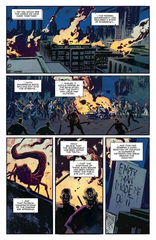
Bunn weaves the narrative through a city in meltdown, employing the use of Newscasts and mass hysteria to link the story threads together so that the comic flows like an unstoppable river of blood. Everything is bigger as Bunn draws in the world view. The action is more spectacular featuring cars chases and massive mutations; the horror is more disturbing with suicides and family murders; the scale of the virus’ invasion is more explicit.

The purpose of this issue is to show the effect on the world that the Empty Man virus is having and that is exactly what Bunn achieves. He still keeps the central characters in play, but uses them to tell a larger story. They become the epicentre of a large storm sweeping through the city, one which Bunn revels in revealing. He has started to bring all of the pieces of the puzzle together. This is a gripping read.

Interior art Empty Man
The Empty Man #6 Credit: BOOM! Studios

Art

Jesus Hervas has his work cut out for him this month. The scale of the horror has increased and to get the full devastation across to the audience Hervas has produced open panels packed with chaos and mayhem. City wide riot scenes have been split across panels to highlight the scope of the violence, focusing on buildings in one image and people in the next. A huge traffic jam has been squeezed to the side of a page to illustrate to congestion. The sound effects, proved by letterer Ed Dukeshire, are haphazardly layered over the cars to increase confusion.

There are many scenes of a horrific nature, each with a different emphasis, but Hervas gives them their own disturbing individuality. They are all part of a greater problem, as laid out in the narrative, but the individual incidents are personal and more disturbing because of this. The reactions Hervas gives to the perpetrators and spectators helps the reader to focus on each grotesque scene at a time before the script links them all together.

The coloring by Niko Guardia helps to separate the scenes and create the atmosphere. Whether it’s a disease ridden greens and yellows portraying the spread of infection or the cold blue washes over the villains, the coloring is an important factor for holding the readers concentration. By combing the expressive color palettes with the over the top, yet effective, sound effects each page grabs the reader and instils the sense of fear that the characters are feeling.

interior art
The Empty Man #6 Credit: BOOM! Studios

Conclusion

Just like the virus in The Empty Man, this comic has been slowly evolving over the months. Each issue steps up the threat levels and turns a personal story into a world problem. A lot of end of the world stories tend to use the opposite approach; starting with the disaster and then introducing the characters. Bunn however has hooked the reader in with the family and is now opening up his world.

The art work is suitably unnerving and nothing in this comic appears for mere shock value. There are shocking scenes but they have something to say in the narrative. The creative team are using the structure of the comic to build a world of terror. They constantly force the reader into difficult situations and places so that they feel the guilt or fear or claustrophobia.

The Empty Man is a magnificent horror comic from cover to cover.


Monkeys Fighting Robots Youtube

Review: ORPHAN AGE #1 Gives Us An Obvious Look At A Harsh Future

Monkeys Fighting Robots

There are many roads to a Dystopian Future; some take months building up the tension waiting for the inevitable end; others get straight to the point and prepare for the aftermath. Orphan Age #1 is one of the later types. It’s also not too dystopian.

AfterShock Comics unleashes a harsh world of religious bigotry and pointless death into comic shops. In the vain of The Walking Dead, minus the Zombies, Orphan Age throws a cast of characters together and challenges them to survive.

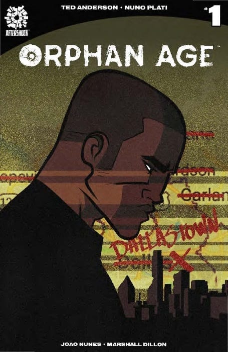
Orphan Age cover art
Orphan Age #1 Credit: AfterShock Comics

Writing/Story

Ted Anderson doesn’t mess about with the end of the world. One page is all it gets at the very opening of Orphan Age. One page. All of the adults die, unexpectedly, leaving the children in charge of the world. Similar in initial premise to The Tribe, a 1999 Australian TV series, Anderson quickly moves the story forward 20 years, when most of these children have grown up.

After the opening you wouldn’t be blamed for expecting a narrative that explores the ageing process without guidance from adults however, that is not what the rest of this comic is about. Societies and misguided religion have sprung up with the usual trappings that come with them. Anderson sows mistrust and fear of strangers into every scene almost creating something that could easily slip into a copy of The Walking Dead. Dallastown is a secluded society, at peace with itself, based on simple farming and sharing openly in a group setting. It is obviously set up for a fall.

Anderson creates a diverse cast of characters who will all have to learn to live with each other in order to survive and these are the strongest element of this comic. Each of the main three characters is cleverly written with their own individual voice. The differences between them are presented in a series of staged scenes, setting up future emotional conflicts as the narrative progresses.

Orphan Age interior art
Orphan Age #1 Credit: AfterShock Comics

Art

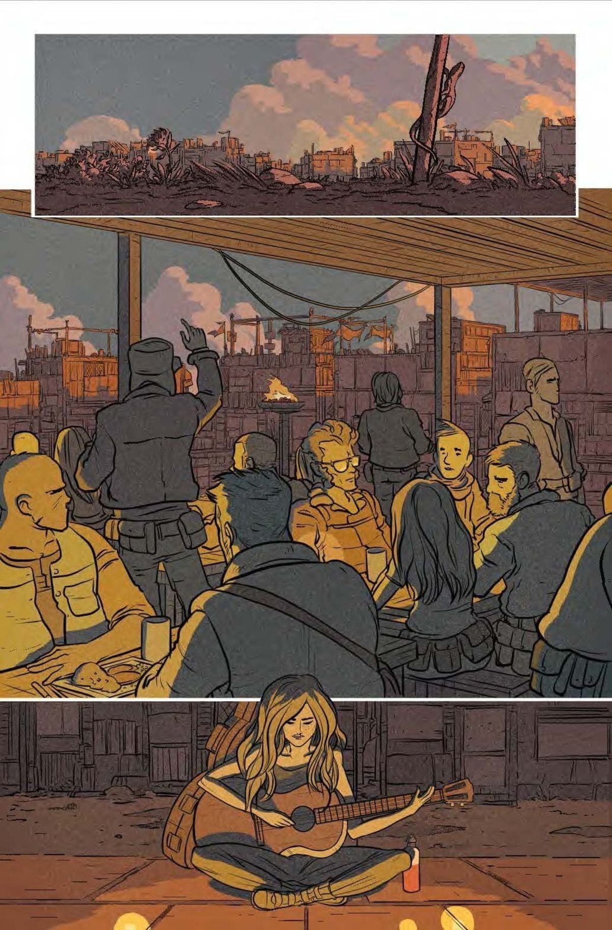
Most of the art within Orphan Age has an earthy coloring to it. This produces much of the general atmosphere and keeps the action surprisingly sedate throughout. It is obvious from the natural shades that modern technology has been expunged from this new world. The tone of the colors sets up this element of world building without the need for expositional speeches.

Nuno Plati’s work is carefully considered with thick black lines defining the characters. Plati adds subtle gestures and expressions to the cast to give them a relaxed, contented feel.

This style continues even into the violent sections of the story which distances the reader from a lot of what is happening. The emphasis however falls on the three central characters and their reactions to the situation. This is where Plati places the emotion and gains empathy from the reader, especially in the character of Princess, the youngest protagonist of the comic.

The layouts that Plati uses creates some interesting imagery and focal points. One page in particular focuses on the three central characters and the subtly differences between them. A series of three stacked panels with compositional differences in each makes the reader carefully study each character.

The lettering within Orphan Age is a pleasure to read. Joao Lemos and Marshall Dillon’s work demonstrates how the storytelling can be affected by the speech balloons. Changes in font size can make such a difference, especially when the balloon size remains the same, a technique which is used to great effect in this comic. There is definition between speech volume and overlapping speech balloons that create naturalistic speech patterns.

Orphan Age interior art
Orphan Age #1 Credit: AfterShock Comics

Conclusion

Where Orphan Age’s narrative fails is in not giving the reader anything new. There is a gluttony of stories dealing with small societies trying to survive that it is difficult to find a new angle. Orphan Age had a potential new angle in the opening pages but then lost it almost immediately. The struggle of the surviving children, alone in an environment slowly decaying, promised a new direction but Anderson skips over it. Instead the reader is left with a Religious Organisation which is, predictably, violent and self-serving, and a small cast of characters on the run in a harsh world.

Orphan Age has some interesting art and tells its story in a sedate, self-conscious way. The highlight of this issue is the integration of the lettering into the art work and narrative. There are moments when the text leaps from the page and tells the reader more about this world than the art or the script does.

There is a lot to enjoy here, just don’t expect anything new from the plot.

Monkeys Fighting Robots Youtube