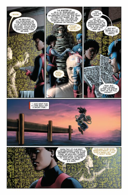
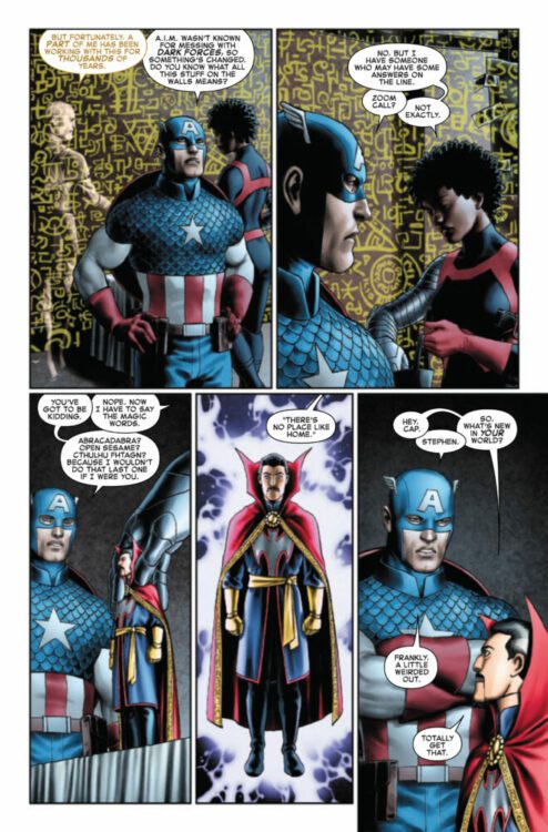
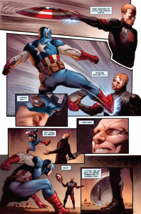
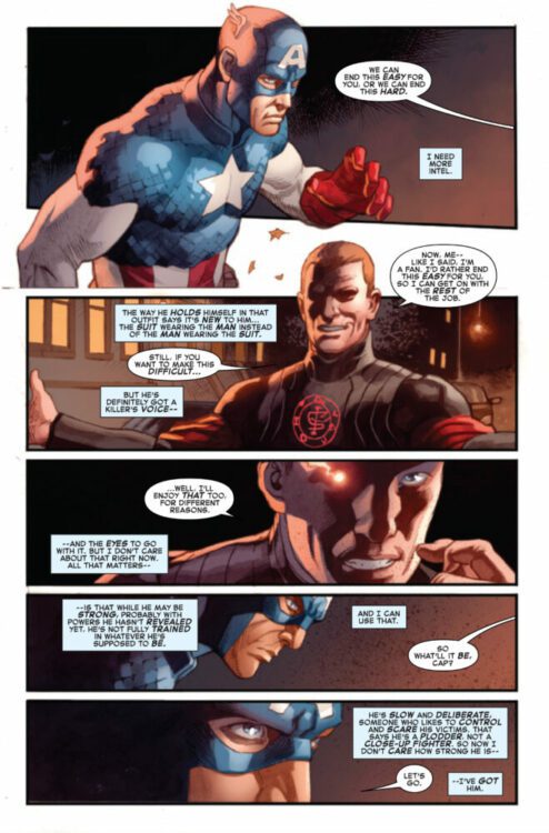
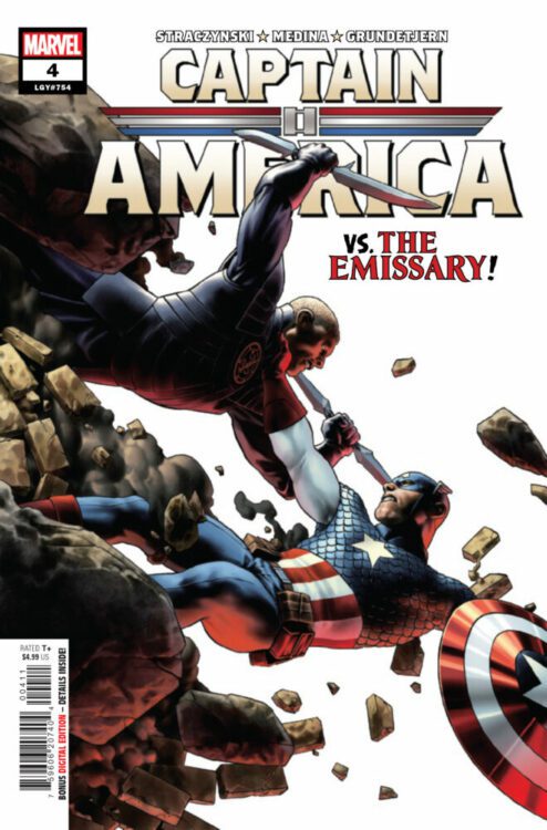
CAPTAIN AMERICA #4 hits your local comic book store on December 13th, but thanks to Marvel Comics, Monkeys Fighting Robots has an exclusive four-page preview for you!
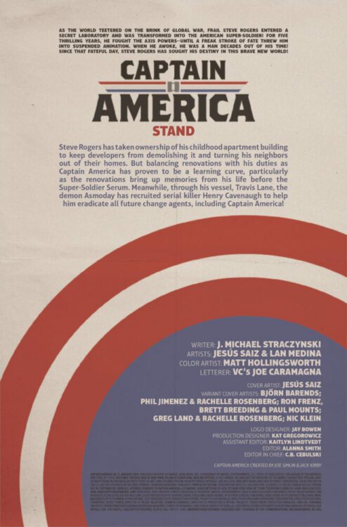
About the issue: THE ENEMY STRIKES! When the mysterious organization targeting Captain America goes on the offensive, Steve Rogers thinks he’s prepared – but the battle is not what it seems. Who – or what – is the Emissary?
The issue is by writer J. Michael Straczynski and artist Lan Medina, with colors by Espen Grundetjern, and letters by Joe Caramagna. The main cover is by Jesús Saiz.
Check out our CAPTAIN AMERICA #4 preview below:
Are you reading CAPTAIN AMERICA? Sound off in the comments!
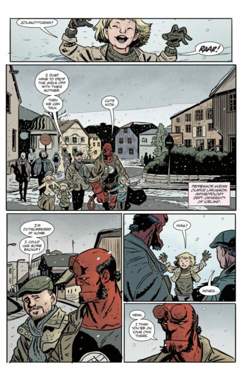
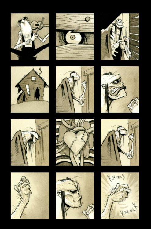
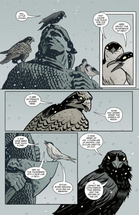
From Matt Smith (Folklords) comes a new Hellboy holiday tale complete with snow and giant cats in Hellboy Winter Special: The Yule Cat. Featuring colors by Chris O’Halloran and lettering by Hellboy veteran Clem Robins, this year’s supernatural Christmas story is a ton of fun just as a standalone comic, but like any good Mignolaverse piece it’s clearly a part of a larger whole. With a great blend of action and mythology and fantastic, eerie visual, this is a great one-shot to pair with a fireside mug of spiked Christmas Eve cocoa.
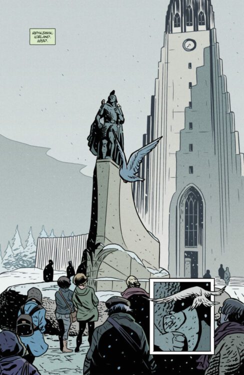
“Hellboy travels to Reykjavik, where children are disappearing and a giant beast has been spotted . . . could it be the infamous Yule Cat of Icelandic lore?”
Writing & Plot
Matt Smith has been quickly rising in the ranks of Hellboy storytellers, and Hellboy Winter Special: The Yule Cat is a perfect example of why. His work on Bones of Giants, Young Hellboy, and Hellboy in Love has proven that Smith knows how to blend the mythology, humor, and overarching mystery of the Mignolaverse in every one of his comics. The Yule Cat takes our big red paranormal investigator to Iceland, where a local myth has supposedly come to life. A giant spectral cat stalks the Icelandic night just before the holidays, and it’s up to HB to find out what it wants – then punch the crap out of it. However, as per usual, things are not what they seem – and there’s much more to our feline friend than meets the eye. Smith’s core story here is mysterious and compelling, providing just as many questions as answers as the plot progresses. Smith ties Yule Cat to his prior work in Bones of Giants neatly, but there’s no need to have read that story to understand what’s going on here. Just like every great Mignolaverse story, there are hints of what came before and what is still to come, but this is still a great story to read on its own. Smith nails HB’s personality through his interactions with others and his casual attitude towards eldritch abnormalities. Yule Cat, as with all other Hellboy comics, paint a partial picture of a web of mythology that is older and more powerful than can be imagined. What’s so good about Hellboy as a character is that he treats that truth like it’s his 9 to 5 desk job – because it is.
Art Direction
Matt Smith follow’s the Mignola visual formula while maintaining his own style in Hellboy Winter Special: The Yule Cat. Every artist that has worked on a Hellboy or B.P.R.D. comic has emulated Mike Mignola’s style in some way – it’s how the whole universe has maintained a consistent feel. Smith is one of the best to do it. At first glance, Yule Cat looks like it was in fact drawn by Mignola himself. A moment’s inspection, however, reveals the details that set the two artists apart. Smith has less of a reliance on heavy inks and utilizes thinner linework, using more hatching for character details and atmosphere. His versions of both the classic Hellboy cast as well as the mythological beings that show up in the comic are brought to life with a signature series of unique features and animations. This not only makes the comic feel more like a part of this larger and artistically sound universe, but helps Smith establish his visual style. He crafts some truly mesmerizing otherworldly scenes during HB’s investigation that clash with his equally great normal town drawings.
Chris O’Halloran’s color art also mirrors the aesthetic of other Mignolaverse books, but still manages to keep this comic looking original. The dull grey and white of an Icelandic winter casts a filter over the traditional colors of the small town HB is visiting. Flashes of unnatural light and the mystical haze that consume the climactic sequences perfect the reading experience as they pull the reader into the strange realm that this story inhabits. Clem Robins’ lettering is a stellar as always, with his unique hand guiding the reader along from HB’s snide remarks to the off-kilter incantations of ancient beings in numerous font styles. Hellboy: The Yule Cat is a comic that visually stands tall among its acclaimed and iconic peers.
Verdict
Hellboy Winter Special: The Yule Cat is a delightfully mysterious and fun one-shot entry into the Hellboy mythos. Matt Smith’s writing and visual storytelling sensibilities capture everything great about Mignolaverse comics, while maintaining his own style while playing in this well-established universe. Chris O’Halloran’s color art perfects the atmosphere and pulls readers in effortlessly to this paranormal holiday mystery. Be sure to grab this issue when it hits shelves on December 6th!
Writer and artist Matt Smith spoke with us about some of his inspirations behind Dark Horse Comics’ upcoming Hellboy Winter Special: The Yule Cat, and told us about some of his connections to the land of fire and ice!
About the issue (from Dark Horse): Hellboy travels to Reykjavik, where children are disappearing and a giant beast has been spotted . . . could it be the infamous Yule Cat of Icelandic lore?
Fan-favorite Hellboy artist Matt Smith writes and draws this chilling wintery one-shot!
MONKEYS FIGHTING ROBOTS: I actually just moved to Reykjavik about 4 months ago. So opening this issue and seeing Hallgrimskirkja with the statue of Leif Erikson out the front was amazing. I’ve been past it a hundred times, the design of the church is so cool. I have a couple of questions about that:
A. What did research look like for getting the panels set in Reykjavik just right? Did you visit or was it mostly online work?
MATT SMITH: First off, I am seriously jealous and when can I visit? Ha. Secondly, I’ll take
that as a good sign that you think they look right! I went over a few years back and took some ungodly amount of photos. At the time I thought I might get some landscape reference for an Icelandic Saga adaptation I’m hoping to do someday and didn’t know I’d be getting to Hellboy in the city first!
B. Do you have any connection to Iceland? You definitely seem to know it well!
SMITH: It started over a fascination with the Sagas. Later, I felt more connected by getting there and taking in the scenery, seeing some of the places the Sagas were set, visiting (I think) every Saga related museum and also meeting a fellow Hellboy fan there who’s become a great friend.
MFR: The Yule Cat was actually a folk story I heard when I first arrived, along with the 13 or so “Santas” or Christmas trolls that make visits to your house in the advent season. They make a brief appearance in this story too. It was subtle but I loved it. The Yule Cat – or jölakötturinn – eats children who don’t get new clothes for Christmas. I think if I didn’t live here, I would assume it was something made up for the story. What attracted you to a story like this?
SMITH: I knew I wanted to set the story in Iceland. After that it was a matter of finding a reason for [Hellboy] to be there. The Yule Cat is specifically Icelandic and also it’s a giant cat, which is hard to pass up on. I did play with the folklore a bit. I wanted for Hellboy to have a version of the Yule Cat specific to his world. I also like stories that give you the “grim reality” behind the fables and children’s stories so this leaned a bit in that direction.
Troll Hunter comes to mind immediately. Through the work of the title character you find out which aspects of troll lore and children’s tales hold true in the real troll world of the film. Also, films like The Thirteenth Warrior and Beowulf and Grendel, both giving you a take on the “actual events” that led to the epic poem. I especially liked a scene in Beowulf and Grendel, seeing one of Beowulf’s crew working out the poem on the trip home, depicting the first oral telling of the story to be retold and revised for 500 years or so before being written down.
MFR: How do you feel the Yule Cat compares to other folk stories around Christmas time? Are there any others you’d like to adapt or see adapted for future Winter Specials?
SMITH: The Yule Cat of children’s stories is a lot of fun. It’s a giant, menacing, animal. Who doesn’t love those? Ghost stories are a classic for Christmas time. Icelandic ghosts from the Sagas are a very particular kind of ghost and there are some fantastic — and hilarious — stories about getting rid of them. Not that things need to stay in Iceland, but they could. Maybe they should. Shouldn’t they? Let me stop you right there, yes. Absolutely they should.
MFR:Norse mythology has always been a part of the DNA of Hellboy stories. You also drew The Bones of Giants, another Norse-infused Hellboy story. How did researching these stories affect you? How did it affect your art?
SMITH: Well, the credit goes to Mike and to Christopher Golden there. Their interest and
research led to Bones of Giants. I will say that I’ve been a fan of Norse Mythology since only the All-father remembers and is territory I’d imagined for a long time. When the opportunity came up to work with both it and Hellboy, I was very much ready. I suppose it affected my art in just that I was offered an assignment I didn’t even know I could hope for. “I can draw a Hellboy series and there will be elves and dwarves?”
MFR:There’s this wonderful interplay between the ancient myths of the Aesir – the Norse gods – and the modern day folk stories that parents tell their children (I love the moment of the little girl warning Hellboy to wear new clothes). Myths affect the stories we tell today. What’s your favorite myth, of any mythology?
SMITH: Oh boy. Someone asked me for my favorite film earlier today and no matter how many times you get asked that, it never gets easier. It’s like a favorite song. There’s one that suits you for one mood or works on different levels at different points in your life. I’ve spent the most time with Norse mythology but the thing that set it all off were the Greek myths.
I had this book as a little kid and I’d read and reread it. This was a first exposure to a set of related myths and I got pretty lost in it. The idea of a world existing with these gods, heroes, and monsters was absorbing. I imagine half-mortal characters like Heracles and Perseus set me up for taking to Hellboy as strongly as I did. Sure, it was the incredible art spooky vibes that hooked me but then those classic mythological echoes sealed the deal. So, is this me not really answering your question? I would if I could.
Thanks again to Matt Smith for taking the time to chat with us. If you like spooky Christmas folktales and giant cats, you definitely don’t want to miss this amazing one-shot. Hellboy Winter Special: The Yule Cat is in comic book shops today and it’s simply dripping with festive scares!
The premise is simple: read one comic every day for the entire year. It seems like a simple task but there is no way that I read 365 comics last year, even if you count the individual issues in collections. So, this year, I am committing myself to this reading challenge, in the hope that I can broaden my reading habits and fully engage with my favourite hobby again.
Another double header. Partly to help me catch up on the writing side, but mostly because I’ve had a laid back couple of weeks, mainly reading Paul Cornell’s run on Demon Knights. I’m not a big follower of DC Comics, but when TheNew 52 kicked off in 2011, I picked up a bunch of titles. And, for the most part, I enjoyed them to start with. I followed Supergirl until the end (40 odd issues); I got to Scott Snyder and Jeff Lemire’s crossover with Swamp Thing and Animal Man; I enjoyed Snyder’s Batman for the first couple of arcs; and, of course, I have all 16 issues of Cornell’s Demon Knights.
When it comes to DC heroes, I tend to dip in and out of the characters, caring little for the continuity. Demon Knights is a great series that feels self-contained, although it does contain hints of links to the greater DC universe and previous incarnations of the characters, but it deals with continuity in a matter-of-fact way. Part of the story addresses contradictions in continuity head on but never makes it a major part of this series. For this reason, it was a perfect jumping on point and allowed the creators to tell their own story featuring the characters without worrying about stepping on the toes of history. The Big Two should do this more often. I’m aware that The New 52 is seen as something of a disaster, but there are a number of titles under that banner that I still re-read today, more so than other DC comics.
But before Demon Knights..
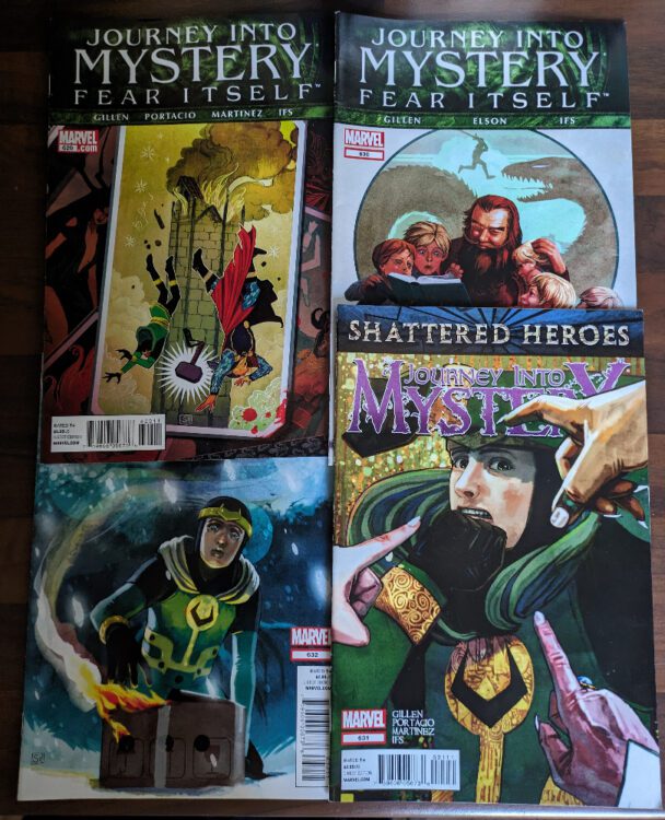
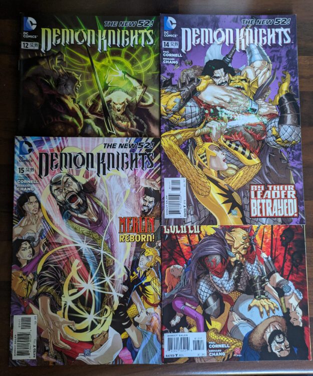
Journey Into Mystery #629 – 633 Credit: Marvel Comics
I stand by everything I have said previously about the Fear Itself event, however, after reading the last two Journey Into Mystery tie-in issues, I realize that I might have misunderstood which title was the “main” one. Issue #629 explains everything that Loki has been up to, how it fits with the Fear Itself storyline, and what actually happened at the end of the event. It all makes sense and is beautifully told by Kieron Gillen, Whilce Portacio, Doug Braithwaite, and a host of inkers, colorists and letterers.
“I’m winning the war against Fear Itself, and no one appreciates it,” says Loki in the opening page of this issue. And he isn’t wrong.
Issue #630 is even better. Volstagg is rescued from the roots of the World Tree, where his body has been in hiding while his essence has been controlling the Destroyer Armor (you need to read the story to understand). The voluminous Asgardian then returns home to tell his brood how he defeated the Serpent — twice. In this single issue, Volstagg’s story tells you everything you need to know about Fear Itself in an easy to follow and entertaining way. Volstagg’s version is better than Matt Fraction’s. It also creates a wonderful talking point for how comics have historically dealt with complex and long narratives: reducing the core elements to a few simple sound bites. This was the essence of Classic Comics Illustrated.
Volstagg’s story is simplified and, in some places, straight up lies but then again, aren’t all stories?
The following two issues deal with the aftermath of the big event story and sit under a new banner, Shattered Heroes. Issue #631 deals with the serious fallout from the battle with the Serpent: Thor’s death, Odin’s estrangement, the new ruling council of All-Mothers. But #632 has much more fun dealing with one particular consequence. This issue actually touches base with all of the main players in the comic but does it in such a way that it doesn’t feel like Gillen is just reminding readers who is where. Which is actually the mission statement for this issue.
Journey Into Mystery was the reason I managed to read all of Fear Itself, and I think I might continue reading until the end of Gillen’s run.
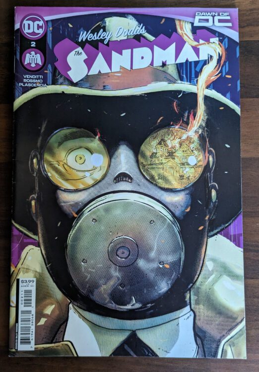
Wesley Dodds The Sandman #2 Credit: DC Comics
Comic Number 318: Wesley Dodds The Sandman #2
I picked this comic up randomly from the shop while browsing. I used to read the Vertigo Sandman Mystery Theatre title in the 1990s and enjoyed the pulp storylines and the noir aesthetic. It’s pleasing to see that this updated version still has the same sensibilities.
Robert Venditti and Riley Rossmo tell a wonderfully engaging story about a man obsessed and haunted by his inventions and actions. Rossmo’s artwork flips the action between comedy and thriller expertly, not allowing one tone to dominate. Ivan Plascencia’s color work assists in this by creating the atmosphere for each scene, allowing Rossmo’s exaggerated style to express urgency, horror, or farce as the script dictates.
This issue was thoroughly enjoyable, and at no point did I feel left out for not reading the first issue. The story drew you in, dropping any required backstory seamlessly into the narrative at the relevant points, and advanced at a comfortable pace. It left you feeling like you’d read a full story when, in fact, you’d only read part of one.
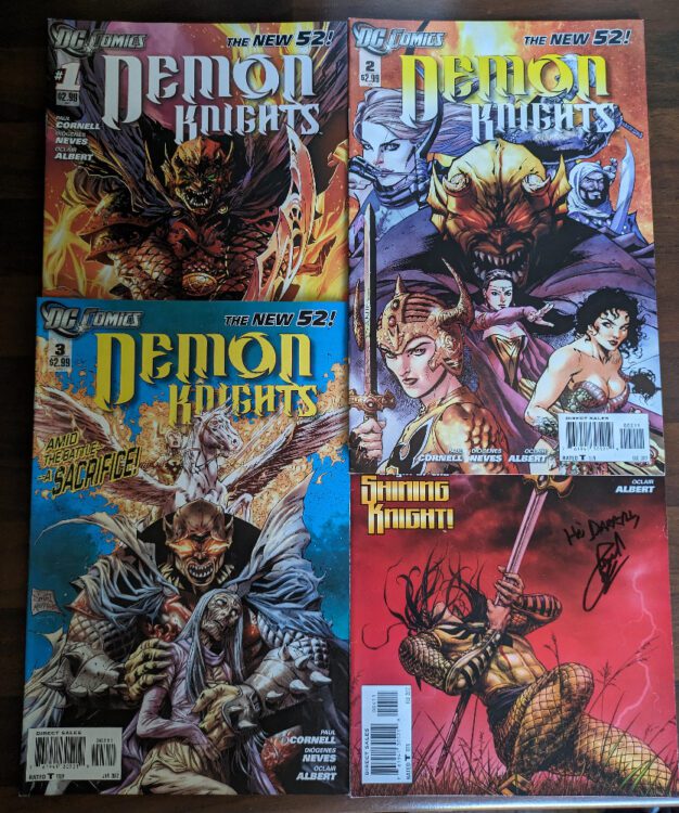
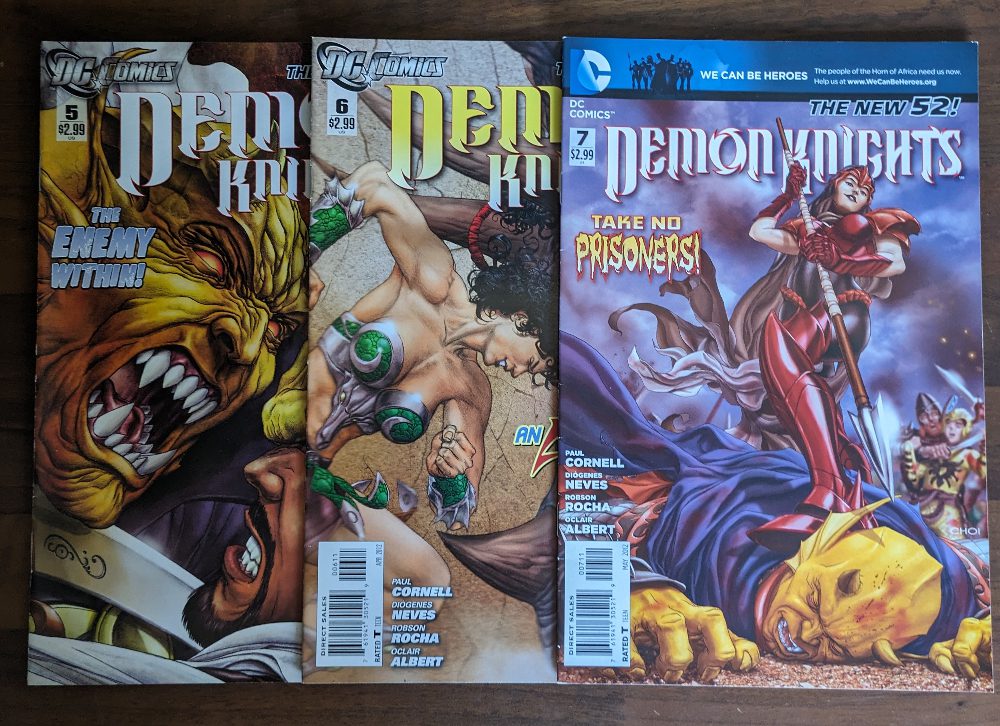
Demon Knights #1-4 Credit: DC Comics
Comic Number 319 and 320 ( the end of this week): Demon Knights (New 52) #1-7
The first seven issues form the first of Cornell’s arcs. It is an origin story, of sorts, that introduces each of the ‘knights’ and brings them together for the first time to do battle against the Questing Queen and her unstoppable horde.
The central characters here are cover star Etrigan, part-time rhyming demon and occasional human host Jason Blood, and Madame Xanadu, an immortal witch. The complex relationship between these two forms the backbone of the story throughout the series and their importance is cemented by several flashback stories acting as their backstory. In fact, the opening issue starts with the fall of Avalon and the merging of Etrigan with Jason.
Demon Knights is a sword-and-sorcery story in the vein of modern superhero comics. Paul Cornell draws on his previous writing, which includes superhero, high fantasy, and urban supernatural stories. At the heart is a very British sense of humor which most readers will find endearing, although it may be a turn off for some.
Throughout the first seven issues, the heroes bicker their way through a siege on a small town. Each of the characters has a depth that makes their interactions exciting and even without the murderous horde knocking at the gates, there is enough conflict in the story to keep most comics going for years.
I’m a fan of Etrigan and often pick up comics with him in. I’m also a fan of Paul Cornell — he did write one of the best Nu Who episodes after all. So, it’s not surprising that I picked this comic up in 2011. What is surprising is how much I enjoy this comic. It’s big, and bold, and often quite daft, but the tight script and excellent artwork by Diogenes Neves and Oclair Albert, make it a worthwhile read.
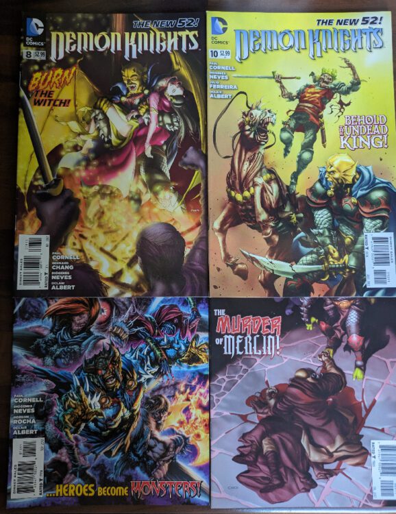
Demon Knights #5-7 Credit: DC Comics
On to Week 47
Most of this week has been taken up reading the final nine issues of Demon Knights. The story moves on from the siege, which turned out to be a triumph for the heroes (sort of), and a new mission is undertaken: to find the soul of Merlin.
The nine issues are packed with twisting narratives, seeing the heroes fight sea monsters, pirates, demonic hordes, and even themselves, again. At one point they become cursed by a light from the ruins of Camelot and have to face their true, evil, potential. Then they are forced into hell by the treacherous Etrigan before finding themselves in the middle of three armies, set for war. So, a lot happens.
The sword-and-sorcery excitement continues at breakneck speed as each of the knight’s characters are explored through the traumas they encounter. Despite the fact that a lot happens in a handful of issues, Cornell gives each of the characters time to breath and grow. By issue 15, these characters have come so far from where they started which is a great testament to the writers skills.
A selection of artist work on the title over these 15 issues, and each brings their own little twists to the pages while maintaining a general aesthetic so that the story reads as one, continuous adventure.
Demon Knights #8-11 Credit: DC Comics
Demon Knights was a bold move by DC when they relaunched their entire line in 2011. It would have been easy to focus on the superhero stories and rebuild those brands. However, they released a number of different comics focusing on genres that were not very prevalent at the time, especially for the big publishers. The New 52 contained westerns, war comics, horror, and supernatural. At the center of it all was Paul Cornell’s take on mythological characters and stories. It was a pleasure to read then and still remains a worthwhile read today.
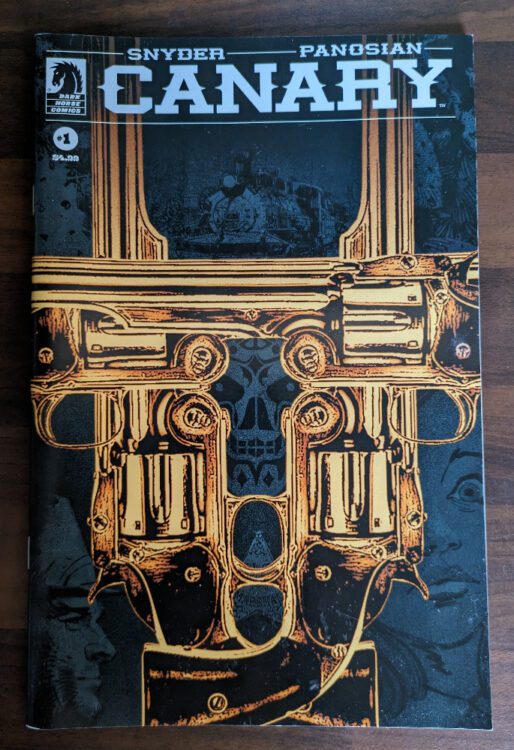
I can’t let this week pass, however, without mentioning Canary #1 from Dark Horse Comics. Written by Scott Snyder and drawn by Dan Panosion, this western is a superb piece of genre work. The story is gripping and the visuals are outstanding. Panosian uses the page layouts to their advantage when creating tension and employs the use of color like an expressionist painter drawing out emotions from a canvas. Issue 1 of Canary sat on my bedside table for a while before I got around to reading it and the wait was worth it. One of my favorite new comics that I’ve read this year.
Comics 321 to 327 ticked off (with plenty in hand).
Canary #1 Credit: Dark Horse Comics
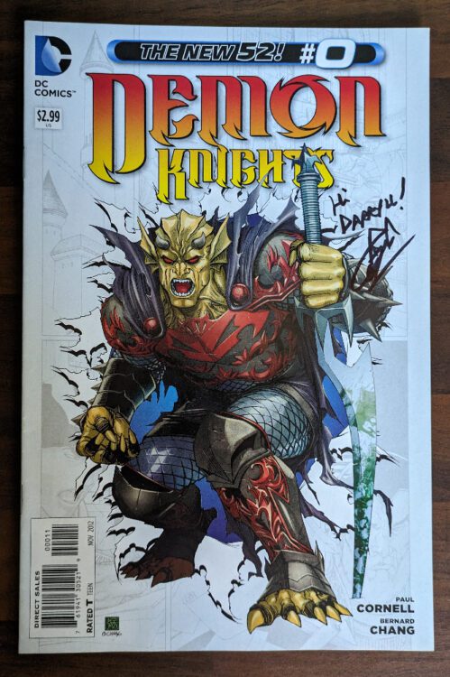
And a few of those other Demon Knights covers because.. why not?
Demon Knights #0 Credit: DC ComicsDemon Knights #12-15 Credit: DC Comics
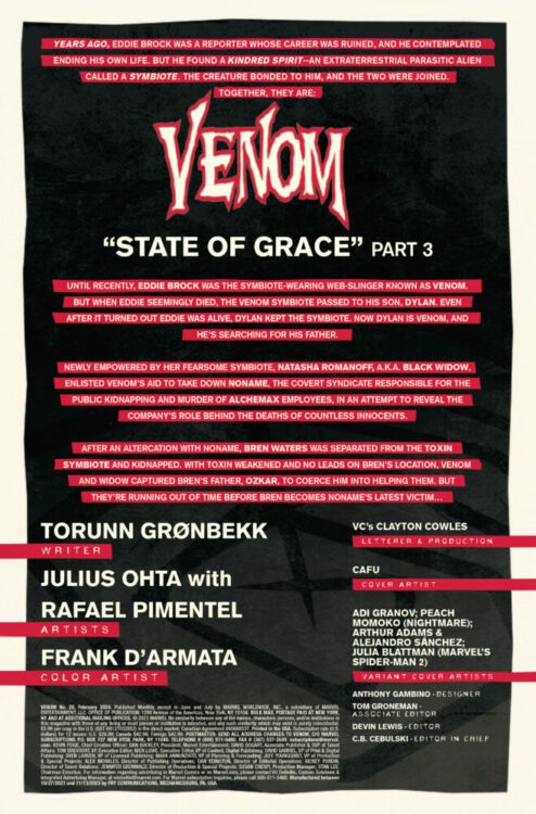
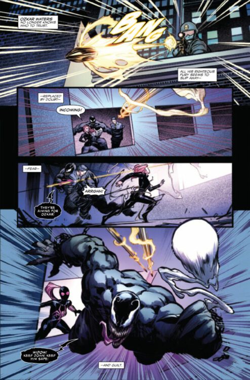
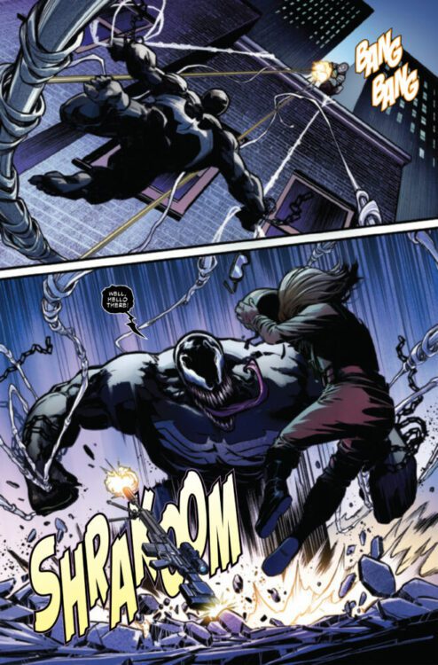
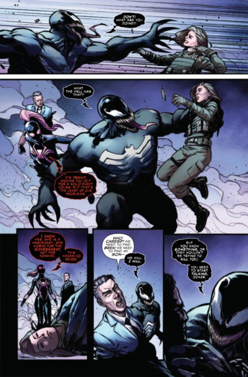
VENOM #28 hits your local comic book store on December 6th, but thanks to Marvel Comics, Monkeys Fighting Robots has an exclusive three-page preview for you!
About the issue: A SYMBIOTIC FREE-FOR-ALL!
Freshly united and teamed up, VENOM and TOXIN fight like hell to save one of the Marvel Universe’s greatest heroes from the darkness within her, unleashed by an all-new, all-horrifying symbiote! Remember how VENOM used to eat brains but then got over that as it tried to become a hero? Well, THIS symbiote doesn’t share that kind nature!
The issue is by writer Torunn Grønbekk and artists Julius Ohta & Rafael Pimentel, with colors by Frank D’Armata, and letters by Clayton Cowles. The main cover is by CAFU.
Check out our VENOM #28 preview below:
Have you been reading VENOM? Sound off in the comments!
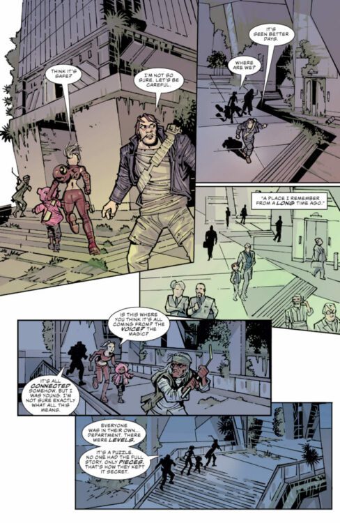
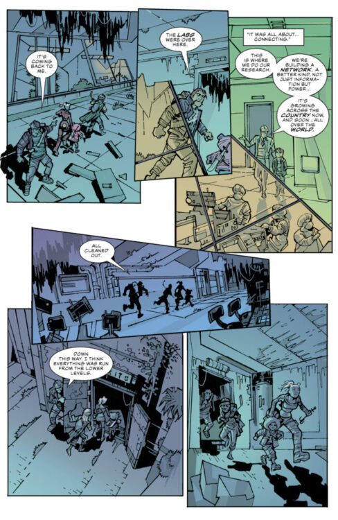
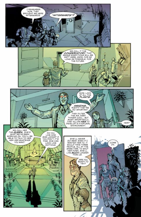
WAG #4 hits the internet December 5th, but thanks to Comixology Originals, Monkeys Fighting Robots has an exclusive five-page preview for you.
About the series: Now in the District, the four companions rummage through old buildings, and memories, to figure out how to bring an end to Wag’s troubles. Finding few answers from the old world, they face danger, and a glimmer of hope, as they continue onwards.
WAG is by writer Scott Hoffman (aka Babydaddy of Scissor Sisters fame) and artist Juan Bobillo, with letters by Steve Wands. Rian Hughes is the book’s designer, and the main cover is by Hughes and Bobillo.
Check out the WAG #4 preview below:
Are you reading WAG? What are some of your favorite Comixology Originals? Sound off in the comments!
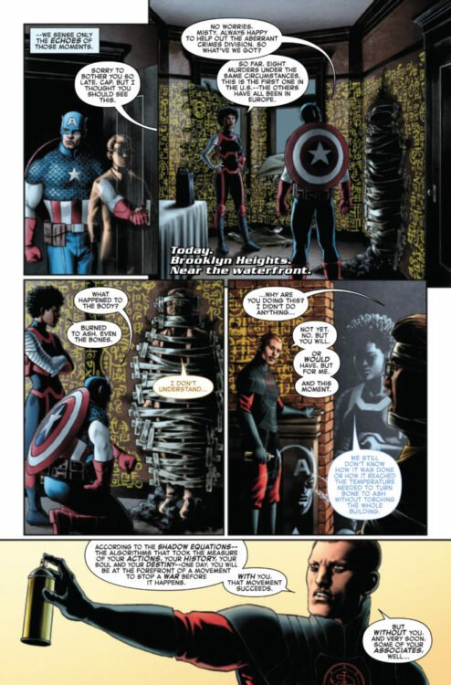
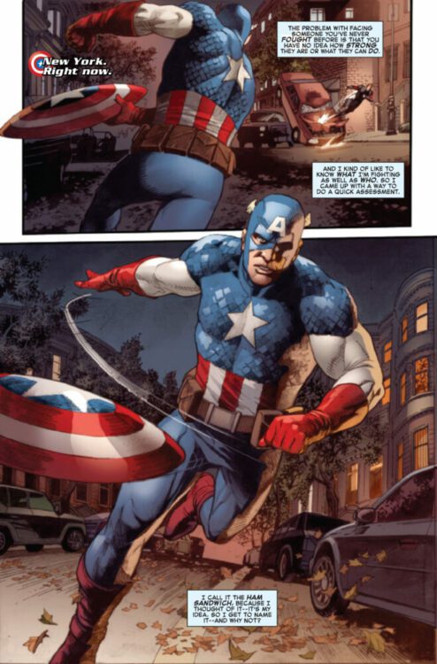
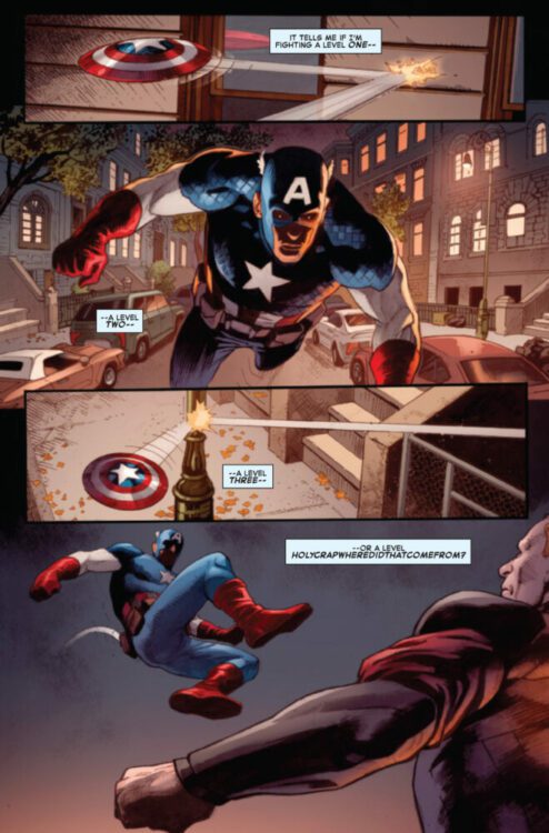
CAPTAIN AMERICA #3 hits your local comic book store on November 29th, but thanks to Marvel Comics, Monkeys Fighting Robots has an exclusive four-page preview for you!
About the issue: Misty Knight has uncovered a string of murders with seemingly supernatural origins – and Captain America’s been marked as the next target. Something about the crime scene strikes Steve as familiar…but can he find the connection between the murders and his past before this mysterious new threat finds him?
The issue is by writer J. Michael Straczynski and artists Jesús Saiz & Lan Medina, with colors by Matt Hollingsworth, and letters by Joe Caramagna. The main cover is by Saiz.
Check out our CAPTAIN AMERICA #3 preview below:
Are you reading CAPTAIN AMERICA? Sound off in the comments!
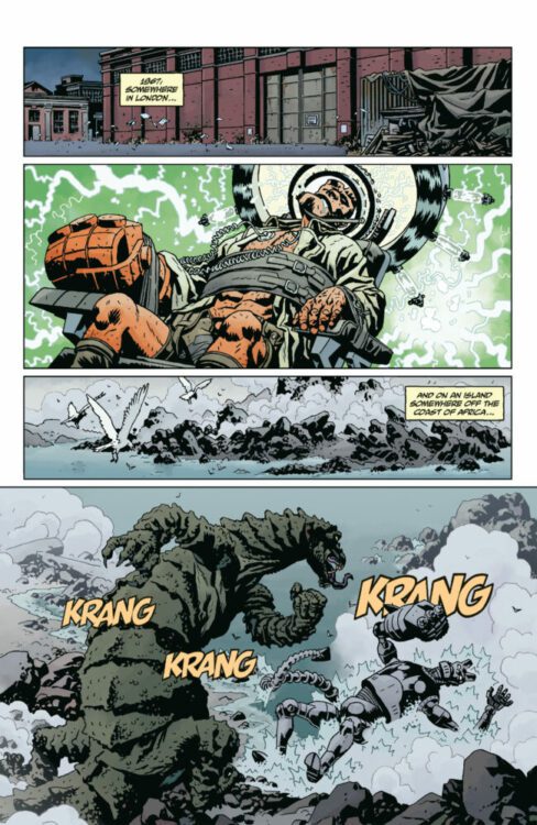
Dark Horse Comics’ Giant Robot Hellboy does it all. It has the pulpy action-packed thrills of a kaiju match coupled with Hellboy‘s trademark mythological depth. Writer Mike Mignola, artist Duncan Fegredo, colorist Dave Stewart, and letterer Clem Robins yank us back into the fray with this issue, but they balance the chaos by hinting at meaningful truths that are hiding just beneath the surface.
About the Issue (from Dark Horse):
While Hellboy’s robotic counterpart battles giant monsters on a faraway island, the scientists running the mission scramble when things at the lab get more than a little out of hand.
Writing
People have often said that comic books are today’s version of mythology. That’s never been more true than in the case of Mignola’s Hellboy Universe. His stories have subtly intertwined over the course of its decades of publication. Lobster Johnson, the Black Flame, the Hyperboreans, and even Frankenstein’s monster all tell us a little more about each other. From the dawn of creation to its final moments, no story is truly insulated in this sprawling world Mignola has masterminded. Except a story about Hellboy controlling a mech suit to fight monsters on an abandoned island, right? Surely there’s nothing deeper going on there? Guess again.
Mignola separates Giant Robot Hellboy #2 into two different narratives. The first is as simple as it gets. We see the titular robot beating monsters into a bloody pulp. It’s all sound effects and explosions. There’s no dialogue at all. The second narrative is a little more mysterious. The shadowy corporation that has kidnapped Hellboy — who may be somehow related to our friends at the BPRD or perhaps their UK counterpart — have sent one of their agents into an abandoned building to look for clues to what’s going on. The agent’s handlers piece together scraps of information to try and make sense of what they’re seeing. But they know more than they’re telling us. Mignola feeds the reader details sparingly, keeping the stakes high and the mystery intact. But what he does tell us shows that he has big things planned for the final issue, and this series has more going on that what first meets the eye.
Art
Fegredo’s art is atmospheric and dynamic. When he places a scene in an abandoned office, you almost want to brush the cobwebs out of your way as you follow along. And when he draws a battle sequence, the detailed carnage and destruction has you wondering if you should run for cover before reading more. But there’s something even more brilliant about Fegredo’s action scenes than the riveting displays of power. Instead of getting lost in the mayhem, Fegredo guides us through it with a play-by-play of images. We see Hellboy’s mechanical avatar pulling his fist back in one panel and then it making contact in the next. The giant lizard he’s tangling with picks him up by his arm and leg first, and then throws him into a mass of rocks next. This “setup then payoff” style of visual storytelling gives us a sense of the momentum of these brawling bodies and helps us track the development of the fight clearly.
But Fegredo doesn’t just use this technique to make the combat comprehensible. He also uses play-by-plays in the more peaceful moments we encounter. One character inhales from his cigarette and exhales smoke in exasperation right after. Another character pulls a document from a file cabinet and then we flip perspective to see her reading it. Time moves very slowly in this issue. You get the sense that you’re seeing every second of what’s going on. Every action is followed by a reaction, turning these tumultuous pages into something we can understand.
Coloring
Again, Stewart keeps the color palette in this issue relatively pale. The insides of the lab where they’re holding Hellboy are shown in faint hues of blue, grey, and red. Even the more action packed scenes of the giant robot throwing punches tend to stick to muted greens, browns, and blues. The moments that stand out to us are interesting though, because they highlight something unexpected. The first time we notably see saturated warm colors is when the robot lets loose some explosives into his monstrous foe. Hellboy, with the help of lab technicians who are running his weapons systems, doesn’t back down. He rains more explosives down on his crippled enemy, resulting in a river of warmly colored red blood pouring from the monster’s hide.
There’s another scene where the reptilian titan sits in the middle of raging orange and red flames. He looks pitiful rather than terrifying. Stewart actually has us questioning the pages of this book on a much deeper level. Are we really on the side of the people trying to beat the big lizard? Or should we be on the side of the poor animal whose home has been visited by a technological invader?
Lettering
Robins’ placement of sound effects, which populate most of the pages of this issue, are interesting. Instead of placing the sounds of gunfire or missiles at their point of impact, Robins often has their sounds closest to where they’re coming from. And so, the giant robot is the one that’s most often surrounded by the “BRAPAPAP” of bullets flying or the “FWOOOSH” of rockets blasting, while the beasts he’s up against tend to be accompanied by the sounds of their own screams. One looks to the sky where big, green, block letters spell out the “SCREEEEEEE” of his death cries. Even in the details as subtle as this issue’s letters, we’re asked to reconsider how simple this story actually is.
Verdict
Giant Robot Hellboy is a ton of fun, but it’s also so much more than that. It delivers more colossal cage matches than you’d dare hope, while slowly teasing out themes and connections to a much bigger story. Do not miss this brilliant new issue, Giant Robot Hellboy #2, out from Dark Horse Comics at a comic shop near you!
The premise is simple: read one comic every day for the entire year. It seems like a simple task but there is no way that I read 365 comics last year, even if you count the individual issues in collections. So, this year, I am committing myself to this reading challenge, in the hope that I can broaden my reading habits and fully engage with my favourite hobby again.
This week is a little different to my usual trawl through the week’s reading. I was lucky enough to give a talk at the Comics Forum 2023 comic conference in Leeds. My talk was based on the visual representations of Frankenstein within a collection of comic book adaptations. In preparation, I obviously read a bunch of comics but instead of going through each one, I thought I would share an edited version of the talk itself. Therefore, I present:
The Constantly Evolving Frankenstein: Changing visual representation through multiple comic book adaptations.
Frankenstein is a great work of literature and has been heralded as the first work of modern Science fiction. It has also become a sprawling transmedia text, spawning theatrical performances, radio plays, film adaptations, experimental performances, and of course, a host of comics ranging from direct adaptations to modern re-tellings. The characters, especially the creature, have been appropriated into other works, such as the robot replica monster created to battle the X-Men in the Marvel comics, and over time there has been an evolution of the narrative and all of the elements associated with Shelley’s original.
Universal Frankenstein by Andrew Swainson
Frankenstein or The Modern Prometheus, written by Mary Shelley, was first published in 1818 with a second English edition in 1823. This second edition was prompted by the success of a stage play based on the novel, Presumption: or, the Fate of Frankenstein. This was followed by a single volume third edition, which was published in 1831 and had been heavily edited by the author herself. With a big budget film version released in 1931, and a sequel, The Bride of Frankenstein, following in 1935, there were already a number of versions and adaptations of the novel around when the comic industry turned its attention to the property.
In 1939, DC’s Movie Comics #1 included the first comic book version of the characters, although this itself was an adaptation of the third Universal Frankenstein movie Son of Frankenstein. The images that make up the panels were taken directly from the movie, like a photo-story, with only small elements illustrated to simplify the images for a comic publication. Backgrounds and extras were removed and replaced by flat color fields or large areas of text. This comic reinforces the visual decisions made by the movie director and costume designers, paying Shelley’s original little attention. By this time Boris Karloff’s appearance as the creature had been a marketing phenomenon, with a wide variety of merchandise available. Even today the visuals depicted in the early Universal movies resonate with audiences who may not have seen those films. However, it is not just the creature’s appearance, but sets and elements of the narrative that have become part of mass recognition, detached from the original source.
Son of Frankenstein page from 1939’s Movie Comics #1
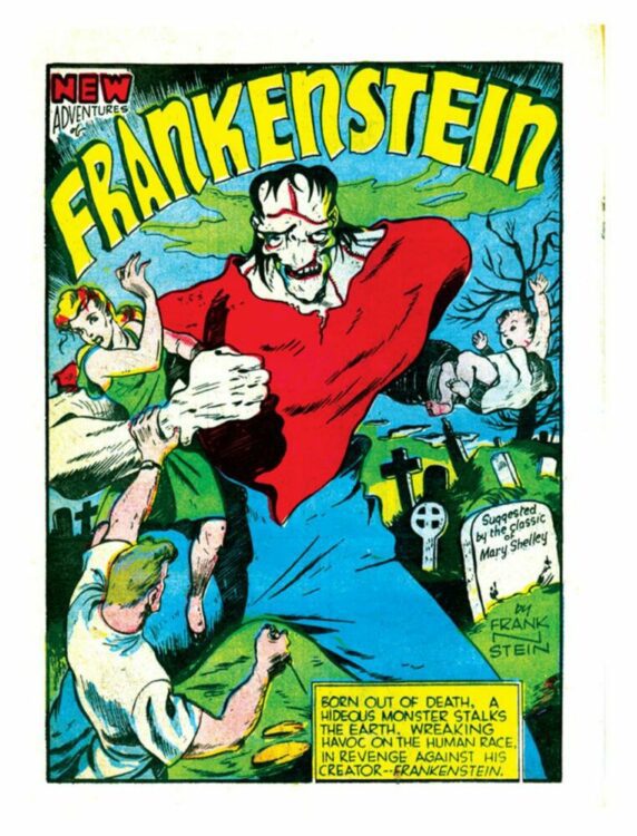
The influence of previous media can be seen in the first original Frankenstein comic adaptation, Dick Briefer’s New Adventures of Frankenstein, first appearing in 1940’s Prize Comics #1. The comic strip started out as a horror comic, evolved over time into a humour strip but eventually returned to horror in the 1950s. The most interesting aspects of the first issue, a loose adaptation of the novel, are the visual representations of locations and characters but also the acknowledgement of influential sources outside of the novel.
The creature is a large, disfigured, brute with an instantly recognizable flat head and scarred face. The appearance is clearly reflective of Karloff’s appearance in the movie series and the silent anger that features in panels of violence also calls back to James Whale’s 1931 movie. After several pages of seemingly mindless violence, Briefer gives the creature a voice, turning him from the typical ‘grunter’ monster that was part of the mass media adaptation up to that point, into a more thoughtful creature. This final two-panel twist breaks the standard representation of the creature from that time. Frankenstein’s creation was portrayed as a mute, unable to communicate in any way except through violence but Briefer returns some agency to the character, which was a major element of Shelley’s original novel.
Frankenstein as visualised by Dick Briefer
Unfortunately this brief recognition of the complexities from Shelley’s book wasn’t to become a feature in the comic book adaptations until much later. Throughout the 1940s and up to the 1970s, further representations of Frankenstein’s creature would reiterate the monstrous aesthetic from the early adaptations. Even when the character is adapted into superhero comics, such as the short lived Dell publication Frankenstein, and Marvel’s The Monster of Frankenstein, the creature is something to be feared — a horrific monster. It is also during this period that the name Frankenstein becomes more closely related to the creature himself and not the creator. In Dell’s superhero comic for example, Frankenstein is the name of the monster and his creator is simply known as The Doctor.
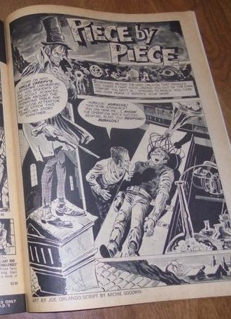
By turning our attention to setting and scenery instead of character, the changes to the novel can be clearly seen. Comics are a visual medium and the metaphors and similes of the novel are translated into imagery and visual symbolism. In issue 30 of Creepy, published by Warren Publishing, the story Piece by Piece written by Archie Goodwin with art by Joe Orlando, starts with a splash page with Uncle Creepy, the narrator, on the left and a ‘mad scientist’ leaving over a body on a table on the right.
Title page for Piece by Piece in Creepy #30 by Warren Publishing
Despite Piece by Piece not being an adaptation of Frankenstein directly, the image resonates with the readers. One look at the page and you instantly know what is going on, no background knowledge is required. It is the archetypal ‘mad’ doctor in his lab. From that single image we know that the scientist has built himself a creature from the body parts of the dead and brought him to life via some dangerous scientific means.
This image is instantly recognizable as the creation scene from Frankenstein; however, the lab, the life-giving electricity, and the gothic surroundings are all additions to Shelley’s original novel. The description of Victor Frankenstein’s laboratory and the effect of the events that happen within it help the reader to understand the character and his reactions; however, the design and visualization of the lab has changed drastically across adaptations.
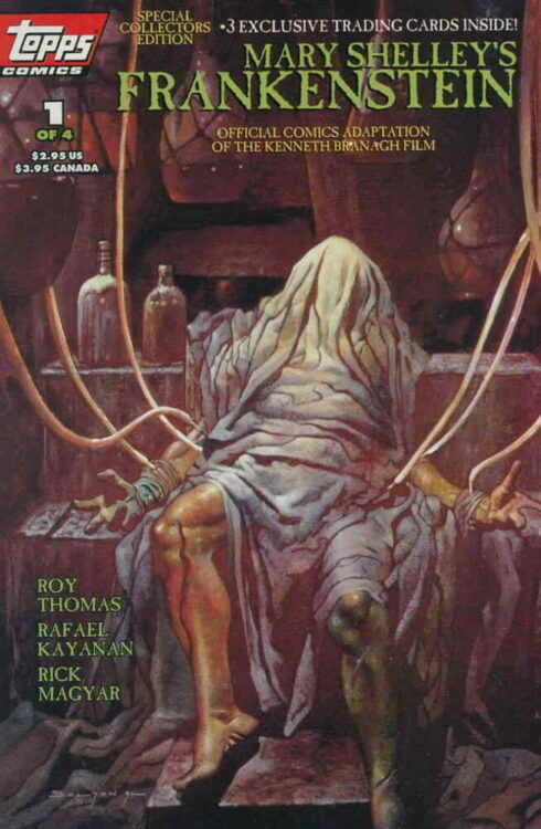
The humble abode where the scientific breakthrough is made barely gets a mention by Shelley. There are not descriptions of elaborate workshops full to the brim of scientific gadgetry or even science fiction machinery and yet a simple Google search for “Frankenstein’s Laboratory” will bring forth a vast array of complex machines, jars and bottles filled with unexplained liquids, just like the scene from Piece by Piece. There is also, always, an abundance of electricity. The ‘spark of being’ that Victor mentions almost in passing in the novel becomes a literal bolt of electricity in a number of adaptations; for example see the Tops adaptation of the film Mary Shelley’s Frankenstein from 1994.
Mary Shelley’s Frankenstein published by Topps Comics
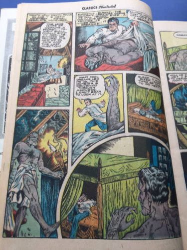
The elaborate lab motif was a very early feature of stage productions, although the comic book versions started out a bit more true to the novel. Classic Comics #26, published in December 1945, was a reductive adaptation of the novel, produced for educational purposes and with the intention of attracting younger readers to classic works of fiction. The writer, Ruth Roche, followed in the footsteps of theatrical performances of the text and edited down or removed large sections of the story while maintaining a fidelity to the original material. Huge sections of the novel have been reduced and presented on a few pages or even in only a handful of panels. Towards the end of page five, the bottom tier shows the studious scientist at work in his lab and just like in the novel, it is an unassuming setting. In the fifth panel, nothing of the background can be seen, instead the image and the text focus entirely on Victor’s obsession. This type of visualization is a technique often applied in comics to draw the reader’s attention to a specific element of the narrative. By removing the background, the reader’s attention is 100% on the character.
Page six creates the atmosphere present in the novel and maintains the normalcy of the rooms without relying on spectacle. There is nothing outlandish in the visuals and the first panel on the page could be any workroom or loft space. Artists Robert Hayward Webb and Ann Brewster are not creating the superhero experience that has become associated with comics in the modern age, instead they are focusing on atmosphere through a sense of realism. The setting is minimal, and only visible as a full room in one panel, but the design and layout allows the artists to engage the reader in the same way that the novel does. Fear, revulsion, and mental imprisonment all coexist on the page.
Classics Illustrated #26
The design of the laboratory in the Classic Comics version does not embrace the extravagance of other visual adaptations of the novel. One argument against comics being accepted as literature is the visual aspect that they employ and that they favor images over text, but in Roche’s adaptation, the reduction in the plot does not mean a reduction in the meaning. The art takes the signifiers of the novel and gives them visual representations without unnecessary embellishment. In James Whale’s 1931 movie adaptation the scenery is ostentatious and elaborate, mimicking the emphazised horror aspect of the story that Boris Karloff’s creature represents. The movie is about spectacle and was intended to shock its audience. Its success at the box office not only allowed for numerous sequels but it also produced a merchandising frenzy that spread the visual imagery of the movie far and wide. Elements of the movie became part of the zeitgeist and instantly recognizable by the public.
One aspect, the scientist’s lab, has influenced many adaptations and parodies that followed. The influence of the movie can be seen in print as early as 1945 in Dick Briefer’s horror/comedy comic Frankenstein. In the creation sequence, the body of the creature lies atop a large table in the center of a vast stone walled room. The scene is dressed with large electric machines with pipes and cables filling the backgrounds of the panels. The layout leads the viewers eyes down through the page to the creature. In contrast to the Classic Comics adaptation, the attention is given to the creature and the materials/machines used in its birth. The scientist, in Briefer’s version, is the epitome of the mad scientist trope. He is excited and exhilarated by his discovery and not at all despondent or repentant like Victor in the novel. The labs in both Briefer’s comic and Whale’s movie are full of wonder and imagination but also uncertainty. They both embrace the fear of the modern, with machines that can create life as well as bring destruction. Both of these examples embrace a visual excitement not found in Shelley’s novel but has become a mainstay in the history of the adaptations.
One of the most famous sequences of the novel is of the creature’s education. In the middle section of Shelley’s novel, the Creature takes over as narrator and relates to Victor the circumstances surrounding the emergence of his intelligence. “Through this crevice a small room was visible, whitewashed and clean but very bare of furniture,” the creature explains, what lies before him is a restricted and contained view, similar to a static film made with a static camera or a series of comic panels. The images that pass before him act as guides to language and emotion and this is how comics work to tell stories. Writers such as Thierry Groensteen stress the importance of the relationship between different panels and the images that they contain, just as in literature Structuralists concentrate on the meanings of objects and theatre designers place great importance on the mise-en-scene. The Creature’s view through the peephole is reminiscent of a theatre audience staring across the threshold of a stage into the fabricated world unfolding before them. Everything on that stage and in view serves some purpose in informing the reading of the scene and the characters. Transposing this to a comic page, the layout of the page and the decisions regarding stage dressing is just as important as any other visual medium. Where the Son of Frankenstein from Movie Comics #1 failed to successfully set the scene, the Classic Comics version succinctly captures the poor, working family.
In two short pages, Webb and Brewster set up the family dynamic, the Creature’s ability to help unseen, the education that the creature undergoes, and the final horror as the family turn on the Creature in disgust. This is achieved through a strong image and text synergy with the caption boxes detailing the Creature’s broadening mind and the props providing signifiers for the relevant stimulus. The ability to layer the signs and signifiers across visual and textual elements allow the artists to relate the same themes and narrative as the novel but in a compact format.
Gris Grimley’s Frankenstein, a page from the creatures tale section
In Gris Grimly’s Frankenstein, the author tells the Creature’s story through silent, at first, comic panels. This technique allows Grimly to show the emergence of the Creature’s intelligence through the act of visual learning. More so than the Classic Comics approach, the concept of seeing is important to Grimly’s version. Although the Creature features in several panels, the majority of the comic strip is viewed from his point of view. The reader peers through the crack in the boards to spy on the family as they entertain each other. The representation of language at this point is incomprehensible because the Creature himself does not understand it so in turn the reader is denied understanding. The view of the world is also very much from the Creature’s point of view with the introduction of objects that, at first, he doesn’t understand. The backgrounds are simplistic, a few lines to represent the wooden boards of the walls, allowing the focus to be on the characters and these new objects. Each of the small panels contains only what is needed to reflect a single emotion or idea. Minimalism is the key.
In modern adaptations, the main concepts of the novel have become the driving factor of Frankenstein stories rather than the recognizable visuals. Dean Koonz has transformed Frankenstein into a modern day serial killer, harvesting internal organs for transplants in order to prolong his life. In this interpretation, the creator and monster have become one and the same.
Over at Marvel comics, the Punisher was briefly re-branded as Franken-Castle, a revenge-driven killer whose torn body is reassembled to resemble the classic monster appearance. The sense of misjustice the creature in the novel feels is overlaid onto the Punisher’s misguided sense of justice and the narrative allows the comic to draw these comparisons between modern super-vigilante action and Mary Shelley’s examination of nature versus nurture.
Victor LaValle’s Destroyer is a modern take on Frankenstein, positioned more as a sequel than a direct adaptation. It focuses on the relationship between creator and the created, drawing on the legacy of each. It was praised at the time of release for its commentary on race relations, demonstrating how the narrative can be repurposed to fit different agendas. Frankenstein lends itself perfectly to this form of storytelling, where the central character, the creature, is a representation of the other, an outcast, someone who does not fit into society. If handled correctly, this otherness can be used to confront social viewpoints and challenge preserved normality.
But what does the examination of a transmedia text like Frankenstein tell us about a) the text and b) the adaptations? With such a rich range of versions to choose from and compare, it becomes apparent that you can find something to fit into whatever theory of study you wish. There are examples of pure entertainment (Marvel’s version), creator indulgence (Gris Grimly), and educational merit (Classic Comics). The original novel has earned a place in literary history and is often the focus of literary study and the adaptations have become as relevant in their respective media. Each of the comics mentioned here have something to say about the original text and touches on the themes addressed by Mary Shelley. The techniques used by the artists and writers of the comic adaptations are varied, and the visual influences are drawn from different places and mediums, but their goals are aligned: they still show respect for the source material and, through adaptation and the desire to walk the fine line between fidelity and creativity as discussed by writers such as Linda Hutcheon, they attempt to bring the concerns of the original to new, and wider audiences.
(Comic counts for our daily read, numbers 306 – 312: Movie Comics #1, Prize Comics #1, Classics Illustrated No. 26, Gris Grimley’s Frankenstein, Victor LaValle’s Destroyer #1, Creepy #30, and Mary Shelley’s Frankenstein #1. Plus James Whale’s 1931 movie, the original novel (third edition) and a host of other media adaptations)
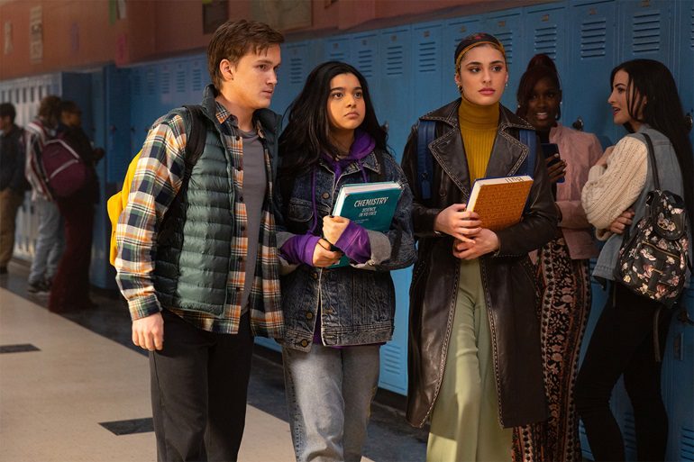
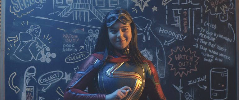
Kamala Khan is one of the more recent heroes to be introduced by Marvel Comics, and she made her Marvel Cinematic Universe debut even more recently in the Disney+ miniseries Ms. Marvel. With the character making her cinematic debut in The Marvels, now is a good time to look at the TV series.
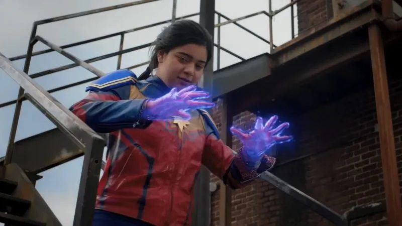
Kamala Khan (Iman Vellani) is a Pakistani-American teenager living in Jersey City. She’s a Captain Marvel fangirl, a skilled artist, and has a dominating mother (Zenobia Shroff). When Kamala receives a bangle from her grandmother, it unlocks her powers and she becomes a local superhero. However, her powers gained the attention of the US government and people from another dimension.
Since the events of Avengers: Endgame, the MCU needed some flesh blood. Some of the major characters have left the franchise, and Kamala Khan offered something different since she’s young and from a different background than most superheroes. The series can be described as a superhero’s origin story if it was directed by Gurinder Chadha.
The comparison to Chadha is due to her filmography. She’s best known for making Bend It Like Beckham, and many of her films have focused on second-generation immigrant families, culture clashes, and coming-of-age. Ms. Marvel featured all of that. Kamala had a similar story: she was a typical teen with American sensibilities, like her clothing, but her family was more traditional. Kamala’s mum was telling her to get her head out of the clouds and not bother with this superhero nonsense.
Ms. Marvel dealt heavily with the Muslim experience in America. One of the villains of the series was Sadie Deever (Alysia Reiner), an agent for the American government. Ms. Marvel shows the prejudice that Muslims suffered in post-9/11 America and the scrutiny they endured. It was a fresh perspective on the superhero genre and in American media.
The other dramatic thread in Ms. Marvel was Kamala’s journey of self-discovery. The series spelled this out early when Kamala met her school’s guidance counselor and he sets her an assignment to think about what she wants to do with her life. Kamala also learns of her family history, particularly her great-grandmother (since the bangle belonged to her), and Kamala’s mother wouldn’t talk about her. Kamala learned the truth about what happened to her great-grandmother during the partition of India, which gave the series its emotional heft.
Ms. Marvel can be compared to Spider-Man: Homecoming and, to a lesser extent, the DCEU’s Shazam. All of them were teenage-centric superhero stories. Tonally and visually, Ms. Marvel was similar to Spider-Man: Homecoming due to them both being lighter in tone, having high school drama, and the visual style. Kamala and Peter Parker would probably be friends if they met. Both characters sought to impress their idols, since Peter wanted to attract Tony Stark’s attention and become an Avenger, whilst Kamala was a big Captain Marvel fan since she was the one who changed the tide of the battle against Thanos. Kamala and Billy Batson had emotional stories about their identities. Kamala had to practice using her powers like Billy did in Shazam, and other characters in the MCU (i.e. Iron Man, Ant-Man, and Doctor Strange). Kamala was an artist in the series and her drawings were shown during the opening sequence and when Kamala described her plans. This felt like the end credits to both Spider-Man: Homecoming and Shazam, which also had that high schooler style of art. Ms. Marvel was rated a 12 in the UK, the equivalent to PG-13. This is standard for a Marvel project, and it was a soft PG-13. Children below the age of 12 could watch the series without much trouble.
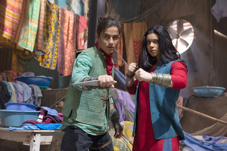
The issues that affected Ms. Marvel were the same other Marvel Disney+ series. Firstly, it had a story that could have been told through a film instead of a TV series. Ms. Marvel was a standard origin story that the MCU has done before but had extra subplots to help pad out the run time. Ms. Marvel felt much smaller in its scale and production values. It was notable that most of the action took place in community centers, hallways, and at a train station with no one else around. It looked more like an Arrowverse or a Marvel Netflix show. Ms. Marvel had underwhelming villains. This has been an issue that afflicted many MCU projects. The main villains are The Djinns who were from another dimension and were threatening to destroy the mainstream MCU Earth, but the urgency and sense of danger were lacking in the show. The series needed a superpower menace but didn’t know how to use them.
Kamala was a likable character who led a likable series. The lead character and her journey gave the series a lot of heart. It was an enjoyable and sweet miniseries even if it was on a small scale.


")