Home Blog Page 306

DOOMSDAY CLOCK and Geoff Johns’s Apolitical Superman

Love it or hate it, Doomsday Clock and its publishing history have caused a lot of discussion about DC Comics and its future. Some fans question the ethics of using Alan Moore’s creations against his wishes. Others complain about the publishing delays. Still, other fans feel a sense of narrative betrayal at DC, seemingly abandoning whatever plans they had for the rest of the DC Comics universe to catch up “one year later” with Doomsday Clock‘s status as canon thrown into question. Finally, some simply didn’t care for the story.

For my part, I enjoyed the entirety of DC Rebirth and its narrative culmination, Doomsday Clock. I think Superman, in particular, had one of his best runs in Superman and Action Comics in a long time, and I thought Doomsday Clock was a celebratory love letter to the character. Sure, it had its flaws, aside from the delays (which Johns has indicated might have been avoided if he had been given the amount of lead time he originally wanted), but I really enjoyed its second half in particular. I thought Johns and Gary Frank did a good job sticking the landing. If Johns’s and Frank’s work has a flaw, it is in their depiction of an apolitical Superman.

Before I go further, I must give credit to where credit is due, and thank the long-since-forgotten Twitter user whose tweet has been lost to the ether, who got me thinking about this problem. When Superman was first created, he was a hero of the working class, an idea Grant Morrison returns to in his Action Comics run for the New 52. Superman opposes corruption at the highest levels of society for the good of those who are crushed by it.

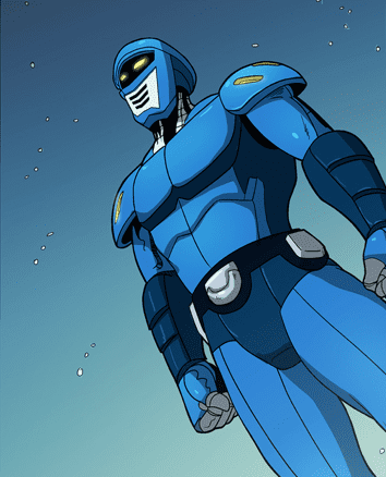
In Doomsday Clock, Superman takes up another tactic. In a world where a conspiracy theory called “The Superman Theory” claims that 97% of the world’s metahuman population lives in the U.S. because they have been created as an army to serve U.S. interests, a super-soldier army ready to be deployed if the proper circumstances arise. The constant battles between superheroes and supervillains are a “false flag” meant to cover up this fact. Now, countries around the world are arming, creating their own metahuman armies, and metahumans worldwide are being persecuted, with many escaping to the Middle Eastern country of Khandaq, ruled by Black Adam, for refuge. When Doomsday Clock begins, Superman is the only superhero who remains above suspicion, trusted by all the world’s people and governments.

In a CBR interview from shortly after the release of Doomsday Clock‘s final issue, Johns indicates that he wanted to explore Superman as a foundation for the mythology of modern superheroes, as a symbol who transcends the stories that are written about him and the political conflicts the world finds itself in. I do question whether we need an transcendent, apolitical Superman. Do we need a Superman who is “above the conflict” of, let’s say, Black Lives Matter? Do we need a depiction of Superman as a centrist who tries to find common ground between people, equivocating between two positions on the political spectrum that aren’t always morally equal?

In depicting Superman as timeless and mythological, Johns fallen into the trap that Umberto Eco diagnosed decades ago in his famous “The Myth of Superman” article. Eco argued then that the problem with Superman (and superheroes in general) is that they never really change the world they live in. They participate in local acts of charity, but they never really change the status quo. While there are certainly corporate reasons for that (the show, as they say, must go on), what this does is shape the imagination of readers to accept the status quo in society as it is, unable to picture a radical reshaping beyond just individual acts of charity. You can’t reduce the division and conflict in our society by simply saying, “If everyone would get off of social media, stop yelling at each other, stop focusing on identity politics, and just listen to each other, then we would all get along.”

One scene that stands out, and it’s one I’ve seen the Twitter-verse comment on frequently, was Superman’s defense of a supposedly Trump-filled White House against a group of formerly persecuted metahumans, defending the White House against the threat of a person of color from the Middle East (the guy made of sand). In some ways, it feels like a repeat of the Killmonger-problem in Black Panther. A character puts forward a number of legitimate complaints about oppression of minorities in the world, chastises the comfortable for their complicity in it, but who is depicted as angry and violent, thus delegitimizing his point and reaffirming the status quo. One thinks of Superman’s plea to the metahumans of Russia and Khandaq who come to the U.S. to apprehend Superman in Doomsday Clock #12. Superman asks them to be careful because there are civilians in the area. Black Adam’s response, “Since when has that ever stopped your country?” rings true, but is immediately delegitimized and forgotten because he is marked as “the bad guy.” His very legitimate critique is made invisible. Surely this status quo should disturb us as much as the break from it we experience in this show of violence.

I understand the appeal of transcendent hope, and I sympathize with the message that we all need hope. I myself am a religious person, but we religious folks have a saying: “You’re so heavenly minded that you’re no earthly good.” Johns’s Superman lacks the political edge of Jerry Siegel and Joe Shuster’s Superman, which again, Morrison touched on in his own Action Comics run.

I say all of this as someone who genuinely liked Doomsday Clock and its ending and thinks that DC should’ve stuck with the narrative thread leading into it (which they are now trying to retroactively fix).

However, placing Superman above the fray, beyond “outdated identity politics,” removes him too far from the conflicts that define everyday human existence for countless people who don’t have the luxury or privilege of being above the fray, who can’t escape their identities (and are disenfranchised because of those identities). Johns and Frank certainly dealt with issues of racism and xenophobia in their Superman and the Legion of Superheroes story in the 2000s, so it seems like an odd choice in messaging to castigate identity politics and to depoliticize Superman. If that story taught us anything, it’s that we need a Superman who critically interacts with and addresses issues of identity, racism, immigration, and sexism…even in the 31st century. That involves picking sides.

Being above the fray won’t help anybody.


Monkeys Fighting Robots Youtube

How DRYAD #2 Is Blending Genres

And so a great evil has been released in Dryad #2.

DRYAD #2, available June 10 from Oni Press, continues the tale of one family – and the secrets they are running from. This series may only be two issues in, but it’s clear that they’re willing to defy and merge genres for the sake of the story.

And so a great evil has been released in Dryad #2.

***SPOILER WARNING***

Are you looking for a different sort of series to dive into? One that is already making a point of breaking expectations and creating a new combination of storytelling techniques? Then Dryad is a series worth your time.

Dryad is the latest series to come from the mind of Kurtis J. Wiebe, famous for his Rat Queen series. Working alongside Wiebe, you’ll find Justin Osterling and Jim Campbell. Together they’re working hard to create something new and different.

Morgan and Yale seem like a classic love story – the tale of how opposites attract. But many things about their relationship have been flipped on its head. Now that they’re parents to two teenagers (Rana and Griffon), things have become even more complicated for our heroes.

When Yale tells you to be quiet, you shut up.

The Writing

Dryad #2 is an intense and dramatic read for a variety of reasons. We’re still getting to know the family, as well as the town of Frostbrook, and yet Kurtis Wiebe was not content to slow the story down any.

Now everything and everyone is in mortal peril – and we’re at the edge of our seats. It’s been clear from the start that this is not your normal family, but it’s safe to say that the revelations that occurred within this issue were not predictable.

It’s also going a long way in making the series stand out, taking it away from a classic fantasy standpoint, and pushing it more into a blend of science fiction and fantasy. Some fans will adore that, while others might have preferred one or the other.

It’s difficult to predict what will happen next to this family, though thanks to that cliffhanger ending, things do not look good. It’s an edge-of-your-seat sort of conclusion to an issue and is more than enough to have us looking forward to the third issue.

The town of Frostbook will be forever changed after this.

The Artwork

Justin Osterling (art & colors) and Jim Campbell (letters) were the artists behind Dryad #2, and here is where the issue truly stands out. While the writing itself was intriguing, the artwork made it all the more compelling.

The character designs and expressions are a highlight of the series thus far. That is especially true of the dramatic shots provided here, with characters looking striking and intense. Or ready for battle, as the case may be.

The colors are vibrant and alive – much like you would expect for a fantasy series set in the woods. But there are also bold colors, courtesy of the infusion of science fiction elements. The blend of the two is shockingly beautiful.

Finally, the lettering is pure perfection. We’re talking carefully threaded words, designed to lead our eyes throughout the pages. There is a significant amount of subtly in the work here, but then again, this is Jim Campbell we’re talking about, so of course, there is.

‘Who do you think I am?’

In Conclusion

Dryad #2 lived up to the promises made in the first issue, continuing this compelling tale, while giving us more reasons to continue reading. There are still countless questions left to be answered, but they will all come in good time, of that we can be sure.

It will be fascinating to follow this series further and see how far they’re willing to push the boundaries of the genres they’ve been defined by. More than that, we’re looking forward to seeing how the characters develop now that their course has been set.

Monkeys Fighting Robots Youtube

Review: EXCALIBUR #10 – Divided Loyalties and Broken Realities

The beginning of Excalibur #10 out this week from Marvel Comics might leave even the most devoted reader wondering, “Wait. Did I miss something?”

When we last left our heroes, they were exploring Otherworld and had been attacked by the forces of Queen Satyrne. However, as this issue starts, our heroes find themselves back in Britain, which has apparently been bombarded by Krakoan missiles. As Britain prepares to go to war with Krakoa, Betsy Braddock (Captain Britain) finds herself caught in the crossfire between her two homelands, as a citizen of Krakoa and as the sacred defender of Britain.

But all is not as it seems. While it was obvious to most readers that making Jamie Braddock king of Avalon and giving him free rein may not have been the best idea. Nevertheless, we discover that the reality-warping mutant has played a hand in the disjointed-feeling narrative, and it may make way for some changes for the mantle of Captain Britain.

Tini Howard crafts an interesting reality-altering tale, while providing some handy exposition for how “pocket realities” work.

She is assisted in this story by artist and color artist Marcus To and Erick Arciniega, who have a knack for giving things a “mystical aura,” a benefit in a series that plays with the tropes of the fantasy genre. Additionally, as Jamie continues to break reality, the art and use of the gutter is able to brilliantly capture the fracturing of reality.

Many artists have different ways of portraying multiple realities or the splitting of reality in comic books. Through the line work, To and Arciniega are able to capture this not only the breaking of reality but the shuffling of each Excalibur member into an alternative dimension where they each serve as founding members of a new Captain Britain Corps.

Excalibur isn’t necessarily the strongest of the X-titles, but it continues to provide unique storytelling potential in Betsy’s struggle establishing herself as the new Captain Britain, the machinations of Apocalypse, and the Krakoan impact on Otherworld.

Monkeys Fighting Robots Youtube

Review: DEADPOOL #5 – Can Wade Save Manhattan?

DEADPOOL #5, available in comic book stores on Wednesday, June 10th, brings readers a story of monstrous proportions (which is saying something for the newly crowned King of Monsters). After soundly defeating Kraven the Hunter last issue, Deadpool decides to let his subjects enjoy themselves in the ocean off the coast of Staten Island. But when a Godzilla-sized lizard named Smash Smash escapes from the Island, the people of Manhattan could pay the price.


Story

With Smash Smash making waves on his way to the city, Deadpool and Elsa Bloodstone desperately search for a way to arrive before the monster can destroy anything. Fortunately, Night Wolf suggests the quickest yet grossest solution: teleportation via the monster Hurl’s special pink goo.


Upon arriving mostly unharmed (aside from the disgusting transport vehicle), the two heroes and Jeffrey confront Smash Smash. Deadpool makes it clear he does not want to kill the monster; he feels the weight of his new responsibilities as King of the Monsters and wants to care for his subjects. But when Smash Smash makes it clear he wants to create explosions within the city, our hero may have to make some tough decisions.


Kelly Thompson’s writing is as funny as ever, yet finds a way to fill the narrative with just enough heart. We feel Deadpool’s existential angst over his identity as he tries to avoid killing anyone, a quality he feels has defined him as a character for far too long.

Artwork

Gerardo Sandoval’s penciling and Victor Nava’s ink work provide awesome illustrations of our heroes and the mighty Smash Smash as he wreaks havoc on the sleek, clean New York buildings. This is coupled with Chris Sotomayor’s coloring, which contrasts the bright reds of Deadpool and with Smash Smash’s earthy tones. And VC’s Joe Sabino’s lettering completes the ensemble by matching the color of character dialogue boxes to their own hues.

Conclusion

DEADPOOL #5 is one of the most engaging issues yet in the new line of Deadpool comics. Our hearts laugh, cry, and continually question Deadpool’s sanity as he and Elsa attempt to save Manhattan.


What was the funniest part of this issue for you? Let us know in the comments below!
Monkeys Fighting Robots Youtube

Review: NEW MUTANTS #10 – Where’s the Action?

New Mutants #10 proves that Rob Liefeld may have a good point about modern comics. Perhaps comics have gotten too…verbose. In theory, there’s a lot happening in this issue. I know this because the characters spend A LOT of time talking about it.

The New Mutants are in the hostile nation of Carnelia, where a young mutant has begun to manifest her powers, drawing the surrounding area into her nightmares, including a few members of the New Mutants. Meanwhile, the prime minister of the country plans on blaming the New Mutants for a problem he thinks they caused as retaliation for not signing a treaty with Krakoa.

I realized about halfway through this issue I was getting a little bored. Ironically, Ed Brisson seems aware of this, with the character Wildside chiming in halfway through the issue: “Is this all you guys do? Stand around, talking. It’s boring. Where’s the action?!

Given that the character was co-created by Rob Liefeld during his run on New Mutants, perhaps this is a self-conscious nod to the reader on Brisson’s part. Or perhaps a veiled criticism of Liefeld. He has a point though, although frequently the middle of an arc acts as an exposition dump in order to set up a finale. Perhaps that’s what is going on here. We’ll see.

Rod Reis’s cover art helps me to imagine what I wish this comic was – a truly horrifying experience. Given that the plot involves people getting absorbed into another mutant’s nightmares, this might be a missed opportunity in the story.

Flaviano and Carlos Lopez’s second page helps capture the horror-potential of this story.

Review: NEW MUTANTS #10 - Where's the Action?

I am tempted to comment on the possibly phallic imagery of the first panel, given the comic industry’s overall poor track record on misogyny in comics. It’s not quite at “Blob eating the Wasp in Ultimatum” problematic levels, but it does give me pause. The image alone is striking and horrific, reminding me a bit of the scene with the tree in Evil Dead. The coloring of these panels, though, are beautiful and ethereal, along with the lettering by VC’s Travis Lanham which captures the out of control despair of the nightmare mutant.

When Armor, Wildside, Mondo, and Cypher attempt to rescue those inside, the world inside the nightmare orb looks like a twisted, Dark Multiverse equivalent of a Steve Ditko drawing.

While I enjoyed the artwork and am still excited to see where this series goes, I do think this issue suffers a bit from an overabundance of talking.

There continues to be a lot of great potential in this series, even if this cast is a little big. I’m thinking that maybe splitting New Mutants into two titles (maybe a Generation X title?) might’ve helped this book to feel more focused in its run so far.

Monkeys Fighting Robots Youtube

Review: JAMES BOND 007: THE WARREN ELLIS OMNIBUS Is Bond At His Finest

James Bond Warren Ellis Omnibus, Masters cover

JAMES BOND 007: THE WARREN ELLIS OMNIBUS, available today from Dynamite, is Warren Ellis’ take on the legendary super spy. The Omnibus is a collection of two story arcs: Vargr and Eidolon. In each arc, Bond encounters a bevvy of dangerous enemies and colorful allies, all in service to Her Majesty’s Secret Service. With decades worth of source material and pop culture iconography, does Ellis’ version of the titular character hold up?

Writing

Let’s just get this out of the way. In these collections, Warren Ellis has written peak James Bond. Bond is charming with a touch of scoundrel when interacting socially; deadly accurate and ruthless when facing the enemy. He’s a smart ass and yes, to use an old-fashioned phrase, he’s very much a ladies man. To put it simply, Ellis has taken all the best characteristics of Bond from the books and films and merged them into a dynamic and engaging personality.

In Vargr, Bond is assigned to hunt down the maker of a designer drug that’s killing it users. Bond eventually discovers the plot is bigger and more twisted than a simple drug dealer with bad product. The villains in Vargr just barely skim the line of cartoon-ish, but the action is tight, and the stakes are high for the entire island of Britain. What I appreciate most about Bond here is he takes more than a few lumps, true to his depiction in the original books. Bond doesn’t escape all attacks with perfect hair and a winning smile. when the fight scenes take place, Bond’s expertise saves the day at the cost of more than a few bruises. Excellent authenticity by Ellis.

In Eidolon, a insurgency cell connected to SPECTRE has infiltrated the highest levels of British Intelligence. Bond fights to survive assassination attempts from within his own ranks to uncover the traitors and save the agencies meant to protect Britain. There’s a bit of commentary from Ellis in this story as he raises the questions about how far we need to go for security before we trade one danger for another. Eidolon is the more paranoia-filled and tense of the two stories, and it’s imminently enjoyable as a spy thriller. The ending is not your typical smarmy-one-liner-before-he-kills-the-bad-guy ending, and big credit goes to Ellis for infusing the character with more depth than previous incarnations with the final fight.

One quick note about the female characters. Bond stories have received some criticism in the past for their depiction of female characters, either for coming across as agentless damsels-in-distress or as nothing more than a love interest for Bond. I was pleased to see that ALL the female characters in these collections are integral to the story and have complete agency when it comes to the romantic interactions with Bond. Again, kudos to Ellis for getting that bit right.

Overall, the omnibus is well-constructed, and the stories are mature without a a hint of camp in sight. This is probably the fastest omnibus I’ve ever read through. Not a single panel is wasted and the story moves.

Pencils/Inks

Jason Masters’ art in Vargr is cinematic. Every panel is rendered with enough detail as to look like a cell lifted straight form a Bond film. Masters’ realistic style lends an air of maturity to the material that keeps the far-fetched elements (an assassin with robot arms?) grounded.

Likewise in Eidolon, the realist art style intensifies the cinematic qualities of the story. Every character is distinct and well-rendered such that the art enhances the writing and dialog to create three-dimensional people, even with the lesser used side characters.

Extra kudos goes to Masters for the creation of the main villains. In typical Bond story fashion, the main villain is usually distinguished by some sort of scar or deformity. In both stories, Masters draws villains with their telltale scarring but does it in such a way as to add to the backstory of each character, giving them more depth.

James Bond Warren Ellis Omnibus, art sample

Favorite Panel/Page: Part of the Bond mythos is the endless ribbing he gets over his choice of personal firearm, the Walther PPK, On page 28, Q is inflicting just such a ribbing and suggests Bond choose a more meaty weapon with an appropriate shoulder holster to carry it. Without spoiling it, Bond’s comeback had me laughing at loud because it’s just such a perfect representation of the character in all the best ways.

Coloring

Guy Major’s coloring is chock full of mood, particularly in the more brutal death scenes when it’s one-on-one. For example, the opening scene of Eidolon depicts the death of a henchman who’s gotten “sloppy”. The entire sequence is bathed in hues of yellow and orange to reflect the sunset lighting from outside, but it also paints a sickening atmosphere of malignancy that takes a simple murder to something more sadistic…and therefore, impactful.

James Bond Warren Ellis Omnibus, color sample

Lettering

I mentioned earlier this was the fastest omnibus read through I’ve ever done. The writing, art, and lettering combine to practically sprint you through the pages. That’s in part to Simon Bowland’s lettering work. Bowland makes excellent use of background space to put in word balloons only when absolutely necessary. That’s also why the stories move along so quickly. In the first eight pages of Vargr, there are exactly eight word balloons, and even then, they all show up only on the last of the first eight. Sometimes less is more, and Bowland get it absolutely right by tucking in the letters in the sparsest of corners to let the stories fly.

Conclusion

JAMES BOND 007: THE WARREN ELLIS OMNIBUS is a collection of tense, taut, and thrilling James Bond adventures. The quality of stories, in both the writing and art, is on par with the best James Bond films and even better than some of the original novellas. Absolutely worth your time for the price.


Author’s Note: Local Comic Shops (LCS) are going through a tough time right now with the pandemic outbreak of COVID-19. Comics fans of every flavor that care about his or her LCS should try to do what they can. So, here’s my part:

If you’re in Northern Delaware, South East Pennsylvania, or Southern New Jersey area, please take a moment to visit Captain Blue Hen Comics in Newark, DE. Say ‘hi,’ pick up a book, order a book (they’re on Comichub.com), and let them know you support them.

If you’re nowhere near that area, please find YOUR LCS using Comic Shop Locator and lend your support.

Thanks, and stay safe.

Monkeys Fighting Robots Youtube

GUARDIAN #1 – Tom Carter’s Superhero Sneak Preview

Guardian #1 Cover

Guardian #1 is a superhero indie comic by UK filmmaker Tom Carter, available via Comixology. This passion project has been in the works since his college days.

ABOUT THE BOOK:
Zack West, who just graduated returns home spending time with his family and girlfriend living his normal life ever day life until a mysterious alien symbiotic crash lands on earth; it fuses with Zack and together they become Guardian, the newest superhero and defender of earth.

Guardian #1 Introduction

Tom Carter’s Guardian #1 wastes no time introducing his title character… characters? The way Carter works with artist and letterer Jang Haryadi for introductions is pretty clever. Readers assume it’s the civilian identity of Zack West until later some context from the beginning reveal that it’s him and a symbiote. Think if Venom was more technological. What’s more, Zack is an everyman who surrounds himself with quirky yet down-to-earth characters like Guardian and his family. When you get down to everything, this is the ideal viewpoint of the reader to a new universe. Empathetic enough for a reader to latch onto, but not sympathetic enough to the point of pity. That’s certainly the way for Guardian who learns through Zack that there are already superheroes about.

Building Up Future Stories

With the universe building in the background, this generates interest for more content. However, the way Guardian #1 sets up future stories can be kind of lackluster. Their archenemy Mars The Destroyer and his presence combined with the disappearance of Zack’s family friend Sean Hunter advertises itself as a mystery. But to readers who pay attention, it’s actually pretty on the nose. Guardian’s conflict with the crime lord Maverick seems more interesting, especially with his skull-masked helper.

Guardian #1 Artwork

Meet Blue... uh.. Guardian. No not Blue Guardian just Guardian.
How popular is Blue Beetle (Ted Kord) in the UK?

Jang Haryadi does a very good job with how he handles penciling, inking, and lettering. The designs of his characters in Guardian #1 are diverse enough for readers to tell everyone apart. But it’s the designs of the heroes and villains that are the most praiseworthy. Guardian’s simple design not only makes it notable, but the trunks it features are a tribute to Silver Age superheroes. Villains like Mars, Maverick, and Skull all feature designs that fit their personalities. Mars is an over-the-top supervillain with a cape who ironically watches from the shadows, while Maverick is a large intimidating man in a suit. Skull’s mask with eyes that occasionally glow purple imply a mystical nature, all while dressing in a fedora and trench coat. This is a display of Maverick trying to cover all areas of superheroics including the more fantastical aspects that have yet to show up.

Lettering problem in Guardian #1
This looks better if you see the panels above this picture.

However, when it comes to Haryadi’s lettering, they range from being creative to chaotic. The captions, as mentioned earlier on Guardian’s introduction is some of the best in Guardian #1. Unfortunately, some of the word balloons and captions can be out of place. When Zack is speaking with his girlfriend Amy, her opening dialogue looks like it should be in one panel or happens too late. Otherwise, Zack’s apology looks awkward when reading from just the panel it takes place in.

Coloring by Papillon Studio seems to vary. They range from relatively simple like most of the series where Zack goes about the day to highly detailed where Guardian makes his debut. The background however doesn’t get much detail unless there are trees. Otherwise, the urban architecture looks kind of dull.

The First Step Of The Carterverse

Guardian #1 is far from perfect, but it has the potential to grow into something greater. You have characters who serve as the gateway into a bigger world of superheroes instead of being the first of an epic. Sure, Guardian’s building superhero career looks lackluster, but maybe Zack’s family can be a treat. Where else can you find superhero stories that can be fun and be a means of figuring out what to do with your life? Anybody trying to find their way can relate to that. Maybe you just need to wait and see where this all goes.

What do you all think? Is this series just another attempt at reinventing the superhero wheel? Or could something come out of this? Leave your thoughts in the comments.

Monkeys Fighting Robots Youtube

Review: Faithless II #1 – To Fill A Blank Canvas

This Wednesday, Brian Azzarello, Maria Llovet, and Andworld Design continue their tale of Faith’s rise in stardom through questionable means in BOOM! Studio’s Faithless II #1.

It’s been about a year since the first part of Faithless wrapped up, so refresh yourself with Darryll Robson’s reviews here! Then support your LCS and pick it up.

Faithless II #1 is for mature readers, so make sure you know that before jumping in. However, you need the background from Faithless, so that should come as a given.

FAITHLESS II #1 AND THE DAUNTING CANVAS

Azzarello reintroduces the cast we’ve gotten familiar with by having each interact with Faith, thus showing how they’ve progressed. Yet it doesn’t seem like it’s been that long since the previous story, as Faith is still getting called “the next big thing.” That and Faith feels like the character we left in the previous serious, still confused and not sure of herself. Instead of having her feeling confidant, she still doubts herself constantly; this is shown with a simple narrative—a blank paint canvas.

The blank paint canvas that haunts Faith throughout the first issue is great; it shows how she feels she still lacks something. Instead of skipping ahead, Azzarello continues at a slow, steady pace, showing that she is still evolving. The many changes Faith went through in Faithless was the highlight, and it seems Azzarello knows that, as she still has a way to go. Nonetheless, changes happen when Solomon enters the picture. Solomon was introduced in Faithless, yet was never delved into. It seems like he’ll play into Faith’s further transformation down the line.

An artist and her canvas.
Maria Llovet

A VISUAL TREAT

Faithless was a visual treat with a lot of the story riding on Llovet’s art, the same can be said on Faithless II #1. Not only does Llovet’s style perfectly fit Azzarello’s tale, but it also heightens it. This ability to take the story up a notch stems from her European art form, with uneven lines and styles of panel. Albeit her characters are emotional and her ability to showcase realistic feelings is great, her backgrounds are just as amazing. During some scenes, Llovet’s backgrounds are cluttered, showing the business of that location. While other locations are void, helping showcase the foreground. It helps that this genre is one Llovet transcends at.

However, her art isn’t the only phenomenal aspect, as her colors and fashion sense works wonders. This detail for fashion can be seen in her other works as well. Nonetheless, her colors fit the narrative quite well. Her color palette is subtle and realistic. At times Llovet will employ brighter colors, yet at no time does it outshine what is transpiring. Another neat aspect of her colors is how at times, they flow outside of the lines. In Faithless II #1, you’ll find objects and panels that include colors that aren’t in the pencils lines. It’s a small detail, yet simply beautiful.

Brian Azzarello, Maria Llovet, Andworld Design

WORDS OF PASSION

There are a few moments in Faithless II #1 where Llovet includes hand-drawn sound effects. When these occur, they look magnificent and later on help portray a great visual moment. Be that as it may, Andworld Design’s lettering is wonderful when teamed with Llovet’s art and Azzarello’s story. The word bubbles and font style seems to be more freehand then not, with Andworld Design changing the dimensions of the bubbles when needed. The font style used not only makes the story feel more realistic but is gorgeous to boot.

Brian Azzarello, Maria Llovet, Andworld Design

FAITHLESS II #1 CONCLUSION

Although there are some fun character moments in Faithless II #1 the reintroductions of the characters don’t do as well as their initial introductions. Nonetheless, Llovet’s art continues to be drop-dead gorgeous with Andworld Design’s lettering helping tell the story. If you enjoyed the first series, then you’ll want to check out the follow-up.

Fun Fact: Llovet does her comic work digitally.

Monkeys Fighting Robots Youtube

Review: IT EATS WHAT FEEDS IT Is A Story That’s Eerily Simple

It Eats What Feeds It cover Scout Comics Lumazark

Scout Comics’ It Eats What Feeds It, written by Max Hoven and Aaron Crow, and illustrated by Gabriel Iumazark, tells a story that’s simple yet haunting. The story takes place in the Louisiana swamps. The dingy feeling and the fog in the air makes it feel like danger is around every corner. We follow Kenny, a young high school graduate who is responding to a want ad in the bayou. In a large, spooky house, the seductive Francois waits. She simply needs Kenny around to keep the place clean, keep her company, and ignore the blood splatters in the kitchen.

Writing

Hoven and Crow are building a world of characters from scratch. It’s natural to have a little bit of over-explaining, and some heavy exposition here and there. But somehow, Hoven and Crow dodge this pitfall and dive right into the story. Sure, Kenny isn’t exactly subtle. At one point he’s jumping on his bed saying “She wants me… she wants me hard!” But he’s a horny high school graduate, so the tone of his dialogue works perfectly. Hoven and Crow understand the character they’re writing. They know that if they dangle sex in Kenny’s face, they can then throw in as many red flags into the writing as they want. And so, the reader is warned with every page that something sinister is going on, while Kenny settles deeper and deeper into his dream life. This makes the tone of the comic both spooky and seductive at the same time. You’re lured into the beauty of the world they’ve created, despite that fact they’re screaming at you to run.

It Eats What Feeds It Lumazark Scout Comics

Art

Iumazark, in a way, takes on the role of Francois in this creative process. It’s his job to seduce us into the house, get us sitting comfortably and then scare the shit out of us. And Iumazark does it well. For one thing, much of the art seems to have a haze over it. Since this comic takes place in the Louisiana bayou, the foggy feel in the air is fitting. It’s like you can’t fully see what’s going on. It’s not clear. Iumazark is constantly shying away from detail. His minimalist approach often looks like a picture half-drawn. This brings everything into question. Are we really seeing what’s going on, or is this in Kenny’s head? It’s the uncertainty that becomes the most terrifying factor of the story. The very feeling that there is something between you and a clear picture creates a sense of panic.

Coloring

Iumazark’s coloring is where the balance of dread and seduction comes in. Somehow, scenes that are cast in a “golden days” kind of glow, don’t seem all that different from washed out scenes that suggest a coming doom. We do notice all the differences, but they’re subtle. The tinges of grey and yellow are replaced by a hint of green. But the changes are so subtle that we almost want to convince ourselves they aren’t there. Early on in the story, as Kenny first meets Francois in her dimly lit house, Iumazark’s color scheme manages to be both tempting and ominous at the same time. The dark room should feel scary, but the woman in the red dress makes it feel intimate instead. Maybe even sexual. It’s once Kenny discovers the blood and bones in the kitchen that Francois’ red dress begins to represent both sex and death. Kenny doesn’t seem to bothered once he realizes he might have a chance with Francois.

It Eats What Feeds IT Crow Scout Comics

Lettering

Iumazark’s letters seem out of place at first. The sharp edges of the square word balloons clash with the soft shapes of his pencilling. But something about it kind of works. The orderly, clean letters floating above a dark and messy world. It casts more doubt over the atmosphere. Doubt that things are alright, that things are as they seem. And Iumazark’s sound effects are always a tease. The garbled “Wheck! Whreeck! Wreeck!” flying out of the window in panicked letters is just Kenny jumping on his bed. Screams that echo through the halls are cries for attention, not cries of death. And so the lettering of this story is always convincing us it’s something that it’s not. Scary looking sound effects are actually associated with innocuous acts. Tidy word balloons hide the sinister intent of the words themselves.


It Eats What Feeds It, from Scout Comics, is a seemingly simple series. But the work Hoven, Crow and Iumazark have put in is anything but simple. We have none of the insecurities one often sees with creators introducing us to a new world. Instead, this creative team is confident. And with a story like this, they should be. It Eats What Feeds It #1 is out from Scout Comics July 8th!

Monkeys Fighting Robots Youtube

How SHADOW SHOW: STORIES IN CELEBRATION OF RAY BRADBURY Pays Tribute to the Sci-Fi Author

Cover of Shadow Show

Shadow Show: Stories in Celebration of Ray Bradbury is an anthology of short stories inspired by the late science fiction author. The stories included contain references and draw inspiration from many of Ray Bradbury’s short stories and novels, and we will look at how a few of the tales are linked to the timeless author.

Ray Bradbury is best known for writing novels such as Fahrenheit 451, Something Wicked this Way Comes, Dandelion Wine, and the Martian Chronicles. He also wrote hundreds of short stories, several stage plays, and some screenplays. While mostly known as a science fiction writer, Bradbury’s short stories touch on nearly every genre imaginable, and his unending creativity inspired countless of today’s authors. Shadow Show is just one of the many ways these authors have attempted to pay tribute to Bradbury and features an astounding variety of short stories that relate to Bradbury’s works through either topics or themes. Shadow Show was published in 2015 through IDW publishing and contains a total of nine stories that pay tribute to Bradbury.

Ray Bradbury

Shadow Show begins with an adaptation by Jason Ciaramella of a Joe Hill short story titled “The Silver Water of Lake Champlain.” It is illustrated by Charles Paul Wilson III and Jeremy Mohler. The story is about a young girl named Gail, who discovers a dead monster on the beach with a boy named Joel. The monster is similar to a giant aquatic dinosaur, and the children celebrate their discovery of the prehistoric creature. Those who have read the short story “The Fog Horn” by Ray Bradbury will be quick to realize that the creature in this story and Bradbury’s are incredibly similar, if not one in the same. This is clear from the foghorn noise that both creatures make. Another way that “The Silver Water of Lake Champlain” mirrors the works of Ray Bradbury is the young main characters. Many of Bradbury’s stories, such as Something Wicked This Way Comes and Dandelion Wine, feature children as the main characters and focus on this innocent time of life. It is difficult to capture the wonder of being a child in words or through art, but Joe Hill, Ray Bradbury, and everyone who worked on the adaptation to a comic book are able to do so successfully.

The Creature and Children from "The Silver Water of Lake Champlain"

“Backwards in Seville” is a tale featured in Shadow Show that does not have a direct link to any of Bradbury’s stories. It does not feature a character from one of his short stories, an excerpt from one of his novels, or Bradbury himself as a character like other stories in the anthology do. Instead, “Backwards in Seville” relates to Bradbury purely through the themes covered in the story. “Backwards in Seville” is a story written by Audrey Niffenegger and illustrated by Eddie Campbell that follows a middle-aged woman named Helene on a cruise ship with her father and many other elderly passengers. It explores themes of life quickly going by, and how youth is wasted on the young. The story has a magical twist as well, despite most of the story appearing to be set in a realistic world. This is a staple of many of Ray Bradbury’s short stories and novels, such as Something Wicked this Way Comes. The topic of aging and growing old is also something that Bradbury was clearly fascinated with, and shows up in many of his stories, such as Dandelion Wine and “Season of Disbelief”. It would also be rude to continue without noting the beautiful and unique art style of “Backwards in Seville,” which causes Helene’s experience to seem as if she does not have a firm grasp on reality.

Artwork from Backwards in Seville

“Live Forever” is one of the most interesting stories told in Shadow Show, because Ray Bradbury himself is a character in it. Written by Sam Weller with art by Mark Sexton, “Live Forever” tells the story of a writer meeting his hero, Ray Bradbury, and talking about his history. The story almost seems it could be a real account when Ray Bradbury tells the writer a true story of when he was a child at a circus and was told by one of the performers to “live forever,” but soon after the story dips into the realm of fiction. Bradbury leads the writer to his basement, where many robot versions of Bradbury’s mentors are spending their time. These robots are indistinguishable from humans except for a very faint ticking noise, and are ripped directly from the Bradbury short story “Marionettes, Inc.” This story is a marvelous read because it helps illustrate just how deep of an impact Bradbury has had on many writers of today.

Scene Depicting the Time Ray Bradbury Was Told to Live Forever
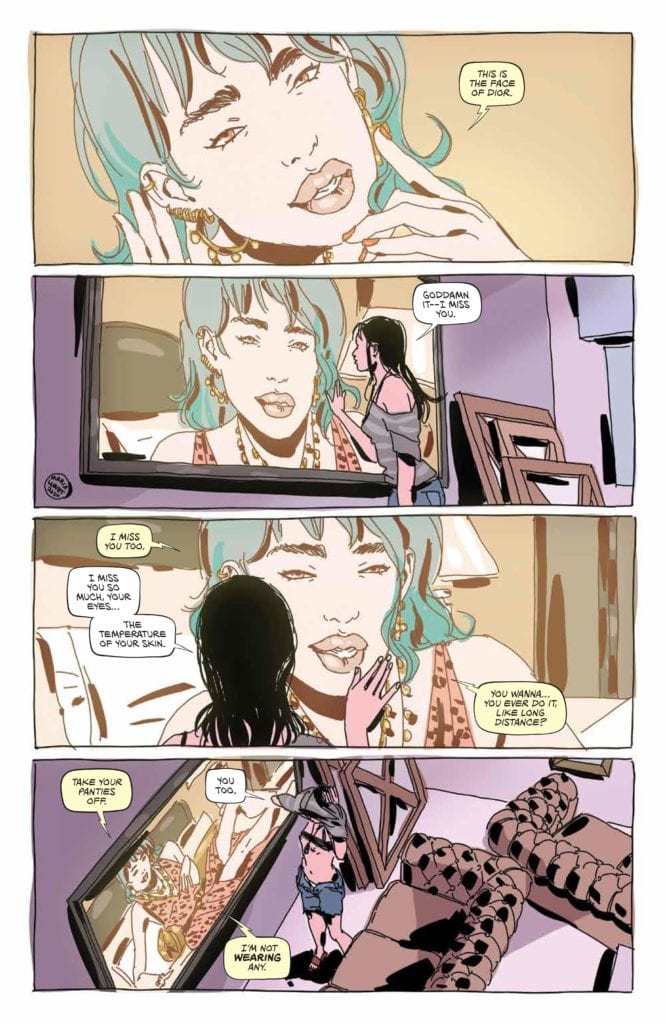
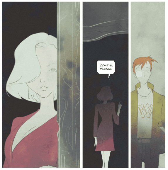
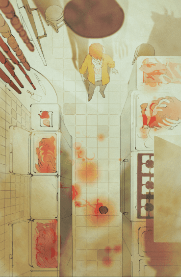
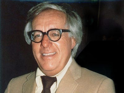
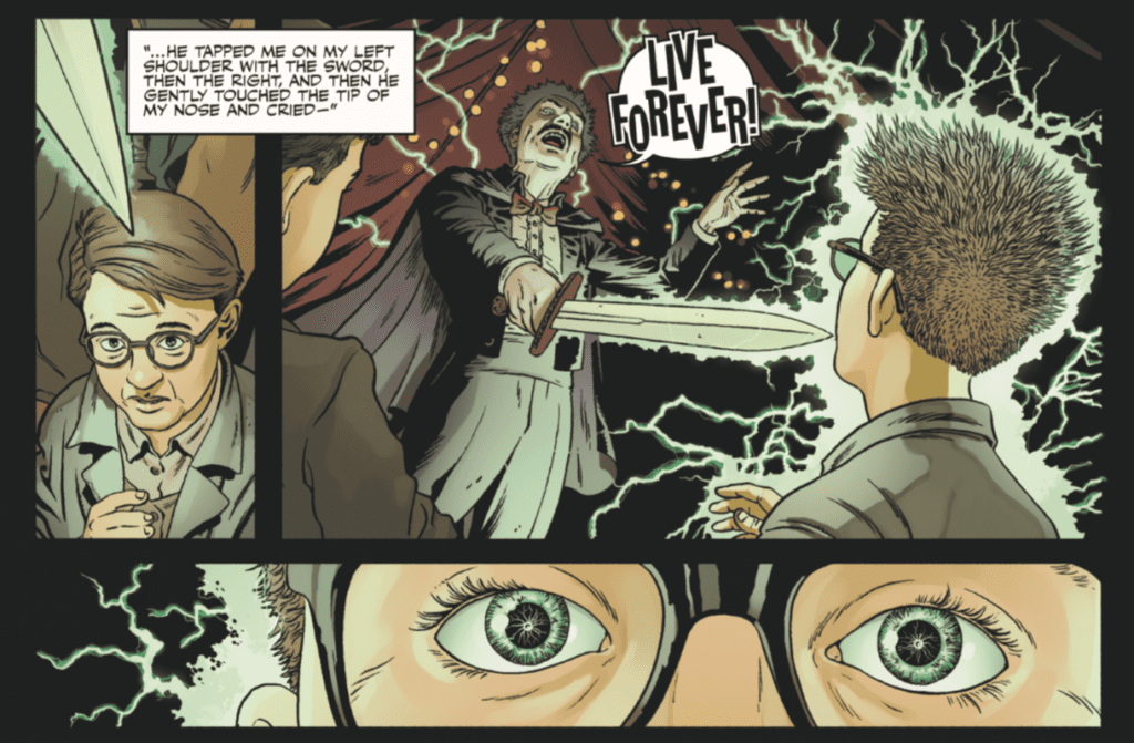
Shadow Show: Stories in Celebration of Ray Bradbury is a wonderful anthology, full of diverse topics and themes that truly capture the feeling of Bradbury’s writing. Although this article only covers a few of the stories in the anthology, Shadow Show still contains plenty of other wonderful stories that are worth looking into. I believe it would be difficult for someone to read this fantastic collection of stories and not be instantly motivated to explore the writing of Bradbury for themselves.


Are there other anthology comic books that you like? Let me know in the comments below!

Monkeys Fighting Robots Youtube