Home Blog Page 304

IDW Exclusive Preview: DYING IS EASY #5 Brings Joe Hill & Martin Simmonds’ Mystery To A Close

dying is easy #5 exclusive preview

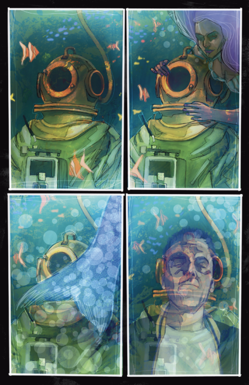
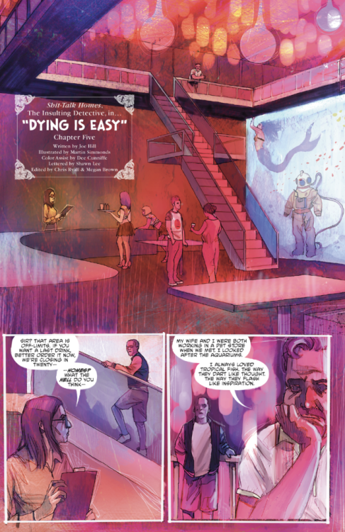
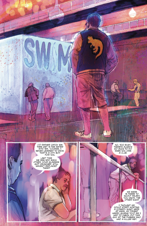
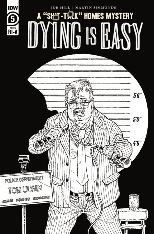
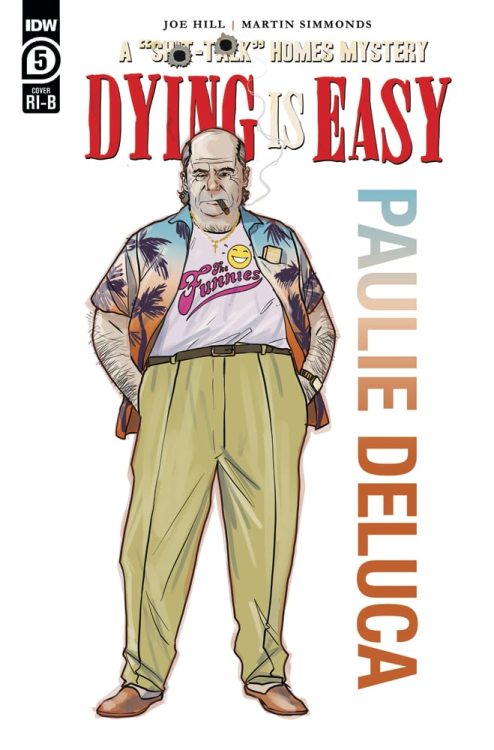
DYING IS EASY #5 hits your local comic book store June 17th, but thanks to IDW Publishing, Monkeys Fighting Robots has an exclusive three-page preview for you.

About the issue:
After a final confrontation with the killer of joke thief Carl Dixon, Syd Homes can finally take off his shoes and relax as an innocent man. But if dying is easy, then detective work is hardand there are a few more twists to go before this case can be solved…

DYING IS EASY #5 is by writer Joe Hill and artist Martin Simmonds, with colors by Dee Cunniffe and letters by Shawn Lee. It’s co-edited by Chris Ryall and Megan Brown.

The series is billed as the inaugural Syd “Sh*t-Talk” Homes mystery, which suggests that Hill and Simmonds will bring Homes back for additional stories in the future.

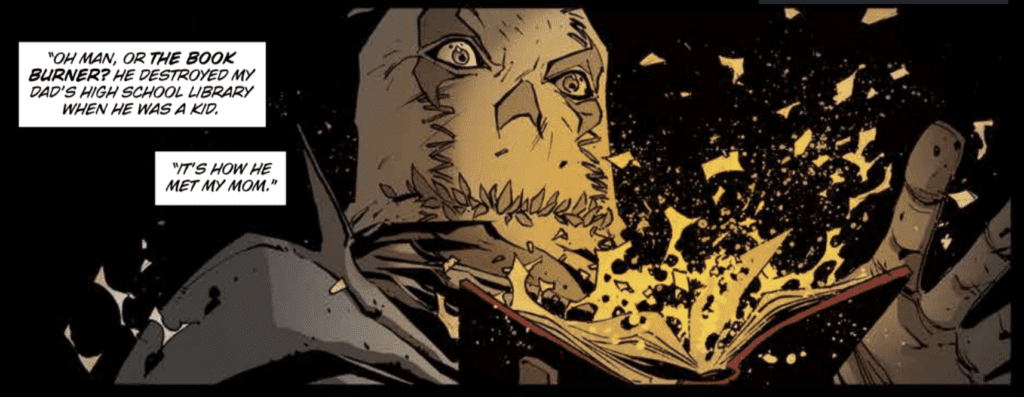
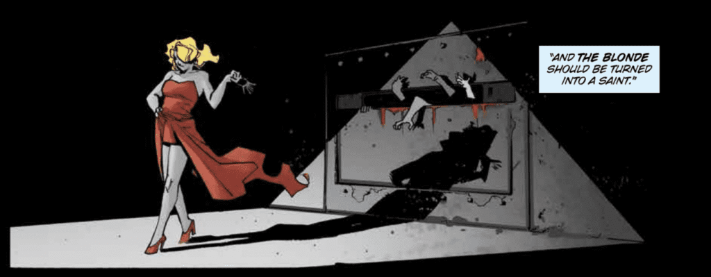
Check out the DYING IS EASY #5 preview below:

dying is easy #5 exclusive preview

dying is easy #5 exclusive preview

dying is easy #5 exclusive preview

dying is easy #5 exclusive preview

dying is easy #5 exclusive preview

dying is easy #5 exclusive preview

dying is easy #5 exclusive preview

dying is easy #5 exclusive preview


Are you excited for the DYING IS EASY finale? Sound off in the comments!

Monkeys Fighting Robots Youtube

Interview: Jim Rugg On The Making And Process Of OCTOBRIANA 1976

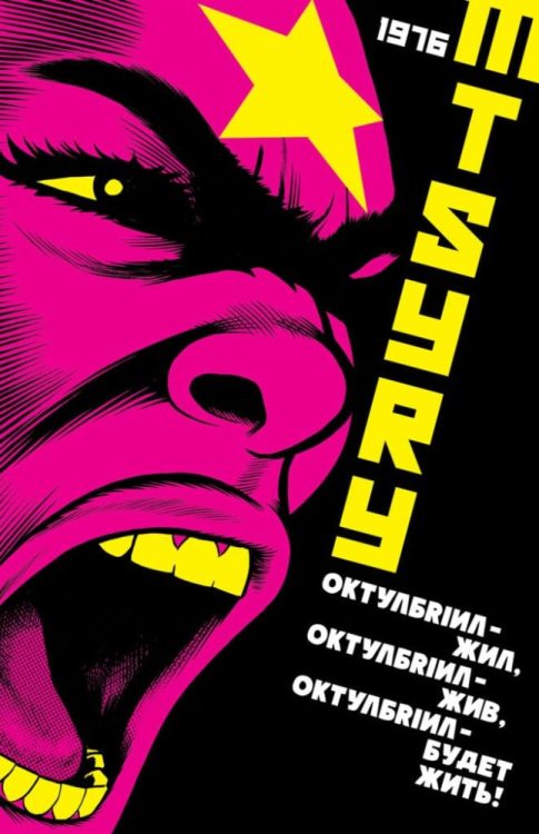
Octobriana 1976

Jim Rugg is a man of many hats in the comics/cartoon community. He’s been a teacher, designer and illustrator. He is the co-creator, with Brian Maruca, of Afrodisiac and Street Angel, He also illustrated the young adult series the PLAIN Janes, written by Cecil Castellucci. And of course, he is one-half of Cartoonist Kayfabe.

Jim recently embarked on a new comics project, Octobriana 1976, that he launched through Kickstarter. He was cool enough to take some time and talk to us here at Monkeys Fighting Robots all about it.


Octobriana 1976

Monkeys Fighting Robots: So let’s jump right into your project, Octobriana 1976. Tell our readers a bit about the project.
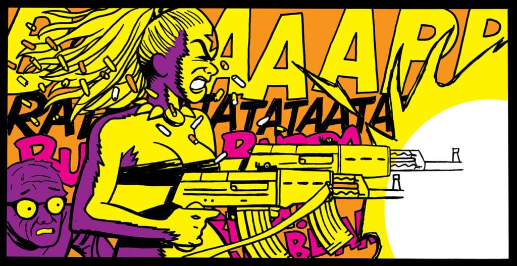
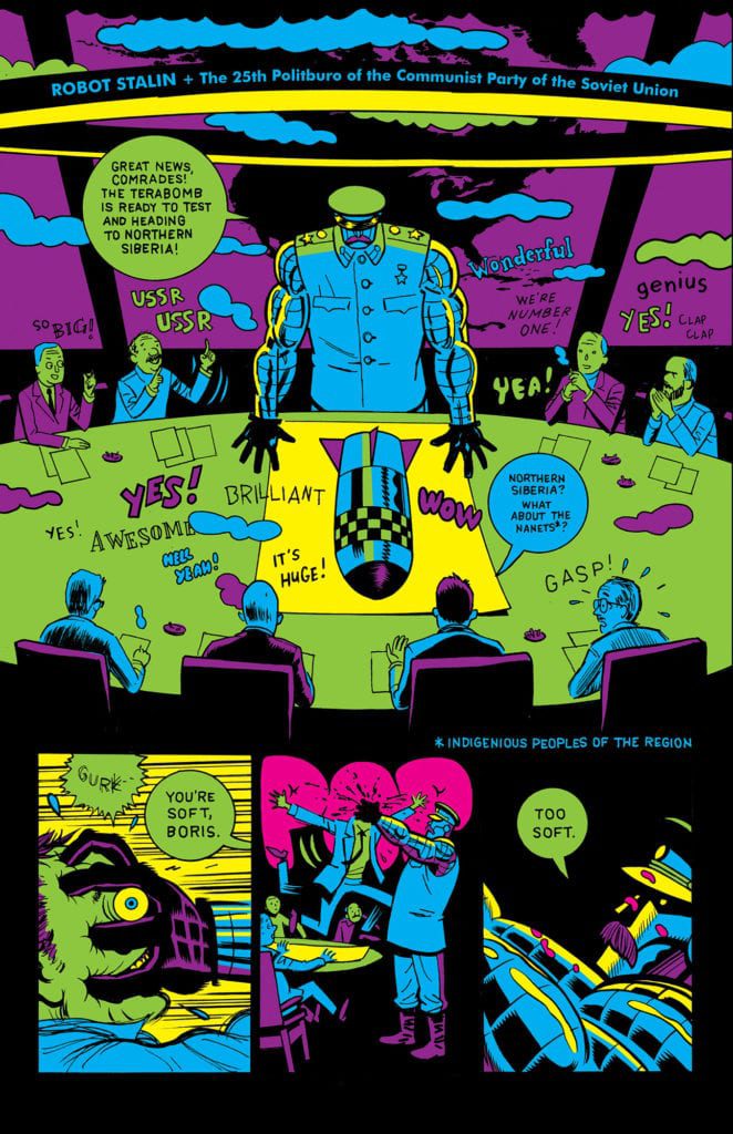
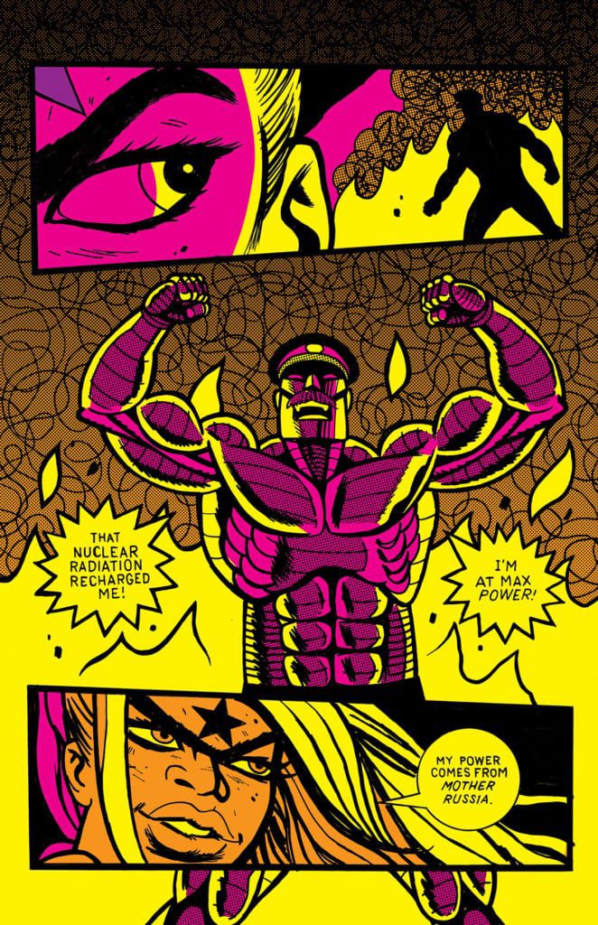
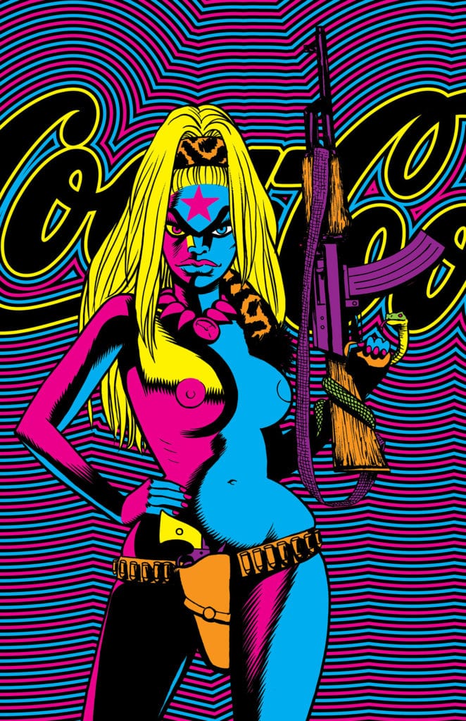
Jim Rugg: Octobriana 1976 is the world’s 1st blacklight comic book. It’s printed with fluorescent ink and will look like no other comic ever! Super bright colors. Octobriana is an outlaw Russian underground superhero from the 1960s. She was created to fight Soviet oppression and is the spirit of the October Revolution. Sort of. Actually, she comes from a book called Octobriana and the Russian Underground (1971) – but it turned out that her story was a hoax! In any event, she was a public domain superhero and a few cartoonists started using her in their comics – notably Bryan Talbot in The Adventures of Luther Arkwright. In my book, she and the PPP (Progressive Political Pornography group) have to stop Robot Stalin from using his new Doomsday Device. It’s an action comedy in the vein of Mike Mignola’s Amazing Screw-On Head, but with some weird psychedelic, 1970s style. 

MFR: Octobriana is almost a sort of mythical, modern character. Where did you first hear about her and what made you want to make the comic?
Rugg: I first read about her in a book about weird comics by Paul Gravett. I LOVE weird comics and it caught my eye so I tracked down the book, Octobriana and the Russian Underground (1971), and fell in love with it and the character. She definitely has a mythical, modern quality and that’s special. Few characters achieve such stature and because she’s public domain, cartoonists can use her as this big, iconic superwoman! I wanted to use her almost immediately. The public domain characteristic is interesting and her appearance is very striking graphically. 

MFR: Any particular comics, artists or stories that inspired your approach to Octobriana?
Rugg: There’s a bunch of badass, sexy comics characters like Pravda by Guy Peallart, Barbarella, Phoebe Zeitgeist, and then there are a number of visuals that inspired what I’ve done like Charles Burns’ Black Hole. That whole book looks like a blacklight poster! The comics of Richard Corben are also very psychedelic and left an impression on me. Ben Marra is another cartoonist who influenced me on this book. I actually made a video where I show off a few books and artists that directly influenced Octobriana 1976: https://youtu.be/dkzrA6JoWo

MFR: So with the black light coloring. How early on in the process did you know this would be a factor?
Rugg:  knew it from the beginning. I had plans to make a blacklight comic book for over a year. I spent a lot of time writing stories or writing parts of stories to try to find a story that I felt fit the blacklight visual style. As I was writing Octobriana 1976, I was thinking about how it would look as a blacklight comic book. People who follow my work know that I bounce around stylistically. I try to make adjustments to my style to get the best out of the story. Octobriana 1976

MFR: How did coloring for black lights change your approach to creating the page? Did it change the way you look at color use? Were there special paints/markers that made it different physically?
Rugg: I built a palette at the very beginning because I knew the inks I wanted to use in the printing process. I describe it almost like the 8 pack of crayons we had as little kids – but an LSD neon version! So the palette was unique compared to other projects I’ve done. The other art choice is to use a lot of black ink. When I did Street Angel: Deadliest Girl Alive (Image, 2019), the book is very bright and colorful without too much black. For a blacklight poster or comic, black is almost like the most dominant color on the page. That creates a very different look. Definitely it changed my approach to the page and drawing style and tools. 

MFR: You have been extremely successful with the Kickstarter for this project. What exactly led you to take this route for publishing? And has it changed on how you will approach publishing, in general, going forward?
Rugg: I’ve been interested in Kickstarter for a while. Like experimenting with style, I’m also interested in experimenting with publishing, distribution, and connecting my comics to readers. For this project, I planned on publishing it and taking it to comic conventions. I had a lot of conventions planned for this year because I had 2 big graphic novels come out in late 2019 and early 2020 – Street Angel: Deadliest Girl Alive and The PLAIN Janes. I thought I’d make Octobriana 1976 and surprise everyone at these shows with a new, wild-looking comic book! When Covid-19 shut down the conventions and comic book stores, I pivoted to Kickstarter. It seemed like a perfect fit for a crowdfunder. Going forward, I will definitely consider Kickstarter in my future plans. We plan to sell Octobriana 1976 to the Direct Market too. So there’s a long sales cycle ahead of us and I’m curious to see how Kickstarter impacts that. I think it’s been a great way to promote the book in addition to selling copies. And I think there are people who buy things on Kickstarter that don’t have a local comic shop and I think there are comic shop patrons that don’t back Kickstarters. So I view it as another option and method of connecting my comics to readers. I hope it will ultimately help me and comic shops sell more books as a result of raising awareness of the book. 

MFR: So give us some details on the Kickstarter campaign. What are the goodies we are gonna get, I am a backer so I want to know personally haha.
Rugg: There are a few that I’m really proud of!

  1. Octobriana 1976 blacklight comic book! This is the big one. Printed with fluorescent ink, this comic book should look incredible! 
  2. Blacklight screen print posters. These planted the idea in my brain. I love screen prints and posters so grab one or ten of these! They will look so cool on your wall!!!
  3. Digital (PDF) and limited edition comics. I created 3 different versions of PDFs of the comic – NEON, RETRO, and BLACK+WHITE. This is the base REWARD so $5 gets you all 3 versions! I’m also doing limited print editions of the RETRO and BLACK+WHITE comic books for those who love print (like me!). 
  4. Digital (PDF) PROCESS ZINE. It’s 180 pages!!! Notes, script, sketches, original art scans (like an Artist Edition) – if you love process and director commentary and want to see how I made Octobriana 1976 – you’re gonna love this thing! It’s a MONSTER of a zine and comes with every pledge of $10 or more. Octobriana 1976

MFR: Do you think you’ll do more Octobriana stories?
Rugg: Maybe. I have another one I’d like to do…but we’ll see. I am booked pretty solidly into 2021 and by then, I’ll be someone else.

MFR: The Kickstarter ends soon right? Any idea when you will have the book out in the wild?
Rugg: I hope to have copies in July and start fulfillment in early August. 

MFR: Will it be available outside of those who backed in on Kickstarter?
Rugg: Yes. It will go through Diamond to Comic Shops. And eventually, it will be available online from me, from AdHouse Books, and probably from comic booksellers. 

MFR: Well thanks again, Jim! I look forward to getting Octobriana 1976!
Rugg: Thanks, Manny!Octobriana 1976


You can back Octobriana 1976 here! And make sure to follow Jim on Instagram and Twitter. 

Monkeys Fighting Robots Youtube

Image First Publisher To Carry Diamond’s “Back The Comeback” Label

Image + Back The Comeback logo

On May 13th, Diamond Distribution unveiled its campaign to show support for comics retailers in a post-COVID-19 world. “Back The Comeback” is envisioned as a type of watermark that retailers, and eventually publishers, would attribute to their products and services in a bid to turn a global catastrophe into a net positive.

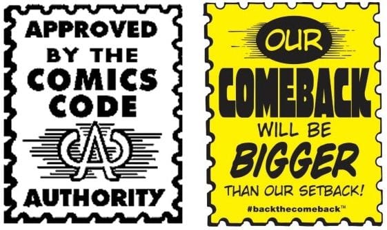
It’s fair to say that reaction to the campaign has been mixed, partly due to the logo design directly mimicking the Comics Code Authority stamp, which carries its own historical stigma.

Comeback_CCA comparison

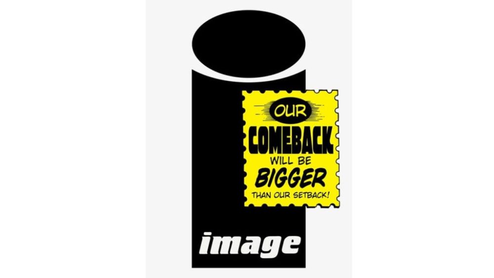
In addition, it’s unclear exactly how the campaign is intended to help the Comics Industry beyond a simple show of supportive solidarity. Regardless, Diamond has aggressively pushed to get every link in the comics supply chain on board with the campaign. In a press release issued by Diamond and coming directly on the heels of Eric Stephenson’s open letter to Image staff, Image Comics has agreed to be the first major publisher to change their covers to include the new “Back The Comeback” logo.  Full Pres Release and Image samples below:

Image Comics ‘Backs The Comeback’ With Comeback Logo Appearing on the Cover of June 17 Titles

(BALTIMORE, MD) — (June 15, 2020) — On May 13, 2020, Diamond Comic Distributors and Alliance Game Distributors partnered to launch the “Back The Comeback” campaign, a multi-part initiative designed to support local comic book and game stores as they began to safely reopen, restart, and rebuild following the easement of nationwide stay-at-home orders amid the COVID-19 pandemic. Now, as comic book and game stores across the country have resumed selling new weekly product, many publishers have rallied behind the campaign to support retailers by including the “Back The Comeback” logo on the cover of their newest titles. Image Comics is the latest publisher to support the initiative by including the logo on the cover of their June 17 on-sale titles.

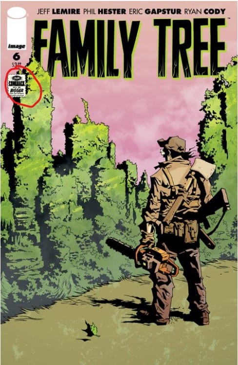
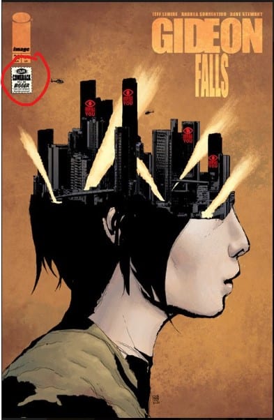
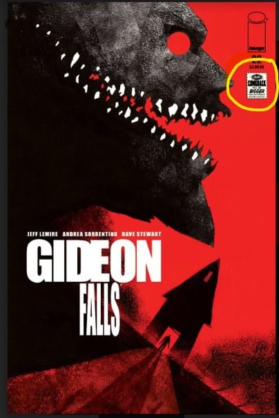
Family Tree #6 and Gideon Falls #22 from Image Comics will be hitting shelves on June 17, complete with the “Back The Comeback” featured on the front cover. Family Tree #6 (FEB200178) continues the tale of an 8-year old girl who begins mysteriously transforming into a tree, and the journey of her dysfunctional family in their attempt to find the cause of the transformation and stop it. In Gideon Falls #22 (MAR200061; MAR200062), which features the logo on the main and variant covers, the Eisner-Awarding winning series reaches a tipping point as the heroes find themselves strewn across the Gideon Falls multiverse after the destruction of the Black Barn that contained. Our heroes are up against old West, cyberpunk, and 1984 versions of their reality.

Back the Comeback in-store promotions for game stores are in the works and will be announced shortly.

Fans can head to their local comic shop to purchase a copy of these Back The Comeback support titles from Image Comics. To find a comic shop near you, visit www.comicshoplocator.com. To stay up to date on Back the Comeback announcements visit the campaign’s social pages on TwitterFacebook and Instagram or visit backthecomeback.com.

Retailers interested in placing wholesale orders for these items are encouraged to reach out to their Retailer Services Representative or contact Diamond’s New Accounts Department aT: newaccounts@diamondcomics.com.

Family Tree #6 coverGideon Falls #22 coverGideon Falls #22 (variant) cover

Image is the first publisher to take the plunge with Diamond’s badge, but will they be the last? Is Image taking this step purely in support of the Comics Industry, or is this partly in reaction to DC’s move to cut ties with Diamond? Let us know in the comments section below and share this article with your friends.

Monkeys Fighting Robots Youtube

How JEEPERS CREEPERS: TRAIL OF THE BEAST Brings the Terrifying Creature to the Page

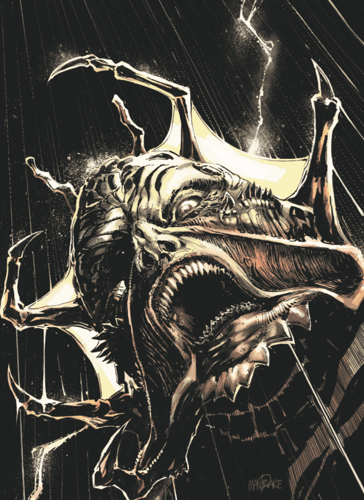
Jeepers Creepers Issue 3 Variant Cover

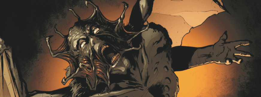
Jeepers Creepers: The Trail of the Beast from Dynamite Entertainment features the creature from the movie series of the same name in a new setting terrorizing new main characters. The question is: how does this comic book use the different medium to bring the movie monster to life?

The first Jeepers Creepers movie was released in 2001, and its popularity allowed two sequels to be made, with the most recent — Jeepers Creepers 3 — being released in 2017. Jeepers Creepers: Trail of the Beast was created in 2018, and the creators were tasked with crafting an entirely new story with the fan-favorite creature. The story follows Devon, a grad student working on his thesis about Aztec mythology. He travels to Mexico for more information, and during his search ends up creating a link between himself and the monster. Through the writing of Marc Andreyko, the art of Kewber Baal, and the colors of Jorge Sutil, Jeepers Creepers: Trail of the Beast is able to use techniques unique to the comic book medium to instill fear in the reader.

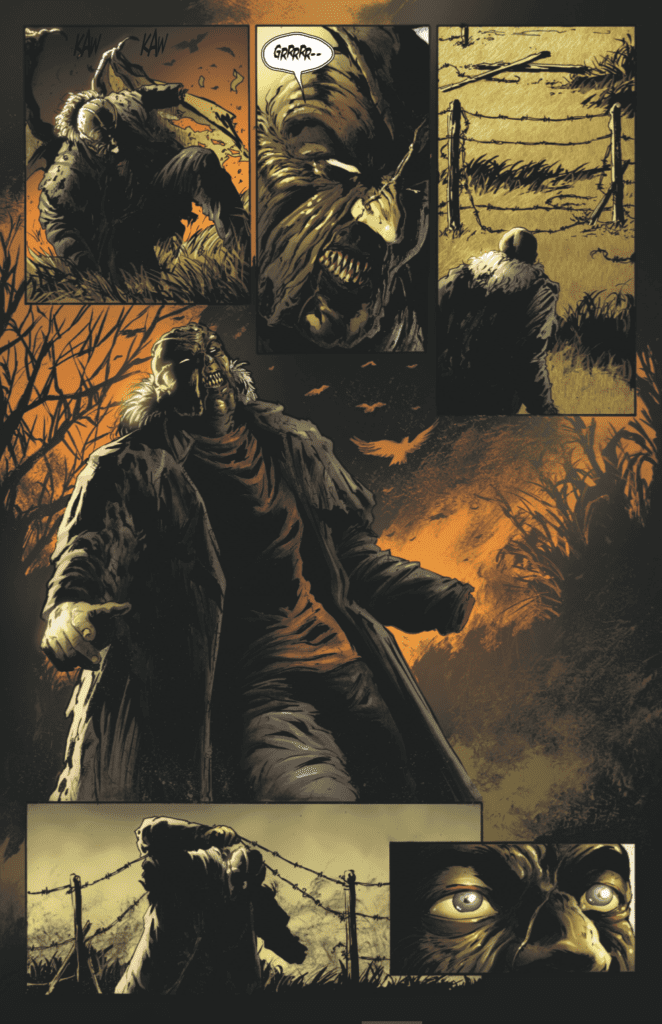
The first example we can see of Jeepers Creepers: The Trail of the Beast using the comic book medium to its advantage is through the opening. After flipping through the introductory information, the reader is greeted with a scene depicting the creature crashing to the ground from the night sky, and entering a barn in search of an unknown item. Throughout the scene, there are no dialogue or speech bubbles besides grunts or background noises, and the scene helps establish a tone of mystery around the monster. The reader can see it clearly has a goal in mind but is left to wonder what exactly the creature’s motivations are. Scenes, where words are absent such as this, are unique to genres such as film, comic books, and theater, but are especially useful in comic books. Due to the fact that comic books are composed of a series of still images, it is much easier to progress plot through words rather than actions. This makes it so scenes without dialogue are few and far between in the comic books medium, and also carry much more weight when they appear. Such happens in the case of the Jeepers Creepers opening, as well as a few other instances in the story. Jeepers Creepers Scene Without Dialogue

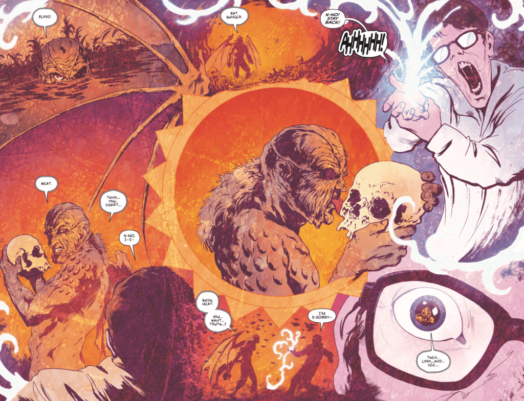
Another technique that is particularly notable in Jeepers Creepers: Trail of the Beast can be seen in the dream sequences that the main character experiences throughout the story. These scenes are done as double-page spreads that have several scenes overlapping one another, without the clear borders that are usually found between comic book panels. This helps distance these scenes from reality and adds to their impact. It is also a great example of a technique specific to the comic book medium. While dream sequences are common in almost every medium, each has various techniques that are used to execute them. The ones found in Jeepers Creepers: Trail of the Beast are beautifully executed, and it is clear to see how the overlapping panels with unique borders can only be accomplished in the comic book medium.

Jeepers Creepers Double-page Spread Dream Sequence

Whether you are a fan of the movies or not, Jeepers Creepers: Trail of the Beast is a story worth reading. Unless you are repulsed by scenes with gore, Jeepers Creepers: Trail of the Beast is a fun read full of spectacular art and thrilling writing. It is a classic monster story that wonderfully takes advantage of the comic book medium.


Are there other comic books that have characters from films that you enjoy? Let me know in the comments below!

Monkeys Fighting Robots Youtube

Image Publisher & Chief Creative Officer, Eric Stephenson: “Negligent Behavior” By DC

As reported last week, DC Comics has terminated its working relationship with Diamond Distributors due to what DC has described as an impasse in negotiations. The announcement, unsurprisingly, sent tsunami-sized ripples throughout the Comics Industry as the loss of DC’s business means a roughly 30% loss in revenue for Diamond. Whether or not Diamond can weather the financial hit remains to be seen, and DC’s competitors are none too pleased with the move; speculating a threat to Diamond’s viability is a threat to the Comics Industry itself.

It’s not unheard of, almost becoming commonplace, to hear creators lash out at publishers or other creators when something goes sideways. What is exceedingly rare to see is a publisher go on the full offensive against another publisher. On June 11th, Bleeding Cool obtained a communication Image Publisher and Chief Creative Officer, Eric Stephenson, penned to Image staff, voicing his explicit dislike for DC’s move away from Diamond. The full letter is included below.

In the letter, Stephenson accuses DC of “negligent” and “sociopathic” behavior; acting out of self-interest rather than the good of the Comics Industry as a community. [WARNING: It’s not a short letter.]

6.11.2020

Dear Creators—

“Those who do not learn from history are doomed to repeat it.” It’s true: We can either learn from past mistakes, or we can make them again.

In comics, it often seems as though we like to make the same mistakes.

Just ask DC.

Back in 1994, Marvel bought a distributor called Heroes World.

At the time, there were multiple distributors, Diamond Comics Distributors and Capital City Distribution, being the largest among them.

So Marvel bought Heroes World and then announced they would distribute exclusively through that one outfit.

DC’s response was to sign an exclusive with Diamond.

That prompted Archie, Dark Horse, and Image to negotiate with both Diamond and Capital for exclusives.

Diamond made the better offer.

Viz and Kitchen Sink signed exclusives with Capital, but by 1996, Capital’s business was failing and Diamond bought them out.

A year later, Heroes World went out of business, too, and Marvel returned to Diamond.

Why Diamond?

Well, Diamond was the only distributor left by that point. Sure, there were some small distributors handling indie and alternative titles, but they didn’t carry anything from the major publishers. For a publisher of Marvel’s size, Diamond was literally the only remaining option when Heroes World went out of business in 1997.

And lest we forget, Marvel was in bankruptcy at the time.

So here we are in 2020, with the world in something approaching the worst shape it’s ever been in, and DC has forgotten this bit of comics history and chosen this moment to leave Diamond.

You’ve no doubt read their statement about how this move was intended to strengthen the marketplace.

Pardon the profanity, but that’s bullsh-t.

This is a hasty, sociopathic decision made by people who do not care about the long-term welfare of our marketplace, let alone about comics.

The good news is that just as Marvel wasn’t capable of destroying our industry back in 1994, DC – still a distant second to Marvel after all these years – isn’t going to, either.

Some of you are concerned about Diamond’s continued stability after losing DC’s business, but the truth of the matter is that DC is around 30% of Diamond’s comics business, and Diamond doesn’t just deal in comics.

In addition to distributing comics, Diamond also distributes toys, games, and other merchandise, with games in particular being an increasingly large part of their business. Diamond owns a games distributor – Alliance Games – which services roughly half the number of accounts that make up the comics market and their business has been fairly robust.

As far as comics are concerned, though, the rest of the marketplace accounts for 70% or so of Diamond’s Direct Market business.

That doesn’t mean this isn’t going to be a challenge for Diamond and for the rest of the marketplace, but it’s not quite the deathblow so many seem to fear.

That fear, though – the fear that has prompted emails and texts from so many of you, and which has been coursing through the retail community since the news dropped last Friday – underscores something that should alarm everyone in comics:

DC did this without any consideration for how it would affect the rest of the marketplace.

There’s a great Maya Angelou quote that along with the quote I opened with, is one of my all-time favorites:

“When someone shows you who they are, believe them the first time.”

Generally speaking, when a publisher leaves one distributor for another, there is a transition period. Inventory and data are transferred, accounts are taken care of – everything is done with careful planning so that all involved parties can move forward with peace of mind.

When Marvel bought Heroes World and pulled their business from their other distributors, they gave notice. Not in terms of days, but months.

That is not what happened here.

With everything going on right now – not just a global pandemic that has left our economy on the brink of depression, but an unprecedented number of nationwide protests against police brutality and institutional racism – DC decided to blindside Diamond and the rest of the industry with their decision to end a decades long business relationship.

They’re the second largest publisher of comics and graphic novels in the United States, owned by one of the largest telecommunications companies in the world and financially more secure than almost any other publisher in comics.

They didn’t have the resources to give even a few months notice? Not just out of professional courtesy, but out of consideration for the rest of the retail and consumer marketplace they will continue to operate in regardless of who distributes their comics?

Ultimately, what this all boils down to is distributor confusion causing retailer panic and disarray, and at the end of the supply chain, you have BATMAN readers wondering what in hell is going on.

And embarrassingly, it’s nothing more contrived than negligent behavior and a deep lack of business acumen and poor internal leadership. This might be forgivable from a smaller company with fewer resources and less history in the market, but not from a publisher of DC’s stature.

To put that in perspective: There are Image creators who have requested that we hold off on promoting their work because they think it would be tone deaf against the backdrop of current events—but DC made this move as though they were not only tone deaf, but completely oblivious to anything other than their own ambitions.

Our industry is more than one publisher, though, and we will get through this.

Should something happen to Diamond, we aren’t without our options, both within the Direct Market and the book trade, but as of now, the hope is that exploring those options won’t be necessary. Should that change at any point, we will let everyone know.

I have spoken with Steve Geppi and members of the Diamond team about what’s happening, as has Image’s President, Todd McFarlane. Our takeaway is that while there will definitely be some challenges ahead for the marketplace, Diamond is not on the verge of collapse.

Someone asked me if Image is still being paid by Diamond, and we are.

Back when Diamond stopped shipping due to COVID-19 and the various statewide stay at home orders, that action – frustrating though it was – prompted Diamond to set up reduced payments to publishers.

The way those payments were structured meant that for eight weeks, we received 25% of what we were owed for sales made from late January to mid-March, with the remaining 75% to be paid out over the following eight weeks.

While that wasn’t ideal at the time, the payments we are now receiving are making up for the period when stores were not receiving new product, and we are well on our way back to something approaching “normal.”

We’re almost a month into shipping comics again and, while not all stores have reopened yet, the drops in our books’ orders have been relatively minor. Some titles’ orders have actually increased from what they were at pre-COVID.

In other words, there are reasons to be hopeful.

That’s not easy for everyone, and that’s understandable.

Image isn’t owned by AT&T or Disney.

Image doesn’t have an overall first look deal with Paramount or Netflix or Amazon Studios or Legendary or HiveMind or any of the other IP farms with little actual interest in selling comic books.

We’re not like everybody else.

When Image first started, there were many who accused the Image Founders of leaving Marvel and setting up their own company out of self-interest, and given how incredibly successful Image was in the beginning, they could have easily just produced their own comics and left it at that.

What they did instead, though, was invite their fellow creators to join in building the company they’d started, or as Image’s former Executive Director Larry Marder once put it, “to cast off their work-for-hire shackles and join the revolution.”

As a result, Image doesn’t operate like other publishers—least of all, Marvel and DC.

That makes publishing with Image a little daunting at times, because “not like Marvel and DC” can sometimes be construed as “I have to do everything myself and I don’t get a page rate and what if nobody buys my book and I never make any money doing this and will I ever be able to get a job anywhere else again if this doesn’t work out?”

But Image has been the company it is for going on 30 years now, because it offers creators the same independence Rob, Todd, Jim, Marc, Erik, Whilce, and Valentino craved for themselves back in 1992.

It isn’t always easy, and that independence is at times fraught with hardship and uncertainty, but that independence is what makes it possible for everyone – from a relative unknown at the beginning of their career to a bonafide superstar – to work with Image, instead of for Image, and share the same opportunities.

Or at least the opportunities they want to share.

There is no one way to do things at Image – no masterplan. What looks like an opportunity to one creator may seem like trouble to another, and vice versa.

When the company first started, the founders themselves had a single rule, which was that no partner could tell another how to run their business.

To a large degree, that extends to the company’s philosophy toward the creators we work for and with. For some, that’s liberating, but for others it’s frustrating.

The bottom line, though, is that the idealism that launched the company with such fanfare all those years ago is the same fuel that propels Image along now.

We use the word “creator” a lot – we publish creator-owned comics, so it’s hard to avoid – but something that isn’t said often enough about Image and its founders is that they love comics. They didn’t become the biggest names at Marvel by accident or spend years at their drawing boards prior to that because they had a passing interest in drawing.

Without exception, they loved comics, and it was through their mutual affection for this medium and their shared frustration with the business that had developed around it that they came together to start a company that, frustrating though it may be in its own way, was better than the rest.

Not a company that exists as a line item on a spreadsheet amidst some larger corporate entity’s other investments, not as part of a plan to harvest ideas for other media as an end to itself, but as a fully realized vision of what can happen when people who genuinely love what they do come together as a group.

So getting back to DC, and where the comics industry has suddenly wound up as a result of their decision to dissolve their distribution agreement with Diamond, this isn’t the first time one of our industry’s “Big Two” has shown us who they are, and as history has proven repeatedly, it’s probably not the last.

That’s scary and it’s stressful for all of us, but at the same time, moments like these are why Image exists.

We believe in comics, we believe in this industry, and we believe in you.

And despite how bleak things may look now as we shelter in place and worry what surprises tomorrow might bring, we believe there are better days ahead.

Sincerely,

-e.s.

Eric Stephenson
Publisher
Image Comics, Inc.

What do you think, intrepid MFR reader? Is Stephenson speaking out for a just and righteous cause, or is he a competitor taking petty, cheap shots? Let us know in the Comments section below, and share this news on social media to make your opinion heard.

Monkeys Fighting Robots Youtube

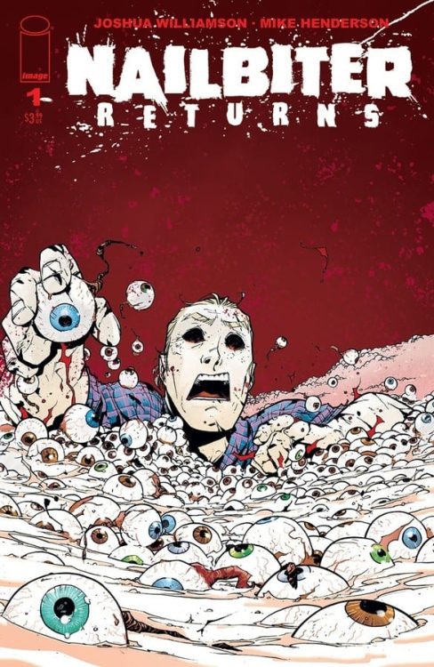
Interview: NAILBITER: RETURNS With Joshua Williamson & Mike Henderson

nailbiter

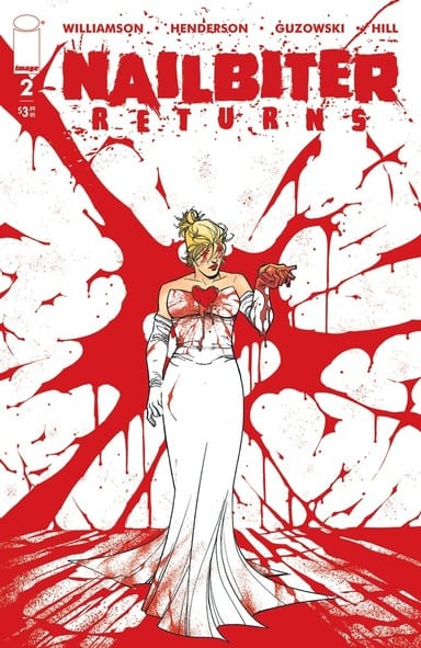
Nailbiter: Returns #1 hit your local comic book shop early this month and issue two drops July 1, thanks to Image Comics, Monkeys Fighting Robots was able to chat with the creators; writer Joshua Williamson and artist Mike Henderson. The duo talked about what goes into making a good horror sequel.

About Nailbiter: Returns:
Sixteen of the world’s worst serial killers were all born in the same small town…but Agent Finch and Sheriff Crane solved and buried that mystery. Didn’t they? Violent copycat murders imitating the infamous Buckaroo Butchers have begun in Portland, Oregon, and if Finch wants the killings to stop, he’ll have to team up with the daughter of the Nailbiter himself.

Joshua Williamson & Mike Henderson

MFR: Joshua and Mike – As soon as I hear about a horror sequel, the three rule pop in my head:

  • The body count is always bigger.
  • The death scenes are always much more elaborate, with more blood and gore.
  • Never, ever, under any circumstances, assume the killer is dead.

How have the rules of SCREAM 2 influenced NAILBITER: RETURNS?

WILLIAMSON: 100% YES. Of course. And yeah, we’ll have all of that. We do get a bit crazier in this volume. And WAY more action. I feel like some of the best horror films added a lot of action in the sequels, and we did that here as well.

HENDERSON: We have a LOT of ground to cover to rack up a bigger body count than the original Nailbiter, but I think we’re in observance of the latter two rules. RETURNS is about making the reader say “ick” out loud, but a different sort of “ick” than the original.

Interview: NAILBITER: RETURNS With Joshua Williamson & Mike Henderson

MFR: Joshua, what is the mental transition like going from the moral compass of the DC Universe (The Flash) to a slasher horror comic (NAILBITER: RETURNS)?

WILLIAMSON: Going back to Nailbiter is like going home. It’s home cooking for me.

I usually separate the two books out by weeks. If I had to work on them both on the same day, it would be hard. Because they are SO different in tone.
So, I usually have a week set aside from Nailbiter. Watch some horror. Read some horror. And all my books have playlists that help get my back in that state of mind.

It’s the same with Flash. But I’ve also written more of Flash than anything else in my life, so I know how to dive right back into that mindset and world when it’s the right time.

Both books are driven by a voice. Nailbiter is Warrens, and Flash’s is Barry. Once I can hear their voices in my head, I’m ready to roll.

Interview: NAILBITER: RETURNS With Joshua Williamson & Mike Henderson

MFR: Joshua and Mike – The background of the panels go from dark to light, and then back to dark. Can you talk about the color palette Adam Guzowski used for the first issue?

WILLIAMSON: Mike and Adam have worked with each other for years now, and have a good relationship and communicate well. My only real direction on this arc was to make sure we spent time on scenes in the daylight, as the idea of horror in the sun is important to this story.

HENDERSON: We had settled into a familiar palette over the 30 issues of NAILBITER and tried to shift a bit in RETURNS. I remember discussing a warmer, Halloween-esque palette with Adam, but he does a great job of using what the mood calls for. We also switch back and forth between white and black panel gutters, at times using black to close in a claustrophobic way on the reader and white to open things up and relieve tension when it’s called for.

Interview: NAILBITER: RETURNS With Joshua Williamson & Mike Henderson

MFR: Mike, I read the book in digital form, so I just scrolled down to read, but I noticed how you used the page turn to set up scares. Can you talk about creating horror in comics?

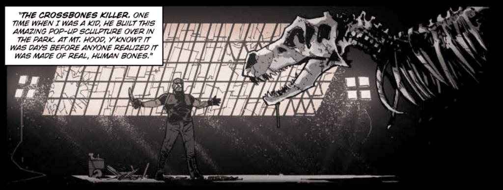
HENDERSON: The page turn is one of the more potent tools in comics, and one of the few in horror comics that are transferable from film. It can work as a reveal or a jump scare in a way that a panel to panel sequence can’t and is usually the difference between eerie horror and the kind of slasher horror that team NAILBITER specializes in. It’s tricky stuff!

Joshua Williamson & Mike Henderson

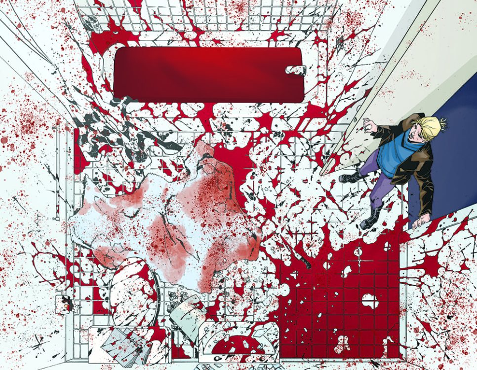
MFR: Joshua, what was your reaction to seeing the finished version of the bloody bathroom splash page (above) for the first time?

WILLIAMSON: That moment is actually in Issue 30 as well. We showed it twice there, and Mike copied that moment to tie it all together. My FIRST reaction was… “MORE BLOOD.” And then we added more blood. But then because it does connect to the original series it was a nice sign that we were on the right path with the story.

MFR: Mike, the bloody bathroom splash page is brutal elegance; can you breakdown this page and what you were trying to accomplish?

HENDERSON: This was in part a way to throw new readers into the deep end of Nailbiter, but also reward everyone who’s been with us since the original series. But, as always, I had to ratchet whatever we did from the first time from 10 to 12. Then hand it over to Adam to ratchet it up to 14 or so. It’s always a team effort.

Interview: NAILBITER: RETURNS With Joshua Williamson & Mike Henderson

MFR: Joshua and Mike – The musical score in a horror film is a big factor in building tension. How do you create tension in a comic book?

WILLIAMSON: I think about this a LOT. A LOT. I love horror films. And I think about what happened with the original Halloween a lot. How John Carpenter would do test screenings and showed the producers a cut and they hated it. Then he quickly put together the classic score and theme, and placed it on the movie. The producers thought he did a huge edit and felt it was MUCH scarier. But it was JUST the music added. It does speak to how the sound is important. SO instead, we play with the silence. The lack of any sound. Play with the fact that the reader can’t hear what the characters hear. It’s fun.

HENDERSON: It’s a tricky balance, slowly ramping up the sense of dread in a comic. I think one of our not so secret weapons is humor, which I think lets the reader take a breath every once in a while before we start squeezing the breath out of them again. Why can’t we have a musical score??

Nailbiter: Returns #1

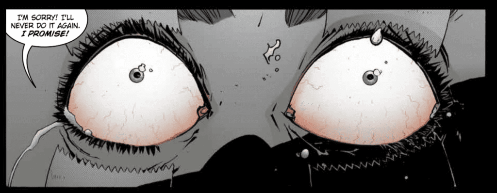
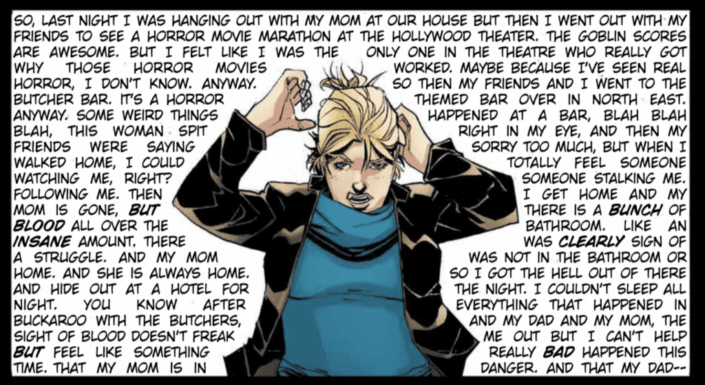
MFR: Joshua and John J. Hill – The panel above stands out from the rest in NAILBITER: RETURNS #1. How do you get me to read it very fast and be out of breath by the end of the panel just like Alice?

WILLIAMSON: Because John is great at his job and found a way to take a crazy idea and make it work. Haha. My original plan was to do it as one HUGE word balloon, but Mike had the idea of having it fill the background of the panel. The first pass and lettering it wasn’t working, and I had to add MORE dialogue to get the idea across. John made the madness there work like he always does.

JOHN J HILL: When you remove the background and any familiar devices like captions and word balloons, wall to wall text behind the character(s) becomes overwhelming and, in some ways gives off a claustrophobic vibe. It’s been done many times and isn’t innovative or anything, but definitely works when you’re trying to convey a sense of bombardment. This was Josh’s suggestion; I just did my best to make it work with what Mike and Adam did.

Interview: NAILBITER: RETURNS With Joshua Williamson & Mike Henderson

MFR: How much world-building is involved with NAILBITER, and how far do you see the series going? Are we talking FRIDAY THE 13th territory (11 films)?

WILLIAMSON: We have a plan for an “ending.” I don’t see us going THAT deep into the series. We won’t return that many times.

As for World-building. A lot of it is about the cast and then building out from there. Having fun with the horror. The main world building was done in the first series. We actually have a lot of behind the scenes world-building and history that never makes it into the book or on the page. Which might help the book feel lived in.

MFR: Joshua and Mike – The events of COVID-19 and loss of life is a massive moment in time. How will this impact your future creative process and or work?

WILLIAMSON: It’s hard in a lot of ways. Thankfully, I’m busier than ever. Able to find ways to focus there. A lot of people depend on me to get the scripts in, which allows them to work, so I’m doing the best I can to keep the trains running. I had a few creator-owned books I wanted to do in the future that actually leaned a bit too close to some of the things we’re experiencing now. Not exact. But feels…too close. So those went on the back burner for a long time. Otherwise, I’m really busy with work and trying to keep moving. Thankful for the work and the creative opportunities and output I have now.

HENDERSON: The loss of life and the huge changes in everyday life have put my process into stark perspective. I still love working traditionally and have no plans to ever stop fully, but if nothing else, with a new family, it has highlighted just how important my time is. Working on some projects digitally could help me take back some of that. But for my work overall, it’s also put in stark contrast the work we own and the work we don’t, and just how valuable a balance of the two can be to having any kind of longevity in this era of comics.

MFR: Joshua and Mike – Furthermore, with the COVID-19, the comic book industry is at an evolutionary moment. What do you think the comic book industry will look like in 10 years?

WILLIAMSON: Hopefully, something NEW and growing. My first job was at a comic book store when I was a kid, 25 years ago, and I’ve seen the industry go through some crazy times. Nothing like this. This feels new and we’ll never go back to what was before. But I believe in comics and in the people who make them. There is no reason to go back to “normal.” We can work to create a better future in comics. It’s interesting how much comics has changed in the last ten, twenty years. But I do know I’ll still be making comics.

HENDERSON: Now that Diamond has reasserted itself as more or less the sole distributor for the entire industry, I expect it will look very much the same for creators in terms of how vulnerable we are to the weaknesses of a business model that is essentially a line of dominos. But, I think, if creators are smart and organized (and a little lucky), we might be able to make sure we don’t go down with the ship the next time it starts sinking. I don’t pretend to have the Marshall Plan for comics but the point remains: great books are still going to be getting made by great creators, but the health of the industry, especially its most vulnerable members, hinges heavily on making sure this never happens again.

MFR: Thank you again for your time, and best of luck with NAILBITER: RETURNS!


Did you read Nailbiter, are you excited for the sequel? Comment below with your thoughts.

Nailbiter

Monkeys Fighting Robots Youtube

KILLING EVE – Beautiful Monster | TV Review

The third season of Killing Eve is reaching for its end game with the penultimate episode “Beautiful Monster.”

Despite being injured in her last mission Villanelle gets assigned another assassination by Hélène (Camille Cottin). In London, Carolyn looks for evidence that her boss is a member of The Twelve, and Eve discovers a potential way to find Villanelle. Konstantin’s plans to escape gets complicated when his teenage daughter gets incarcerated in a Russian psychiatric unit.

“Beautiful Monster” had a terrific opening where a Villanelle meets Hélène when she assigns her the mission. Hélène flirts and intimates Villanelle during their meeting: the French woman even seductively touches Villanelle’s wound. This scene showed more of Villanelle’s vulnerability where she reveals she has doubts, but when quizzed further, she deflects with a joke. What Villanelle says to Hélène was typical for the assassin, but it was framed in a sad manner. She uses humor as a defense mechanism.

Villanelle’s doubts were explored further when she goes on her assassination mission with Dasha. Dasha states to Villanelle that the assassin has lost it and was unable to kill. Villanelle nearly blew her last mission, broke down in front of Dasha, and told her handler she wanted to leave. If Eve regained her mojo in the previous episode, Villanelle has lost her. Villanelle and Dasha had some funny exchanges when they were in Scotland. Dasha was bitter towards Villanelle, and Villanelle did her usual combination of jokes and deliberately alternating a plan.

Eve, Bear, and Jamie made for a great comedic trio in this episode. There had some funny moments before this episode, yet “Beautiful Monster” takes it to the next level. It starts with Eve searching in a dumpster, and Bear makes some oblivious comments. The trio was a great team when they were looking at a lead to find Villanelle. This combination of witty dialogue and espionage activities, as displayed here, was one of the main reasons why people loved Killing Eve in the first place.

Jodie Comer as Villanelle, Harriet Walter as Dasha – Killing Eve _ Season 3, Episode 7 – Photo Credit: Laura Radford/BBCAmerica/Sid Gentle

Carolyn also shows her wit again in her first scene of the episode. She decimates Mo and Eve during their breakfast meetings. Carolyn basically called them stupid in her own biting way.

Konstantin suffers a lot of stress in this episode. He’s feeling the heat from many different directions. He has to keep doing his duties for The Twelve or else raise suspicion and try to maintain his relationship with Geraldine so he can pump her for information. His early interactions with Irina were the most interesting in the episode because he has to confront the fact she’s similar to Villanelle. Irina is intelligent, and a master of languages, but has no empathy. During Konstantin’s visit, Irina was nonchalant despite being surrounded by teenagers with personality problems. Konstantin was normally able to get her out of trouble, but not this time.

“Beautiful Monster” was one of the best episodes of the season so far. It was a great package of humor, character development, and espionage and sets up, hopefully, a great finale.

Monkeys Fighting Robots Youtube

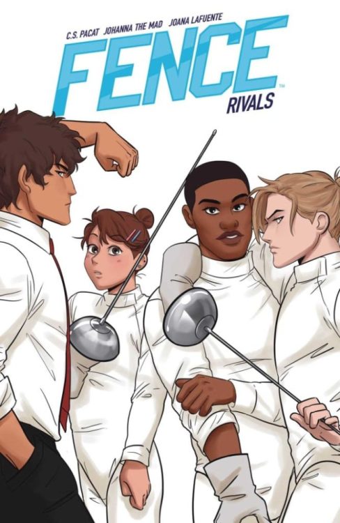
Preview: FENCE RIVALS Building Tension And Growing Friendships

Fence Rivals Cover Art Credit: BOOM! Studios

Making the move from monthly titles to Original Graphic Novels, Fence returns for a fourth volume later this year (expected 30 June 2020). Published under BOOM! Studios Boom! Box imprint, Fence continues the adventures of a college fencing team and the relationships that emerge during the training.

The first 12 issues of Fence were witty and entertaining with a wonderful cast and found a loyal audience among young adults and the LGBTQ+ community. The questions are, has the shift to the graphic novel format affected the story and is the longer wait between chapters worth it?

Volume 4 picks up directly from where Chapter 12 ended with Seiji face to face with his nemesis Jesse. Something happened between the two world class fencers that forced Seiji to join the Kings Row private school and it’s underdog fencing team. What that was and how it affects Seiji’s relationships with his new teammates forms the backbone of this volume.

Fence #4
Fence #4 Credit: BOOM! Studios

Character Development

The first thing you will notice is that virtually nothing has changed. The Graphic Novel is split into chapters continuing with number 13. If you were only reading the trade collections of Fence you wouldn’t even realise that anything was different. I suspect that one of the reasons for dropping the monthlies is that the collected volumes were selling considerably more. Passed Fence arcs have proven to work better in bulk so it is no surprise that BOOM! Studios would move to an annual release instead of monthly ones.

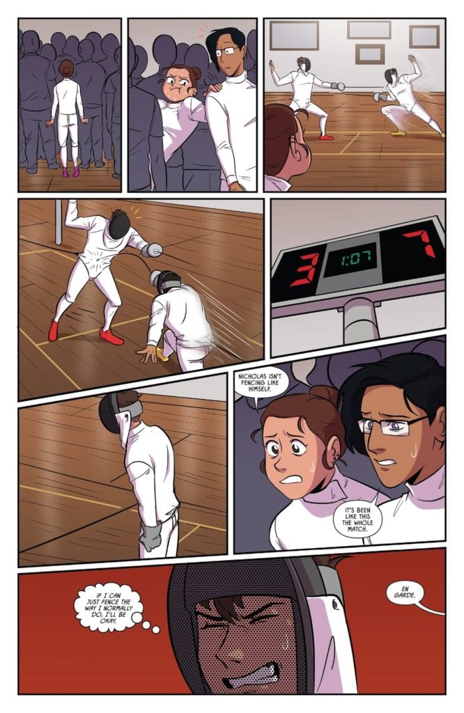
The first chapter of the novel is given over to illustrating the rivalry between Seiji and Jesse but writer C.S. Pacat makes sure that the focus isn’t entirely on these two characters. The reactions of the rest of the team are as important as the demonstration match that the two are putting on. Most importantly is how the main character, Nicholas, is affected by seeing the two rivals fencers. It makes him realise that he lacks so much skill and that the passion he has might not be enough to beat his own rivals.

The title of Volume 4 is Rivals for a very good reason. The story revolves around characters who are at odds with each other. However, this also allows Pacat to grow the relationships between friends as well as enemies. Most notable, and evident from the first chapter, is how the dynamic between Nicholas and Seiji changes. By giving them the same goal to fight towards, it brings them together in a new and exciting way. Their friendship is allowed to evolve beyond the initial rivalry that brought them together.

Pacat doesn’t forget about the rest of the cast and still allows everyone to play a part. She focuses on the strengths of the characters and weaves a number of different story-lines around the central narrative. This means that no matter who your favourite character is, they don’t get left behind.

Fence #12 Credit: BOOM! Studios

Rendered Fencers

By the time you get to the fourth volume you should know what to expect from the artwork. Johanna The Mad hasn’t changed the style of presentation from issue one to now. There is a certain Manga influence to the work that is clear almost from the beginning but this is part of Fence’s appeal. The audience this comic is aimed at are more likely to be reading manga serials than DC Superhero comics.

The straightforward character design has always been a high point in Fence and continues to be here. Johanna The Mad appears to be using more and more cartoonish renderings throughout the story to emphasise the humour and the child like nature of the characters. Johanna The Mad is able to do this because the reader has become accustomed to the drawing style and the design of the characters. There is no confusion caused in the reading because of these sudden shifts. In fact, they enhance the storytelling because they reveal so much about the characters depicted.

The coloring is the easiest element of this comic to overlook. Joana Lafuente has to deal with so much white because of the fencers uniforms that she has to create emotional backgrounds instead of realistic renderings. Lafuente favours block coloring with very little shade or shadowing but this suits Johanna The Mad’s thin inked lines. The characteristics and emotional outbursts become clearer because of the alternating colors behind the characters. Especially during bout scenes where most of the fencer is covered in a white protective suit; the backgrounds act as the emotional outlet for the character.

Lettering

Jim Campbell and Taylor Esposito have a lot of work to do with the lettering. A large part of Fence’s style comes from the way that the characters interact and how certain ideas are presented on the page. In a lot of cases this falls to the lettering to create that specific look.

The interaction with speech is important, with the placement of the speech balloons providing the tempo for the conversations. However, it’s not just placement that makes these interactions so energised, Campbell and Esposisto use a range of balloon shapes and tweak the text to indicate inflections and whispers. They have created rich and varied voices for the characters, producing personality and individualism.

This is before you even begin to look at the none speech element of the lettering. So much of the Fence world relies on visual design and Campbell/Esposito have given 100% to make the comic look and flow effortlessly.

Fence #9 Credit: BOOM! Studios

Conclusion

Fence has already got a dedicated fan base who will love this new addition. It has been nearly a year since Volume 3 was released but the moment you start reading all of the previous story comes flooding back. It feels as if there has been no gap at all.

This new chapters encapsulates everything that made the first 12 issues popular while substantially moving the narration forward. There is a greater sense of importance on the fencing matches as the Kings Row team move out into the world. In response, the creative team have pushed the design and storytelling to greater heights, improving on previous arcs.
From a story point of view, this will appeal to anyone who enjoyed previous chapters. From a comics view Fence will appeal to people interested in the storytelling craft, especially lettering. Everything is laid out with such care and attention that it is difficult not to become enamoured with the world of Fence.

Monkeys Fighting Robots Youtube

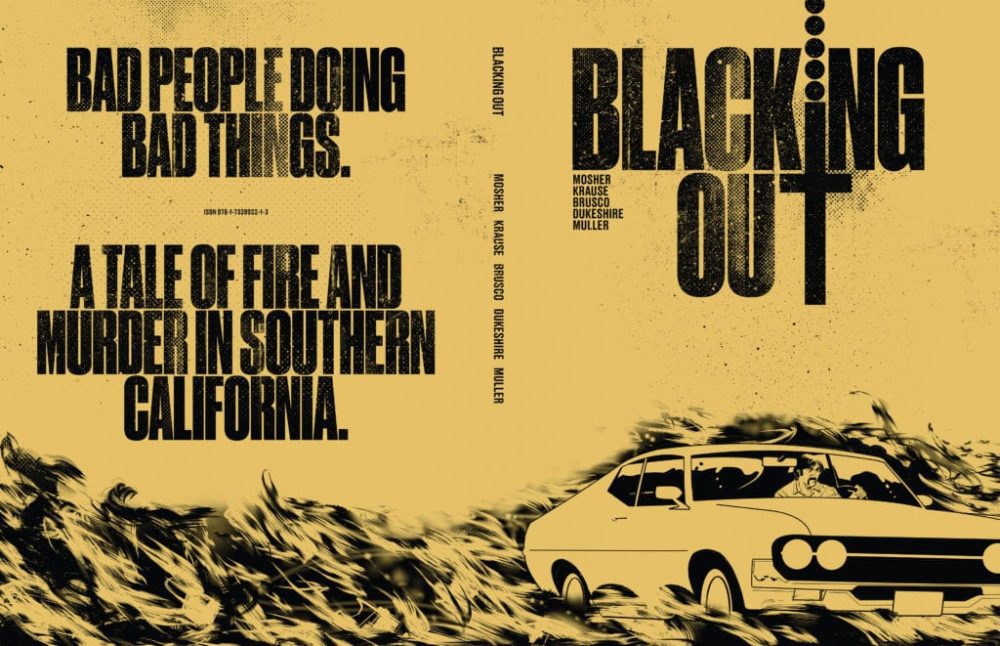
Graphic Novel Review: A Fiery Noir Tale in BLACKING OUT

Writer Chip Mosher teams with artist Peter Krause (Irredeemable), colorist Giulia Brusco, and letterer Ed Dukeshire to tell a 70’s grindhouse-noir tale full of fire, booze, and woe in  Blacking Out. This Kickstarter graphic novel is a sharp read full of questionable folk, an ever-thickening plot, and stunning artwork. This all culminates in what has got to be one of the most insane twists in recent years – in this or any medium.

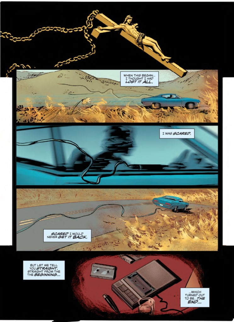
” Disgraced ex-cop, Conrad, seeks redemption by unraveling an unsolved murder during Southern California’s fire season. Connie follows a lone clue—a discarded crucifix—to unravel the death of Karen Littleton, whose body was found amid a blaze that scorched 10,000 acres. The search leads Connie to clash with the victim’s father and prime suspect, Robert Littleton, as well as hostile former colleagues on the local police force. All the while, Conrad combats his consuming alcoholism and fading faculties.”

Writing & Plot

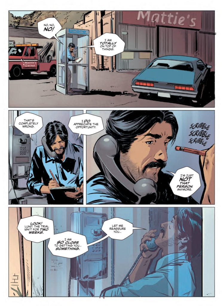
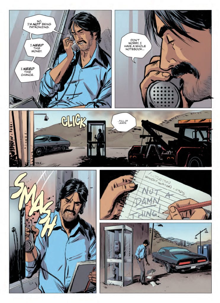
In true crime-noir fashion, the protagonist for Blacking Out is a down on his luck ex-cop who meets a beautiful woman and decides to try and turn his life around when an investigation falls into his lap. Also in genre fashion, none of the characters including Conrad himself can be trusted to divulge the whole truth about anything at any time. This is a pressure cooker of a crime tale, with a slowly-building plot that makes the most of its 56-page runtime. The backdrop of a burning California landscape that encroaches on the setting is a clever plot-device that adds to the building tension of Connie’s investigation. Most of Connie’s “investigating” involves finding suspects and beating them until they talk, which is, of course, as it should be in a grindhouse crime comic. Conrad’s backstory is delivered in tidbits of both internal narration and meetings with old acquaintances. None of these moments feel bloated or forced, which is tough to accomplish in such a short format. This being said, Blacking Out is a plot-driven tale that uses characters as a vehicle rather than being character-focused. This is the case for most noir-tales with questionable characters, and this still makes for a wholly engaging comic for fans of the genre. The plot twist in the final pages is…impressive, to say the least. It’s a left hook that approaches insane twists the way they should be, with a trail of seemingly innocuous breadcrumbs that assemble to form a complete picture seemingly out of nowhere, just as you realize it was staring you in the face for the whole story. It’s brilliant. If there was any small complaint, it would be that Connie’s romantic interest, Anita, would be fleshed out more as a character. Most characters in the novel fill specific roles for the advancement of the plot, while Anita is the whole reason Conrad wishes to better himself and solve this case. She isn’t a bad character in any way, and her hold on Connie is compelling, I just wish she had been given more time in the story. This small complaint aside, the storytelling is solid grindhouse crime noir with enough grit and atmosphere to please any fan of the genre.

Art Direction

Blacking Out is gifted with the immense artistic talent of Peter Krause, best known for his work on  Irredeemable and  The Power of Shazam. His work here is as stellar as ever, with stellar character animations and detailed environmental drawings. Krause’s visual style here could be considered a more picturesque realism, which creates a cinematic perspective to pull the audience in. Due to noir’s history in film, this is a wise artistic choice, and it makes this graphic novel easy to get lost in. Much of the visual pull comes from Giulia Brusco’s colors which, aside from providing the dimension for the settings, has a sort of film grain aesthetic. This, along with the kind of smoky fog left in the air by the surrounding fire, makes Brusco’s work integral to the book’s visuals. She and Krause’s work here in  Blacking Out is excellent and makes for a seamless read from an artistic standpoint.

Blacking Out is a gripping and entertaining crime-noir graphic novel that makes the most of its 56-page length. Chip Mosher’s script is sharp and tautly paced, lined with gritty narration and ending in one of the most memorable plot twists I’ve seen in any medium. Peter Krause and Giulia Brusco’s artwork, along with Ed Dukeshire’s solid lettering, makes for a visually superb experience that keeps the reader pulled into the heat of the story and its ever-thickening plot. Back this grindhouse affair on Kickstarter to get yourself a hardcover full of woe and fire in a burning California landscape.


Monkeys Fighting Robots Youtube

Review: PROJECT SUPERPOWERS OMNIBUS VOL. 3 Is Packed With Super-History

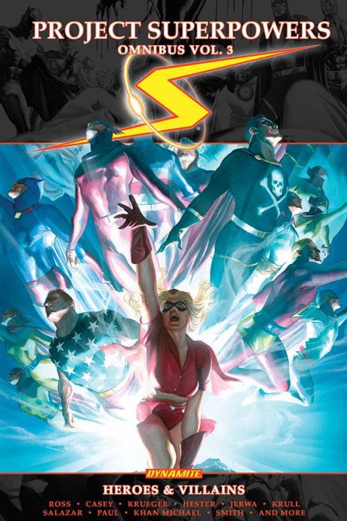
Proj Superpowers Omni Vol. 3, Ross cover

PROJECT SUPERPOWERS OMNIBUS VOL. 3, available now from Dynamite, releases the WWII-era superheroes from Pandora’s Box into a near-future present that’s evolved without them. The heroes work to re-establish their place in the world, fight both old and new villains, and uncover the mystery of who trapped them for so long and why. This is a wholly original universe created by Alex Ross brought to life by a small army of writers and artists. Does the seminal artist’s creative vision hold up?

Cover Art

Alex Ross handled the cover art for both the Omnibus and the individual issue covers that encompass the collection. Ross’ covers are photo-realistic, inventive, colorful, and heroic. Everything you’ve come to expect from an Alex Ross painting is on full display.

Writing

As mentioned in the introduction above, a small army of creatives helped bring Ross’ vision to life, so rather than touch on each writer’s contributions separately, we’ll focus on Ross’ story plot.

Ross’ collection is told through a collection of solo one-shots, single-character multi-issue arcs, and team-up adventures. It’s a LOT to take in, and that’s the only flaw with the universe Ross has constructed. There’s a bit too many characters doing too many things all at once.

In total, you have a mix of stories that include 21 separate heroes of assorted rank and 26 villains the heroes encounter throughout time. Also, the characters don’t have a particularly inventive range of superpowers to make them distinctive, with a few exceptions. Most boil down to the typical set of flight, strength, invulnerability, and elemental (water, electricity, fire) manipulation. Thankfully, the omnibus comes equipped with a few cheat sheets to help new readers keep all the characters straight.

So many characters you need a cheat sheet? Vanilla powersets? “Why bother?” you may ask, but that’s not the power (pardon the pun) of this story. Ross effectively leapfrogs decades worth of canon and world-building to plop the reader right into a universe that carries the weight of it’s own history in just a fraction of the pages. Most publishers develop their stable of characters over years before having some Earth-shaking crossover event that changes everything. In PROJECT SUPERPOWERS, you start with the big crossover event and are introduced to a whole world you never knew existed. It’s like being introduced to long lost family members you never you knew you had.

The plot and structure is so steeped in lore, every story is satisfying in and of itself. and yet, each story peels back only a sliver of the larger universe waiting to be explored. It’s quite a remarkable feat to bring it all together. It’s not perfect. The reader can easily get confused following all the parallel threads, but the end result is wholly entertaining.

Pencils/Inks

Again, a slew of artists contributed to this collection, so for the remainder of this review, we’ll focus on the overall quality of the art aspects rather than refer to any single creator’s work.

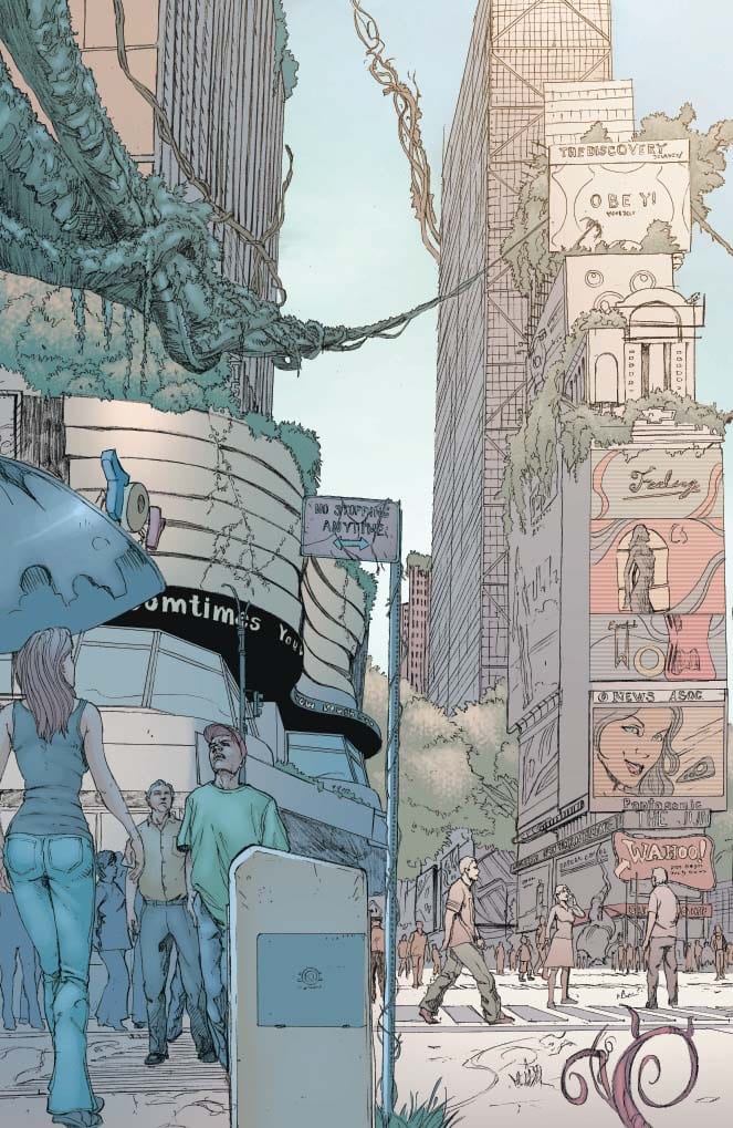
Set your expectations now. This is an Alex Ross creation, and Alex Ross painted all the covers, but Alex Ross did not do the internal pages. In that regard, the art is consistently inconsistent from one issue to the next. All issues are good-to-great in fleshing out this new world, but some are more distinctive than others. The sharp line work and pencil shading in Death-Defying Devil is stellar, while Masquerade’s myriad of costume changes (she goes through several) in her origin story captures the essence of her WWII origins without looking dated.

Proj Superpowers Omni Vol. 3, art sample

Despite the  range of artistic voices, at no point did the quality of the art suffer. You simply get a different perspective…a different flavor…of Ross’ world with each new issue.

Coloring

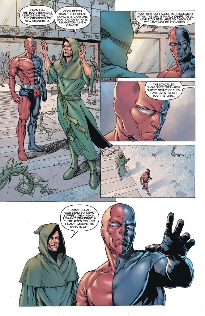
The coloring for most of the omnibus is muted, and that’s a positive. Ross deliberately designed his characters with costumes that reflect a bit of the simplicity of superheroes from the early 20th-Century. By modern superhero designs, the costumes look a bit outlandish. Like something you’d see in a circus sideshow. Therefore, keeping the colors  muted keeps the outlandish aspects of the costumes a little more grounded to prevent distraction. At the same time, the muted colors add a grainy, nostalgic quality to the panels to give the impression you’re watching an old movie serial from the 1940’s, which fits perfectly in the aesthetic Ross was going for in the designs.

Proj Superpowers Omni Vol. 3, color sample

Lettering

There’s a lot of lettering going on to cover the multitude of threads. You have characters conversing, inner monologues from each character trying to figure out what happened while they were trapped for 65+ years, and action box narration with exposition to fill in the gaps. While the artwork tended to vary from story arc to story arc, the lettering was surprisingly consistent. It kept the pace of all the stories moving, it was easy to read, and with so many characters involved, the reader never loses track of who’s saying what. Excellent job on the lettering, overall.

Conclusion

PROJECT SUPERPOWERS OMNIBUS VOL. 3, available from Dynamite on June 10th, brings you into a new and massive world, steeped in superhero history. Alex Ross’ creation is creative and so chock full of ideas, it will take years to unpack it all. The art team varies from issue to issue but the quality of work never suffers. You’ll get more than your money’s worth for this collection.


Author’s Note: Local Comic Shops (LCS) are going through a tough time right now with the pandemic outbreak of COVID-19. Comics fans of every flavor that care about his or her LCS should try to do what they can. So, here’s my part:

If you’re in Northern Delaware, South East Pennsylvania, or Southern New Jersey area, please take a moment to visit Captain Blue Hen Comics in Newark, DE. Say ‘hi,’ pick up a book, order a book (they’re on Comichub.com), and let them know you support them.

If you’re nowhere near that area, please find YOUR LCS using Comic Shop Locator and lend your support.

Thanks, and stay safe.

Monkeys Fighting Robots Youtube