1776 #1 hits your local comic book store on November 12th, but thanks to Marvel Comics, Monkeys Fighting Robots has an exclusive four-page preview for you!
About the issue: REVOLUTIONARY WARRIORS, ASSEMBLE!
Calamity strikes when a mysterious force dares to tamper with the sacred threads of history. CAPTAIN AMERICA and his formidable squad of Marvel heroes leap into action! Their mission? To safeguard the founding of the United States of America! The fate of the nation hangs in the balance at the dawn of the Revolution, as these valiant heroes must navigate the treacherous waters of the past to ensure a future that remains untarnished.
The issue is by writer J. Michael Straczynski and artists Sean Damien Hill & Ron Lim, with inks by Jay Leisten & Roberto Poggi, colors by Alex Sinclair, and letters by Joe Caramagna. The main cover is by Pete Woods.
Check out our 1776 #1 preview below:
Are you picking up the first issue of Marvel’s 1776 next week? Sound off in the comments below!
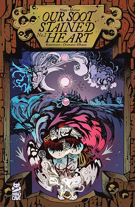
From writer Joni Hagg and co-author & artist Stipan Morian (20th Century Men) comes a grimy, Dickensian take on a holiday story with Our Soot Stained Heart #1. Featuring Ropemann on colors and letting from Hassan Otsmane-Elhaou, this opening issue is a beautifully crafted comic book that may be the most interesting take on a Christmas story in many years – in any medium. With a stunningly poetic script and phenomenal visual work, Our Soot Stained Heart is one of the best debut comics of the year.
“The Coalition is a city of wonder in the deep north, but it is ruled by the cruel Governor Glass and his factory lords. Coal is the lifeline of the city, and for honest workers like young Peggy Stones, life can be hard because of the nefarious quota. To get extra coal at the end of the year, you must be bad, every day! Peggy’s life is thrown into chaos when she is imprisoned and sent into exile, which begins a harrowing journey to the ends of the world to find answers that could change the world!”
Writing & Plot
Joni Hagg and Stipan Morian craft an entrancing, poetic take on a wintry tale in the pages of Our Soot Stained Heart #1. The pair immediately take to crafting their own lore about this coal covered, corrupt town where the poor work for less and less every day while the rich get richer. Within the framework of this familiar story is where the magic happens. Hagg’s scripting is so poetic and thoughtful that even the most familiar and tropey of lines feel brand new and natural to this world. What starts off as a girl trying to work and live on her own turns into a tale of revolution on the road to answers. As we’re drip-fed information about this world – the Coalition, the Baron, Quotas, Peggy’s family – it never devolves into exposition. Everything the reader needs to understand the story is supplied through the carefully crafted narrative. This makes the story feel all the more organic, like we’re reading a poetic tapestry of fable rather than a more plainly written comic. The dialogue and Peggy’s overhead narration weave seamlessly throughout the issue, providing both texture to the world and more depth to our protagonist and her backstory. As far as takes on Dickensian tales of winter woe, Our Soot Stained Heart is on track to be one of the absolute best in terms of written storytelling.
Art Direction
Of course, what takes Our Soot Stained Heart #1 to the next level of comics greatness is Stipan Morian‘s incredible visual work. The 20th Century Men artist & co-creator demonstrates the full range of his creativity with a constantly shifting art style and creative sequential direction. Morian’s approach to world and character design makes this book feel almost timeless, like it could just as well be an Avant Garde French comic from the 70’s as it is a contemporary holiday tale. He brings a brutal, classically Dickensian vision of a coal burning industrial city to life in possibly the best way its’s ever been done in a comic. He then sharply contrasts this with the equally brutal pure white of the snowy tundra the latter part of the book takes place in. Morian’s character animations and action sequences have an excitement and fluidity seldom seen in comics anymore, and that’s even among big mainstream superhero books. His sequential direction ranges from classic, detail-focused blocks to weaving images over each other on a massive unbroken spread, in an effort to demonstrate the passage of time for a single character. My favorite visual moment in the comic (even though they’re all incredible) is a page where Morian completely changes his style into a sort of Herge’s Tin-Tin tribute, and it works perfectly in the book. I actually let out a gleeful chuckle. Morian’s work is bolstered by Ropemann’s stellar color art, which echoes the variety of approaches the pencils take. Backgrounds are a stunning mix of atmospheric the help craft the tones of desperation and hope this comic swings between. You can feel the heat of the furnaces and the biting cold of the snow as you read through each page of the comic. The color art also shifts drastically in approach from the current-time action to the more dreamlike flashbacks Morian takes us on. The impeccable cherry on top of the reading experience comes in the form of Hassan Otsmane-Elhaou’s lettering, and the longtime industry pro may have done his best work yet in the pages of Our Soot Stained Heart. From the classical storybook-esque approach of the narrative lettering to the constantly surprising and reactive dialogue lettering, Hassan’s lettering work here is just as dynamic as the rest of the visual experience. The SFX works perfectly and matches the art and the action in-panel (my favorite is a big WHOOSH of a train going by), and there seems to be no shortage of types of fonts used for every scenario this story comes up with. Visually, Our Soot Stained Heart is a nearly-unmatched work of brilliance.
Verdict
Our Soot Stained Heart #1 is actually a bit of a difficult comic to review, solely because it feels like it’s playing on a completely different level of creativity than most comics I’ve read in recent memory. Joni Hagg and Stipan Morian’s story is a compelling, thematically deep take on Dickensian wintry woe that still sings with hope. The visual work from Morian, Ropemann, and Hassan Otsmane-Elhaou is executed on a masterful level in every regard, giving this comic a timeless effect. Be sure to grab this incredible debut issue when it hits shelves on December 10th!
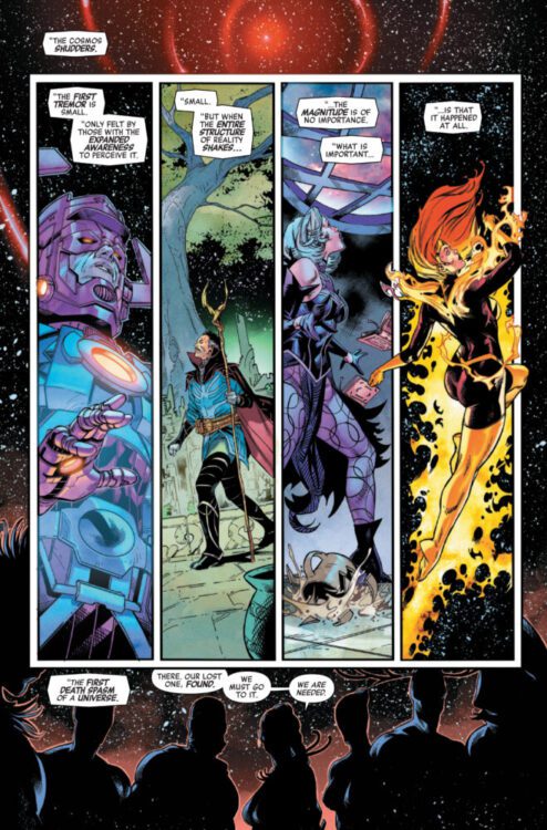
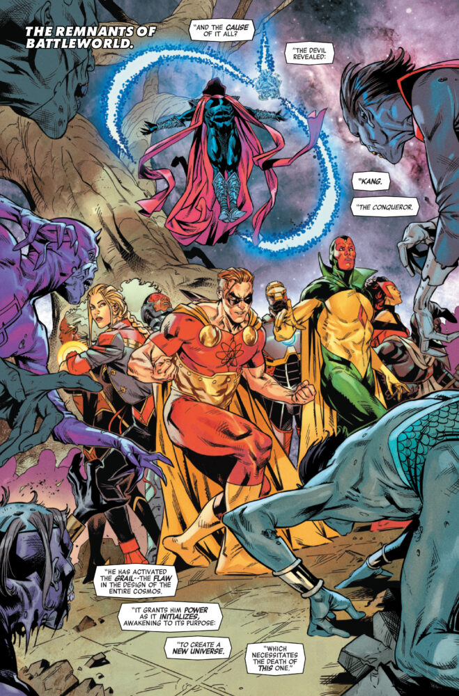
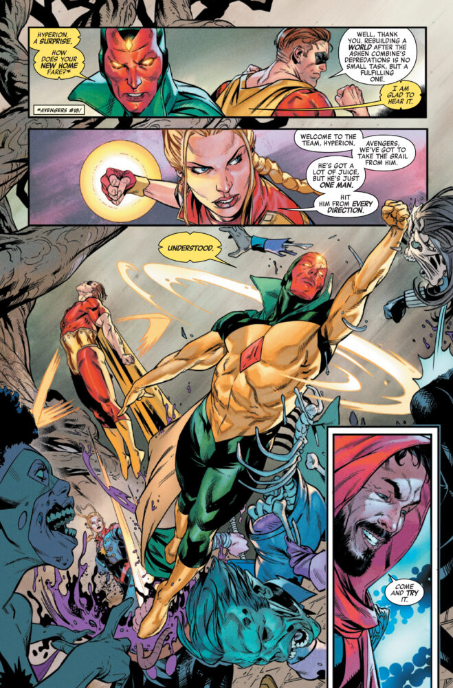
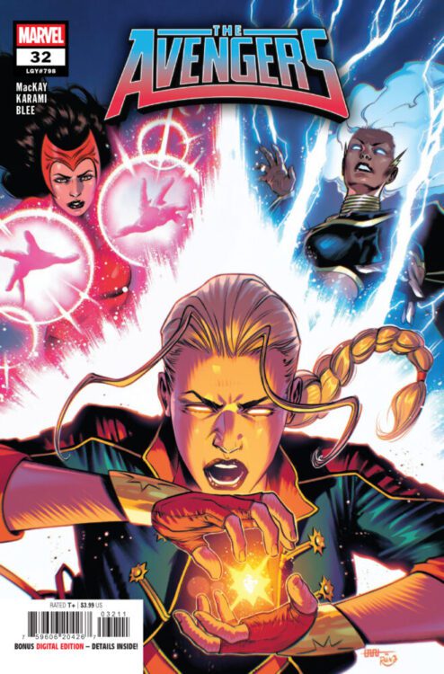
AVENGERS #32 hits your local comic book store on November 5th, but thanks to Marvel Comics, Monkeys Fighting Robots has an exclusive three-page preview for you!
About the issue: ZOMBIE INVASION!
The curtain has been pulled back and KANG’s triumph seems inevitable with the grail in his hands. The Avengers are outnumbered – but when they assemble, ANYTHING is possible! PLUS: A FALLEN AVENGER returns! But is he friend or foe?
The issue is by writer Jed MacKay and artist Farid Karami, with colors by Federico Blee, and letters by Cory Petit. The main cover is by CAFU and Moreno Dinisio.
Check out our AVENGERS #32 preview below:
Are you reading Marvel’s AVENGERS? Sound off in the comments!
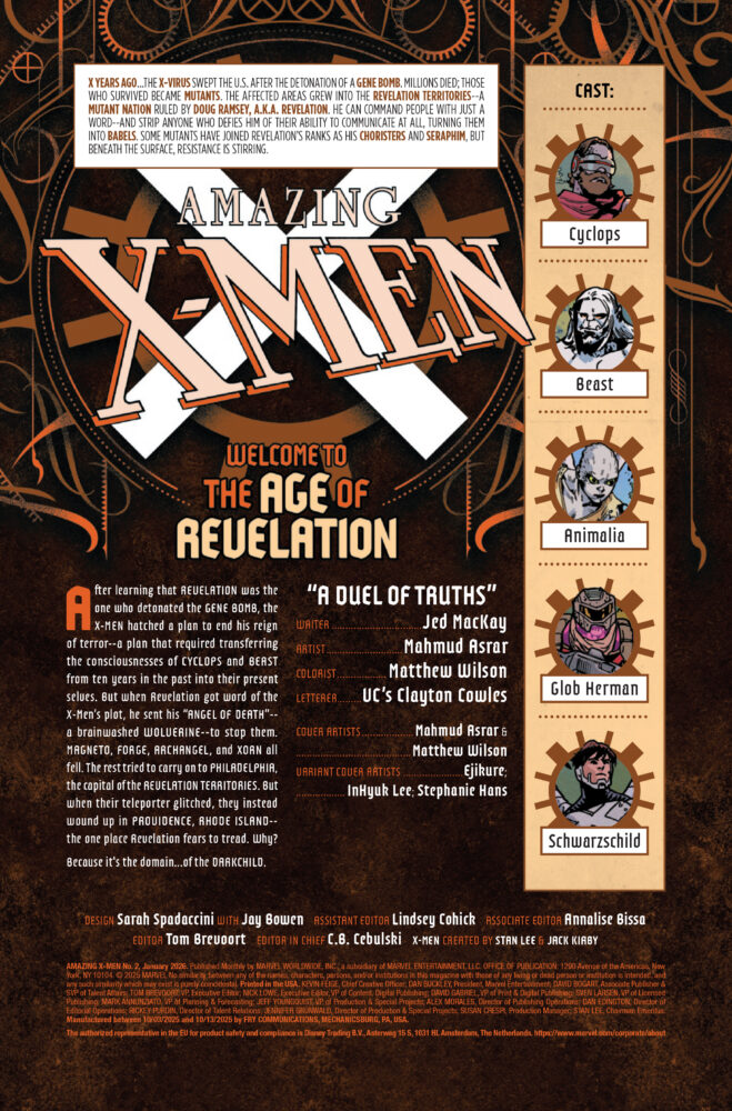
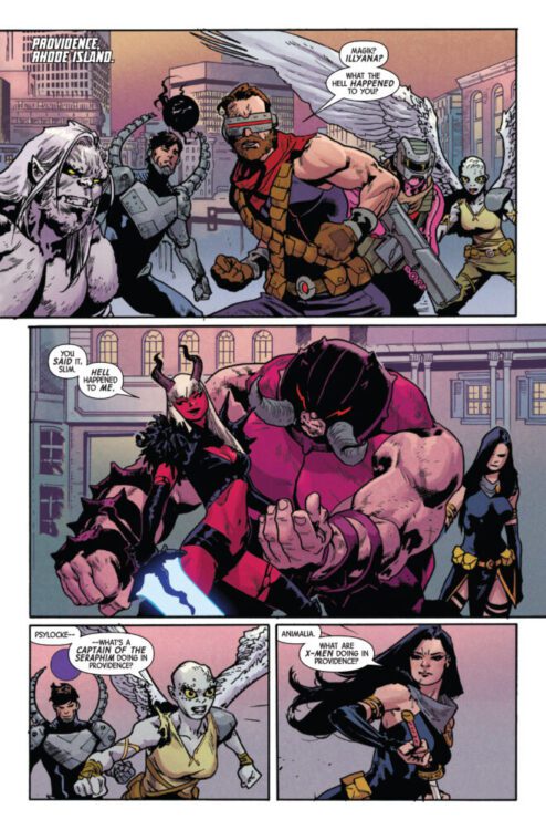
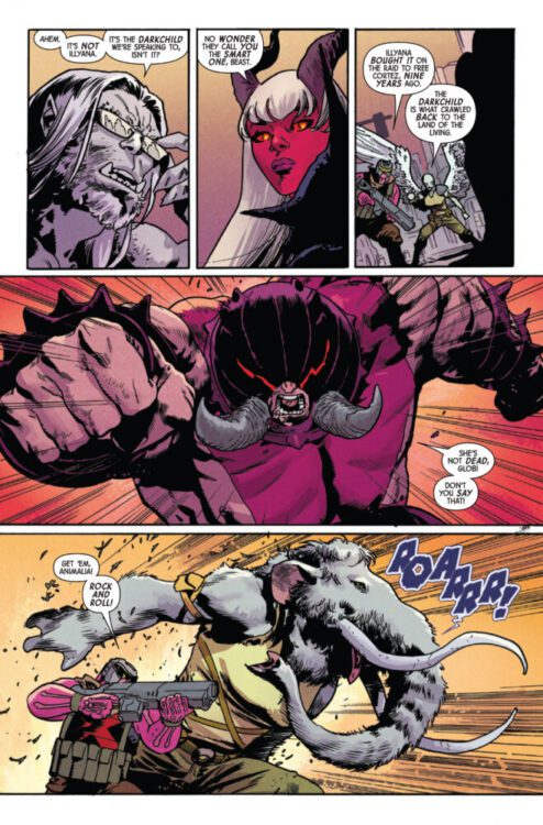
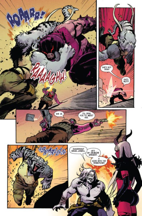
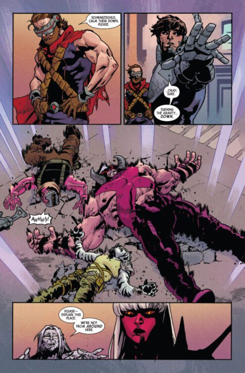
AMAZING X-MEN #2 hits your local comic book store on November 5th, but thanks to Marvel Comics, Monkeys Fighting Robots has an exclusive four-page preview for you!
About the issue: OUT OF THE FRYING PAN AND INTO THE HELLFIRE!
X YEARS LATER, the X-Men find themselves at the mercy of the Darkchild and her demon knight, the Juggernaut! Can the X-Men escape Providence, or will they join the residents of that cursed city in damnation? A new ally joins them, but new truths coming to light threaten to tear them apart!
The issue is by writer Jed MacKay and artist Mahmud Asrar, with colors by Matthew Wilson, and letters by Clayton Cowles. The main cover is by Asrar and Wilson.
Check out our AMAZING X-MEN #2 preview below:
Did you pick up the first issue of AMAZING X-MEN? Sound off in the comments!
Absolute Batman 2025 Annual is a very strong and emotional set of stories from many different creatives.
Writer/artist Daniel Warren Johnson, colorist Mike Spicer, and letterer Clayton Cowles focus on the first story, which also happens to be the longest one. The story features Bruce driving through an area named Slaughter Swamp in order to get some new weapons to round out his artillery. He’s quickly met with local supremacists, and decides to handle them himself.
Writer/artist James Harren and colorist Dave Stewart are joined by Cowles for a story featuring the Party Animals and Bruce finding a small group of them after having taken down Black Mask.
Creator Meredith McClaren takes on this last story herself. It’s a short two-page story featuring some facts about bats that ends up being wildly heartwarming and hopeful.
All of these stories come together very naturally to give us a new look at this Batman and his psyche as well as how Gotham operates around him, because of him.
A young Bruce talks to his father.
WRITING
Starting with Johnson’s story, we’re in for an action-packed ride right off the rip. Johnson’s specialty is giving us these awesome, larger than life characters while showing us that the problems they face and internal struggles they carry are just as large as them. The majority of the story features Bruce fighting white supremacists, protecting locals in the area. He goes all out on them, being incredibly violent the entire way through. There are voices of reason through asking him to show mercy, but he ignores them. The entire time though, the words of his father spoken at the beginning of the story really resonate in both us and Bruce. He has to help make change, because not a lot of people have the power to. With that being said, is it possible to go too far? Johnson asks this and handles the climax wonderfully.
The next story from Harren is less action focused, letting us sit more with Bruce as a sort of terrifying creature of the night. It’s a slower story that primarily features Bruce sneaking around, only going in for attacks when all else fails. Harren really balances two ideas with this story. He acknowledges that Batman is a force to be reckoned with, but also shows how there is still good in people for those less fortunate from the relative of one of the Party Animals who maybe was just on a bad path. It’s a really interesting look not only at the character, but at the people of Gotham as well.
McClaren’s story comes at the tail end of the book. It’s short, yet impactful. She shows the city’s relationship with Batman, and how they trust and support him. He’s mostly seen as this fierce, horrifying animal. McClaren shows you that while he is that, he also does something as small as getting a meal for a homeless person. He inspires the community, and that’s the essence of Batman.
Absolute Batman standing in flames with his artillery.
ART
All three of our aforementioned artists drew their own respective stories as well. Starting with Johnson, it’s honestly easy to be at a loss for words when describing his work here. He has such an incredible range to draw a heartfelt conversation between father and son in one panel with a massive Batman walking through flames in the next, both feeling incredibly relevant to the story. Johnson has always had such a good eye for character design. The people in the story living in tents look so sad and hurt, trying to make the most of what they have. The supremacists on the other hand look exactly how you’d expect them to, but with an evil glint in their eyes. Johnson succeeds in making his villains look incredibly unsettling, even when they’re just people.
Harren’s art is really out of this world. There’s this specific page where Batman enters the building from a rooftop, but his sectioned cape is flowing in the wind. Each end curls in a way that really adds a gothic feel to the story, giving more personality to both Bruce and Gotham. The story isn’t told from Bruce’s perspective, so when he is seen by the Party Animals he looks like this monstrous deity slowly roaming the halls, looking for a kill. It’s a really great look at how fear plays into this Batman’s ability to help those in need.
McClaren’s art in the final story is simple, but sweet. It may seem small, but there’s a lot going on in every little paneling. The sectioning of each panel really works. While we hear these bat-facts and news of Bruce’s exploits through the city, in the background he’s drawn doing small things to help the people of the city. It’s a good contrast from the other two stories that gives the character a little more heart.
Bruce drives into Slaughter Swamp
COLORS
Spicer handles the Johnson story, and he really excels here. When Bruce is talking with his father in flashback, or talking to another character in the story—helping people a non-Batman way—the colors of the background are these flat pinks and oranges with little to no detail. When he’s on his manhunt though, everything colored on each page is incredibly detailed with intense oranges that change with the flames surrounding Bruce. It’s really intense and provides a welcome contrast from the book’s usual hectic nature. Sometimes the calm and peace is necessary.
Stewart handles the Harren story. The story for the most part is primarily blue with the sky and lighting in the rooms the Animals are in illuminating most of what we see. There’s a special moment near the end of the story where a civilian chooses kindness to help someone, his face covered red. It shows that blue is a calm color, and the average person is safe in Batman’s Gotham. But it also shows that if you help who you shouldn’t, then you’re stained with that. It’s interesting though as that moment can also be seen as a character breaking the mold, Batman obviously noticing but allowing it to happen because of his inherently hopeful nature. Stewart gives you a lot to think about.
Onto McClaren again: her coloring is special. There’s nothing too crazy or elaborate, but it’s nicer that way. It shows that Gotham is still a city and a people. The only color changes in the issue are for the text boxes, which are black and white rather than lively like the rest of Gotham. Bruce will think about these cold hard facts and how they will take him where he wants to go, but largely won’t see the good he does for the city and how that brightens it.
Bruce buys weapons from an old man.
LETTERS
Cowles covers both the Harren and the Johnson stories in this issue, with McClaren covering her own portion. Cowles gracefully matches the style of both stories with his textplaces. He primarily uses small boxes and bubbles in the Harren story, adding to the sense of dread the Party Animals feel when they know Batman’s somewhere around them. In the Johnson story, Cowles does a really good job working around the art. He places the boxes and bubbles perfectly and really lets Johnson’s action and story soar. There’s a few pages specifically where it seems like those bubbles are almost operating around a kick or flying knee from Bruce. It’s really satisfying.
McClaren’s portion is sure to be a favorite. The only text in the story are the bat facts, and they have a really fun look to them. There’s a small bat on top of the initial box making it look almost like a sign at a zoo, most likely referencing the first issue. Each box after that ditches the bat, but keeps the same style. McClaren is especially consistent with it and it really works in favor of her story.
Bruce finds a gang attacking protestors.
CONCLUSION
The Absolute Batman Annual is a welcome look at this character and this Gotham from multiple perspectives. While Snyder and co. work hard on the main book, it’s really refreshing to see this character written, drawn, lettered, and colored by others. It results in three short stories that have every right to be as good as they are. Three important and impactful stories telling us more not only about Bruce’s character, but about this Gotham as well.
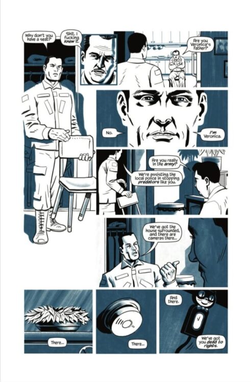
Truth, justice, and the American way… These are all themes writer/letterer Julian Darius and artist/colorist/letterer Steven Legge explore in Martian Lit’s Necropolis: The Life & Death of Mark Hernandez #1. But their exploration isn’t one of wide-eyed curiosity or general intrigue. In many ways, it feels more like an autopsy.
Writing
Darius — returning to the world he created alongside Mike Phillips and Steven Legge in Necropolitan — reintroduces us to the series’ leading man, Mark Hernandez. From Necropolitan‘s main title, we know Mark is a few things. He’s a family man, he’s the famed Kraigslist Killer, and he’s ultimately a damned soul. And yet, we also know from snippets of conversations that even Mark’s killings had a sense of justice to them. He got his name for luring in and murdering child predators. The Life & Death of Mark Hernandez is Darius’ answer to the many questions plaguing us about Mark’s character. Perhaps, it will even answer the biggest question of all: why is Mark in Hell?
But to say that Mark’s descent into the Inferno is all this issue is about would be extremely reductive. As previously stated, this issue feels like the autopsy of the American Dream. When Mark signs up to fight in Afghanistan and Iraq after 9/11, we see his years as a soldier while his wife Jessica holds down the fort back home. In their conversations over the phone, Darius—through Jessica—recounts all of the troubling news reports that indicated US soldiers were committing atrocities during these wars. We watch as Mark fights to still believe in what he’s doing, while quiet disillusionment slowly creeps in as he realizes his own culpability.
Ultimately, this is really an analysis of the “War on Terror,” playing out in the lives of these characters. In some ways, the writing does occasionally feel more like a news crawl than a story. Jessica’s relaying of information over the phone to Mark has an on-the-nose quality to it. But in grounding the story in Mark’s life, and especially in hinting that it’s these years that turned him into a killer, Darius makes the problem personal. He asks us to consider the human cost — the devastation it created not only in the Middle East but in the very heart of American morality. How does a public move on from discovering they were the bad guys?
Art & Coloring
Legge’s work is extremely versatile and fresh. There’s so much subtlety and minimalism at work in these pages. On one page, two panels set in vastly different scenes are right next to each other, with Mark standing one one side but extending into the gutter between them. In Mark’s scene, he’s on the phone while his fellow soldiers march by outside in the hot sun. Mark, in contrast to the bright outdoors, appears as a black silhouette on the page. But his form extends into the scene of Jessica and his daughter calling him from home. The looks on their faces show that they feel his absence, and the black empty space that he’s supposed to be occupying highlights that fact beautifully.
The coloring is appears deceptively simple. Legge uses only two colors on each page: black, and either yellow or blue. The early pages all appear in blue, but once 9/11 happens and Mark ships off to Afghanistan, the pages turn yellow. The bold, brash, American coloring gives way to the faded yellow of the desert. And while the blues and yellows are often used to depict things in the background, Legge occasionally but very poignantly switches it up. When Jessica feels depressed, Legge colors her surroundings using the black ink usually reserved for main characters. Jessica, though, is depicted in yellow. It makes her seem unreal, invisible, and part of the background. It masterfully reflects her inner life in that moment.
Conclusion
Darius and Legge have a truly incredible prequel on their hands. They’re interested in more than just Mark Hernandez’s story, though: They’re interested in their shared history with the character. They show us the injustice, the lying, the callous ways in which Mark is used as a tool and not seen as a person. They show the twisted, fragmented world that he came up in. In doing so, it’s like they’re saying “Yes, this all drove Mark a little crazy. But doesn’t it do the same to you?” Martian Lit’s Necropolitan: The Life & Death of Mark Hernandez #1 is available on their website here, and it’s a must-read!
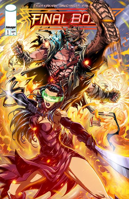
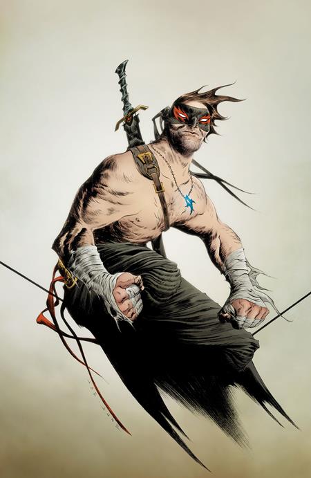
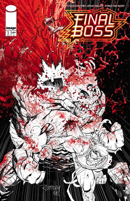
FINAL BOSS #1 hits your local comic book store on November 19th, but thanks to Image Comics, Monkeys Fighting Robots has a three-page preview for you!
About the issue: From the dynamic creator and artist, Tyler Kirkham (Amazing Spider-Man, Green Lantern), comes a thrilling new action hero: Tommy Brazen in FINAL BOSS!
Get ready for an over-the-top adventure that’s a high-octane nod to classic action stories. Trying to forge a new path, Tommy uses his newfound powers for various paid enforcer gigs and street fights, only to uncover a past far more complex than he ever imagined.
FINAL BOSS is Kirkham’s Image Comics debut. Known for his variant covers and work on titles like Amazing Spider-Man, Green Lantern, and Ultimate Fantastic Four, Kirkham is bringing his signature energy to a creator-owned series that’s being billed as “BRZRKR meets Mortal Kombat by way of Invincible.” The debut issue features variant covers by Ryan Ottley, Jae Lee, V. Ken Marion, and Kirkham himself, which you can see below.
Check out our FINAL BOSS #1 preview below:
Are you picking up FINAL BOSS #1 when it hits shelves next month? Sound off in the comments!
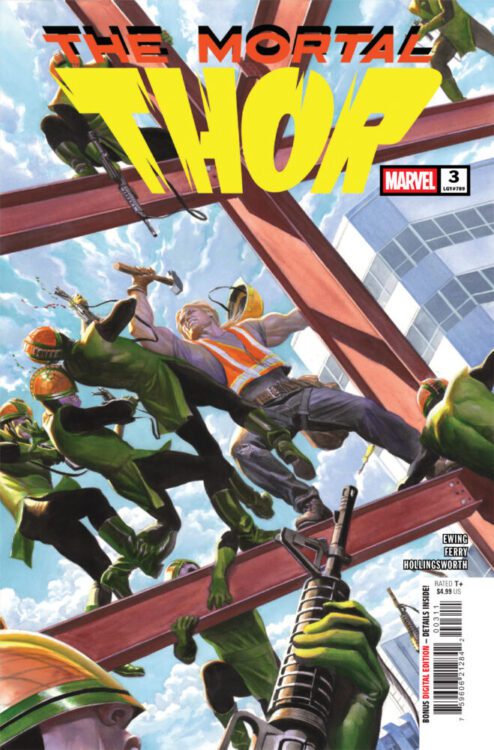
THOR #3 hits your local comic book store on October 29th, but thanks to Marvel Comics, Monkeys Fighting Robots has an exclusive two-page preview for you!
About the issue: SNAKES IN THE GRASS!
Roxxon Construction has a vigilante problem. But whoever this “Thor” is, they know he’s only human… …and the people they’ve hired to find him are much, much more. Somewhere in the city, a man with a hammer is being hunted…
The issue is by writer Al Ewing and artist Pasqual Ferry, with colors by Matt Hollingsworth, and letters by Joe Sabino. The main cover is by Alex Ross.
Check out our THOR #3 preview below:
Are you reading Marvel’s THOR? Sound off in the comments!
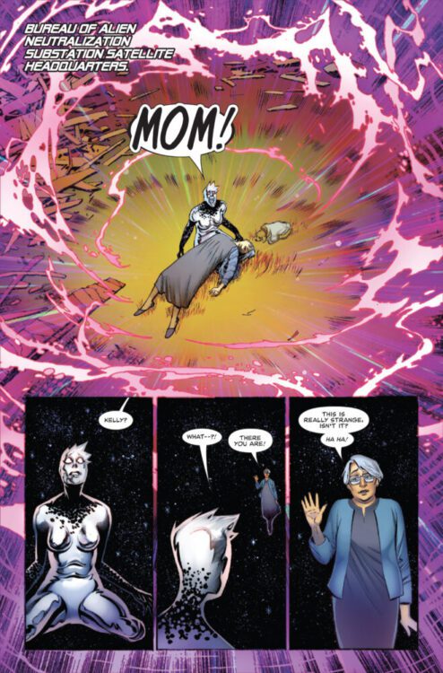
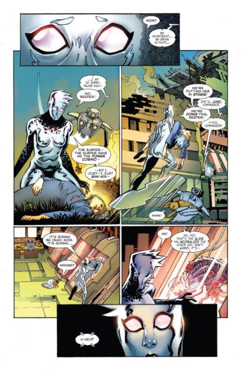
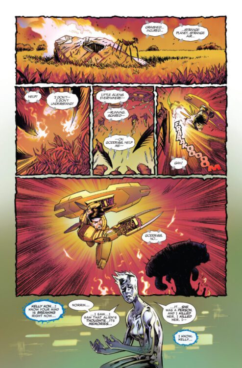
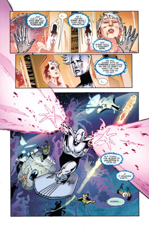
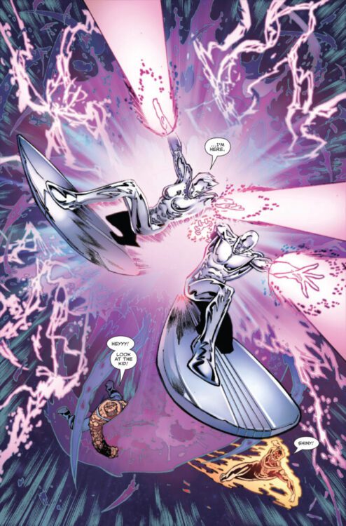
DEATH OF THE SILVER SURFER #5 hits your local comic book store on October 29th, but thanks to Marvel Comics, Monkeys Fighting Robots has an exclusive five-page preview for you!
About the issue: THE ALL-NEW SILVER SURFER?!
The Silver Surfer is dead. Long live the Silver Surfer.
The issue is by writer Greg Pak and artist Sumit Kumar, with colors by Frank D’Armata, and letters by Joe Sabino. The main cover is by Dike Ruan.
Check out our DEATH OF THE SILVER SURFER #5 preview below:
Have you been reading Marvel’s DEATH OF THE SILVER SURFER? Sound off in the comments!
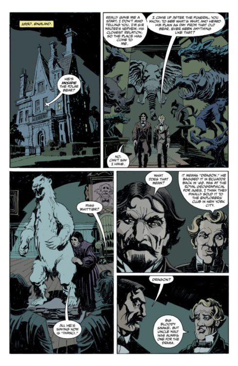
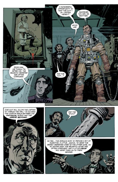
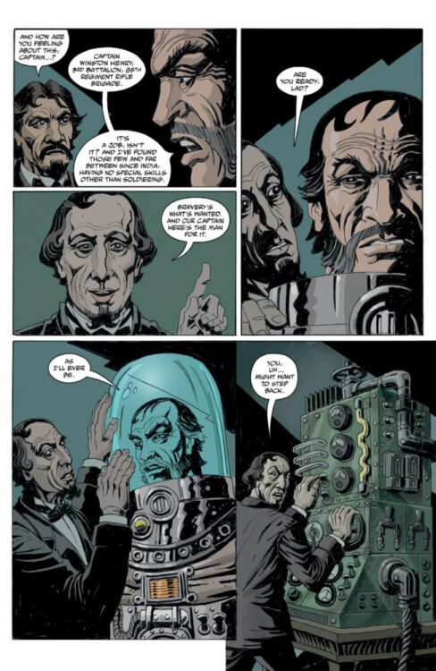
From comics legend Mike Mignola and creator Bruce Zick (The Mighty Thor, Primordial) comes a new adventure in the paranormal Curious Objects universe with Captain Henry and the Graveyard of Time #1. Featuring lettering from Clem Robins, this opening issue is exactly the sort of jaunt you’d expect and want from Mignola and his collaborators. With a witty, fun script and unique, perfectly fitting visuals, this first chapter is a must for fans of Mignola and of takes of good ol’ Gold and Silver Age adventure stories.
“On a dark night in 1880s England, the ever-adventurous Whittier family, along with Edward Grey, are attempting to send a man into the realm between reality and the Beyond to free the trapped spirit of a Whittier uncle. But his expedition into space—and time—will take him to places beyond even the Witchfinder’s knowledge. Captain Henry and the Graveyard of Time follows an intrepid time-travelling explorer on a journey to a new dimension. He soon discovers that the monsters he encounters aren’t his only problem, as time itself might represent the ultimate danger.”
Writing & Plot
Mignola’s storytelling across his multiple projects has built a reputation for a bit of silliness wrapped up in some occult adventuring – and that’s exactly what you get with Captain Henry and the Graveyard of Time #1. Along with series co-creator Bruce Zick, Mignola introduces readers to the wealthy and eccentric Whittier family as they try and solve a strange paranormal occurrence by putting old soldier Captain Henry in a suit to send him to another realm to save a lost soul. Chaos, calamity, and cheeky one-liners ensue. Anyone familiar with other stories in the Curious Objects series or obviously many Hellboy comics pretty much knows what they’re getting into here, but that doesn’t keep Captain Henry from being a fun read. Mignola and Zick’s dialogue is a joy to read, from the Whittier’s posh and innocently ignorant reassurances to Henry’s deadpan delivery of one-liners, the script slides on by with a focus on humor and monster-fighting action. Captain Henry reads like a modernized take on a pulpy supernatural adventure comic from decades long past, and I wouldn’t have it any other way.
Art Direction
Any comic in the Mignola library needs to have standout art to match the unmistakable tone of his comics, and Bruce Zick delivers in spades in the pages of Captain Henry and the Graveyard of Time. His distinct linework and heavy shading make for a book that fits the bill as far as Mignola comics go, but still looks wholly unique. Zick’s take on the Curious Objects universe’s 19th century steampunk aesthetic is a treat, with suit and monster designs that fit right into the Mignola library. His sequential direction is seamless, with large panels making the comic’s pace and action move along at a steady clip. Zick’s color art crafts the perfect tone for the reading experience, with his deep blacks and blues being offset by unnatural greens and flashes of magical lightning. As always, Clem Robins is on hand to letter another comic in the Mignola library, and at this point it’s impossible to imagine anyone else doing the job. His distinct dialogue letters and signature style of SFX work will be instantly recognizable to longtime readers, and fits is perfectly with Captain Henry. Overall, Zick makes a great showing with his visual direction in this new story in the world of Curious Objects.
Verdict
Captin Henry and the Graveyard of Time #1 is a witty and fun opening chapter in this new series from Mignola’s Curious Objects universe. Mike Mignola and Bruce Zick’s storytelling here reads like an almost satirical take on old pulp adventure stories, with every bit of the charm that readers have come to expect from books in Mignola’s catalogue. Zick’s visual work fits the mold of what we’ve come to expect from Mignola’s collaborators, but also stands out as a genuinely unique style on its own. Be sure to grab this debut issue when it hits shelves on October 22nd!