Home Blog Page 28

Interview: Jeff Lemire Talks MINOR ARCANA and Bringing Back the “Ongoing Series”

boom studios jeff lemire minor arcana interview

Minor Arcana #1 is out today from BOOM! Studios, and Monkeys Fighting Robots had the chance to speak with cartoonist Jeff Lemire about the new series!

About the series:
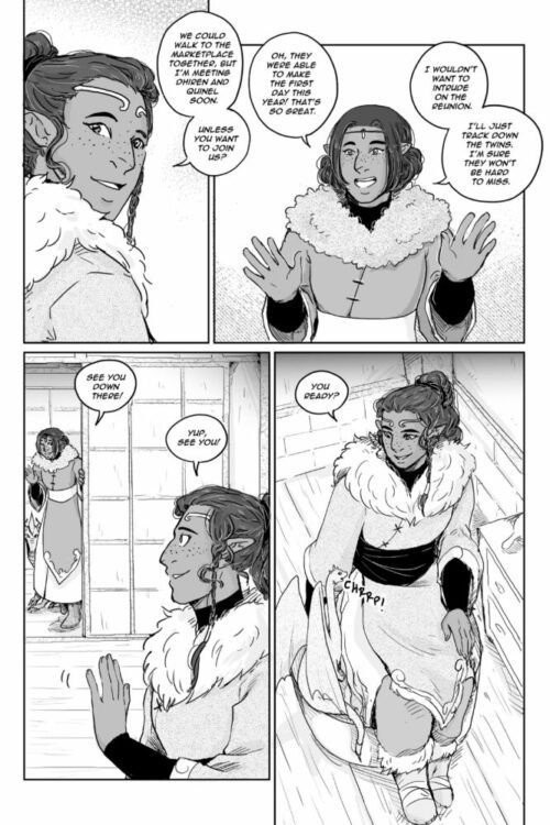
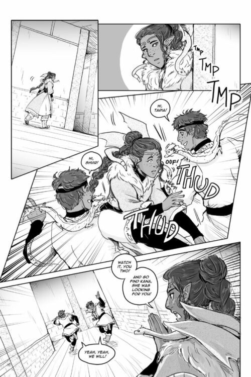
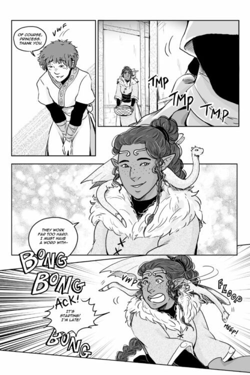
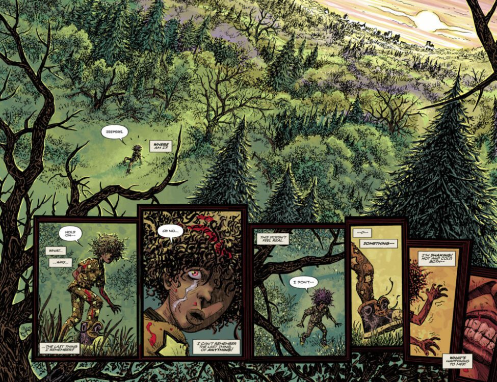
Theresa, the prodigal daughter of a small-town “psychic” tarot reading fraud, begrudgingly returns home to care for her ailing mother after having left home for good–or so she thought.

Arriving back in her childhood hometown seemingly untouched by time, Theresa learns that there may be more to the magic than she originally believed. And with that, she finds herself caught up in a town that desperately needs her help…

Read on for our interview with Lemire, where we discuss his move to BOOM!, his artistic process, and how ongoing series can survive in the current comics landscape.


Monkeys Fighting Robots: You’ve published a number of creator-owned works, but Minor Arcana is your first series with BOOM! Studios. What’s your thought process like when deciding where to publish a series, and why was BOOM! the right fit for Arcana?

Jeff Lemire: Minor Arcana was an idea that slowly developed as I was working on the Essex County TV show here in Canada in 2021-2022. Originally, I thought it would be a project that I wrote and someone else illustrated, but the deeper I got into researching and writing it, the more I fell in love with the characters and the world, and the more connected to it I felt. Ultimately, I decided I wanted to draw the book myself too.

As all this was happening, I also happened to reconnect with some friends over at BOOM! I’ve known Matt and Eric at BOOM! for a long time and always wanted to do something with them. So, the timing just felt right as Minor Arcana was really starting to take shape.

MFR: What has been your experience with tarot cards that led you to use them as inspiration for this series?

Lemire: The importance of tarot in Minor Arcana really came out of doing research for the book. The original spark of an idea I had was exploring the world of a small town storefront psychic. As I began to dive into that, I immediately saw how the incredible imagery, symbolism and archetypes of the tarot just fed into the kinds of stories I wanted to tell. Once I hooked into the idea that everyone in the small town represented a different story, and a different tarot archetype, the series really unlocked for me.

So, I am new to tarot and very much learning as I go, and as I work on the book, but in this case, it works for the story, because it’s all new to Theresa, our main character, as well. So she and I are learning together.

boom studios jeff lemire minor arcana interview

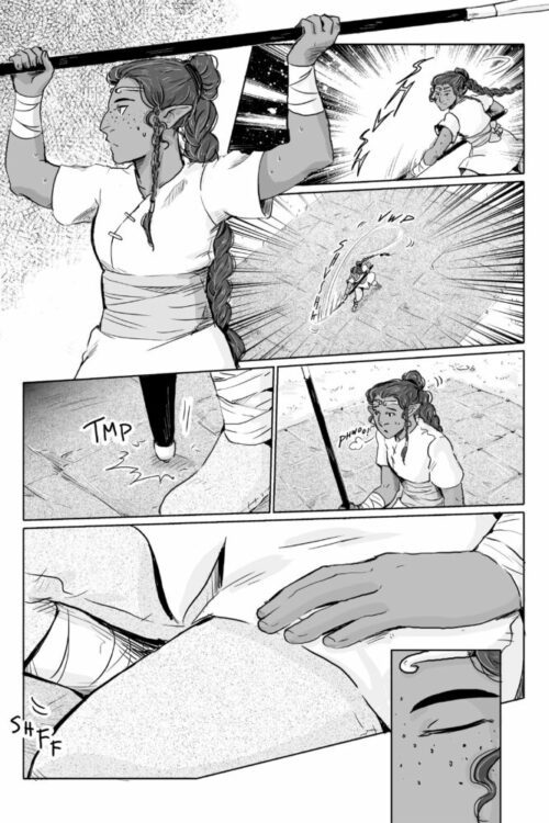
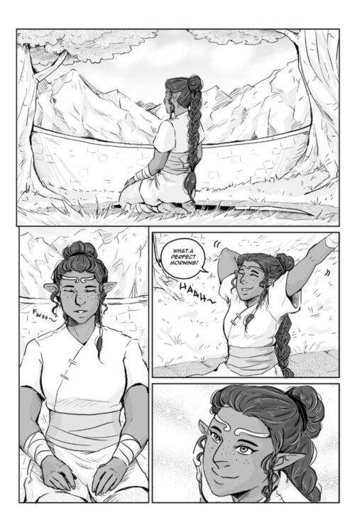
MFR: The color palette jumped out to me immediately while reading Minor Arcana. Theresa in particular is very muted compared to the other town residents (especially her mother), until she puts on her grandfather’s jacket. Typically, you might expect the main character of a series to stand out more; what were you trying to say by having Theresa almost blend in with the background?

Lemire: I wasn’t sure at first if I would color the book myself, so the color palette and painting style developed as I got deeper into the story. I knew there would be multiple “worlds” depicted in the book, and I wanted a different style and palette for each.

In terms of Theresa’s small town, day-to-day life, I wanted Theresa to be very different from her Mom, who is obviously a really flamboyant and colorful personality. So her more grounded and earthy colors are a stark contracts to Vickie’s more colorful world and the world of the psychic shop.

MFR: Theresa isn’t the friendliest character when we first meet her, and understandably so. She feels like she’s been forced back to the hometown she promised to leave behind forever. Was it a hurdle for you to introduce a protagonist who’s prickly and rude to the locals, but who you also want readers to connect and empathize with, and how did you come to marry those two things?

Lemire: My original draft had Theresa being even more abrasive and misanthropic, but I worked with Eric Harburn, my editor, to tone her down a bit. I liked the idea that our main protagonist wasn’t immediately “likeable.” I think it’s truer to life. People are complicated and often put on an outward attitude to protect themselves. And Theresa is no different. Obviously, this series is all about Theresa’s journey. And this is just the starting point for her.

boom studios jeff lemire minor arcana interview

MFR: The concept of returning home (sometimes reluctantly) and facing your past is a common thread connecting your works. What is it about this theme that speaks to you as a storyteller?

Lemire: Well, I am from a small town myself, so there’s always a lot of that in my work. It’s baked into who I am and my own life, I guess. And, in this case, it seemed like the perfect starting point for Theresa and the story I wanted to tell with her.

MFR: When announcing your new series, you said that you’ve felt like ongoing series are a “dying breed.” Why do you think that is, and what is the trick to keeping an ongoing series going without it getting stale?

Lemire: This book, is many ways, is a real love letter to the classic “first wave” of Vertigo comics I loved as a teenager. And they were all true ongoing titles that I could go to the comic shop and read every month. We certainly don’t see that as much anymore. It almost feels rare for a series to run for 12 or 15 issues in the current marketplace.

I think one of the keys is creating smaller, more contained stories within the larger world and story. And the tarot is a great device for that. It’s the key to let me, and Theresa, explore shorter, more contained stories within the series, while still building a larger world and mystery as well.

boom studios jeff lemire minor arcana interview

MFR: Minor Arcana is set to be your longest self-drawn series since Sweet Tooth. How did you approach this series after doing mostly limited series and graphic novels for the last decade? What changes did you make to your process?

Lemire: Well, I definitely knew that I wanted to do something longer form. But I also know that I’m at a very different point in my life and career than I was when I did Sweet Tooth every month. So, my intention is to draw the bulk of the series myself, but I also know that I’ll be bringing in friends and other talented artists to help along the way. The great thing about the way I’ve structured this book is that the storylines are shorter and more self-contained, so it will feel much more natural to have guest artists come in and do key issues and stories to help me juggle the workload.

MFR: Finally, what do you hope readers take away from Minor Arcana that’s different from your previous works?

Lemire: I really wanted to do a book that was about connection and community. That is the heart of this story and something I personally feel a need to explore right now. I can’t control how the book or story is received or what people take from it. All I can do is try and create something that’s important to me, and hope that it connects to the readers. I think that this book has a real chance to do that. I’m definitely going to take readers on a journey here, where we start is far from where we end, and I have twists and turns planned that, I think, will be genuinely shocking and thrilling. I’m very excited about the book and can’t wait to start putting it out there into the world.


Thanks to Jeff Lemire for taking the time to answer our questions. Pick up MINOR ARCANA #1, out today from BOOM! Studios!

Monkeys Fighting Robots Youtube

Marvel Comics Exclusive Preview: THE SPECTACULAR SPIDER-MEN #7

marvel comics exclusive preview spectacular spider-men peter parker miles morales

SPECTACULAR SPIDER-MEN #7 hits your local comic book store on September 4th, but thanks to Marvel Comics, Monkeys Fighting Robots has an exclusive four-page preview for you!

About the issue:
The battle of the Spider-Men comes to an end, but now Peter and Miles are face-to-face with the makers of the Arcadium and the people who hired them. If you think there weren’t any twists left, meet KNAIVE, a truly terrifying new addition to the Spiders’ rogues’ gallery!

The issue is by writer Greg Weisman and artist Humberto Ramos, with inks by Victor Olazaba, colors by Edgar Delgado, and letters by Joe Caramagna. The main cover is by Ramos and Delgado.

Check out our SPECTACULAR SPIDER-MEN #7 preview below:

marvel comics exclusive preview spectacular spider-men peter parker miles morales

marvel comics exclusive preview spectacular spider-men peter parker miles morales

marvel comics exclusive preview spectacular spider-men peter parker miles morales

marvel comics exclusive preview spectacular spider-men peter parker miles morales

marvel comics exclusive preview spectacular spider-men peter parker miles morales

marvel comics exclusive preview spectacular spider-men peter parker miles morales


Are you reading THE SPECTACULAR SPIDER-MEN? Sound off in the comments!

Monkeys Fighting Robots Youtube

DSTLRY Announces Sci-Fi Noir WARM FUSION

Hoffman and Ponticelli introduce a Dystopian New York City that blurs the lines between biotechnology and body horror.

DSTLRY, the next-generation publisher redefining creator-owned comics and collectibles, is thrilled to announce Warm Fusion, a new sci-fi horror mystery series by writer Scott Hoffman (Nostalgia, Wag, member of pop icons Scissor Sisters) and artist Alberto Ponticelli (Frankenstein: Agent of S.H.A.D.E., Orc Island). The series will debut this November, plunging readers into a nightmarish vision of New York City as biotech corporations unleash atrocities to rival the serial killers stalking the night.

Half a century into the future, New York City has been devastated by crime, ongoing storms, residual radiation from a terrorist attack, and genetic mutations spurred by the medical innovations created in response. After a series of murders rip through the city’s brothels, an escort named Vin Young, who cosplays as the Brothers Grimm’s Snow White—and is one of the generation of deformed victims—pursues the killer, or killers, reluctantly joining forces with Jarrod Hannover, the lone cop assigned to the case. The two eventually arrive at a biotech megacorp developing a cellular metal called Warm Fusion—a pioneering technology meant to replace prosthetics limbs—and soon confront the sociopathic scientist Nicholas Fleischer, his monstrous alter-ego, Mr. Barnaby, and the hideous monster that he’s been secretly developing.

Warm Fusion combines the visceral body horror of David Cronenberg with the dystopian urban sprawl of Blade Runner, offering a chilling experience for fans of sci-fi benchmarks including Videodrome, The Thing, and RoboCop.

“Warm Fusion is a deep dive into the grotesque possibilities of biotechnology and its impact on humanity,” says writer Scott Hoffman. “Alberto Ponticelli’s art is transportive, blurring the lines between flesh, machine, and everyone caught in the gutters between. This is an evolution of the body horror classics I watched growing up, and perfect for a time when humanity is obsessed with (and achieving) provocative new levels of post-humanism.”

“Working on Warm Fusion has been an exhilarating experience,” adds artist Alberto Ponticelli. “The world Scott and I have incubated straddles horror and hope, and imagining the extremes humanity will warp itself into in the coming decades has been perverse and delightful.”

“No matter what medium Scott’s operating in, his voice is unmistakable,” says DSTLRY co-founder and CCO Chip Mosher. “He and Alberto foster a harrowing vision that we couldn’t resist.”

“Warm Fusion is the definition of provocative sci-fi; it asks the hard questions about who we are and what our technology says about us,” continued DSTLRY co-founder and CEO David Steinberger. “This book goes to places—extreme and exhilarating—you can’t possibly foresee.”

“Warm Fusion is one of those rare projects that pushes every boundary,” said DSTLRY Founding Editor Will Dennis. ”It’s been a thrill to help that vision come to life.”

Each issue of Warm Fusion is presented in DSTLRY’s perfect-bound Prestige format, featuring wraparound covers with spot gloss on robust cover stock, complemented by 48 pages of exquisite interior stock. “It’s the DSTLRY difference,” says DSTLRY CCO & Co-Founder Chip Mosher.

For more information on Warm Fusion and to keep up with DSTLRY’s upcoming releases, visit www.dstlry.co and follow DSTLRY on social media at @DSTLRY_Media.

Monkeys Fighting Robots Youtube

Dark Horse Exclusive Preview: PATHWAYS: CHRONICLES OF TUVANA Vol. 1

dark horse comics exclusive preview pathways chronicles of tuvana

Elaine Tipping’s PATHWAYS: CHRONICLES OF TUVANA Volume 1 is out September 4th, but thanks to Dark Horse Comics, Monkeys Fighting Robots has an exclusive ten-page preview for you!

The trade paperback collects the first nine chapters of the hit webcomic-turned-graphic novel.

About the series:
A cast of heroes from all walks of life leads the charge to stop an ancient empire bent on world domination in this Queer YA graphic novel!

An archaeological dig backed by all four countries of Tuvana is meant to shed light on the past while uniting the countries under a similar goal, despite their differences. However, the project takes a sudden dark turn after an unexpected discovery. Communications are lost, family members are missing, there are strange changes in the land and unexpected climate irregularities–all threatening to unravel the tenuous ties that have kept Tuvana at peace for so long.

A clever princess, a set of royal twins with two very different personalities, a patient guard looking after an inquisitive scholar, a powerful and mysterious loving couple, and a fun-having street brawler are all pulled slowly from their very different paths through life as they each stumble across parts of a puzzle that, once assembled, could change–or destroy–the future of their world forever.

The series is by cartoonist Elaine Tipping.

Check out our PATHWAYS: CHRONICLES OF TUVANA preview below:

dark horse comics exclusive preview pathways chronicles of tuvana

dark horse comics exclusive preview pathways chronicles of tuvana

dark horse comics exclusive preview pathways chronicles of tuvana

dark horse comics exclusive preview pathways chronicles of tuvana

dark horse comics exclusive preview pathways chronicles of tuvana

dark horse comics exclusive preview pathways chronicles of tuvana

dark horse comics exclusive preview pathways chronicles of tuvana

dark horse comics exclusive preview pathways chronicles of tuvana

dark horse comics exclusive preview pathways chronicles of tuvana

dark horse comics exclusive preview pathways chronicles of tuvana


Are you picking up PATHWAYS: CHRONICLES OF TUVANA when it comes out? Sound off in the comments!

Monkeys Fighting Robots Youtube

Review: THE HORIZON EXPERIMENT: THE MANCHURIAN #1 – New Era Cold War

From writer Pornsak Picheshote (The Good Asian, Dead Boy Detectives) and legendary artistic duo Terry & Rachel Dodson comes a sharp and sexy as hell espionage debut with The Manchurian #1. Featuring Jeff Powell on letters and design and John Ereck on color flats, this first issue is a compelling and stunning opener. With Picheshote’s clever and deeply intelligent writing alongside the Dodson’s gorgeous, seductive visual work, The Manchurian is off to a fantastic start.

“A Muslim exorcist, a reverse Indiana Jones, and more. THE HORIZON EXPERIMENT are one-shots created by comics, film, and TV superstars, providing new POVs on popular genres and acting as pilots for new series. It starts with THE MANCHURIAN, a Chinese James Bond running covert missions in America for the enemy…”

Writing & Plot

Pornsak Picheshote takes his demonstrated skill in the world of conspiracy/mystery thrillers and applies it to international espionage in The Manchurian #1. A neat mix of 007 and The Americans, this chapter establishes a type of spy setting very new to the genre – in and out of comics. Much like its influences, Manchurian is based on a very real agency – in this case China’s own espionage organization – but is made into a sort of mythology to make a story this feels grounded yet irresistibly improbable. Picheshote’s script is exciting for sure, but he’s also making sure you’re paying attention. Every page is filled with narration and dialogue, making for a denser read than many action comics. If you’re one who prefers to let the visuals and sequential direction do the storytelling, you may want to check out another comic. Luckily, Picheshote’s writing is never boring or unnecessary, and it makes the reader interface with every aspect of these characters. Keep in mind that this issue is technically still just a one-shot – a part of Image’s Horizon Experiment. Each “pilot” in the Experiment has the goal of presenting a classic genre with a twist, typically taking place from the perspective of a minority group from creators that have a unique take on specific genres. Hence, Picheshote’s distinct take on the Hollywood espionage genre. As such, it’s easy to understand why this single issue is so loaded with information and exposition. I do hope Manchurian is picked up as a full series – there’s a ton of potential in this story, and Picheshote’s script is a fun as it is compelling.

Art Direction

Few artists in the comics industry nail the smooth charm and seductiveness of Hollywood espionage like Terry and Rachel Dodson, and they work their magic once again here in The Manchurian #1. The iconic duo bring their signature visual style to Picheshote’s script and make it irresistibly stunning while also adding to the story’s compelling allure. Terry Dodson’s pencils and colors bring each character to life in a very 007 manner – meaning that each person is absurdly attractive. Beneath that exterior though, they are still also fully realized characters with distinct personalities and body language exhibited through the Dodson’s work. Terry’s sequential direction has a blockbuster film-like structure, lending an urgency to the conversational scenes and more impact to the action. The colors are rich and also cinematic, with every panel having a kind of stage-lit feel like they’re being shot on film. All of this works spectacularly for the comic because of what The Manchurian is effectively emulating. Letterer and designer Jeff Powell even brings in a Hickman-esque data sheet about Chinese espionage that makes the comic feel even more like it was taken out  of a sealed folder in a locked filing cabinet. Visually, The Manchurian is a vibrant and deliciously sexy ode to spy cinema while still utilizing the comics medium to its fullest.

Verdict

The Manchurian #1 is a sharp and stunning pilot for what will hopefully become a full series. Pornsak Picheshote’s writing is dense in the world of comics, but offers an intelligence and swagger in its worldbuilding that makes it fun to read while demanding your full attention. The visuals from Terry and Rachel Dodson are sleek, sexy, and well animated, bringing this alternate 007-style story to life with brilliant flare. Be sure to grab this one-shot when it hits shelves on September 25th!

Monkeys Fighting Robots Youtube

Review: ‘PATRA #1 — A Slasher Is On The Loose

Writer James Robinson, artist Scott Kolins, and letterer Jim Campbell come together and herald an early start to the horror season with ‘Patra #1 from Dark Horse Comics, the gory origin story of the titular young ‘Patra, a little girl trying to survive, the vicious killer desperately seeking her out, and a small community shaken to its core.

This first issue kicks off as many slashers do, in a quaint little town rocked by tragedy. Yet, with a missing girl seemingly spared from the massacre, a mysterious doctor who knows a bit too much, and a glaring supernatural presence emanating from both the killer and his target, ‘Patra #1 leaves a mystery to unravel.

Writing/Story

Robinson plunges us right into the fray, as the police discover the horrid crime scene our murderer left behind. The narrative is broken into two voices and places, one being ‘Patra herself who finds herself alone in the woods, being hunted and haunted, asking herself how she got there and why. On the other side of town, the police are asking similar questions, and a stranger arrives to answer them. This man’s journal acts as the second narrative voice. While I wish some of the exposition had been discovered perhaps a bit later in the story, as some pages feel very content-heavy, it did not pull me from the story.

The split in the story does wonders for establishing both the confusion ‘Petra is feeling as she stumbles through the woods, and showing the reader the true threat and capacity for violence our antagonist has, as the police uncover the horror he has left in his wake. While ruthless and cruel, the killer is given a strong backstory, and while you certainly don’t root for him, it isn’t hard to comprehend how he became the monster he is.

Art Direction

As someone familiar with Kolins’ works, I had to make sure ‘Patra was indeed one of his creations. I’ve known his typical style as one with limited shadows and very tight line work, which leaves his art feeling very “clean.” None of that is present in ‘Patra. Yet, it works perfectly. His decision here is to go very gritty, with color that escapes the lines and pops vividly especially when portraying blood. ‘Patra and the killer are both the biggest examples of this, as they seem to be styled more brutally than the other characters, allowing them to embody the emotions they feel palpably.

The lettering from Campbell also showcases the characters well. Two specific highlights would be the inner monologue from ‘Patra, which mimics a scared child, with lots of short sentences, often filling the page with small incomplete thoughts she is having. This contrasts the secondary narrator, who is an educated, calm man, whose inner monologue and exposition fills large chunks of expository yet concise thoughts. The voices always feel clear and personal.

Verdict

Patra #1 is a mystery thriller to its core. It shows no fear of being very dark, yet it balances the tone well, not feeling gratuitous. ‘Patra herself has yet to do much of anything in the first issue and the villain steals the spotlight, but jeepers, I am excited to see where the next three issues take her.

Monkeys Fighting Robots Youtube

Review: UNIVERSAL MONSTERS: FRANKENSTEIN #1 Hits You In The Electrodes

Universal Monsters: Frankenstein #1 Cover art. Credit: Universal Pictures/Skybound

When it comes to recognizable monsters, Frankenstein’s creature could arguably be the most famous. Whether you have seen the 1931 Universal Pictures movie directed by James Whale or not, you will be familiar with Boris Karloff’s visual presence, grunting vocabulary, and predilection to violence. The film has inspired wave after wave of filmmakers and storytellers in the near 100 years since it was made, and the visual motifs have bled into popular culture to such a degree that that this version of Frankenstein is the default setting for so much that has followed in horror, drama, and even comedy.

It is no surprise, therefore, that the new Universal Pictures/Skybound presentation of Frankenstein, releasing on August 28th, returns to the setting of the original film and integrates a new story into the existing one. This sets Universal Monsters: Frankenstein apart from Skybound’s previous serials, Dracula and Creature from the Black Lagoon Lives, which were both sequels involving the monstrous characters. Just like the absurdist play Rosencrantz and Guildenstern Are Dead, this new Frankenstein contains a story that happens in the wings, behind the scenes of the lead narrative. And just like the boy at the center of the story, the narrative sneaks cheeky glimpses at the main filmatic story while hiding in the shadows, desperate not to be found out. It’s like the writer wants to recreate the famous film but is nervous about treading on such an iconic piece of art. Instead he uses the story of the boy to allow himself some agency into the legend and show us, the reader, the best bits of the movie.

Frankenstein
Universal Monsters: Frankenstein #1 Interior art.
Credit: Universal Pictures/Skybound

The comic opens with a tragic scene: a boy alone at the grave of his father. Before him is spread the remnants of a toy his father made for him, broken by bullies, and which he is unable to fix. The toy lies on the ground in separate parts with the whole seemingly lost to the world now that his dad is not there to reconstruct it. This simple set up is an echo of the future narrative and has great significance to the way that the boy’s involvement with Frankenstein and his monster will play out.

After witnessing Henry Frankenstein and the comical hunchback, Fritz, dig up the coffin containing his father, the boy hitches a ride on the wagon back to the gothic mansion where the infamous doctor is performing his experiments.

Universal Monsters: Frankenstein #1 Alternative cover.
Credit: Universal Pictures/Skybound

Throughout this comic, writer/artist Michael Walsh revels in mixing his story with that of the original 1931 movie. He swipes lines of dialogue and exposition directly from the film while retelling classic scenes in his own way. Both the movie and the comic open with a grave robbing scene, but it is not the same scene. This is important because it allows Walsh to set up the characters in a particular light that is slightly different from James Whale’s visual shocker. The character of Fritz is diminished in the beginning, with Walsh sidestepping the awkward comical representation of the disabled character. However, as the comic story progresses a completely different side to Fritz is shown, elevating him into the realms of complex character and not just comic relief. This is the first example of how Walsh manipulates the original sentimentality of the film, which was aimed at a specific social audience, and alters it to fit the modern world.

Fritz exists in the movie as a hangover from the stage productions based on the novel. At that time, certain elements of theatre had to be included in order to get the plays produced, therefore comic relief and musical numbers were added to the visually striking stage design. James Whale’s movie took inspiration from these stage plays, arguably more than the original Mary Shelley novel, and through the power of cinema made them integral to the plot of Frankenstein. In retelling the movie version, Walsh has to navigate these elements and, just as Whale did in the 1930s, make each of the parts fit his modern story. In this aspect, Walsh creates a nostalgic yet modern take on the movie. Readers will instantly recognize certain elements and scenes, but the subtle changes won’t be as noticeable, thereby allowing Walsh to slightly change the characterization and poke at different emotions in the reader.

Universal Monsters: Frankenstein #1 Alternative cover.
Credit: Universal Pictures/Skybound

Speaking of the familiar, the design work in this comic is phenomenal. It captures the essence of the 1930s spectacle and gives it a comic book twist that has the same effect on today’s reader that the film had on audiences 90 years ago. When the boy first enters Frankenstein’s lab, the transition and impact is exactly the same as in the movie. As a reader, your jaw drops in awe at the unimaginable wonder that you are confronted with. Even today, where the elaborate laboratory is the expected norm from a “mad” doctor like Frankenstein, the presentation by Walsh is immaculate. Some of this is down to the shifting color palate provided by Toni Marie Griffin. Throughout the comic, the colors are muted and sparse, reflecting the black and white of the movie, but giving it an emotional element that is directly linked to the central character, the boy. In the page before the big laboratory reveal, the color transitions from the unnerving, scary, ruby colored skies and grey/blue grounds into the manufactured green of the lab. One panel in particular includes both the natural, outside color saturation and the looming unnatural color of the inside. As the boy moves through the panels, his environment changes and, as a reader turning the page to see the boy’s destination, we are hit with a sense of awe inspiring wonder underlined with dread. We know what happens in that lab and this makes us fear for the boy. He is new, his presence in the story is an unknown factor, and this makes us readers—knowledgeable of the Frankenstein story—uncomfortable.

If someone were to say to me that they were going to retell Frankenstein and make me afraid for one of the characters, I would have dismissed them instantly. But Michael Walsh has done just that. He has injected this legendary story with a new horror, a fear for a child, but he has also brought back the sublime beauty that is inherent in Mary Shelley’s novel. The 1931 movie made the creature into a monster. It removed his ability to communicate effectively and made each of his actions a destructive one. The creature in Shelley’s novel is a desperate one, a sympathetic one, and intellectually more in touch with its surroundings. There is a deep sadness to the creature who reaches out emotionally at every opportunity. Much of this is lost in James Whale’s adaptation, but Micheal Walsh is able to reintroduce this to the character and the narrative. Along with the horror and the uncertainty in the comic, there is a really heartbreaking moment. It is an emotional punch, at first comforting and heartwarming, but that feeling dissipates as foreknowledge of the creature’s future shrouds the scene in darkness.

Universal Monsters: Frankenstein #1 Interior art.
Credit: Universal Pictures/Skybound

The Universal Monsters line of comics from Skybound have landed at exactly the right time, as horror and the uncanny are sweeping through whole ranges of comics. The re-emergence of EC into the market, with announcements of future titles to come out towards the end of the year, and the success of the Creepshow anthology from Image Comics appear to have influenced the entire market, with other publishers getting in on the act. The beauty of this comic, and its main selling point, is that Frankenstein is an established property, recognized the world over. It appeals to comic book fans, but also literature fans, movie fans, pop culture fans, and a host of academics. Most people who pick this up will already be familiar with the concepts behind the story and the visual motifs of the setting and characters. The Universal Pictures Frankenstein monster is the template that has dominated visual representations of the character, especially in the North American market. To play successfully in that sandbox is a risky business, but Walsh makes it look easy. He has grasped the monster by the electrodes and screamed louder than any of the other creators in the Universal Monsters series, daring to improve on the original material of the 1931 movie.

Out of all of the possibilities for tie-in comics with the Universal Pictures back catalog, Frankenstein is the probably one of the most anticipated, but also the most challenging. More so even than Dracula, the Universal Pictures Frankenstein has a distinct aesthetic and tone that will resonate with people. To recapture that and create something new, something that people would want to read, is a massive undertaking. Luckily, Michael Walsh knocks it out of the park. This is an exceptional comic that breathes new life into Frankenstein’s monster while lovingly embracing a 90-year-old movie.

Monkeys Fighting Robots Youtube

Marvel Comics Exclusive Preview: PHASES OF THE MOON KNIGHT #1

marvel comics exclusive preview moon knight phases

PHASES OF THE MOON KNIGHT #1 hits your local comic book store on August 28th, but thanks to Marvel Comics, Monkeys Fighting Robots has an exclusive five-page preview for you!

About the issue:
ILLUMINATING LOST LUNAR LORE!

Though he is among the most recent, Marc Spector is far from the first FIST OF KHONSHU! The true history and depth of the legacy of the Moon Knight has been shrouded in the mystery of antiquity…UNTIL NOW! Featuring an awesome assembly of creators from across the industry, PHASES OF THE MOON KNIGHT begins with a story of the Moon Knight you know as he enacts his unique and violent vision of justice! PLUS! An all-new Moon Knight from the Marvel Universe’s ancient past: the Moon Knight of the Old Crusades! Forged in the crucible of a holy war, what long-forgotten secrets of the Marvel Universe are waiting to be discovered in his saga?!

The issue features two stories. The first is by writer Erica Schultz and artist Manuel García, with inks by Sean Parsons, and colors by Ceci de la Cruz. The second story is by writer Benjamin Percy and artist Rod Reis. Both stories are lettered by Cory Petit, and the main cover is by Mateus Manhanini.

Check out our PHASES OF THE MOON KNIGHT #1 preview below:

marvel comics exclusive preview moon knight phases

marvel comics exclusive preview moon knight phases

marvel comics exclusive preview moon knight phases

marvel comics exclusive preview moon knight phases

marvel comics exclusive preview moon knight phases

marvel comics exclusive preview moon knight phases

marvel comics exclusive preview moon knight phases


Are you picking up PHASES OF THE MOON KNIGHT #1 next week? Sound off in the comments!

Monkeys Fighting Robots Youtube

Marvel Comics Exclusive: X-FACTOR #2 First Look

marvel comics exclusive preview first look x-factor x-men

X-FACTOR #2 is coming to your local comic book store September 18th, but thanks to Marvel Comics, Monkeys Fighting Robots has the exclusive first look at the issue!

About the issue:
POLARIS VS. X-FACTOR!

There’s a new mutant rebellion, and Polaris is at the forefront of it all! But how do they know so much about X-Factor’s classified missions? Havok must seek out a traitor on the team…but how can he if it’s him?!

The issue is by writer Mark Russell and artist Robert Quinn, with colors by Jesus Aburtov, and letters by Joe Caramagna. The main cover is by Greg Land, Jay Leisten, and Frank D’Armata.

Get your first look at X-FACTOR #2 here:

marvel comics exclusive preview first look x-factor

marvel comics exclusive preview first look x-factor

marvel comics exclusive preview first look x-factor


Did you pick up X-FACTOR #1? Hit us with your thoughts in the comments!

Monkeys Fighting Robots Youtube

Marvel Comics Exclusive Preview: DEADPOOL #5

marvel comics exclusive preview deadpool

DEADPOOL #5 hits your local comic book store on August 21st, but thanks to Marvel Comics, Monkeys Fighting Robots has an exclusive three-page preview for you!

About the issue:
Deadpool is in Death Grip’s clutches and not in a fun way. This mad mystic martial artist will stop at nothing to find the limits of Deadpool’s healing factor. At what point will the Merc’s mouth stop growing back? And has Deadpool been a good enough father that his daughters will try to save him?

The issue is by writer Cody Ziglar and artist Andrea Di Vito, with colors by GURU-eFX, and letters by Joe Sabino. The main cover is by Taurin Clarke.

Deadpool & Wolverine is currently playing in theaters, and is on the precipice of beating 2019’s Joker to become the biggest R-rated movie of all time.

Check out our DEADPOOL #5 preview below:

marvel comics exclusive preview deadpool

marvel comics exclusive preview deadpool

marvel comics exclusive preview deadpool

marvel comics exclusive preview deadpool

marvel comics exclusive preview deadpool


Are you reading DEADPOOL? Sound off in the comments!

Monkeys Fighting Robots Youtube