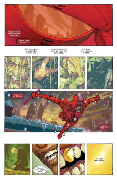
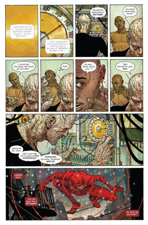
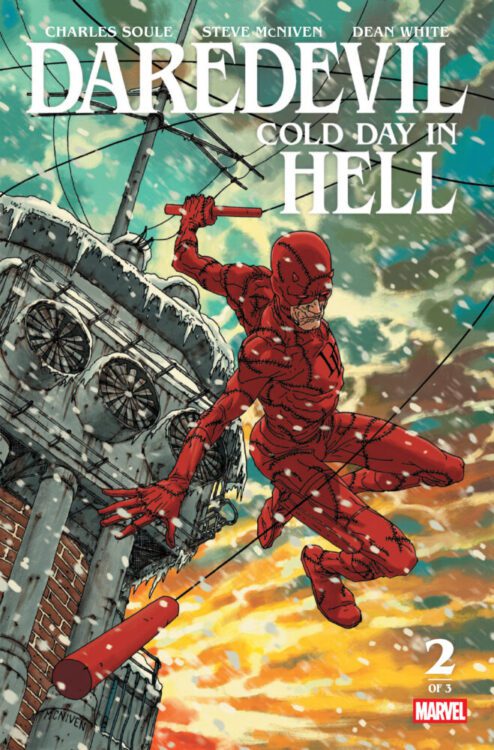
DAREDEVIL: COLD DAY IN HELL #2 hits your local comic book store on May 28th, but thanks to Marvel Comics, Monkeys Fighting Robots has an exclusive four-page preview for you!
About the issue: THE DAREDEVIL HAS RETURNED!
The city is in danger, and a Man Without Fear is once again swinging through the air. He will soon discover that he should have been afraid.
The issue is by storytellers Charles Soule (dialogue) and Steve McNiven (art), with colors by Dean White, and letters by Clayton Cowles. The main cover is by McNiven.
Check out our DAREDEVIL: COLD DAY IN HELL #2 preview below:
Did you pick up the first issue of DAREDEVIL: COLD DAY IN HELL? Sound off in the comments!
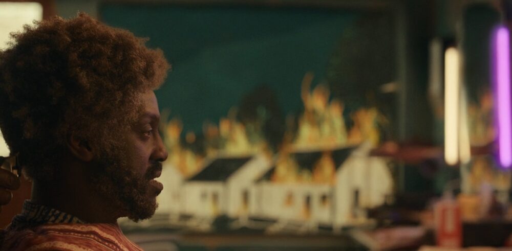
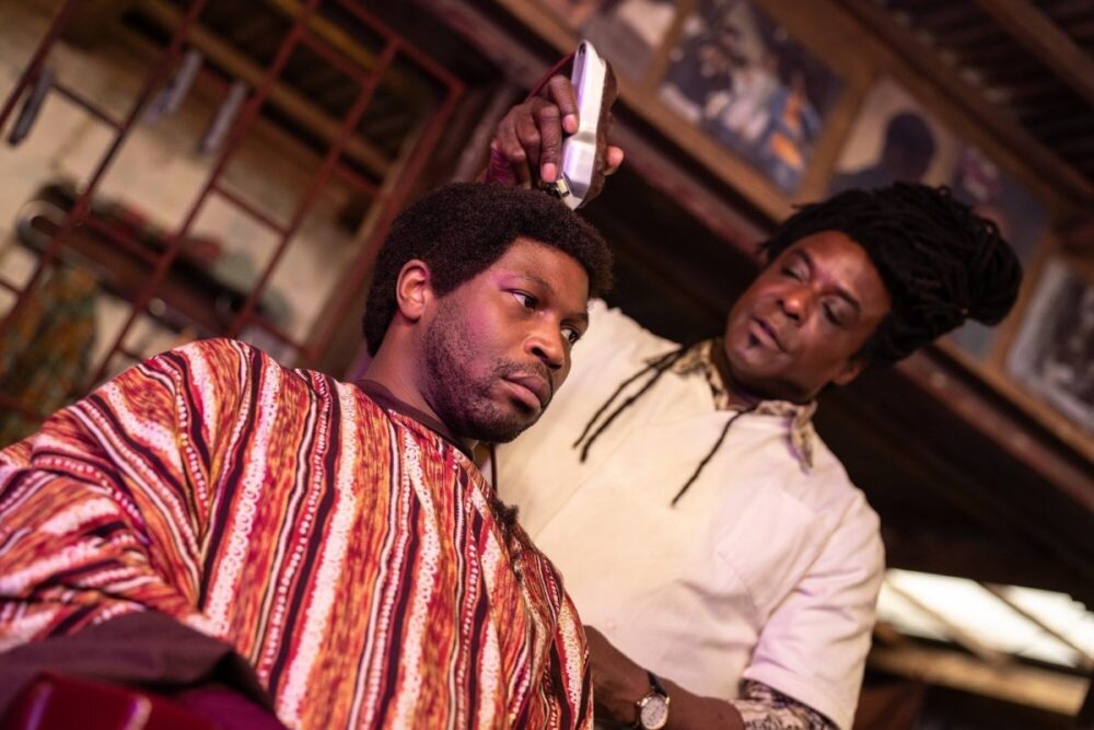
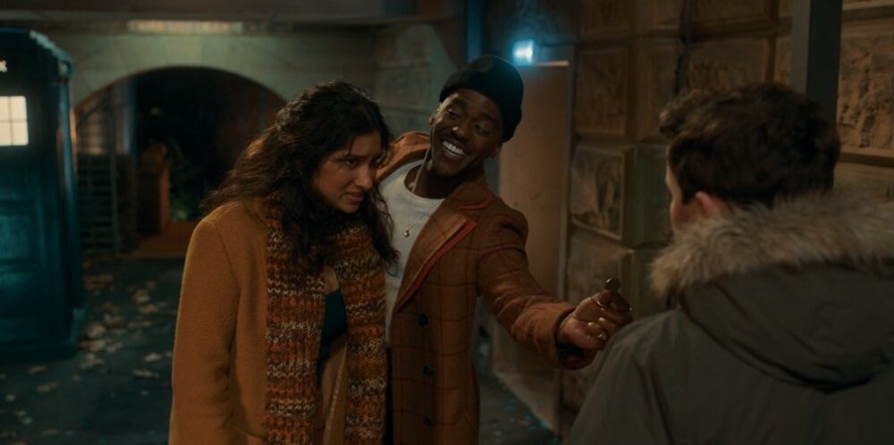
After the Doctor-lite episode “Lucky Day”, the Doctor and Belinda return and see the Time Lord go to a new location, Nigeria’s biggest city.
The Tardis lands in Lagos in 2019, and the Doctor sees it as an opportunity to visit his old friend, a barber called Omo (Sule Rimi). When the Doctor arrives at the barbershop, he finds that Omo and his patrons are held hostage by a being called The Barber (Ariyon Bakare), and the barbershop feeds on stories. The Barber wants The Doctor’s stories since he has them in abundance.
“The Story & the Engine” was written by Inua Ellams, a British playwright from a Nigerian background. His biggest plays, The Half God of Rainfall and Barber Shop Chronicles, have focused on African themes and settings, and “The Story & the Engine” gave him a chance to bring these themes to a wider audience. “The Story & the Engine” was an episode that aimed to show Nigerian culture to the masses: oral storytelling, local gods and beliefs, and even African hairstyles. “The Story & the Engine” was the first Doctor Who episode to feature a cast made up of a majority of people of color.
“The Story & the Engine” felt like an episode made during the Chris Chibnall era. During his tenure as Doctor Who’s showrunner, he expanded the show beyond European and American settings. One of the best episodes during his run was “Demons of the Punjab,” which was set during the partition of India, and “The Story & the Engine” borrowed some stylistic images from the episode “Can You Hear Me?” Ellams came from a similar background to the writers who worked under Chibnall, since many were playwrights or were known for writing dramas.
“The Story & the Engine” shared some of the same issues as the affected episodes during the Chibnall era. “The Story & the Engine” was a restrictive episode since most of it took place in the barbershop, and it was a dialogue-heavy experience. This showed the writing’s stage origins, but this made the episode into a long debate. It was hardly compelling TV.
Even though “The Story & the Engine” had a new setting, it revisited ideas that were explored before in Doctor Who. There have been many episodes where entities fed on stories, and The Doctor has lifetimes of them. The Series 7 episode “The Rings of Akhaten” explored those ideas where people had to sing to their sun. The Barber was revealed to be a godlike being, and the Disney+ era has become dependent on godlike villains. The Fifteenth Doctor has already faced four members of the Pantheon of Discord, and The Barber has taken the identity of many trickster gods.
“The Story & the Engine” was a noble attempt to expand The Doctor’s horizon on Earth, but it was lackluster because of its undercooked ideas. The episode did not live up to its potential.
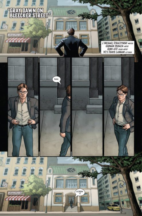
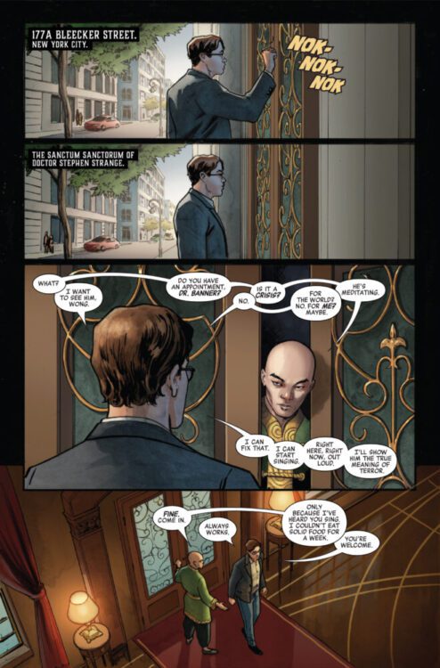
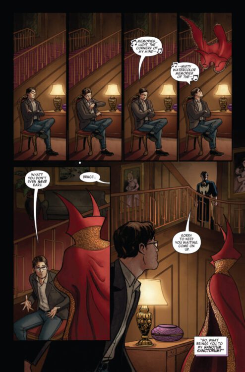
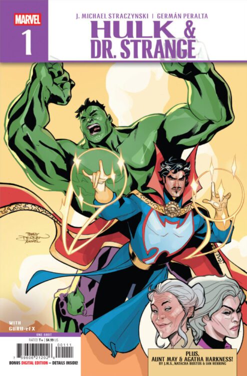
HULK & DOCTOR STRANGE #1 hits your local comic book store on May 21st, but thanks to Marvel Comics, Monkeys Fighting Robots has an exclusive five-page preview for you!
About the issue: TWO DEFENDERS REUNITE FOR A JOURNEY INTO THE PSYCHE OF BRUCE BANNER!
When BRUCE BANNER needs help, he goes to the only doctor who is willing to see him: DOCTOR STEPHEN STRANGE! Travel back to the origin of THE INCREDIBLE HULK with J. MICHAEL STRACZYNSKI and GERMÁN PERALTA as they answer the question: Can you truly change the past?
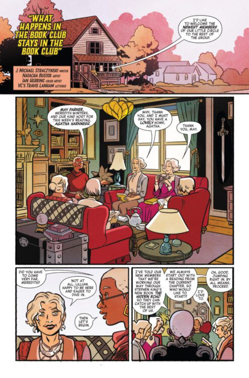
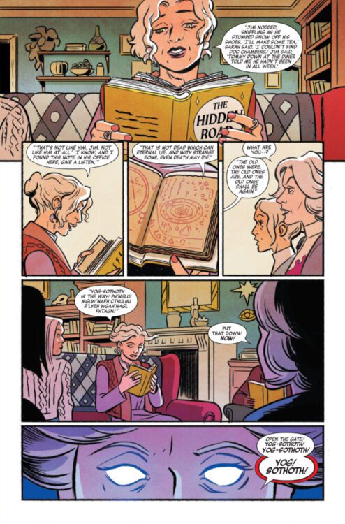
PLUS: MAY PARKER and AGATHA HARKNESS team up in the most unlikely manner – THE MIGHTY MARVEL MANNER!
The issue is by writer J. Michael Straczynski and artist Germán Peralta, with colors by Guru e-FX. The backup story is also written by Straczynski, with art by Natacha Bustos and colors by Ian Herring. Travis Lanham letters both stories, and the main cover is by Terry and Rachel Dodson.
Check out our HULK & DOCTOR STRANGE #1 preview below:
Are you picking up HULK & DOCTOR STRANGE? Sound off in the comments!
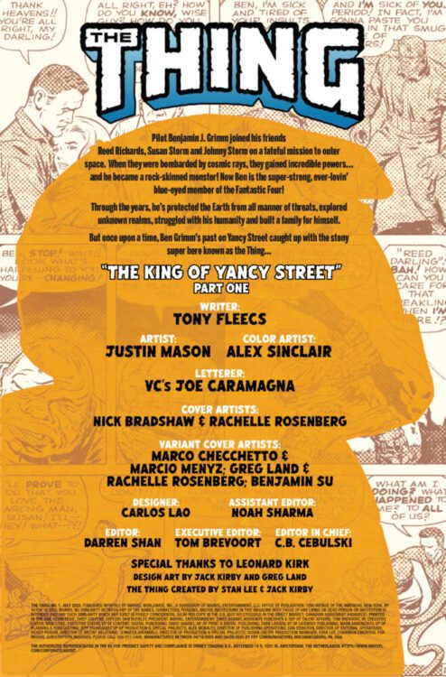
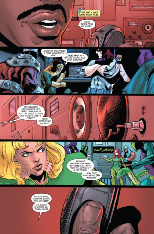
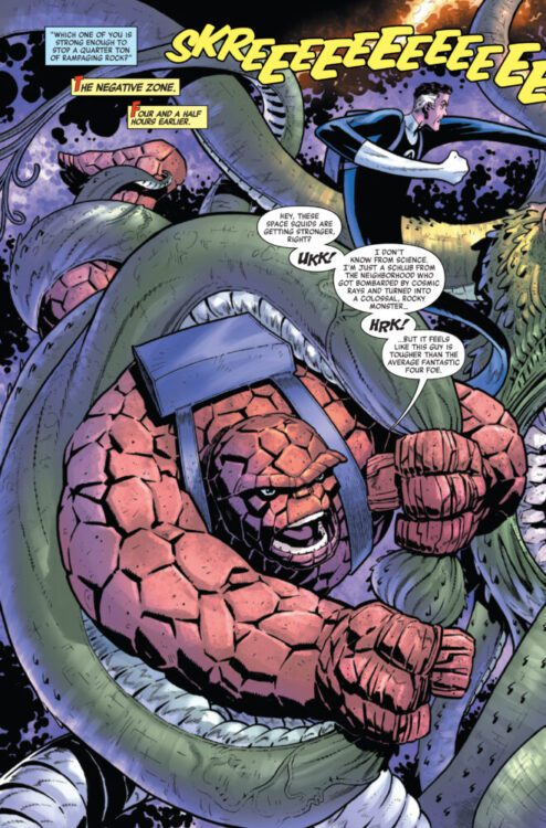
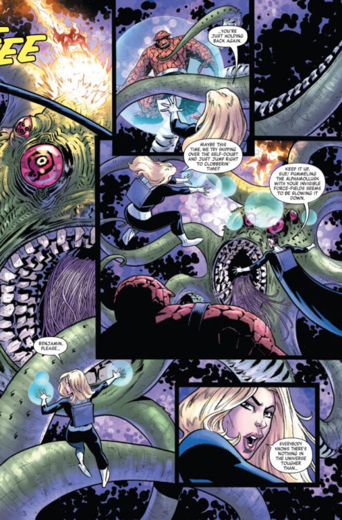
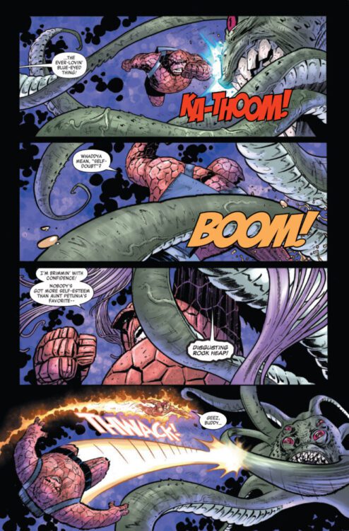
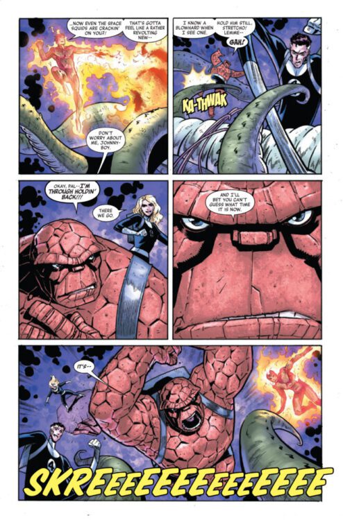
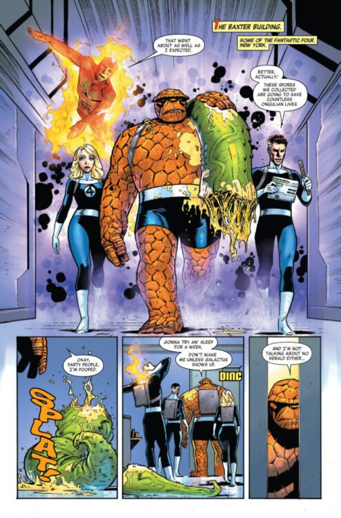
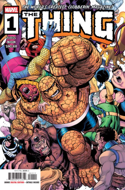
THE THING hits your local comic book store on May 21, but thanks to Marvel Comics, Monkeys Fighting Robots has an exclusive six-page preview for you!
About the issue: THE THING CLOBBERS THE MARVEL UNIVERSE!
Ben Grimm may be the strongest member of the Fantastic Four, but once upon a time, he was just a scrawny kid from Yancy Street. When an unexpected visitor from his past sends him on a search for a missing child, the Thing must unravel the mystery even if that means becoming a wanted man! Get ready to see the Ever-Lovin’ Blue-Eyed Thing versus every super-powered criminal and bounty hunter in New York City!
Writer Tony Fleecs (Stray Dogs) and artist Leonard Kirk (STAR WARS: THE BATTLE OF JAKKU) give a glimpse into the history of the Thing that reminds you why Ben Grimm is the heart of the Marvel Universe…and why you don’t want to let him hear you say that!
The issue is by writer Tony Fleecs and artist Justin Mason, with colors by Alex Sinclair, and letters by Joe Caramagna. The main cover is by Nick Bradshaw and Rachelle Rosenberg.
Check out our THING #1 preview below:
Are you picking up THE THING #1 next week? Sound off in the comments!
“Lucky Day” is the Doctor-lite episode of Series 15, showing Ruby Sunday’s life after her adventures with the Time Lord.
Conrad Clark (Jonah Hauer-King) met the Doctor and Belinda when he was a child and has been obsessed ever since. As an adult, he launches a podcast about The Doctor and aliens, and he gains the attention of Ruby Sunday after posting a picture of her online, leading to the pair forming a relationship. However, Conrad is being hunted by an alien called The Shreek.
Some of Doctor Who’s best episodes have been Doctor-lite. “Blink” and “Turn Left” were fantastic, and even the lambasted episode “Love & Monsters” had an interesting idea because it showed the lives of people who had an encounter with The Doctor. The best episode of Series 14 was “73 Yards,” where Ruby was abandoned by everyone she knew because a malicious spirit haunted her.
“Lucky Day” had a lot of ideas. Some were recycled from previous episodes, but they were repacked effectively. Conrad’s story was similar to Elton Pope from “Love & Monsters” since they both encountered The Doctor when they were young, and it impacted their lives. Elton created a Doctor support group, whilst Conrad started a podcast. The use of podcasts and social media felt like an evolution from an idea showcased way back in “Rose”, where it showed how the internet made researching the Doctor easier.
Previous episodes have looked at companions’ lives after their adventures with the Doctor. The episode “School Days” showed The Doctor reuniting with Sarah Jane Smith, and she led the spin-off show The Sarah Jane Adventures. “Lucky Day” shows Ruby’s life immediately after her adventures with The Doctor, entering into a state of malaise since it’s a come down from travelling across time and space to living a normal life in 21st Century London. Meeting Conrad gave Ruby a new lease of life. Ruby still got to partake in monster hunting, and like other companions, she worked with UNIT. It gave audiences a broader look at the Doctor Who universe and acted as a taster to potential spin-off shows.
Kate Lethbridge-Stewart also played a major role in the episode. She was committed to her work, and even her love life was linked to her job. Kate wasn’t shackled by the Doctor, which meant she could be more ruthless and showed why she shouldn’t be messed with.
“Lucky Day” was split into two halves. The first was about Conrad and Ruby meeting and entering into a romance. At the halfway point, there was a twist, so from this point on, there will be SPOILERS!
It was revealed Conrad was not a Doctor enthusiast, he was actually a conspiracy theorist who wanted to expose UNIT for faking alien encounters. It was an unexpected revenge story since Conrad had a grudge against UNIT. He aimed to mobilize the public so they could bring down UNIT.
Fake news and conspiracy theories are topical issues. It’s easy to come across podcasts and websites that capitalize on conspiracies and hatred. Alex Jones made a lot of money peddling conspiracy theories and selling products to his followers. Conrad was a fake since he was lying and used the masses for his own agenda, which drew parallels to an event in January 2021. There will be some complaints that Doctor Who was soapboxing and being overly political, but people who knowingly spread fake news don’t deserve attention. The Doctor’s speech at the end of the episode did have weight to it and made its point better than some episodes during the Chris Chibnall era.
“Lucky Day” was a refreshing, more ground-level, character-driven look at the Whoiverse and tantalizes potential spin-offs involving UNIT.
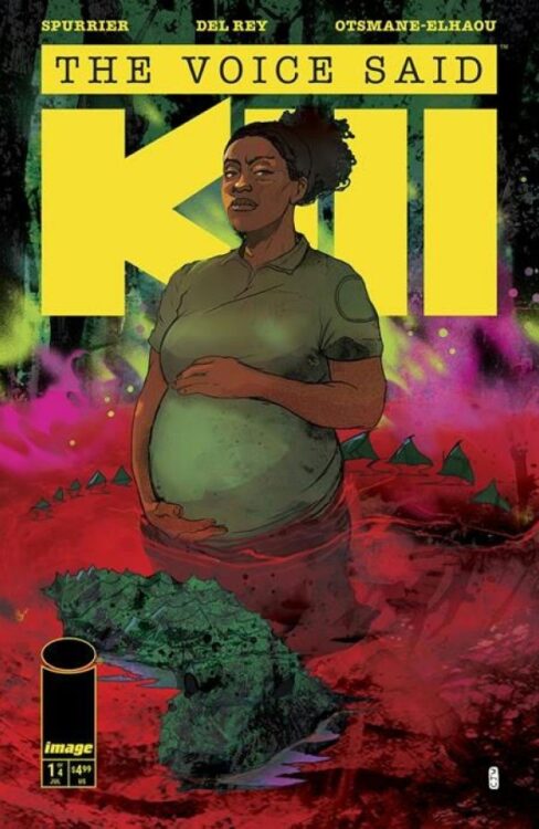
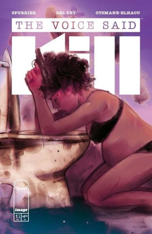
From acclaimed writer Si Spurrier (Coda, John Constantine: Hellblazer) and singular artist Vanesa R. Del Rey (Redlands) comes a fever dream of a crime story with The Voice Said Kill #1. Featuring colors by John Starr and lettering from Hassan Otsmane-Elhaou, this debut chapter is tense, striking opening to this genre-bending crime mini-series. With a creative script and arresting visual work, this is undoubtedly one of the coolest debut issues of the year so far.
“The wet heat of the Louisiana bayou.
Alligator poachers prowl the mudbug mire.
A park ranger, heavily pregnant, raises a hateful mug of moonshine with a criminal matriarch.
And one deadly sonuvabitch, out of his mind on shrooms and retribution, loads his rifle for the Human Hunt and screams down the stars.”
Writing & Plot
Few writers nail feverish insanity while still telling a grounded story like Si Spurrier, and he showcases his skills once more with The Voice Said Kill #1. Right out of the gate, the Hellblazer writer throws readers into the heat of the bayou and the ravings of an unhinged gunman, right before grounding things with the perspective of the main protagonist. Sergeant Marie Burgau is left alone in a remote wildlife outpost to contend with not only the basics of her job, but the machinations of a local crime boss. Also, she’s heavily pregnant – though this doesn’t impact her character as much as it increases the tension felt throughout the story. This tension is due to a traumatized, hallucinating madman with a rifle running loose in the Bayou, while Sgt. Burgau is the only one around to contend with him. As the details around the characters and the relationship between the madman and the crime boss is revealed, the core character conflict is revealed and the proper crime story elements come into play. The real star in this script is Spurrier’s varied, rich writing style. His focus on deep southern colloquialisms and Cajun language firmly plants readers in the setting, while the hazy, confused narration keeps the story feeling off-kilter. One of the main themes this comic contends with is how concepts like criminal justice and infrastructure don’t exist in the same degree in these remote, contested places as they do in more populated areas. As soon as the book’s main conflict is revealed, the tension refuses to let up since our protagonist can’t receive any aid for what’s she’s contending with. Spurrier’s writing builds both atmosphere and conflict with an expert hand, making this opening issue a taut reading experience.
Art Direction
As great as Spurrier’s script is, it’s Vanesa Del Rey’s visual work that makes The Voice Said Kill #1 stand out so much as a comic. Her chaotic yet detailed penciling lends both humanity and entropy to the reading experience. The bayou feels suffocatingly hot and oppressive thanks to both Del Rey’s environmental design and sequential direction. Every sequence in this comic is memorable, but the showdown/conversation between the crime boss and Sgt. Burgau is especially notable due to how Del Rey frames both characters. Every person feels like a real human character, but the moonshine boss and the gun-toting madman have that something in their eyes that makes them feel more primal. Del Rey’s sequential direction also carries the story along at a slow, thoughtful pace that ratchets up the intensity of the story as it continues into the final showdown. The atmosphere of The Voice Said Kill is completed by John Starr’s wild use of colors. The fever dream elements of this comic come largely from his use of watercolor-esque tones that bleed into each other in every image. When combined with Del Rey’s textured linework, the overall experience feels hallucinatory while still being easy to follow. Finally, Hasan Otsmane-Elhaou’s lettering is a star all on its own in this issue. His visibly hand drawn dialogue shifts in shape and size to reflect the tone of the speaker in a way that’s seldom seen in comics, making Spurrier’s dialogue feel like its rattling off in your head as you read. His SFX work is also on another level, using textured styles that emulate the soundwaves you’d imagine screams and gunshots would make. Overall, The Voice Said Kill storms out of the gate with one of the best visual presentations in the medium this year.
Verdict
The Voice Said Kill #1 is a tour de force of mad comics talent. Si Spurrier’s script blends feverish madness with genuine humanity and character, all while constantly upping the stakes within this issue’s narrative. The visuals from Vanesa Del Rey and John Starr bring this fever dream vision of a contested, isolated space to life in a mire of sweat, foliage, and blood. Be sure to grab one of the best debut issues of the year when it hits shelves on July 23rd!
Artist Steve Cuzor‘s graphic novel adaptation of THE RED BADGE OF COURAGE hits your local comic book store today, but thanks to Abrams ComicArts, Monkeys Fighting Robots has an exclusive six-page preview for you!
About the book: Written by Stephen Crane when he was just 24, The Red Badge of Courage is a Civil War story that captured the imaginations of readers worldwide and made its author an overnight literary icon. Now artist Steve Cuzor and Abrams ComicArts are publishing a powerful graphic novel adaptation of the classic and genre-defining war novel. Cuzor’s stark yet detailed artwork in The Red Badge of Courage perfectly captures the realistic prose of the original novel, presenting a lushly illustrated, unflinching depiction of war through the eyes of a young, inexperienced soldier.
A groundbreaking and realistic examination of the psychological effects of war, The Red Badge of Courage draws from firsthand accounts and research and has been continuously in print since its publication in 1894. Crane’s depiction of his main character, Henry Fleming, and his internal monologue, ring so true that many readers mistook Crane for a veteran himself. The realistic prose and visceral descriptions of battle that Crane used marked the first shift away from uncritical patriotism in war literature. It would take until at least the 1920s and the wake of the horror of the First World War for the rest of the genre to catch up. In the years following its publication, The Red Badge of Courage was hailed by Crane scholar Henry Wertheim as “unquestionably the most realistic novel about the American Civil War,” while Ernest Hemingway called the novel an “American classic.”
Hear what Cuzor himself had to say about the preview pages below:
“The wide shots help us understand how the battle unfolds. Who wins, who loses, which side advances, which side retreats… Close-shots convey emotions, as the reader runs with the men and dies with them. This large image with the wide shot on page 115 [the first preview page] doesn’t exist in the novel. I wanted to create this sequence because, until now, Henry and Wilson thought their regiment was winning over the enemy from the ground. Seen from above in the undergrowth, they realize that the opposite is true. They’re being slaughtered, and the two comrades know they’ll have to go back inside the battlefield. This creates a dynamic of suspense for the rest of the story.”
And check out our exclusive RED BADGE OF COURAGE preview below:
Are you a fan of The Red Badge of Courage? Are you excited to pick up Cuzor’s graphic novel adaptation? Sound off in the comments!
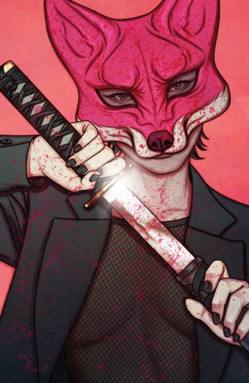
The game is afoot in Exquisite Corpses #1, the new Image Comics work from writer James Tynion IV, artist Michael Walsh, colorist Jordie Bellaire, and letterer Becca Carey. This haunting tale feels like a fantastic recipe that combines Battle Royale, James Gunn’s The Suicide Squad, and a dash of Halloween for bit of horror flavor. All of this combines into an amazing first issue that sets up a macabre playground for an intriguing story about a deep state (or colony) conspiracy and murderous mayhem.
Blood drops on corpses and katanas held by foxes, Killers for hire in a rich family’s riddle, Monsters in masks and throats strangled with wires, These are a few of Image’s Exquisite Things.
Tynion and company brings their audience into the sleepy town of Oak Valley on Halloween. The book wastes no time in letting you know this place is in for one hell of a night, and something is rotten with those who are in charge. The book begins to reveal its large cast that is split between Oak Valley and a secret venue where the nation’s elite have gathered to unleash hell on the inhabitants of the quiet little burg.
One thing that catches this reviewer’s eye is the enormity of this cast. There are plenty of townie types that feel like your run of the mill slasher movie fodder. There is an evil aristocracy plotting and scheming in the background, a plethora of serial killers, and of course one brooding anti-hero who just wants a regular life. One might be concerned that this book is simply doing too much, and time will tell if that is true for the series. However, the writing of this oversized introductory issue feels quick paced and allows a lot of characters time to breath. This allows a reader to begin forming relationships to the cast. In normal circumstances, one might be concerned that this work may become bloated and forgettable, but for my money, Tynion is at his best when he is navigating a large ensemble. The author’s Detective Comics that centered on a large team bought enough trust to make readers excited to see where he takes the group assembled here.
Michael Walsh’s work is darn near perfect for this type of tale. The character designs are on point and help establish the wide range of personalities in the ensemble. Each face feels distinctive and new. The art conveys a deep sense of emotion for whichever figure is on stage. The mood conveyed by the pencils is on point for any section of the work the reader is in. Whether you’re in the town with a foreboding sense of dread as night approaches, or learning about a handpicked psycho’s forte, Walsh’s art establishes a sense of feeling that is right on for every page.
With all this in mind, you are now going to hear about the star of the show, the colors by Jordie Bellaire. As we have noted this book is packed with characters and concepts. The book is lively and vibrant in parts, and then dark and ominous in others. Bellaire juggles a vast array of pallets and makes each page feel unique without losing a sense of wholeness for the entire work. The coloring in this work gives Oak Valley a sense of unease, and allows each killer a sense of identity and uniqueness. In this work, color matters and helps the reader sort through the massive amounts of personalities without feeling overwhelmed. If the colors had failed, the entire book would have probably collapsed in on its own weight. Yet, Bellaire’s work enlivens the book and is delightfully exquisite.
Becca Carey’s lettering is on point. The lettering in the dialogue handles the work of conveying the story without providing any unnecessary distraction. Where the lettering sparkles is when a new killer is introduced to the story. Each intro is limited to under a page. Carey gets to play around with each new name, and uses fonts to great effect to give you a sense of the type of psychopath you are dealing with. It helps make so many characters feel fleshed out in a limited space. It is another great piece in this tapestry. It is perfectly on point and flares just at the right moment to help the reader manage all that is going on in this story.
Exquisite Corpses #1 provides a lot of information to take in for one issue, and it knocks it out of the park. My personal litmus test for a first issue is seeing how excited it makes me for issue two, and for Exquisite Corpses, I am chomping at the bit to see where this goes. This is an instant pull list addition. I WANT MORE. James Tynion IV, Michael Walsh, Jordie Bellaire, and Becca Carey have made a remarkable horror comic, and it is big and expansive. Its accessibility is truly a master class in how to pull together a large cast into a single work without losing intrigue. I just hope the next issues will be just as exquisite as all the corpses we are about to see.
From the Invincible Universe arrives Battle Beast #1, penned by Invincible co-creator and showrunner Robert Kirkman, with art by Ryan Ottley, colors by Annalisa Leoni, and letters by Rus Wooton. Battle Beast #1 follows the titular protagonist immediately after his victory over the New Guardians of the Globe and Invincible. This series follows his adventures from that moment, and seemingly seems to lead to answering how he ended up in a Viltrumite prison ship alongside Nolan and Allen.
Writing/Story
This first issue wastes no time reminding readers that the Battle Beast name, much like Conquest’s, is a title—one given to a being who lives solely for the thrill of combat, and who desperately seeks defeat. As we follow the start of his journey, we see glimpses into his origin, becoming the savior of his homeworld due to his immense strength, and then having to abandon said world to save it from himself. This characterization of Battle Beast is very in line with what has already been established. He is not just a mindless brute rampaging through the universe; he’s an intelligent brute rampaging through the universe.
While not much is revealed about Battle Beast that Invincible fans weren’t already aware of, the story does deliver in giving fans exactly what they want: ferocious combat and unhinged bloodlust. He owns every frame he is in, both in presence and quotable dialogue. The things that made Battle Beast such a beloved character to Invincible readers and watchers are displayed here in spades, and it’s clear Kirkman is still extremely familiar with both the character and what fans want to see.
Art Direction
Like Kirkman, Ottley is also an Invincible co-creator. While he didn’t launch the series with Kirkman, Ottley became the series’s longest-running artist, and his work helped define Invincible. Unsurprisingly, the art style in Battle Beast remains mostly the same.
However, there have been clear improvements and added details over the years, with the art keeping its original style but now looking more refined and striking than ever. This showcases itself in the first real fight scene of this new series, when Battle Beast encounters the Colossus of Emsiu. The battle that ensues has a clear and defined choreography and sharp visual blows, all of which are accentuated expertly by Wooton’s lettering, which allows the action and flow of movement to be easily tracked and made more impactful. It’s hard not to compare this scene to the Battle Beast’s final battle against Thragg in Invincible, as that is when we last saw him in action. While this battle is of much less consequence, it’s clear Ottley has returned to the Invincible universe better than ever.
Wooton’s lettering is especially effective, although somewhat understated in parts of the comic where battle is not featured. While I wish to have seen a bit more onomatopoeic movement throughout the comic, what was there was always wisely placed and vibrant in the flow. The general dialogue bubbles use negative space well, and the page never feels too wordy, which I believe was the intent for such a battle-heavy comic.
Leoni’s color work was fantastic as well. The Colossus fight was especially noteworthy. The planet where the fight took place being is mostly represented by shades of blues and reds. Even due to this restriction, the horizon is established, and there is no lack of depth or confusion of character or background placement. The colors also enhanced the “desolate planet” feeling as intended. It was also a smart choice to make the creature’s blood green so that it becomes quickly distinguishable from the maroon soil and clouds.
Verdict
Given the popularity of the Invincible TV show and Battle Beast himself, the expectations were high for Kirkman and Ottley’s new book. However, this comic shows they know exactly what they are doing with the character. Battle Beast is portrayed here as cool and vicious as he ever has been. It was great to see glimpses of his nature when he isn’t solely focused on combat, and I am excited to see where the comic takes him and his new companions next.
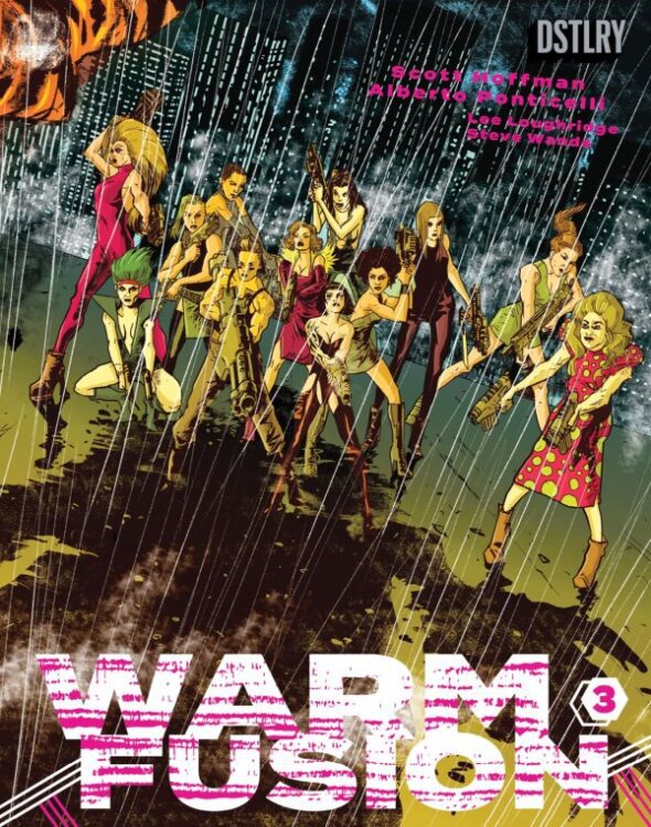
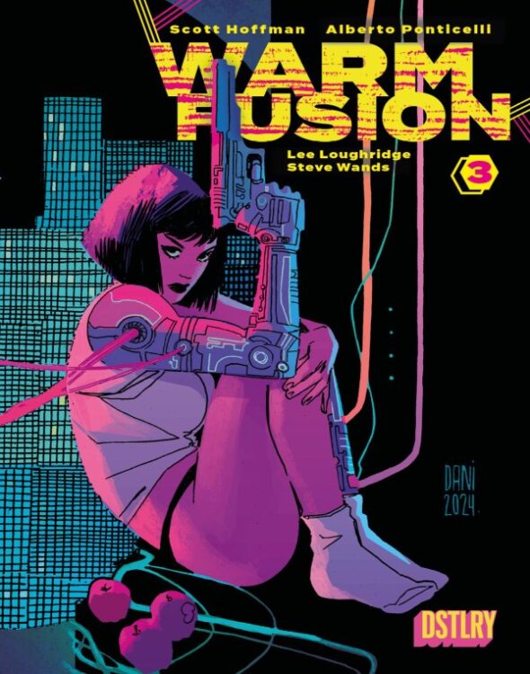
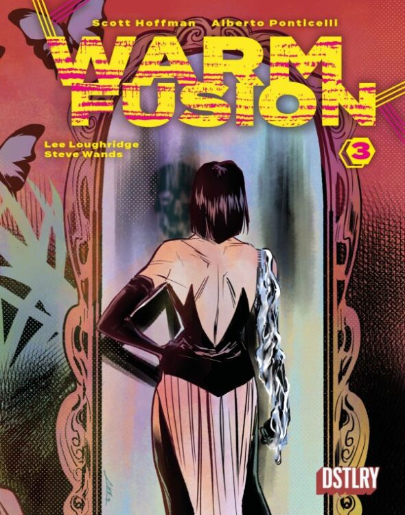
From writer Scott “Babydaddy” Hoffman (Nostalgia, Wag) of Scissor Sisters fame and artist Alberto Ponticelli (Frankenstein: Agent of S.H.A.D.E.) comes the final issue of their DSTLRY published cyberpunk body horror romp with Warm Fusion #1. Featuring color art by Lee Loughridge and lettering from Steve Wands, this finale takes all of the attitude and disturbing revelations of the prior chapters and turns it all into a crescendo and violence, vengeance, and even more twists. With a tight, compelling script and fittingly grimy visual work, Warm Fusion #3 is a fitting end to this stellar sci-fi comic series.
“In a smoldering finale, Vin recruits an army of the maligned to confront her enemy just as Prophetiq prepares to present its new product to the unsuspecting public. Meanwhile Nicholas and Mr. Barnaby scramble to complete their plan as their grotesque creation returns to his makers and the series comes to its violent conclusion.”
Writing & Plot
The most impressive aspect of Scott Hoffman’s writing in Warm Fusion #3 is how the puzzle pieces have been put together over each issue. This miserable cyberpunk vision of New York and all of the twisted elements that got it to the state its in tie neatly in to the story of the medical corporation at the center of the story, and why they’re making what they are. Vin and the other characters at the center of the story are great reminders of how people are caught in the wake made by the decisions of these giant corporate entities. Hoffman’s dreamlike narration clashes with the varied character dialogue in a way that adds to the setting remarkably well. In fact, the unique dialogue of every cast member really brings the story to life in a who other way as well, making the whole experience feel more organic. Even with all of the ingredients to this story being stirred around constantly, nothing ever feels confusing. A large part of this is the sequential direction, but also in how Hoffman scripts scenes. Pieces of dialogue overlay each other and sequences are happening at the same time in a way that builds on the chaos of the story. The whole ending sequence, involving a press conference, police blockade, protests, and um, *more,* is all covered at the same time with Hoffman bouncing from conversation to conversation without ever convoluting the reading experience. Like any great science fiction story, Warm Fusion balances depravity and consequence with genuine humanity, offering beauty and poeticism even in its most gruesome sequences. It would have been nice to have gotten more than 3 issues, but the fact that Hoffman managed to craft so much history and character in only 3 chapters is a serious achievement. Warm Fusion #3 is one hell of a final chapter.
Art Direction
Alberto Ponticelli has been on deck to deliver the grimy, gory, and neon-coated imagery for the whole series, and his work comes to a stellar close with Warm Fusion #3. The Frankenstein: Agent of S.H.A.D.E. artist uses his rough pencils to deliver a visual experience that is at times disturbing, and at others dreamlike in its execution. One element of his work here that truly stands out (aside from his whole unique style) is how he designs characters. All of the villains and crooked billionaires are drawn with less humanity than Vin and her crew. Even outside of Mr. Barnaby’s disturbing mask, all of the ultra-rich capitalists look and behave so wildly different than the grounded main characters. The grotesqueness of some of the human characters fits well with the hopeless, gray & neon appearance of this version of New York, which feels straight out of 1981’s Heavy Metal. As cool as they are to see, the body horror elements of the story are perhaps the least interesting part of Ponticelli’s work here. His sequential direction is top notch, locking sequences together in a way that carries the story at a careful tense pace. The sequence I mentioned earlier with the multiple perspectives happening at the same time work so well largely because of how Ponticelli stages his panels. The color art from Lee Loughridge perfects the visual experience, showering the rainy cyberpunk landscape of this ruined city in tones of neon and smog. Steve Wands’s lettering is also unique here, especially with his off-kilter choices for SFX work (there’s noises here that I’m not even sure make sense but dammit they work). Overall, Warm Fusion ends on a visual treat that’s just as great as the rest of the series.
Verdict
Warm Fusion #3 is a stellar, hopeful finale to this grim cyberpunk mini-series. Scott Hoffman proves his talents as a comics writer with a script that is thematically rich and character focused, telling a deeply compelling story that makes the most of its 3-issue run. The visuals from Alberto Ponticelli and Lee Loughridge are atmospherically and tonally rich, providing a reading experience that sells the used, grimy, and somehow dreamlike feel of this issue to excellent effect. FOC is on May 12th, so be sure to hit up your local comic shop or dstlry.co to grab this final chapter!


")