Home Blog Page 10

James Gunn’s SUPERMAN: Rekindling Hope

superman 2025 james gunn dc comics DCU movie review

From the mind behind the MCU’s Guardians of the Galaxy trilogy & 2021’s Suicide Squad retry comes one of the best live action superhero films of the last decade with Superman. Starring David Corenswet as the Man of Steel himself, Gunn leads an all-start cast to a smashing success of comic book filmmaking. Superman works on a variety of levels, but it’s greatest achievement is how well it understands both the ideas behind the big blue boy scout and the nature of comic book storytelling itself – while still feeling very much like a great James Gunn comic adaptation. Superman is one of the most pleasantly surprising cinema experiences I’ve had in recent years.

Right off the bat, Gunn sets up both his Superman and his version of the DC Universe right in the middle of the action. In the opening scene, Supes is coming back from a brutal battle and is dragged back to the Fortress of Solitude by his faithful (and hilariously ill-behaved) pal Krypto. One of the highest pieces of praise I can give this film is that it feels like picking up a Superman comic run about 20 issues in, or watching a story arc from Timm & Dini’s Superman: The Animated Series. The DC Universe here feels alive and lived in, with no need for an introduction. All of the characters feel at home, and none of the reveals feel too out of left field – everything just *oozes* superhero comic storytelling. One of my biggest concerns going into this film was that there were too many characters for a standalone Superman film. Fortunately, Gunn manages to give the additional heroes – Green Lantern Guy Gardner, Hawkgirl, Metamorpho, and Mr. Terrific – an ample amount of screentime to make them feel important without ever stealing too much of the spotlight away from Supes. While the plot veers in sometimes unexpected directions, it stays focused thematically. There are character additions and twists I certainly did not see coming from a live action Superman flick, but Gunn manages to make everything feel organically comic book-y.

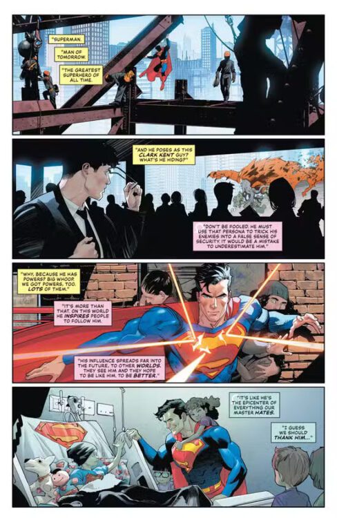
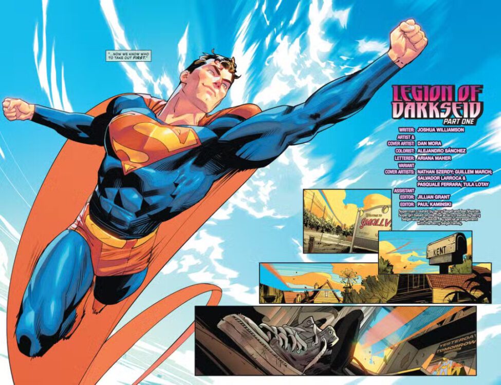
While Gunn’s scripting and directing are what haul the film to greatness, it’s the incredible work of the cast that really makes Superman shine. David Corenswet is easily the best Man of Steel we’ve gotten since Christopher Reeve himself. Seeing him in a sharply designed bright blue and red suit (with trunks!) is like seeing a panel from a great Superman comic rendered in reality. Corenswet plays Clark with all of the small town charm you could want, while delivering the unabashedly hopeful persona you need from a great Superman story. Clark’s frustration at a world he’s still coming to understand is palpable, while his determination and unending quest for peace is still awe-inspiring. Another great element of Corenswet’s performance is his phenomenal on-screen chemistry with Rachel Brosnahan’s Lois Lane. Her interpretation of fierce, insightful, and often a bit *too* brave Daily Planet reporter is a joy to watch on-screen, and I found myself just as drawn into her sequences as I was the big super heroics. As great as the late Gene Hackman’s take on the Lex Luthor was, Nicholas Hoult’s performance has handily become the best live action interpretation of the maniacal billionaire. His performance adds dimensions to the character not seen outside of the comics, and feels especially relevant to our current reality. Also, again, as great as the whole cast is, Edi Gathegi’s take on Mr. Terrific almost stole the whole show.  Every character in the film had their own memorable moment, and the film is all the stronger for it.

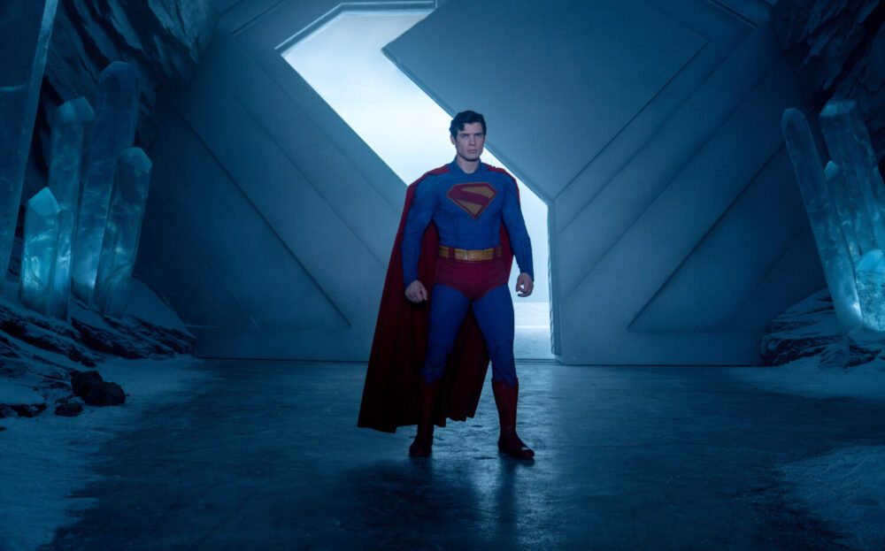
While Gunn’s scripting is sure to soak up most of the praise, his directing is what makes Superman feel especially exhilarating. Everyone talks about Gunn’s comedic timing and emotionally hard-hitting moments (as well they should), but he’s often underrated as an action director. The fight sequences are composed of long shots and camera follows that capture the momentum of the characters on screen. You feel like you’re being pulled along on a roller coaster as Superman battles against kaiju and super-powered foes while taking breaks to save people and animals caught in the mayhem. The fact that the film’s visual effects are so stellar (in a genre where they can often fall short) makes the action feel all the more encompassing. It’s also a really *bright* film. As it should be, it’s a Superman story, after all! The combination of practical makeup and stellar CGI propels Superman to be one of the best-looking live action comic book films in recent memory.


Superman’s greatest achievement as a superhero film is how unapologetically *comic book* it actually is. Gunn allows the movie to be emotionally sincere and even a bit corny in ways that comic book adaptations have become afraid to be. While Gunn’s sometimes distracting quips are still here, they’re dialed back considerably compared to his prior work. There’s a moment where Clark equates being kind and empathetic to being the new “punk rock” and honestly, that’s intrinsic to the thematic core of the whole film. While they didn’t get too much screen time, Ma & Pa Kent (played by Neva Howell and Pruitt Taylor Vince) are rightfully portrayed as the backbone of Superman’s ideals. Even with the arguably controversial change in Superman’s origin in this film, the Kents being the reason Clark is the man he is is still attributed to the kind, honest upbringing of a Kansas farm couple. James Gunn’s Superman is the most sincere adaptation of comic book super heroics in a long time, and it sets up both this version of the Man of Steel and this new era of DC Studios in spectacular fashion. I can’t wait to see how Gunn and his collaborators follow this film with their takes on the DC Universe.


Monkeys Fighting Robots Youtube

Review: KAYA #28 — When Sister Knows Best

kaya-issue 28-comic book-cover

Wes Craig’s Kaya saga has proven itself a standout in Image Comics’ fantasy-adventure lineup. It carves a unique path somewhere between the sweeping scope of Star Wars and the heartfelt character dynamics of Avatar: The Last Airbender. Kaya #28 takes a deliberate departure from typical fantastical fare, offering an introspective and emotionally resonant chapter that elevates the series beyond the action-adventure genre. This issue does not rely on grand battles or overt magical displays. Instead, it centers its entire drama around a character’s absence, specifically that of the titular heroine, Kaya.

kaya-issue 28-comic book
A DESTRUCTIVE PROPHECY UNFOLDS.

Kaya, ever the pragmatic provider, has ventured forth to perform the arduous and often thankless task of hunting for food. Her departure leaves a void, one that immediately stirs a potent mix of tension and vulnerability within the disparate group of starving refugees and rebels. Foremost among them is her younger brother, Jin, who finds himself unexpectedly thrust into a position of near leadership, a role for which he is clearly unprepared. The narrative meticulously tracks the consequences of Kaya’s absence. Jin, in his earnest but inexperienced attempt to fill his sister’s shoes, nearly makes a rash decision. This moment beautifully expresses both his inherent good heart and his profound lack of seasoned judgment. This moving narrative beat transforms the series into a poignant exploration of childhood, of the often messy and unpredictable process of self discovery when one is forced to navigate the world without a guiding hand.

Craig takes a calculated risk in structuring an entire issue around the reverberations of Kaya’s being elsewhere rather than her central participation. It is a risk that undeniably pays off. What could have easily devolved into a dismissive narrative detour instead becomes a thoughtful and compelling examination of a community under stress. The characters, stripped of their usual anchors, no longer feel like archetypes. Instead, they emerge as fully realized individuals. This issue achieves a remarkable balancing act, maintaining its accessibility for younger readers while simultaneously offering a rich, nuanced experience for adults. Younger readers, particularly those with siblings or active experiences of being the youngest one, will undoubtedly find themselves empathizing deeply with Jin’s struggles and the anxieties of being left to fend for oneself and their circle. For adult readers, this issue evokes a healthy dose of nostalgia, serving as a gentle reminder of the makeshift communities forged in the margins of childhood, often when adult guidance proved insufficient. It recalls those moments when sisters, cousins, or trusted friends stepped up, often preventing things from completely unraveling.

kaya-issue 28-comic book
RAZEL TELLS KAYA TO HUNT FOR FOOD AGAINST HER WISHES.

Wes Craig’s linework remains a special achievement. His style is kinetic and deeply intimate, drawing the reader into the characters’ most vulnerable moments. Each character is rendered with an astonishing degree of expressiveness. The panel layouts are consistently varied and thoughtfully constructed. This is not simply a sequential arrangement of images; it is a meticulously choreographed dance of visual storytelling. The aesthetic of Kaya #28 leans into a rugged, almost vintage sensibility, clearly evoking the stylistic hallmarks of comic book legends like Jack Kirby and Jim Steranko. Craig himself has cited these two titans as key influences in his endearing “Why I Believe in Comics” found on Image Comics’ website. Yet, this is no simple exercise in retro homage. Craig innovates as much as he echoes, ensuring that each page stretches the world’s emotional limits as much as its magical ones. He does not simply replicate past styles; he internalizes them, filtering them through his own unique artistic vision to create something fresh and invigorating. A special commendation must be given to the textural quality of Craig’s ink work. It is rough and unyielding when the harshness of the world demands it, yet remarkably clean and precise when clarity is paramount. Every line, every shadow serves a deliberate purpose, contributing to the overall narrative and emotional weight of the issue.

Colorist Jason Wordie’s masterful use of clashing atomic greens, purple gradients, and sudden whiteouts enhances the harsh world of Kaya. This is not a world polished by the glossy sheen of high fantasy. Wordie’s palette gives us a more gritty world, imbuing the landscapes and characters with a sense of enduring struggle and resilience. The watercolor style backgrounds deserve particular praise. They possess a subtle quality that softens the often stark borders between fantasy and memory, enhancing the overall tone of the issue without ever overwhelming the characters or the narrative.

Tom Napolitano’s lettering performs an immense amount of heavy lifting in this issue. He is tasked with the delicate balance of presenting raw emotional dialogue, hushed arguments, and moments of tense silence. The placement of word balloons is always clear and intentional, guiding the reader’s eye seamlessly across complex scenes without ever creating distraction or confusion. His font choices are finely tuned to the emotional tenor of each moment, never resorting to overt melodrama, yet never feeling flat or lifeless. When emotion surges, he allows the art and the words to breathe, giving them the space they need to resonate. It is professional, confident work that seamlessly integrates with the other artistic elements, enhancing the overall reading experience without ever drawing undue attention to itself.

kaya-issue 28-comic book
RAZEL ENCOURAGES JIN TO BECOME THE LEADER IN KAYA’S ABSENCE.

At its very core, Kaya is a story about responsibility and rebellion, viewed through the eyes of children who are prematurely forced to shoulder burdens typically reserved for adults. Kaya herself emerges as a brilliant protagonist, not because she is an invincible paragon of stoicism, but precisely because she is so intensely real. She is strong, yet undeniably angry. She leads with an unwavering resolve, yet she feels deeply, experiencing emotions that reflect the intelligent and passionate young women navigating the complexities of real life. Her emotional honesty, even when she is not physically present on the panel, sets her apart from more archetypal fantasy heroes. She embodies the spirit of that reliable older sister who always managed to keep things together when the adults failed to do so. This blend of capability and heartfelt anger makes her a truly compelling and relatable figure.

There is an old adage that states you don’t know what you’ve got until it’s gone. Kaya #28 constructs an entire narrative around this profound truth. And then, softly but surely, it reminds you that the individuals who tirelessly hold everything together are often the ones whose efforts are most taken for granted. This issue is thoughtful, artful, and profoundly emotionally honest. It serves as an ideal entry point for new readers, a deeply satisfying narrative beat for earlier fans, and a gentle yet potent reminder of the often unacknowledged importance of young women who courageously carry the weight of worlds, both literal and emotional. Without spoiling the ending of this issue, the reader is left with a powerful realization. Sometimes, the young women in our lives possess an uncanny understanding of exactly what needs to be done. And perhaps, we should take a moment to appreciate them while they are still here.

Monkeys Fighting Robots Youtube

Marvel Comics Exclusive Preview: STAR WARS: THE HIGH REPUBLIC — THE FINALE #1

marvel comics exclusive preview star wars high republic finale

STAR WARS: THE HIGH REPUBLIC — THE FINALE #1 hits your local comic book store on July 30th, but thanks to Marvel Comics, Monkeys Fighting Robots has an exclusive five-page preview for you!

About the issue:
THE END OF THE BEGINNING!

The final battle between the Jedi and the Nihil has been fought, sacrifices have been made and the dust settles. As friends and allies gather for one last celebration, a decision is made, and a fate sealed. Guest-starring faces from across the best-selling multimedia initiative. All roads lead to Dalna.

The issue is by writer Cavan Scott and artist Marika Cresta, with colors by Jim Campbell, and letters by Ariana Maher. The main cover is by Phil Noto.

Check out our STAR WARS: THE HIGH REPUBLIC — THE FINALE #1 preview below:

marvel comics exclusive preview star wars high republic finale

marvel comics exclusive preview star wars high republic finale

marvel comics exclusive preview star wars high republic finale

marvel comics exclusive preview star wars high republic finale

marvel comics exclusive preview star wars high republic finale

marvel comics exclusive preview star wars high republic finale

marvel comics exclusive preview star wars high republic finale


Have you been following the STAR WARS: THE HIGH REPUBLIC series? Sound off in the comments!

Monkeys Fighting Robots Youtube

Marvel Comics Exclusive Preview: ULTIMATE SPIDER-MAN #19

marvel comics exclusive preview ultimate spider-man

ULTIMATE SPIDER-MAN #19 hits your local comic book store on July 30th, but thanks to Marvel Comics, Monkeys Fighting Robots has an exclusive three-page preview for you!

About the issue:
THREE-WAY DANCE, ALL-OUT WAR!

FISK vs. MR. NEGATIVE vs. MYSTERIO with SPIDER-MAN and his allies caught in the middle! Will the SINISTER SIX destroy New York before they destroy each other?!

The issue is by writer Jonathan Hickman and artist Marco Checchetto, with colors by Matthew Wilson, and letters by Cory Petit. The main cover is by Checchetto and Wilson.

Check out our ULTIMATE SPIDER-MAN #19 preview below:

marvel comics exclusive preview ultimate spider-man

marvel comics exclusive preview ultimate spider-man

marvel comics exclusive preview ultimate spider-man

marvel comics exclusive preview ultimate spider-man


Are you reading ULTIMATE SPIDER-MAN? Sound off in the comments!

Monkeys Fighting Robots Youtube

Review: SUPERMAN #28 — Legion Is

Superman #28 is the book that leads us into DC’s summer event this year. Its job is to make sense of the pieces put out for us back in DC’s All-In Special released in late 2024, and while it doesn’t necessarily succeed at that here, it does bring us closer to understanding what’s going on. Writer Joshua Williamson, artist Dan Mora, colorist Alejandro Sánchez, and letterer Ariana Maher set up an interesting story with what they’ve been given, and they form a path for us to see what DC has in store in the months ahead.

The issue starts with members of Darkseid’s Legion discussing Superman, as we see panels and images of him doing what he’s famous for. They decide that he has to be the first one taken out in order for their mysterious plan to be carried out properly. After this, the issue pivots to Clark and Ma Kent talking in their Smallville home. Their conversation essentially recaps the events of Absolute Power, the All-In Special, and the Summer of Superman Special. After this, Clark flies off. He’s met with a version of Saturn Girl from Darkseid’s Legion, and she’s nothing like the one that he remembers. From there, things escalate.

Darkseid's Legion watches Superman.
Darkseid’s Legion watches Superman.

WRITING

Williamson’s job here is mostly setup, and he succeeds at that. The issue is a good recap for readers who may have missed anything, but a lot of the story that touches on the Legion kind of loses you when you remember that you don’t really know anything about them. All we’ve really been told up until this point is that Darkseid has control of a Legion and that he’s now beginning to execute his plan. One would’ve assumed that Williamson would’ve dived a little deeper into that here, but he just doesn’t. It’s not that he doesn’t have time to later, it’s just that he really dives right in with them here and it’s a little jarring to keep up with. It doesn’t even really seem as though Saturn Girl is there to taunt or observe Superman. She seems like she’s more just there to let him know that he’s pointless? It’s unclear what the goal is with most of the interaction, but it does end in an interesting way. Again, it’s a pretty solid recap issue of what we already know while also displaying how Superman is already outmatched by this new Legion, but it just doesn’t take any extra steps to raise the stakes.

Superman flies home.

ART

Mora is, as always, fantastic. He really has a strong grip on these characters and what they represent, and is constantly able to show that through his art, whether it be in single panels or huge spreads. Some individual panels of Superman look a little funky, but Mora’s actual paneling this issue is some of his best. There’s this great spread where many events of Superman’s life are shown, and he walks through them with Saturn Girl as though those events make up the floor and walls around him. There’s a really special spread where Superman uppercuts another character, and all the panels around him almost move with him and form around him. They’re all near the bottom of the page signifying the speed at which Superman is rising, but they’re also all slanted and angled towards the punch. It gives each panel depth and really allows us to feel the weight and force of Superman’s attack. Really impressive paneling from Mora this time around.

Superman sits on his childhood bed.

COLORS

Sánchez’s work is always one of the most exciting things that these issues have to offer. He really works well with lightning characters and making everyone pop with bright colors illuminating them. When two Legionnaires are seen floating in space, they’re lit by the light of the Justice League Watchtower, and that light completely shines on them from the front, giving them a really strong silhouette. Later in the issue, Superman teleports away at a certain point, and his colors become less dynamic and flat in the panel before he fades away completely. It kind of plays like Dragon Ball’s instant transmission, with us seeing the teleportation happening for just half a second. It gives it a lot of personality.

LETTERS

There’s a lot of exposition and explanations in this issue, and Maher spaces out all the dialogue really well. Especially in those double-page spreads, Maher follows each character and gives them room to breath while also not covering any important pieces of art. Every bubble is placed carefully, and it really allows us to soak it all in. Something cool from the end of the issue is when Darkseid contacts Saturn Girl. His words aren’t bound by any box or bubble. It’s almost like they rumble through the very Earth she’s standing on. It’s free text on the page with a font that makes it seem like it’s a higher calling than what we’re used to. It’s immediate and omnipresent, and very striking.

CONCLUSION 

Overall, Superman #28 is a solid issue that this team has given us. Williamson, Mora, Sánchez, and Maher all do their best to catch us up. While that does come with some drawbacks, their execution is very good for the most part. We’re immediately given a feel for these characters and the situation that Clark finds himself in, and this threat already seems larger than life. It’s an issue with a hard job, and it does succeed in having us eager for another issue to answer more burning questions as we move into this new era of DC.

Monkeys Fighting Robots Youtube

Marvel Comics Exclusive Preview: JEFF THE LAND SHARK #2

marvel comics exclusive preview jeff the land shark rivals

JEFF THE LAND SHARK #2 hits your local comic book store on July 23rd, but thanks to Marvel Comics, Monkeys Fighting Robots has an exclusive four-page preview for you!

About the issue:
AFRAID OF A SHADOW?

A malevolent force has been set upon the world – a being of pure darkness who wants nothing more than evil and destruction, darkness that lurks in the most seemingly innocent and sunny of places. Beware the evil known as…SHADOW JEFF!

The issue is by writer Kelly Thompson and artist Tokitokoro, with colors by Jim Campbell, and letters by Joe Caramagna. The main cover is by Gurihiru.

Check out our JEFF THE LAND SHARK #2 preview below:

marvel comics exclusive preview jeff the land shark rivals

marvel comics exclusive preview jeff the land shark rivals

marvel comics exclusive preview jeff the land shark rivals

marvel comics exclusive preview jeff the land shark rivals

marvel comics exclusive preview jeff the land shark rivals

marvel comics exclusive preview jeff the land shark rivals


Did you pick up the first issue of JEFF THE LAND SHARK? Sound off in the comments!

Monkeys Fighting Robots Youtube

Review: ABSOLUTE BATMAN #10 — Bane Of The Bat

Absolute Batman #10 is an absolute masterclass work. It’s impressive in every aspect; you can tell the team worked really hard to put this together and make it perfect. From the cover to the last page of the book, it just doesn’t let up once. Writer Scott Snyder, artist Nick Dragotta, colorist Frank Martin, and letterer Clayton Cowles bring us this issue that feels like our introduction to the Court of Owls all over again, only much scarier this time around.

The issue begins with a worried Martha Wayne talking to Jim Gordon. They’re talking about the disappearance of Bruce. We then see Bruce waking up on the floor in a white room, completely naked with bandages all over his body. He wakes up and attempts to escape, being caught by the horrors ingrained into the maze every time.

Bruce Wayne wakes up on the floor.

WRITING

Snyder returns to his Batman roots with this one. It really does almost feel like you’re reading The Court of Owls again for the first time. Bruce trapped in a maze, constantly being bested by Bane, while also being disgusted by what he finds in the labyrinth. Snyder dials the body horror to 11 in this one. Faces and body parts are part of the walls and floors outside of Bruce’s room, with Bane ruling over them.

Since the start of this run, Snyder’s motto has been “bigger.” While that works very well literally through the hulking masses that are Bane, Batman, and the Batmobile, Snyder’s really pushing that term figuratively as well. This shares a lot with Court of Owls, but again feels bigger. Not only is Bruce trapped with nowhere to go, constantly ending up in the same place, but the world around him is full of horrors. Other trapped beings and the walls around him come into contact with him, all orchestrated by Bane. It’s a gauntlet for Bruce. He constantly attempts to fight his way out in creative ways, trying a different plan each time as he’s just ending up right back where he’s started, only more damaged. There’s an emotional core to this too, with Brace looking for his friend Waylon. It mixes themes of friendship in with the horror and action, and Snyder navigates that spectacularly.

Credits over a large mass of flesh.

ART
It’s really hard to point out just one thing that Dragotta does well this issue, because every little thing that he touches is near perfect. It’s easy to stare at each page for minutes on end just admiring every little detail he presents us with. Starting with Bruce’s room, it’s arguably the most simple aspect of the entire issue. It’s all white and gray with some chains hanging from the ceiling and a small lock on the door. One of the first things we see Bruce do is remove a small piece of metal from his teeth, using it to pick that lock. The blood dripping off it and hanging onto it while he pulls it out is just such a nice detail.

Dragotta also draws a very detailed human body. Bruce is naked for most of the issue, and Dragotta works to make sure you can see every muscle on his torso and how it moves and flexes depending on how Bruce is moving. It’s a great understanding of the human body and kind of simplifies it for us. It’s a great contrast to later when you see Bane’s massive, unnatural body standing over a floor of loose flesh with mangled faces and arms coming from the floor. Another thing Dragotta does spectacularly well is show the passage of time. Every time we see Bruce break out from his room, he looks just a little different. He becomes bearded and disheveled slowly, giving context to just how long he’s been in there.

Later on, Bruce is in his room with his empty batsuit hanging from the ceiling. Bruce is going insane. He’s holding himself and staring at the ground hauntingly, as though he hasn’t blinked. There’s this great page where the suit is almost haunting Bruce. He looks over at it and it almost looks back at Bruce, despite being unworn. It’s calling on him to perform his duty, like Bane is taunting him with it. Which then leads into one of the best Batman pages of the entire run so far. You really don’t want to miss how stellar the art in this issue is.


Bruce escapes his room.

COLORS
Whenever Bruce is in his own room, he’s completely covered in a bright white light from almost every angle. When he leaves his room, Martin has him faced with darkness. It makes you feel like that while Bruce is in his own room being studied, the second he walks out he tries to return to the shadows that care comfortable to him. Bruce has been stripped of everything in his own room, Bane knowing how to already take everything away from him. It’s a really nice contrast on Martin’s part.

Later, when Bruce gets far enough in, he’s faced with these rooms that have blood in the air. A red tint covers everything as Bruce is beaten by Bane. He looks at the floors of people’s bodies, all red and covered with dry blood. Later, when Bruce attempts another escape, doctors enter his room. His room changes from white to red as he beats them mercilessly, mirroring the rage that he feels. When it’s over, the room returns to white.

Going back to the one page of the unworn batsuit discussed earlier, Martin’s work on that page is incredible. The room has shadows now, and they’re practically emanating from the suit. The completely black eyes and mouth call to Bruce. The suit isn’t empty, Bruce just isn’t wearing it yet.

Bruce enters a different room with screens.

LETTERS

Most of this issue’s narration comes from a doctor watching Bruce. Cowles makes it so every box of text that isn’t dialogue is handwritten, also making it look like it’s a torn passage from a notebook. This makes the entire issue feel like Bruce is being studied. He’s being monitored and every little thing he does is being written down, whether he’s in his own room or not. Something interesting is that we mostly get these boxes when Bruce is in his room, almost like this is when the doctor is able to collect her thoughts. Anywhere else, the text is still there but it doesn’t take up as much of each panel, almost like she’s observing. Cowles does a fantastic job setting the tone for pretty much the entire issue here, and is really consistent with it throughout.

CONCLUSION

Absolute Batman #10 is a dive into Bruce’s mind that showcases him constantly being pushed to his own limits. Snyder, Dragotta, Martin, and Cowles all fabulously tell this story of a trapped Bruce Wayne and this demented world that he’s in. It’s the freakiest issue of the run by far with body horror galore, but it may also just flat out be one of the best. The entire team gives it their all and it shows with every single page. If this is the consistent quality of DC’s Absolute Universe, then it should last forever.

Monkeys Fighting Robots Youtube

Review: ESCAPE #1 – War is Anthropomorphic Hell

From acclaimed comics writer Rick Remender (Uncanny X-ForceF.E.A.R. Agent) and powerhouse artist Daniel Acuna (Avengers, X-Men) comes the most unique and brutal war comic since Ennis’s Marvel MAX work in Escape #1. Featuring letters by Rus Wooton, this anthropomorphic war story manages to slip past its odd appearance to make for a war comic that questions the morality of combat better than most stories like it is recent memory. With a tense, powerful script and absolutely phenomenal visual work, this is one of the best debut comic issues of the year so far.

“Milton Shaw is a battle-hardened bomber pilot, flying missions over a war-torn world ruled by a ruthless empire. But when his plane is shot out of the sky, Milton wakes up behind enemy lines—in the smoldering ruins of a city he helped burn. And in less than 24 hours, his own side is dropping the big one to finish the job.
Now, injured, unarmed, and being hunted through enemy streets, Milton’s only shot at escape comes from the unlikeliest place: a grieving father and his son—civilians shattered by the same fascist regime that rules this land with an iron claw. Enemies by blood. Allies by circumstance. Together, they’ll have to fight their way out before the bomb drops and erases everything…and everyone.”

Writing & Plot

There aren’t many writers who could come up with an anthropomorphic World War II comic that brings the morality of combat into question and play it dead serious. Rick Remender happens to be one of the few, and this is exactly what he does with Escape #1. From the opening pages, Remender pens a war story that is as brutal as it is morally complicated – and it takes no time at all to get used to the fact that the main character is a talking bear. The concept of the war is basically the Bats (Germany) waging a brutal campaign against other species (the Allies). It only takes a few lines of dialogue to completely overlook the fact these are sentient animals and instead focus on the complicated morality of being a bomber crew. A huge focus from this opening chapter is the cost in collateral damage, and if the lives of countless civilians are worth ending a war. All of this is handled with Remender’s phenomenal naturalistic dialogue and narration, giving the comic a realistic yet pulpy reading tone. The grim subject matter and the brutality of loss make this one of the heaviest war comics to come out in years, and Remender’s characterization makes the story deeply compelling. Each character, even if they only have a couple of lines, feels like a fleshed out person due to their part in the opening conversation. As the combat opens up and the main chunk of the story going forward begins, the impact of loss and the stakes at hand hit the reader and drag them forward into the chaos. Escape is my favorite piece of Remender’s writing since F.E.A.R. Agent, and I cannot wait to see where the series goes next.

Art Direction

A concept such as what is offered in Escape #1 works so well due to Daniel Acuna’s phenomenal visual work. His heavily shaded and detailed work makes the comic feel like an old pulp war issue, but with modern visual touches. The sheer amount of detail work in Acuna’s work here is staggering. The facial animations of each character are brilliantly life-like, making all of their demeanors and personalities shine even when not considering their animal features. Acuna’s style makes the anthropomorphized world work seamlessly, matching Remender’s writing approach perfectly. The environmental details are also intricate, from the WWII bomber crew uniforms to the lights and gauges of the instrument clusters. The more fictionalized design elements – the Bats’ planes, for example – fit beautifully into this take on World War II; as if Wolfenstein took place in the Zootopia universe. Acuna’s sequential direction is another huge reason each character feels like a fleshed-out crewmember, as well as why the book feels so intense. Reaction shots are captured in small panels often in a backdrop of the chaos of the crew delivering their payload amidst antiair fire. Impacts and losses are given gravity amidst the bloody, explosive action, and each decision is focused on to make the weight of what this crew is doing felt by the reader. Acuna’s heavily shaded pencils are given life by his staggering colors, giving this comic a wholly unique visual approach. Every surface looks like its covered in oil and black powder, refining the wartime/industrial aesthetic that is often associated with WWII. The way Acuna lights up scenes with explosions and alarms is genius as well, creating some of the most memorable panels we’ve gotten in comics this year. Rus Wooton’s lettering fits into the visual style spectacularly well, especially his approach to SFX lettering. His hollowed-out SFX work blends in to the panel, highlighting the explosive chaos and mechanical clicking of the action in the bomber. The visual team is on an artistic tear with this opening issue, and it’s one of the best looking comics of 2025 thus far.

Verdict

Escape #1 is a brutal and brilliant war comic that just happens to have anthropomorphic animals. Rick Remender’s script is a brutal, morally complex snapshot of a fictional version of Word War II that is oddly full of humanity due to his stellar sense of characterization. The visuals from Daniel Acuna are absolutely staggering, with his unique visual approach making for one of the best looking comics of the year. Be sure to grab this debut issue when it hits shelves on August 20th!

Monkeys Fighting Robots Youtube

Marvel Comics Exclusive Preview: NEW AVENGERS #2

marvel comics exclusive preview new avengers thunderbolts

NEW AVENGERS #2 hits your local comic book store on July 16th, but thanks to Marvel Comics, Monkeys Fighting Robots has an exclusive three-page preview for you!

About the issue:
SEEING DOUBLE!

Deranged duplicates of the Illuminati attack the New Thunderbolts, prompting a surprise visit from Clea Strange! But even with the help of the Sorcerer Supreme of the Dark Dimension, several of the doubles are too powerful to contain. To understand how to stop them, the team needs a genius, one who wasn’t connected to the original Illuminati. But their best candidate is big, green and very, very angry…

The issue is by writer Sam Humphries and artist Ton Lima, with colors by Rain Beredo. and letters by Joe Sabino. The main cover is by Stephen Segovia and Beredo.

Check out our NEW AVENGERS #2 preview below:

marvel comics exclusive preview new avengers thunderbolts

marvel comics exclusive preview new avengers thunderbolts

marvel comics exclusive preview new avengers thunderbolts

marvel comics exclusive preview new avengers thunderbolts


Did you pick up the first issue of Marvel’s NEW AVENGERS? Sound off in the comments!

Monkeys Fighting Robots Youtube

Advanced Review: THE KNIVES — Hollywood Hell

I know, “Hollywood Hell” is a bit of a stupid title for an article, but when in doubt: alliterate! At least that’s always been my rule of thumb. But all the writing cliches I have in my toolbelt just couldn’t prepare me for Image Comics’ The Knives — yet another brilliant entry into the Criminal canon by writer Ed Brubaker, artist Sean Phillips, and colorist Jacob Phillips. The Knives, like so many of their other works, feels too personal—and too powerful—to be covered in a simple run-of-the-mill review. This creative team, yet again, has me sitting in front of my laptop and staring at a blinking cursor, at a loss for how to begin.

You see, there’s something that happens when you write a review — when you experience a work of art that makes you feel a certain way. Someway, somehow, you want to transfer that feeling to the readers of your analysis. But then, of course, there are still plenty of boxes that you need to check if you’re doing your job half right. Every aspect of this vibrant, brilliant creative team needs to be discussed at length. They are all part of the final product, and artists, colorists, and letterers in particular are often left out in the cold when their works are reviewed. The publishers, the formatting, the search engine optimization of it all, it’s all got to fit into what you’re going to say.

Yet, by the time you’ve checked all the boxes, at least in my own case, I often find I’m left with yet another run-of-the-mill review. I wax eloquent where I can. There are fleeting traces of what it feels like to actually read the work I’m discussing. But only traces.

WRITING

It might seem like I have completely lost the plot here. Specifically, the plot of The Knives, which is what I’m supposed to be telling you about. Somehow, this is a little of what the book feels like, though. It feels like it’s a comic about comics, and art in general. Brubaker weaves two stories together: the story of Jacob Kurtz coming to Hollywood, and the story of Angie losing her adoptive father. But there’s a realness beneath the surface of it all. Brubaker isn’t talking to us from Jacob or Angie’s perspective, he’s talking to us from his own. It’s his own pain, frustration, and experiences that pen each word written on the page. Some of what drives Brubaker to these places is obvious, but other things only become apparent when you read his afterword to the book.

Amazon’s Criminal adaptation, for instance, casts a large shadow over The Knives. As Jacob Kurtz’s strength is sapped by working amongst phony Hollywood execs — all of whom consider themselves experts in storytelling because they read Save the Cat in college — you can’t help but picture Brubaker doing this same dance. Could he have watched in quiet frustration as he saw his characters being misunderstood, or perhaps this is just his way of processing his terror of what the adaptation could have become in some nightmarish version of events? Either way, there’s a real fear of losing one’s self that drives this plot forward. Jacob seems confused in whether he wants to fit in with the vapidly self-satisfied or whether he’s glad he’s different to them.

And yet the whole thing begs the question: is Jacob simply self-satisfied in his own way? Are these questions Brubaker had to answer for himself when he sat in a writer’s room? Was he wrestling his own ego and trying to figure out which battles to fight to protect his work? Was he trying to distinguish between his integrity and his pride? The sheer rawness of The Knives leaves you desperate for answers to these questions. Of course, there’s plenty more going on in this book than Brubaker’s own soul-searching. Once Angie — a down-on-her-luck orphan who has taken to cat burgling to make ends meet — shows up, Jacob’s life gets a lot more complicated. All the action, crime, and drama you want from a Criminal book still finds its way into this story in spades.

ART

I always struggle to put words to the art of a comic. I can tell you all about Sean Phillips’ inking — which somehow feels haphazard and precise at the same time — but you won’t know what I mean until you see the scribbled details of a face which, when brought together, create an expression that you can really feel. Or maybe you will know what I mean, and then that’s all you’ll see when you look at each page. You see, I can tell you about the dramatic faces of the Hollywood residents, and how that perfectly juxtaposes itself to Jacob Kurtz’s almost constant look of quiet concentration, but sometimes, it feels like I’m drawing the curtain back on something that was supposed to stay hidden. It feels like I’m taking a beautiful piece of artwork and analyzing it into oblivion. It’s as though the entire process has to occur as an autopsy — in order for me to be able to pick it apart, I have to kill some of the magic first. Because the beauty of Sean Phillips’ work is that it lures you in without you knowing it. And Jacob Phillips too, for that matter!

I hadn’t noticed at first that the colors in so many of the scenes amongst the Hollywood elite were really affected. They were seen as though through a painted lens. The deep purples, warm oranges, clear blues all dominate each panel, while Jacob Kurtz’s times over at his aunt’s house are realistic and simply colored. I couldn’t have told you this on my initial read — though I marveled at the beauty of the dramatic hues. I just knew that when the chapter was done that it felt like the only moments that were really real were when he went away to see his aunt. The idea had been placed in my head by the Phillipses, without me even noticing the two of them were creeping around up there. They put their work right under your nose, and yet you don’t see it. You don’t see the brushstrokes, the colors, the forms — you’re there in the page, experiencing the lives of their characters firsthand. At least that’s how it should be. But in pointing out their strategies as artists, I feel as though I’ve tainted their work. I experienced what they were doing on my first read. Now, with the curtain drawn back and the autopsy completed, it all risks becoming an exercise for your mind rather than an affair of the heart. But at the same time, their work is so brilliant, no matter how hard you try to look at it analytically, it’s bound to pull you in regardless.

Sean Phillips’ lettering is similarly a kind of covert operation. He has a toolbox that he returns to, and for good reason. His word balloons always look the same, so do his caption boxes and sound effects. But that’s so that the sound effects, bits of dialogue, and captions that need to stand out can. A truly brutal smack over someone’s head is written in large, scratchy block letters that fill the background of a panel. The quiet whisper of something under someone’s breath is miniscule compared to their usual words. It’s all invisible parts of the story until it’s not supposed to be. You notice the things Sean Phillips wants you to notice. The rest simply sneaks in through your eyes.

CONCLUSION

This was a book I truly loved to read. And yet the more that I put words to the brilliance I see within these pages, the more I wish I could just reach through your screen to you and place the book on your lap. Still, I hope there’s something here that pulls you in, like The Knives did me. When it comes right down to it, I still face the same problem. Brubaker, and Sean and Jacob Phillips have created a work that speaks for itself so powerfully, it’s hard to add anything to the conversation except that you should go read it. So if you take nothing else from me, take that.

The Knives: A Criminal Book arrives from Image Comics in comics stores on August 27th.

Monkeys Fighting Robots Youtube