One of the things that is often said about comics is that you can do things you can’t do in any other medium. Often this isn’t always obvious because a large number of mainstream comics don’t tend to experiment too much with the format, instead mimicking other mediums to make themselves easier to access. However, there are plenty of comics, published by some of the big named publishers, that push the storytelling boat out. Undone By Blood from AfterShock Comics is one such title.
I have written previously about Undone By Blood and artist Sami Kivela’s clever use of the image to break one panel into many. However, this is only the tip of the iceberg when it comes to the creative techniques that are used in this comic.
Kivela does not conform to any set panel layout. There isn’t an overriding pattern that can be discerned from reading each issue. There are no formulaic nine-panel grids here. Instead, Kivela chops and changes the layout page by page, choosing a structure that suits the scene. On occasions, the narrative may warrant a character comparison, so the panel layouts on given pages will mirror or match previous pages. At other times there may be specific elements of the plot that need to be emphasized; small details that Kivela can zoom in on. There are also specific page transitions that need to be made for the story to flow easily.

Inserts and Overlays
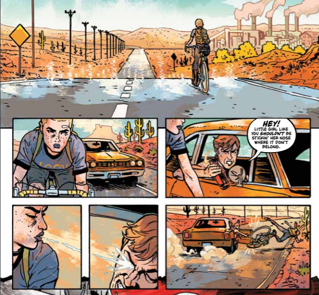
One of the techniques used by Kivela to accomplish a number of different narrative tasks is to employ the use of inserts into larger panels or small panels that overlap gutters. These are not simply a quick succession of panels in a tier to increase the narrative pace, although he does do this on occasion (see example above).
The inserts that I am referring to are usually close-ups of an object or part of a scene. These close-ups draw the reader’s attention to something specific in the narrative that plays an important part in a particular scene. They also act as a narrative device themselves to inform the reader of some change either in place, time or as in the following example, a move from one fictional world to another.
The narrative within Undone By Blood is split between two stories; the first is about Ethel Lane, who is looking for her family’s killer; the second is the book that Ethel reads, entitled The Shadow of a Wanted Man. The shift from one narrative to the other is usually pretty clear, especially if you compare the artwork side by side. Kivela uses a different style to render the characters and backgrounds for each story, and the color, by Jason Wordie reflects the two different time periods.

Narrative Breaks
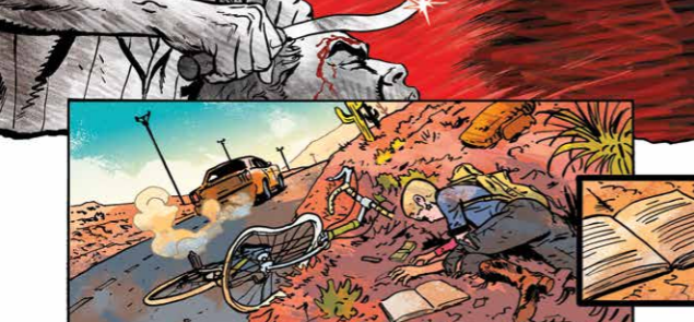
The two concurrent stories do not appear on the same page, however, and occasionally the artist signals to the reader that a transition is coming. This signal prepares the reader before a page turn that the focus will shift from one character to another. It acts like a full stop, or paragraph break, and takes the form of a small square panel at the bottom of the page. The panel has a thick border, sometimes white or sometimes black, and the image bleeds to the right of the page. Its other distinguishing feature is that it overlaps the final panel on the page, becoming more prominent.
This form of page ending happens on several occasions in issue 3, and the example from Page 9 (above) highlights how it looks and functions. The page shows Ethel being attacked and knocked from her bike as she scrambles by the side of the road in that penultimate panel on the page the moment is interrupted by a close up of her book. It has fallen from her bag and lays open on the ground, the writing visible (but not legible) on the page. The thick black border makes the panel stand out because it is different from every other panel design on the page. The right of the panel bleeds away into the page turn and takes the narrative into the book on the next page.

Concentrated Detail
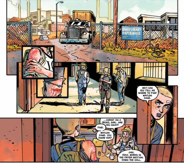
These small panels don’t just appear at the end of a scene or a page. Kivela enjoys placing them throughout the comic like a close up in a movie. Single beats that make a quick point, drawing the reader’s attention, and then back to the larger scene. There are three such panels on page 11 that are especially interesting as they work together to enhance an element of the narrative.
After being knocked down, Ethel has followed a lead to a Paper-mill in the hopes of meeting someone who can help her. As she enters the Mill, two overlapping square panels are very similar to the one discussed above. Each panel features a close up image and thick black borders. The difference is that they are solid on each side, contained images that do not lead to something. In essence, they act like bullet points highlighting, in this instance, the injuries that Ethel has sustained.
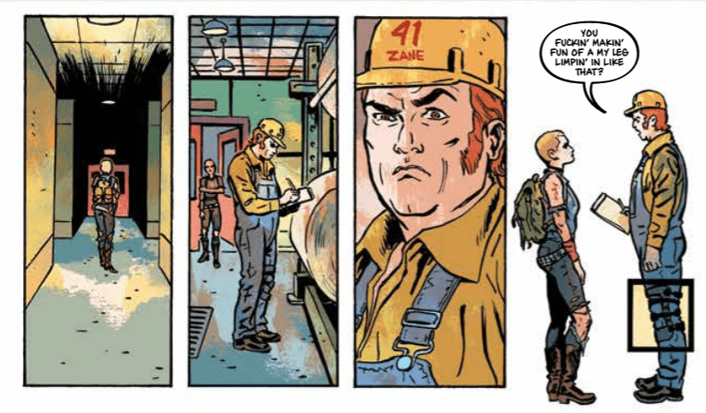
Her scraped shoulder and bleeding knee not only explain her stance in the panel that lays below, panel four if you will, but they also relate to a third, similar panel later on the page. This third panel is a true insert as it is situated completely in the final panel. It is designed in the same way with a thicker border and acts as a close-up image. The difference is that there is no zoom; it merely emphasizes an element of the image, inviting the reader to take note.
The image is of Waylon’s strapped up leg, denoting an injury of his own. The simple panel border that Kivela places around the leg reinforces part of the conversation that Waylon and Ethel are having but also refers to the top of the page and Ethel’s own injuries. It is making a contrast between the open wounds of the heroine and the old wounds of Waylon. The moment also makes a comment on the freedom of one character against the restraints of the other.
So much is inferred by the one overlapping panel and its relationship to the overall page.

Conclusion
The creative team of Undone By Blood is experimenting with the storytelling possibilities of the comic book medium. Each member of the team is pushing the boundaries of what they can do for the greater good of the comic and the story.
Kivela is not bound by rules, especially those that define other mediums, and instead demonstrates exactly what you can do with a page of panels and images. He thinks about the single panel image and what that has to convey, but he also considers the page and even beyond to the issue as a whole. When you read Undone By Blood, you get the impression that everything matters, and the creators are leading you through the pages, allowing significant clues to sneakily slip by in the background.
The majority of comics aim to engage the readers enough to pick up the next issue. Undone By Blood has so much going on it feels like it’s aim is to get you to instantly re-read it. There is so much to take in; Kivela’s use of small, close up panels is only a tiny fragment.
Undone by Blood #3 from AfterShock Comics is currently on sale at your Local Comic Book Shop.

