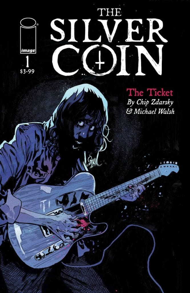
Image Comic’s THE SILVER COIN #1 is the start of a thrilling new horror series. One that brings many different creatives together. This is the first in an anthology created by Michael Walsh, Ed Brisson, Jeff Lemire, Kelly Thompson, and Chip Zdarsky.

The Silver Coin #1 is the start of a brand new collaboration, one that brings Chip Zdarsky, Michael Walsh, Kelly Thompson, Ed Brisson, and Jeff Lemire all together for one series. Specifically, it’s a horror series, and who can pass that up?
The first issue was written by Chip Zdarsky (Stillwater), and illustrated by Michael Walsh (Star Wars, Black Hammer), and it does an excellent job of setting the tone. But more on that later. Every issue will be set in the same world, one that is naturally quite full of horror, chills, and thrills.
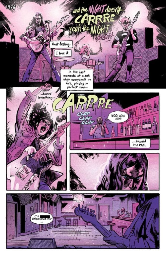
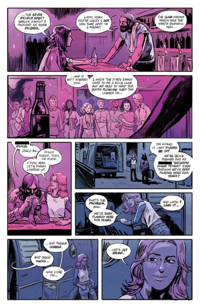
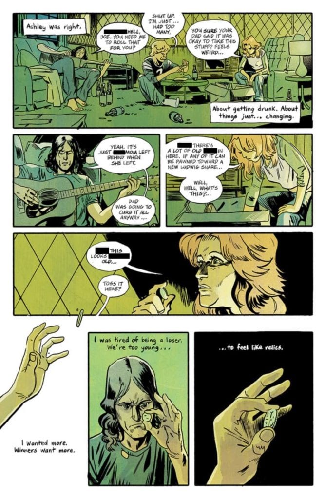
It’s 1978, and one rock band is falling to hold the attention of their audience. They just can’t outshine the newest trend – disco. That is until one of their bandmates finds this mysterious silver coin…

The Writing
If you’re looking for a graphic series that merges horror with rock vibes, then The Silver Coin #1 is an issue you need to pick up. Chip Zdarsky starts this anthology off right. The introduction is one that is easy to imagine and even easier to emphasize.
That fact makes what follows all the more tragic. The characters in this story aren’t necessarily likable – but they don’t have to be. Their struggle is real – a band fighting against the changing of the tides (IE: the audiences’ growing love of disco).
Zdarsky elegantly introduced the true driving force of the series: the silver coin. It’s immediately clear that something is wrong with this coin. Every time it comes into play, something happens. It’s easy to predict that things will worsen before they get better (assuming they survive that long).
One of the most intriguing parts of the narrative, at least for me, was watching how one character’s obsession seemed to grow. Sometimes it was subtle; other times, it seemed to double between panels. It spoke volumes about the horror of the unknown, and I can’t wait to see how the anthology’s next issue follows it up.

The Art
The Silver Coin #1 has such a dark aesthetic; it’s quite perfect for the plot. It matches the horror and rock elements in equal measures. The end result is a story that feels as organic as it is chilling.
The lines, colors, and letters were all done by Michael Walsh, and the level of cohesion really shows. The color palette is a highlight worth talking about here. Each panel seems to have one solid color that it runs with. It gives the issue a really unique look, one that feels quite at home with the overall style.
Walsh’s lettering is another element worth discussing and with good reason. He takes the lyrics (literal lyrics) to a new level here – you can almost hear them being sung. More than that, you can practically feel the passion going into the words.
Likewise, it’s the lettering that hints at something more sinister happening, especially towards the end. Take note of the stability (or lack thereof) in the way thoughts and words form. It’s pretty telling.

Conclusion
The Silver Coin #1 is a dramatic start to this horror anthology. The creative team/creators of this series is what originally caught my attention, but it’s the aesthetic that really sold me on the whole series. I am very much looking forward to seeing what happens next.

