This April 1st join the crew of salvage vessel Cortes as they land on a planet filled with grotesque horrors in Oni Press’ newest series, Rogue Planet #1.
ROGUE PLANET – HORROR PLANET
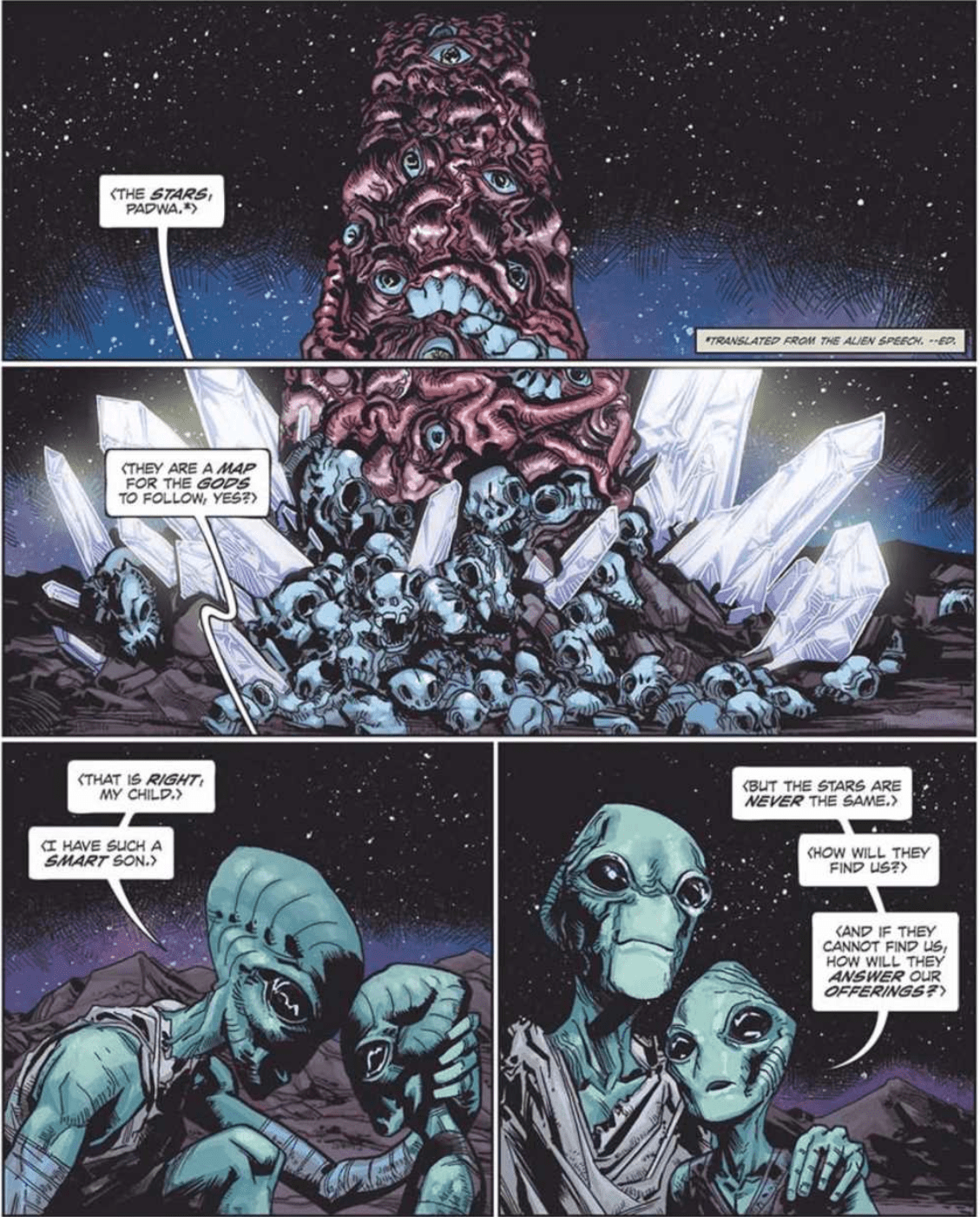
Rogue Planet #1 shows that Cullen Bunn knows how to start a DAMN comic! Within the first two pages, Bunn is able to draw you into this new space horror. Alas, Bunn isn’t new to horror, as he has written multiple amazing titles in this genre. You don’t have to look far to know this with his famous series, Harrow County receiving a sequel series. Yet, where Harrow County takes place on earth, Rogue Planet takes us to the deep, dark, terrifying space.

Rogue Planet #1’s plot is familiar to 1979’s Alien, yet mixed with mind-boggling cosmic horror. Nonetheless, it isn’t a beat-by-beat tale, as Bunn’s own ideas make the first issue unique and stand out. One such idea that stood out was something I’d never seen before; the way hypersleep is handled. From the small amount shown, it looks as if the crew takes turns in having their bodies used by robots/drones. Furthermore, they take turns sleeping while another team makes the rounds working.
The captain of the crew – Joel Narris – mentions their brains being “turned off.” Thus it seems the crew’s bodies are used by the ship to maintain it while the mind is asleep. Once you see it, you’ll wonder why it hasn’t been done before. Brain sleep aside, Bunn brings a lot to the space horror genre in Rogue Planet #1. Each character seems to fit the typical characteristic you’d see in one of these stories. Yet, Bunn keeps them fun and fresh, much like the rest of Rogue Planet #1. Well, fun and fresh from a horror perspective.

THE BEAUTY OF DESIGN
On art duty is Andy MacDonald, whose work throughout the first issue is fantastic. Nonetheless, the highest praise goes toward his designs of aliens, creators/monsters, the spaceship, and the crew’s suits. For a space-faring story to stick, it needs a great design all around. But, for horror to stand out, you need to make the monster terrifying and grotesque. MacDonald knocks it out of space in all of those aspects. Sadly speaking on the design of the monsters in Rogue Planet #1 may ruin the surprise for some. However, it’s a sight to behold.
Cortes’ interior design looks extremely claustrophobic, even for just a crew of only eight. That in mind, this closed corridor ship seems like the perfect place for the team to have more horror-filled moments transpired. Yet, one ship design stood out most—the cockpit. As a fan of clustered cockpits in spaceships, MacDonald nailed the design.
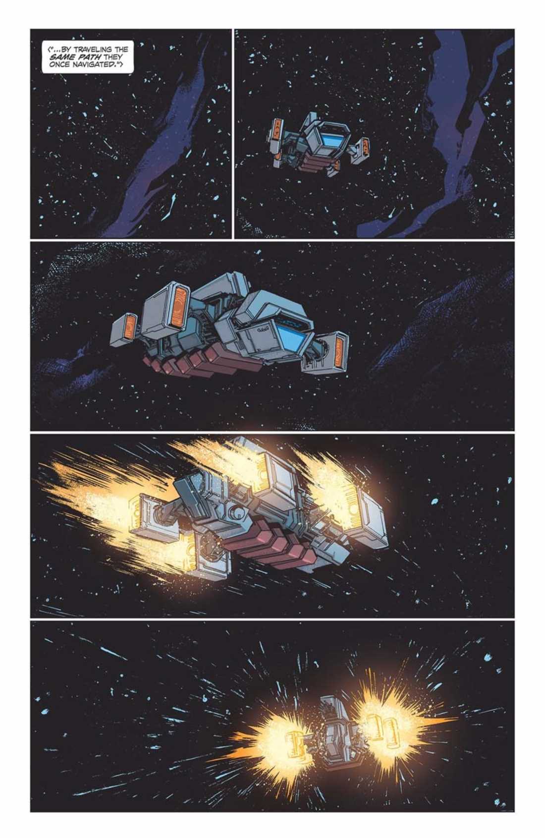
Helping Rogue Planet #1’s creepy factor is the bleak colors by Nick Filardi. When the Cortes is introduced drifting through space, Filardi keeps the colors deep and dark, with only sprinkling of stars seen throughout. That is until their destination; planet Lonely Orphan comes into view. Lonely Orphan is a dulled down red with a bright red hue circling it. If we didn’t already know that horrors awaited our crew here, Filardi’s colors would tell us.
When the crew arrives on Lonely Orphan, Filardi gives the interior a brighter color. This color never betrays the darker shades but helps the planet’s creepy factor. Furthermore, once the creature makes its debut, Filardi colors add another layer upon its hideous appearance. Filardi’s colors mixed with MacDonald’s fantastic design makes the creatures in Rogue Planet #1 something that’ll stick with you.

ALIEN LANGUAGE
Crank!’s sound effects help bring Rogue Planet #1 to life. When the Cortes is drifting through space, Crank! makes sure there is no sound. A great portrayal of the vast soundless space. But, when building up to the creature the team does so with haunting sound effects. Once introduced the size of the creature is amplified by Crank! hiding part of the sound effects behind it.
HORRIFIC HAPPENINGS
Although Rogue Planet #1 feels familiar to other stories, it adds in its unique twists and does so amazingly. Yet, there was one thing that felt needed—name tags. Thankfully when introduced character’s name and title are included in a box. Yet, when they’re in their suits no name is displayed. However, this isn’t that big of a deal, yet having a name tag would’ve been great. Alas, if horror, space, creepy monster are your bag then tell your LCS that you want it!.
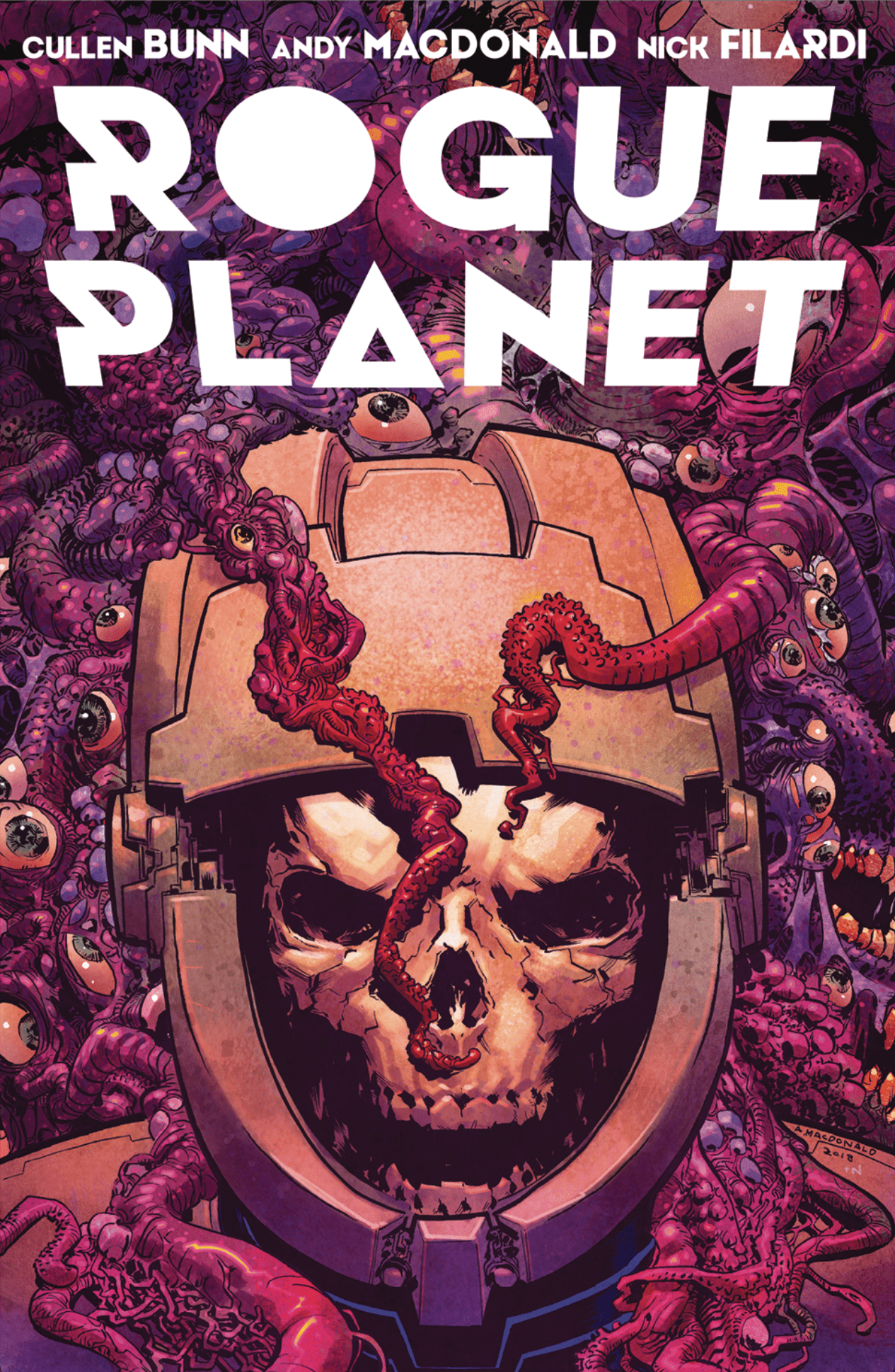
Cover Story: Honestly, I didn’t even read the synopsis for Rogue Planet #1, I just went in blind. The thing that sold me? This beautiful cover by MacDonald.


