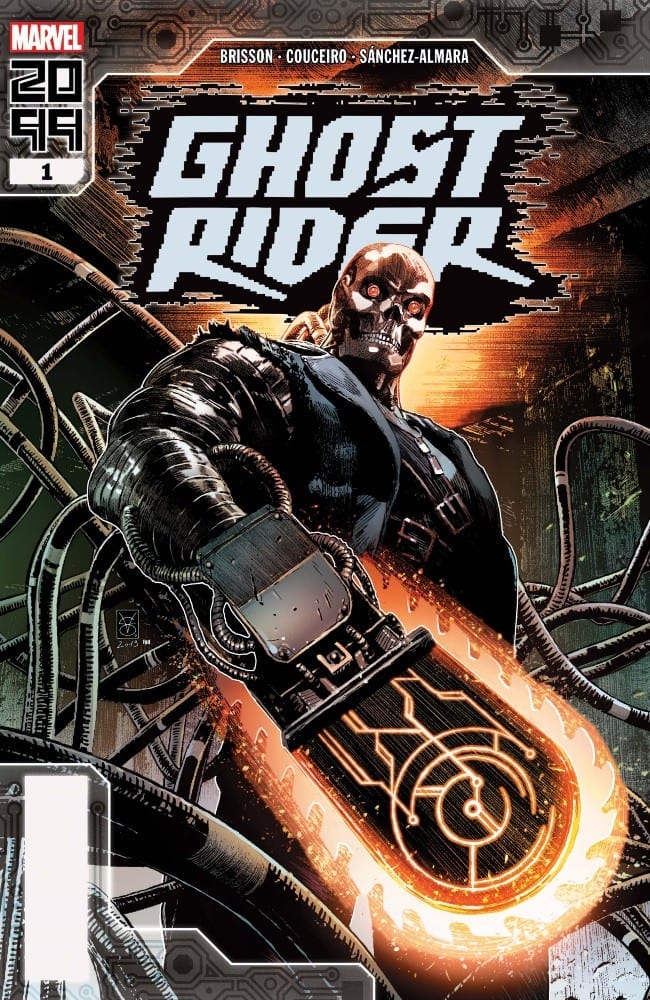
The future is here with Ghost Rider 2099 #1 from Ed Brisson, Damien Couceiro, Dono Sanchez-Almara, and VC’s Joe Carmagna. Does this new spirit of vengeance take the reader on a wild ride or does it find a way to break down at the start?
Summary
SPIRIT OF VENGEANCE OVERDRIVE! It’s the city that never stops! Welcome to Transverse City, where everything’s for sale—if you’re fast enough to take it! Kenshiro “Zero” Cochrane was just your average keyboard cowboy until he shocked with the wrong people and got murdered—life’s a glitch, ain’t it? Now, with a second chance from a higher power and an advanced weaponized automaton, Zero will punish those who have spilled innocent blood!

Writing
The biggest fault of this issue is it seems to bite off more than it can chew in just the first issue. Writer Ed Brisson establishes the origins of the new Ghost Rider, has him find out who betrayed him, and make a big leap towards taking his revenge all in a single issue. It all happens so fast, there is very little time to stop and appreciate what is happening.
Further evidence of showing this issue trying too hard comes from the introduction of Kylie, Zero’s girlfriend. When a gang comes and incapacitates Ghost Rider, Kylie ends up dispatching the introducers without breaking a sweat. It’s kind of hard to rally behind how epic a hero is when his superpowerless significant other has to step up to save them on their very first outing.

Artwork
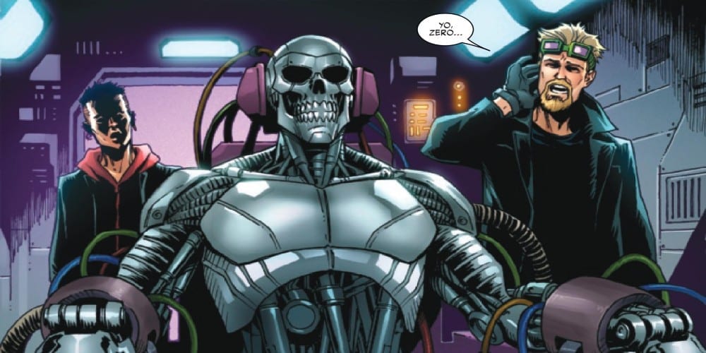
The art by Damien Couceiro definitely helps to cement the idea this issue takes place in the future. Everything has a high tech feel to it but at the same time the little details of graffiti and filthy scatters about helps to seal the look of a cyberpunk future. There also is a great difference in style between the real world and what Zero experiences when he enters the cybernetic interface to show just the difference between the two settings
The colorwork by Dono Sanchez-Almara helps to add to the technological atmosphere present through the issue. Thanks to proper coloring, the technology looks more futuristic and the mystical elements surrounding Ghost Rider look unnature. It is the ideal mixture to showcase with a comic featuring a possessed cyborg.

The lettering by VC’s Joe Carmanga isn’t as up to its usual standard of excellence. Here, the lettering actually becomes distracting and doesn’t help with the story. In once scene, the lettering is even used for censoring violence. It’s an instance where the lettering is more a distraction than aiding in the flow of the story.
Conclusion
Ghost Rider 2099 #1 can basically be summoned up as “meh” which is a crime in itself. A series featuring a haunted cyborg wielding a flaming chainsaw should be the epidemy of epic. The very essences of the future Marvel 2099 are built around cyberpunk elements this issue touches on. Sadly at the end of the day, the issue is just not a fun ride.

