

The comic industry maintains itself on re-issues, re-prints, collections, and special collected editions. DC Comics have recently found a spectacular new way of bringing their older stories to new readers, in their easy-to-read, cheap-to-buy Compact Editions. They also cater to the opposite end of the collectors market with high-end Absolute Editions that are top quality reprints with the comic book equivalent of DVD extras. These books are large and expensive on release—and even more expensive to buy after the release date.
There are a number of reasons why collected editions exist, and one of the most obvious is that they present long out of print comics in new formats for new readers to discover, or for older readers to reacquaint themselves with past favourites. One of the best series of reprints are The EC Archives, which have had a number of homes over the years, but are currently being printed by Dark Horse Comics. Each of the books collect a number of the original 1940s and 1950s infamous EC titles into bingeable tomes, allowing modern readers to experience the horrors and genius of one of the best publishers of North American Comics that have ever existed. Titles like Tales From The Crypt, The Haunt of Fear, and Crime SuspenStories are as fresh and engaging today as they were 70+ years ago. For modern readers to still be able to read these comics without having to sell their home is a blessing. Yes, there are a lot of new horror anthologies on the market—in fact, horror and crime comics tend to get a resurgence every decade—but you’ll be hard pressed to find any that have quite reached the spectacular heights of the original EC titles.

There is a “however” coming. I have a problem with the current run of EC Archives that Dark Horse is publishing, one which on the surface looks like a personal issue, but underneath, when you get to the root of it, highlights a difficult aspect of the reprinting, reissuing process. The change made to the current run of EC Archives does more than just represent the comics in a new format: it affects the presentation of some of the stories, while also eliminating one of the greatest artists to work for EC, and other major studios from the 1960s onwards.
During the 1940s and into the 1950s, EC Comics produced a wide range of titles and became a successful publishing house, not only because their comics sold in large numbers, but because the comics they published were created, written, and illustrated by some of the best talent in the business at the time. Names like Graham Ingels, Wally Wood, Al Feldstein, and Bernie Krigstein became synonymous with powerful storytelling; each were masters of the short story. The look and feel of an EC comic was notorious, and over the years they have influenced many, many, MANY creative people—from writers and artists, to actors and directors. And one of the most consistently brilliant and hard working members of the team was Marie Severin.
The early EC titles were drawn in black and white and then sent for coloring by anonymous colorists who had no contact with the artists or writers. This led to dull and often inappropriate coloring which disappointed and infuriated the artists; they detested the Mickey Mouse-style coloring on their realistic stories. “They wanted some control, so that the coloring would help sell the story along with the text and art.” (1)
Enter Marie Severin.
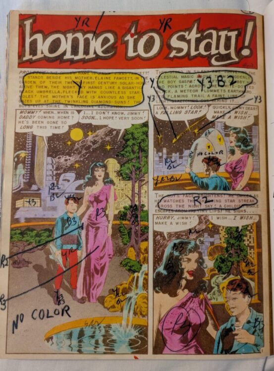
Severin took control of the coloring for almost all of EC’s titles. This gave her not only an element of artistic control, but it also allowed her to control the severity of the horror and crime stories, and even veto work that she felt went too far, especially when it came to the depiction of women. By coloring the artwork, Severin was able to manipulate the stories and control the visual impact the comics would have. It was noted by Grant Geissman, “If she found a panel too gruesome to color in the ‘traditional’ way, she would often opt to color the whole thing blue as a way to tone down the gore.” (2)
This aspect of her work didn’t go unnoticed. David Hajdu also comments on her artistic abilities, stating that she embellished “the original black-and-white art without overwhelming it, often softening the gruesome scenes with muted tones.” (3)
This idea of muted tones, of leaning into the reality of the worlds portrayed in the comics while also controlling the horror or violence, is one aspect that is lost, or at least diminished, in the current series of reprints. Take a story like A Snapshot Of Death, first published in Crime SuspenStories #1 (published 1950), as an example. In the original opening page, the title and header are colored with a dirty yellow and the background for the large first panel has a deep orange that complements the heavy black behind the title and the recesses of the skull. The camera has a dark purple wash with a subtle blue skull reflected on the lens. The main skull has been left white, but because of the cheap newsprint that the original comics were printed on, there is a smudged, greyness to the bone.
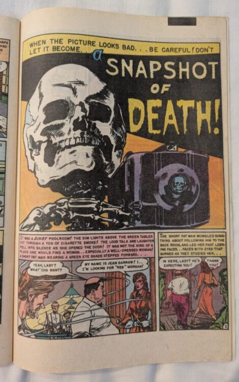
In contrast, the EC Archives reprint (in volume 1 which collects issues 1 – 6 of Crime SuspenStories) published in 2024 changes several of the colors on the opening panel, and replaces the muted orange background with a bright yellow. The banner has been changed to a baby blue color, and the word “Death” is now a flat, bright red. The most significant change is with the camera, which has been altered to a dull grey with an off-white skull in the lens. The original coloring used the blue as a set up for a motif that runs throughout the story. In that opening panel, the color of the skull is a reflection of the ‘A’ in the title of the story. This circle of blue features throughout the rest of the story, often isolating a character’s face within a panel, and creating a distinctive separation between foreground and background. The reprint loses that, just as it loses subtlety with its garish bright colours, especially in the characters’ clothing.
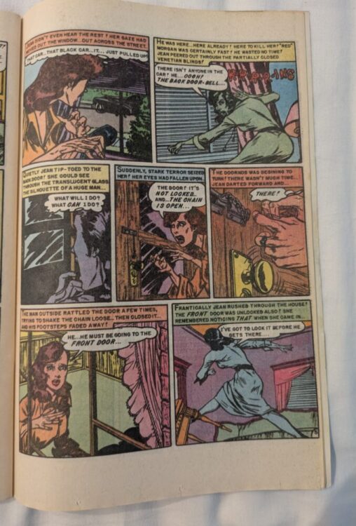
In this story, the new, modern coloring could easily fall into the category of the “Mickey Mouse” style of coloring that the original artists detested. Severin’s blocks of pastel and toned down colors provide an uneasy atmosphere to the story; they give it depth and a physical darkness that creates the terror within the narrative. Some of this is lost with the brightness in the reprint. Take for example the second panel on the fifth page (see image below). In the reprint (seen above, at the top of the page), each aspect of the scene is as clear as day: the blind covering the window is a crisp white, inferring that the action is taking place in the middle of the day. Severin chose to color this scene in three distinctive washes: a dark blue for the background, an unhealthy green for the foreground, and a streak of fleshy pink down the middle, separating the two. The blood red ringing of the telephone, “R-R-R-R-ING”-ing across the panel also helps to highlight the fear on the central character’s face. This is a scene of panic, of impending doom. Not the bright safety of the reprint.
One thing that must be taken into consideration is the difference between the two products. The original comic was printed on cheap, newsprint paper that soaked up the inks, diffused the colors, and were prone to smudging. The EC Archive books are printed in a larger format on glossy, crisp white pages. The printing process is very much different and is more precise, reproducing the actual colors that are added to the art. Severin was working with materials that had an element of unpredictability. However, her understanding of the printing process meant that she could create the intended visual atmosphere on each page, in each story, with a masterful skill. The modern reprints do not have that same eloquence and actually suffer because of the more advanced printing process.
Marie Severin used her talents as an artist to work with the other creators to produce exceptional stories. Qiana Whitted notes in her book EC Comics: Race, Shock & Social Protest, “Their collective efforts not only extend[ed] the limits of the medium in all directions but also resulted in an idiosyncratic brand of narrative commentary.” (4)
Some of the work that EC published went beyond mere entertainment. Over the short years that their titles held sway, the company published some very important, poignant, social commentary. The story The Guilty (Shock SuspenStories #3 1952), for example, highlighted the inherent racism within a society and the treatment of people who were of a different race. While the story dealt with the cruelty and hatred, the visuals were also breaking comic stereotypes. The artists, with Severin, portrayed the black characters with the same sense of reality that they used to portray their white characters. They did not fall into the trap of using stereotypical features and representations, but instead created characters that would challenge the readers’ perceptions. As Whitted says of their treatment of the central character in The Guilty, “Wood and Severin make Collins’s blackness easy to see but difficult to read.” (5) The character is as complex as his white counterparts, and this is achieved through the visuals, and through Severin’s application of the colors.
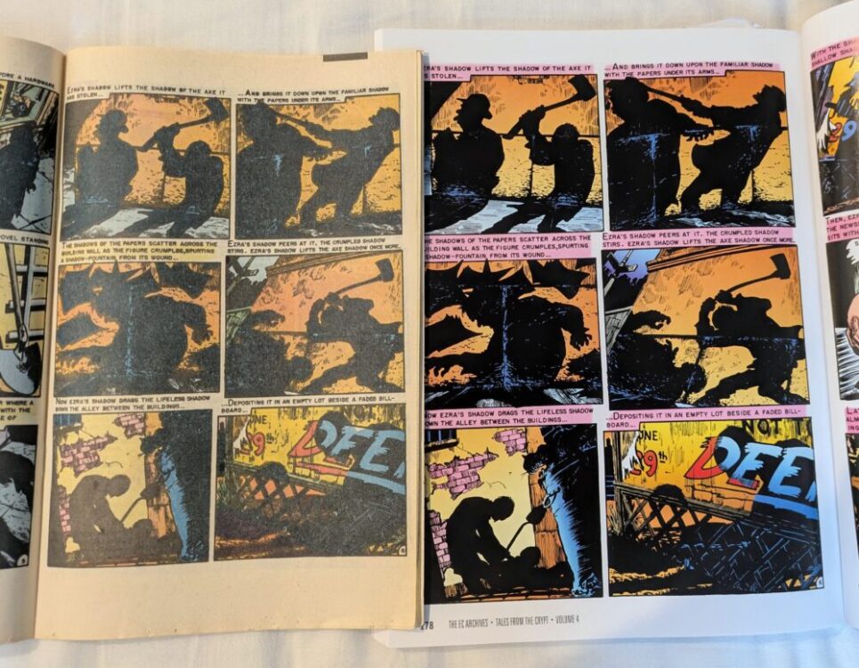
The colors also played a large part in the shock or twist endings that EC comics became famous for. An obvious technique that Severin used when wanting to help build up these shock endings, especially the horror and social justice stories, was to employ the use of a full panel color wash. As has been noted already, Severin used color washes to dampen the more gruesome scenes in the horror comics. However, the same coloring technique helped Severin to expose racial prejudice within a story and hide a twist in the tale. In the Frontline Combat story Perimeter, for example, Severin used a monochromatic blue to represent the nighttime setting, but also to disguise the race of the characters in the sequence. Only at the end, when she reintroduced a wider range of colors for the aftermath of the story does the difference between characters’ skin color become apparent. This technique is used across several stories for a similar effect, such as In Gratitude…, one of the greatest EC stories. But specific color washes weren’t used just to disguise a character, they were often used to manipulate the reader’s impression of a character. In Blood Brothers, Severin “makes Sid [one of the villains of the story] appear demonic in red and orange hues.” (6) In Shadows of Death, as the story progresses, Severin coloured the scenery in dark washes, emphasising the murky story unfolding and enhancing the black shadow stalking the night. In the reprint from Volume 4 of Tales From The Crypt, the colours are brighter, the printing is clearer, which in turn diminishes the intensity of the sequences. It may seem like a little change but, side by side, the difference in atmosphere is apparent.
The EC Archives collection is a wonderful series of books that represent the old EC stories for new readers to enjoy. However, it is a shame that the coloring has been updated, not least because this removes the work of not only one of the great EC artists, but also eradicates the work of the only female artist to work on these stories. Marie Severin produced high quality work for a large number of comics, over a long period of time, and it is disappointing that her legacy is reduced to a paragraph of small print on the contents page.
In the words of the great Bill Gaines, owner and publisher of EC comics, Marie Severin “was probably the best damn colorist in the history of the comics industry.” (7) Her work should be featured in the reprints and celebrated along with the other greats reproduced in the collections.
References
Numbers 1, 2 and 7 from FOUL PLAY: The Art and Artists of the Notorious 1950’s EC Comics by Grant Geissman, published by HarperCollins (2005) (page 239,240)
Number 4, 5, and 6 from EC Comics: Race, Shock, & Social Protest by Qiana Whitted, published by Rutgers University Press (2019) (page 6, 59, 91)
Number 3 from The Ten-Cent Plague by David Hajdu, published by Picador USA (2009) (page 189)
The title “The Moon Isn’t Yellow” is a reference to an interview with Marie Severin which was featured on the DVD extras for Tales From The Crypt and can be watched here..