Getting people to accept comics as serious literature can be difficult. Part of this is because the only interaction that people have with comics is the numerous blockbuster movies that Marvel, and occasionally DC, release. It’s hard to hold something up for serious consideration when the pinnacle of experience is three hours of costumed muscle men punching each other.
Stereotypes and modern social symbols affect initial interpretations and can form a barrier to experimenting with new mediums. If all you see is one genre of a medium, why would you want to venture any further?
However, it’s not just the iconography that can create blockades for new readers, the structure of a comic can be challenging to translate, and itself be off-putting. When faced with a page of panels, often overlapping or with small inserts, it can be daunting to read.
Natural instincts will drive a reader to take the Z-Path reading approach through a page, starting at the top left and finishing at the bottom right. However, even comics with straight forward panel layouts aren’t always grammatically easy to read. How does one panel interact with another? Is the new row of panels a new idea or a continuation of the previous row? The different page and panel transitions can be complicated to follow if you are not au fait with a particular style of comic and, just like any storytelling medium, comics contain flashbacks, dream sequences, and changes of perspective, all of which can complicate things further.
In Understanding Comics*, Scott McCloud approaches Comics as if they have their own grammatical structure, containing signifiers specific to sequential art. Thierry Groensteen takes this concept one step further in his books**. He describes the structure of a comic as if it was a language of its own, made up of the same elements that make up any written language. He breaks comics down into paragraphs, sentences, and even verbs; an entire syntax that can be studied beyond image interpretation.
To explain the workings of a comic as language is not an easy task, it can appear as complex as learning any new language. However, as much of the comic language is visual in nature and created using concepts that readers are already familiar with in other mediums, especially prose novels, it isn’t as complicated as it first seems. Basic ideas can be demonstrated in simple ways if the right comic is chosen as an example. You can use comic strips like Peanuts or Dick Tracy to easily explain the progression of images to build simple sentence structure; Neil Cohn does this wonderfully in his book The Visual Language of Comics***. Alternatively, you can look at the page layouts in a graphic novel such as Blue Is The Warmest Color and see how it follows a structured formula akin to a prose novel in order to tell it’s story.
By studying the different techniques that Julie Maroh uses in Blue Is The Warmest Color it will become clear that the graphic novel utilizes familiar and repeated structures to advance plot and enhance character. It does this in the same way that a movie or a prose novel uses techniques specific to those mediums to lead an audience naturally through the narrative.
* Understanding Comics Chapter 3: Blood in the Gutter by Scott McCloud, Published by William Morrow in 1993
**The System of Comics and Comics and Narration by Thierry Groensteen published by University Press of Mississippi
***The Visual Language of Comics Chapter 3: The Visual Lexicon part 2 written by Neil Cohn and published by Bloomsbury Academic in 2013.
Blue Is The Warmest Color*
Le bleu est une couleur chaude was first published in french in 2010. Written and drawn by Julie Maroh, it is a story about self discovery and social bigotry. The central character, Clementine, falls in love with an older teenager she glimpses briefly in the street and her life is changed dramatically by the relationship that follows.
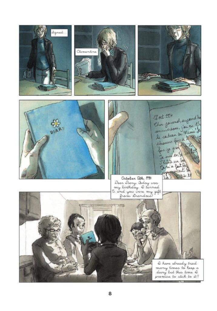
Maroh’s art style is fairly expressive, reflecting the aesthetic of the 1990s, where most of the comic are set. The main character’s features are slightly exaggerated, giving each one a distinctive look, which is important because most of the story is set in grey scales with only a splash of color. This is because the majority of the story is told as flashbacks, through the use of a diary that one of the characters reads.
The contrast between the present day and the diary entries is reflected by the lack of color. It creates a clear distinction between the time periods with the written captions providing setting both physical and emotional. This is the first of many examples of Maroh using the structure of her graphic novel to aid the reading experience.
*Simply to be known as Blue from this point onward
Scene Breaks
When you pick up a prose novel there are a number of structural elements that you would expect to find contained within the book. The narrative is often broken down into paragraphs and chapters, denoting moments of time and scenes from the characters’ lives.
A graphic novel or comic contains the same breakdown of narrative information; however, it might not take the same form as prose. The most obvious separations of time are between the panels themselves; however, the structure of sentences and paragraphs in a comic goes beyond single panels. A series of panels and gutters define a period within a scene, and the overall page structure reflects various lengths of time. In Blue, Maroh signifies time shifts in a visually obvious way, as I will demonstrate.
As already explained, Blue takes the form of diary entries to tell Clementine’s relationship with Emma. The book* opens with Emma visiting Clementine’s parents’ house and picking up a blue-covered diary that has been left for her. There is a somber mood which overshadows everything that is to come.
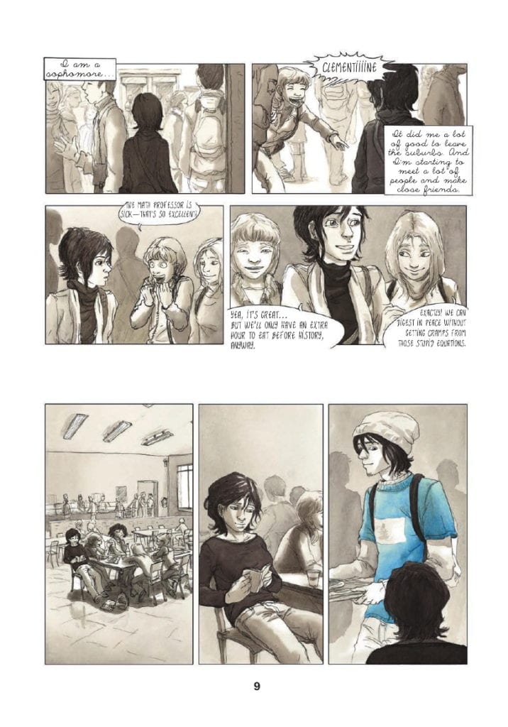
Early on, you get an example of how Maroh uses the space on the page to signify jumps in time or breaks in scenes. On page 9, the reader is introduced to Clementine in her school when one of her friends calls out her name. Two tiers of two panels reveal Clementine in a short character moment that also establishes her situation and location: she is a high school student on campus. In the scene Clementine and her friends discuss the bonus of having an extra hour for lunch. The scene then skips to the canteen where Clementine is sat with her friends, already well within the lunch period.
To illustrate the jump in location and the passage of time, there is an extended gutter between the two scenes. A gutter that is noticeably larger than the gutters between the four panels at the top of the page.
This extended gutter creates a larger time-lapse than the previous gutters suggest. At the top of the page, there are mere moments between each panel, even the move from the end of tier one to the start of tier two is representative of a shorter period of time. This is because the gutter is smaller between the panels and the tiers. However, the break between the end of tier two and the start of tier three is approximately four times the size. The physical time it takes the reader to get from panel 4 to panel 5 is longer and indicates that the journey Clementine took between the two moments is also longer.
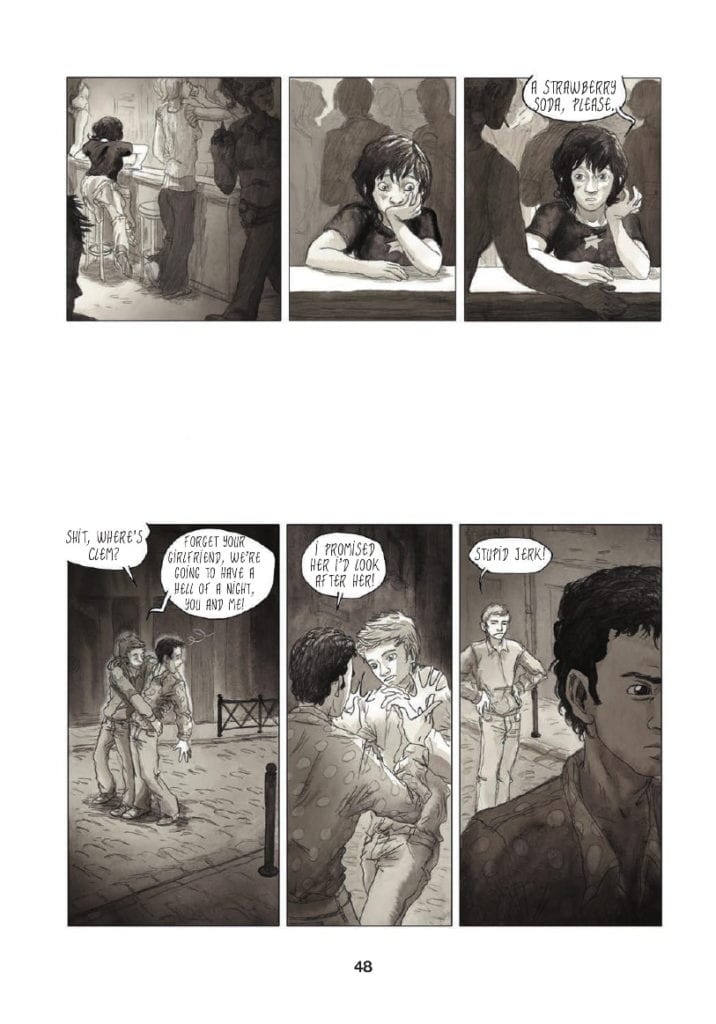
This approach to the layout continues throughout the novel with the gutters between scene changes altering in size, representing longer periods of time. Another great example of this occurs on page 48.
Clementine has been taken out by her friend Valentine for a night on the town, visiting the local gay bars. During the evening, Clementine starts to feel like a third wheel so she secretly splits off from her friends. She finds herself sitting alone at a bar where she orders a drink. This occurs at the end of the first tier of the page. There is then a break between the first and the second tiers when the focus shifts to Valentine realizing that Clementine has gone.
The gutter between the two tiers is especially large, almost big enough for another row of panels to be introduced. This large gutter represents two narrative elements, one physical and the other emotional.
In the first instance there is a shift in space/time between the characters. The action moves away from Clementine and focuses on Valentine. The size of the gutter infers that there is a lengthy time period between one ordering her drink in the bar and the other noticing he has lost his friend. There is also the indication that Valentine has traveled some distance away from his friend.
The larger gutter illustrates a psychological distance as well as a physical between the characters. Although they are friends, the evening is clearly more enjoyable for Valentine than it is for Clementine. She is uncomfortable and unsure of herself and her surroundings. Valentine on the other hand is in his element, enjoying himself. For Valentine, the large gutter is a visual indication of the phrase’ time flies when you’re having fun’.
Although the altering of gutter sizes is not unique to Blue, very rarely is it used so notably to reinforce the characters’ movements and emotions. The standard practice is to change a scene on a page turn, a technique Maroh employs; however she is able to add more narrative weight to the story by changing scenes mid-page.
*This article is based on the soft cover, Arsenal Pulp Press printing with the first edition in 2013. Any references to page numbers therefore refer to this particular print and may differ from other editions.
Chapter Endings
Although not all novels, or graphic novels, are produced with chapters, there is always an element of significant narrative change where a character or plot reaches a point of no return. These usually take the form of some thematic breakthrough or mood change in the story.
Maroh chooses not to use formal chapter breaks, but there are sections of the book that perform the same function. These pages are notable because the structure of the page layout is significantly altered.
Throughout Blue, Clementine’s life and ideals are challenged and there are turning points where something important happens. These points are punctuated in the book in one of two ways. The first is via full-page spreads, that is, one image taking up an entire page. I will come back to these later.
The second technique that Maroh uses is to significantly alter the panel form and layouts. The alterations signify the importance of a moment of time as it stands out, not only on the page but in the rhythm of the novel as a whole.
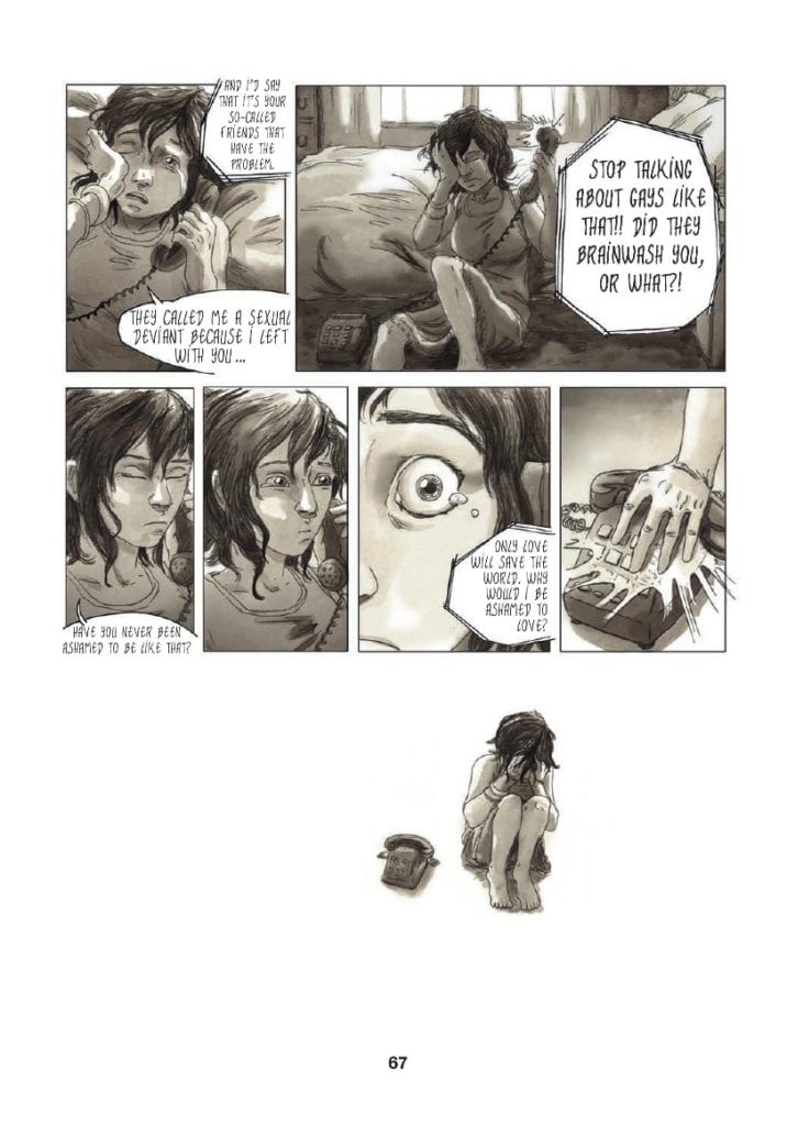
After a bad day at school, where Clementine is bullied by her once best friend because of rumors about her sexuality, she turns her frustrations on Emma. Via a telephone call, Clementine blames Emma’s indiscretions for the bullies’ behavior, and in return, Emma points out Clementine is hiding who she is. The scene, which reaches a climax on page 67, is a turning point for Clementine as she is forced to seriously face her sexuality and the implications it will have on her life. She has to accept who she is and how she is going to live her life.
The emotional moment of realization is the biggest turning point in her teenage life, so big that it cannot be contained within the borders of a panel. The top two-thirds of page 67 are laid out in the same formula as the rest of the novel, with tiers of panels placed next to each other. However, the end of the scene is of such significance that Maroh ends it by breaking her own structure. Even a large gutter is not enough to punctuate this moment.
Instead, the emotional Clementine is pictured by the telephone, a physical representation of her conversation with Emma, and nothing else. She is not situated in a location; there is no background or foreground, no set whatsoever. Even the conventions of the comic are stripped away by removing the panel borders and, by association, rendering the gutter obsolete. The bottom third of the page becomes an empty world only populated by Clementine and the memory of her argument.
Similar moments appear in the graphic novel, but not many. This visual representation is reserved for life-changing character moments. Maroh uses the technique sparingly, to punctuate the major narrative beats as if they were chapter endings. These moments are emphasized full stops and force the reader to contemplate the events leading up to this point.
Splash Page Punctuation
I previously mentioned the splash page. Within Blue, Maroh uses the splash page sparingly and in a similar way to the ‘Chapter Ends’. It is a technique she uses to emphasise a specific emotional moment. Where the two techniques differ is that Splash Pages focus on Emma instead of Clementine. Although this is primarily Clementine’s story, it is also Emma’s.
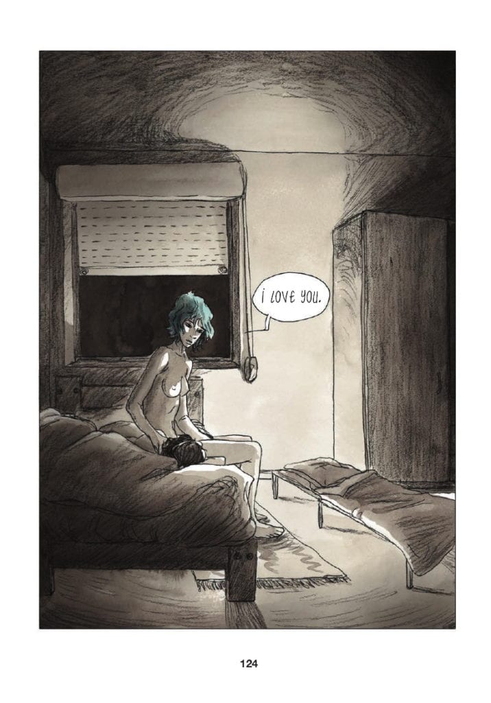
The splash pages represent an emotional high, or extreme low, where Emma is the central concern. The first two such pages, pages 82 and 83, illustrate Clementine’s growing obsession with Emma, a focus of her love and attention. Page 124, which is arguably Emma’s breakthrough moment in the narrative, shows the older woman’s vulnerabilities but also her strengths.
She sits on the edge of the bed in Clementine’s parents’ house, naked and exposed. There is an element of risk in the scene as signified by the cot bed, where Emma should be sleeping.* The reader can barely see Clementine, only the top of her head is visible, but all of Emma is on display. The darkness outside and the surrounding shadows are reminders of the problems that the couple still have to overcome, but there is also a column of light, shining on Emma as if it were a ray of hope. The full-page is a character dissection of Emma, where she has been and where she is at that moment. In this sequence that changes Clementine’s life forever, the moment is writ large and focused, specifically, on Emma.
The next full spread, page 145, also focuses on Emma, but this time the image, almost black with scribbled pencil, represents the breaking of a heart. Page 124 endears Emma into the hearts of the reader, making the follow-up page, page 145, that much more painful. Despite it being a monumental part of Clementine’s life, it is almost as important to Emma. This is why Maroh chooses this technique to focus on the narrative and character.
The final full-page spread is also the final page in the novel. It is all-encompassing, signifying both the lives of the characters and a grander sense of immateriality. These moments, illustrated in the novel with such a presence, are the most important periods of time for each of the characters. The size of them makes the moments last long beyond what is expected, but are also just as fleeting. Each page is in actuality only one panel, but they contain so much more, physically, and emotionally.
* Clementine’s parents are homophobic and at this point in the story do not know that their daughter is gay
Conclusion
Everybody’s lives are made up of the mundane and the monumental. The passing of time can contain a vast array of experiences and emotions but just as easily be fleeting and forgettable. It is the job of the writer/artist to differentiate between those times and emphasise what is relevant for the narrative. In Blue, Julie Maroh employs different visual techniques to portray the moments in her heroine’s life.
Large gutters, layout alterations, and oversized panels all create different types of punctuation within her storytelling. Consistency with these techniques enhances the reader’s experience and understanding of the narrative. Very quickly, you become accustomed to Maroh’s style and the visual grammar she utilizes to reflect elements of character and plot. In the same way that you would instinctively understand the structure of a novel or the editing in a movie, Blue has a straightforward structure that the reader can follow to get the most out of the graphic novel without being overwhelmed by complex, medium-specific, constructs.

